10 Best Ecommerce Stores: Get Inspired With Designs We Love

For eCommerce stores, having a website that’s both visually appealing and easy to use is crucial. After all, it’s your chance to make a lasting impression on your visitors and convert them into customers.
If you’re a brick-and-mortar store and just starting your eCommerce journey or want to accelerate your growth, you need an eCommerce website.
In this article, we’ll discuss 10 examples of great eCommerce website designs to inspire your own.
But first, let’s talk about the principles of a good website design.
What Makes a Great Ecommerce Site?
Here are 5 essential elements of a good eCommerce website:
1. User-Friendly Navigation
User-friendly navigation is crucial for an eCommerce site because it helps customers find what they're looking for quickly and easily.
A good eCommerce site should have a clear and intuitive navigation menu that organizes products and categories logically. The navigation should be easily accessible from any page on the site, and it should be consistent throughout the site to avoid confusion.
2. Simplicity
Simplicity is essential for an eCommerce platform because it makes it easier for customers to find and purchase products.
A good eCommerce site should be clean in terms of design, content, and imagery. Avoid clutter, unnecessary elements, and difficult words that may distract or confuse customers.
3. Visual Hierarchy
Visual hierarchy refers to the way that elements on a web page are organized to guide the user's attention.
A good eCommerce site should use visual hierarchy to establish a focal point and highlight the most important elements, such as product images, prices, and CTAs. This can be achieved through size, color, contrast, and other design elements.
4. Load Time
Load time is critical for an eCommerce site because customers are likely to abandon a site that takes too long to load.
Images and other elements should be compressed to minimize load times. Additionally, the store should be hosted on a reliable server with fast response times.
5. Mobile-Friendly
With more and more people using mobile devices to shop online, it's essential for an eCommerce site to be mobile-friendly.
eCommerce businesses having a responsive and mobile-friendly website design will improve the user experience, leading to greater chances of conversion and increased sales.
10 Examples of Ecommerce Stores We Love
1. Bliss
An Ecommerce Store With Visually Appealing Skin Care & Beauty Products
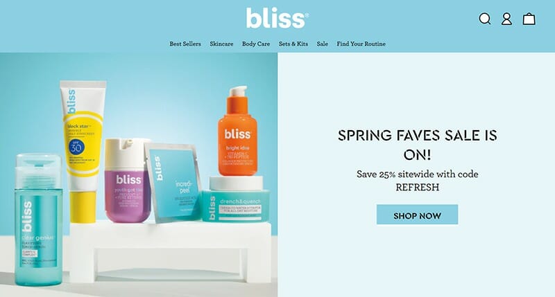
Bliss is a cruelty-free, planet-friendly skincare brand on a mission to empower everyone to achieve a higher state of happiness, and its website design reflects that well.
This online store uses a cotton candy color palette scheme to highlight the products to its target audience, i.e., Millennials and Gen Z. The friendly and funky brand ‘vibe’ is further reinforced through its short yet informative sentences. The website has a clean layout, with information divided into pages and sections, so customers can easily find what they’re searching for without having to browse around too much. It’s also optimized for speed, which is essential for customer conversion.
What We Love
- Focus on the brand’s funky and friendly vibe throughout the site
- Products are divided into multiple categories, making it easy for customers to find their desired products
- Option to add products to cart directly from homepage makes user journey short and simple
- The Instagram section on the homepage does a great job of showcasing social proof
What Could Be Better
- Prices are mentioned in the CTA buttons, which might be confusing for customers
- Increasing the font size in some places can improve readability
2. Simply Chocolate
An Ecommerce Store With An Eye-Catching Web Design
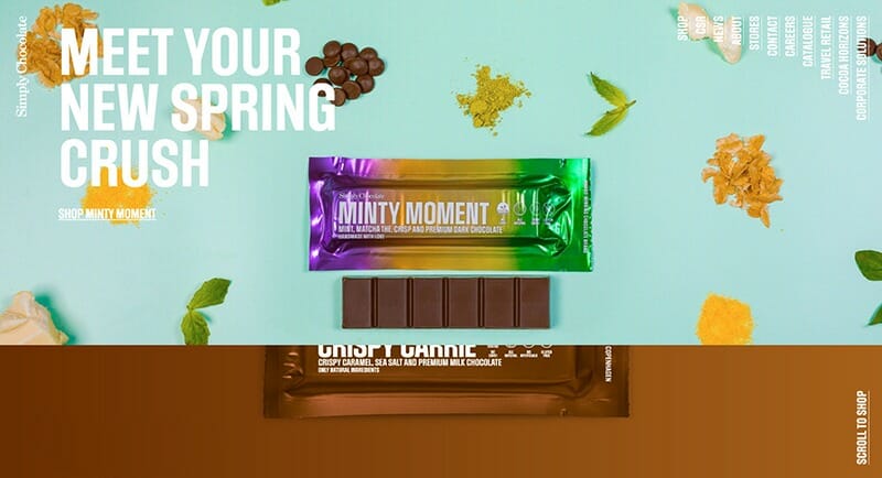
Simply Chocolate is another eCommerce website that boasts an exceptional design with intuitive navigation.
Simply Chocolate doesn’t have a typical homepage; instead, full-width images of the chocolates are displayed with animated backgrounds, making it very visually appealing.
Overall, the website has a clean and modern layout with minimal load time. However, that’s not the only good thing about it.
The eCommerce store locates a ‘Have You Tried Our Bestsellers?” section on the page – a clever strategy to upsell and increase average order value.
What We Love
- Clean and modern layout with easy navigation
- Navigation elements contain images
- Full-width images with animated backgrounds make it very attractive
- Important details, such as nutritional information, are given on the product page to help customers make an informed decision
- Corporate Social Responsibility (CSR) activities highlighted on the website help establish goodwill
What Could Be Better
- The vertical menu on the homepage might be difficult to read for customers
- Using social proof, such as reviews, can help establish trust
- The “add to cart” buttons could be made more prominent on the shop pages and homepage
3. Skullcandy
A Great Example Of Modern Ecommerce Web Design
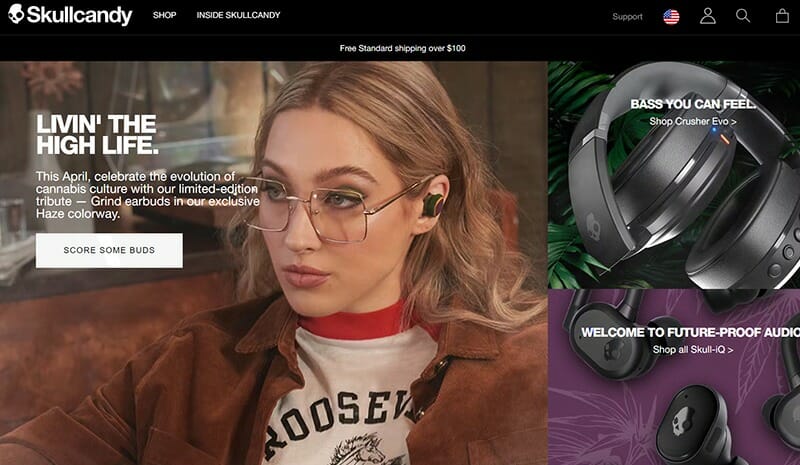
When it comes to the list of best eCommerce site designs, it’s hard to miss Skullcandy – and for all the right reasons.
The eCommerce website combines bright colors with black to create a funky yet sleek look that matches the brand identity. Skullcandy uses the optimal amount of text and visuals to make its website aesthetic yet informative and easy to navigate.
The shop page categorizes products based on their type, which makes it easier for customers to find their desired products. All the pages are concise and to the point to ensure seamless browsing.
There is also a sorting feature and a menu in the footer so visitors can easily find the information they require.
What We Love
- Sleek and modern web layout with the right amount of text and visuals
- Customer reviews displayed on individual product pages help establish trust
- Product features are listed on the product page, helping customers make an informed decision
- The use of full-width images gives an immersive feeling and makes it visually appealing
- Informative product help pages
What Could Be Better
- Adding more sections on the homepage, such as the bestsellers, can help increase conversions
- Having a single page for About instead of multiple pages can simplify the user journey
- More instant contact options like live chat and phone support could improve the user experience
4. DressUp
An Apparel eCommerce Business With Stylish Web Design
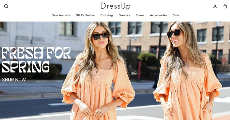
DressUp is a women’s apparel brand that aims to become the ultimate destination for trendy and affordable fashion. It is a brick-and-mortar business with 16 locations, and now, with its own eCommerce store.
The homepage is designed as a catalog, which is perfect for a clothing store. What sets it apart is the use of lifestyle photos that exhibit a fun and friendly vibe, as it helps build a connection with customers.
Another great feature of DressUp’s website is the option to filter products based on price, availability, and more, which saves time and effort for customers.
Overall, the website follows a neat and stylish layout that resonates with its target audience.
What We Love
- Effective sitewide navigation
- Use of fun photos and visuals throughout the website
- Attractive offers like Free Shipping are highlighted on every page to encourage online sales
- Important details, such as the measurements, are given in the product description to help customers make an informed decision
- Use of white background and clear typography make the text easy on the eyes
- Faceted navigation and sorting
- Quick view for products
What Could Be Better
- Website performance can be improved
- Increasing the size of the text in the footer menu and product pages will improve readability
5. Di Bruno Bros
An Eye-Catching Online Business Example Selling Gourmet Food
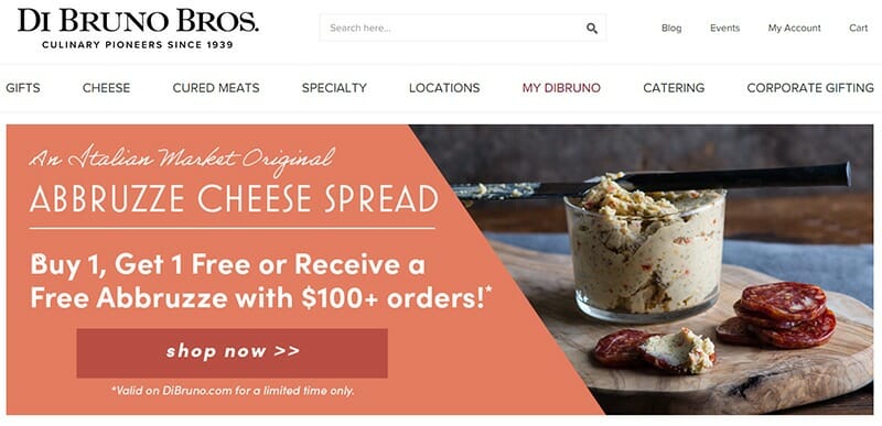
Di Bruno Bros is a brick-and-mortar gourmet food retailer with an inspiring eCommerce website.
The first thing you’ll notice when you enter the Di Bruno site is the sleek layout. The homepage is concise and well-organized, with different sections highlighting important information about the brand along with best sellers.
One of the highlights of this site is the descriptions on each product page, which give customers information about the origin, flavor notes, usage, and more to help them make an informed decision. The descriptions are crisp and to the point, keeping readers engaged.
Overall, the website layout does a great job of ensuring a seamless shopping experience for customers.
What We Love
- Use of high-quality product images makes the website visually attractive
- Filters and sorting options
- Intuitive website that offers user-friendly sitewide navigation, with multiple categories to help customers find what they’re looking for
- Each product page contains a wealth of information displayed in a concise manner
- It has a great accessibility menu
- Reviews on every product page
- Lazy loading of product images for better performance
What Could Be Better
- Some pages can be slow to load, which may discourage users from staying on the site and making a purchase
- They can improve accessibility by adding alternative text for images
6. Barry M
An Inspirational Ecommerce Website For Beauty Brands
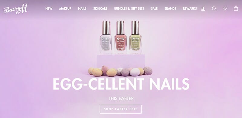
Barry M is a beauty brand with an aesthetic and functional eCommerce website. The website has a crisp and clean design with a predominantly white background and accents of pastel colors.
The homepage features a large hero banner that showcases the brand's latest products and promotions. Below the hero banner is a section that highlights featured products, followed by a product block and then reels of real-life customers using the product, serving as social proof.
The product pages have high-quality images, detailed descriptions, and customer reviews. On checkout, there’s a section called ‘Combines Well With,’ showcasing other products from the same category. This is a clever strategy to increase order value.
Overall, the website has a user-friendly layout, with easy navigation and a straightforward checkout process, making it easy for customers to find and purchase products.
What We Love
- The site's images and graphics are optimized for fast loading
- Dropdown menus for product categories and filters for product attributes make it easy for customers to refine their search and find the products they need
- Use of pastel colors on a white background helps to draw attention to important elements
- Customer reviews on every product page help to build trust and confidence in the products
- Reward program and gift cards to make customers more loyal
- Live chat support
What Could Be Better
- While the website is mobile-friendly, the product pages for nails, makeup, and skincare feel too cramped. They can be optimized for a better mobile experience
- Some CTAs could be more prominent and visually striking to encourage more conversions
7. Northernism
An Online Store With A Minimalistic Website Design
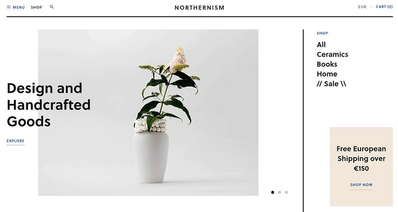
Northernism is an online concept store with a website that uses a grid-based layout. This is perfect for a business that sells a limited number of unique handcrafted interior objects.
The homepage has a catalog-like design, which is appropriate for an eCommerce business like Nothernism. All the important information, including the menu and free delivery offer, is displayed in the first fold of the homepage, ensuring easy navigation.
The product pages are concise and contain enough product information. The checkout process is also quite simple and fast.
Overall, the website has a clean and minimal design with fewer elements and plenty of white space that makes it look less crowded.
What We Love
- The website loads quickly, which is essential for a good user experience and sales
- Unique grid-based layout makes the store attractive and sets it apart from others
- Simple and user-friendly navigation menu that is easy to understand
- Product pages have high-quality images that showcase the items in great detail
What Could Be Better
- Increasing the font size of prices on the Shop page can improve readability for customers
- The site does not have a favicon for brand presentation and better navigation in browsers
8. Bon Bon Bon
A Visually Appealing Ecommerce Site That Sells Artisan Chocolates
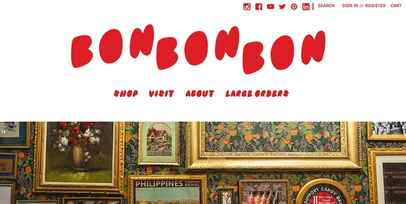
Bon Bon Bon’s eCommerce website has a fun and playful design that reflects the brand's unique approach to confectionery.
The homepage features a large hero banner with a simple CTA. Below the banner, there are multiple product blocks showcasing the different items available at Bon Bon Bon. The option to purchase directly from the homepage makes the user journey short and simple.
The website's color scheme is primarily pink and white, with accents of blue, yellow, and green. The use of bright colors and whimsical illustrations creates a vibrant and cheerful atmosphere, while the clean and simple layout makes it easy for users to navigate.
The typography is also playful and whimsical, with a mix of bold and script fonts that add to the overall aesthetic.
What We Love
- Fun and engaging design that accurately reflects the brand’s image
- White background makes the colorful product images pop out
- Products are displayed on the homepage, so customers can purchase them directly from there instead of having to browse around
- Reviews given on individual product pages help build trust with customers
What Could Be Better
- Using a simpler font for headings can improve readability and give the website a clean look
- Improving the website load speed might help increase conversions and ensure an enjoyable shopping experience
9. Jonathan Adler
An Impressive Ecommerce Website Example For Home Decor
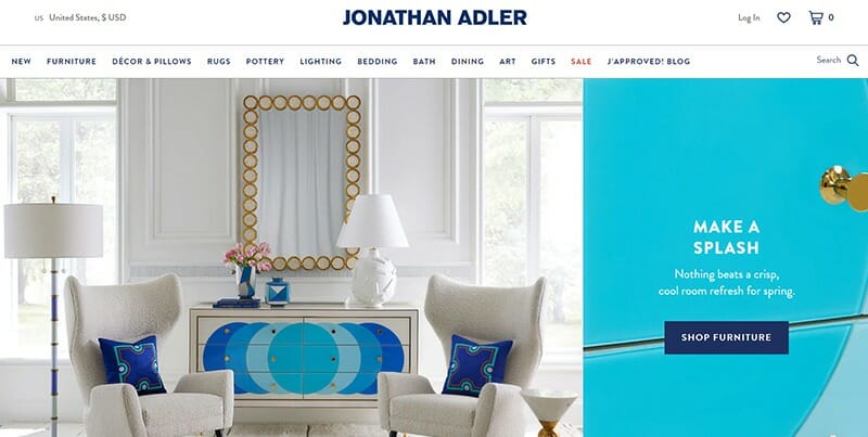
Jonathan Adler is a modern home decor and furniture company with an equally modern website.
The eCommerce site primarily uses a white background, which makes the product images stand out. The color scheme is complemented by a royal blue color and neat typography, giving it a sleek look.
The main menu is a dropdown that appears when the user hovers over the category links. The products are categorized based on style, collection, and more, ensuring easy navigation. The product pages have a simple and consistent layout for a seamless browsing experience.
The best feature of this website is the product descriptions that are clear, concise, and descriptive. Customers can also view reviews from other customers on the product page, which helps build trust.
What We Love
- Sleek and modern website layout with easy navigation
- Multiple categories and products are displayed on the homepage, allowing customers to easily find what they’re searching for
- Option to create your own wishlist enables customers to save products and find them later without any hassle
- Customer reviews on individual product pages help establish credibility
- Filters by color, type, and material on the product pages and multiple sorting options
What Could Be Better
- Changing the color and style of some CTAs can make them more visible
- Items not in stock should be marked as “sold out” on the Shop page
10. Magic Spoon
An Ecommerce Website With A Fun & Funky Vibe
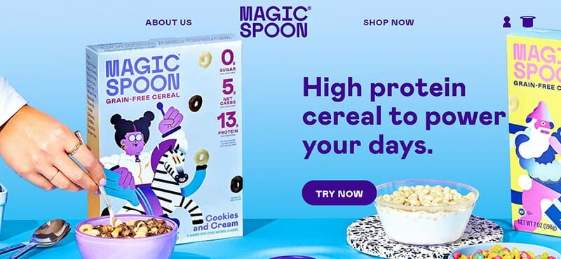
Magic Spoon is a breakfast brand with a mission to make cereal exciting. The brand does a great job of portraying its identity through its website.
The website has a magazine-like layout with a funky color palette that exhibits a feeling of excitement. High-quality product shots are used throughout to make the website look visually appealing.
Perhaps the most interesting thing about Magic Spoon’s website is the live bits of cereal moving on the screen that you can ‘pop,’ ensuring an enjoyable shopping experience for customers.
Overall, the website excels in terms of design and is highly responsive too.
What We Love
- Well-designed and user-friendly, with clear CTAs and a streamlined checkout process
- The use of bold colors, playful illustrations, and cool animation creates a fun and memorable user experience
- The messaging is straightforward and easy to understand, with bold headlines and concise product descriptions
- Customer reviews are accompanied by customer photos, which adds a personal touch and further reinforces the authenticity
What Could Be Better
- They could make the ‘About Us’ and ‘Shop’ navigation elements at the top more contrasting on desktops
How Do I Create An Ecommerce Store?
Creating an eCommerce business from scratch involves much effort. The steps and means to achieve the final result will vary on a case-to-case basis. However, you should develop your plan and strategy, which will guide you through the below steps.
What products will you sell? Will you pick the most trending products for selling, or will you stick to more niche ones with less competition? What does make you stand out from competitors? How many people and dollars do you need to create and maintain your store?
If you are stuck, look at successful ecommerce businesses that you can learn from. They already have a tested strategy, and you can modify it to create your own business model or build a completely different one. Sometimes we need a little nudge to go forward.
1. Choose Your Ecommerce Platform
Select one of the best eCommerce platforms for startups that suits your needs, such as Shopify, WooCommerce, or Wix.
2. Choose A Domain Name
Select a domain name that reflects your eCommerce business and is easy for customers to remember.
3. Design Your Website
Customize the design of your eCommerce store to match your brand and create a user-friendly experience.
4. Add Products With Detailed Information
Upload product descriptions, prices, and images to your store while following search engine optimization (SEO) practices.
5. Set Up Payment And Shipping
Determine how customers will pay for products and how you will ship orders.
6. Test Your Website
Ensure that your website functions properly and customers can easily navigate and purchase products.
7. Launch Your Store
Once you've completed these steps, you can launch your eCommerce store and begin marketing your products to customers.
While creating an eCommerce store can be complex, platforms like Shopify offer step-by-step guidance to simplify the process. You may also want to consider hiring a professional web designer or marketer to help ensure your store's success.
Best Ecommerce Store Examples FAQs
A great eCommerce store is user-friendly, visually appealing, optimized for mobile, provides excellent customer service, and is secure.
Common issues with eCommerce stores include slow loading times, poor navigation, inadequate product information, security vulnerabilities, and complicated checkouts.
Yes, Amazon is the world’s largest online marketplace, offering a wide range of products to customers worldwide.
Ecommerce stores can be challenging to make as they require expertise in website design, product sourcing, marketing, and customer service. However, with the right tools and resources, it's possible to create a successful eCommerce store.
An example of an online boutique is Reformation, a sustainable fashion brand that offers clothing and accessories for women.
Yes, you can sell sports equipment online. Many eCommerce stores specialize in sporting goods, and platforms like Amazon and eBay also allow individuals to sell their sports equipment online.
It depends on the laws and regulations of the region where the sale is taking place. In some areas, it may be legal to sell beer online, while in others, it may not be allowed.
Explore Further
- How to Start a Profitable Online Store in 6 Steps (+ Top Builders)
- How to Start a Dropshipping Business
- What Is Connective Ecommerce? Can you benefit from it?
- 24 Best-Selling Sites and Marketplaces to Sell Products Online
Was This Article Helpful?
Anastasia Belyh
Anastasia has been a professional blogger and researcher since 2014. She loves to perform in-depth software reviews to help software buyers make informed decisions when choosing project management software, CRM tools, website builders, and everything around growing a startup business.
Anastasia worked in management consulting and tech startups, so she has lots of experience in helping professionals choosing the right business software.