15 Principles of Good Web Design
Starting a web design project requires a meticulous understanding of the principles contributing to a successful website design.
A well-designed website can positively impact your business. Web design statistics show that about 50% of customers believe the website’s design is crucial to the overall business’ brand identity.
Creating a good web design that leaves visitors in awe will increase your brand awareness and conversions on search engines.
When creating a good website, essential design elements include usability tests, consistency, brand colors, typography, imagery, simplicity, and functionality.
This article explores 15 essential principles of good website design you can apply when designing your website.
Let's dive right in!
1. Simplicity
Creating a visually appealing website requires following the basic web design principles to ensure the site's performance is optimal and aesthetically pleasing.
Simplicity is essential for boosting your website's usability and user experience. Ensuring your site displays visual balance and simplicity goes a long way in projecting essential information and brand values in a positive light.
A good web design should adhere to the KIS guideline (keep it simple) to make it fun and engaging for visitors exploring vital details.
Simplicity in web design refers to keeping the interface clean, intuitive, and easy to understand for users.
Most users rarely visit a website to appreciate its design. They are there to find information. However, the design layout will determine how long they will spend on your page.
Always aim for simplicity rather than complexity. Having a user-friendly and simple website creates a warm atmosphere where visitors can discover vital information and pay attention to the finer details on the page.

Christy Anne Jones’ site is one of the best simple and minimal website examples that shows the web design principle of simplicity.
2. Consistent Design
Consistency in web conventions refers to maintaining a uniform visual design. Maintaining consistency in fonts, colors, and icons throughout your branding is essential to achieve a unified look.
The human eye can quickly identify motions, patterns, and layouts, which are critical factors in having a consistent outlook on your website.
Consistency ensures that users have a seamless and intuitive experience across different elements like sidebars, headers, footers, navigation bars, page layouts, and fonts and typography.

Bath House is one of the best website designs that uses consistent design across its web pages. Whether you click on the Williamsburg or the Flatiron site, you will observe they follow the same color schemes, headers, menu structures, and page layouts as the home page.
3. Complementary Colors
Colors can convey messages and elicit feelings from website visitors, emphasizing your brand's visual identity.
Web design statistics show that 40% of consumers appreciate the colors on a website more than any other design component. Choosing a color scheme that works for your business can positively impact how your customers perceive your brand.
For example, using many dark colors can produce a moody feeling, while a splash of bright colors can generate energy and happiness.
While creating your web design, ensure that your chosen colors complement each other, regardless of font style. Sometimes, this means sticking to similar shades, but opposites can also attract (for example, orange and teal).
Selecting colors that are opposite or next to each other on the color palette should always give visitors a complementary outlook that is visually appealing.

Jones Bar-B-Q uses complementary colors like Burnt Orange, Light Tan, and White as complementary colors for its website design.
The best colors for websites with visually appealing color combinations to awaken your creativity vary, but whatever you choose must match your brand identity.
4. Imagery
Think of imagery in web design, like the emojis and stickers you use to express yourself in chats and social media posts. The colorful, attention-grabbing decorations that make your favorite apps and websites pop with personality.
Visitors rely on images rather than texts because they are eye-catching and more accessible to digest and remember.
Imagery serves many objectives, like telling a narrative, illustrating a product’s functions, arousing feelings, or setting the mood.
Imagine a new user logging into a site with captivating visuals where every image whispers tales of adventure, emotion, and inspiration. Visitors will become curious and explore other visual elements on the web page.

SEEDIBLE is one of the best colorful website examples that uses high-quality imagery that leaves a long-lasting impression on visitors
5. Use The ‘F-Shaped Pattern’
The F-pattern is a term used to describe a typical reading pattern or scanning behavior that users display while interacting with a website.
Presenting your content using the F-shaped layout increases the average time spent on a website. Websites using the F-shaped pattern enjoy higher average conversion rates than those displaying inconsistent content.
The F-shaped pattern draws attention and makes headlines stand out, enticing readers to continue reading below or to the right of the headline.

CNN uses the F-shaped pattern to structure its web content and how users read through its web page.
6. Negative Spaces
Negative space in web design is the empty areas around and between elements on a page. This unique design element might seem like nothing, but it's important because it helps the main elements stand out.
Using negative or white space does not equate to building a dull, white website. A neutral or contrasting background helps draw attention to the main subject.
You can arrange, highlight, and frame elements in your web design using negative space to improve your content's appearance, readability, and interaction.
Imagine your favorite video game character against a plain background – that is negative space, making it look awesome! Your site design should provide visitors with a dynamic and engaging user experience.

Rust & May is a great example of a well-designed website that uses negative spaces to bring attention to its main subject.
7. Easy Navigation
Navigation is a wayfinding system that seamlessly helps users interact and find what they want on a website. Ensure that your website navigation is simple so users can move between different sections of your site.
Consider for a moment that you are visiting a website and finding that every link on the home page is clustered. There are flashing ads everywhere, and you are trying to find your way around the mess, but nothing is helping.
What’s your next step? Give up and look for the information elsewhere.
However, clear, consistent, easy-to-use navigation smoothens visitors' exploration and shopping processes. A menu navigation bar can accomplish this in your design process.

Chubbies is one of the best Shopify eCommerce stores you can use as inspiration to design an easy and user-friendly navigation system for your site.
8. Typography
Bold typography refers to the technique and art of arranging letters and texts on a web page in a way that improves legibility and readability.
The legibility of text is crucial in a web design. Certain factors affect legibility, like font size, font choice, line spacing, and other elements.
An engaging article features various font sizes that get users glued to their screens. Using sizable fonts as headings and moderate sizes for subheadings makes an article interesting to users.
Avoid fancy fonts while considering the font choice because they can be challenging to read due to their highly stylized features and unusual appearances.
Applying web-friendly fonts like Verdana, Tahoma, and Arial helps foster user-friendly experiences because of their legibility.

Tiff Cruz’s website uses a clean and readable serif font paired with colorful backgrounds, animations, and vector graphics.
9. Hick’s Law
Have you ever been on a website, felt there were too many options, and needed to know what to click on first? That's where Hicks Law comes in, stating that “the more choices you have, the longer it takes to make a decision.”
Having to pick from a wide range of choices is overwhelming, and users may need guidance on what to choose. However, providing limited but effective options is preferable to help hasten the decision-making process.
Take, for instance, having to choose from three options, which would take a minute or less to decide. But once the options are numerous, this frustration comes with what exactly to pick.
To make the decision process easy for your customers, ensure the options are limited but adequate.

PivotPoint’s website uses Hick’s Law by providing one CTA button titled “Let’s Talk”, helping direct users to make a decision.
10. Instant Gratification
Instant gratification is the idea that users expect their search to be as fast as possible whenever they surf a site in less than two seconds. Failure to achieve their result in less than two seconds may cause them to leave your site for another.
Speed search functionality is essential to attain instant gratification. This functionality is a feature that allows customers to access any information they need speedily.
Have you ever tried accessing a particular web page, and it felt like it was taking forever to load? You probably felt frustrated, right? Yeah, every internet user knows the feeling. What did you do? Let me quickly guess: you left that particular web page for another.
Whenever there is a delay in instant gratification, users tend to leave the site for another. Users don't have the patience to wait for a particular web page when competitor pages can provide the same search result almost immediately.
The same way you want instant delivery when you place an order is how users wish for instant results when they are on any website.

Sophie Brittain has one of the best responsive web design examples with a fast page load speed of 467 ms.
11. Mobile Friendly
Imagine you're checking out a website on your phone, and everything looks super tiny, and you have to zoom in and squint to read anything. Not fun, right?
Being “mobile-friendly” refers to a site displaying well on different screen sizes, whether big or small. This magic is called ‘responsive design’.
A user's experience while accessing a web page via a desktop computer should be their experience accessing the same page through mobile devices.
When designing a website, your page must be accessible to users through easy access, instant gratification, and easy navigation, irrespective of the device in use.
Mobile-friendliness increases user experiences. Making your web page mobile-friendly automatically expands your customer base to anyone doing a mobile search.

1790 Coffee is one of the best mobile website designs with a fast page loading speed, eye-catching visuals, and a responsive web design.
12. Great Content
Web designing is not just about creating designs but having great content. This design element includes written content like articles, blog posts, product descriptions, and headlines.
A website is nothing without good content.
Your web page should only contain relevant information to the target audience. Only relevant content should be on the page because it will make it too busy and clumsy, which can be a turn-off for users.
But here's the thing – all that content isn't just there for fun. Sometimes, it is to get users to buy a product, sign up for a newsletter, or make a reservation.
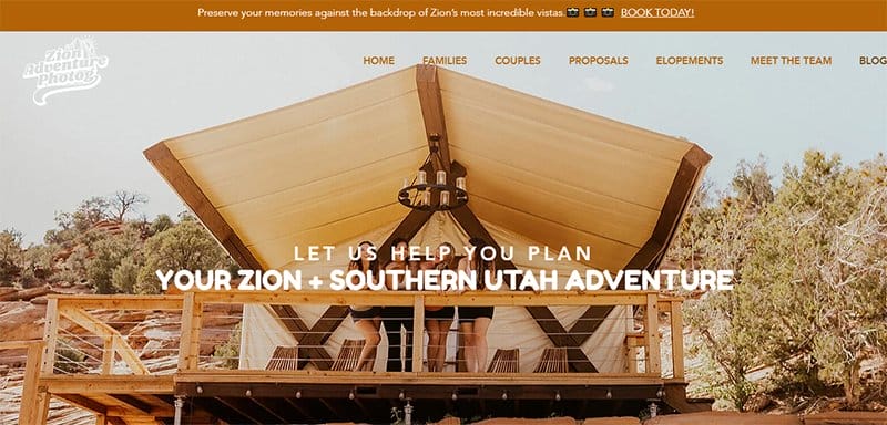
Zion Adventure Photog is one of the blog examples that provides high-quality photography content that connects to its target audience.
13. Visual Hierarchy
Visual hierarchy is like a secret code that helps your eyes know where to look first and what's most important on the screen!
For example, when browsing online, the most significant and boldest text usually catches your eye first. That is because it is at the top of the hierarchy, signaling that it is the most important thing on the page.
Visual hierarchy ranks among the most essential elements that help designers organize information for users to easily understand without feeling overwhelmed.
A well-structured visual hierarchy ensures that your webpage leaves a positive first impression and encourages visitors to spend time on the page.

Juno is a Webflow website template with an upside-down photo of a woman bending over with her head between her legs that catches the eye. Your eyes can’t help but focus on the big, bold black text at the top left-hand side of the site.
14. Z-Pattern
The “Z-pattern” in web design is a bit of a reflex action. This pattern exists independently of our conscious awareness, yet it subtly influences how we navigate through content on a screen.
Imagine your phone or computer screen is a giant canvas. It's like scrolling through social media or browsing a website without really thinking about it, but your eyes naturally follow a pattern similar to the letter “Z.”
This pattern helps organize the grid-based layout of web pages and guides users' attention to key elements without thinking about them.

Crafty Copy uses the Z-pattern (left to right and top to bottom) movement to draw visitors’ attention to what you want them to focus on.
15. Accessibility
Accessibility is among the top principles of good web design. Good web design ensures users, regardless of their abilities or disabilities, can easily access and use a website.
Calls to action, like buttons prompting users to “Buy Now” or “Sign Up,” are essential in accessibility. They should be clearly labeled and easy to find so all users can easily engage with them.
One way to ensure accessibility is by providing alternative text for images so that screen readers can describe the photos to users who can't see them.
Additionally, ensuring the website is navigable using only a keyboard is another great example of accessibility. Users with difficulty using a mouse can still move around the site and interact with all its features using just the keyboard.

Partake Foods is one of the best accessible website examples with an accessibility toggle that allows you to adjust several elements like fonts, text and cursor size, and line height.
Explore Further
- How to Design a Website
- How to Create a Website
- What Is Graphic Design?
- Types of Graphic Design
- Excellent Website Redesign Examples
- Great Web Application Examples
- Graphic Design Website Templates
- Best Award-Winning Websites
Was This Article Helpful?
Martin Luenendonk
Martin loves entrepreneurship and has helped dozens of entrepreneurs by validating the business idea, finding scalable customer acquisition channels, and building a data-driven organization. During his time working in investment banking, tech startups, and industry-leading companies he gained extensive knowledge in using different software tools to optimize business processes.
This insights and his love for researching SaaS products enables him to provide in-depth, fact-based software reviews to enable software buyers make better decisions.