The Anatomy of a Web Page: 17 Basic Elements

A web page is written in HyperText Markup Language (HTML) code as an electronic document with its unique Uniform Resource Locator (URL) or web address, which helps to point out which web server this electronic document exists.
The fundamental elements that comprise most web pages are beneficial in creating the required structure of the webpage by presenting information in an organized manner. The primary purpose of a webpage is to display content on the internet.
Every element utilized in building a web page has its unique impact and contribution to enhancing and providing the best user experience on the site. You can not design a website properly without knowledge of its basic element.
Here are some of the important elements of a webpage you will likely come across in modern website design.
1. Header
The header is the top part of every webpage, the area that catches your visitor attention before they move through other sections of your site.
This website element is one of the strategic elements of great importance. It is expected to set the pace for core navigation about the website as users, from split-second scans, can move to the main pages they need.
Otherwise referred to as site menus, headers are positioned in the website layout as an element of primary navigation.
Usually, they include specific layout elements such as a logo used to identify the brand, links to social networks and categories of the website content, search field, subscription field, call-to-action button, and primary contact information.
You must not overload your header with information as not all the layout elements need to be included in your web page header section. It must be limited to the vital ones to catch users' attention.
The choice of what vital layout elements for your header section should be left to the designer and marketing specialists, who have the expertise on what layout elements would generate the most attention in the header section.
Small Business Websites’ Header
Small business websites optimize the header zone optimally by including the company's logo in the left corner, the links to core navigation in the middle, and the call-to-action button in the right corner.
This zone is separated from the rest of the web page by a horizontal line serving as a visual appearance divider and is placed in the most scannable section of the webpage.
The design practice chosen for your web header depends on what works best in driving the most attention, as the combination of a logo, call-to-action button, and links to navigate web content works best in most cases.
Here are some of the popular web header design practices.
Sticky Headers
Sticky headers do not hide or blend into the webpage but stick to the top part of the page even when users scroll through the webpage.
They are beneficial in heavy-content pages that require long scrolling by keeping the core navigation visible and accessible.

Two-Layer Navigation Headers
Two-layer navigation headers have two distinct navigation routes, serving as a double set of navigation for sites to enhance web usability.
Another popular pattern used for website headers is making the website logo a tool to open or refresh the homepage by clicking on it.

2. CTA Button
A call-to-action (CTA) button is a user interface element designed to encourage a user to take a specific action, usually a conversion for a web page that prompts a user to buy, contact, or subscribe to a particular product.
A CTA button is an effective tool for converting a passive user into an active customer and needs to differ from all other controls on your web page or screen. The best website designs use attractive CTA buttons.
Due to its engaging nature, the CTA button should catch the attention and encourage users to perform the required action that it spells out on the web page.
The CTA buttons need to be easily noticeable, and web designers create them intending to catch the attention of website visitors in split seconds and respond by clicking on the CTA button.
Boldness is one feature your CTA button needs to display. Besides catching visitors' attention, it must encourage them to click on the text inscription that the CTA button shows, as it risks being ignored or untouched if not clearly defined.

3. Typography
Typography is essential to your web page graphic and user interface design. It sets the tone for how users read your page's content.
Your text is also designed to create and deliver a specific message about your brand. If properly constructed, it can set the right mood for users when they go through your web page.
Typography can create a visual hierarchy in your design. It directs visitors' attention to where to look for specific content and what items are essential when navigating your web page.
Going for larger font sizes would likely catch more users' attention. It drives the focus to that section of your web page as users consider their essential information, unlike smaller font sizes that users write off as a subsection that supports a broader header.
The weight, size, and height of your fonts are essential in typography for your UI design.
Typography is quite similar to a page layout in that it dictates how a user digests the content of your website. It must be easy to read and follow even when structure and hierarchy are established within your web content.
Line spacing is another important aspect of typography that you must consider on your webpage. Without it, paragraphs would look jam-packed and hard to read. You must experiment and develop the perfect line spacing to make your content easy to read and digest.

4. Hero Section
The hero section is the area of the web page found before scrolling above the fold. It contains a solid visual hook presented as an element to attract visitors' attention and put the message you want to convey at the back of their minds.
A hero section usually consists of a hero image, slider, text written in catchy typography, or a video, all utilized to get visitors' attention on the web page.
Your hero section can include the product or theme image of what the web page is about, be it abstract or not, as long as it grabs visitors' attention.
With a well-designed hero section, website owners build an emotional and informative connection with visitors. They are better motivated to engage the web page and scroll through it to see what it entails.

5. Footer
A footer is found at the bottom part of the webpage, marking the end of the web page.
This web page element is one of the critical elements of navigation on a website. It contains essential and additional fields, valuable links, and data users can refer to or may have missed while scanning the website.
A typical website footer usually includes the name and logo of the company or product serving as the brand identity sign, links to user support, FAQ page, about page, and privacy policy.
Credits to website creators, contact information and forms, links to company or product socials, testimonials, certification, and a subscription field or button are included in the website's footer section.
In infinite scrolling on a site, a fixed footer would be more effective than the traditional footer in the navigation zone as it ensures users do not lose this area while scrolling through contents on the web page.
The footer for most website users is a common place to search for contact information, credits, and site maps. Utilizing a footer as one of the elements of your webpage can be beneficial in getting interactions on your site.
The choice of using a footer supports the site's usability and navigability. It needs to harmonize well with the overall design of the site layout and its concepts.

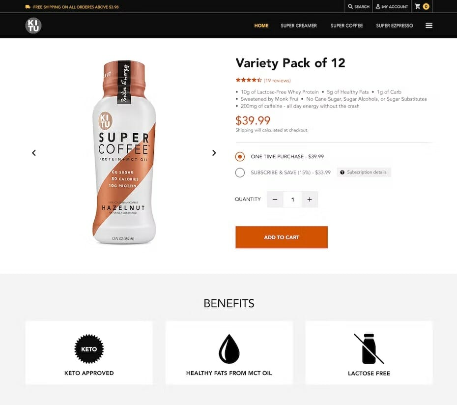
6. Product Images
The image and icon outlook of your site would be one of the primary e-commerce elements of your e-commerce site as users try to make sense of what your site is all about.
Your product image size would go a long way in developing the right impression of your site. You need to be wary of your site's loading time as large-size images affect the loading time of sites.
As much as you would want your product images to be broad and convincing to visitors, you should not compromise the overall efficiency of your site for more aesthetics. A slow site is a significant turn-off for users.
Meaningful icons work better with sites as they load quickly and can be a suitable replacement for large product images. Utilizing them with a product description text helps users understand your content better.
Every quality web page has to be designed with the ability to engage users and keep them hooked on the site and encourage them to check out other pages on the site. Product images are one such element that helps you achieve these goals.
7. Slider
Slider is one of the many interactive elements of a web page that utilizes a slideshow or carousel technique to present various products and offerings to users.
They are the most popular and widely used to create business and eCommerce website designs as they present a gallery of the site's products and services.
Although sliders often come out to many site owners as a controversial interactive element, there are numerous benefits you can gain from utilizing this element for your web page.
Better user engagement, an attractive visual hook, and better space management on your page are among the factors that help paint sliders as a good tool for your web page, but there are also some pitfalls that you need to consider.
The slider functionality decreases the speed of your website and, by doing so, influences your page's SEO. It displays numerous options simultaneously, which affects your site's usability as it distracts users from the primary focus of your site.
Also, the mobile adaptation of your website particularly ushers in a series of problems with sliders as they are often mistaken for ads and get skipped, which limits its efficacy.
So in adding sliders to your list of elements for your web page, you need to consider both sides of the divide and determine whether you have more to gain than lose from this interactive element.

8. Search
Search is an element of a web page that allows visitors to browse through contents contained in the website and displays them according to the search query.
The search function reveals relevant content by employing a shortcut of what users need, thereby saving users valuable time and effort that would have been expended by searching for content manually.
Internal search also improves the usability and desirability of a digital product, helps a business retain its customers, and increases its conversion rate, among numerous benefits this element affords website owners.
The search field, search bar, or search box is the interactive element that aids search in a search engine, and by users typing in what they are looking for in the search query, the search engine helps look up the content needed.
An internal search function would be beneficial for web sites with many pages. A well-designed, easy search field helps users move across important content to their pinpoint sections without browsing through numerous web pages.
Another crucial point to note in web development and web design is that you need not prioritize the search functionality over the navigation functionality when setting up your site's user interface.
Not everyone would find interacting via search very easy. Easy navigation would come in particularly helpful for these categories of users.
An internal search function is not needed for a single-page website as long as your site is not heavily packed with content. Simple thought-out navigation will suffice well for your website and its intended users.

9. Menu and Navigation
The navigation bar is at the center of every effective website strategy. Studies have shown that websites with no or poor navigation tools have the highest rate of visitors leaving such a site without thoroughly checking out the whole website and its sections.
You can use the navigator bar to locate the web page you need or the website’s home page.
On the other hand, the menu is at the core of navigation regarding the user interface. It is a graphical controlling tool that offers interactive options to users on the site.
The menu can be a list of commands with short verb action phrases like save, delete, buy, and send or categories that show how contents are arranged and presented in a given interface.
Menus are located differently in an interface and can exist as side menus, header menus, footer menus, or other forms. Depending on their appearance and level of interaction, they can exist as dropdown menus, drop-up menus, sliding menus, and the like.
A designer's final choice on a menu's functionality, appearance, and placement must be guided by thoughtful and well-analyzed user research.
Menus help tailor this research according to the general needs and the maximum satisfaction of identified target audiences as it lays the groundwork for a successful user experience.
Typically, menus can either be organized horizontally or vertically. Here are the common types you are likely to find on popular websites.
Classic Horizontal Menu
The classic horizontal menu is the most common and widely used menu type that offers navigation as a well-organized horizontal line in the website header.
Sidebar Menu
Unlike the classic type of menus, a sidebar menu gives users a vertical list of options for choosing from left to right of the web page.
Drop Down Menu
Drop down menu is for sites with rich content as it is more complex than other menu types. A list of additional options in the dropdown menu opens below as secondary options when the primary choice is clicked.
Drop Up Menu
The only difference with the dropdown menu is that the additional list opens up and is not down in this menu type.
Mega Menu
Mega menu works for sites with a wide range of options as it is a complex and expandable menu that presents its list in a two-dimensional dropdown layout format.
Hamburger Menu
The hamburger menu functions on a button characterized by three horizontal lines and expand when clicked. Most websites have multiple options that can overwhelm users without the right menu. This menu option helps save space and is best for mobile versions of websites.
10. Breadcrumbs
Breadcrumbs is an efficient navigation element that provides a user with the needed support to navigate a website by creating the necessary awareness and availing them with a website structure for a more effortless user experience.
This web design element is a tool for finding your way across a website. Still, they are not a direct replacement for the primary navigation menu as they only act as a secondary navigation level option to increase usability for sites with many pages.
Breadcrumbs offer benefits to users, such as increased findability by serving as a point to search for web content and grasp the structure of the site, as well as requiring fewer clicks with minimal effort.
Effective use of space is another benefit a user can gain from utilizing breadcrumbs. They take the structure of a straight horizontal line with plain text elements that require little or no space.
Breadcrumbs offer one of the best support for first-time visitors new to the modern web design world, which ultimately translates to a lower likelihood of these new users bouncing the web page.
They are used primarily on big e-commerce sites, media, news sites, and blogs. A complex hierarchy of multiple layers often characterizes them, hence their need for a secondary navigation option.

11. Form
The form is an element that allows users to interact by sending information to a system or server through various functions and options to make the process relatively easier, clear, and smooth.
This web page element is a traditional way of collecting data as users at one point in time deal with documents in their digital lives, from the registration process to making payments, sending feedback, and several other digital functions.
Forms act as an efficient means of communication between users and the digital product being offered. They must be simple and easy to use as they help web designers express their thoughts and efforts logically.
Generally, the simpler the form element of a web design is, the more room it creates for designers to express their thoughts and efforts. Forms make data input more logical while navigating through the form intuitive process.
By minimizing the number of actions required on a web page, forms utilize visual prompts and offer relevant tips to support the user while filling out the form.
12. Cards
Cards or tiles, as often fondly called, exist as layout elements to help a user scan, arrange, and visualize contents in an easy-to-read and understandable manner.
The difficulties that usually come with smaller screens have paved the way for a more responsive web design as the top pick for site owners.
Their pages can be broken into smaller segments and later repositioned into one easy-to-use form.
The spotlight has now been focused on cards as a design pattern. They are ideal for mobile devices and responsive design as they exist in different shapes and sizes.
Cards typically include a title, picture, various icons, username, and other additional information, such as a brief text or product description, acting as a small, condensed web page.
Although cards are organized in a grid manner, each card still stands out as a separate item in this system as they work to combine a variety of contents about a particular item.
For example, a product preview card on a catalog page would include information such as an image, title, basic functionality, and other relevant information needed to give users an informed idea of why the product was designed.
13. Video
Although video is not one of the essential parts of a web page, with the progress and solutions being made regarding web development, more websites are currently utilizing video in their page structure.
In a UX design, utilizing a catchy video designed with a vivid understanding of what the target audience needs is an effective tool for driving the attention and focus of customers towards your page.
The good thing about video content is that it touches target audiences' audio, visual, and motion perceptions by simply relaying a story they can identify with and understand.
With the combination of all these perception features mentioned earlier, video content usually appears robust, emotional, and memorable to users.
Videos are utilized alongside the hero section as a visual hook to help users quickly understand the product or service idea being sold to them and a complete overview of the workings of such a product or service.
As an element integrating a video into your web page opens up your page to some pitfalls that you need to consider before opting for this element in your web design.
Loading time, web page responsiveness, and contrast issues are among the drawbacks of video content on your website, as they tend to limit user experience.

14. Progress Indicator
Progress Indicator, although small, gives users an idea of where they stand and their current progress in a large volume of information or actions available for them to navigate through on a page.
This web page element is beneficial for pages loaded with voluminous text contents that need long scrolling, such as long-read articles or guides.
Progress indicators ensure users do not get lost on the page and can be a tool for users to estimate the time needed to cover all page contents successfully.
Apart from long-read texts, some web pages have complex forms and processes that require meticulous step-by-step actions. With a progress indicator, users know what segment of the process has been covered and what has left ahead.
15. Favicon
Favicon is unique from other elements as it occurs as a special symbol that represents the product or brand in the URL-line or bookmark tab of the web browser.
Otherwise known as a URL or bookmark icon, Favicon provides users with a quick visual connection while making their way through a site.
Favicons are used in toolbar apps, search bar recommendations, history tabs, bookmarks dropdowns, and browser tabs to make it easier for users to find their desired website.
With the list of URLs looking similar in the bookmarks dropdown or history tabs, favicons help point out the specific website you need from the long list of web pages.
As one of the visual elements, Favicon is particularly useful for creating productive website promotions as it helps bring the site's visual identity to visitors' attention.
Favicon as a symbol or icon is usually tiny in size, which is an advantage to your site as it aids web usability.
16. Tags
Tags are usually found in blogs and websites that have very numerous distinct content as they form another element of secondary navigation.
They usually consist of a keyword or phrase for a section that allows users to jump right into that section for which the term or keyword was assigned by simply clicking on them.
Tags can be regarded as specific pieces of metadata. They provide users quick access to particular sections and contents on a site and exist to support navigation by simple and precise content classification.
This web page element is often created for users to serve as an alternative to the naming or categories the site owners have fixed and cannot be changed by users under any condition.
17. Links
Links should be distinct from the rest of the text on a site to make it easy for visitors to tell what texts are links.
Text links typically appear in blue and are underlined, making it a unique element, and unlike other regular texts, your cursor changes to a hand when you move it over texts or graphics links.
The link's text becomes bold and changes to a different color. Depending on the web browser, you would be generally informed of the website address associated with the link and access it with just one click.
Links help you have an idea of the pages you have previously visited. The texts on the hypertext links usually change to a different color. This change indicates the link has been seen before, but you are free to visit again by just clicking the link.
Depending on how a website is designed, there is likely to be one or more related web pages associated with it. These web pages are linked together by a system of hyperlinks to enable easy access to these web pages.
Was This Article Helpful?
Anastasia Belyh
Anastasia has been a professional blogger and researcher since 2014. She loves to perform in-depth software reviews to help software buyers make informed decisions when choosing project management software, CRM tools, website builders, and everything around growing a startup business.
Anastasia worked in management consulting and tech startups, so she has lots of experience in helping professionals choosing the right business software.