12 Best Black and Gold Website Designs for Inspiration
Colors are one crucial aspect of any web design, potent tools for portraying a brand's identity. Your choice of color can be a determining factor for sustaining the interest of potential clients on your site or a key to losing them to competitors.
Setting the right balance for web design colors is where many run into confusion. If you are looking for classy colors that exude luxury and sophistication to (re)design your website, black and gold colors are great taste.
The elegance of these colors will quickly help you to get visitors glued to your site and effectively communicate your brand's message. These colors help you evoke the desired emotions in your client and make you stand out from the competition.
Fortunately, we have compiled a list of the 12 best black and gold website templates you can steal to create your website.
Let's get started.
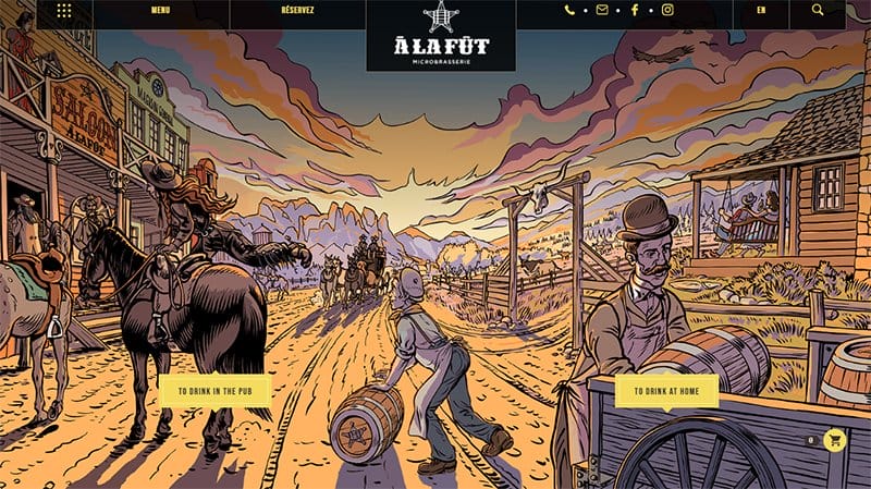
A great example of a black and gold website design, the Alafut website is aesthetically sensational, having a consistent array of illustrations.
The first thing that calls your attention to this website is the striking image that strategically reveals the brand's identity in a tangible visual artistry.
Amidst the color tones and contrast in this creative design, Alafut evokes an all-around elegance and sophistication with a blend of black and gold.
Another inspiring design on this website is the responsiveness of menus and motion effects that animate the page as you scroll. This effect allows for unique transitions and adds a sense of liveliness to the site.
The section layouts are attractive views and highlights of Alafut's micro-brassiere product. Visitors can use the hamburger menu to explore more products, find resources, and use the search bar to penetrate the site easily.

The Dublin Ranch Dental website is Dr. Desai's dental portfolio, complete with the representation of his medical specialty, testimonials, and tactical placement of CTAs.
This dental site uses a WordPress theme with a minimal front-end structure. The center stage of this website is the hero section, which has a black, yellow, and touch of gold color palette that tones with the mien hinged to the side of the section.
Beneath the hero section, you will find the white space introducing his brand while complementing the dark theme of the striking image.
I love his preference for colors that exude simplicity and timelessness, giving his website a clean, minimalistic feel and appealing to visitors who appreciate straightforward designs.
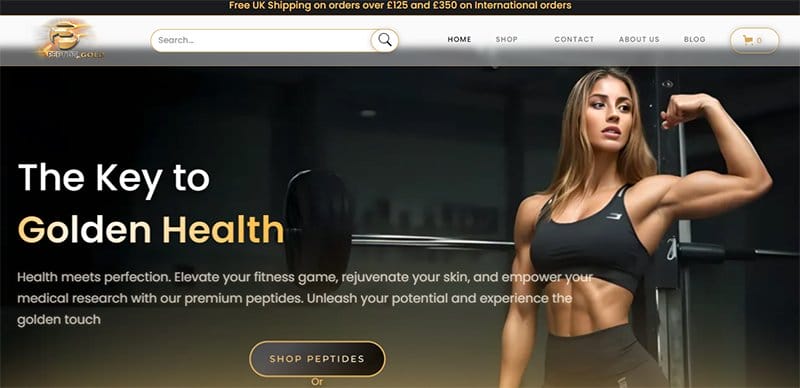
Peptide Gold starts by taking a simple web design approach, equipping it with functionality, and displaying visually engaging content. The content is well-defined, serving as an index for what the brand stands for.
Exploring this online store, you would agree that this brand surely knows how to draw clients in. You can't help but love how it dominates its designs with gold colors that synergize with the supporting blue, black, and white color schemes.
Equipped with scrolling interactions and artistic web design color schemes, Peptide Gold gives you an impeccably executed layout.
This online store has a unique product page, menus with smooth transitions, and a stand-out search bar that allows you to surf the site more specifically. People who enjoy reading fitness-based articles can jump on the blog menu to find tips for a healthy lifestyle.
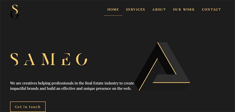
Sameo is a web development brand co-founded by two renowned web designers that helps businesses build an effective and unique presence on the web. I love how Sameo presents its experiences and services in a simple and smooth one-page style portfolio.
This beautiful website does a great job highlighting the values they bring into every project they undertake on top of a Dark Jungle-green color scheme.
As social proofs are becoming increasingly important for marketing in the online space, Sameo provides several case studies of their work.
Visitors get to see and review the websites of companies they've worked with and get design inspiration for their next web design. Since there are no contact links, potential clients can submit their details to notify Sameo of their interest in doing business with them.
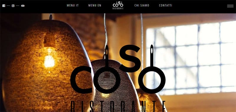
COSCO Ristorante is home to all Italian culinary delights. Their food website focuses on displaying the perfect combination of exquisite and mouth-watering delicacies garnished with green vegetables.
This food website uses white as its primary color and a touch of black and gold to add an elegant feel to the outlook of the web design.
While the striking image features a black-gold design, other images are displayed over the white space along with a flowchart of their restaurants' menus. COSCO Ristorante is a must-see if you are looking for design ideas to create your food website.
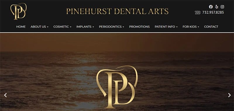
Pinehurst Dental Arts website is another example of a black and gold website that has a great taste for branding. This site features a customized UI/UX design, a blocky layout, and matching colors that blend with the brand's uniqueness.
Upon landing on the page, several slides of brown-themed images with a static bold logo design welcome you. This section features a CTA button that points you to schedule an appointment.
The center of attraction of this site is the parallax effect that reveals the custom background and the sections organizing the contents in their order of relevance. These designs are great tools for attraction and good visual coordination.

One of the best examples of a black and gold website design, the Randy Norbo DDS website immediately engages visitors with large imagery that gives a good first impression on arrival.
The outline of this website walks you through the brand's services while showing you background images of their certifications through scrolling effects. The certifications and testimonials are potential references for prospective clients.
If you have ever thought of using imagery to give an overview of your service workflow, this website is simply for you.

IDEA Branch is one of the leading full-service digital agencies providing the right strategic marketing tool to start-ups and big establishments in Thailand. Compared to other WordPress templates, this website catches the eye with a mind-blowing design that speaks for itself.
Specifically, this site emphasizes the unique importance of using a simple workflow to demonstrate its end-end solutions while capturing users' attention.
IDEA Branch makes it fun for users to stay glued to its homepage with motion-filled designs at every section on the page. What's interesting about this site is how it majors on the essential things and leaves no room for irrelevance.
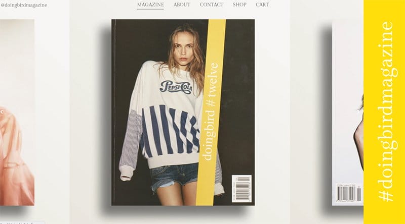
#doingbirdmagazine has one of the simplest and most minimalist web designs, displaying only slides of fashion and creative art publications throughout its site.
I love how this website dominates its simple web design with shades of yellow and gold color schemes to create a sense of excitement.
Upon landing on this website, the homepage feels unnavigable due to the absence of a scroll bar. Fortunately, it prominently presents a menu bar, ensuring visitors are not lost on the site.
By exploring those menus, site users can enjoy a collection of fashion exhibitions, shop, save orders, connect, and find details about the brand.
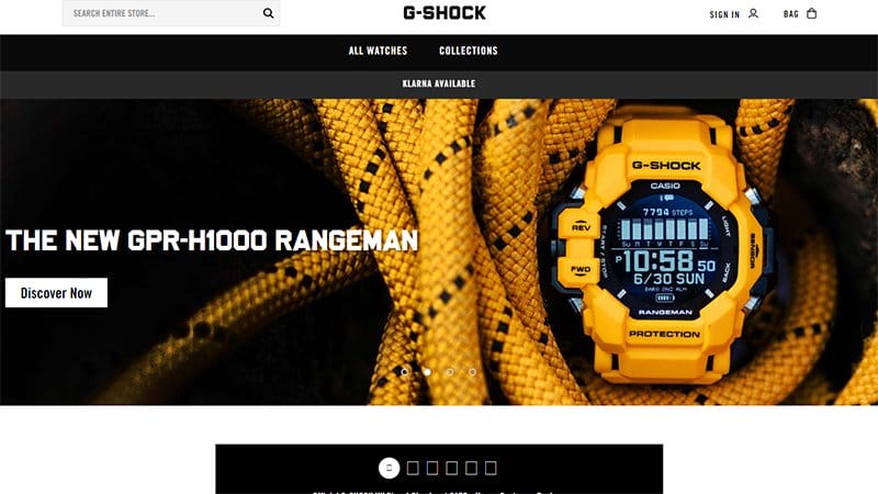
G-shock's website is a place where creativity meets technology. Welcoming visitors on board, G-shock showcases a curation of all-inclusive models of powerful G-watches and embraces color schemes that adhere to the outlook of each design.
I like how the primary white space sets the mood for the absorption of every information and gives prominence to the black, yellow, and gold colors.
Apart from the bold fonts introducing the wordmark logo and headings, other fonts are stylish, ensuring the readability of the content on display. What's handy about this website is the one-stop shop that allows you to make purchases and payments without hassles.

Take Up takes excellent satisfaction in keeping visitors informed of its investment services and prioritizes a playful user's experience in communicating its brand's objectives.
I love the use of a well-balanced mix of yellow, Gold, and black color schemes featuring sleek typography and a video loop over the striking hero background.
The video loop uniquely highlights the workflows of its value-added services, processes, and excellent service delivery in an exciting visual contrast.
Take Up emphasizes helping its potential clients capture the essence of its AI-fostered investment systems. On this account, it simplifies its workflows in an easy-peasy format over a white background so that visitors can get a quick grasp at first glance.
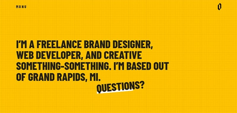
Derek Mohr is a freelance brand designer, creative artist, and seasoned web developer with impressive track records in his areas of specialization. He uses his website design to display the height of professionalism, showcase his expertise, and advertise his business.
Notable designs of this website are grid lines and short-skewed underlines that enhance the creativity and appearance of web content.
He entertains visitors on his website by maximizing micromotions and displaying attractive social media cover posts. His preferred choice of colors is exciting and expressly influences the finishing of his website design.
Derek Mohr's website employs a subtle strategy that proves his art and mastery of his profession and positions him as an excellent choice for business.
Black and Gold Website Design FAQ
There are several places where you can find beautiful web design color schemes. One of the sure places you can easily pick ideas from is Pinterest. This site provides multiple matching color schemes from the color wheel that you can choose for your design inspiration.
Black and Gold are great colors for any website design because the combination symbolizes luxury and class. These two colors come in handy irrespective of your field. Whether you are a lawyer looking for colors to combine for the web design of your law firm or a doctor in need of color ideas to create a medical website, you always go right with black and gold.
You can use black and gold as primary colors or supporting color schemes. If you are using them as primary colors, a touch of white will sharpen the tone of the primary colors. Also, if you are using them as supporting colors, browns, shades of yellow, and purple are best used as background colors.