Charity Websites: 36 Inspiring Examples (2025)
Creating a beautiful nonprofit website design can help you attract donors and volunteers and spread your message to a bigger audience.
There are many charities and nonprofit organizations with websites. If you want to attract visitors and get them to fill out your donation form, build a charity website that leaves a long-lasting impression.
Whether you are building a new website or redesigning an existing one, looking at top nonprofit websites like St. Jude Children's Research Hospital is helpful.
This article covers the 36 best charity websites to draw inspiration from when creating your own website.
Let’s get started.
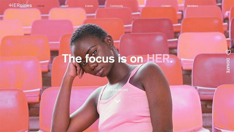
HERoines is on a mission to help women cultivate fundamental life skills while providing them a space to grow in community with one another. The focus of visitors is on the image of a lady seated with the text, The Focus is on HER, adding a twist to the site’s hero image.
Bold colors and high-quality images are the recurring theme on the HERoines charity website, visible throughout the site.
The Donate text at the side with a heart-shaped emoji serves as one of the few Donate CTA buttons, taking users directly to The HERoines donation page.
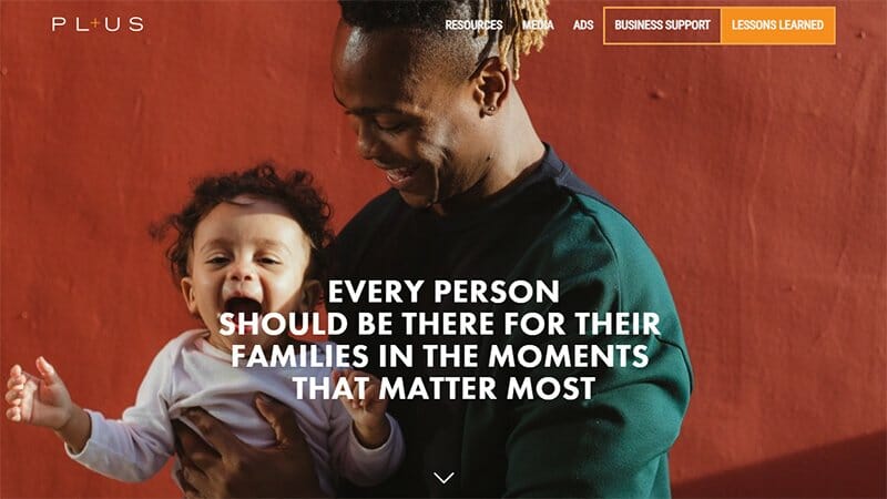
PL+US is a non-profit organization tasked with winning paid family and medical leave for every working person in the U.S. I love how PL+US, one of the best nonprofit websites in terms of engaging photos, displays an image of a man with a child as its hero image.
The scrolling parallax effect experienced by visitors when scrolling through this charity website is visually appealing, leaving visitors wanting more.
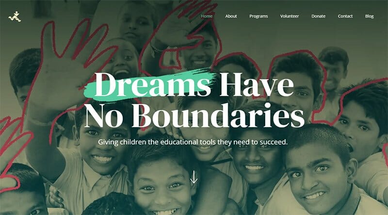
Dreams Have No Boundaries helps students to grow within their communities through teaching various subjects and holding career workshops in Bangladesh. This charity website displays artistic elements all around, with lines, hand-written texts, and equations visible throughout.
The images displayed have a contrast effect, blending well with the bold-colored backgrounds. I love the Word From Our Students section, displaying framed quoted texts alongside the framed images of the students in a slideshow format.
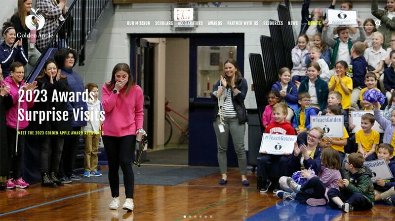
Golden Apple aims to make a material difference in resolving the teacher shortage through its scholars and accelerator programs. Several slideshow images of its programs and happy smiles take center stage as hero images on the Golden Apple charity website.
The Cadmium Yellow color is the background for its CTA buttons and top header menu, making them easy to distinguish from ordinary text.
The footer section chooses a black-and-white color scheme to display separate navigations and icons leading to social media pages.
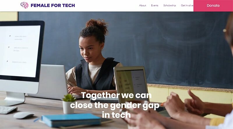
Female for Tech is a nonprofit organization aiming to close the gender gap in the technology industry by empowering more women in tech. Ripe Plum, Pink Lemonade, and Rich Maroon colors from the Female for Tech logo are visible throughout its site.
The Pink Lemonade background color serves as this charity website’s CTA buttons and font color for the header menu. I love the slideshow picture display of its past events, taking visitors through an unusual experience.
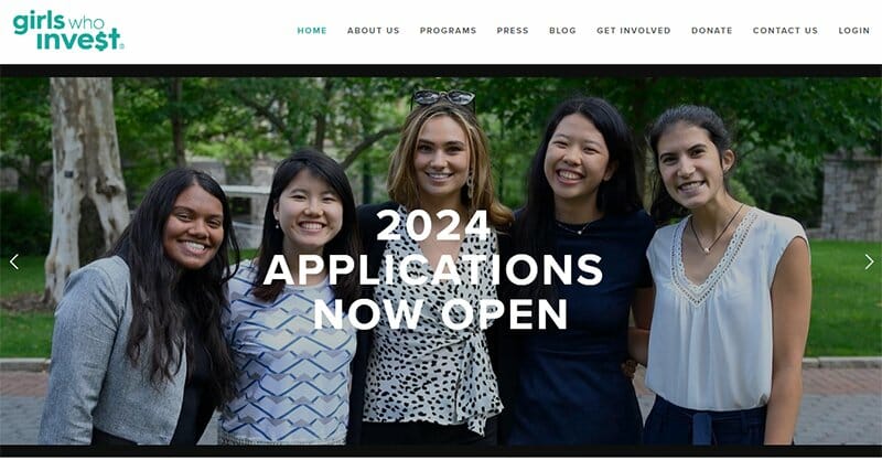
Girls Who Invest is an all-women nonprofit organization transforming the investment management industry by bringing more women into portfolio management and leadership.
Leading the charge right from its charity website, the Girls Who Invest displays slideshow images of women making headway in the investment management industry.
The Persian Green color background of its CTA buttons is consistent throughout the Girls Who Invest website design, conforming with its logo color.
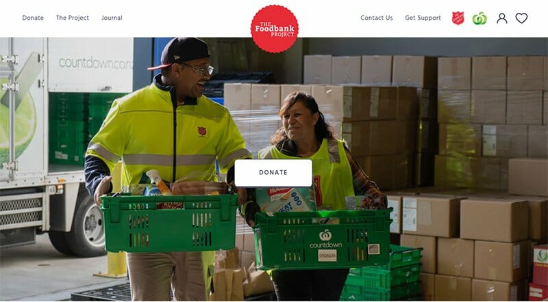
The Foodbank Project started as a passion project by Galen King, founder of Lucid, is now a fully functional online store for anyone to donate groceries.
A seal in Red with the inscription The Foodbank Project is what attracts visitors, standing between two sets of navigation menus in the header section.
The hero image of two people carrying groceries with all smiles officially welcomes visitors, with a white CTA button directing users to donate.
I love how this nonprofit organization states with animations and texts the entire process of how they collect donations on its homepage.
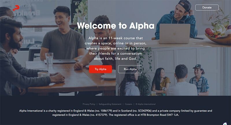
Alpha International falls under the best charity website examples, with its modern design, all on a single page. An 11-week course, Alpha creates a space, online or in-person, where people meet to converse about topics bordering on faith, life, and God.
The call to action buttons that encourage new website visitors to try or run Alpha or donate is one of the standout features of this charity website. Uniquely positioned, the Red and White color scheme makes it easy to distinguish them from ordinary texts.
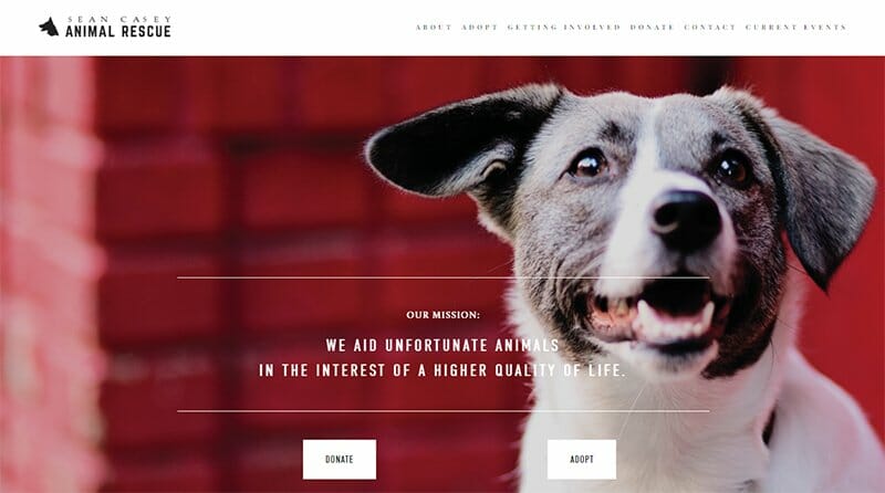
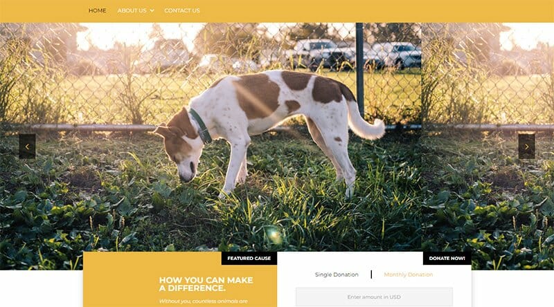
Sean Casey Animal Rescue is a non-profit organization offering foster care and critical service funds to the animals under its care.
This charity website example displays a summary of its organization’s mission statement in White font on its homepage. Visible over the hero image of a dog in the background are two CTA buttons in White, urging visitors to donate or adopt.
Sean Casey Animal Rescue displays icons leading to its social media platforms in a centralized layout in the footer section, leaving plenty of white spaces.
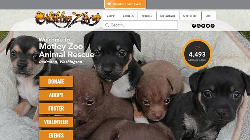
Motley Zoo Animal Rescue is a nonprofit organization providing individualized care for animals and people. This charity website chooses an image of six puppies cuddled together as its background. The image fades in to reveal other content further down the homepage.
Visible as part of its site design is the total number of adaptations made thus far, highlighted by a Golden Bell bordered circle. Motley Zoo Animal Rescue displays this number to inspire people to donate, adopt, or foster as listed as CTA buttons in Golden Bell backgrounds.
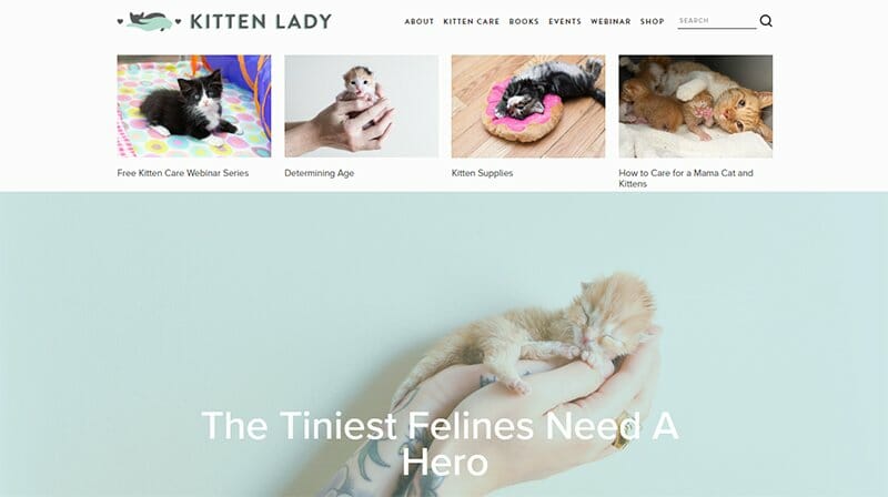
Hannah Shaw is the leader of Project Kitten Lady, a nonprofit organization providing resources that help individuals and animal shelters learn how to save kittens.
The Kitten Lady’s website displays images alongside text in its header menu, helping users navigate through the site. There is a search function in the header menu that makes finding information easy on the site.
I love how the Kitten Lady uses Edgewater color for its call-to-action text, making it easy to distinguish from ordinary text.
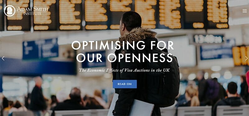
Adam Smith Institute, a nonprofit organization, runs a charity website with its content strategy at the top of its website design. From the homepage, visitors immediately get access to upcoming events, news articles, and blog posts, promoting a positive user experience.
The hamburger menu in the header section opens vertically and displays a list of navigations on an impressive Rhino-colored background.
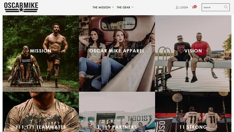
Oscar Mike is a nonprofit organization creating a clear path for peers living with disabilities, hosted by injured veterans, for injured veterans.
This charity website displays images as background for its navigation menu in a three-column layout on its homepage. These images, embedded with links, direct visitors to other pages on the website.
Visitors get regular updates at the bottom of the homepage on the number of visitors and each time someone purchases.
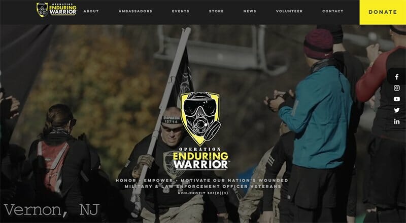
Operation Enduring Warrior is a veteran-founded non-profit organization with a mission to honor, motivate, and empower wounded military and law enforcement veterans in the U.S.
This charity website displays a video background of some of the activities involved in Operation Enduring Warrior.
Pinned to the middle of the right-hand side of Operation Enduring Warrior’s website are icons leading to its social media pages, visible throughout the homepage. The donate call to action buttons stands out in their bright Aureolin-colored background.
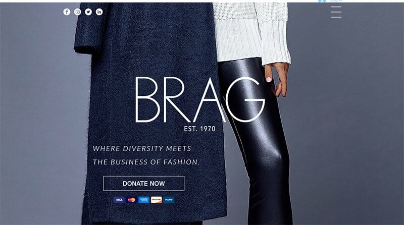
Brag is a nonprofit organization preparing and educating professionals, entrepreneurs, and students of color for executive leadership in retail, fashion, and related industries.
Choosing a Slate Grey color background, Brag displays a half-body image of a model taking center stage. At the very top of her homepage are Brag’s social media icons and a hamburger menu displaying its navigation menus.
I love how Brag displays logos of the payment platforms it accepts beneath the Donate Now CTA button.
RU4Children is a nonprofit organization tackling global poverty, focusing on poverty-related issues facing women and children. For its hero image and taking center stage, an image of two children are visible in the background of RU4Children’s website.
The CTA buttons on the RU4CHildren website are consistent, displaying legible texts in white over a Blaze Orange background. There is a YouTube video celebrating 20 years and counting since RU4Children's inception, with a Donate CTA button underneath.

Humorology is the largest student-run philanthropy and variety show in the state of Wisconsin on a mission to promote community engagement and a philanthropic website.
This Weebly-powered charity website helps raise awareness about its services, using bold typography.
The footer section of Humorology’s website is home to its contact information, displaying a map feature and links to its socials. There is a Donate CTA button in black-and-white, a tool to raise money for its projects.
Furry Friends Shelter is a nonprofit animal shelter receiving custody of unwanted cats and dogs and hosting them till they are ready for adoption. This charity website displays a full-width slideshow image of a particular dog under its care.
The What You Can Do section on the Furry Friends Sanctuary website is brief and catchy. I love how Furry Friends Shelter displays its social media icons alongside a Black and Butterscotch color scheme.
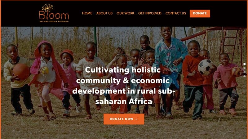
Bloom is living up to its mantra of helping people flourish, cultivating holistic community and economic development in developing countries, especially rural suburban Africa.
This website design takes a unique approach, bordering its homepage with a thick Halloween Orange colored line. The Halloween Orange color serves as the background for its CTA buttons, coined from its logo.
In terms of navigation, Bloom uses a fixed anchor menu visible on the home page as circular dots. These dots help visitors find their way across various sections on the homepage.
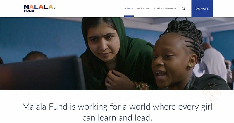
Malala Fund through its education champion network supports the work of educators and advocates in helping bolster girl’s education around the world.
Led by Malala herself, the Malala Fund website displays video content of Malala in her struggle for girls’ education.
The call to action buttons on Malala Fund’s website are consistent, visible, and easily distinguishable in their Cobalt color background. This color is visible in the donate section on the homepage to make the section more attractive to site visitors.
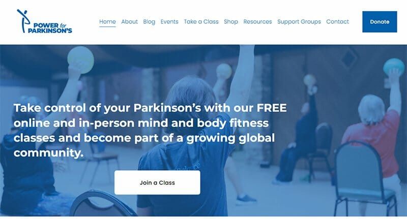
Power for Parkinson’s provides free online and body fitness classes for people with Parkinson’s disease and their care partners. The color Medium Persian Blue from its logo is visible throughout the site as ordinary texts, header texts, and background colors.
Sticking to the Medium Persian Blue color theme, the hero image on the Power for Parkinson’s website is highlighted in a faint blue color, capturing the immediate attention of visitors.
The header text-only menu is centralized between the Power for Parkinson’s logo and a donate call to action button, displaying drop-down menus.

Veterans Legal Institute provides pro bono legal assistance to the homeless and low-income current and former service members. A smiling hero image of a little girl on the shoulder of a young veteran helps pass the intended message of this charity website.
This nonprofit website has plenty of informative content displayed on its homepage. You will find logos of organizations that directly support or accredit the nonprofit organization for financial transparency in the footer section.
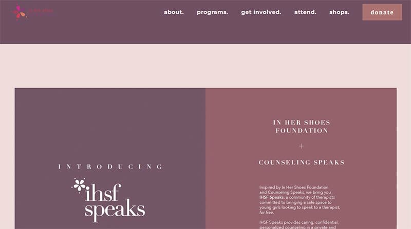
In Her Shoes focuses on making a positive impact through empowering women and girls. This charity website is uniquely built for the category of people it hopes to attract, displaying soft colors of Raspberry Glace and Dull Purple.
One fascinating feature of the In Her Shoes website design is its header menu, displaying all navigation menu texts in lowercase, a distinctive feature. In Her Shoes uses the Vanilla Ice color for its background and a soft color scheme chosen for its web design.

Hoffman Hope House has a charity website that raises funds to provide human trafficking awareness and support to organizations that help trafficking victims.
A passionate and worthy cause, the video background is moving, showing what victims of human trafficking face alongside a framed video of a lady crying.
Hoffman Hope House uses videos alongside bold texts to pass its message, with its CTA buttons asking visitors to donate and learn more standing out. I love how this website displays the word Save vertically, outlined by the color dark Turquoise, in the footer section.
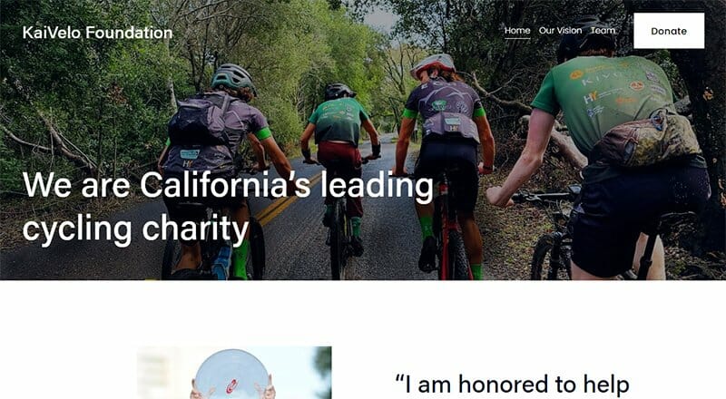
KaiVelo Foundation is California’s leading cycling charity with a simple and modern website design for its cause. Focused primarily on youth development, KaiVelo offers support to women and youth cycling via its women and youth programs.
This charity website is straightforward, making its message clear from its homepage. Bold typography and high-quality images help tell the story of the KaiVelo Foundation.
The contact section is brief, with information spread extensively across a Star Dust-colored background, designed to help visitors stay in touch.
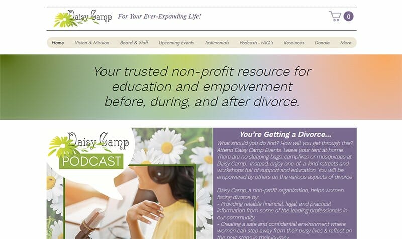
Daisy Camp aims to establish itself as one of the most trusted resources for helping women facing divorce create ever-expanding lives. This website design takes a centralized layout to display all its content, leaving extensive white spaces on both sides of the homepage.
Her site offers plenty of homepage features, with its Podcast and workshops, all accessible from the homepage. I love the extensive display of testimonials displayed on a Rum background on this charity website serves as social proof.
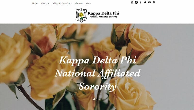
Kappa Delta Phi National Affiliated Sorority promotes academic achievement while encouraging community involvement through philanthropy, helping cultivate the everlasting bond of sisterhood.
The Yellow flower from its logo serves as the hero image on Kappa Delta’s Phi website, blended in to reveal the text in white.
Four circular navigation features are visible beneath Kappa’s mission statement, each revealing background images when the mouse hovers around them.

The Maine Coast Fishermen’s Association works to enhance the sustainability of Maine’s fisheries by advocating for the needs of community-based fishermen.
I love how the Maine Coast Fishermen’s logo spreads down into the video content displayed as its hero image. The text “Together We Preserve” written over it helps put perspective to the video playing in the background.
You can’t help but love how this website sticks to the Marine, White, and Halloween Orange colors of its logo for its website design.
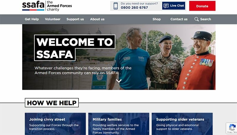
SSAFA works in partnership with other military charities and specialist organizations, providing support covers to regulars and reserves in the U.K. and overseas.
This website design uses the colors Cadmium Red, Deep Sapphire, and Curious Blue from its logo for its texts, headers, and CTA buttons.
Bold typography makes the SSAFA charity website one of the best nonprofit organization websites, visible throughout the site. The live chat feature provides visitors with direct contact with this nonprofit’s unique brand.
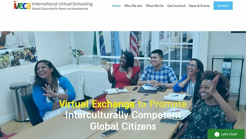
The Intercultural Virtual Exchange of Classroom Activities (IVECA) is a center for International Virtual Schooling.
IVECA, an international organization, offers support to all levels of schools and universities worldwide. I love how the IVECA’s website organizes information, making it easy for visitors to find their way.
This charity website sticks to the Crystal Blue color for most of its colored content, one of five different colors visible on its logo. The Let’s Chat feature displays a smiling emoji alongside welcoming visitors to chat with an online chatbot.
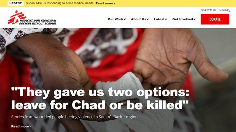
Doctors Without Borders is a nonprofit organization caring for people affected by conflict, disease outbreaks, natural and human-made disasters, and exclusion from health care.
As one of the best nonprofit organization websites, Doctors Without Borders organizes information in an orderly manner, using bold typography to pass its message.
The ArtyClick Red color from its logo makes the website design more appealing to visitors. I love how the footer section provides resources that engage supporters, providing options for fundraising, attending an event, volunteering, or joining a chapter.

The International Rescue Committee is a nonprofit organization, offering disaster relief to people affected by humanitarian crises, helping them survive, recover and rebuild their lives.
A full-width hero image of school children smiling in the background welcomes visitors to the website. The blend of bold typography, Sunglow background color, and animated and real images are the marketing tools this website uses to tell its unique story.
I love the refugee stories from around the world slideshow displayed in a separate section on a Chalky background.
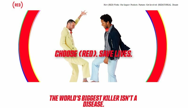
Red is a non-profit organization partnering with several notable brands and people, creating products and experiences that fight injustices that enable pandemics to thrive. A fighter for justice, Red chooses a simple non-profit website design to push its just agenda online.
Like the brand’s name, there are excess displays of different shades of the color Red on this non-profit website, visible as both text and background. The call-to-action buttons use a Red and white color scheme to display content.
Red’s non-profit website displays images and logos of companies it is proud to partner with extensively in a separate section on its homepage.
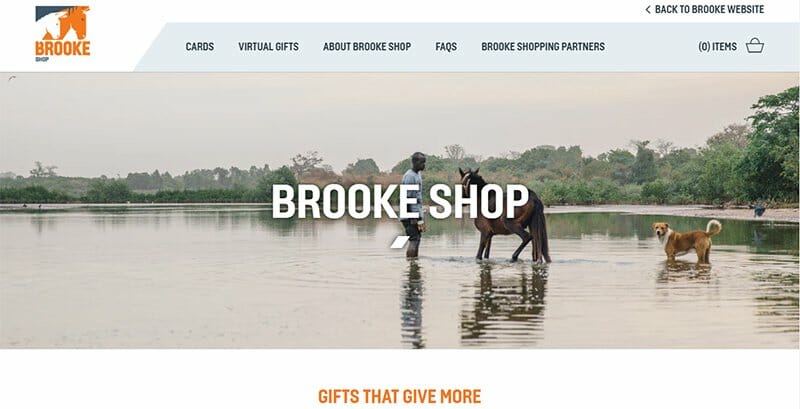
Brooke is an international charity organization helping to protect and improve the lives of horses, donkeys, and mules in the developing world. This charity website is unique, displaying slanting lines all over its sites.
As seen throughout the sites, the slanting lines form irregular triangles in a Mango Tango colored background, giving the site a distinct look.
The CTA buttons follow this triangle structure, filling its background with the Mango Tango color and creating a special effect when the mouse cursor hovers.
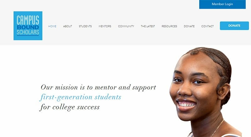
Campus Bound Scholars is a nonprofit organization dedicated to mentoring and supporting its target audience, first-generation students, for college success.
For its website’s color scheme, the Campus Bound Scholars website incorporates colors White, French Blue, and Bright Cerulean from its logo. The success stories of recent graduates are displayed as video content on an extensive Bright Cerulean background.
I love how Campus Bound Scholars highlights the problem faced and proffers solutions in the next section beneath the problem section, a proactive measure.
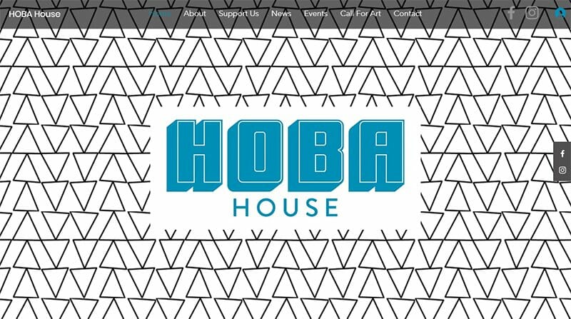
Hoba House is a communal art space providing people access to opportunities to explore new forms of creativity and share their creative pursuits.
This website design is aesthetically pleasing, treating visitors to an extensive image of black lines, forming triangles on its white background.
The Hoba House text in Bondi Blue colored fonts takes center stage, creating a space for itself in the site’s hero image.
Visitors can easily spot two sticky icons leading to the Hoba House’s social media pages pinned to the right-hand side and accessible throughout the homepage.
Charity Website Examples FAQs
Creating a charity website is no easy task. You can decide to hire the services of a web designer. But if you are looking for a quick and affordable way to create a charity website, use the right website builder. Ready templates awaiting your approval, if you prefer a DIY approach.
The best nonprofit website builders are Wix and Squarespace because they offer a rich library of stunning templates and easy-to-use tools for building your own nonprofit website.
The best nonprofit website designs go beyond having beautiful and engaging graphic designs. An about us page, donation CTA buttons, links to social media posts and pages, testimonials, and photos from the organization’s events are must-haves for every nonprofit website.


