26 Stunning Corporate Websites to Inspire Yours
Every business with the desire to have a consistent inflow of a large customer base requires a stunning corporate website. You can easily build trust and establish loyalty among customers when there is a well-designed corporate website in the picture.
Whether you run a software company, law firm, or venture capital firm, having an outstanding and classic web design attracts and keeps visitors.
You can use the best website builder like Wix or Squarespace to create the ideal corporate website that positively represents your organization to your target audience.
This article checks out the 26 best corporate websites with stunning outlooks which you can use as a guide when creating your own website.
Let's get started.
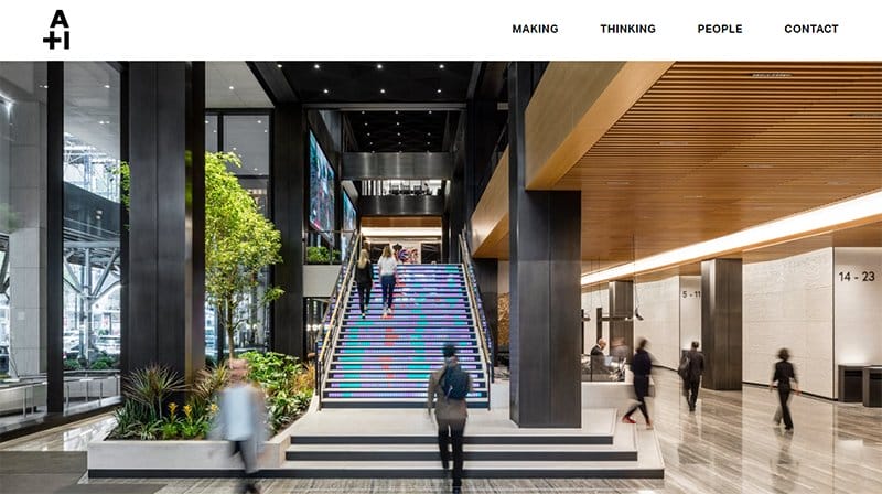
A+I website welcomes visitors with a full-page image slider which gives it a unique outlook from most corporate websites.
As you scroll further, you will observe how the company arranges its services and videos in a two-column format for interested visitors to easily explore.
The black-colored site footer features social media icons, addresses, and a Gmail address for contact information, making it easy for potential customers to reach A+I.
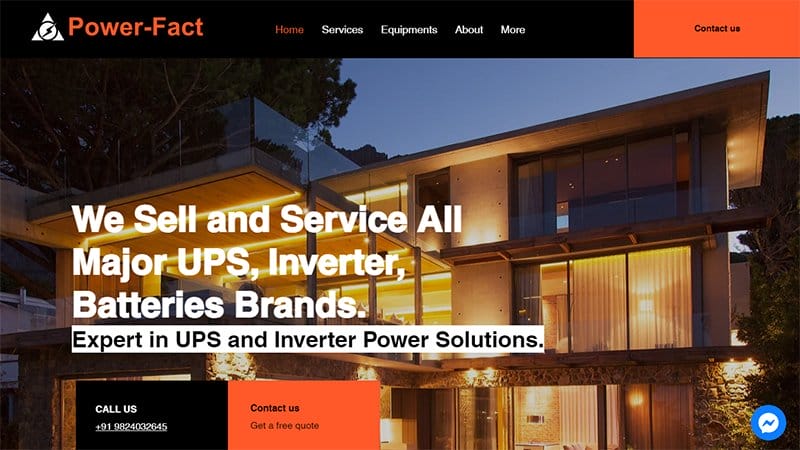
Power Fact has a good corporate website that majors in inverters, UPS, and batteries. I like how this unique corporate webpage features flashy colors such as an orange and white background layout that mirror the services the organization offers.
You can’t help but love the strategic position of its call and contact CTA buttons in the hero section. Interested visitors can immediately state their needs without going through the entire site.
Clicking the orange colored “Contact Us” CTA button is your one-stop shop to reach Power Fact’s customer support team.
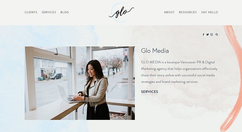
GLO Media welcomes you with a two-page split design featuring a little biography and text CTA buttons.
I like how this webpage has a simplistic yet engaging and colorful design layout without multiple elements like high-resolution images and interactive texts.
A unique feature that gets visitors' attention on this webpage is the newsletter sign-up column at the top of the menu bar. The simplistic nature of this website blends perfectly with the background colors, giving it a pleasing outlook.

Davydov Consulting company website is a full-service web design & development agency in the UK. This site welcomes visitors with an engaging embedded video that features vital content about the company’s services like its branding, marketing, and web development services.
The Navy and Nile blue background colors leave a strong impression on the minds of potential clients. Visitors can contact the company through the WhatsApp widget.
One of the best business websites, navigating this webpage is seamless via the sticky navigation bar with a drop-down feature.
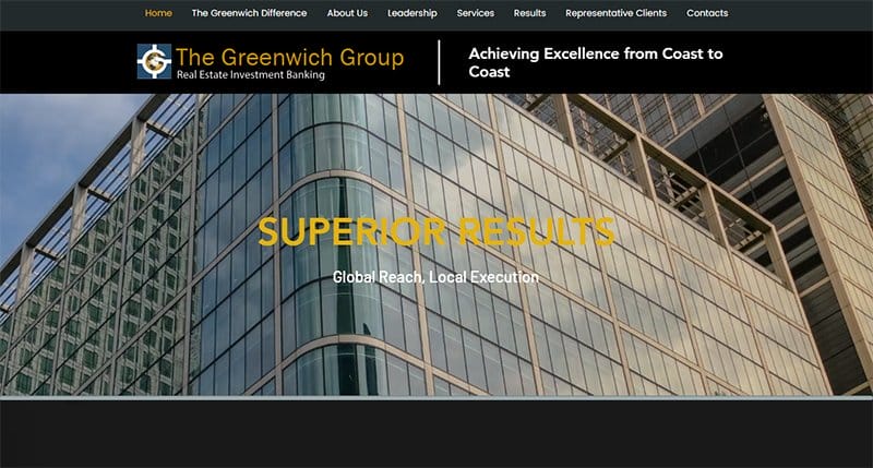
Greenwich Group is a real estate investment banking company that helps its clients navigate their way through various real estate-related issues.
Welcoming visitors to this stunning corporate website is a looping background video of a building in the hero section. The black and dark blue background blends with the image of a high-rise building in their hero section.
I like how the hamburger menu at the top left gives interested visitors various options to explore while navigating through the site.

Studio Bramble is an independent design studio and workshop in Edmonton, Canada. You cannot but love how simple and elegant this corporate website is, featuring high-quality images and engaging texts in various aspects of the page.
This corporate site features a cart icon and a minus menu button for clients to shop for items and check-out services.
As you scroll, there is a brief description of the company services offered and a text + arrow CTA button that leads interested visitors to other pages.
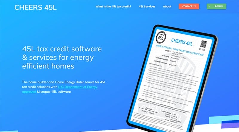
Cheers 45L corporate business website stands out in cyan blue and white. This stunning corporate website example has a modern outlook featuring multiple high-quality and engaging content that will leave a lasting impression on visitors.
You cannot miss the newsletter column just before the website footer for new clients to sign up and stay updated with the company's activities.
I love the display of reputable logos of past clients as you scroll further through the site which serves as a source of social proof.
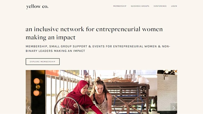
Yellow co is an inclusive network for entrepreneurial women making an impact with proof from top publications.
This corporate website design has a clean design layout featuring a free goal planner download section and a video for first-time visitors. Using stylish fonts in multiple areas gives the site's contents an elegant outlook.
I like how the CTA buttons are everywhere on the site, which helps visitors to immediately click and understand the brand’s story and activities. This element promotes a positive user experience.
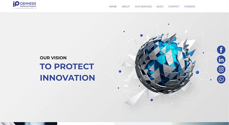
IP Genesis's well-designed corporate business website welcomes visitors with a picture slideshow featuring its vision and mission. A double row below the hero section features its services with a “find out more” CTA button for interested clients.
What stands out in this outstanding corporate website example is the right vertical arrangement of their social media icons throughout the webpage. The site footer contains a Google Maps feature and a contact form for potential clients.
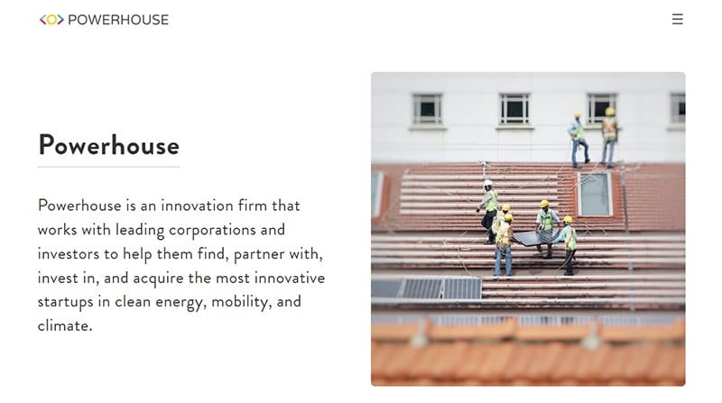
Power House corporate business website welcomes you with a full-length video featuring its daily services and programs.
The hamburger menu at the top right leads interested clients to various aspects of its services. As you explore the site's content, you will love how a free form pops up just after visitors click the contact button.
I love how the white-colored CTA buttons at the site footer provide options for new visitors to subscribe and contact staff members of the firm.
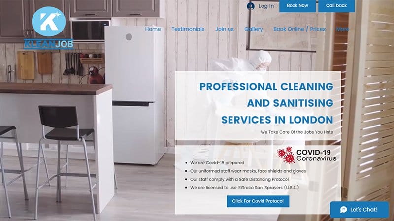
Klean Job is a family-owned professional cleaning and sanitizing service in London. Welcoming visitors is a short clip of a cleaning process in the hero section which offers potential customers a peek into their expertise.
Just after you click on this corporate site, an option displays on the screen for new visitors to subscribe to the newsletter for constant updates. At the bottom of the site is a free form and a “Let's Chat” widget for visitors to contact them.

VP Creative Agency specializes in branding, web design, engagement, and revenue. Welcoming site visitors is a slideshow featuring the company's operations and activities in bold and clear fonts with various vector images and engaging content texts.
The stunning brand images against the white background give the website an inviting and professional outlook. I like how the site features the company’s past experiences with reputable clients using multiple logos of top brands.
What’s handy for me about this webpage is the sticky navigation with a polka dot menu option which aids seamless exploration.
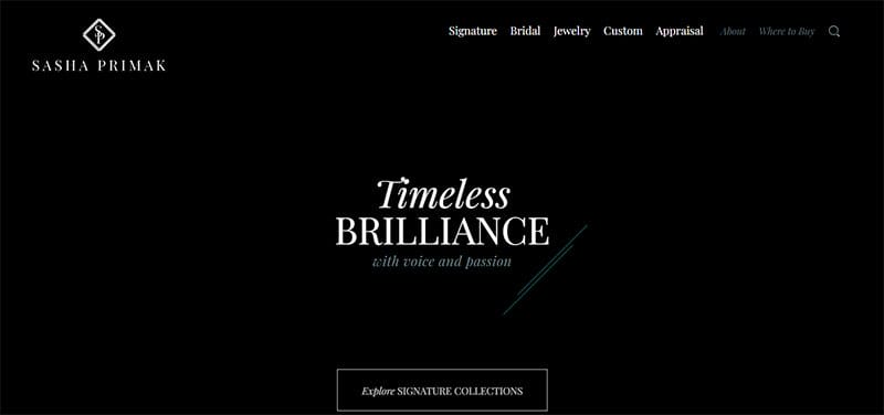
Sasha’s Primax is an impressive example of an effective business website with a clean layout and user-friendly elements on its front page.
I like how the first catchy element on this webpage is full of images of the brand's top products and a transparent CTA button that links to other pages.
The menu bar features a full-screen search bar or search button and fine-print CTA buttons leading visitors to its services and making the exploration process worthwhile.
Sasha’s Primax corporate website leaves a strong impression in the client's mind due to its elegant and sophisticated outlook.
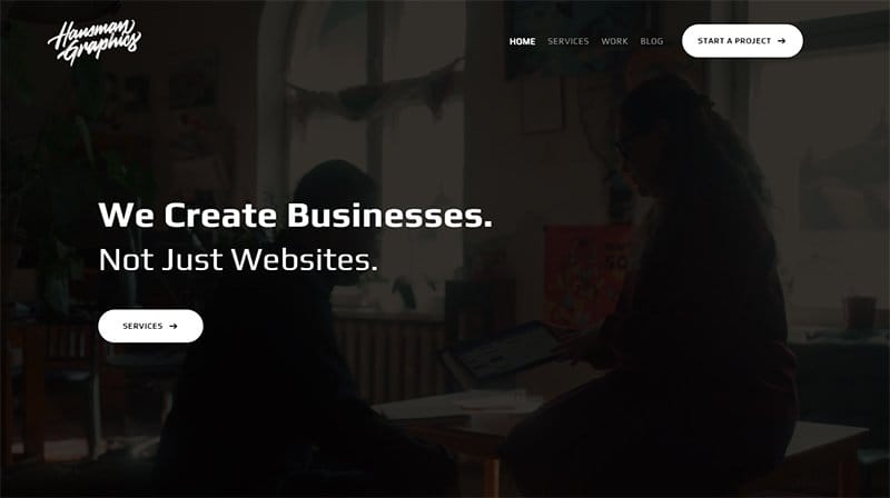
Hausman Graphics’ black and white background corporate website is a beautiful sight. The first attention-grabbing element is the short video clip in the hero section. You can’t miss the white transparent CTA buttons at different positions on the site.
Another unique feature is the “contact” CTA button prompting visitors to get started after the news section. The “Recent New” section uses a two-column layout featuring engaging texts and high-quality images with a thumbnail effect.
Interested visitors can use the mega navigation bar with a drop-down feature to navigate through the site.
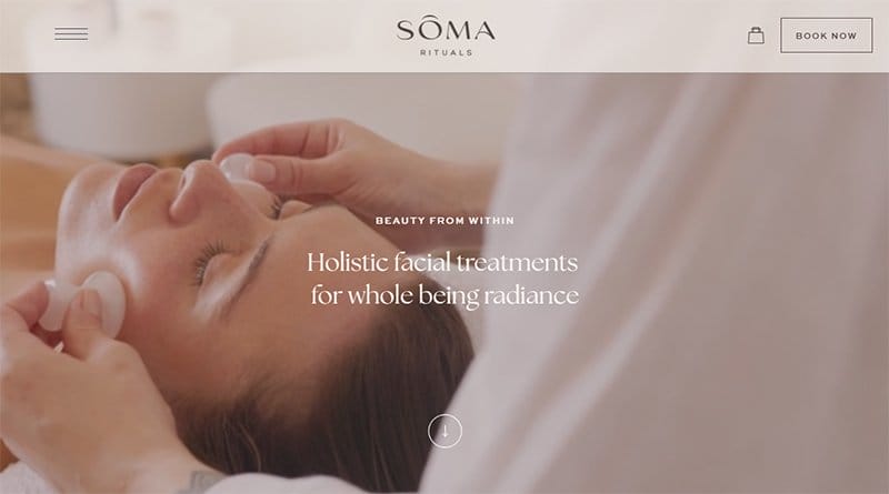
Soma Rituals offers well-being facial treatments in Edinburgh. The first catchy thing for first-time and returning visitors is the video displayed in its hero section. Just below the hero section are multiple CTA buttons for potential clients to learn more and book a session with them.
Interested visitors can use the stick navigation bar at the top of the webpage to explore various aspects of the page.
I like the strategic placements of the slider images in various angles of the page that encourage exploration and purchase behavior from the target audience.
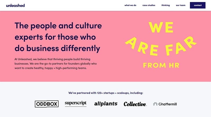
Unleashed is a great example of a corporate organization that helps founders build happy and high-performing teams.
I love how colorful and visually appealing the site's content is, featuring multiple high-quality photos, vector images, stylish fonts, and engaging texts. Below the hero section are logos of top startups they have partnered with.
The most striking feature is the “What We Do” section and the “Get in touch” calendar that serves as the website footer.
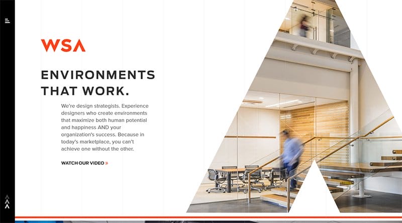
WSA Studio welcomes visitors with a full-length split-screen layout featuring a short biography and a CTA video link. As you scroll further, there is a free subscription newsletter sign-up for new visitors.
Visitors and potential customers can use the hamburger navigation bar to explore various aspects of the webpage and make relevant decisions.
What stands out for me on this stunning corporate professional website is the horizontal navigation menu on the site's footer.
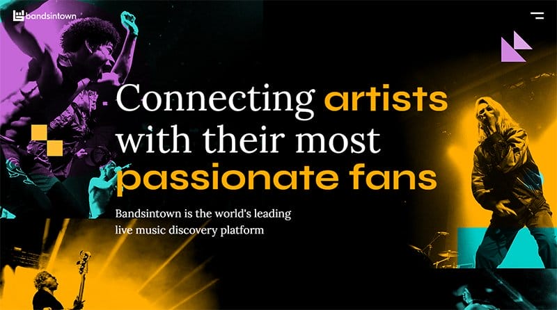
Bandsintown stands out with its yellowish-orange, cyan, and magenta background colors. Welcoming visitors is a full image featuring pictures of live music performances with a splash of multiple colors such as squash, aqua blue, and orchid.
Below the hero section are images of top artists who trust and use the platform. This element serves as a source of credibility and social proof.
I like how the design elements and consistent color scheme blend perfectly to create a well-designed corporate website.

Merchgirls stands out with its unique video, top brands, and perfect design elements. The first attention-grabbing element a visitor notices is a stunning picture slider displaying the company’s products in the hero section.
At the top right is a hamburger menu leading visitors to its services. The site footer features vital content like options for visitors to book a meeting, get a menu, and sign up for newsletters.
Interested visitors can use the sticky navigation bar to explore every aspect of this corporate website.

Tili Von Tiki's corporate business website stands out with a long scroll web design. Interested visitors can immediately click the CTA buttons at the menu bar for quick navigation and purchases.
Below the client testimonial is a free form for visitors and a phone number to contact the team. The elephant-colored site footer features a subscription option for first-time visitors to receive updates and newsletters.

Plant + Perks has the trust and credibility of some of the world's best brands such as Lacoste and Stella McCartney. I like this great website’s homepage features forest green and white background colors which blend perfectly with other design elements.
Potential clients can book a demo, get a free trial, or chat with them through the CTA buttons on the hero section.
The carbon gray site footer features social media icons and a “let's chat” widget for potential clients to state their needs.

Orchard World company website features social media icons at the top right for interested clients to make inquiries. I love how the web page’s parallax scrolling feature makes all the site's contents stand out uniquely and visually appealing.
Above the footer are multiple images, each with a thumbnail effect leading visitors to social media posts. I like how the site features client testimonials with a transition effect that helps to attract potential clients and boost credibility.
What's handy about this webpage is the milk-white background feature that makes all the site elements visually appealing.

Flower Carte is a top corporate website that offers unique and trending bouquets for stylish couples.
Welcoming visitors is a split design feature displaying eye-catching images of flowers and a white-colored banner with a short intro. I like the use of engaging words and fleeting shapes to leave a strong impression on clients.
Visitors can sign up using the newsletter feature at the bottom of the site to get constant updates about the company's activities.

Lee Cooper's company website welcomes visitors with a stunning image of models rocking their latest denim wear. A lava red CTA button at the menu bar leads potential clients to its trending and latest collections to inspire purchase behavior.
The white-colored site footer features logos of top brands and social media icons interested visitors can use to make inquiries. I love the double photo collage that gives the website a simplistic and sophisticated outlook.
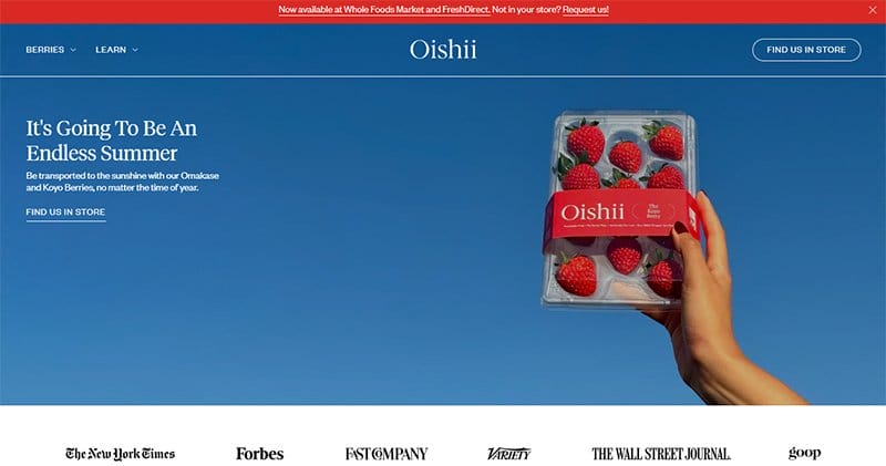
Oishii is a visionary farming company that specializes in using indoor vertical farming techniques to grow and produce healthy fruits for consumers and the planet.
This corporate agency website welcomes visitors with a blue-colored hero section featuring a beautiful full-screen background image of strawberries.
I like the horizontal display of top brands and the split design feature displaying its services as you navigate the site. Interested visitors can find the signup form in the lava-red colored site footer menu to submit their details.

The Culinary Edge company website welcomes visitors with an intro video and a short description in bold font. Welcoming visitors to the webpage is a positively mind-blowing embedded video displaying various mouth-watering content.
I love the strategic placement of videos on the landing page because they serve as a source of entertainment and education for potential customers.
There is a free sign-up column that visitors can use to get constant updates after the digital publications section.
Best Corporate Website Examples FAQs
The best corporate websites you can use as inspiration when building your own site include Decor Systems, Pienso, Blavity Inc., Calendly, Garden, Eight, Apex Transformations, Asset Class, Will Ventures, Oh, Adobe, Citizen, Humain, KD, Capital, Stord, Creative Theory, Vaayu Tech, Kebuke, Hive, Streaming, MeanPug, Venture Capital Firms, and HubSpot.
Some elements to have a great corporate website design featuring at least one professional image, smart navigation, bold colors, animated films, compelling content, call-to-action buttons, product screenshots, catchy mobile design, company profile, contact information, and social media links.
Marketing websites are different from corporate websites because they focus on selling products or services. On the other hand, corporate websites do not promote, advertise, or showcase any form of digital or physical products, rather they focus solely on the company-related information.
Locating a company’s corporate website is not as difficult as it seems. One of the ways you can seamlessly find a company’s corporate website is by observing its website address. A corporate company's website address will simply be the company's name with a “www.” before it and a “.com” after it.
Explore Further
- Corporate Business Name Ideas Generator
- Website Templates
- Small Business Websites
- Best Website Builders for Small Business
- Most Popular Types of Websites
- Business Website Templates
- Lucrative Website Ideas for an Online Side Business
- The Best Tools to Start Your Online Business
- Best Small Business Ideas to Make Money Online
- How to Start an eCommerce Business From Scratch


