The Best 20 Family Website Examples to Follow
Creating a family website is a wonderful way to preserve cherished memories, celebrate milestones, and strengthen the bonds that tie us together.
But where do you begin? How can you ensure your own family website reflects your family history and serves as a digital haven for your loved ones?
Are you seeking ideas for a heartwarming family tree, struggling to come up with your own domain name, or exploring innovative features?
This article covers the 20 best family websites that reflect excellence in design, content, and functionality. Drawing inspiration from these exceptional family website examples will equip you to create or design your own website.
Let’s get started.
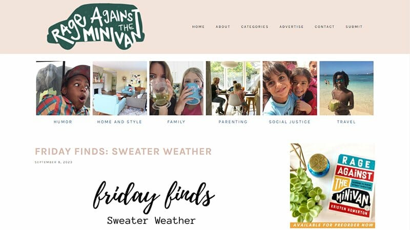
Kristen has been blogging at Rage Against The Minivan since 2006. A progress indicator close to the footer shows the web page you are currently on and how to navigate to newer or older posts.
This family website displays minimalism with its generous show of white spaces and the use of small-sized fonts. A blend of meaningful icons and quick-loading images contributes to the overall efficiency of this website.
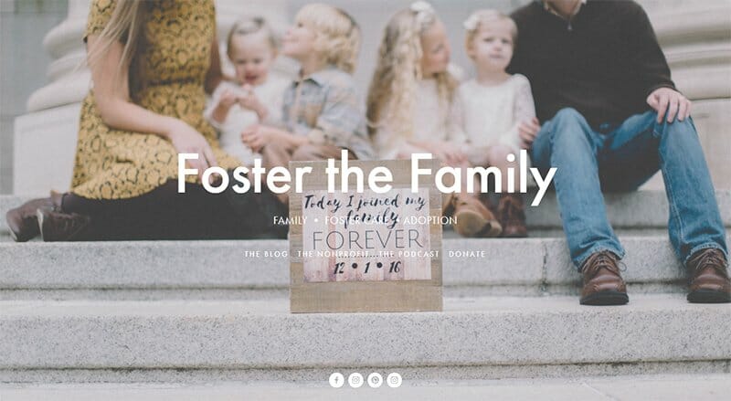
Foster the Family is a non-profit that undertakes adoption and foster care legalities. Their URL directs you to a splash page, which is a page that appears before users can access the main content of the site.
The splash page uses a slideshow to display individuals having family time, which is a good attraction for folks interested in foster care.
You can access the blog and podcast section from the splash page. The blog section features post tiles arranged in a three-column layout, each tile carrying a circle tag of its created date.
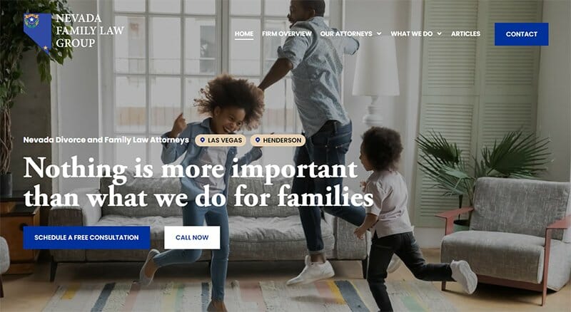
The Nevada Family Law Group comprises professionals skilled in handling family legal matters, such as divorce, custody, and adoption.
This family law website uses a harmonious blue and white color scheme with a warm image of family members on the home page, instantly engaging visitors.
There are two variations of CTA buttons. The blue CTA buttons take on a white color on cursor interaction and the white CTA button turns black. I love how this family site boasts a user-friendly search function in the article section for easy content access.
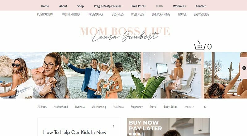
The Mom Boss Life is a specialized platform tailored for mothers, addressing all shades of family needs. This inviting family website boasts a soothing color palette and a heartwarming banner depicting a mom adeptly juggling work and family life.
I love how the home page provides an intuitive ribbon-style navigation system above and below the banner, ensuring easy exploration. You will find the search icon on this website beneath the home page banner on the left.
I like that the multi-layer header sticks to the screen as you scroll, giving visitors a measured view of the home page content and increasing curiosity.
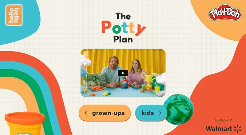
The Potty Plan is a training website where parents can find tips and tricks as they take their baby on the journey of outgrowing training pants. All the pages of this website display its content on a white background with black gridlines.
The landing page is a one-page interstitial gate from where you can navigate to the grown-ups or kids section. This website is very interactive, as all its elements have programming that allows it to animate upon cursor interaction.
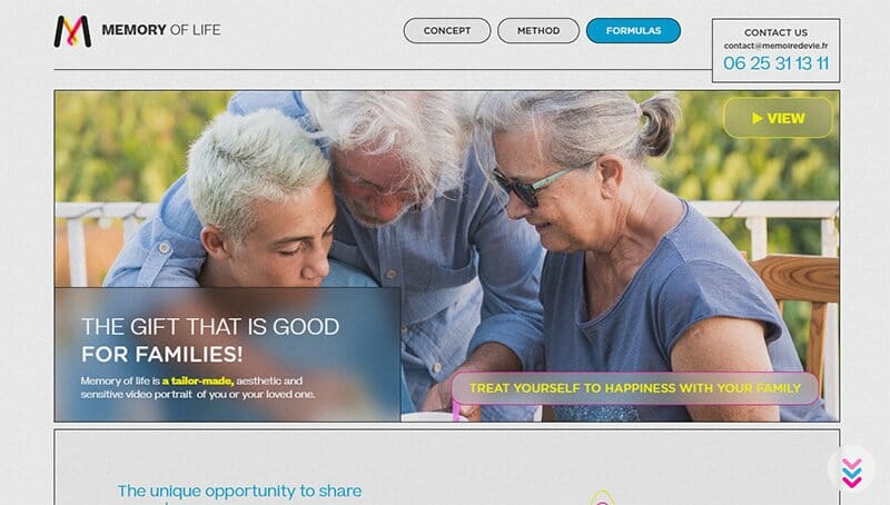
Memory of Life makes sensitive video portraits of seniors and their loved ones. This one-page website displays its content with a mercury background color.
A blue dot appears to the right of the screen as you scroll and shows the position of the webpage you are on. Once you arrive at the portion of the webpage indicated on the header, the header component gets a highlight by dropping a little below its peers.
Close to the bright yellow footer, you will find an expandable and collapsible layout neatly displaying the information in the FAQ section.

Amanda Reymers is a family photographer who also takes personal pictures. She displays her best work on the plain white home page in an uneven three-column layout.
The absence of a header bar and the use of small fonts for the menu options indicate that Amanda uses a minimalist web design. However, her logo stands out in bold and attractive fonts.
I love how the client gallery displays family photos and personal shots with specific name tags. You can use the search function on the home page to browse her portfolio.
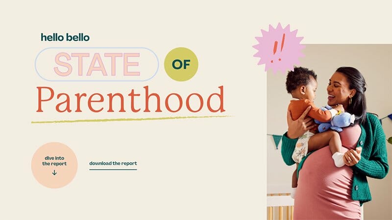
State of Parenthood is a website created by Hello Bello to display the motivation and pain points of different parent cohorts. This family website deploys a landing page with brightly colored texts and effects on a soft peach background.
Following the landing page, you will observe that the contents appear progressively on this website. The texts and elements don’t come together until you scroll to that part of the page. This effect is ideal for lengthy websites to enhance user experience.
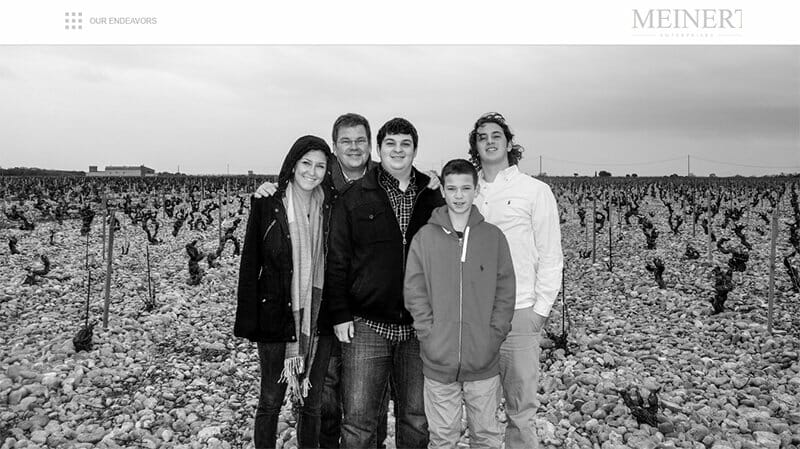
Meinert Enterprise is a family of endeavors led by Joseph Meinert. These endeavors include landscaping, vehicle design, and consulting. The fine hero image is a monochrome picture of the Meinerts.
What I admire is the simple family website design. There are elaborate menu options hidden behind the grid icon on the top left of the header, while the fancy logo is to the right.
The webpage rounds off with individual company logos of Meinert's various endeavors. Clicking the logos will take you directly to the website of the franchise.
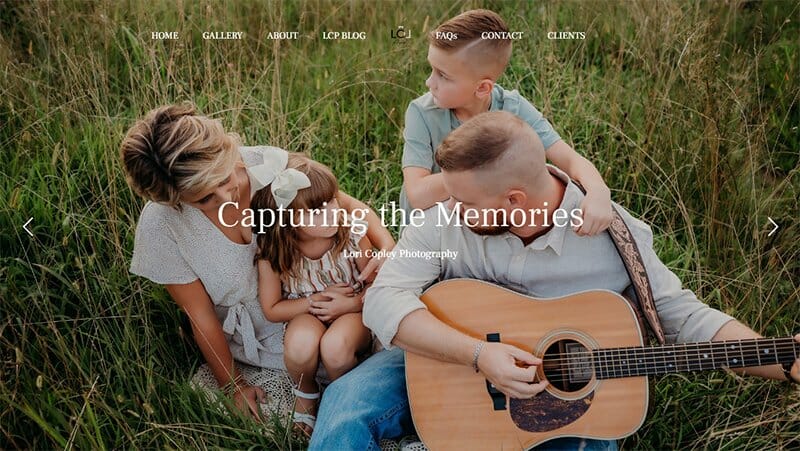
Lori is a photographer that serves the tri-state area of Kentucky, WV, and Ohio. She presents her portfolio with a simple yet fancy web design. The header on this website carries eight components, including a blog and FAQ section.
This landing page displays a carousel of high-quality images with arrows on either side so visitors can control the scrolling speed. This landing page sets the pace for the rest of the home page, where you will find generous white spacing and strategic CTA buttons.
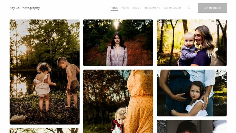
Kaitlyn is the passionate photographer behind the beautiful images on this website. She uses the home page to share photos in an asymmetrical three-column format.
The frames displaying the images have curved edges, contributing to the website's distinct look. With this look, the white spaces between the frames appear more stylish.
What I find interesting is the header composition on this website. The prominent CTA button and user-friendly search function are noteworthy features.
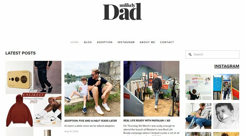
The Unlikely Dad website, with its sleek and minimalistic design, offers a profound insight into the life of a gay father within the LGBTQ+ community. This home page elegantly showcases the latest blog posts, seamlessly guiding visitors through the author's services and experiences
I love how the user-friendly menu includes a contact section for inquiries, fostering a sense of community. Additionally, the website's Instagram section highlights the author's achievements, adding credibility to his voice.
In this harmonious blend of design and content, The Unlikely Dad creates a welcoming digital haven for gay fathers and LGBTQ+ families to connect and learn.
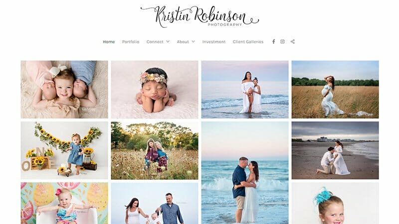
Kristin is a photographer based in Rockland, MA. The first attractive thing on her website is the extravagant font with which she writes her website name. Her home page displays her diverse body of work in small tiles, giving a comprehensive view of her images at a glance.
The header section of this website looks expanded because the website name is on top of the component links and not to the side. This view translates to a relaxing experience on the website as elements don't appear cramped.
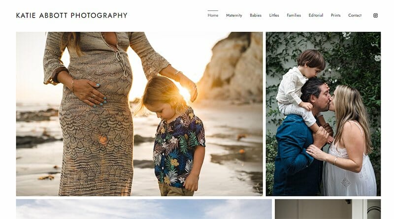
Katie Abbot is another family photographer with a stunning website. She showcases her images in large frames, ensuring that each column contains no more than two frames, maintaining a balanced layout.
As the cursor interacts with these images, a hue matching the color scheme appears on each image. If you count her clickable website name, her header has ten elements.
There is an Instagram icon at the tail end of the header so visitors can quickly begin interacting with Katie on Instagram.
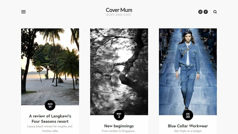
Cover Mum caters to contemporary and multifaceted mothers who refuse to compromise on friendships, work, and style. As soon as you land on the page, you'll notice the striking logo in bold sans-serif. Menu options are behind the top left hamburger icon.
The design of tagging frames on the homepage with a prominent date circle elevates the overall style and chic appeal, offering a delightful experience for visitors. You will find a search function conveniently located in the top right corner of the page.
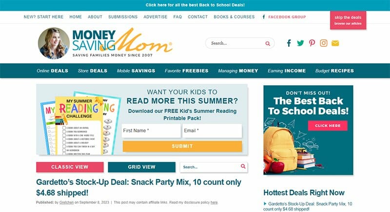
Crystal Paine is the Money Saving Mom. On her website, she shares hot deals that families shouldn't miss out on and several articles on frugal spending and her other interests.
The menu section on this dedicated family website is a four-layer header bar. As you scroll down, the principal elements of all four header bars combine into one white bar hinged to the top of the screen.
Crystal integrates many user-friendly components on her website, one of which is a link to a lite feed displaying only articles and no deals.
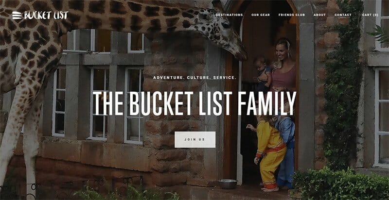
The Bucket List Family is the online identity of the Gees, a personal family of five travel journalists dedicated to traveling the world.
The background video on the landing page presents a captivating experience for visitors. It quickly takes them through the cultures of several countries.
I love how the navigation zone employs a parallax scrolling effect for its display. The foreground section successively promotes a book, Instagram, and YouTube channel.
This family website’s background section features breathtaking images that beckon visitors to join their Bucket List friends, shop, and explore the Bucket List destinations.
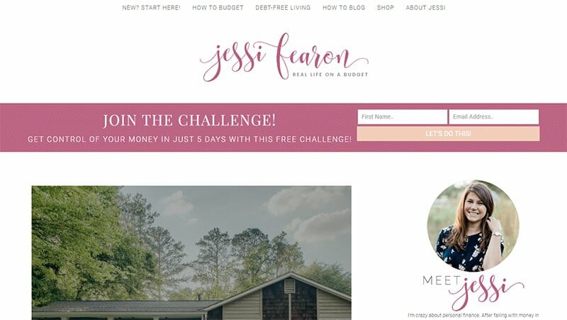
Jessi Fearon is a personal finance educator who shares expert advice on her website on how to conquer your money as a family.
Though the website features several blog posts, visitors can quickly find specific content through a search bar or monthly archive in the side menu section.
Jessi is not shy to upload pictures of herself having fun with her kids or sharing a kiss with her husband. These family images ensure that other families stay connected and interested in her website for as long as possible.
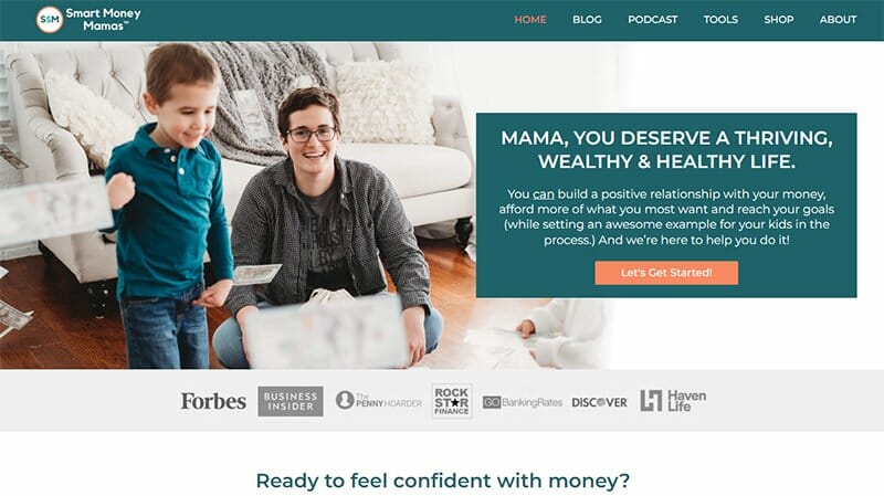
Smart Money Mamas is an initiative that helps mothers reach their financial goals while setting a good example for their children.
The basketball orange CTA buttons are a standout feature on this website. They blend perfectly with the blue or white background they appear on.
Smart Money Mamas and its content team upload multiple pictures and icons on the homepage. These uploads guarantee user interaction but do not add to the site's loading time. The blog titles on the homepage light up as the cursor hovers over them.
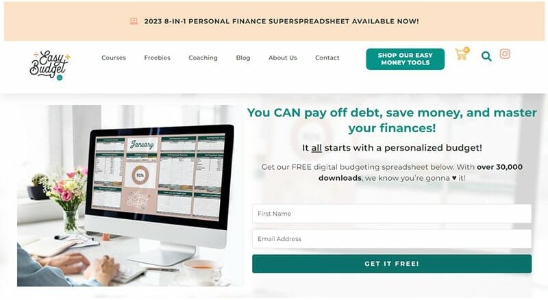
Easy Budget is a good family website example that helps families get serious about their finances.
I like the structure of the two-layer header system on this website. The top layer displays important news and folds in as you scroll down.
On the other hand, the bottom white bar displays vibrant content like the site's logo and a teal-colored CTA button that turns bright orange on cursor interaction.
The online form on the homepage has the same features as the hero image concerning color scheme and design.
Best Family Websites FAQs
A family website should include a message board for communication, a platform to post news and updates, a space for the whole family to share pictures, a shared calendar for events and other important things, and a means for everyone to visit and stay up to date with each other.
Creating a family website offers a centralized hub for organizing a family reunion, sharing videos, preserving memories, and providing a unique gift to loved ones. It is a personalized service that allows you to showcase your family's unique story, ensuring that “Only You” can curate this special digital space.
You can create a family website for free using platforms like Wix or Squarespace, which offer user-friendly templates and tools for easy customization. Additionally, you may find other website builders that run a good family website service, providing free basic plans to set up a simple family reunion website or organization site without any cost.


