18 Examples of One-Page Websites to Inspire You
In today's digital world, almost all websites are cluttered with multiple pages, tabs, and links. But there's something special about the simple design of one-page websites. They are like a simple and clear poster – they show everything you need on just one page.
One-page websites are slowly gaining popularity among businesses and freelancers. They have a clear story. Visitors can easily follow the information from top to bottom. They're great for mobile phones and look good on any screen. Single-page websites also load extremely quickly, so readers don't have to wait.
In this article, we'll discuss some impressive one-page website examples you can take inspiration from. Each one shows how less can be more when designing a website.
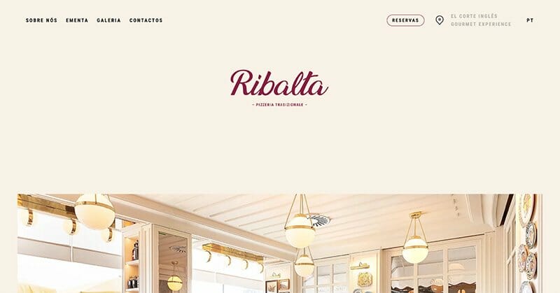
Ribalta is a classic pizzeria located in the fancy Gourmet Experience area of El Corte Inglés. If you're searching for an engaging website idea for a restaurant, Ribalta is a great example. The website looks really nice. The colors, pictures, the way the words look, and the scrolling page make the website shine.
When you look at it, everything seems to be in the right spot, making browsing easy and pleasant. A fun part of this one-page website is when you scroll and animations highlight high-quality food pictures. It's simple but still shows off the restaurant's character without making it too busy or confusing.
While most of the site looks great, the Gallery section seems slightly off. There's text that overlaps the images, which can make it a little tricky to view the pictures properly.
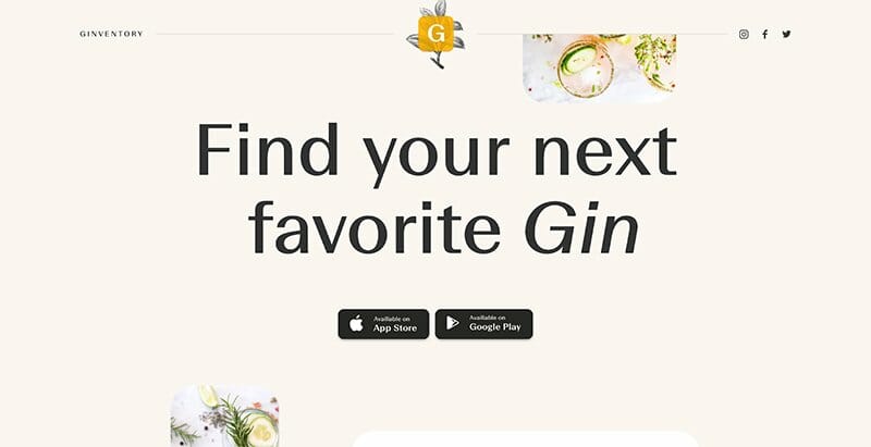
Ginventory is an app for gin lovers, helping them find new favorites. Their single-page website is easy to use and has a special design feature called parallax scrolling. This means that when you scroll, the front and back parts of the page move differently, making things look more lively and interactive.
Right at the start and end of their one-page website, they have a CTA button for users to download the app. This is super helpful, so people don't have to search for it. Just after the main banner, there's a separate section that shows how to use the app in five simple steps using pictures from the app itself. This is a quick and clear way to show visitors what the app can do.
The website is straightforward and easy to use. If you know of a gin that's not on the list, you can use the Google form to let them know so they might add it. And if you want to stay in touch with Ginventory, there are easy-to-find buttons in the footer to connect on social media. Ginventory is one of the best one-page websites.

Subzero is a famous ice cream brand that's been around for over 60 years, making award-winning ice creams. Their single-page website is like a storybook, all packed into one page. When you visit, you'll notice they've chosen clear words in an easy-to-read style.
But what grabs your attention are the great, high-quality pictures of their ice creams. They look so real, it's like you can taste them. The moving images in the background are interesting as well. They make you feel like you're right there, watching how Subzero's ice cream is made and served.
But there are a couple of minor things they could fix. While the one-page website looks good, it can be a bit hard to find specific information. Also, there's important information about allergies, but it's hidden in a PDF link at the bottom of the footer. Putting that link in the middle might help people spot it more easily.

Upstate Laundromat is a laundry service in Greenville, South Carolina. They claim to offer you a better place to do your laundry. Their website is simple, all on one page, making it easy to look around. At the top, there's a menu listing different sections like their features, common questions, and what other customers think. Plus, a banner tells you about any special deals they have right now.
If you have questions, the FAQ area is neat. You can click on a question to see the answer, which saves space and keeps things tidy. If you're wondering where they're located, there's a CTA button on the banner. When you click it, it shows you a map at the bottom. The website's colors are engaging, too. It uses a mix of white, soft blue, and bright red to grab your attention and keep it.
But one thing that could make this one-page website even better is adding a small section about how the laundromat started or what it stands for. It would be a nice way to get to know them better.
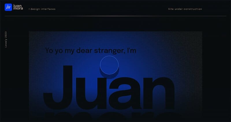
Juan Mora's website shows he's a talented designer. It's a simple one-page site but packed with details. If you're a small business, a creative agency, or just someone working on their website and it's not ready, you can look at Juan's site for ideas. Even if your site isn't finished, like Juan's, you can still show your style, work, and social media links.
Juan has links to his Behance, Dribble, and Instagram to see more of his designs. An interesting thing on his single-page website is the little messages asking you not to scroll further. But this makes you want to scroll more. And as you do, you see subtle animations, different font styles, and drawings.
However, a couple of interactive elements might not resonate with every user. The website's cursor, designed as a circle, blurs out text as it moves. While innovative, this can be distracting, making navigation a bit challenging. Additionally, a slightly brighter shade of blue might have enhanced the website's visual appeal.

“You Gotta Love Frontend” is a community event crafted especially for developers, sharing top-quality content about front-end development. Its single-page website is both engaging and straightforward. The website has a fun, interactive top banner that makes browsing enjoyable.
The website has a simple one-page design, displaying key information about the event, schedule, and contact details. A smart feature is their use of separate subdomains for past events. It keeps the main page tidy while giving site visitors all the important details they might want. This means you can easily access past event details without the main site feeling crowded.
However, there's a small downside. The main page is too brief and might leave visitors wishing for more information without checking other subdomains.
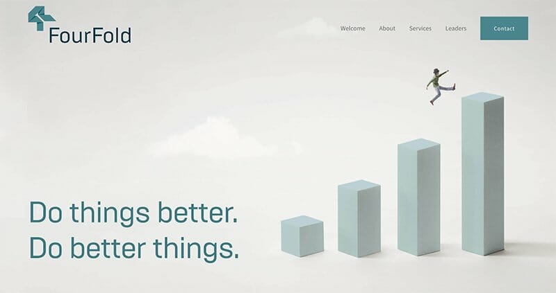
FourFold Consulting helps business leaders create better companies. They've worked in many areas and know a lot about different businesses. Their one-page website uses a tool called “expanders” to compact the information. This design choice ensures visitors aren't overwhelmed with too much text at once, smoothing the content digestion process.
Their business website is tidy and simple. There's a handy menu to help you find stuff easily. If you've scrolled to the end, an arrow button on the right-hand corner takes you back to the start. The website has a clean layout because they've used a lot of open space.
However, a few images on the one-page website don't quite align with the content. Such unexpected visuals could leave some users wondering about their significance.
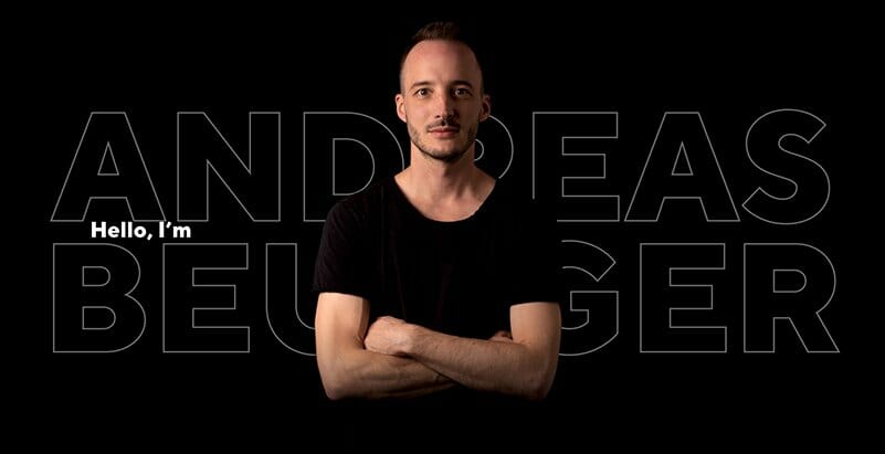
Andreas Beugger is a UX /UI designer, and his one-page website clearly shows his skills. When you visit it, you'll see strong images and words that stand out against a dark background and catch your attention.
The website works fast and looks good on all devices. There is also a nice section where Andreas lists his professional experience. The small emoji picture he uses for the website's favicon is a fun touch.
He has also added a creative video showing how he works on his designs. This gives website visitors a behind-the-scenes look at his work. He doesn't use the usual contact form if you want to talk to him. Instead, he lists his email address and social media so you can decide how to reach him.
Although there is much to admire, a few things could be improved. Some visitors might find the single-page layout confusing or feel that it's cluttered. Also, a regular contact form alongside direct email and social links could make it easier to get in touch.

Banyak Surf Adventure is a tourist destination website. They have a local team well-versed in the islands' beauty and surrounding waters. Their one-page website effectively paints a picture of this dream destination.
With easy-to-understand menu options like ‘the boat,' ‘the camp,' and a ‘social media gallery,' users can quickly find what they want. The menu names are clear and help site visitors get information fast.
Their gallery isn't just pictures – it's directly linked to their Instagram, showing off real-life adventures. Their copywriting is engaging, and every word on the website feels like an invitation to travel. Plus, there's a handy booking form to start planning your trip.
However, some might find the website's text too small to read comfortably. Also, certain areas of the site are packed with information, making it feel a little crowded.
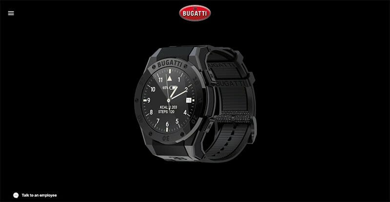
The Bugatti smartwatch website feels just like the watch: fancy and top-notch. It's a one-page site filled with moving animations. Right away, you see big, high-quality photos showing the watch in all its glory. As you scroll, the site has smooth changes between sections, which adds to the luxury feel.
The site doesn't just show the watch; it also highlights its features using fun graphics and animations. If you have questions, there's a chat feature to talk to someone from the company. Plus, there are easy-to-spot CTA buttons throughout the site, inviting you to make a purchase. It is amongst the most beautiful one-page websites on our list.
But there are a couple of minor changes that could be made. At the start, the site has many pictures but not much text. This could make it a bit tricky for new website visitors to get all the information they need. Also, the site is pretty long. Some might find it tiring to scroll through everything.

Mozom Design has a website where they demonstrate their UX /UI design skills. When you first visit their single-page website, you see a picture of a designer in the middle. Right next to it is a text explaining what the company is about. There is a separate section where you can see their previous work. If you're curious, you can even look at the whole website.
They use moving images or GIFs, which makes their website not only lovely to look at but also quick to open. Mozom Designs has a section about their team and how they got started. They also tell a bit about how they do their work. If you want to talk to or ask them something, you can easily do so via the “Contact” button. It is one of the best one-page websites.
There is one thing to keep in mind, though: The website has many moving parts. It looks nice, but the many animations might be a bit too much for some people. Some might find it distracting.
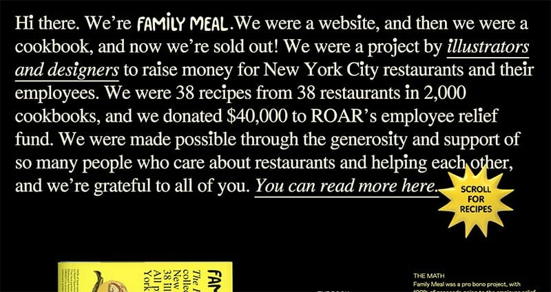
“Family Meal” is a project by illustrators and designers to raise money for New York's restaurant community by selling creative cookbooks. When you visit their website, you'll see a bright one-page design showcasing these cookbooks.
The site is designed with bold typography and limited text, making it straightforward to understand. You'll see a mix of different fonts, colorful drawings, and a section that displays all the tools and cookbooks you can get.
But there are a couple of things to note. While interesting, the many colors and drawings might feel a bit much for some people. Also, the style of font they use for some of the smaller headings can be a bit hard to read.
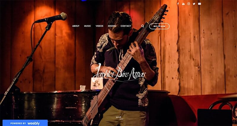
Japhlet Bire Attias, based in Mexico, is an artist skilled in the Chapman Stick. His one page website feels complete, showcasing his talent in one neat package. You'll find clear photos, a bit about him, samples of his work, and ways to reach out.
If you're keen to share his music, Japhlet has links to his ongoing and past projects. To make things personal, he uses pictures and videos to give visitors a real sense of his identity. There's a handy section listing past and upcoming shows for those curious about where he's performed or where he'll be next. Plus, if you want to immerse yourself in his tunes, Japhlet's Spotify playlist is right at the bottom, next to links to his social media.
But, while the single-page website design has lots to offer, it might feel a bit crowded. With so much info in one place, some visitors might find it too much. A little more spacing or organizing might make things smoother.
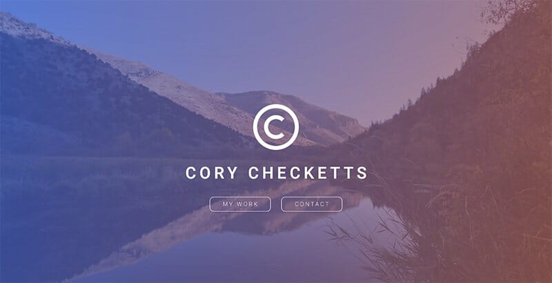
Cory Checketts has a simple one-page portfolio website that works like an online CV. He's skilled in areas like copywriting and digital strategy. The site has handy links that take you to sections about his past work and how to contact him. This makes it user-friendly.
He's listed many of his past work experiences so visitors can see what he's done. But this has made the website quite wordy. Although it's good to see his background, some pictures or graphics of his projects might make the site more interesting. Right now, the only photo is of Cory himself at the start. Adding a few more visuals could make the website even better.
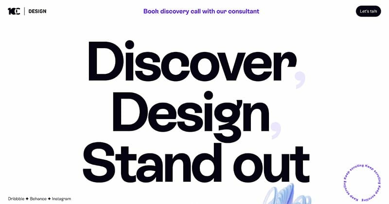
10Clouds is a design team that understands its clients and makes eye-catching online designs for them. Their website shows off their love for lively designs. As you look through their single-page site, you'll notice moving parts like spinning instructions and banners that slide to the side. Plus, a colorful trail moves across the screen, adding a playful touch.
What's really interesting is how your mouse cursor changes as you move to different parts of the site. Even with fancy 3D images, the website still loads quickly, which is impressive.
However, there's a lot of information packed into the one-page layout of the site. For some, this could be a bit too much to take in. Also, you'll have to do a lot of scrolling to see everything, which might be tiring for some visitors.
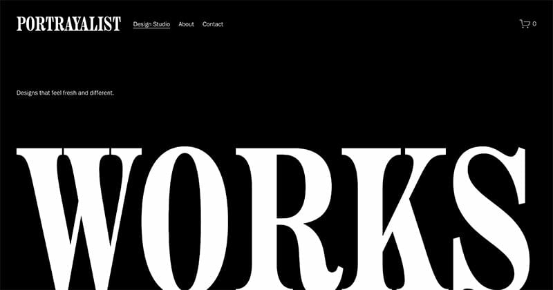
Portrayalist is a design studio that makes innovative websites for different businesses. When you visit their site, you'll see they've also made a great one-page design for themselves. The single-page website is easy on the eyes. It has lots of space, simple words in clean fonts, and a stylish no-fuss design. This all gives you a feel of the top-quality work they do.
Their site is also easy to navigate, and the great pictures keep you interested. A fun thing on their site is the moving designs in their portfolio. This makes their work pop out and feels fresh.
Even though most of their info is on one page, they have other separate pages just for their portfolio. Some might find this a bit mixed up, expecting everything on just one page.
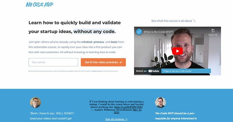
“No-Code MVP” is a helpful one-page website where you can learn to turn your startup ideas into reality without coding. It teaches people to use tools that don't require any coding knowledge.
When you visit the website, there's an intro video that explains everything quickly. If you want to see what others think about it, there's a big section with reviews from Twitter, which feels genuine.
There's a brief course outline to understand what's being offered. The website also includes a Spotify podcast where you can hear from the person who made the course in just 15 minutes. This gives it a personal touch.
However, a tiny drawback might be that there's much to see and do on the site. With videos, podcasts, and a huge review section, some visitors might find it a bit much and a little tricky to find their way around.

YST Tuning's website is all about top-quality car services and repairs. Right from the start, there's a video that pulls you in, showing what they do best. They also share photos and clips from their workshop, letting visitors see their hands-on work.
However, there are a couple of things that might confuse visitors. When you click “Contact Us,” it takes you to an email. A simple form on the site might be easier for some people. Plus, there's a section with different small business websites and client logos, but it's unclear why they're there because there's no title or explanation.
What Design Elements Should be Included on a Single Page Website?
Creating a one-page website is like penning a short story that's brief yet captivating. Each component must have a purpose pointing towards the website's main message. Let's dive into the essential parts that you should include on your one-page site:
Hero Section
This is essentially the ‘first impression' zone of your website. The hero section at the top of your landing page should captivate visitors with a bold headline conveying your message.
A compelling subheadline can expand upon the headline, offering more context. An engaging image or a brief video can visualize your message, ensuring your audience is engaged.
About Section
The About section on your business website is like your brief introduction or digital handshake. In a few sentences, tell your visitors who you are, what you stand for, or the ethos of your small business. It's a chance to build a rapport and connect on a personal or brand level.
Services/Products Overview
This is your virtual storefront. Highlight the visual elements of what you offer, be it services, products, or solutions. Utilizing icons, infographics, or images can make this section visually engaging, helping visitors instantly understand what you bring.
Portfolio/Gallery
Every claim needs evidence. If you're a designer, showcase your best designs. If you're a retailer, show high-quality images of your top products. This section offers a glimpse into your work, vouching for your skills, quality, or variety.
Testimonials
Testimonials are similar to word of mouth in the digital world. Featuring positive feedback or reviews from clients, customers, or even collaborators builds trust and showcases your track record of satisfaction and success.
Call-to-Action (CTA)
This element is all about guiding your visitors. What would you like them to do next? Whether filling out a contact form, downloading a brochure, or purchasing, the CTA provides clear direction.
Contact Information
You should ensure your visitors or potential clients can reach you easily. This section might include an email address, a phone number, or a physical address. Offering multiple contact methods caters to different visitor preferences.
FAQ Section
With the FAQ section, you can easily clarify and inform. Address common questions or concerns here. By providing answers upfront, you ease potential apprehensions, smoothening the user's journey on your site.
Social Media Icons
In our interconnected digital age, social media icons offer a bridge to your social platforms. They allow visitors to engage with you on different platforms, deepening the relationship.
Starting a one-page website from scratch can take a while. A quicker way is to use ready-made one-page website templates. They already have the key design parts, and you can tweak them to match your brand's look and feel.
FAQ
A one-page website is a site with a single page on a single URL. It tries to present the same page with all its content concisely, usually by dividing sections a user can navigate through by scrolling or clicking on navigation links.
One-page websites are often chosen for their simplicity, user-friendliness, and the ability to deliver content concisely without needing multi-page navigations.
Generally, one-page sites can load quicker due to fewer elements and reduced server requests. However, the load time will also depend on the media, scripts, and other resources used on the web page. If your website takes too long to load, think about switching your hosting plan.
For better hosting options, you can check out our list of top web hosting providers for 2023.
When crafting a one-page website, there are several reputable platforms to consider. With its user-friendly interface and elegant design templates, Squarespace is often regarded as one of the top choices.
But there are other great choices out there, too. Wix and Webflow are also popular for building single-page websites. They both offer lots of design choices and are easy to use. Each website builder has unique features, so the best choice might depend on what you need for your site.
The cost of a one-page website varies based on several factors. Using website builders like Squarespace, Wix, or Webflow, prices can range from free to over $20 monthly. A custom domain is between $10-$20 annually. Premium design templates might add up to $100 or more, while extra features and plugins could increase costs. Plus, independent hosting varies from $3 to $30 monthly.
However, if you hire professional help, it can reach from hundreds to thousands of dollars.
