7 Kickass Squarespace Wedding Websites (+ 3 Templates)
When planning a wedding, even the smallest details matter, including your wedding website. Your site should beautifully reflect your love story, and that's where Squarespace comes in handy.
In this article, I've highlighted seven Squarespace wedding websites that successfully blend simplicity with elegance. Read on to explore how these examples can help you craft your unique wedding website effortlessly.

First on our list is “Our Dumb Wedding Site.” It's a cool wedding website made on Squarespace by Ben and Casey. The website's layout is simple, with a white background, nice photos, and important text bits.
Navigating the site is simple, thanks to a well-structured menu. For instance, the menu has all the details wedding guests need, like the wedding schedule and FAQs.
A standout feature of “Our Dumb Wedding Site” is its compatibility across various devices. Whether you're using a desktop, tablet, or smartphone, navigating the site is effortless. On smaller screens, the full menu compresses into three bars. Squarespace's smart design ensures guests can easily find what they need, regardless of the device they use.
The addition of a convenient map feature is another example of the great features provided by Squarespace, enhancing the user experience.
In short, “Our Dumb Wedding Site” shows that wedding websites can be simple yet functional. It's personal and professional, a great example of what you can do with Squarespace for wedding websites. I must confess, the simplicity and efficiency of “Our Dumb Wedding Site” have truly won me over. That's why it's first on my list.

Next up, we have Emily and Manuel's wedding site. Made on Squarespace using the Lenoix wedding template, this couple has customized this wedding website template to their style, beautifully showcasing their love story.
The first thing that caught my eye was their main page message: “We've waited 2,994 days for this. Party accordingly.” This unique, playful message differentiates their wedding website, making their wedding website design journey distinctive from many other Lenoix-template-based sites I've encountered.
Navigating their site is a breeze since the menu provides all the necessary information for guests. The clearly visible and neatly boxed RSVP page– a key element for any wedding site – is a testament to Squarespace's emphasis on important features. Sticking with the earthy tones that come with the Lenoix template, they've maintained a harmonious look with the text color in sync with the theme.
In all, Emily and Manuel have done a stellar job personalizing this Squarespace template. Their site provides crucial information and engagingly tells their unique love story. No wonder it's one of my favorites.

Next, we're looking at Alex and Andrew's beautiful wedding website. The site welcomes visitors with a striking photo of the couple, immediately setting a warm and personal tone. The design of their wedding website is simple, with a bold “Our Story” title standing out against a beautiful image, inviting visitors to learn more about them.
The couple kept the site straightforward, featuring just a few key pages: ‘Our Story,' ‘When & Where,' ‘Wedding Registry,' and ‘RSVP Form' – this focus ensures that their love story and big day remain the center of attention.
For the color, they've opted for a white background, which elegantly emphasizes their photos, making them the site's highlight. Their visual storytelling through photos over the years really stands out.
Alex and Andrew's site is a perfect example of how a simple design can create a stunning wedding website. So, if you're seeking a neat, visually appealing wedding website design inspiration, you'll surely want to check out their wedding website.
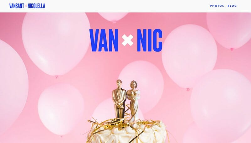
Moving on to Van X Nic's wedding site. It's a digital wedding album created with Squarespace that tells the story of their special day with an artsy, minimalist feel.
The site immediately grabs attention with its brilliant color scheme. The bright pink backdrop with vivid blue text isn't just a design choice. It reflects Jake and Emily's vibrant personalities and their unique chemistry. Each image in the photo gallery matches this color theme, demonstrating their unity and attention to detail.
What's really impressive is the site's Parallax scrolling effect. It feels as though you're not just scrolling through the site but journeying through their wedding day, step by step. The entire site stands out due to its focus on visual storytelling. Each photo doesn't merely serve as a decoration but rather tells a part of Jake and Emily's love story.
The Van X Nic site shows that simplicity can be sophisticated. It's like a page ripped out of a scrapbook, packed with vibrant visuals and a compelling narrative that will make you want to revisit their beautiful website over and over.

Tori and Jose's wedding website is an exciting mix of simplicity and wild splashes of color — but in the best way possible!
For instance, the site feels like a dynamic wedding party with its alternating clean, white settings and vibrant garden scenes. It's as if the couple has chosen these backgrounds to showcase their personalities — sometimes calm and minimalist, and at other times, bursting with life. The smart use of photos and settings shows different aspects of their personalities. Together, however, they form a website that is uniquely their own.
The rest of the site? It's an oasis of simplicity amid this colorful chaos. “We're getting married!” followed by the date and location, takes center stage. It's a classic approach — nothing fancy, just the essential details!

Humayra and Henri's wedding website is truly impressive with its consistent design. The black-and-white background photo against the clean white background creates a timeless and elegant look.
On the homepage, the couple cleverly displays only the date and wedding venue. This allows guests to access important wedding information quickly. As you scroll down, you'll find more pre-wedding photos of the couple in the same stunning setting and a deeper glimpse into their story.
The top menu is well-organized, making navigation a breeze. Each section provides the necessary details, allowing you to explore further. What truly amazes me is their special section dedicated to introducing their beloved dog, Layla. It adds a delightful and personal touch to their site.
For me, what sets Humayra and Henri's wedding website apart are the personal touches. They showcase their love for their furry friend and bring warmth to the overall wedding experience. It's truly one of the best examples of a wedding website that embodies classic aesthetics at its finest.

Sam and DJ's wedding website is a perfect example of elegant simplicity and modern charm. As soon as you land on their homepage, you're welcomed with a heartwarming message: “We're getting married!” accompanied by an RSVP button that kindly requests, “Please Join Us.” It's an inviting gesture that instantly makes you feel included in their joyous celebration.
But what truly stands out is the design of their website. Sam + DJ effortlessly combines earthy tones, Serif fonts, and stunning photographs of themselves. It all ties together to create a visually pleasing experience.
Finding key information on their website is effortless. They've organized everything neatly in the menu options, allowing family members and guests to navigate easily to different sections. Wedding guests can easily access details about travel and accommodation arrangements, as well as an option to give them monetary gifts.
FAQs
The best wedding websites are easy to use and have a nice design. They give a look into the couple's love story and have useful features. These include an RSVP tool, a map to the venue, and a link to the gift registry.
When picking a template for your wedding website, think about your wedding theme and what you need. Different templates offer different things. For instance, some are simple and have a clear RSVP system. These are great if you want something easy and practical. Others have a clean, minimal style. These can turn a plain invite into a fun, interactive experience for your guests.
You can also find one-page templates. These can match your wedding theme and make important details easy to find. They're perfect if you want a website that's both stylish and simple to use. So, choose a template that fits your style and gives your guests the info they need
Squarespace wedding websites make wedding planning easier by giving you a single place to store and share all your wedding info with guests. You can tell your love story, collect RSVPs, share event details, and even handle a gift registry. This makes your wedding more personal and makes planning simpler. Moreover, Squarespace gives you the opportunity to create a custom domain for your wedding website. This adds an extra touch of personalization.


