Veterinary Websites Examples: 20 Inspiring Designs (2025)
In today's digital world, a veterinary practice's website acts as an online reception desk — where you provide information, build trust, and welcome potential clients. Your veterinary website will not just be an online address but a platform that attracts pet owners looking for the best care for their pets. So, creating a well-designed, easy-to-use, and friendly website is crucial. To inspire you, we've picked out 20 best veterinary website designs of 2023.
Scroll down to explore the top-notch veterinary website examples.

Evervet is a leading veterinary hospital that offers ultra-modern and hygienic facilities, ensuring a safe and fear-free environment for your beloved pets. And guess what? Their veterinary website reflects that same dedication. It's modern and all about simplicity.
You won't be overwhelmed with a bunch of unnecessary stuff on Evervet's website. They've nailed it with their top menu, where you can easily find everything that matters. Want to know their location? It's there. Need to explore their services or check out some cool merchandise? You got it.
But let's just focus on their main page for a minute. It's sleek and stylish, with eye-catching, high-quality animations and full-width images. But they don't go overboard and clutter it with unnecessary elements. Instead, the design is clean and focused, with one clear call to action: “Book an Appointment.”
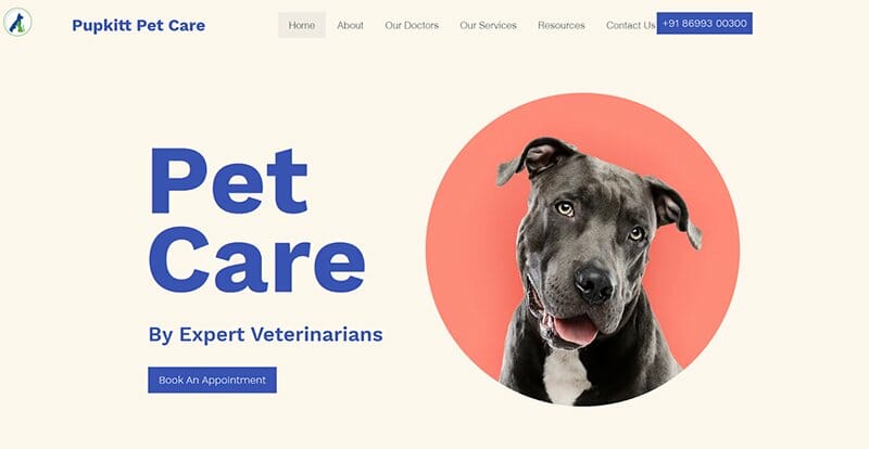
Pupkitt Pet Care is a great example of a veterinary website design that's both visually appealing and user-friendly. I absolutely love the clean design, the use of professional colors like rich grays and earth tones, and bold fonts in deep blues that give it a polished and trustworthy feel.
You can't miss the “Book An Appointment” button when you visit the website, making scheduling easy. Plus, they've placed the contact and appointment number in just the right spots for quick and easy access.
But here's what I really love: the testimonials from happy pet owners featuring their photos. They show you the unique experiences others have had with their veterinary services.
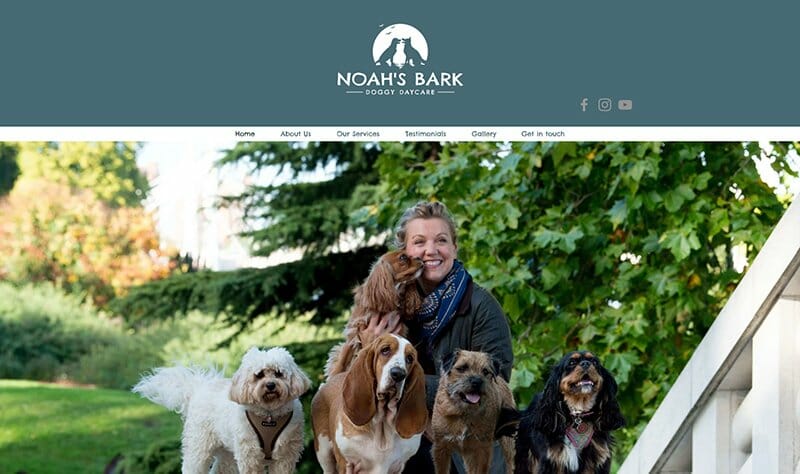
Noah's Bark is a doggy daycare and veterinary service that offers a range of services for your furry friends. While their veterinary services may be limited in scope, they don't let that hold them back from taking an innovative approach to their veterinary business website design.
For instance, on Noah's Bark's homepage, visitors' attention is immediately captured by its distinct layout. Approximately one-fourth of the homepage is dedicated to a sleek grey area that showcases a prominent logo and social media icons.
It is important to note that they have utilized the grey area strategically. It serves as a focal point, making the site a single-page experience. When users click on any option in the navigation area, the corresponding section loads seamlessly after the grey area, ensuring a smooth navigation scheme.
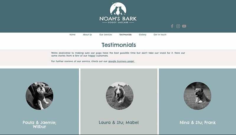
The navigation menu itself is another highlight. It provides easy access to the entire contents of the website, including testimonials, a gallery, and a “Get in touch” button.
Noah's Bark sets itself apart by paying attention to the details, such as font selection. While font choice may not be a priority for many veterinary business websites, Noah's Bark demonstrates how strategic font choices can enhance the overall professionalism of a site.
The theme of the website is another aspect that stands out. With a minimalist color scheme of earthly grey tones and ample white space, the site presents a professional and clean aesthetic. The use of vibrant and high-quality images adds a touch of life to the otherwise minimalist website design.
Overall, Noah's Bark's veterinary website serves as a perfect example of how simplicity, selective use of fonts, themes, and colors can create a visually appealing and cohesive site. It showcases how even a limited scope of services can be presented in a captivating and professional manner.

Goodbye Good Boy is a compassionate pet vet service specializing in pet euthanasia at home. Their veterinary website is well-designed and catches your attention right away.
The smart use of a warm yellow color scheme creates an inviting atmosphere, showing their understanding and empathy for pet owners going through tough times.
The call-to-action button and chat box on the Goodbye Good Boy website are strategically positioned on a dark background. This ensures they stand out and are easy to access for website visitors.
One impressive feature is the inclusion of real-time customer reviews right above the fold. This provides instant social proof of their excellent services and builds trust with potential new clients.
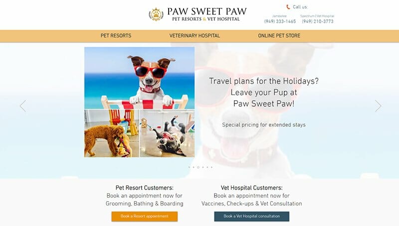
Paw Sweet Paw sets an inspiring example of a captivating vet clinic website that truly engages its visitors with high-quality images and a design that is both easy to navigate and enjoyable.
The most impressive feature of Paw Sweet Paw's website is the clever use of slides on the homepage. These slides effectively organize and present important information without overwhelming visitors, allowing them to find all the relevant content they need effortlessly.
But Paw Sweet Paw's website goes beyond just looking good. It also prioritizes convenience for pet owners. The website provides easy access to appointment buttons and online forms, making scheduling simple for a pet owner. Additionally, social media integration gives visitors more ways to connect with the site.
Paw Sweet Paw's creative designs showcase how features like video integration and full-width images can elevate the visual appeal, creating a dynamic website experience.
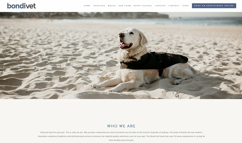
The Bondi Vet Hospital is another prime example of one of the best veterinary website designs in the industry. Put simply, it's top-notch! On their homepage, users are greeted by the most adorable image of a dog, creating an instant emotional connection for pet owners.
But what really caught my attention is their no-nonsense approach. It's just a beautiful image that steals your heart. No clutter, no tons of information, and no call-to-action button. In fact, you'll only find a drop-down menu that takes you to all the important stuff.
It's also worth paying attention to the colors they've used on this veterinary site. It's mostly white that is free from clutter, and effortlessly guides visitors.

Dinovite Pet Care is another great example of online veterinary website design. Their website immediately grabs your attention with its fantastic design and vibrant purple and blue colors, creating a sense of energy and excitement. The use of these bright colors evokes positive emotions and makes the online store feel engaging and lively.
You'll quickly notice the well-organized layout on their homepage, designed with the user in mind. The “Shop Dogs” and “Shop Cats” call-to-action buttons make it incredibly convenient for pet owners to find what they need immediately. This thoughtful design choice shows that the website creators understand their customers' needs and ensure a smooth browsing experience.
One thing that impressed me was the smart use of bold, black fonts in large and clear text. It adds a professional touch and makes the content easy to read, enhancing the overall user experience.
The clever placement of the chat box on Dinovite Pet Care's website is another testament to the thoughtful design approach taken by their team. Overall, Dinovite Pet Care showcases the power of BigCommerce's design elements in creating a successful and optimized veterinary medicine store.
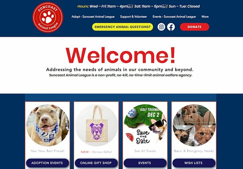
The Suncoast Animal League's website truly stands out among veterinary websites dedicated to animal welfare. I'm impressed by how they warmly welcome website visitors and prospective clients with a friendly “Welcome!” sign and a powerful message that immediately grabs one's attention.
The choice of soothing blues as the main color scheme is absolutely brilliant because it creates a calming and inviting atmosphere that puts visitors at ease.
But what really caught my eye was their clever placement of the red “Donate Now” button on this veterinary website. It's the only red button on the landing page. And its vibrant color and prominent position make it impossible to overlook. Of course, this smart website design choice effectively urges users to act and donate, adding a sense of urgency to support their cause.
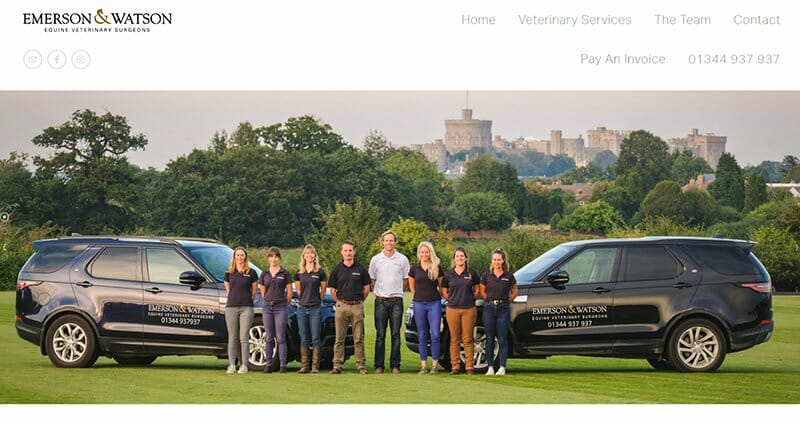
Emerson and Watson is an exceptional equine veterinary clinic available 24/7 at multiple locations. Their veterinary website is dedicated to promptly addressing horse-related issues. And the design of the veterinary hospital site is tailored accordingly.
Every element is placed strategically to make it effortless for potential clients to connect with the team and get immediate veterinary care. On the homepage, you'll find social media links at the top and a WhatsApp chat box for instant assistance.
Emerson and Watson's website stands out as one of the best examples in the veterinary industry when it comes to designing a site that provides prompt vet services. Emerson’s veterinary website design focuses on simplicity and user-friendliness, with well-placed social media links, a user-friendly chatbox, and a contact number.
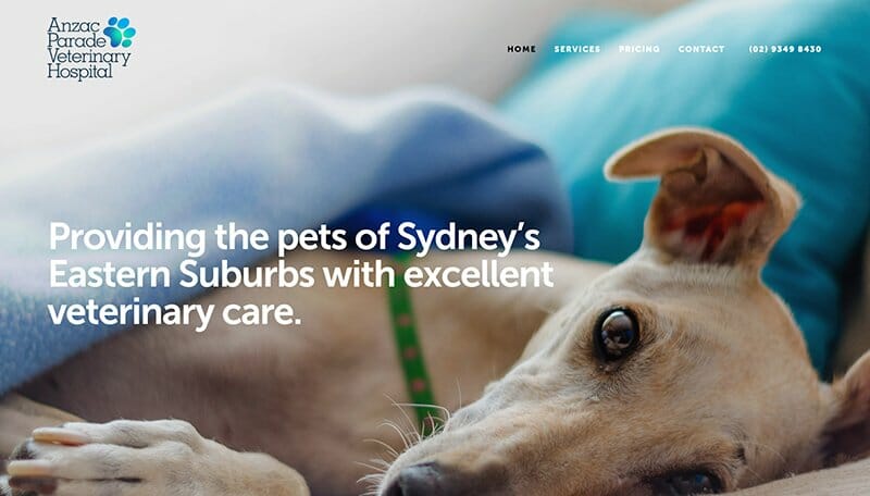
Anzac Parade Veterinary Hospital is a perfect example of excellent veterinary website design, especially if you want a small and user-friendly site. It looks modern and unique and does not overwhelm users with a lot of information. Yet, there are several key elements on this veterinary website that make it effective and special.
First, the background has a high-quality, full-width image of a dog. This smart choice grabs attention and connects with a pet owner right away. Second, the font on the website is professional and easy to read. The big, bold, and clear tagline shows the hospital's dedication to providing exceptional care for pet animals.
Also, if you look at the image, you'll see that the navigation menu is simple and easy to understand. It makes it quick and convenient for website visitors to find the important information they need in a professional manner.
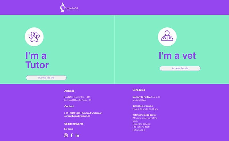
Citolab Vet is a multi-audience veterinary website that caters to different user groups, providing tailored sections to meet their specific needs. It's a great example for veterinary professionals looking to create a multi-purpose and user-friendly site.
When you land on the main page of Citolab Vet, you're presented with just two options, making it easy to navigate to the section you're interested in. It keeps things straightforward.
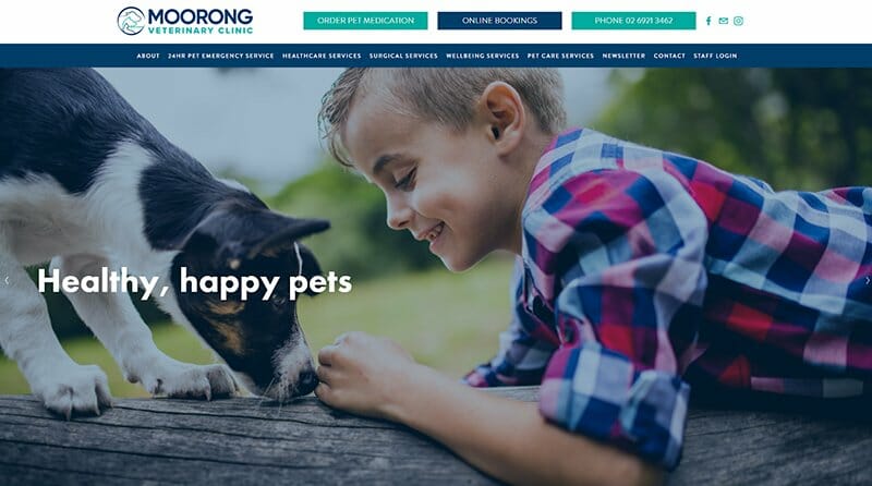
Moorong Veterinary Clinic truly stands out with its thoughtful website design. Take a look at the image above and notice how they intelligently utilize two navigation menus to enhance the user experience.
The top menu provides easy access to essential features like ordering pet medication and booking appointments, ensuring a seamless user journey. And the second menu categorizes healthcare services, surgical procedures, well-being services, and pet care services, allowing visitors to explore specific areas of interest effortlessly.
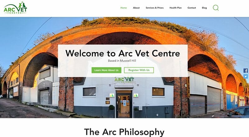
Arc Vet Centre, situated in Muswell Hill, is an independent veterinary practice renowned for its exceptional pet care. Their website design is a good demonstration of the power of simplicity. A simple design can resonate with visitors and captivate them visually.
Upon landing on the homepage, you're greeted with a panoramic image of their clinic, instantly creating an inviting atmosphere and familiarizing you with the place in advance. However, it's their small green logo that steals the spotlight. By incorporating shades of green of their logo throughout the site, they establish a cohesive color scheme that unifies the design. Even the call-to-action buttons, in green or white, seamlessly blend into the overall aesthetic.
The choice of fonts is simple yet effective, resonating with a clean and modern design. The navigation menu is conveniently positioned and includes a search bar, ensuring easy access to all the essential information.
The thing to learn here is how Arc Vet Centre's website embraces simplicity while maintaining visual allure. They remain true to their personal brand by consistently incorporating design elements. The combination of the homepage, thoughtfully chosen images, elegant fonts, and cohesive design adds a personal touch to everything. Yet, it creates a visually pleasing and engaging user experience.
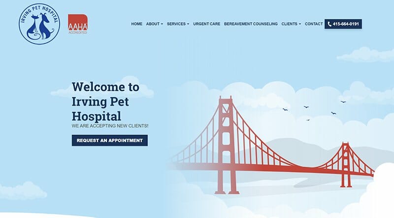
Irving Pet Hospital in San Francisco has a website that's simple-looking, super convenient, and personal. The moment you land on the homepage, you're greeted by a cute animation of the iconic San Francisco bridge. The website isn't flashy, but that little addition ensures you feel part of the community. Plus, it adds a personal, hometown vibe to the site.
Now, my favorite feature on their website is the “Request An Appointment” button, set in a contrasting dark color. It's so easy to spot right there on the homepage. No need to click around or dig through menus – it's just one click, and you're booking your pet's appointment. Not to mention, they've included an accessible button, ensuring their site is user-friendly for everyone, including those with visual impairments. These simple yet thoughtful additions show their commitment to inclusivity and make their website incredibly welcoming.
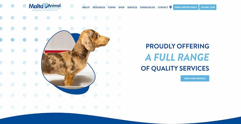
Malta Animal Hospital's WordPress website is a perfect example of how simplicity can deliver a powerful user experience. The design immediately captures your attention with a 3D image of a dog, adding a dash of personality to the site.
As the image displays, the real hero here is the handy navigation menu, putting everything you need — from booking an appointment to finding contact info — right at your fingertips. No frills, no unnecessary complexities, just a straightforward and efficient design that works.
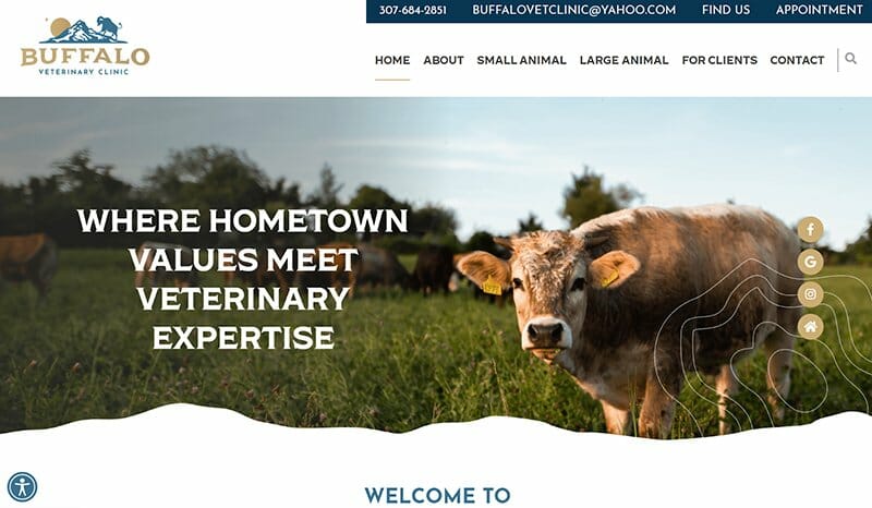
Buffalo Veterinary Clinic's website design is another good example of a straightforward and charming website. Its main image of a buffalo immediately grabs attention. The top info bar of the site clearly shows the phone number and email, making it simple to reach out.
The easy-to-follow navigation menu helps users quickly find what they need, from small to large animal care. And the social media icons invite users to connect further. In a nutshell, this website is an easy-to-use resource that blends local charm with professional veterinary care.
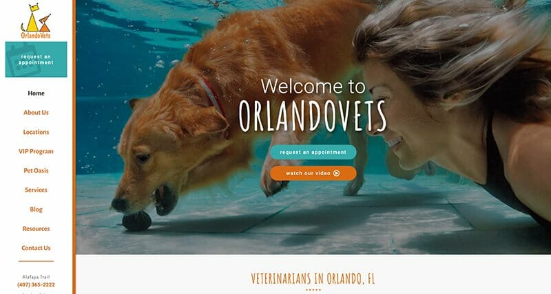
OrlandoVets has an impressive and professional website design that stands out from the rest. What sets this veterinary website apart is the left-side navigation menu, which takes up a significant portion of the page and adds to the site's unique and polished look.
This clever placement allows for a clean and vibrant homepage, while still making important information easily accessible in the menu. The graphics and layout of the homepage perfectly complement this design choice, creating a visually pleasing experience. Visitors will have no trouble finding what they need as they explore the comprehensive navigation menu on the left.
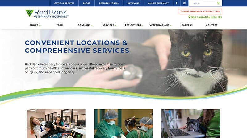
Red Bank Veterinary Hospital's site is a top-notch example of a user-friendly WordPress design that is cleverly organized.
Next to their logo, you'll see a 24/7 emergency care section — it's a comfort for a pet owner, knowing help is always a click away. Looking for their location? Check the sidebar for an easy-to-use finder.
Just below, you'll find a comprehensive menu catering to everyone's needs. Whether the visitor is a pet owner, a vet, or on a job hunt, they've got everyone covered with vital information.
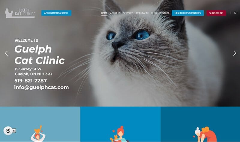
Guelph Cat Clinic's website, a WordPress creation, welcomes visitors with calming blue tones and captivating cat images. Right from the start, the site smartly displays the clinic's address, making it easily accessible to visitors.
So, what catches the user's eye next? It's the intelligently designed top menu. Here, crucial sections like “Appointment” and “Health Questionnaire” stand out against a darker backdrop, making these key features easy to locate and interact with.
But the real highlight is the “Shop Online” option, which underscores the site's emphasis on user convenience. Of course, it's crafted with the user's needs as the top priority!
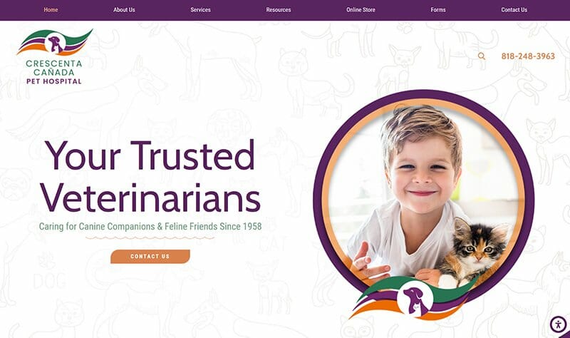
Crescenta Canada Pet Hospital's website is a custom-built marvel. It's living proof that customization doesn't have to be all about complexities. Instead, it's about crafting something unique that really connects with its users. What do I love about this site? Well, first off, its navigation menu. It's stretched out against a dark purple backdrop, and that's an eye-catcher right there.
Another thing that impressed me is how they've highlighted their emergency contact. It's on a simple banner on the right side of the site. It's unobtrusive but ensures that such important info is just a glance away.
Not to mention their greeting message: “Your Trusted Veterinarians Caring for Canine Companions & Feline Friends Since 1958”. This line may be simple, but it speaks significantly about the hospital's longstanding commitment to pet health.
Veterinary Website FAQs
Engaging visuals, informative content, social media integration, clear navigation, visible online appointment booking, contact information, and mobile responsiveness are the key elements that make a veterinary website excellent.
These features enhance the user experience, build trust, and effectively connect with visitors.
Squarespace and Wix are two popular choices for building fantastic veterinary websites. They both offer user-friendly tools, impressive templates, and customization options suitable for veterinarians.
Squarespace provides stunning designs and convenient appointment scheduling on your site, while Wix offers easy website customization. Rest assured, both platforms ensure your website looks great on any device.
Having a website helps you have an online presence, gain trust from clients, share important service information, simplify appointment booking, and communicate effectively with pet owners.


