29 Virtual Assistant Website Examples to Inspire You
As a virtual assistant, your website isn't just a digital space. It’s your canvas, a window into your skills, and a handshake to potential clients. Whether you're starting your journey as a VA or a seasoned pro looking to attract more VA jobs, you are in for a treat.
The best virtual assistant websites have beautiful web designs and interesting content that attract new and potential clients.
You don't need coding experience or to hire a website designer to create a virtual assistant website. A better alternative is to use great website builders like Squarespace and Wix that offer eye-catching and responsive templates.
This article explores 29 exceptional virtual assistant websites to inspire you to create your own site.
Let's get started.
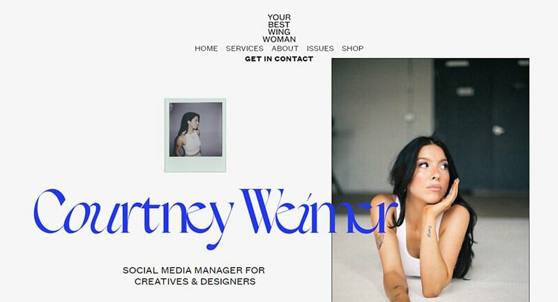
Courtney Weimar's website is one of the best virtual assistant websites listed. This modern site uses stylish fonts that give a chic appeal.
The menu section floats on the top of the webpage and sticks there such that it overlays other site components as you scroll.
“Your best wing woman” morphs into the domain name once you scroll an inch away from the top of the webpage. Visiting this website will surely lend you inspiration for building your own site.

Ericka is the brains behind EC Virtual Services. She's your go-to person if you're a business coach or a podcast pro looking to boost your audience.
The clean hero image on display has elements of pink, which explains why some texts and CTA buttons use the rose-pink color.
Ericka's casual and relaxed look in the image is consistent with the easy-on-the-eye web design and structure. The testimonial section displays a proven track record of Ericka's passion and commitment to delivering first-class VA services to her clients.
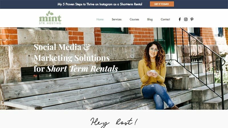
Mint STR Hosting helps potential clients market their rentals through expert social media marketing proven to increase bookings and revenue.
Color schemes on this website are complimentary. The site logo and favicon have a unique mint-gray color inspired by the website's URL.
I admire this website's header, a large white bar that displays recent resources in attractive dark gray-blue above the usual web components.
You may notice that the dull-orange CTA button on the header rhymes with the brick red wall on the hero image just below it. This visual conversation makes the experience engaging and easy on the eyes.

Nyla Bland is a virtual assistant that provides marketing, administrative support, and business support services for business owners.
You can’t miss out on the two hero images on the landing page of Nyla's website. While the background image is a professional look into her work habitat, the foreground frame displays a smile that can capture visitors' hearts as they arrive.
The grayish-green CTA buttons are unique and ideal for this virtual assistant website. I love how the footer and the section that displays the online form have the same color theme, giving the site a consistent brand personality.

MadSavvy VA is a virtual assistant company that partners with ambitious and innovative female entrepreneurs to make their visions for growth and scaling a reality.
The generous white space on the header section of this virtual assistant website sets the pace for a thrilling content journey in the navigation zone.
A lazy loading technique is integrated into the site, giving visitors an interactive experience. The CTA buttons on this site have a unique mineral green color consistent with the footer and the section that displays the alluring testimonials.
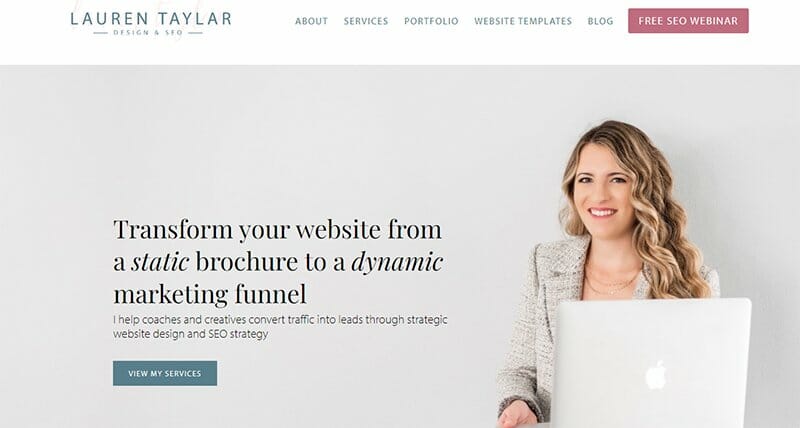
Lauren Taylar is a Showit and Squarespace website designer and SEO strategist based in St. Petersburg, FL. She is quite deliberate about what her own website communicates to potential clients.
The hero image, a professional photo of Lauren, speaks volumes about her readiness for administrative tasks. Pictures in the navigation zone are much more casual so visitors feel comfortable as they discover her other virtual assistant services.
Her footer is a full-paged, bay-leaf-coloured section showing everything visitors may have missed on the main page, plus a search bar and an Instagram feed.
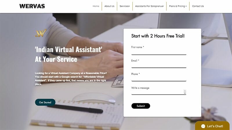
Wervas is an Indian-based virtual assistance service provider skilled at admin tasks like bookkeeping and data entry.
On the landing page, a salient CTA form offering a 2-hour free trial prompts immediate action from visitors. This form overlays a curious GIF of a dedicated worker at his desk seamlessly playing in the background.
The navigation zone features a self-scrolling carousel to display extensive client reviews and build credibility. Colorful caricatures explaining services offered are good for increasing user interaction via entertainment.
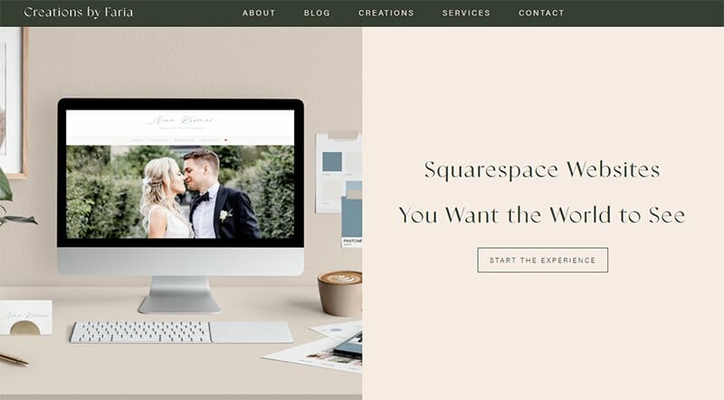
Faria is a founder and Squarespace designer who makes it her mission to build potential clients the site of their dreams. What stands out to me on the website is its alignment.
One of Faria's creations cleanly divides the soft peach background of the landing page into two halves. This spatial organization is consistent across the webpage, as no tile, text, or image seems out of place.
The charcoal black header hinges on the homepage as you scroll. I love how the small width ensures that it does not obstruct any site content.
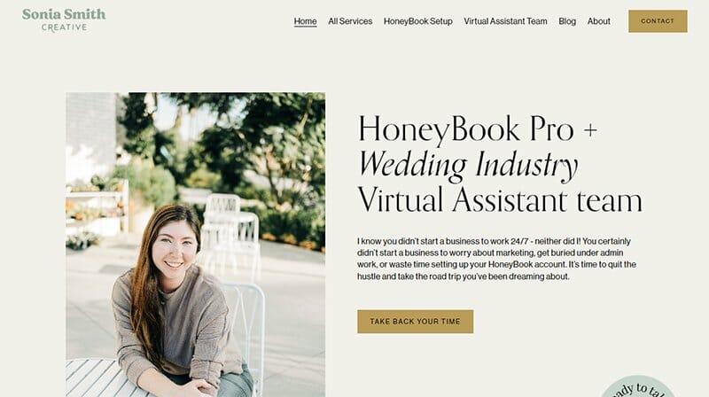
Sonia Smith is a HoneyBook Pro and Virtual Assistant with a wealth of experience in marketing administration, design, and project management.
On Sonia's website, she employs a teal and dark gold theme, ensuring consistency with the dark gold color of the call-to-action buttons. This meticulous attention to detail gives the website an organized and professional look.
I like how the menu options stretch as the cursor touches the words on the header. These effects ensure the high interactivity of visitors on the site. The YouTube embed is a sure way to occupy users with engaging content.
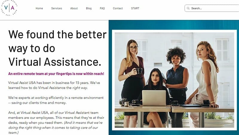
Virtual Assist USA provides virtual assistant services to small businesses, entrepreneurs, and corporations. This vibrant color scheme with teal blue, dark jungle green, and warm purple on a white background creates a visually appealing website.
The homepage prominently showcases an image of four professional women, symbolizing their readiness to assist clients. To the left, concise text outlines their services.
As visitors scroll through the homepage, the content seamlessly emerges. A convenient search box in the header ensures easy navigation on the webpage.
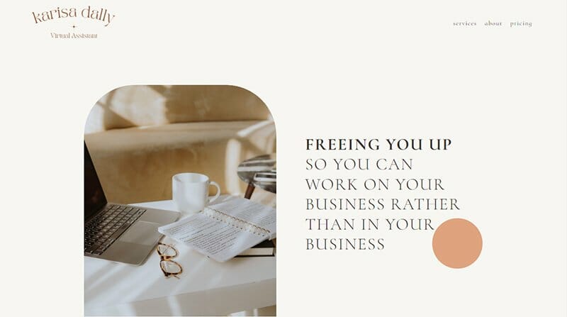
Karissa Dally is a virtual assistant dedicated to assisting business owners by handling various tasks, allowing them to reclaim valuable time.
As the website opens, you immediately notice a lot of free space in the header section. This initiative may be consistent with Karissa's motto to free up busy business owners to pay attention to other things.
What's for sure is that the ample spacing and small fonts communicate comfort and calmness to visitors. I love the frames that display the attractive images on this website. Their unique “doorway shape” adds to the overall elegance of the webpage.
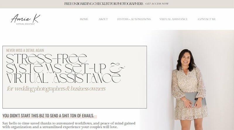
Amie's VA business targets wedding photographers, helping with their systems setup and email marketing. The color scheme on this website is a simple white and almond design.
I like the style and idea of the hero image on the landing page. Amie's use of her full-length picture will increase clients' trust in her brand.
An Instagram feed appears above the smartly demarcated footer section on the home page. Placing your cursor on any of Amie's social media posts displayed above the footer will reveal its caption.
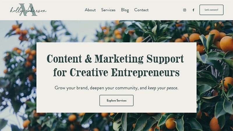
Holly is your go-to person for all graphic design, content writing, content marketing, or web development. She relies heavily on the images of natural products like fruits, leaves, and flowers to beautify her webpage and communicate a feeling of vibrance to visitors.
The white, non-sticky header bar sets the pace for the layer-by-layer structure of the contents of the homepage. On one of the layers, in non-clickable boxes, Holly displays the services she offers. This direct display saves her users the stress of reading her bio to find out.

Kara empowers individuals to launch a successful online business and be pros at social media management and digital marketing. Bold and stylish fonts are the game on this website, and Kara plays them beautifully.
This VA website employs an enlarged header with ample white spacing to minister calmness to visitors as they open the webpage.
CTA buttons across the website have varying colors, but what is similar are the large rectangles that display them. I like the structure of the online form on this webpage and the text design that overlays it.

Xpand Solutions is more than a regular VA business website. Tiffany, the owner, is an executive assistant who helps 6-figure and 7-figure business owners scale seamlessly.
This virtual assistant site boasts an unconventional header design, with a centered logo and menu options floating on either side. The hero image features a cheerful virtual assistant working with a laptop, assuring visitors of a joyful task execution.
Three photos with descriptive text in the navigation zone underscore the benefits of collaboration to potential clients. Strategically placed black CTA buttons prompt visitors to immediate action.
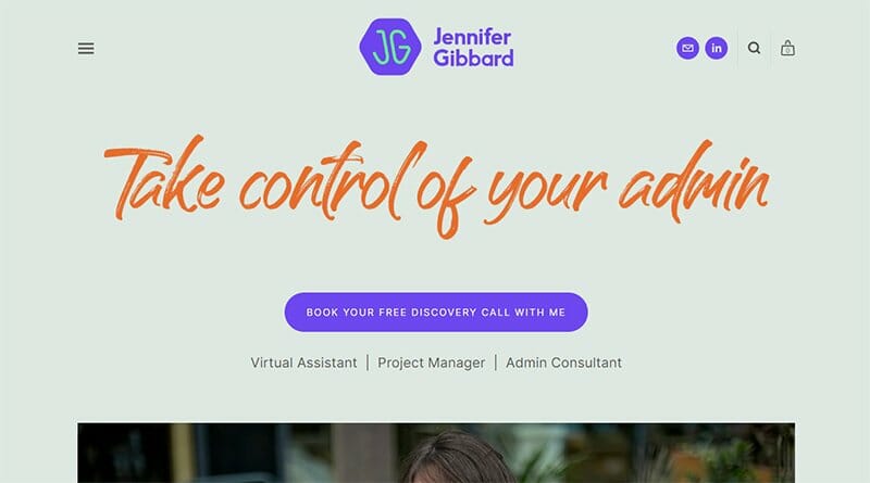
Jennifer Gibbard is a virtual assistant specializing in freelance business support services. The homepage on this website is brief, as not a lot of content is directly on display. Menu options are behind the hamburger icon at the top left of the page.
The attractive bluish-purple of the site's logo appears on some of the CTA buttons. Others take on the burning-orange color of the catchphrase on the landing page.
A sticky header displays the site's search icon. On a section of this site, visitors can shop and count their items on a cart.
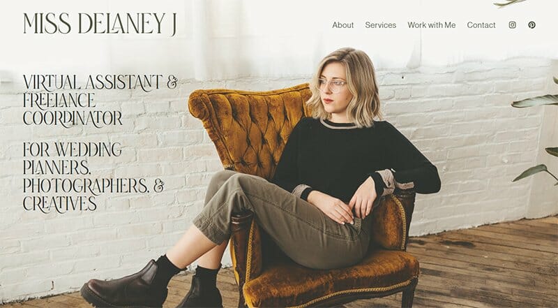
Miss Delaney J is a virtual assistant and freelance coordinator, catering to the needs of wedding planners, photographers, and creative professionals. Her website sports a captivating magazine-style layout, with a sleek and minimalist aesthetic.
Unlike traditional headers, hers forgoes the conventional border or frame, placing the text against a curtain-like background, creating a unique and visually striking effect.
The careful choice of colors on the webpage seamlessly integrates with the textures and hues in the various layered images on the homepage. This thoughtful design approach enhances the website's appeal and ensures a cohesive and immersive user experience for visitors.
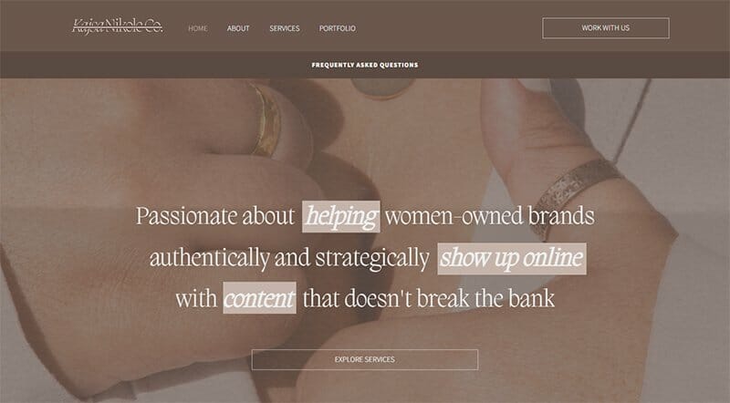
Kajsa Nikole is a UGC creator and social media strategist for Instagram and TikTok. Small texts and faded images present a minimalist approach and a mobile-friendly design of this virtual assistant website.
I like the two-layer navigation bar on the header section of this website. The link on the lower layer changes to a different one every two seconds, increasing user interactivity.
There is a similar ribbon on the footer section of the webpage. The search bar on the footer further improves the already seamless navigation on this website.
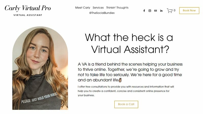
Carly Virtual Pro serves as a user-friendly virtual assistant website. Upon arrival, a freebie offer via a simple form pops up. The form's black color contrasts the site's white background and causes a visually striking effect for the viewer.
I like the unique colors chosen for this website. Texts and elements shine in black and cookie brown colors with an occasional davy gray backdrop. Despite its simplicity, the site's sticky header efficiently organizes content.
The unique CTA buttons prompt visitors to take action after consuming valuable information. I love the carefree design approach that looks organized.
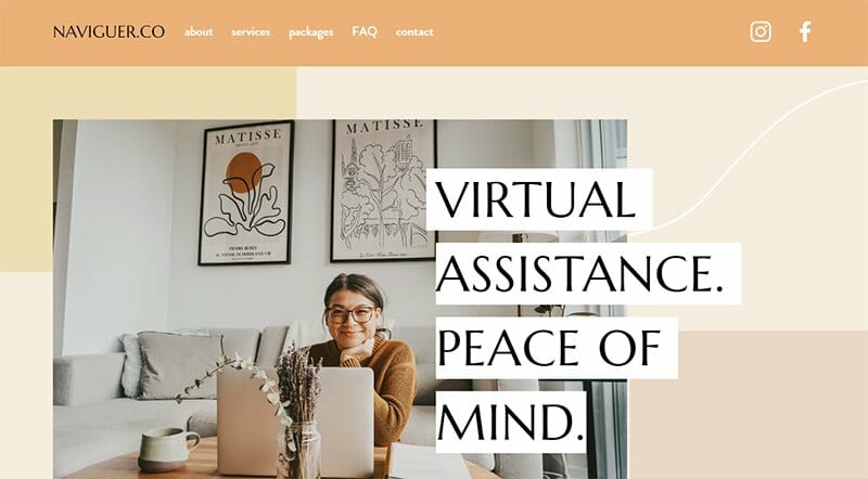
NAVIGUER.CO, a premier virtual assistant website in Toronto, empowers small businesses and busy families, easing their lives through adept administrative support. This VA website boasts a calming monochromatic design that harmonizes with the welcoming hero image.
As visitors scroll, content gracefully emerges, creating a serene browsing experience. The header elegantly follows the scroll, maintaining accessibility.
I like the full-page footer section on this webpage that boldly displays the fancy favicon as a link to her contact pages.
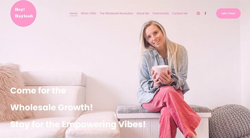
Hey Hayleah serves as an executive assistant, capable of making any wholesale business grow. The soothing dawn pink color palette of the webpage is visually appealing. Unlike conventional websites, it forgoes typical header styles with border lines or frames.
I love how the logo boldly occupies the top-left corner, aligning with the webpage's content list. The primary call to action (CTA) adopts a capsule-like button with an exclamation mark to emphasize urgency.
Hey Hayleah’s homepage features three distinct layers separated by delicate pink lines, each sporting varying shades. Overall, the web design prioritizes user-friendliness.
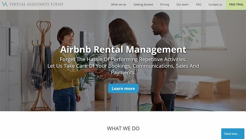
Virtual Assistants Today is an innovative customer service platform, bridging clients with top-tier rental and property management solutions. You will quickly notice the sticky header bar on this website that closes with a tea green CTA button to the right.
The CTA button takes on a darker shade of green when the cursor touches it. This effect adds to the overall interactivity on this webpage.
I like the table that reveals plans and pricing. This feature adds to the beauty of the website and makes it easy for clients to decide what payment plan they will be going with.
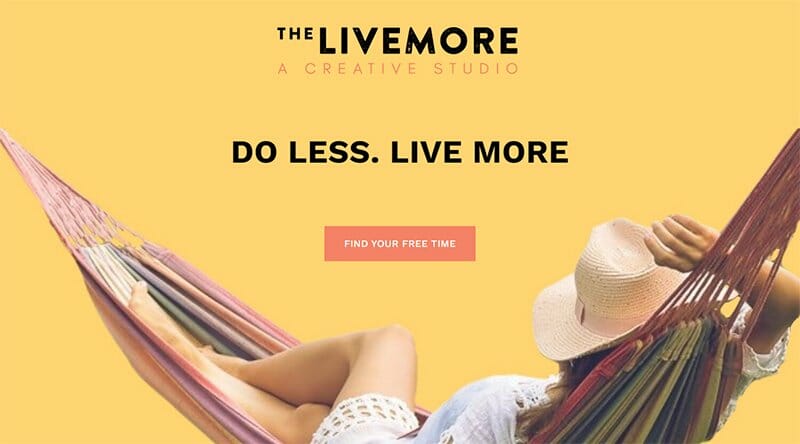
The Livemore Creative provides virtual assistant services and caters to mindfulness and mindset needs. This VA website boasts a user-friendly design where every component harmoniously unfolds as visitors scroll.
An initial image of a relaxed lady conveys the value of trusting this virtual administrative assistant. Each layer introduces captivating colors, vividly demarcating content.
The copy maintains a friendly, engaging tone. Testimonials, strategically placed after a contact form, offer social proof to persuade skeptical visitors.
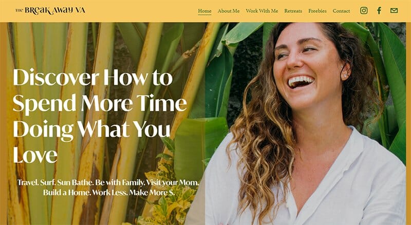
Break Away VA offers virtual assistance to business owners and coaches highly ambitious individuals to find virtual assistant jobs. Anne Marie, the owner, welcomes visitors with a captivating smile, setting a friendly tone.
As you scroll to a page, its contents gracefully come into view, creating an engaging user experience. This lazy loading speeds up the initial loading time on the webpage, as resources only come to view when needed rather than loading everything upfront.
The sticky header has a vibrant mustard color, with the menu tastefully presented in camo green, enhancing the overall aesthetics.

Magnolia Virtual Solutions is a virtual assistant business that helps firms manage their finances and balance their books. The site features a green and black-themed design on a plain white background.
Amanda, the owner, displays a hotline for free consultation on finances. She pins it to the white header with a black bar so it's the first thing visitors see.
A free video resource in the navigation zone explains the 2022 tax highlights. The accessibility icon pinned to the left and the chat feature pinned to the right are the components that encourage seamless navigation on this webpage.
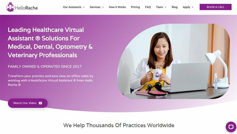
Hello Rache is a prominent healthcare virtual assistant company where remote workers from the company can assist doctors with their admin duties. This VA website opens with a sticky header that tails off with a bold rectangular CTA button, sure to catch visitors' attention.
The captivating blend of purple shades on the webpage entices new clients. A purple-colored CTA button encourages visitors to watch an introductory video of their services. In the navigation zone, there are persuasive social proofs of video testimonials from past clients.
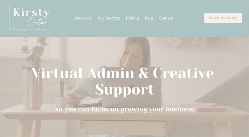
Kirsty Orton Virtual Assistant is an excellent website for small businesses seeking administrative and creative support. The site's aesthetic is light, with a color scheme featuring soft, faded shades like foggy gray, opal, and soft peach.
I love how the background image showcases a diligent virtual assistant, conveying readiness to assist visitors. The header boasts a standout soft peach CTA button, cashmere text, and other CTAs presented elegantly within black rectangles.
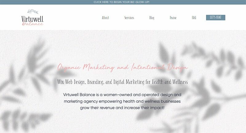
Virtuwell Balance is a team of Wix design and marketing experts. They have a testimonial section worthy of note, a carousel displaying alluring praises from up to 13 of their past clients.
This great virtual assistant website renders its branding portfolio with a horizontal scroll element on the home page. Each template in the portfolio opens in half view with a love button to encourage visitor interaction.
The gray-blue CTA button takes on an attractive pale-pink color upon cursor interaction. Both colors sit well with the white background on which they appear.
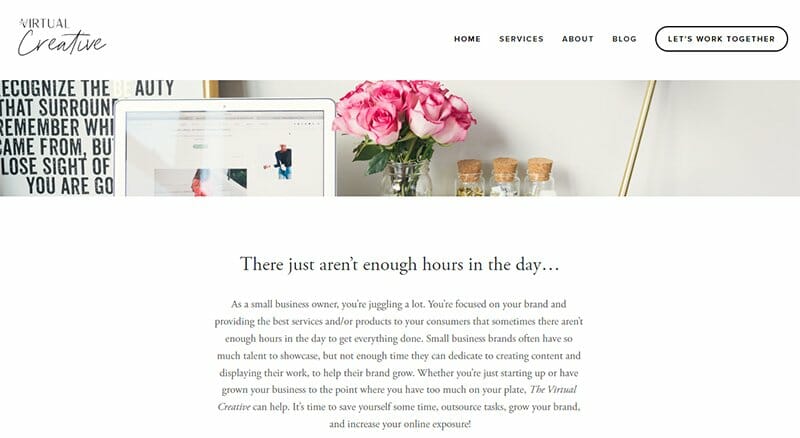
Virtual Creative assists small business owners in handling different services that increase their online exposure and brand growth. I like the minimalistic approach to this virtual assistant website.
The texts and images in the navigation zone are arranged towards the center of the page, leaving the edges in casual white space.
I like the clever progression of the header components leading to a long capsule-shaped CTA button that turns black upon cursor interaction. Virtual Creative ends with a virtual assistant's smiling photos, assuring clients of personal investment in their brand's success.
Best Virtual Assistant Websites FAQs
To create a virtual assistant website, start by choosing a website builder like Wix or Squarespace. Use their user-friendly templates and customize them to highlight your services. Ensure it's easy to navigate and optimize the content for search engines to improve visibility.
Your virtual assistant website should have a clean and professional design. Use a template from platforms like Wix or Squarespace and customize it to reflect your services. Consider hiring website designers if needed.
Yes, there is a huge demand for virtual assistants, especially for services like organizing business websites, travel planning, personal service, and app development. Having a well-designed website optimized for search engines can help you tap into this growing market.
Explore Further
- Virtual Assistant Business Name Ideas Generator
- Virtual Assistant Website Templates
- Best Small Business Ideas
- Best Freelance Jobs Websites
- Profitable Home Business Ideas
- Legit Ways to Make Money From Home
- Best Small-Scale Business Ideas
- How to Create a Website
- How to Design a Website
- How to Host a Website

