Author Websites: 36 Inspiring Examples (2025)
Every author needs a visually-appealing and SEO-optimized website to attract a steady traffic flow. Whether you are a bestselling author, a veteran, or a new writer, an author website can help you position yourself as a professional and brilliant writer.
Creating a professional-looking and interactive website that appeals to your readers is no easy task. Hiring a website designer can be expensive while designing it yourself is a poor strategy with no prior design skills.
A better alternative is to use the best website builders like Squarespace and Wix, which provides attractive done-for-you author website templates.
This article covers the 36 best author website examples you can use as a guide to creating your own website.
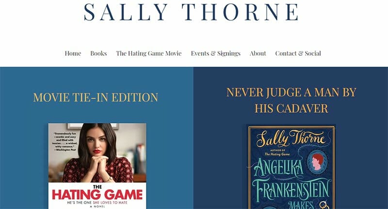
Sally Thorne’s author website design displays two images of her latest and upcoming works on separate denim and rhino-colored backgrounds. The Playfair display, Avenir, and Lato fonts, with high-quality images displayed, make this website visually appealing.
I love how the website domain is the name of the professional author because it makes it easy for people to search and access her website.
You can’t help but admire the beautiful color scheme maintained on the site. The touch of gold for its CTA buttons makes them stand out from the page text.
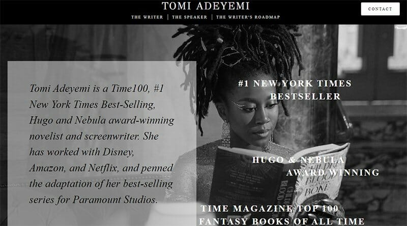
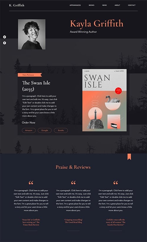
Tom Adeyemi has one of the best fantasy author websites you can customize and replicate to create yours. The award-winning author uses a one-page design with a black-and-white hero image of herself reading one of her books.
You can’t miss out on the text written in a bold style that uses a sliding effect as you scroll. The great typography complements professional photography and blends with the site’s background color scheme.
I love how the Contact CTA is the only call-to-action button that leads to a separate page where visitors can contact her.
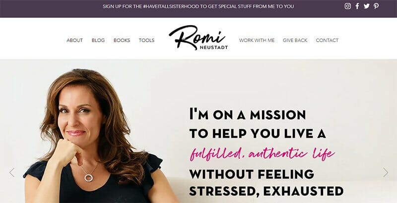
Romi Neustadt’s mission to help you live a fulfilled life is displayed alongside an image of her in the most artistic of fonts.
Quality images of her books are displayed towards the end of her webpage with a short description and strategic CTA to entice visitors. I love how she makes everything on her website stress-free and easy to access.
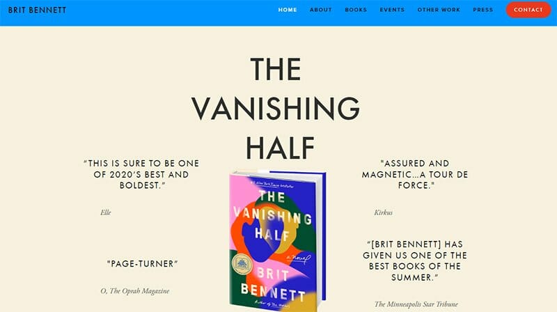
Brit Bennett’s author website displays a centralized image of her book surrounded by review texts from various notable brands. Her fiction novel, The Vanishing Half, is the center of attraction with the colorful book cover on display.
Tapping into the benefit of word-of-mouth marketing to boost her book sales, Brit Bennett's testimonials and reviews all work in her favor.
I love the three CTA buttons in Baltic Sea color placed side by side, almost like an incomplete triangle, just above her social media icons.
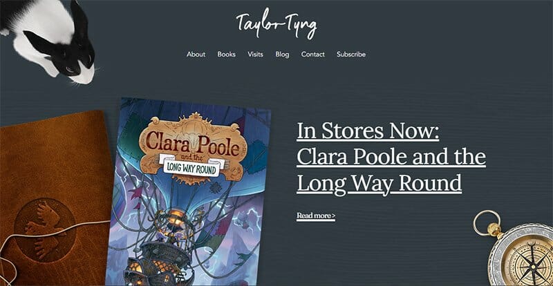
Taylor Tyng went all out for his website design, giving the feeling of anything but ordinary while guaranteeing visitors a pleasant scrolling experience. The biggest catch is the high-resolution images that provide an exciting experience and tell a story on their own.
I love how the colorful images displayed on Taylor’s author website on a dark gray background create an unusual visual contrast, making the effect eye-catching.
For navigation, Tyler uses a hamburger menu that adapts well to the animated layout, collapsing where needed, and ensuring users don’t miss out on important sections.
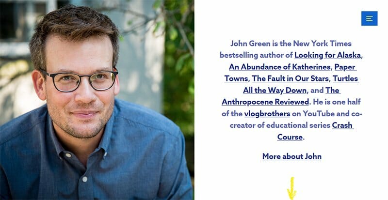
John Green’s website is clean, elegant, and modern, with a fixed hero image of the author on constant display on the left. I love how this author’s website uses different shades of blue as its font colors to present a colorful look.
There is a hamburger menu that opens up several other available pages, including his bio page, blog, YouTube, podcast, appearances, store, and up-to-date contact information.
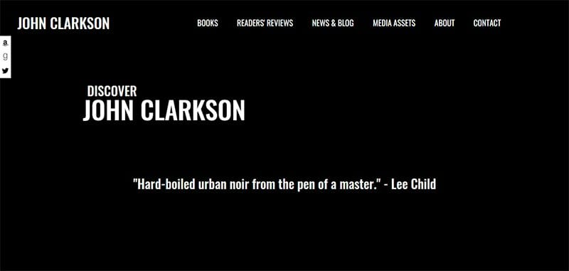
Not shy to disclose people’s opinions about him, John Clarkson replicates the thrilling nature of his books in his author website design. The black background on the homepage is perfect, helping to make the text displayed more pleasing to the eye.
You cannot get enough of this author’s mentions from both seasoned professionals and big publications. There are quotes and mentions of the author displayed all over the website that boost credibility and get visitors’ attention.
I love how he stylishly displays cover images from his books around his website with a red CTA tagged “Buy Now” over them.
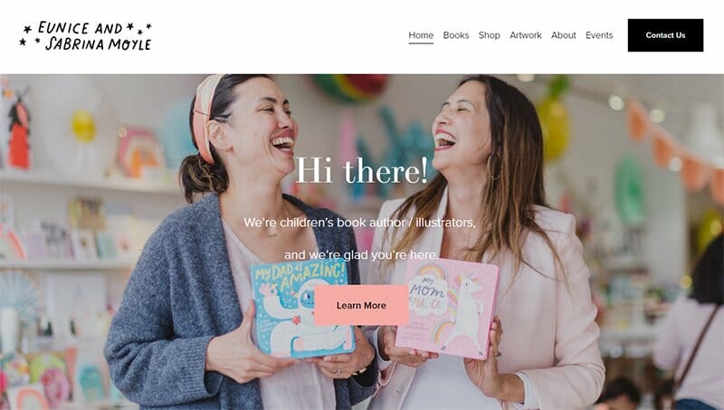
Eunice and Sabrina Moyle are the ideas behind the Moyle sister's author brand, with Sabina leading as the author while Eunice handles the illustrations.
On the homepage is a smiling image of the two sisters holding their works proudly in a background befitting for a children’s book.
Underneath the hero image is text in bold black fonts highlighting this website’s great design. I love how she puts real book marketing statistics on the website (over 700,000 copies sold) to encourage visitors to make the purchase.
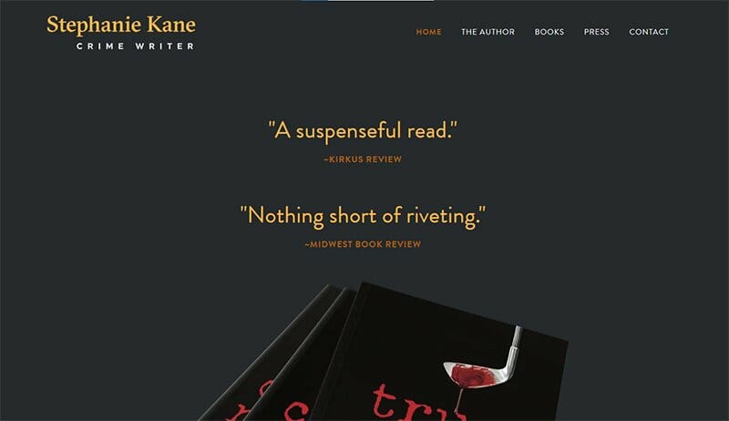
Stephanie Kane is a lawyer with books based on a crime that develops into exciting thrillers to her credit. Her site, designed to look dark and gloomy helps put perspective on her brand with a thrilling look.
A touch of mystery is this author’s website's recurring theme, with excess reviews displayed on its landing page. There is an audio player feature at the footer section for visitors to get a thrilling experience.
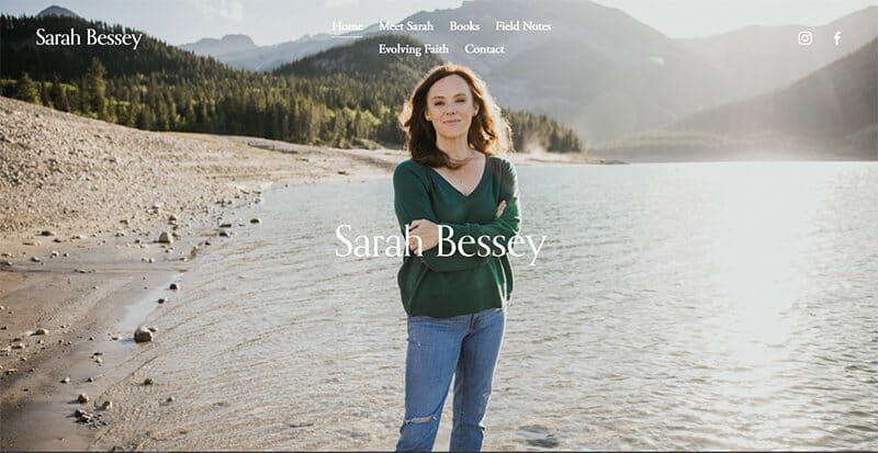
Sarah Bessey is one of the most renowned Christian and bestselling authors. A sea-side hero image of Sarah Bessey serves as the center of attention of her website, blending well with the header section.
All the information you need is displayed as links in the header section, with social media icons embedded with links also included.
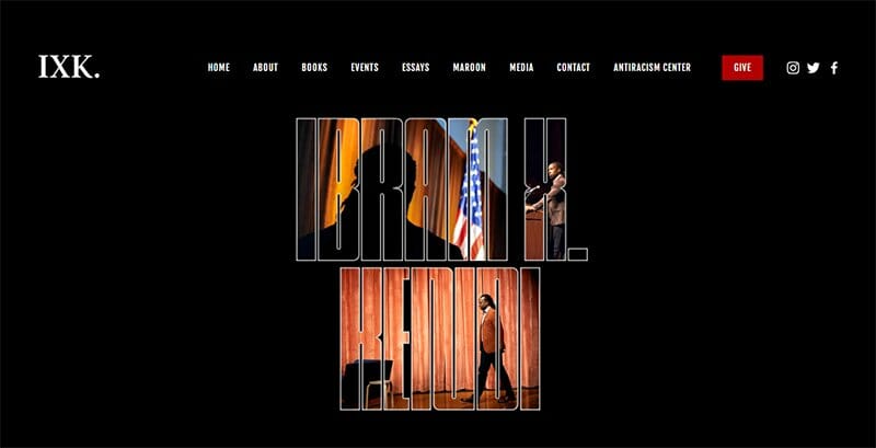
Ibram X. Kendi is an award-winning author, podcast host, contributor writer, professor, and founding director of the Boston University Center for Anti-racist Research.
His website is an all-in-one platform that is home to his books, essays, and podcasts in a well-organized manner. I love how there is a dedicated page that displays Ibram Kendi’s upcoming events for visitors that want to attend.
The image of Ibram X. Kendi speaking at different functions embedded in the text is one of this site’s best interactive elements. You just can’t help but appreciate the aesthetics that this site offers.
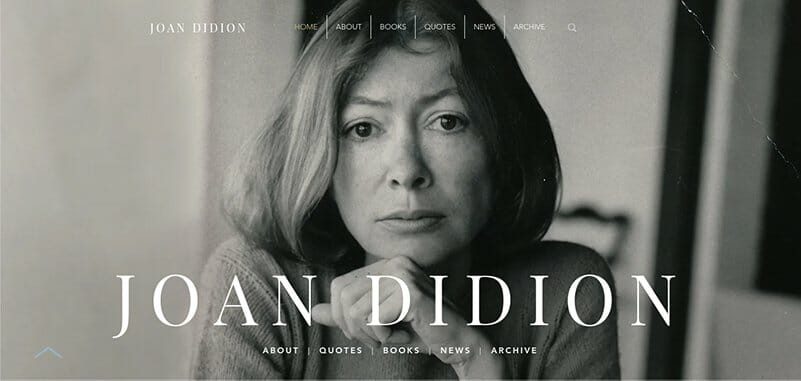
Joan Didion has one of the best author websites that inspire visitors looking to create their own websites. The first thing that strikes your attention is the high-quality black-and-white picture of Joan Didion. You can’t miss the bold white text she uses to brand herself.
I love how Joan Didion uses different bright colors like cloudy blue, almond, white, blossom, desert sand, iceberg, and black for her website design. Joan Didion’s website displays the images of her book covers arranged according to their genres.
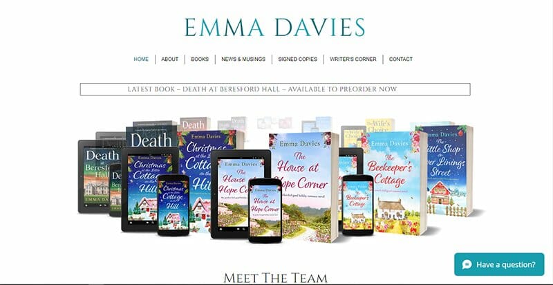
When you go to Emma Davies’ website, you first notice the Turquoise color scheme. Her homepage displays revolving images of the book covers of some of her best works. A nice touch is the inclusion of an announcement box that announces her news releases.
The Meet the Team section helps visitors put perspective on her writing process. I love the chat feature that readily provides visitors with answers about the author and her works.
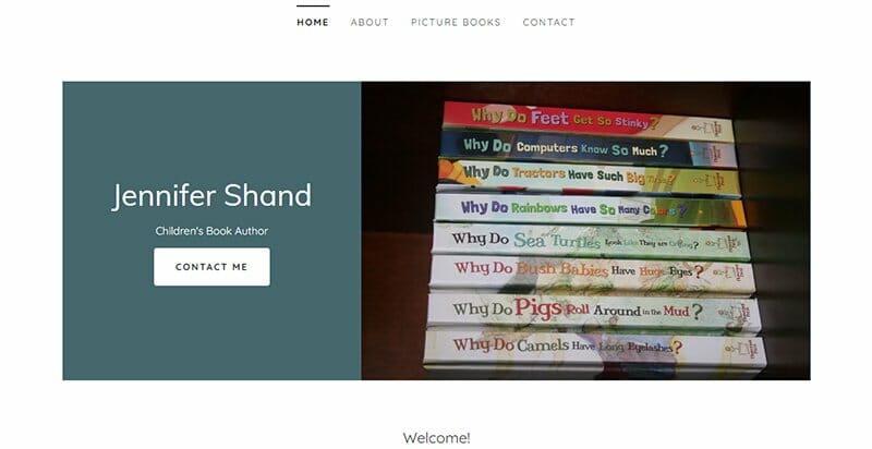
Jennifer Shand is a children’s book author with a degree in psychology which she puts into good use in her books emphasizing hope. Her books are designed to make learning feel fun and in a way, silly for her young readers.
Stacked up as her site’s hero image are images of the side view of her books, going against the norms taken by other author’s websites. Beside the image of the stacked-up book is a “Contact Me” CTA button leading to her contact page.
I love the inclusion of her latest blog post on her webpage with links attaching each article to her blog page.
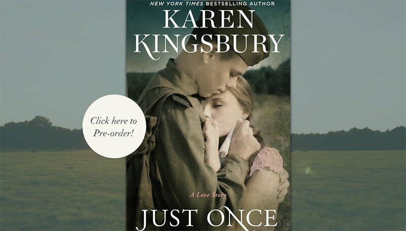
Karen Kingsbury is one of the best self-published authors. Her website is designed to get visitors to buy her latest book, Just Once. You can’t miss the circular “Click Here to Pre-order” CTA button encouraging first-time readers and fans to pre-order the novel.
I love how this bestselling author with a professional-looking website displays a video of a field as her site’s hero image. The use of pink flare background for its different online store options makes this website’s design all the more appealing.
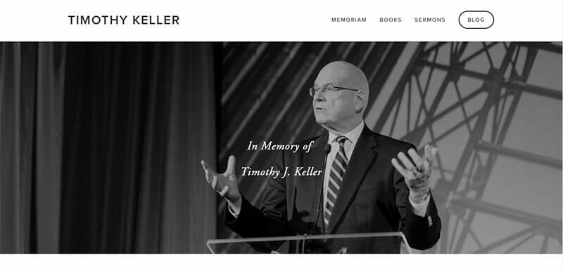
Timothy Keller’s website displays a black-and-white image in memory of the author himself. Just beneath the hero image is a short author bio detailing some of his achievements. This professional author’s website has a fast loading site speed and a beautiful layout.
The top navigation is simple and only features four links: Memoriam, Books, Sermons, and Blog. I like how the black, white, and rose madder color scheme is easy on the eyes.

Jason Reynolds’ author website takes up a contemporary design with plenty of eye-catching features that pull visitors right in.
The first eye-catching feature is the fixed navigation menu that divides the webpage into two segments. This arrangement is maintained throughout the website’s design, with links embedded in each of the four texts leading to other pages.
I love how the fonts (Futura PT and Minion Pro) add their own glamor to this website’s design.
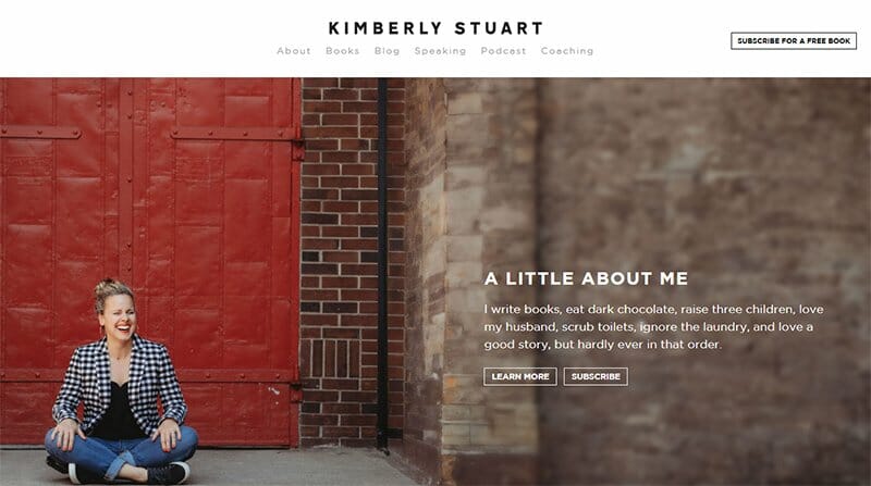
Kimberly Stuart has many novels to her name, with her website displaying a short bio that invites visitors to her world. For first-time visitors, a subscription for a free book awaits them in the header section.
I love how this author's website serves as her branding tool, including links to her speaking, podcast, and coaching pages.
Images of book covers of her published books take center stage on her website’s homepage. I love the attractive “What Readers Say” section that serves as social proof.
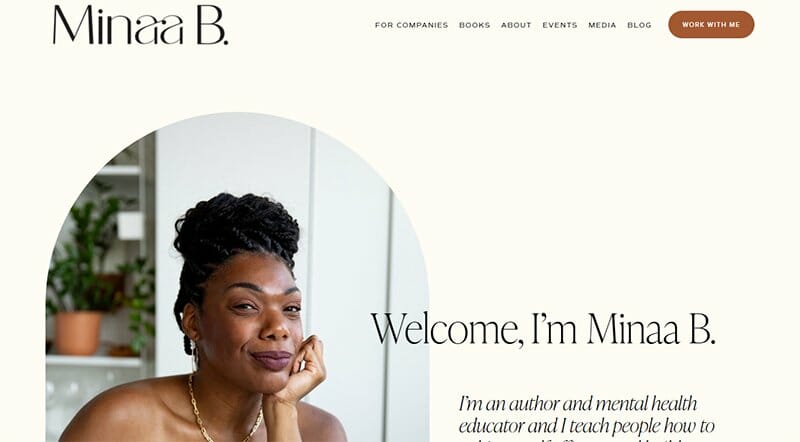
Minaa is a certified mental health professional who is passion-driven in offering self-care to better the quality of life of others.
Her website displays soft colors to prescribe her message of calm, complemented by the neatest of typography and images on display.
Generating attention on her debut book is an announcement feature just above the book cover’s image displaying pre-orders now. The Pre-order CTA button in a sepia skin background is well-designed and so visible that visitors cannot miss it.
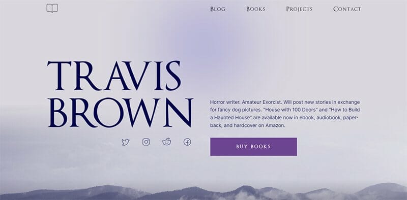
Travis Brown as a horror writer uses a website design that speaks to his niche with a rather haunting web design. The black and purple color scheme displayed makes the foggy forest background image all the more pleasing.
His CTAs and links remind users of his writing with dark lavender colored buttons spelling out “Buy Books,” “View Books” or “View Projects.” Each CTA button is embedded with a dedicated webpage, redirecting users to their other online stores.
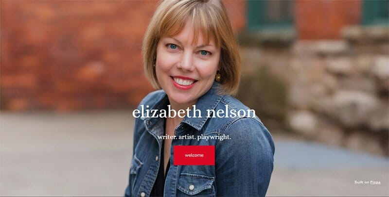
Elizabeth Nelson is a writer, artist, and playwright with a full-width hero image of herself taking most of the attention on her homepage. Designed on a one-page layout, the welcome CTA button in cadmium red opens users up to her world.
Her website, using a simple design, offers tremendous capabilities that most author websites do not. The landing page is clean and uncluttered, making information look orderly.
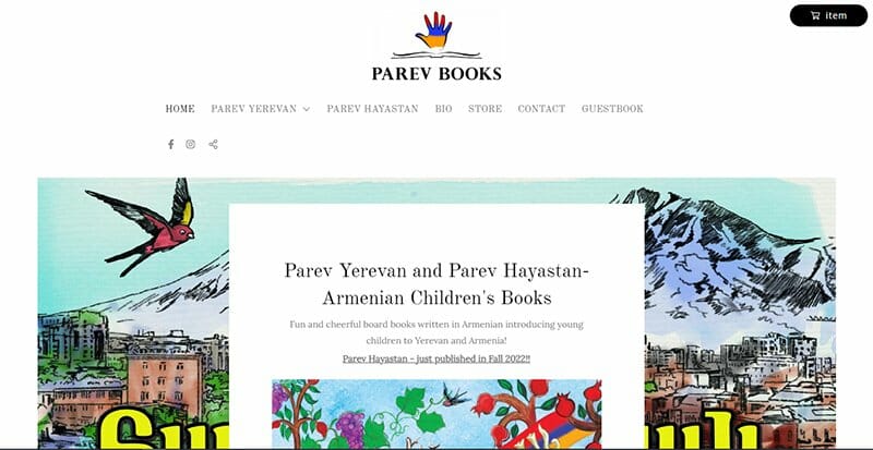
Taleen Moughamian is an Armenian-American children’s author. Her writing hopes to help younger kids build their Armenian connection.
Her author's website is simple, using bright illustrations that reach kids in ways that ordinary text does not. The logo and the animations displayed are specific, speaking directly to her audience, the kids.
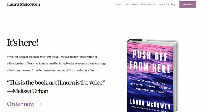
Laura McKowen is a bestselling author who came to the limelight with her book “We Are The Luckiest.” Her website is an author platform for her brand. I love how she uses it for book marketing by displaying the book cover of her latest book.
White spaces are in excess on this author’s website, making the home page less overcrowded. Her events page lists her upcoming book events, retreats, and workshops and is regularly updated.
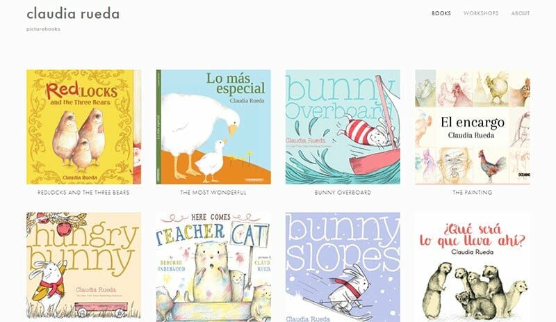
Claudia Rueda is an author and illustrator with more than 30 books attributed to her, translated, and sold in different languages worldwide. Cover images of her profound works are the hero image for her author's website.
I love the neat arrangement in a four-column layout of her book titles. This author’s website design is straightforward to implement, displaying no text except the title of the books on display.
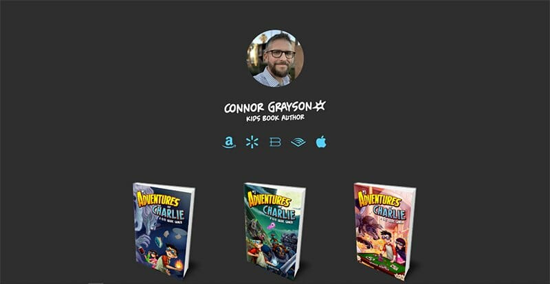
Connor Grayson is a kids’ book author whose imagination knows no bounds, evident in the quality of the books attributed to him. His author's website homepage displays cover images of his books on a thunder color background.
Other than the images of his book and a circular framed image of the author, the only imagery is icons with links to access his books. This one-page site has an arrow icon at the bottom of the webpage that takes you right back to the top when clicked on.
Debbie is a children's books author and illustrator originally from Florida but tells tales of the five states she has lived in over the years. She aims to reach young kids via her simple and detailed website design.
The header section is home to five menu options with links embedded in them that direct visitors to the corresponding pages. I love how the purple-colored text adds bits of style and glamor to the site in the areas where they are highlighted.
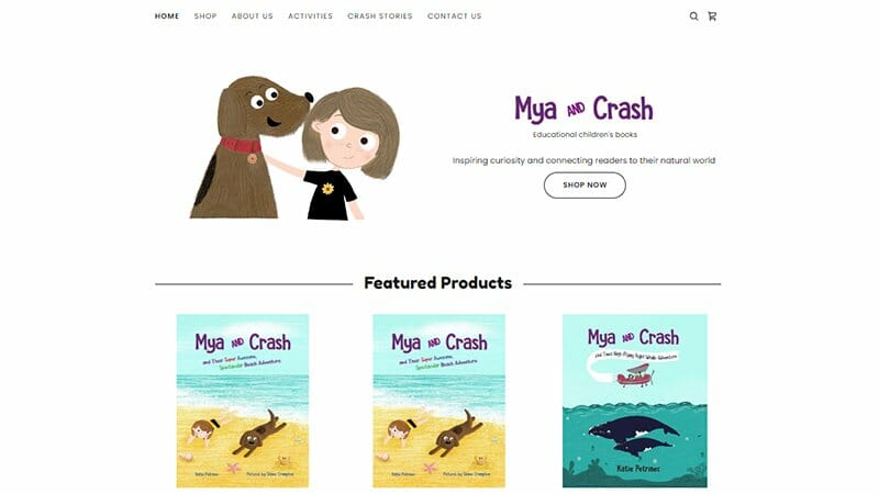
The Mya and Crash website is the online home of Katie Petrinec's children’s book series detailing a little girl and her pup.
Displayed in the featured products section are cover images of the books available in the series alongside the price of each book. There is a CTA button for interested parties that allows them to view all available products at a stretch.
Links to her two social media accounts are included close to the footer section beneath an email opt-in form. Filling and submitting the form grants you first-hand knowledge of upcoming releases and events.
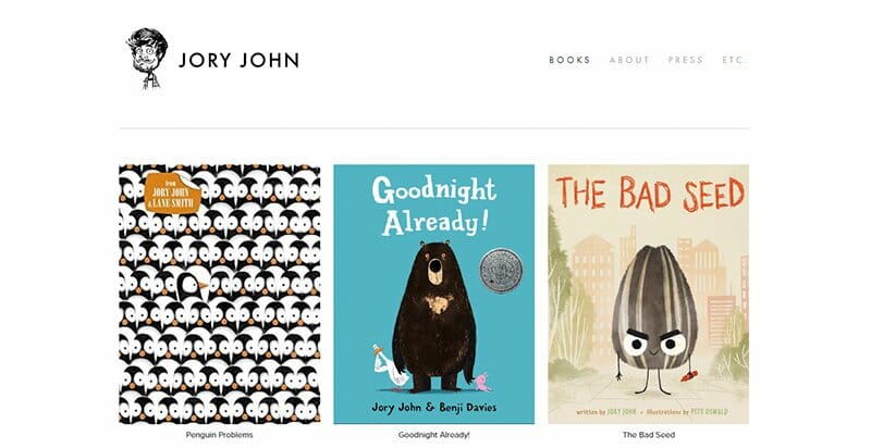
Jory John is a man that is not new to fame, with countless nominations and awards for his brilliant books and unique writing abilities. He lets his website take a central approach in its design with a three-column layout of his books displayed next to each other.
This simplistic website displays only a Twitter icon embedded with a link that directs visitors to his Twitter handle.
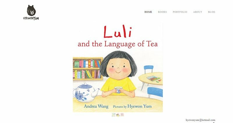
Hyewon Yum is a children’s book author and illustrator with an eye for the arts. This author’s landing page illustrates some of her best works.
Using a single-page website, Hyewon Yum displays a centralized slideshow of her three published children’s books, serving as the only imagery on her site. One takeaway from this minimalist website design is the inclusion of her literary agency with a link to their page.

Fareed Zakaria is a man of many talents, quite notable for hosting a show for CNN Worldwide and being a columnist for The Washington Post. He is also a contributing editor for The Atlantic while writing books in his leisure time.
Fareed displays slideshow images of himself with present and past world leaders, including former president Barack Obama. More inclined to TV and Press, Fareed’s website serves as an author platform to showcase his books.
Visitors can access his author page by clicking the author CTA button in the header section, distinguishable in white font.
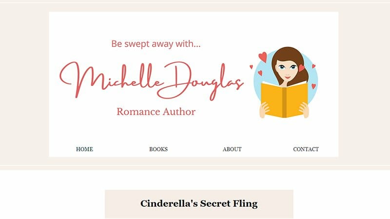
Romance author Michelle Douglas has a simple and minimalistic look, with its header section taking the attention of the homepage.
Replicated at the footer section are the same navigations displayed at the header section, including links to home, books, about, and contact pages.
Images of the author’s released and upcoming books fill Michelle’s author website. There is a subscription form granting interested readers access to her other published books.
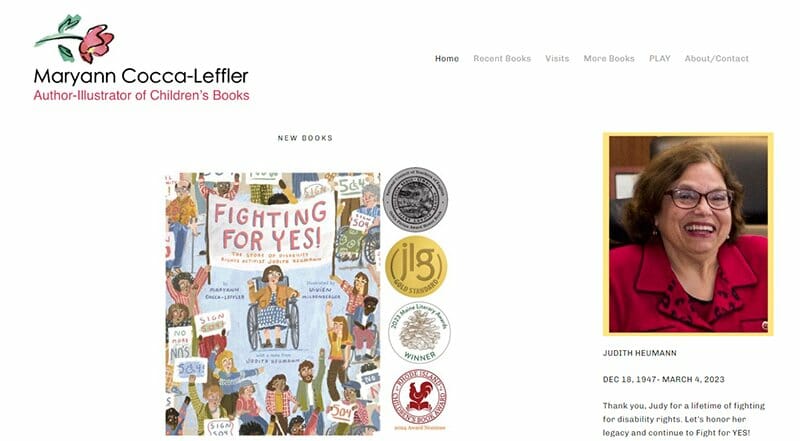
Maryann is an author and illustrator with over 60 books and counting to her credit, speaking to her writing and illustrating expertise. Not just writing without a focus, Maryann's books take up a common theme, recognizing the struggles that go on in a child’s mind.
Arranged in a single-column layout are some of her new books, the latest being a tribute to Judith Heumann. Behind plenty of white spaces, Maryann leaves a heartfelt “Thank You for Stopping By” note at the end of her web page, a plausible gesture.
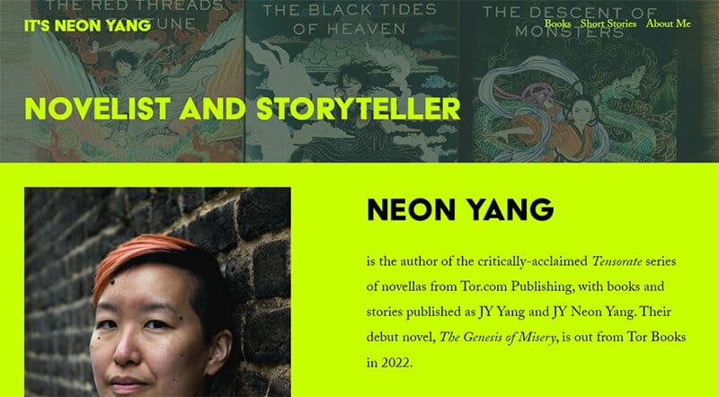
Neon Yang's website uses images of her book’s cover as its underlying background. Using bold colors to make the website pop is brilliant. The lime-lemon color displayed as text and as the select background makes this site look more artistic.
There is a list of awards nominations and praises gotten over the years to help to establish this author’s brand image.
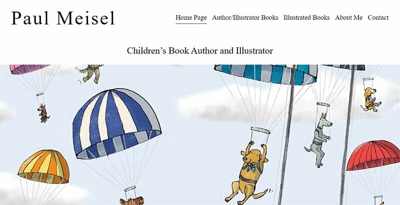
Paul Meisel is a children’s book author and illustrator and his website displays some of his best animated works over the years. The extensive slideshow of animated images keeps flooding the attention of visitors.
In terms of navigation, the menu header at the top of the web page serves as navigation, helping visitors access his other pages.
The message icon at the center of the footer section is his main contact feature and leads visitors directly to his mailing option. You can simply reach the author via his email and he will respond as soon as possible.
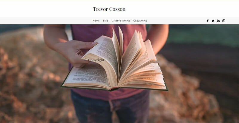
Trevor Cosson’s website design is minimalistic, notably for the excess negative spaces used to draw users’ attention to the text displayed on the site.
He uses consistent and stylish fonts that aid his visual style. The simple serif font he chooses does just enough to enhance his site’s visual style.
I like how the header section includes social media links to help him build his online presence and engage his readers and audiences.
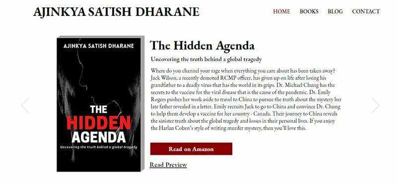
Ajinkya Dharane’s website has a daring web design that speaks about the author as a seasoned professional. The visual hierarchy displayed on Ajinkya’s author's website is unrivaled, with high-quality images that immediately arrest visitors’ attention
This author’s brand is unique in its web layout and clear red CTA button that makes his site one of the best author website examples.
Author Websites FAQs
The best website builders for authors are Squarespace and Wix. They are easy to use and offer their unique features and characteristics. Squarespace and Wix have an extensive library of beautiful author website templates you can customize to suit your unique preferences without having to hire a web designer.
Yes, most upcoming and accomplished authors have websites. The importance of an author’s website cannot be overemphasized. An author website is one of your greatest marketing tools and a cost-effective platform to build your author brand.
An author website is an online tool authors use to build their online presence and interact with their target audience. Some of the benefits of an author website include assisting in selling your works, showing off comments and testimonials, and helping with your overall branding.
Whether a self-published or franchise author, having a website is essential. A website helps improve your credibility and helps build your online presence, making you accessible to readers and fans. Get a website today and improve your online footprint.
There are many author websites for you to derive inspiration from. Stephen King’s website is a great author’s website example if you are looking for a simple but attractive web design. Are you into comics and graphic novels? Check out Mark Waid author's website.