59 Powerful Examples of Responsive Web Design
Are you thinking of creating the best browsing experience on your website for desktop and mobile users to keep them returning for more content? Redesign your website to fit the responsive needs of your target audience and keep them glued to any available screen size.
Creating the ideal responsive website that will stand out from other mobile-friendly websites is essential. You can hire skilled web designers or opt for a website builder.
Hiring a web designer may be expensive. A better alternative is to use the best website builders like Squarespace and Wix. These tools use fluid grids, CSS media queries, and optimized images to help you create a stunning responsive website.
This article discusses the 59 best and most well-designed responsive websites that fit perfectly with large and smaller screens.
Let’s get started.
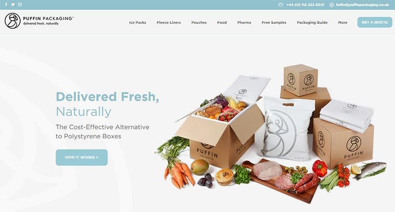
Puffin Packaging has a warm and soft color scheme featuring attention-grabbing colors like different shades of blue that give the desktop version a homely feel.
The sticky navigation bar with a drop feature is your one-stop shop for exploring various aspects of the webpage.
You can click the blue colored “Get A Quote” CTA button to get a breakdown of the prices of relevant items. The white background makes every relevant element on this webpage visually appealing on different devices.
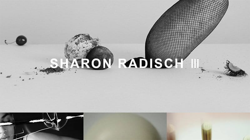
Sharon Radisch is a New York and Paris-based photographer, creative director, and skilled artist. This beauty-based fully responsive website design has a minimalist layout with eye-catching images which are on every part of the homepage.
Each of these images has a thumbnail effect which grants interested visitors access to explore its contents by clicking on them.
I like the retro black and white theme which gives the website a unique and sophisticated vibe and a compelling perspective to make necessary decisions.
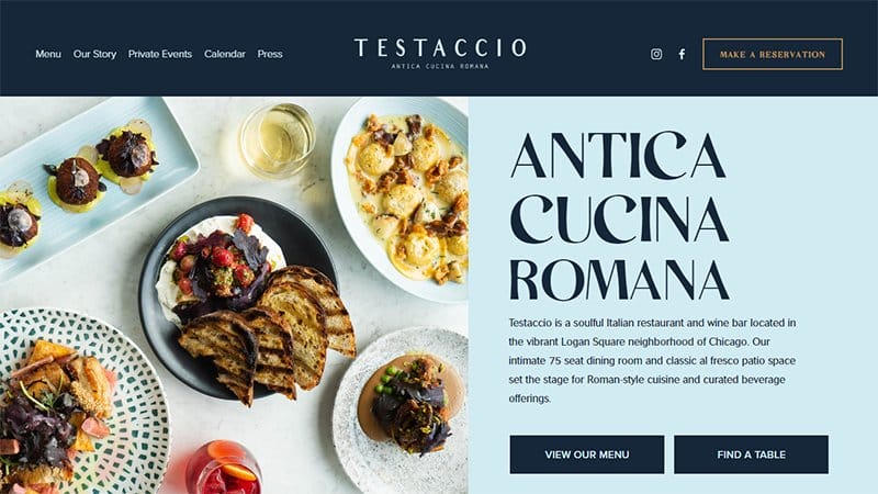
Testaccio is a Chicago-based soulful Italian restaurant and wine bar that offers a 75-seat dining room and a classical fresco patio space. I like how this responsive website uses a zig-zag design layout featuring high-quality images, engaging texts, and CTA buttons.
Potential customers can click the transparent “ Make A Reservation” CTA button on the navigation to book reservations in the restaurant. The navigation bar houses two unique social media icons that link to Testaccio's online profile for further exploration.
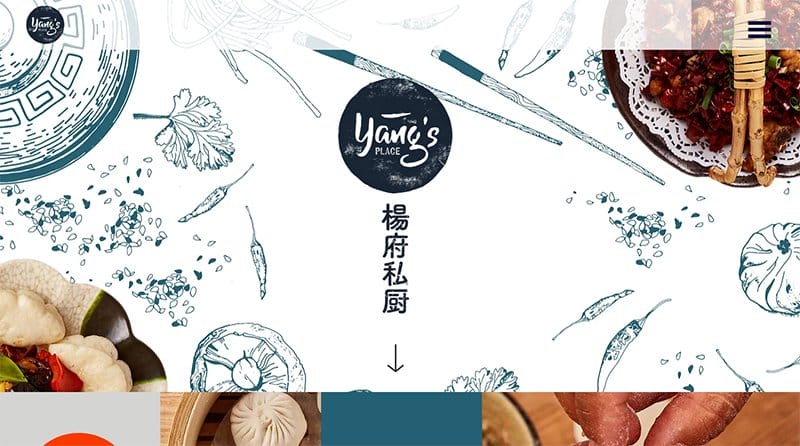
Yang’s Place is a family-owned and run business with many years of culinary Chinese cuisine experience.
I like how the hamburger menu bar has a sticky feature which makes it easy for visitors to explore various aspects of the page without stress. The parallax scrolling effect gives this website’s layout an elegant outlook on any mobile device.
This webpage uses multiple grid layouts and a CTA button in the center of the web page to aid exploration and a fun user experience.
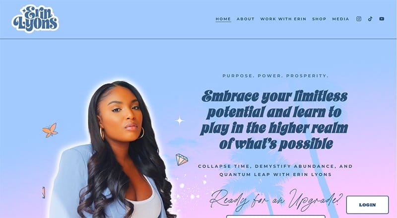
Erin Lyons is a famous International spiritual ascension teacher, priestess activator, & star-seed awakener who makes her services and online course available to interested clients.
This mobile-friendly responsive website has a soft and feminine theme, with flashy colors and eye-catching graphics designs. The motion graphic features and colorful and stylish fonts give this website a stunning and sophisticated outlook.
Fans and interested visitors can listen to her podcast by clicking on the play icon in the live streaming section of the webpage.
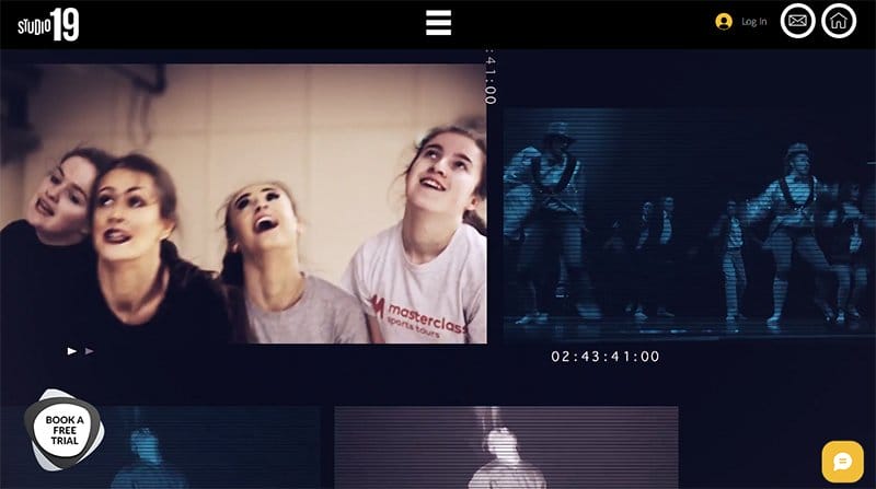
Studio19’s website welcomes visitors with multiple embedded videos of dance sessions to give them a sneak peek into its activities.
I like how this responsive website features a combination of black and white backgrounds to give the web pages a unique and sophisticated outlook.
Smartphone users can use the black-colored stick navigation bar with a hamburger feature to explore various aspects of the page.
Interested visitors can use the brown-colored sticky live chat feature to contact the officials of this dance studio for inquiries.
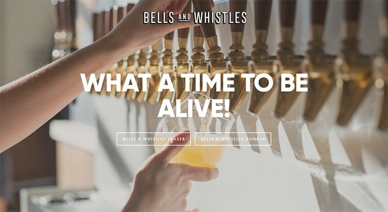
Bells and Whistles is a Daily Hive-based restaurant that offers Juicy Cheeseburgers, Perfect Onion Rings, Fried chicken, and Tasty Ice Cream.
This responsive website has a unique and minimalist design layout featuring a stunning full-width image of a lady pouring drinks and two transparent CTA buttons. These CTA buttons have a hover effect and upon click transport visitors to another page.
Explorers can click on the brand blog at the top of the page to travel to the homepage when they want to visit the second page.
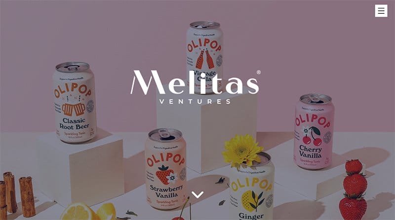
Melitas Ventures offers top-notch beverages and has worked with top organizations like Google, PepsiCo, TULA, and Unliver. The first catchy element on the web page of this mobile site is stunning images featuring different product brands in a catchy and engaging fashion.
You can use the hamburger navigation bar at the top of the webpage to explore various aspects of the site and enable visitors to make shopping-related decisions. Clicking the drop-down button is the fastest way to check out other aspects of the webpage without stress.
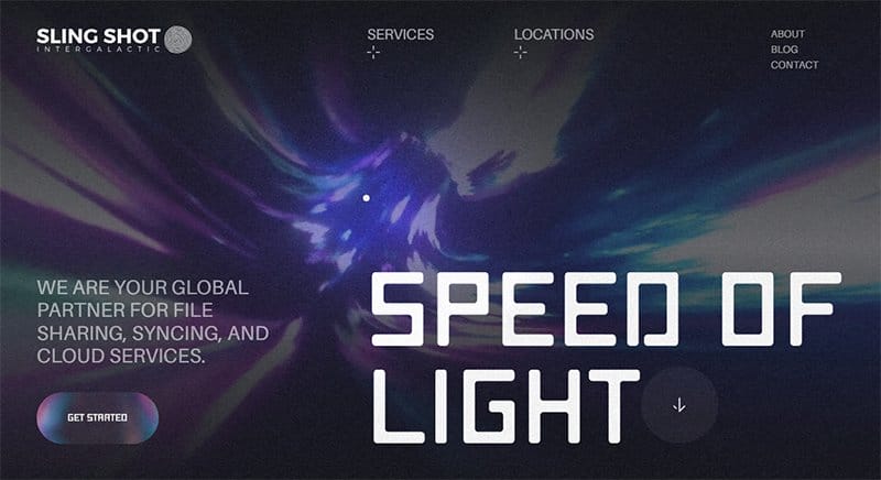
Sling Shot Intergalactic offers technology-related services like file sharing, system syncing, and cloud services.
I like how this state-of-the-art responsive website features multiple visually appealing elements like looping videos, graphics design, and stylish text fonts. The hamburger navigation bar is your one-stop shop to explore the site content without breaking a sweat.
I love how the track pack has a light bulb feature that causes it to glow as users scroll across the webpage.
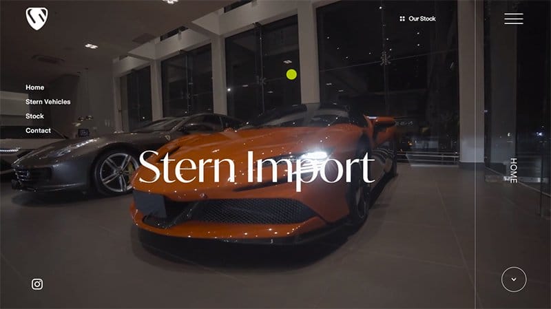
Stern Import's website features multiple stunning images of luxury cars that will pique the interest of their target audience.
The first catchy element is an intriguing background video in the hero section displaying content about the company’s operation and its latest products.
I like how the web page uses a two-column layout to display their top products with the price tags at the base of each column appealingly. You can use the hamburger navigation bar to check out every nook and cranny of this responsive website.
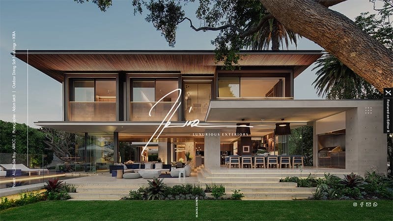
Ikira has a mobile-friendly website that offers a top-notch experience on regular and larger screens.
I love how the hero section displays a full-width image of a well-built apartment featuring all the necessary details that make the house spectacular. The parallax scrolling effect makes the website outstanding and gives it a fun and engaging vibe that is enjoyable to explore.
I like the vertical novation bar feature on the left side of the page is your one-way ticket to exploring every relevant content of this website.
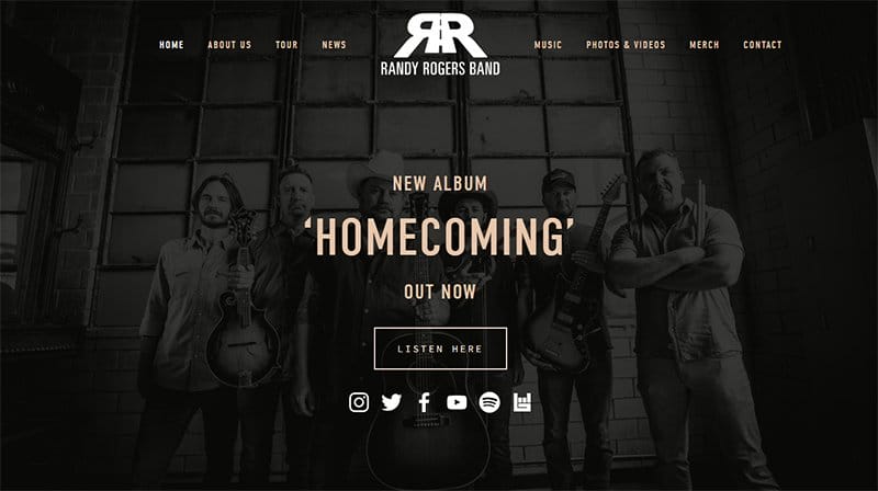
Randy Rogers's band is a unique brotherhood fueled by a shared passion for making great music and a strong commitment to each other.
The first eye-catching element on the blog is a full-width display of the band's image in a black color scheme. There is a link to listen to their new album ‘Homecoming’.
Below the hero section is a dark background with a social media icon that compels visitors to follow for News and Updates. As you explore the rest of the website, you will see beautiful images of the band performing live on stage.
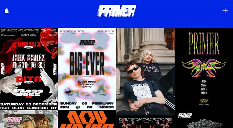
Primer features multiple high-quality images, illustrations, and motion graphics displayed in a fluid grid layout. The motion graphic effect on most of the high-quality images gives an elegant look and makes the website fun to explore.
I love how the black background makes every detail on this responsive web page visually appealing and engaging as users explore the website.
My favorite aspect of this webpage is the automated blue-colored navigation bar featuring the brand logo changing into different stylish fonts.
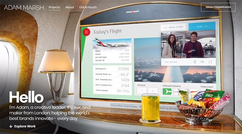
Adam Marsh is a successful creative leader, thinker, and maker who designs human-centered solutions for global brands.
The informative video takes you on a journey on the company’s mode of operation and its driving forces in a fun and appealing fashion. Below the hero section is a catalog of top organization logos that have business with Adam Marsh.
As you scroll further, you will see other videos that give visitors and potential customers accurate information on how they can benefit from the organization’s offerings.
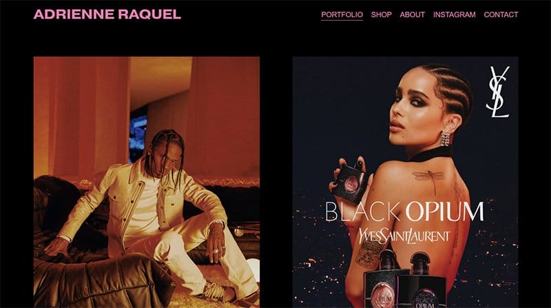
Adrienne Requel is a photographer and a creative director, her first solo exhibition ONYX, was on view at Fotografiska New York in 2021.
This stunning and responsive blog page welcomes visitors with beautiful high-resolution images in various aspects of the page. I love how her blog photos convey the uniquely hazy melding of fantasy and reality which appeals to her target audiences.
My favorite aspect of this webpage is the unique blend of the black background color and the velvety pink colored text.
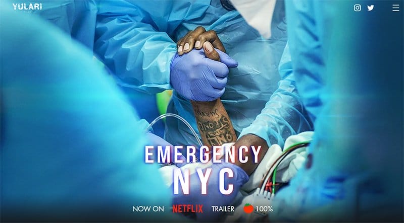
Yulari Films creates state-of-the-art movies and documentaries that help in tackling social issues. This responsive website’s homepage welcomes visitors with a full-width image of their latest project to boost their credibility and improve social proof.
The hamburger navigation bar on the mega menu is your one-stop shop to explore various aspects of the webpage without stress.
As you scroll further you will see some of Yulari Films’s best projects in a zig-zag display layout with high-quality images and CTA buttons.
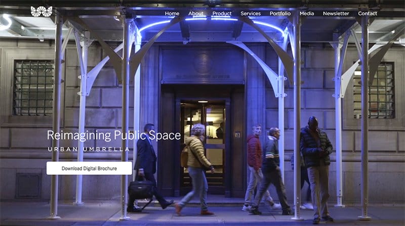
Urban Umbrella is a construction company that produces durable sidewalk shields approved for usage in New York City by the Department of Buildings.
The sticky navigation bar with the drop-down effect is your one-stop shop to explore every aspect of this mobile and desktop site. I like how the Instagram section uses multiple grid design layouts to structure its content appealingly and engagingly.
The quality of Urban Umbrella’s site topography is top-notch, making the exploration process memorable for explorers and potential customers.
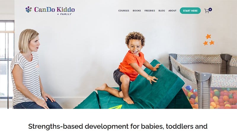
Cando Kiddo is the brainchild of Rachel, a pediatric occupational therapist. She focuses on helping parents under parenting pressure learn, play, and grow alongside their kids.
On the homepage is a colorful image of her playing and having the time of her life with a toddler. This image is an avital welcoming element which gives the homepage a warm and friendly feel.
A soft and calming color scheme is visible in all the sections of the blog accompanied by mum and kids images and short stylish text.
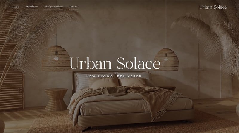
Urban Solace is a growing Brisbane-based real estate development company, offering numerous successful residential project outcomes across South East Queensland.
I love the combination of multiple high-quality images and a parallax scrolling effect which gives the webpage a unique and sophisticated outlook. Each of these images has a thumbnail effect which grants interested visitors access to explore its contents by clicking on them.
The black-colored site footer contains vital information like contact details, toll-free numbers, email addresses, and an “Enquire Now” CTA button.
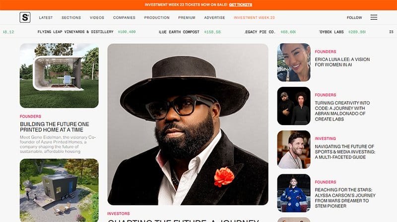
StartupStarter features various ads and content about trending startup companies that are making waves in the market.
This responsive website design has a newspaper-themed layout with multiple high-quality images, engaging texts, and relevant CTA buttons.
Online visitors can use the sticky navigation and the hamburger menu to explore the site’s content and make necessary decisions. You can use the newsletter column as a passageway to getting constant updates regarding StartupStarter’s activities and the latest news.
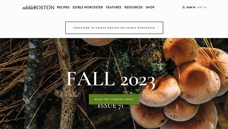
Edible Boston is one of the best food blog magazines in Boston. The brand is devoted exclusively to local and sustainable food and the people who make it.
Welcoming visitors is a full-length image of mushrooms with a width-lent bold text. On the navigation bar above the hero section is an extensive display of a black-and-white scheme CTA button that links to the subscription page.
This food blog features a white background with different headers, an elegant image layout, and attention-grabbing content for visitors.
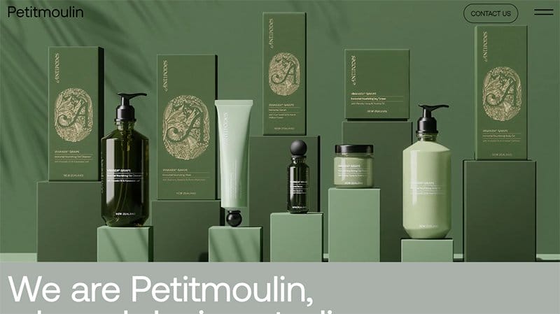
Pentitmoulin is an outstanding French contemporary design studio dedicated to meaningful and forward-thinking brands.
I like how the images in the product section have a switching and thumbnail effect that makes it appealing and engaging to potential customers. Each of these sections has a CTA button that serves as a portal to other parts of the website leading to further exploration.
My favorite aspect is a catalog of top organization’s logos at the center of the page that helps boost credibility.
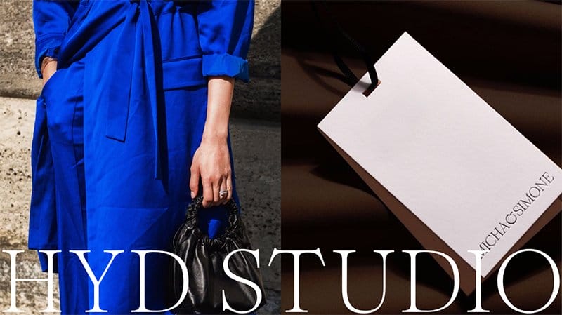
HYD Studio is a beauty and fashion brand that is making waves and they have a customer base in various parts of the world.
I love how this responsive web page design features multiple grid layouts with high-quality images and a thumbnail feature for in-depth exploration. You can explore the blog section above the site footer by clicking any of the images you want to read.
The white background makes all the colorful and catchy elements on this website appealing to potential customers.
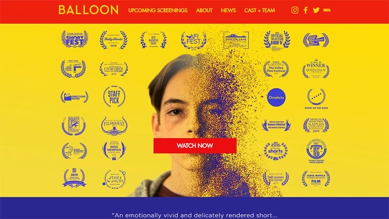
BALLOON’s website’s hero section features a modified image of a young man with multiple awards and a red-colored “Watch Now” CTA button.
Below the hero section is an embedded background video that sheds light on the organization's mode of operation and how it can better serve its clients.
Interested visitors can access details about the upcoming events by clicking the red-colored “Details” CTA button. The parallax scrolling effect makes all the fancy page elements come together in unity which makes the website visually appealing and engaging.
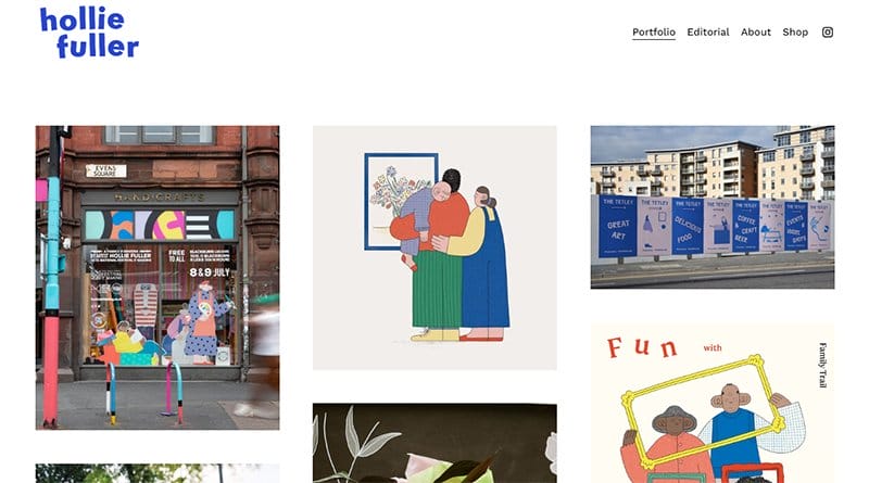
Hollie Fuller is a UK-based freelance illustrator and maker from Lincolnshire. Her wild imagination plays a vital role in exceptional artworks.
The first thing you will notice on this webpage is a unique set of eye-catching illustrations in a multiple-column layout which makes them appealing to visitors. Each of these images comes with a thumbnail effect which upon clicking links to the portfolio section for further exploration.
The peach-colored site footer houses a vertically shaped navigation bar which helps visitors explore various aspects of the webpage before making any decision.
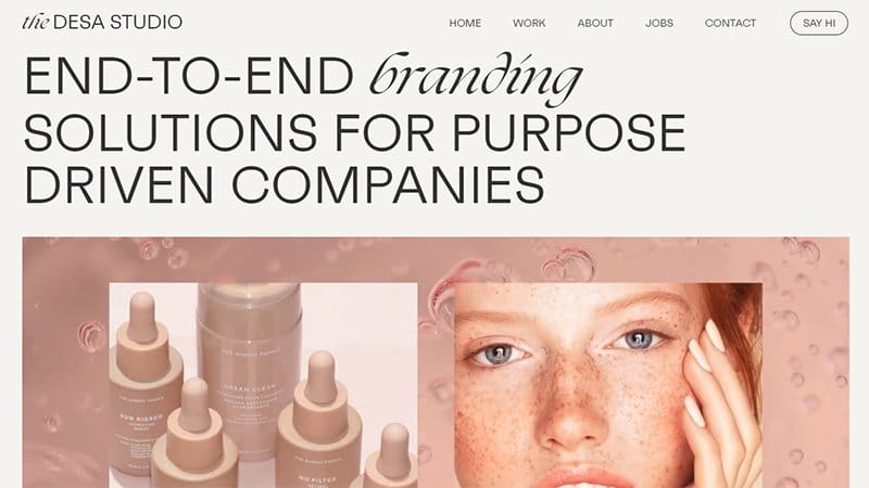
Desa Studio offers brand-related solutions like brand strategy and visual identity to social media management and creative video production. This stunning website design welcomes you with an intriguing video in its hero section that displays vital content about the brand’s products.
Below the hero section is a three-column layout of high-quality images with a thumbnail effect that allows visitors to explore the product content.
The About section features vital content about the brand’s history, products, and mode of operation which helps to bring visitors closer.
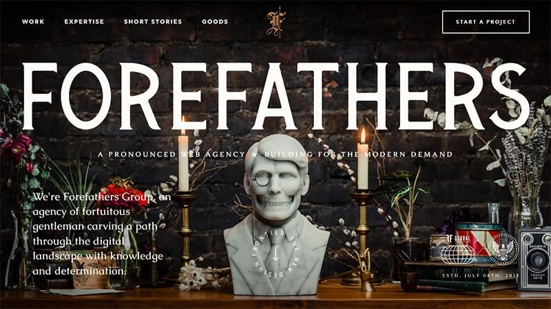
Forefathers Group web page is a unique responsive website design with multiple mind-blowing and interactive elements to boost positive and consistent user experience.
This stunning website design features numerous responsive images and eye-catching motion graphics which are visually appealing with a mobile layout and desktop versions.
I like how the high-quality images on the web page have a professional outlook on the desktop and mobile versions of the site. The use of stylish and engaging texts makes the visitors of this mobile-friendly website glued to their mobile screens during exploration.
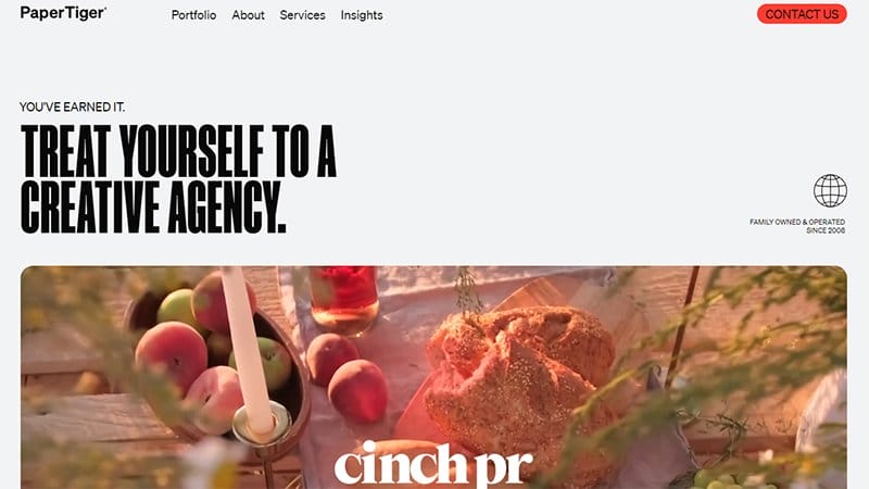
Paper Tiger is a New Jersey-based design agency displaying multiple columns and fluid grids to give the layout a stunning and attractive outlook.
The client’s logo display section gives this fully responsive website a professional vibe and helps to boost credibility among potential clients.
Interested visitors can use the mega navigation bar at the top of the page to execute multiple activities resulting in a seamless user experience.
The black-colored site footer features multiple elements like social media icons and a contact button that mobile users can seamlessly access.
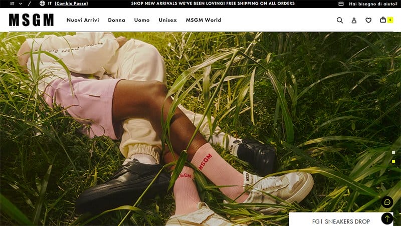
MSGM website features eye-catching and adaptable typography with optimal use of line spacing that appeals to users of desktop computers and mobile phones.
The first catchy element of this website’s responsive design is a slide show featuring different high-quality images in the hero section. Visitors can have a seamless experience while navigating this page due to the presence of a drop-down menu bar with a sticky effect.
I like how the white background makes all the elements on the web page appealing on the site's desktop and tablet versions.
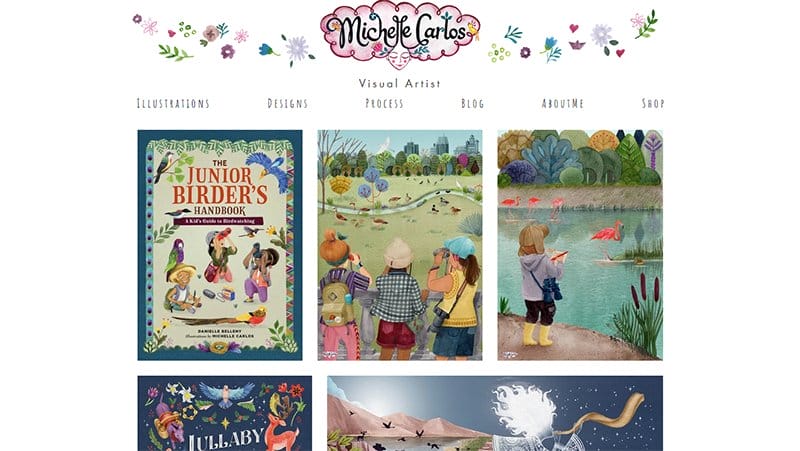
Michelle Carlos is a skilled designer, illustrator, and artist who has been in the business for more than two decades.
This multiple-page website features various engaging and attention-grabbing elements that will make visitors and potential customers glued to their web devices. I like the use of stylish fonts and colorful images in various aspects of the page to give it a friendly and warm feel.
Interested visitors can use the white-colored navigation bar with vital links to explore various aspects of the website without stress and make necessary decisions.
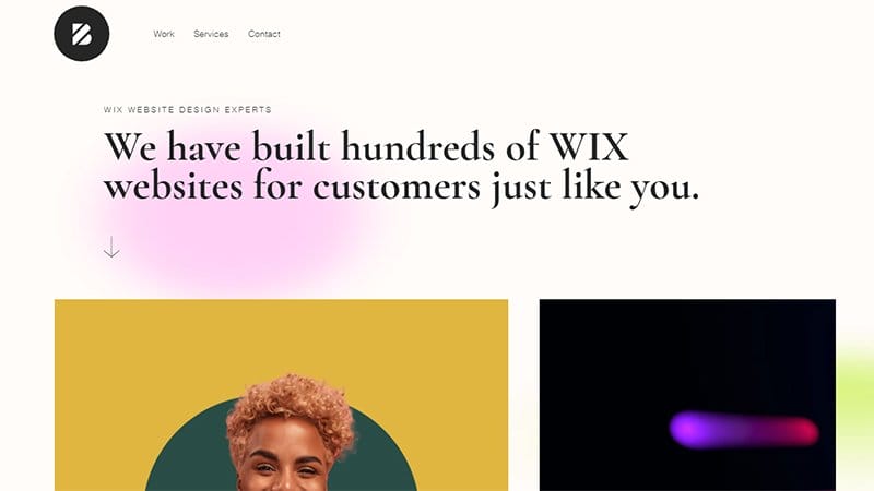
Brown Owl Creative builds high-quality and custom Wix websites, for clients in various parts of the world. You can use the transparent navigation bar with a sticky feature to make exploration decisions on the website which makes your discoveries hassle-free.
As you explore the site content further, you will discover various high-quality, full-width images with thumbnail effects at various aspects of the page.
Online visitors can click the transparent “Get In Touch” CTA button with a hover effect to reach Brown Owl Creative’s customer service.
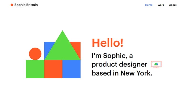
Sophie Brittain is a New York product designer with a passion for creating seamless and delightful user experiences. This three-page website features multiple engaging and eye-catching elements like a mockup of a desktop website and handheld devices.
The white background makes all the relevant elements on the web page visually appealing and convincing to prospective clients.
I like how the site footer features links to Sophie Brittain’s social media profiles and resume page which visitors can explore for further information and collaboration.
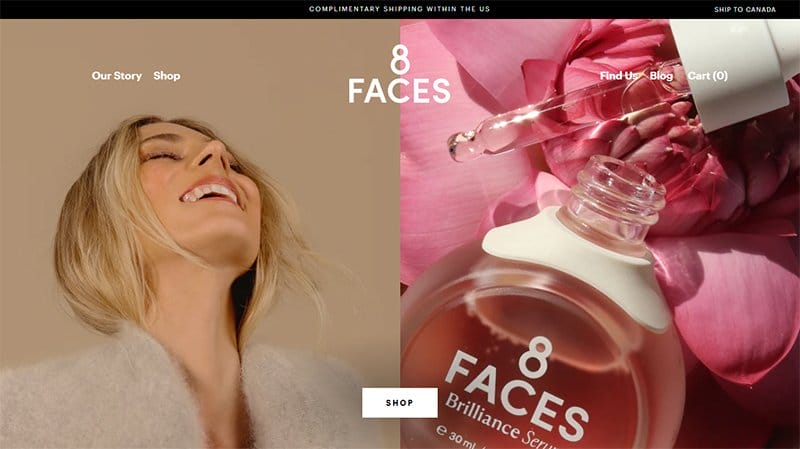
8 Faces Beauty is a skin and beauty-based brand that offers solutions in the form of multi-purpose products. This page has various catchy elements like flexible images that make the site unique from other responsive web design examples.
Interested visitors can click the white-colored “Shop” CTA button at the center of the hero section to explore the eCommerce store section.
My favorite aspect of this unique mobile website is the flexible grid feature that makes the high-quality images visually appealing and compelling to potential customers.
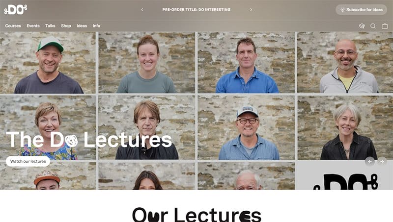
The Do Lectures website has expressive, engaging, and fluid layouts featuring high-quality images, videos, and engaging texts.
I love how this responsive web page uses flexible grids to display high-quality images of the organization's lectures in a warm and friendly fashion. This element has a slideshow feature that allows visitors to explore the content by clicking the navigation buttons.
You can locate the lecturer-related content in a video format by clicking the white-colored “What Our Lectures” CTA button at the left corner of the page.
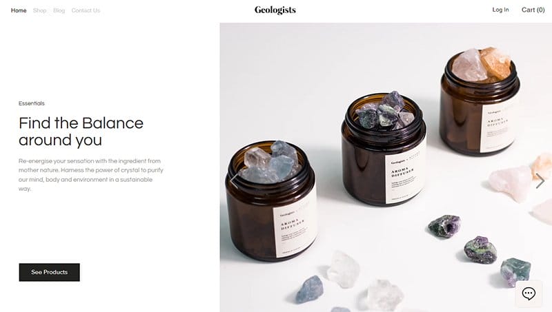
Geologists web page doubles as an eCommerce website where interested visitors can purchase various products and explore the blog section for vital information.
The first catchy element on the Geologists website is an automated slideshow of various high-quality germs and stones moving appealingly. You can click the cart icon on the white-colored sticky navigation bar to purchase various items of choice.
This responsive website features a search bar that helps visitors locate items seamlessly and make necessary decisions.
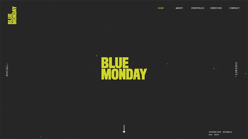
Blue Monday is an outstanding design studio, founded in 2014, in the heart of Birmingham. They offer services such as event coverage, photography, and creative consultation.
I like this responsive web design features multiple engaging and visually appealing content to get online visitors glued to their cell phones and other devices. The black background feature is the icing on the cake that makes all other elements catchy and worth exploring.
You will find a catalog of top organization’s logos at the center of the page which is a unique social proof and helps to boost credibility.
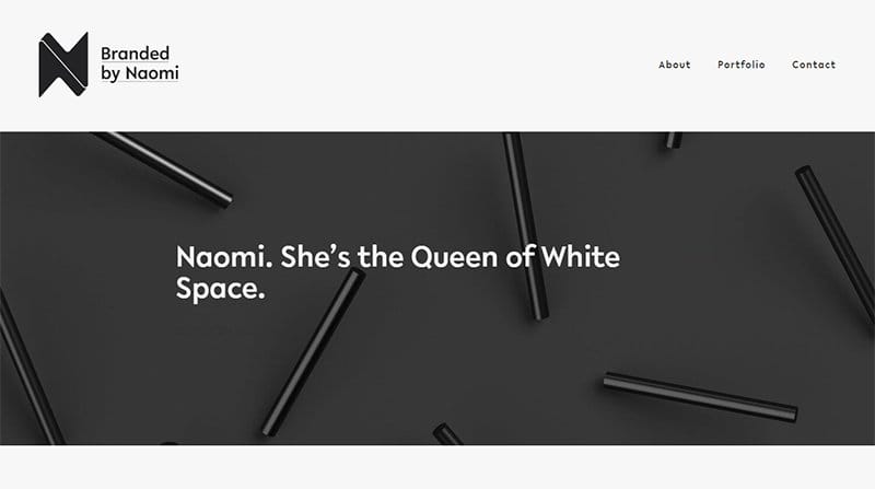
Naomi White uses design and brand strategy to create positive, progressive social change. The first catchy element on this web page that makes it stand out from other responsive websites is the motion graphic effect on the hero section.
I like how the biographic section features multiple engaging and warm texts that help to bring visitors closer to Naomi.
As you explore the rich media files on this webpage, the responsive typography and the parallax scrolling effect make it fun and seamless.
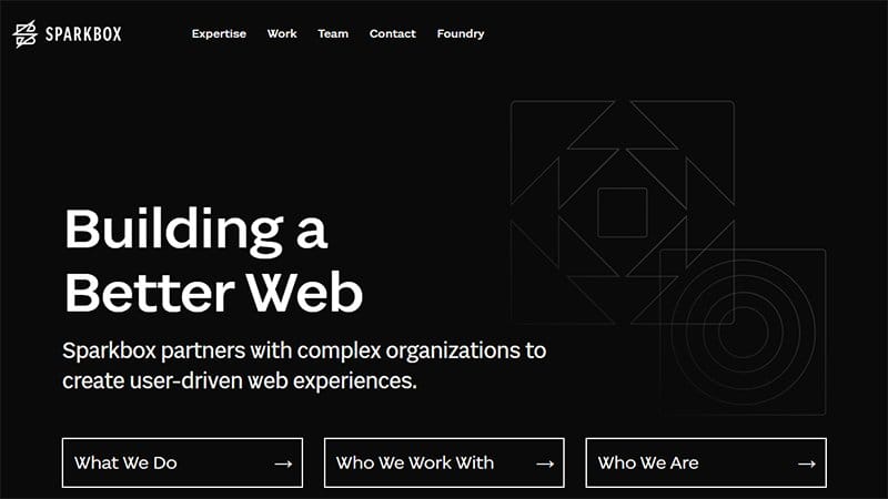
Sparkbox has a minimalist design layout with mind-blowing design elements that appear stunning on all screen sizes. The three CTA buttons with a hover effect on the base of the page link to the three unique pages that feature vital content about Sparkbox.
I like how the page features a single-column layout with a fluid grid feature, high-resolution graphic images, and CTA buttons in the blog section.
The white-colored site footer houses a subscription column that appears in a catchy fashion on multiple screen sizes.
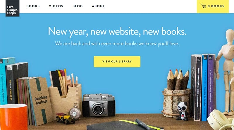
Five Simple Steps is a book-based and educational online store where visitors can buy, borrow, and read books on any mobile screen without stress.
Interested visitors can use the mega navigation bar at the top of the page to explore various aspects of the website. You can click the yellow colored “View Our Library” CTA button with a hover effect to explore various aspects of the online bookshelf.
The black-colored site footer features vital elements like social media icons, a newsletter form, and an email address that appears excellently on multiple devices' screen sizes.
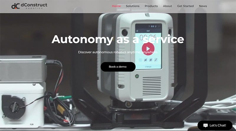
dConstruct organizes conferences and workshops that focus on technology and making robots smarter. The first catchy element on this webpage is an informative video in the hero section that displays content about the organization.
Interested visitors exploring this responsive site can click the “Book A Demo” CTA button with a hover effect to get started.
I like how the partners’ section features a slider effect that makes exploring the various logos fun and engaging on mobile websites and desktop screens.
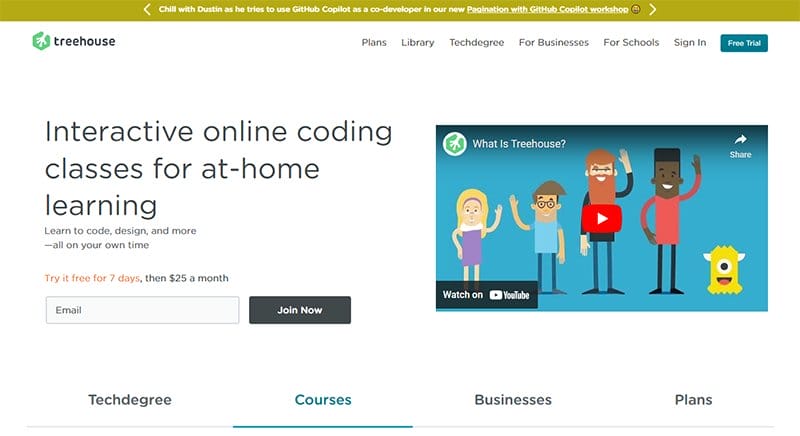
Treehouse is an education-based organization that offers Interactive online coding classes for at-home learning. The first catchy element you will see on arrival is an embedded YouTube video that brings visitors up to speed regarding what Treehouse entails.
Interested visitors can input their email address in the free trial color and click the black colored “Join Now” CTA button to get started.
I love how the testimonial section features heartwarming customer reviews and the client picture to authenticate the review.
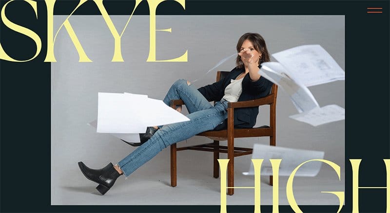
Skye High Interactive helps skilled entrepreneurs create mind-blowing and unforgettable brands and websites to give their businesses a head start in the global market.
I like the looping video in the hero section that features a lady throwing sheets of paper and the brand’s name on display.
My favorite aspect of this unique responsive website design is the smooth combination of high-quality images and engaging text to foster a blissful customer experience. Navigation of the webpage is seamless via the hamburger navigation bar with a sticky effect.
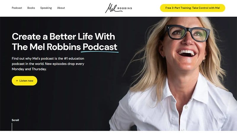
Mel Robbins uses her podcast as a medium to share proven tools that empower her listeners to create a better life and remain afloat amidst troubles.
The first catchy element on this webpage is a stunning picture of Mel Robbins smiling in the hero section of the website. Interested visitors can click the yellow-colored “ Listen Now” CTA button on the right side of the page to have a taste of her intriguing podcast.
The sticky navigation bar with a drop-down feature makes exploration seamless and worthwhile for fans and potential clients.
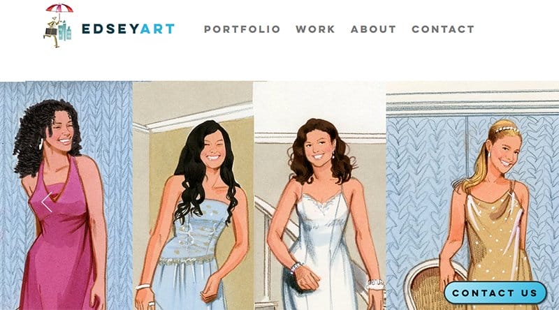
EdseyArt is a creative art and video production studio that uses artwork and expert storytelling to express their client's ideas.
I love the automated slideshow of mindblowing free-hand drawings and illustrations in the hero section of the page which gives visitors a memorable welcome.
Interested visitors can click the sky blue colored “Contact Us” CTA button with a sticky effect to seamlessly access the contact page.
As you explore the site’s content, you will see various high-quality animated images with a thumbnail effect that serves as a portal to the product page.
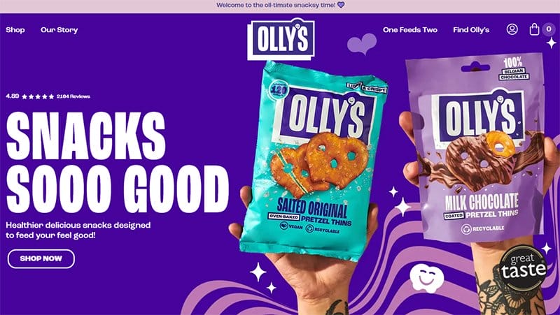
Olly’s Snacks website has a colorful and engaging design layout with its dominant colors being peach, purple, blue, and pink.
This responsive website doubles as an eCommerce store that allows visitors to purchase their products by clicking the shop link on the menu bar. I love how the webpage has a splash of high-quality images, motion graphics, colorful CTA buttons, and engaging texts.
Below the hero section are logos of top brands that are in business with Olly’s Snacks. This feature helps to boost social proof and further authenticates the brand's credibility.
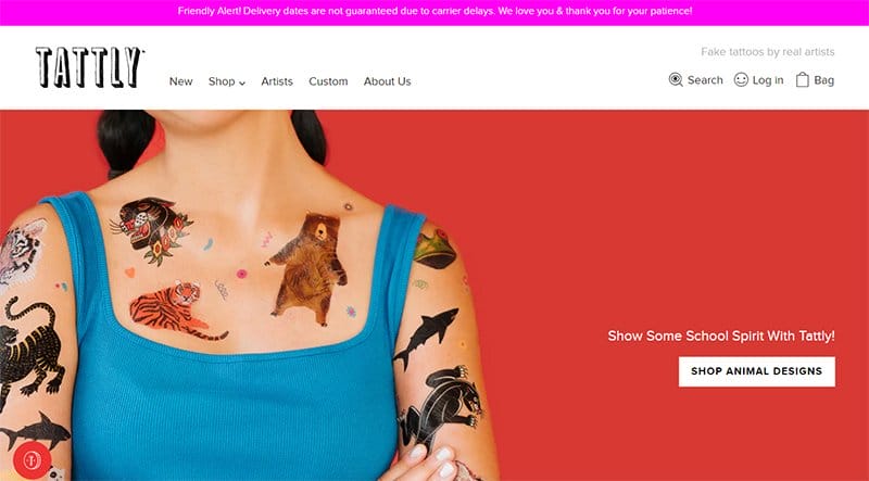
Tina Roth Eisenberg created Tattly in 2011, a company dedicated to the production of quality temporary tattoos for adults and children.
The first catchy element on the desktop or mobile version of this responsive website is a stunning image of a lady covered in temporary animal tattoos.
You can use the white-colored sticky navigation bar to explore various aspects of the page before making any purchase-related decisions.
The search icon makes it easy for prospective customers to locate specific items or information on the website via any mobile phone without stress.
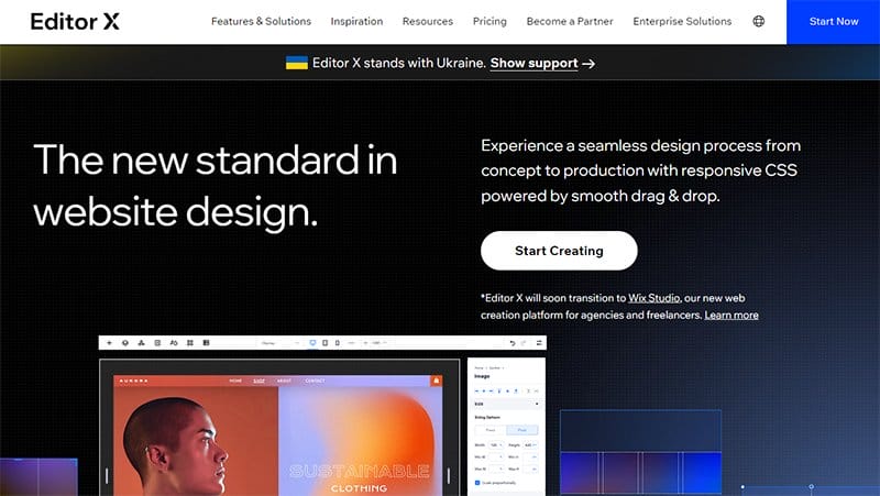
Editor X is a unique web creation platform that focuses exclusively on helping designers and agencies achieve their goals. This responsive website has a colorful outlook with different shades of colors in plain and gradient colors to give the homepage a fun and lively vibe.
The parallax scrolling effect gives the website a sophisticated and professional outlook designed to attract potential customers.
I love how the white-colored site footer houses various vital contents like links to other pages, social media icons, and a vertical-shaped social media icon.
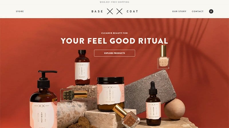
Base Coat Nail Salon was founded by Tran Wills in 2013, the first non-toxic nail salon in Denver. You can click the transparent “Explore Product” CTA button at the center of the hero section to access the shop page before making a purchase decision.
Prospective customers can use the sticky navigation with a drop-down effect to explore various aspects of the webpage seamlessly. Explorers can check out the FAQ section to get insight into the activities of the company and understand their mode of operation.
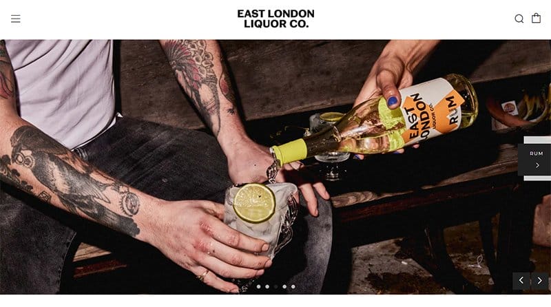
East London Liquor Company brews one of the best liquor in East London which is popular in various parts of the world.
I like the welcoming feel the slider displaying various alcoholic drinks on the homepage gives to potential customers. Potential customers can use the search bar to locate specific items or information on this responsive website before making a purchase.
I love how the testimonial section features a slider that helps potential customers explore the various heartwarming customer reviews.
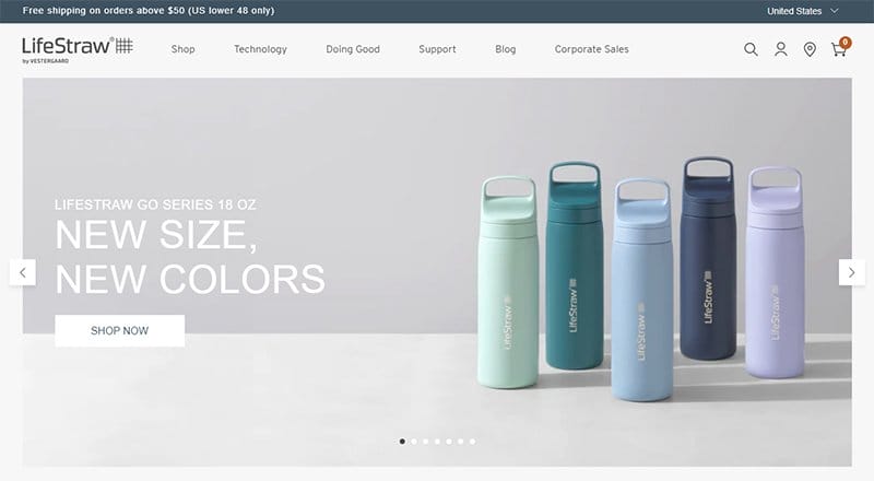
LifeStraw designs beautiful, simple, and functional products that provide the highest protection from unsafe water.
The first catchy element on the webpage is an informative slideshow that displays various high-quality images of water bottles and engaging texts.
This responsive website has a soft color scheme which is an off-shoot of the water bottles theme color in the hero section of the page. Interested visitors can submit their details in the newsletter column to get constant updates and news from the company.
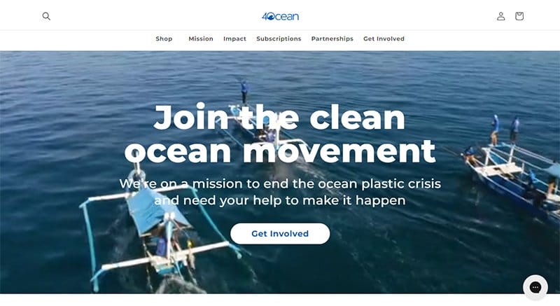
4ocean is an initiative founded by two surfers on a mission to end the ocean plastic crisis in various parts of the world. I love how the white background makes all the relevant elements on the page pop and visible to online visitors and prospective clients.
Interested visitors can click the white-colored “Get Involved” CTA button to join the initiative. The gray-colored sticky live chat feature on the right side of the page is available for interested visitors to contact the officials for inquiries or collaboration.
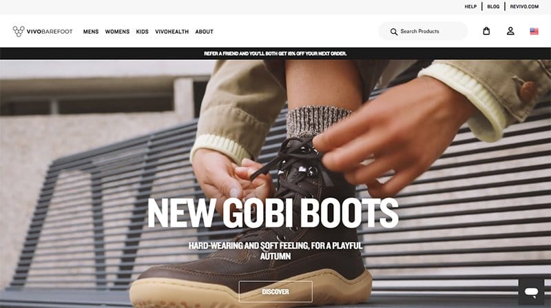
Galahad and Asher Clark are the founders of Vivobarefoot, a footwear brand based on helping people connect to nature.
As you explore further, you will love the various heartwarming content in the blog section which features fashion and fitness-related content.
The course section features an attention-grabbing background video that offers potential customers a sneak peek into its content. I love how the search bar at the top of the page makes it easy for visitors to locate vital items and products.
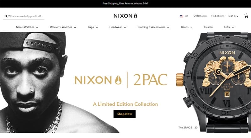
Nixon is a fashion eCommerce store that offers luxury products and accessories at an affordable price to their target audience in various countries of the world.
The hero section of this responsive website welcomes visitors with a stunning black-and-white image of the popular musician 2PAC with an image of the Nixon watch.
You can click the black-colored “Shop Now” CTA button to access the shop page and make purchase decisions. I like how the Instagram section features a catalog of contents with a slideshow element to make it engaging to potential customers and visitors.
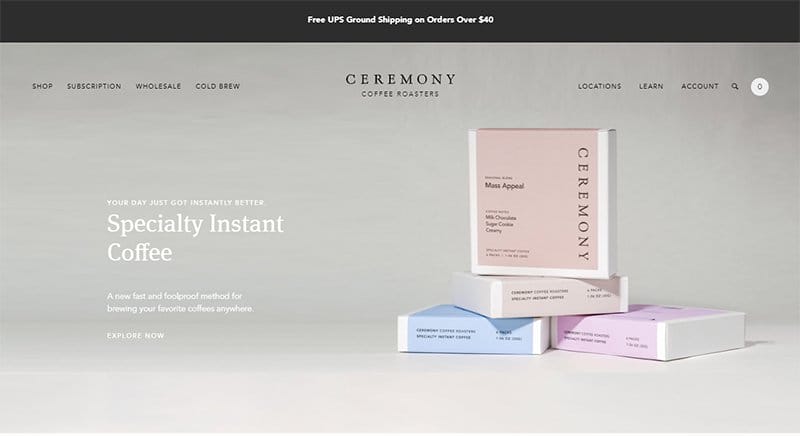
Ceremony Coffee Roasters is an instant coffee brand with an easily accessible online store and multiple physical locations.
This responsive website has a well-put-together and autistic design layout with catchy elements from top to bottom that keep visitors glued to their screens.
As you explore the site’s content you will love how each stork of movement with the trackpad has a graphic effect on the background. The search bar on the sticky navigation bar is your one-stop shop to locate various items and explore the site’s content seamlessly.
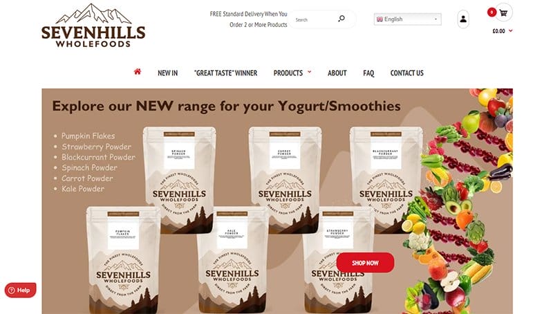
Sevenhills Wholefoods sells food-based products like ginger, maca, and pumpkin at affordable rates to wholesalers and retailers.
I like how this responsive website uses a fluid grid layout with a slider to display Sevenhills Wholefoods’ best sellers to complete visitors' purchases. Clicking on the images on the home page will transport you to the shop section where you can make your purchases.
What's handy about this online store is how smooth the topography is with the element in the right section of the page.
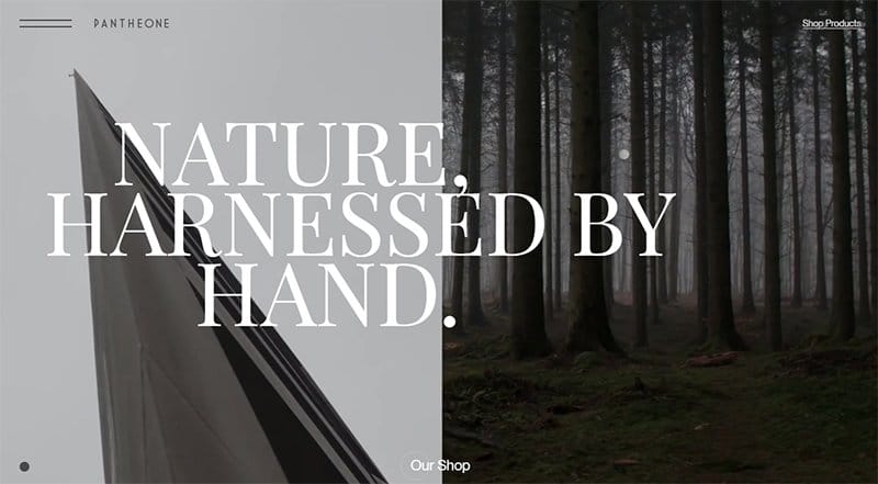
Pantheone Audio is a fusion of audio speakers designed for those who appreciate flawless function and have a passion for minimalistic aesthetics.
Welcoming visitors to the page is a background video with beautiful nature-themed images, bold text, and other relevant elements.
At the center of the hero section is a compelling transparent ‘‘Our Shop’’ CTA button for easy purchase. I love how the white background makes every flashy and attention-gripping element on the page visually appealing to potential customers and visitors.
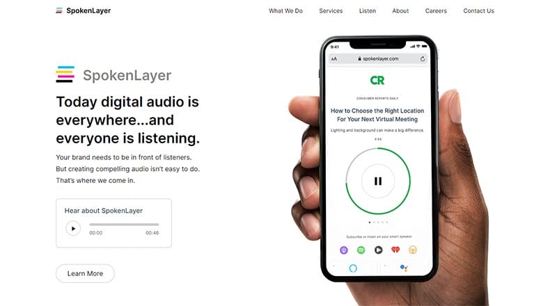
Spokenlayer offers a full-service studio that specializes in custom, short-form digital audio content. This white background website has a soft, calm design and captivating content written in black.
The unique feature on this page is the image display of audio play formats on mobile phones and tabs mockups. I like how this responsive site features multiple logos of top organizations and popular brands to help boost credibility and increase social proof.
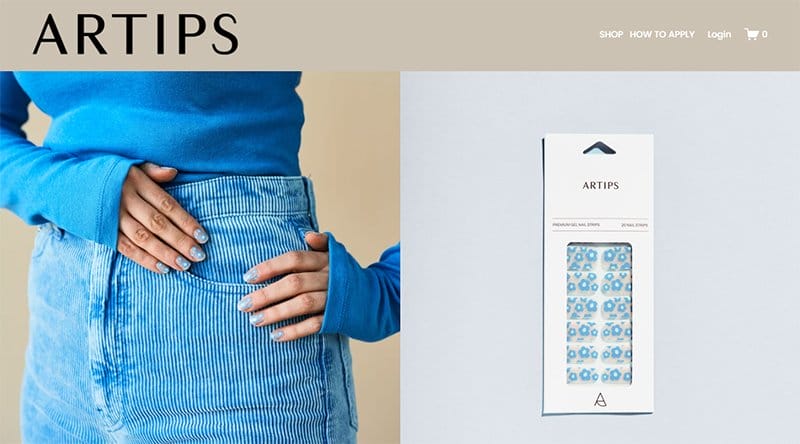
Artips blog is a premium gel nail strip for women. The blog is known for its stylish and elegant nail art they execute in ten minutes.
I like how the site features a four-column layout displaying beautifully painted fingernails with image product and stylist content on the page.
The client testimonials section offers insight for the visitor interested in purchasing by bringing to light heartwarming customer reviews. Interested visitors and prospective customers can submit their details in the newsletter column for constant updates and the latest news.
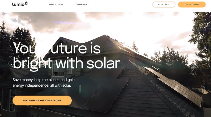
Lumio is a solar power company that helps and educates people on producing and storing their power to provide authentic sustainability.
The first catchy element on the page's hero section is an informative video featuring solar panels on the roof with a catchy yellow CTA button.
I love how appealing the color pattern of this responsive web page is, with each column having a unique color and text style. The testimonial section is below the hero section and features multiple heartwarming customer reviews to boost sales.
Best Responsive Website Examples FAQs
The most significant quality of a responsive website is its ability to adapt and deliver the best experience to users, whether they are on their desktop, laptop, tablet, or smartphone. Additionally, responsive sites respond to user's behavior and environment based on screen size, platform, and device orientation.
A responsive web design offers various advantages to owners and users of the website. For example, it makes your website engaging and mobile-friendly and improves its visuals on devices with both large and small screens. With these added features, site visitors will doubtless spend more time exploring your site content, helping boost your rankings in search engines.
Here are some vital tests you can execute to certify if your website is responsive. Check the content, alignment, and font, shrink and enlarge the window of your browser to see the outcome, check the loading speed of your page on various devices with different resolutions, or use special tools like Emulators, Responsinator, and ViewPort Resizer.
Here are some factors to consider in ensuring your website is responsive on mobile devices. Develop a responsive layout, optimize website speed, compress images, use HTML5 instead of Adobe Flash, avoid pop-ups, change button size, and placement, use a large and readable font, space out links, declutter web design, and test the website on mobile devices regularly.


