32 Beautiful Examples of Gradient Websites (2025 Design Inspiration)
Are you looking for ways to spice up your webpage to get visitors and potential customers scrolling and clicking on your CTAs? Implementing a gradient element in your web design will help you achieve your site’s goals.
With the best gradient designs, you can give visitors a fresh experience while exploring your site’s contents and make the CTA button more compelling.
Use the best website builders like Wix and Squarespace to design state-of-the-art gradient-coated websites that help keep visitors entertained.
This article reviews the 32 best gradient website examples you can use as a source of inspiration when building your own gradients.
Let's get started.
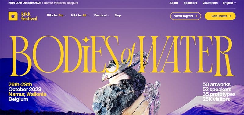
KIKK Festival is a non-profit organization founded in Namur in 2011, and committed to building bridges between the arts, sciences, culture, and technology.
Welcoming visitors to the radiant webpage is an animated feature displaying water redienting a seashell floating on a gradient-coated island.
The parallax scrolling feature gives this webpage a unique and outstanding outlook which makes its content visually appealing and engaging.
I love how this beautiful website uses attractive color trends to give it a sophisticated outlook. The dominant colors include sunglow, violent violet, black and white.
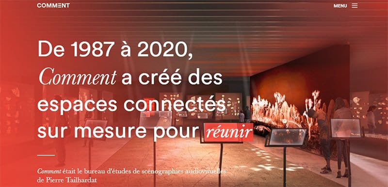
Comment is a design office specializing in engineering and audiovisual scenography. The first thing you will observe while exploring this amazing webpage is the red gradient-colored background image featuring an observatory.
I like how the web page displays a sophisticated use of stylish fonts to make the page content visually appealing and engaging.
The parallax scrolling effect makes all the site’s content sync in imperfect harmony and makes it easy for visitors to distinguish between its contents.
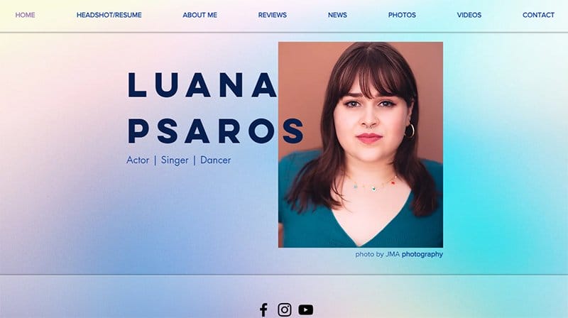
Luana Psaros is a Brazilian-Californian actor, singer, and mover based in New York City. Welcoming visitors to this minimalist portfolio website is a stunning gradient background that features colors like a Gray goose, blue haze, oyster pink, and Neptune.
At the center of the hero section is a stunning image of Luana Psaros with blog text describing her skills and expertise. Interested visitors can use the full-length navigation menu to explore various aspects of the page without holding back.
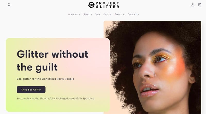
Projekt Glitter is one of the best gradient website examples you can use as inspiration to create your site. Banana yellow, lavender rose, and ripe lemon form the main color combination of this stunning and radial gradient-coated website.
You can use the search feature on the mega navigation bar to locate items before making any purchase decision. As you explore the content further, you will love the various high-quality images of the product with thumbnail features that encourage purchase.
The black-colored site footer offers visitors and potential clients multiple payments which they can use to purchase any beauty-based brand.
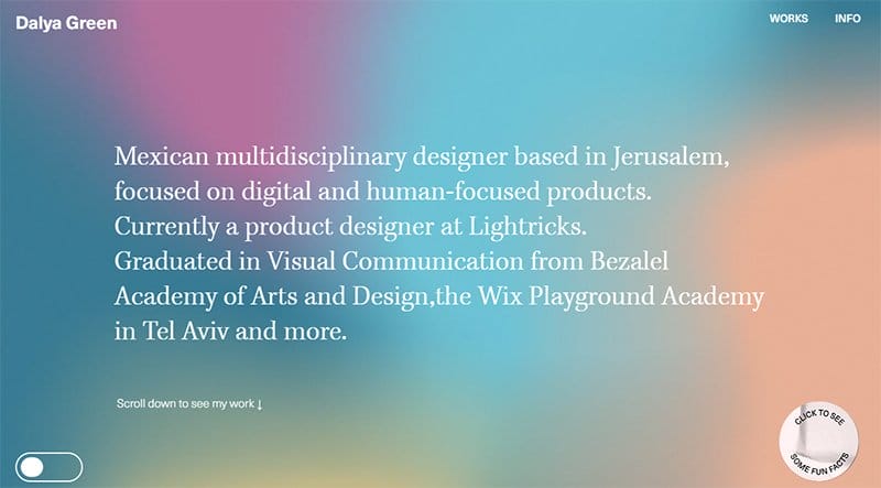
Dalya Green is a Mexican multidisciplinary designer based in Jerusalem, focused on digital and human-focused products, and is currently a product designer at Lightricks.
I love how the webpage features bright color gradients in the hero section and an engaging short biography about Dalya Green and his passion for arts. You can switch the page’s orientation via the switch widget on the left side of the hero section.
Below the hero section is a catalog of Dalya Green’s top projects and images to give you a better perspective of his ability.
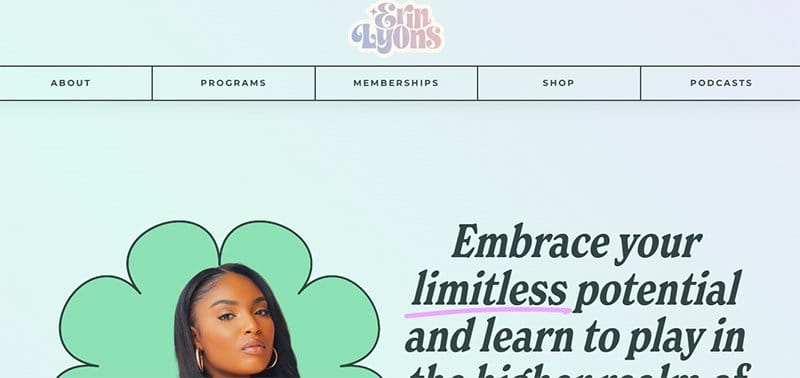
Erin Lyons is a channeler and spirit medium. Inspired by the 2020 global pandemic, Erin Lyons started using the internet to help people.
Welcoming visitors to the colorful gradient website is a stunning image of Erin Lyons with inspiring text to get visitors excited about the rest of the page.
I love how design elements like the lavender-colored gradient background, animated hero section, and transparent images create a visually appealing website layout.
The mega menu bar with a drop-down feature is your stop shop to explore various aspects of the website without any hassle.
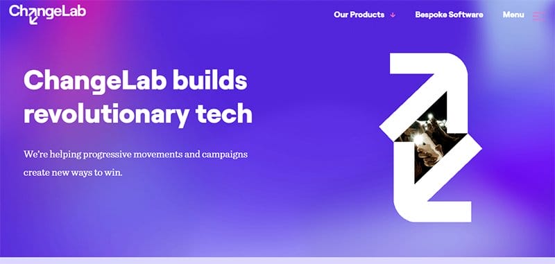
ChangeLab builds revolutionary tech that helps progressive movements and campaigns create new ways to win.
Welcoming visitors is a smooth display of lavender pink and purple-blue in gradient format to make the hero section and other sections fun to explore.
I love how the webpage features a motion graphic feature that contains logos of all the brand's past clients in an orderly fashion. The bold text feature makes it easy for visitors to seamlessly explore the site’s contents without any form of restrictions.
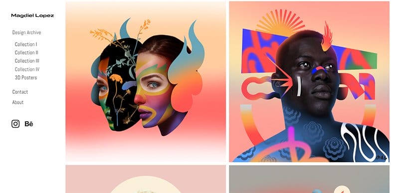
Magdiel Lopez is a graphic designer and digital artist Born in Havana Cuba.
Welcoming visitors to this unique webpage are stunning gradient-coated illustrations in multiple grid format. Each of these images features thumbnail effects which grants visitors passage to explore further content in each art exhibit.
Visitors can use the sidebar on the left side of the site to explore various parts of the webpage without any restrictions. You can click any of the social media icons to have a better perspective of his art on his online profile.
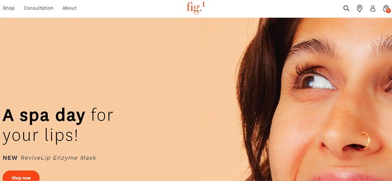
Fig.1 Beauty is a skincare brand that democratizes access to high-quality skincare infused with high-performance ingredients that are backed by science.
The first catchy element you will see on arrival is a catalog of automated sliders featuring eye-catching gradient collated graph designs.
This stunning gradient website doubles as an online store where visitors can visit the eCommerce page to purchase the brand's products.
The black-colored site footer features vital content like a newsletter column, social media icons, and navigation bars for seamless explorations.
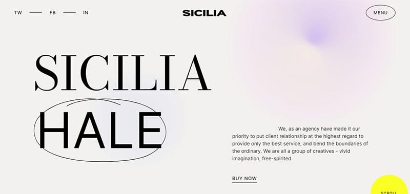
Sicilia is a fashion-based brand that features multiple engaging contents with bold and engaging texts to get visitors glued to the page.
I love how this stunning web page uses a purple-colored gradient background to make other elements in perfect harmony with the page’s concept.
As you explore the content further, you will see multiple high-quality images in a grid layout with a responsive element that makes it fun to explore. Clicking any of these images is your one-stop shop to explore its contents.
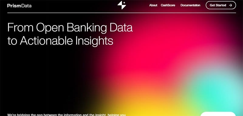
PrismData focuses on empowering businesses to serve more customers, build better products, and make smarter decisions with financial transaction data.
I love how the black background functions in perfect harmony with the light-based flashy gradient color palette to make the site’s message stand out.
The engaging and informative texts help visitors have better insight into the brand's mode of operations and functionalities.
I like how the page features multiple “Get Started” call-to-action buttons to be a part of the company's activities.
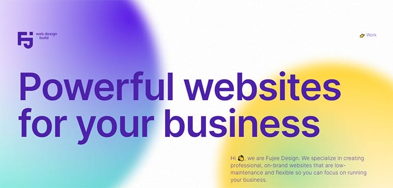
Fujee Design specializes in creating professional, on-brand websites that are low-maintenance and flexible and can help clients focus on running their businesses.
Welcoming visitors to this unique web page is an embedded gradient-coated background video featuring two balls rotating each other. The caption “Powerful Websites For Your Business” gives visitors a perspective on the brand's activities and mode of operations.
As you scroll further, you will see multiple gradient-colored elements respond when you move to various sections of the page. I love how the testimony section uses a zig-zag design layout to display heartwarming content for pleased customers.
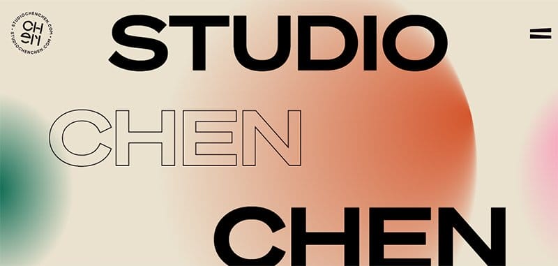
Studio Chen Chen is a design agency that charts diverse and expressive pathways in branding and design. I like how stunning images pop up as visitors scroll across the project section. clicking on any of these grants potential clients access to check out the contents of the project.
You can use the hamburger navigation bar to explore this creative agency site content for a better perspective on their competence.
My favorite aspect of this webpage is the gradual translation of a gradient background to a dark and light-themed background.
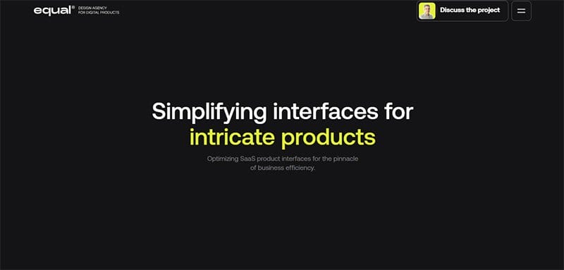
Equal Design Agency strengthens a brand’s in-house team or works on the product themselves, to launch MVPs, close individual tasks, or look for points of growth.
This inventive agency website features multiple eye-catching elements such as a motion graphic feature to display logs of past clients. The page’s dynamic scrolling feature gives this stunning gradient-coated website a sophisticated and elegant outlook.
You can use the black-colored back to the top navigation bar to access the beginning of the page without having to scroll with your trackpad.
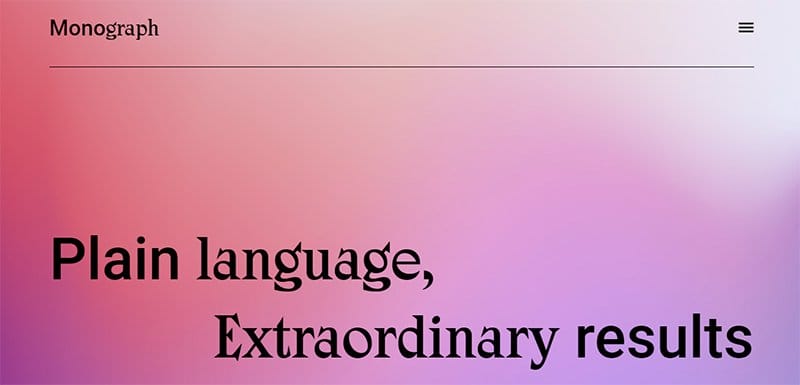
Monograph uses plain language, creative concepts, and an obsession with positive brand experiences to connect their clients with their audience.
You cannot but love the purple and peach-coated gradient background gives this stunning website a fresh and fun outlook. Interested visitors can use the newsletter column on the right side of the page to submit their details for constant details about the brand’s activities.
I love how each section features a “Learn More” Navigation bar to access other parts of the website for a better perspective on the brand’s activities.
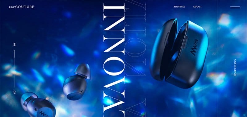
EarCOUTURE is a sound-based company that sells high-quality earphones, headphones, players, accessories, and earpieces.
Welcoming visitors to the unique web page is an automated slider featuring gradient-coated items in a visually appealing fashion that will get visitors glued to their screens.
As you explore the site’s content further, you will love the multiple high-quality images with responsive design features that activate upon contact. I love how the white background gives life to all the page’s design elements and makes its contents visually appealing.
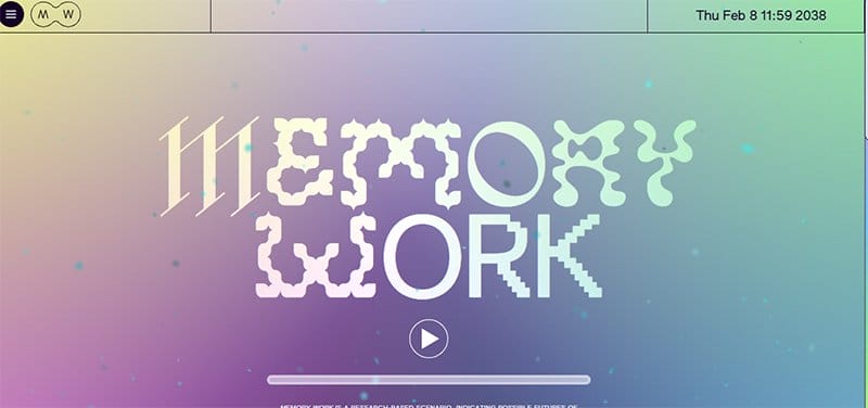
Memory Work’s website features multiple unique and engaging content that will keep visitors scrolling across its content.
This minimalist yet autistic website features multiple eye-catching elements that will get visitors and potential clients exploring its contents without restraint.
Clicking the embedded video feature in the site’s hero section opens visitors' eyes to the multiple activities of the brands.
I love the use of colorful gradient design which makes the stylish fonts and engaging texts compelling and attractive to potential clients.

Fincastle Baptist Church welcomes visitors with an interesting video element that displays their energetic and spiritual time of worship. I love how this church website uses a card design at the center of the page to display its programs and activities.
These high-quality images come with a thumbnail feature which grants visitors more insight on Fincastle Baptist Church's mode of operation and how they can participate.
The blog section features engaging content in a multiple-grid design layout with engaging texts and gradient-coated cover photos with quality color value.
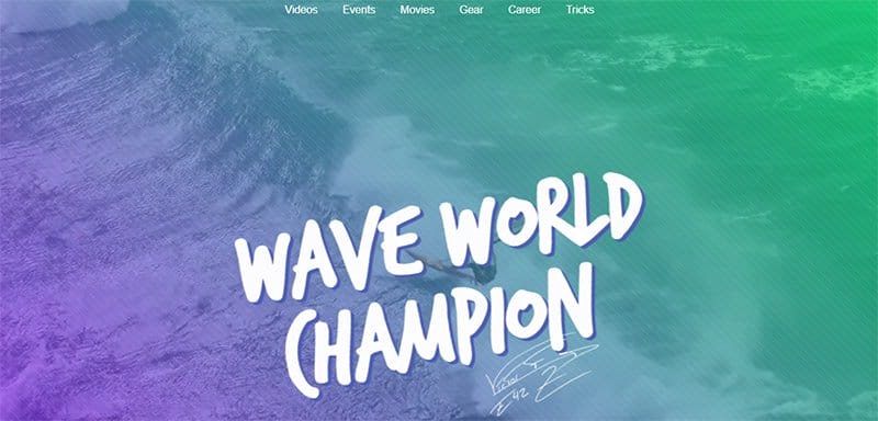
Victor Fernandez began practicing windsurfing with his father at the early age of five years old in his home spot, Almerimar.
The first catchy element you will see upon arrival is a gradient-coated background video displaying fun and engaging content about Victor Fernadez. I love how the mega navigation bar serves as a doorway to explore various aspects of the page without any form of distraction.
As you explore this gradient website further, you will see various eye-catching elements like slideshows, engaging texts, high-quality images, and motion graphics.
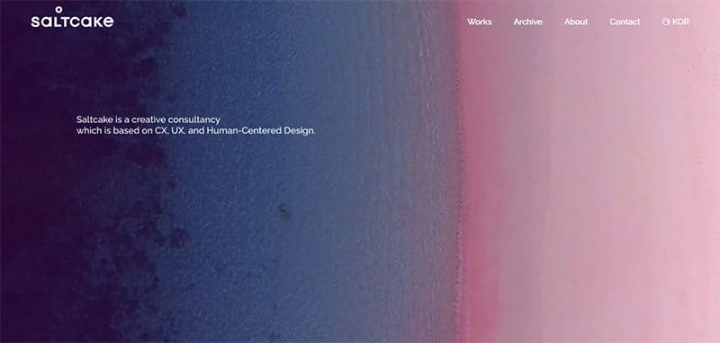
Saltcake is an experience consultancy firm that creates innovative creatives based on human-centered design and solves complex problems for companies and brands.
I love how the site’s navigation bar uses a video background to attract visitors and compel them to explore the content. This section’s dominant colors include old lavender, deep rose, light plum, black, and bazaar in a gradient format.
The white background gives this stunning gradient website a strong visibility and makes it easy for visitors to appreciate the content.
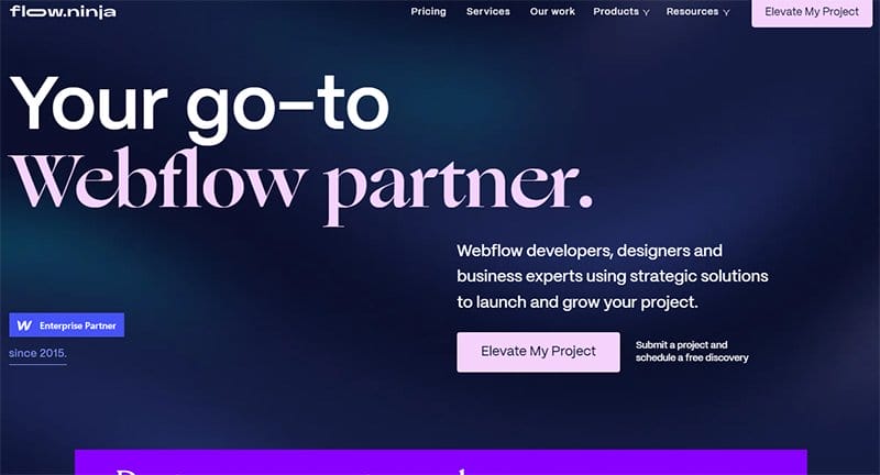
Flow Ninja helps organizations get new ideas off the ground and launch them into the stratosphere and beyond with a talented team.
I love how the dark background gives this page's dynamic and flat designs a stunning and memorable outlook. My favorite aspect of the page is the combination of horizontal and vertical scrolling effects, making the site's content appear elegant and sophisticated.
Interested visitors and potential clients can use the mega navigation menu with a drop-down feature to explore various aspects of the page.
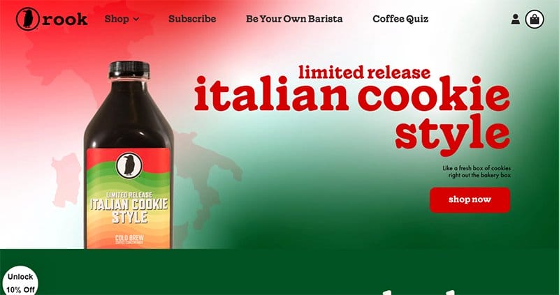
Rook Coffee is a coffee-based brand that is the fruit of two best friends with a passion for creating happiness through coffee and shared moments.
The white-colored sticky navigation bar with a drop-down effect serves as a portal to explore various aspects of the webpage.
I love how the colorful food-based website features a red and green gradient layout with other bright colors to make its content appealing.
Clicking the shop icon on the right side of the page is your one-stop shop to explore various aspects of the page.
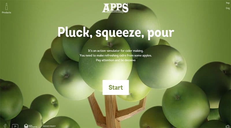
Apps is an action-simulator for cider making with a unique website that displays high-quality images and engaging content.
This stunning webpage has a minimalist design layout that makes it easy for visitors to enjoy its content. The first catchy element is a green gradient layout which blends with the colors of the apple tree in the hero section.
Clicking the white colored “Start” CTA button at the center of the page is your one-way ticket to explore the video content.
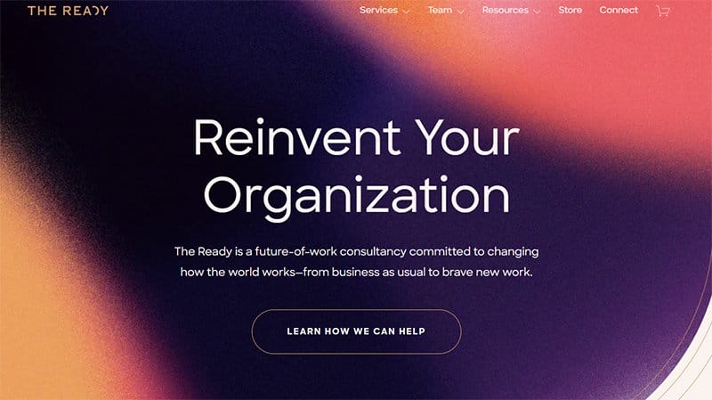
The Ready are specialists in the ways of organizational culture and transformation. This company helps organizations accelerate that change as fast, far, and wide as possible.
I love how this webpage integrates a smooth combination of dark indigo, grape, Indian red, dark terra, and sunrise orange. The grey background helps give the webpage a unique personality and encourages exploration without any feeling of boredom.
My favorite aspect of this amazing gradient website example is the catalog of logos that displays some of the brand's top clients and trusted partners.
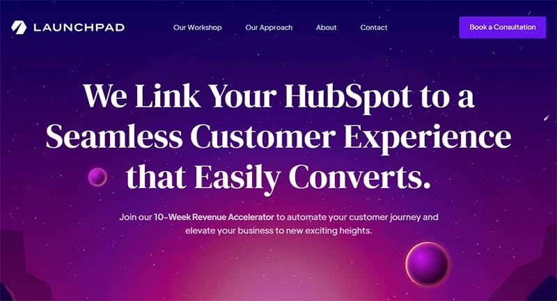
Launchpad Consulting leverages a combination of systems, processes, empathy, and automation to enable its expansion.
Welcoming visitors to this beautiful example of a stunning gradient website is a unique planetary system featuring a man at its center.
Upon scrolling, you will discover more content about the brand’s activities via the testimonial section that features heartwarming reviews with high-quality images.
The blue-colored “Book A Consolation” on the mega navigation bar is your one-way trip to begin business discussions with the brand's officials.
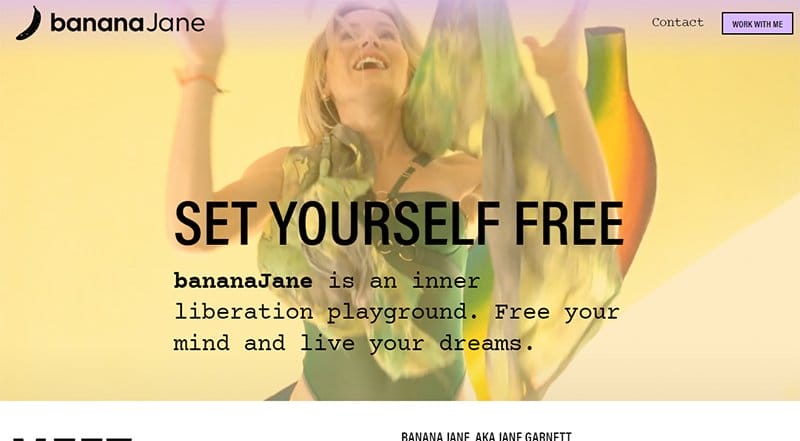
Banana Jane is an inner liberation playground that encourages people to free their minds and live their dreams without any form of restrictions.
Mandys pink, wax flower, sand, and light musterday make up the core gradient color elements in the website homepage. As you explore the site’s contents further, you will see multiple high-quality images and engaging text about the brand's activities.
The purple gradient-colored site footer features vital content like social media icons, contact links, and a newsletter column that allows interested visitors to receive updates.
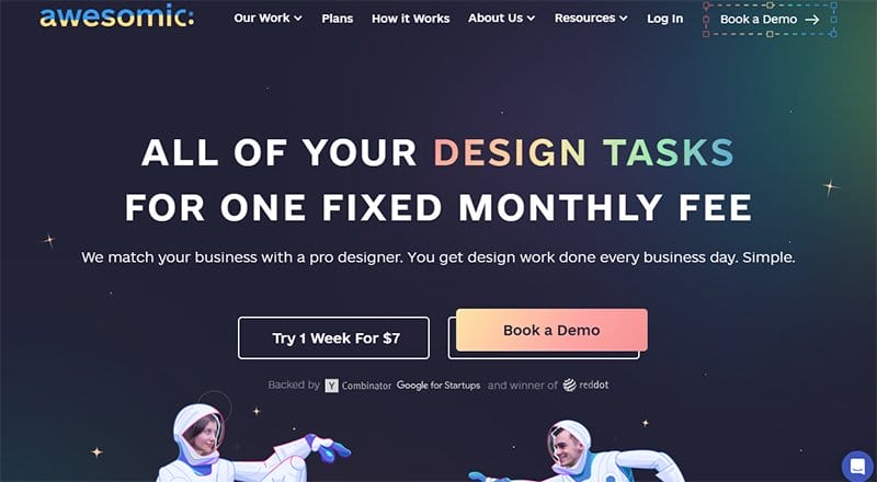
Awesomic is a design agency with an overall goal of helping their clients to be in dramatically better shape in three months. I love how the stunning design web page features multiple card layouts to make its contents compact and easy to explore without restrictions.
Each of these contents features a thumbnail effect that grants visitors and potential clients access to other aspects of the webpage.
The FAQ section helps to bring visitors and potential clients closer to the answer they seek to know about this design company before diving into business.
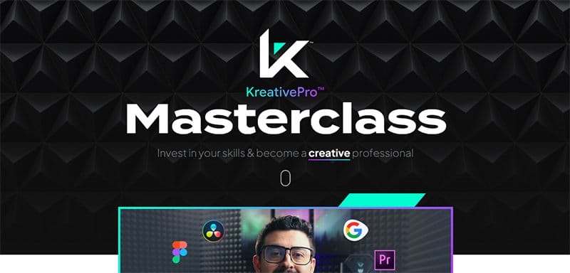
KreativePro is a creative design course platform that gives interested clients all the information they require to become creative professionals.
I love how the light background on the KreativePro web page makes all the subtle gradients and other elements visually appealing. The white typography throughout the site gives the website’s design an attention-grabbing vibe.
My favorite aspect of the home page is the strategic use of the gradient effect to create visual interest from potential clients and visitors.
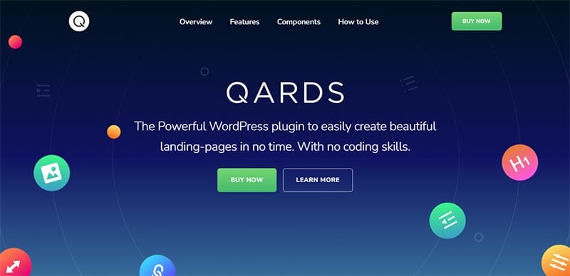
Qards is a creative design platform that mixes, matches, and combines a wide variety of pre-designed cards to create a website that perfectly expresses your design concept.
Welcoming visitors to this perfect gradient website is a smooth transition between motion and linear gradients in the hero section.
An additional feature that makes the page stunning is the floating bubbles of icons coated in two or more colors that give it an appealing outlook.
Upon scrolling, you will notice how each gradient design shines brightly on the white background. Beyond the stunning gradient accessories, the webpage features multiple high-quality images of the brand's projects to help boost credibility.
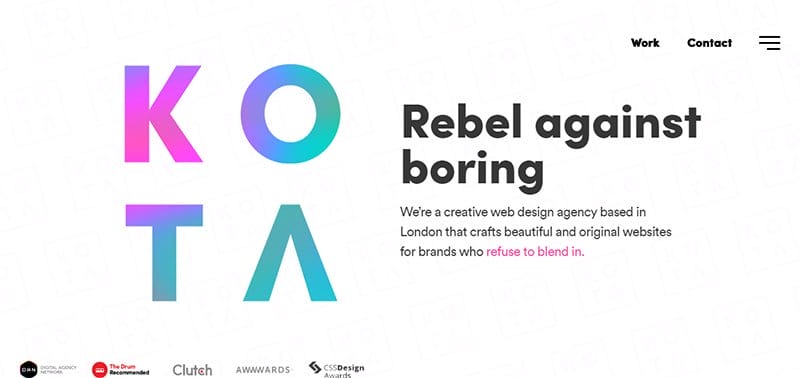
KOTA is a team of talented creatives who live and breathe great design and offer services like creative web design, web development, branding, digital marketing, and eCommerce.
I love how this stunning web page uses white space to make the soft gradients and other color aspects of the page irresistible.
The first stunning and eye-catching element on the page is a responsive design element that changes its structure as a user hovers across the hero section. Interested visitors can use the hamburger navigation bar to visit other pages on the site.
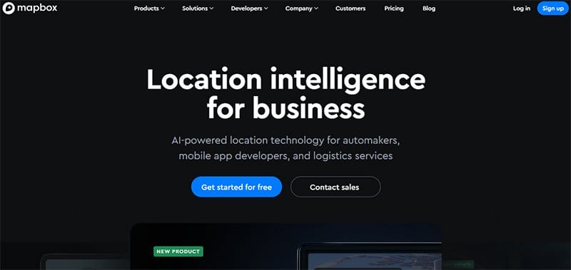
Mapbox is a living platform of location services that equips innovators to keep up with a changing world by using real-time data and map rendering technologies.
I love how the black background gives this unique multiple website a stunning outlook and makes it easy to explore.
What’s handy for me about this webpage is the animated maps element displays innovative solutions and genius that will help change the world.
You can use the black-colored sticky navigation bar with a dropdown feature to explore various aspects of the webpage.
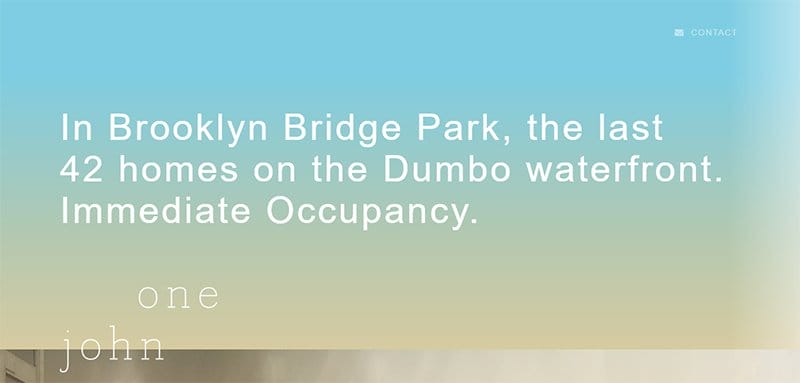
One John St is a Brooklyn Bridge Park based 42 homes on the Dumbo waterfront with space for immediate occupancy.
I love how the subtle gradient background changes its color palette as visitors scroll and explore various aspects of the webpage. This one-page website features engaging content that helps visitors and explorers have an insight into the history of Brooklyn Bridge Park.
The icing on the cake is the smooth synergy of high-quality images, engaging texts, and responsive outlines that help visitors have a full view of the webpage.
Best Gradient Website Design FAQ
A gradient color describes a range of colors that gradually fade into one another in perfect harmony to create a fresh and unique design pattern. In other words, a gradient is a continuous colormap that consists of many shades of the same color, or multiple colors that blend. Other names for gradient colors are color progressions or color ramps.
Using gradient backgrounds in website design helps web designers create an outstanding web page with eye-catching and colorful elements. A well-put-together gradient background makes objects stand out by adding a new dimension and realism, visual interest, and depth to a website.
The different types of color gradients include linear gradients, radial gradients, angle gradients, diamond gradients, linear gradients, radial gradients, color stops, conic gradients, reflected gradients, horizontal gradients, and single-color gradients
The major trends in gradients for the web that help give life to every shape, text, and image are linear gradients and radial gradients.