23 Best Informational Websites (Examples 2025)
Latest Website Statistics show that there are over 1.13 billion websites in the world. Is it possible to stand out from the competition and attract your target audience to your site?
Creating a great informational website is the perfect content marketing strategy for nurturing long-lasting relationships with visitors and customers.
If your informational site fails to impress a visitor, you may never get a second chance to impress. Don’t settle for a decent website if you want to turn visitors into fans who read through your content, revisit, and hit the share button.
The best informational websites are mobile-compatible, have fast loading speeds, and use an easy-to-skim content structure, user-friendly navigation, and a satisfying color scheme.
This article explores the 23 best information website examples you can use as inspiration to create your own website.
Let’s get started.
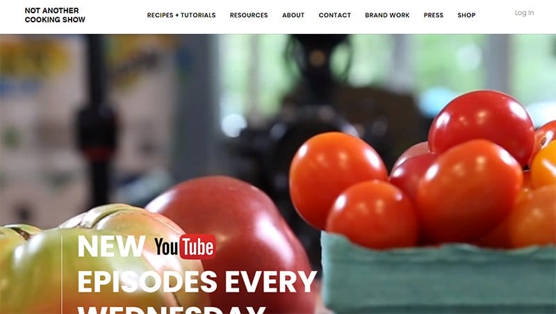
Not Another Cooking Show is an online forum that offers valuable information about cooking recipes, videos, and resources to help visitors and members become better cooks.
This food-based information website does a great job of creating a spectacular welcoming theme with a mouthwatering background video in the hero section.
Including a parallax scrolling effect feature is an excellent choice for creating a visually appealing platform. This feature makes the exploration process pleasurable.
New customers can submit their email addresses to the latest news and updates by submitting their details in the subscription column.
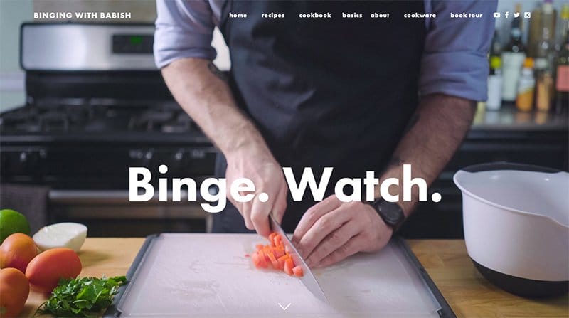
Binging with Babish is a food blog created by Andrew Rea, a chef and filmmaker. His cooking show is loved by millions of burgeoning chefs and foodies around the globe.
Welcoming visitors is a full-length image of himself preparing a dish, and at the center of the image is a visible CTA text ‘Binge.
On the homepage is a feature button that compels visitors to explore the website, and another noticeable back-to-top feature that easily returns visitors to the homepage.
I love the beautiful images of his food recipes. Ending your page tour is a lovely display of his social media platforms.
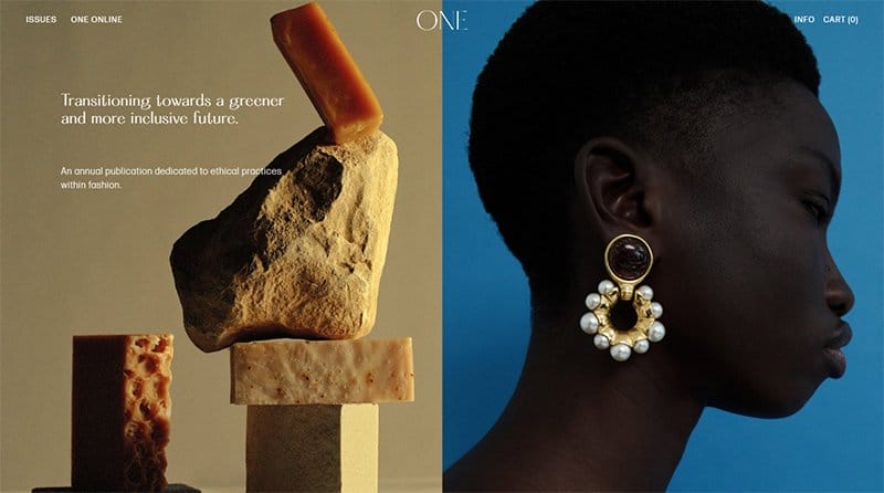
ONE Magazine is a consistent annual print and online journal dedicated to sustainable and ethical practices within the fashion industry.
The first catchy element is the split page feature in the hero section, displaying two high-resolution images and engaging texts to spice things up.
I like how the site’s home page uses a zig-zag design layout to display important information in different categories, featuring texts, CTA buttons, and high-quality images.
The drop-down navigation bar and parallax scrolling effect give the webpage an elegant and sophisticated outlook.
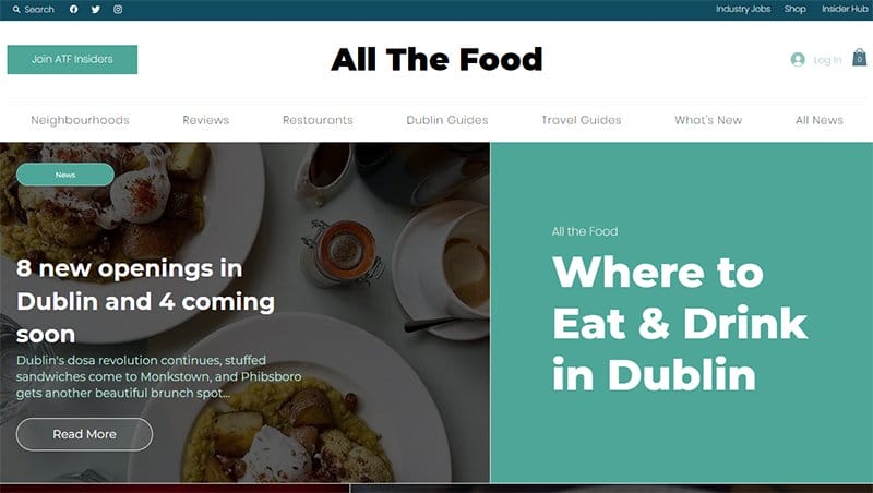
All The Food platform is based on the idea of helping readers experience the best food Dublin has to offer. I like how the tale green and white color scheme gives this stunning webpage a unique and sophisticated outlook worth exploring.
The split page feature displays engaging texts and a mouth-watering picture of delicious food items. Visitors can click the tale green-colored Join AFT Insiders CTA button to become a member of this food-based initiative without breaking a sweat.
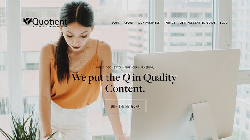
The Quotient Social Influencer Network connects content partners with the brands they love to create high-quality and high-performance sponsored content.
This stunning information website has a minimalist and well-organized layout with eye-catching images and engaging texts in the right areas, creating a pleasurable user experience.
Interested visitors can click the transparent “ Join The Network” CTA button to join the bandwagon.
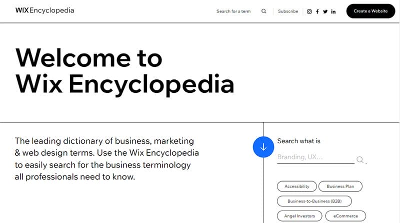
Wix Encyclopedia is an information website that encourages users to take immediate action in building a website.
I like how this great website features a strategic and ample use of its white space that makes its elements and contents look modern. Visitors and potential customers can use the search function on the sticky navigation bar to locate items and resources.
The icing on the cake for me is the full alphabet feature that makes it easy for a person to search terms by letter.
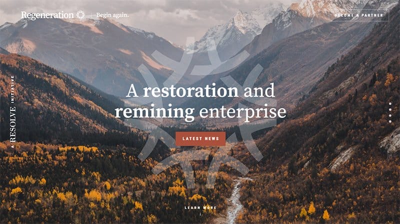
Regeneration website welcomes visitors with a breathtaking hero image displaying a serene nature-themed landscape.
I like how the site’s home page uses a zig-zag design layout to display important info about the brand, featuring texts, CTA buttons, and high-quality images.
Visitors can seamlessly navigate this information website pages and locate any article or specific topic via the bullet points menu.
The black-colored site’s footer features two social media icons that link to Regeneration’s online profile where their target audience can get additional information.

Experience Map is an informational website with a light and clean design that kicks off with an attention-grabbing title text “The Ultimate Guide to Experience Mapping”
The sticky navigation bar is your one-stop shop for significant mapping and exploring every nook and cranny of this information website example. I like how the white background makes all the elements of this one-page website sync giving the page an elegant feel.
Interested visitors can click the red colored “Map Your Experience With Us” CTA button to get started.

Create & Cultivate is an online community and conference company focused on young women who want to take their business or skill to the next level.
My favorite aspect of this unique information website is the hero slider functionality in the member section that switches horizontally as you hover across the page.
The testimonial section features heartwarming content about how the platform improved the lives of its members. I like how the page uses bullet points to list the benefits of being a member, increasing credibility and boosting personal branding.

Timid Magazine offers fresh news, stories, and articles in various areas like business, culture, fashion, style, food, and entertainment.
This entertainment website doubles as an online store that gives every visitor the chance to purchase by clicking the cart icon on the navigation bar. I like how the site uses multiple grid columns to display its contents appealingly and interactively.
Clicking on any of the images will transport you to the blog page to get better information regarding the specific topic.
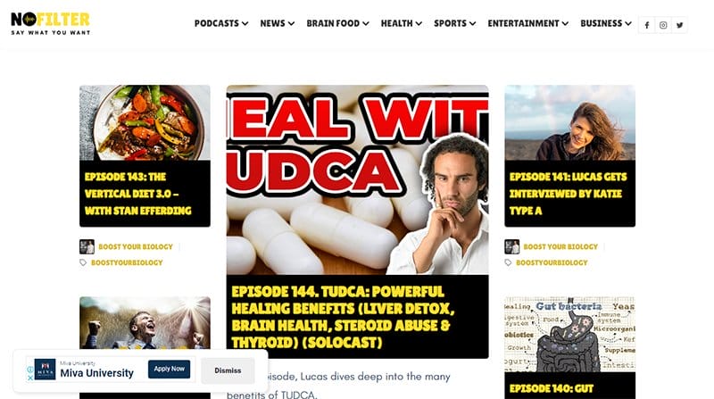
NoFilter Media is your one-stop shop for getting the latest news, podcasts, sports updates, business news, and health-related news.
This news and information website welcomes visitors with a catalog of the latest news featuring engaging captions and high-quality images with thumbnail effects. Clicking on any of these images is a one-way ticket to having a wild view of each story and news.
The white-colored mega navigation bar features vital links to multiple pages and three social media icons visitors can use to access their online profile.
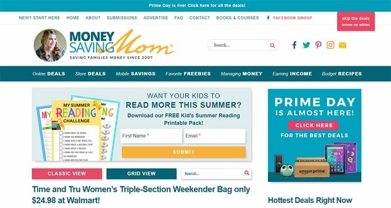
Crystal Paine is the mastermind behind the success of Money Saving Mom, a bargain-shopping platform. Interested visitors can use the search feature on the sticky navigation bar to locate specific items without hitting a speed bump.
I like how colorful and attention-grabbing the structure and arrangement of this information website, and the white background makes all the elements visible.
As you scroll further, you will see a colorful newsletter column which potential customers can submit their details for regular updates.
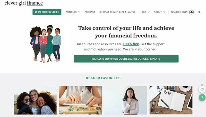
Clever Girl Finance's website has a colorful and interactive layout featuring illustrations, high-quality images, and engaging texts.
Members and visitors can access the podcast section to listen to intriguing and educative information about life and finance via their desktop or mobile phones.
The green and white color scheme gives the webpage a calm, trusting, and welcoming outlook that will compel visitors to become members.
As you explore the site’s content, you will see an embedded YouTube video that sheds light about Clever Girl Finance’s online course program.
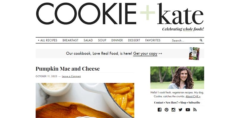
Kathryne is the creator of Cookie. She is a self-taught photographer and cook from Oklahoma with a knack for good food and pastries.
The first catchy element on this stunning information website is the brand’s logo displayed creatively and intriguingly to grab visitors' attention on arrival.
Moving across pages and making decisions is easy via the mage navigation bar with a drop-down feature. The gray and white colored footer houses vital information and links like a horizontally shaped navigation bar, social media icons, and a subscription column.

Smart Passive Income was founded by Pat Flynn, as a personal blog focused on teaching members ways to grow their audience and make more passive income.
Interested visitors can watch the embedded video in the About section to get a balanced view of what the platform stands for.
The testimonial section features heartwarming reviews from participants of Smart Passive Income’s online course, and a picture to authenticate their claims and boost credibility.
My favorite aspect of this stunning information webpage is the smooth topography featuring a well-together web page with every element in sync.

Copyhackers is a copywriting school that organizes copywriting training meant for startups. The first catchy element on this information website example is a high-quality picture of a beautiful lady and attention-grabbing caption “Copywriting Is A Team Sport.”
There is a catalog of logos featuring past clients or partners of Copyhackers that serves as a source of social proof and increases credibility.
I like how the blog section uses a single-column grid layout to arrange its contents appealingly and intriguingly.

One World Health is a health organization that is built to fill the gaps left by governments in developing countries to provide quality and affordable healthcare.
Welcoming visitors to the homepage is a full-width image of an old woman in the waiting section with the caption “Strategic Vision” in bold white text.
Interested visitors can click the deep green colored CAT button that sticks to the right side of the page to join the initiative.
I love how the page features motion graphics displaying happy faces and attention-grabbing content written in white and bright yellow colors on a castleton green background.

Mystic Spores is a wellness blog created to bring natural power to people's daily lives, by using mushroom nutrients to promote wellbeing.
The first catching element on the website is a background video displaying mushrooms with attention-grabbing texts and a white-colored “Discover Our Tinctures” CTA button.
Below the hero section are four compelling displayed product images with a thumbnail effect which leads to the shop page.
As you explore, you will observe that other sections use different color patterns, with each column having a unique color and text style.
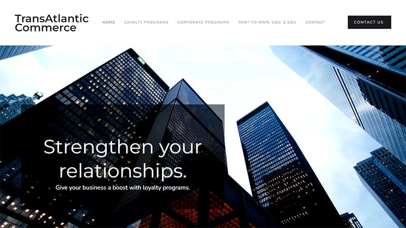
Transatlantic commerce is a loyalty marketing and awards distribution import/export provider. This info website helps clients strengthen their customer relationships and convert leads to loyal and returning customers.
Welcoming visitors to the page is the background image of superstructure towers with a transparent banner containing the caption “Strengthen your Relationships” in the hero section.
This information website features a white background with lengthy contents in black text and an elegant image layout that is highly visible to visitors. The parallax scrolling effect makes all the page elements sync together in a unique and sophisticated fashion.

WIP is a GMP Ltd publication that was established in 1999 and focuses on current case studies, renewable energy, data centers, and grid power.
Welcoming visitors to the site is a three-slide image of a power generator, wind turbine, and gas turbine with a publication date for visitors to explore.
Above the hero section is a sticky menu bar with the yellow logo on the left side and the blue email icon on the right side. Visitors can use the navigation menu to get seamless access to the entire page.

GeekTyrant is a movie-based information website that features exciting information about blockbuster movies. I love how the website uses multiple fluid grid layouts to structure the attention-grabbing movie trailer and catchy texts to give visitors a memorable experience.
As you scroll across the website, you will see various high-quality images with a thumbnail effect that transports you to a separate page upon clicking.
This colorful information and entertainment website features a sidebar feature that displays four social media icons and a search bar feature that encourages exploration.
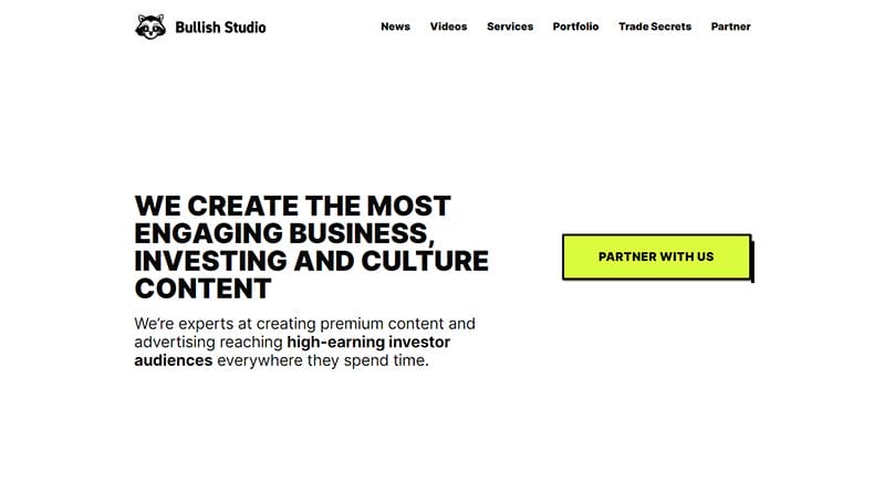
Bullish Studio is a digital advertising agency and content studio that is passionate about business, investing, and culture.
This information website has a white background with a calm design and captivating content written in black. At the center of the homepage is an eye-catching CTA button “Partner With Us” in a digital yellow that is visible to visitors
My favorite section is how the webpage features organizations' logos, top brands, and clients to help boost their credibility and increase social proof.
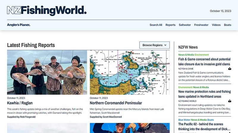
NZ Fishing World uploads the best New Zealand fishing content including weekly regional fishing reports, videos, and instructional tips features about fish.
The first attention-grabbing element is the latest publication update containing an image of four fish catchers with a sizable fish on display.
As you explore the rest of the website, you see high-quality images and YouTube videos on a white background with short text. I love the arrangement of the NZFW News and Regional Report section, each column contains a brief intro of the published content.
Best Informational Website Examples FAQs
An Informational website helps to convey helpful information to a specific user or audience so that the reader learns something new or understands a topic better. These websites bring visitors closer to their goals about various topics.
Some steps you can follow to create your own information website include picking a niche, establishing a goal, choosing a hosting provider, a domain name, and a site template or layout, building relevant pages, establishing a payment system, and testing and fine-tuning your site.
Some of the best examples of design trends from an information website include smooth navigation, scrolling effects, kinetic typography, drag interaction, structured typography, ticketing service, colorful gradients, animated illustrations, mixing horizontal and vertical text, geometric shapes and patterns, 3D design, and bold and beautiful text and images..
The best website builders for informational sites that help you create a stunning website with unforgettable design elements are Wix and Squarespace. These two website builders come with state-of-the-information website templates that make the building process seamless and effective. The drag-and-drop features encourage users to be as creative as they want.


