35 Examples of Outstanding Marketing Website Designs
Do you want to design a marketing website that attracts visitors and increases your customer base? Are you thinking of building an eCommerce website for your marketing business but don’t want to spend a fortune on web developers?
The simple solution is to use state-of-the-art website builders like Wix and Squarespace to create beautiful website designs optimized for different screen sizes including mobile devices.
This article explores the 35 best marketing website designs you can use as a source of inspiration when creating your own website.
Let’s get started.
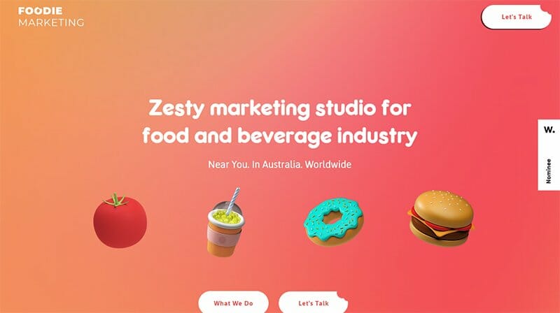
Foodie Marketing agency offers services like photo and video production, digital marketing, and digital menus.
The first thing that catches the eye are images of mouth-watering food items, engaging texts, and three CTA buttons. I like how the service section uses a two-column design layout with eye-catching illustrations as its section’s cover.
Visitors can click on any of the social media icons on the gradient-colored site’s footer to explore the agency’s online profile.

Bob’s Agency has a responsive web design with colorful and flashy elements like motion graphics, engaging texts, and high-quality images designed to attract potential clients.
The first catchy element of this marketing website design is the looping video of a mascot dancing in the hero section of its landing page. Potential customers can click the black colored “Let’s Get Started” CTA button at the center of the hero section.
Below the hero section of the home page is a catalog of logos representing large and small business websites and brands that are Bob Agency’s clients.
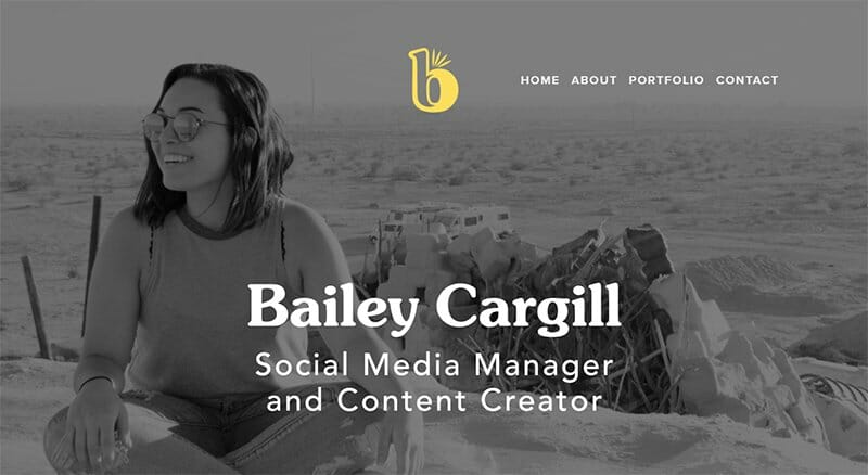
Bailey Cargill is an award-winning social media manager and content creator who has a track record of always getting the job done.
The first catchy element on this multi-page website is a black-and-white hero image featuring Bailey Cargill sitting in the desert and having a great time. I like how her brand logo is at the center of the page which helps visitors to know they are in the right place.
The white-colored site footer houses three social media links that interested visitors can use to access Bailey Cargill’s social media platform.
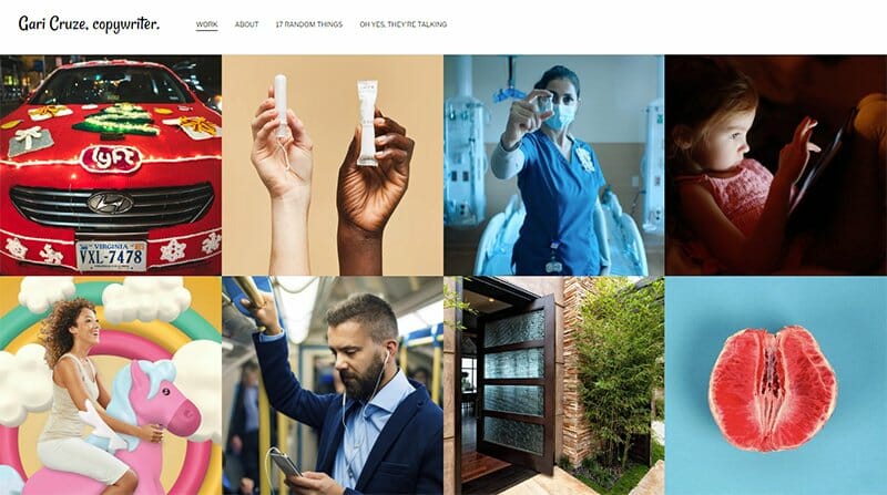
Gari Cruze is a skilled associate creative director and copywriter who has made his mark in marketing.
This marketing website has a minimalistic design featuring a multiple grid design layout from top to bottom. Every image has a thumbnail feature that grants interested visitors access to a new page to check out vital information related to the content.
The sticky navigation bar encourages prospective clients to access various aspects of the page by clicking on the links connected to different pages on the website.
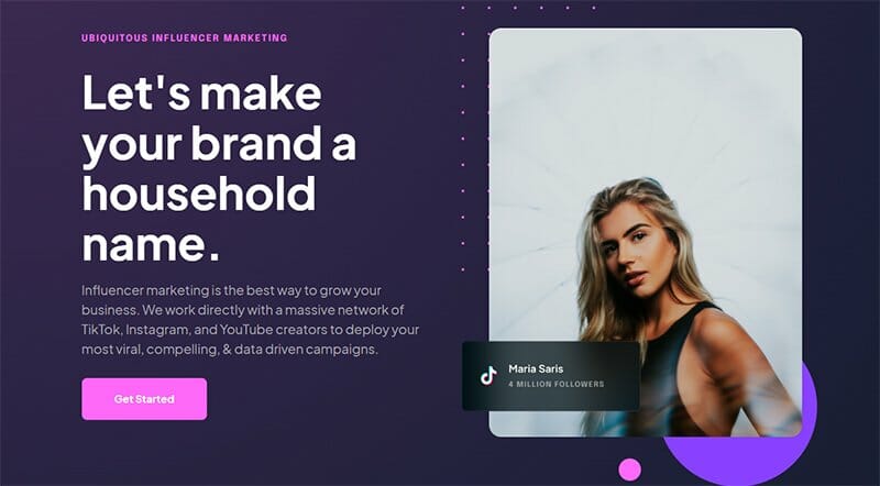
Ubiquitous works with a massive network of creators to help create viral, compelling, and data-driven influencer marketing campaigns.
The first thing you see on this influencer marketing site is the caption “Let's Make Your Brand a Household Name” and a stunning picture of Maria Saris. Below this section is a catalog of top brand logos that are part of the Ubiquitous client base.
I love the splash of navy blue and purple in various aspects of the site that gives the webpage a catchy and sophisticated outlook.
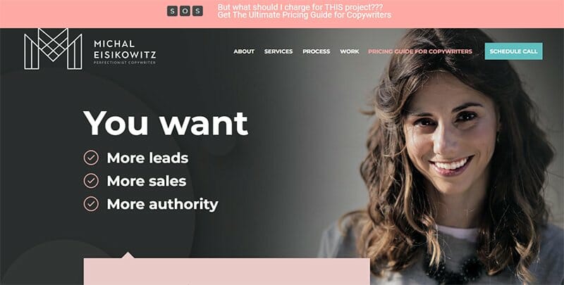
Michal Eisikowitz has over ten years of experience in marketing and copywriting. This marketing agency website has a colorful design layout with bright colors like misty rose, rosebud, dust storm, pale pink, white, and black.
As you explore various aspects of the page, you will see multiple high-quality images of Michal Eisikowitz in different parts of the page.
I like how she uses a slideshow to stylishly display customer testimonials to boost her brand’s credibility and serve as social proof.
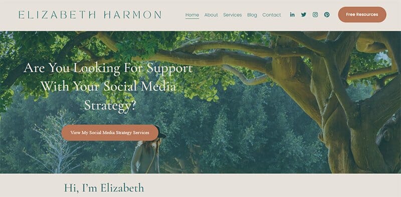
Elizabeth Harmon offers top-notch support to individuals, companies, and big organizations in boosting their social media marketing strategy.
I love how warm and welcoming her webpage’s hero section is. This section features engaging texts, a brown-colored CTA button, and a stunning image of Elizabeth Harmon walking under a big tree.
Interested visitors can explore her online profile by clicking on any of the social media icons on the sticky navigation bar at the top of the page.
I like how the website uses multiple grid-column layouts with CTA buttons to display the site's content and take necessary actions.
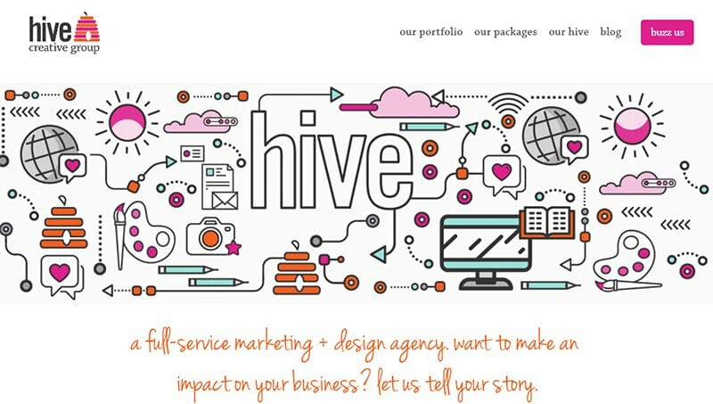
Hive Creative Group’s website uses stylish and attractive fonts to get visitors' attention and boost engagement.
What's handy about this outstanding marketing website design is the unique application of flashy and colorful content with motion graphics and illustrations.
At the center of the page, there’s a full-width picture of the hive team with the brand’s biography below the section to help visitors get acquainted.
I love how they use a slideshow to display eye-catching logos of their top clients to serve as a source of social proof and boost credibility.
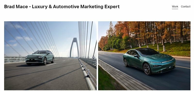
Brad Lace is a luxury and automotive marketing expert with an amazing website design that uses a multiple-grid column design layout.
This outstanding marketing website welcomes visitors with high-quality images of eye-catching cars in different locations to get the attention of visitors.
I like how the white background makes all the pages visually appealing to convince visitors to click the contact CTA button at the top of the page. There are social media icons that visitors can click to access the company’s social media icons for further exploration.

Vovi Studio’s entire website is full of amazing content written in bold fonts. I like how this marketing agency website example combines a colored and black background making the catchy design elements on the homepage appealing to potential customers.
Website visitors can use the hamburger navigation bar to explore various angles of the website such as its product pages, recent works, and contact page.
My favorite aspect is the autistic display of Vovi Studio’s color scheme featuring vibrant colors like purple, red, white, gray, black, and gradient.
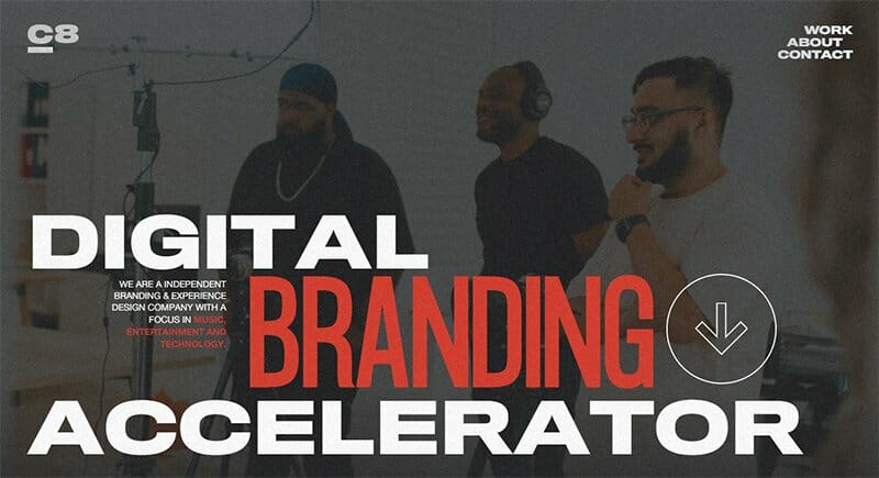
Cre8tive Agency welcomes visitors with a unique dark-theme design with a noisy background, to create an exclusive and welcoming feeling for its target audience.
I like how the high-quality photographs on this great website design have a thumbnail effect which leads to product pages.
As you scroll further you will see names of top brands such as Adidas, Puma, and Red Bull at the center of the page to boost credibility. This multi-page website uses bold colors like black, white, and red on most aspects of the homepage.
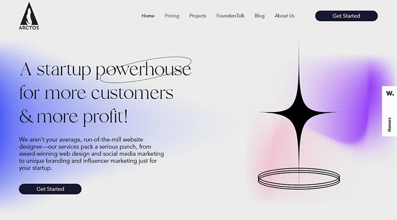
Andres is the CEO and founder of Arctos Agency. The agency has a team of branding specialists who can make big corporations and small businesses appealing to their target audience.
This outstanding marketing website features a linear website design with a catchy color palette displaying bold and neutral colors from various angles of the page.
I love the blurred shapes and grain effect which makes all the shapes more dramatic and appealing to potential clients.
The customer testimonials section features multiple videos that contain mind-blowing reviews that are based on the effectiveness of strong branding.
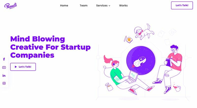
Peanuts Studio’s sticky navigation bar with a drop-down effect makes exploration fun.
As you explore this outstanding marketing website design, you will see various catchy and user-friendly elements such as motion graphics, hand-drawn illustrations, and multiple calls-to-action buttons. I love how the featured logos have a hover effect.
The customer testimonials section uses a grid design with a slider effect to make it engaging and appealing to potential customers. I like how the white background makes all the contents on the page sync in a visually appealing fashion.
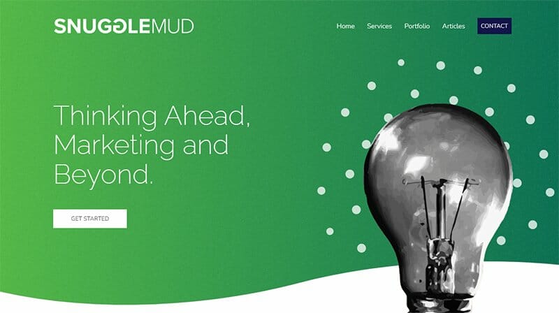
SnuggleMud's primary goal is to offer high-value marketing services in NYC to brands without the high pricing associated with the city.
Unlike other marketing website design examples, SnuggleMud offers a unique design layout with simple colors like green, black, white, and blue.
The hero section gets visitors' attention with an appealing caption “Thinking Ahead, Marketing and Beyond” and a picture of a light bulb.
Interested visitors can click the white colored “Get Started” CTA button in the hero section or the “Contact” CTA to reach the brand’s official for collaborations.
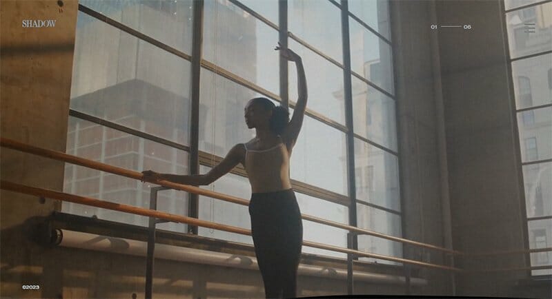
Shadow Agency webpage welcomes visitors with an insightful background video in the hero section which makes it possible for them to generate more leads.
This marketing site has a clean design with various amazing elements like large images, minimal copy, and a smooth on-hover text color change.
The hamburger navigation bar is your one-stop shop to explore all this marketing website content without breaking a sweat. Interested visitors can click the large “Get in Touch” button on the site to access the agency’s contact page with ease.

Statement is an outstanding marketing agency that offers services like SEO, copywriting, influencer marketing, explainer videos, and marketing campaigns.
This marketing website has a colorful design layout with large texts, motion graphics, full-width images, and multiple CTA buttons.
I like how the dotted-pattern background and the fresh orange color make the user interface playful and visually appealing to potential customers.
You can use the fresh orange-colored “Menu” CTA button on the right side of the page to explore the page and content on the platform seamlessly.

Power Digital’s website’s hero section welcomes visitors with their latest innovations with texts and high-resolution pictures.
The search function at the top of the page makes it easy for potential customers to seamlessly locate various items on the page. You can use the sticky navigation bar to explore different aspects of the page without breaking a sweat.
I love how the black-colored site footer features multiple pieces of content about this brand. You can’t miss out on the vertical-shaped navigation bars and a subscription column that encourages visitors to submit their details.

Quadrate28 is a top-notch offshore agency that offers a variety of services such as digital marketing services, recruitment, and retail.
The first catchy element on the website is an automated slider displaying high-quality images of past projects at lightning speed to get the attention of visitors.
I like how the site’s page uses a moving text feature to display logos of top clients this marketing agency is working with.
Prospective clients can use the red-colored site footer to access the company’s social media pages and contact them.

Traackr is a prominent old-school influencer marketing platform that offers state-of-the-art tools successful marketing agencies and brands require to execute influencer campaigns successfully.
I love how this influencer marketing platform shares valuable and enticing data from real-world case studies to incite visitors' interest and boost social proof.
Interested visitors can explore the site’s contents via the sticky navigation bar with a drop-down effect. Clicking the orange” colored “Talk To Us” CTA button transports visitors to the contact page.

Lamb Creative Group’s web page has a flashy and colorful design layout with multiple color schemes ranging from red, blue purple, soft pink, and basketball orange.
This webpage features illustrations, and high-quality images in different aspects of the site to get visitors excited about the site content.
Navigating the site’s content is seamless due to the presence of a bullet point navigation bar and a regularly sticky menu bar. The parallax scrolling effect makes all the site content sync in a visually appealing and engaging manner.

Niika offers services such as design, branding, digital, social, illustration, marketing, video, UX, and 3D. The first catchy element you will see on this marketing website is a full-width motion graphic design of the brand’s initials in the hero section.
As you explore the site, you will see the stylish use of catchy illustrations, motion graphics, and large texts in multiple areas of the page.
I like how the “Work Section” features a zig-zag design layout displaying high-quality images with a thumbnail effect to grant interested customers access to the page’s content.

Maycreate is a successful marketing company committed to building strong brands through search engine optimization marketing. This marketing company’s primary aim is to connect people with value and help increase conversion.
One fascinating thing about Maycreate’s site is the high-quality image in the hero section that welcomes visitors. You can use the hamburger navigation bar to explore various aspects of the page seamlessly.
I like how the dark-colored footer displays Maycreate’s motto, email address, and links to their social media handles to encourage visitors to explore.

I like how Poetic’s site switches between light and dark backgrounds which gives the webpage a fun engaging outlook, and makes it visually appealing.
At the center of the page, you will see a catalog of the brand partner’s logos with little details about their partnership. This element is a vital ingredient in boosting the agency’s credibility among potential clients.
You can check out the blue-colored site footer to extract vital information about the brand like contact details, email addresses, and social media links.

Qualified offers digital marketers and salespersons an effective tool called the pipeline cloud to boost their lead generation exercises. Interested visitors can use the sticky chat widget at the right side of the page to contact the agency’s customer service officials for inquiries.
As you scroll further, there’s an engaging video at the center of the page that features content about turning your website into a pipeline generation machine.
The white background is a major ingredient in the overall beauty of the webpage because it makes all the elements visually appealing.

Match Media Group offers state-of-the-art innovative advertising solutions to help their clients reach highly engaged audiences.
I like how this one-page design website features a mobile device mockup in the hero section that changes its content in an automated fashion.
The client testimonial section displays logos of top brands like Tinder, Match, Black Singles, and Archer, with short content about their affiliations. I love the parallax scrolling effect because it makes the page appear professional and sophisticated.

Burningred is a digital marketing brand that offers businesses new customers and brings digital cohesion to brands.
The recent work section features multiple high-quality images with a thumbnail effect which links to unique pages to get better information about the project.
I like the splash of black, red, and white in various angles of the page working together to give the webpage a fun and lively outlook.
Interested visitors can click the red colored “Find Out More” CTA button at the center of the page to get more information about their operations.

345 Marketing agency website welcomes visitors and potential clients with a stunning picture displaying some of the company’s staff members having a great time.
The parallax scrolling effect on this marketing website design makes the home page look unique and visually appealing to visitors. This feature makes the scrolling process fun and engaging and makes all the unique page elements appear smoothly.
Interested visitors can use the live chat widget on the right corner of the page to chat with 345 Marketing agency’s customer service officials.

128 Digital website features a blue dot with a circle that follows the mouse cursor. Clicking the transparent “Get In Touch” call-to-action button will transport interested visitors to the site’s contact page where they can request a quote.
The search function on the sticky navigation bar is a useful tool for locating the site value proposition and other relevant items without breaking a sweat.
What's handy about this webpage is the stylish use of multiple grid design layouts to structure vital site content like the bio section and past projects.

Parrot Digital is a versatile company that offers premium website and digital marketing solutions using recent technologies and strategies. The site’s background color choice of blue and white coupled with the featured image of a man smiling, gives it a calm and relaxing feel.
I love how there’s a section displaying a few designs with an orange-colored “See More Designs” call-to-action button with a hover effect.
You can’t help but notice the black-and-blue colored footer featuring a vertically structured navigation menu and a subscription form.

Nightingale is a fashion-based marketing agency that helps their clients get their products to their target audience. You can use the hamburger navigation bar on the right side of the website to explore the site content without breaking a sweat.
Clicking the transparent “Learn More” CTA button with a hover effect will transport you to the brand page where you can access in-depth company information.
My favorite design element on this webpage is the star-themed motion graphic that moves in different directions on the black background.

Fantasy agency websites use background design and combine colors like black, porcelain, and ArtyClick Red. I like how informative and visually appealing the background video in the hero section with a volume button at its base to control the sound effects.
As you explore the site content, you will see various high-quality images with thumbnail effects which give interested visitors access to other pages.
The hamburger navigation bar has a sticky effect which makes the exploration process seamless and worthwhile.

Reform Digital is a marketing platform that offers high-end websites, social media, branding, and web development services for brave and ambitious clients.
I love the stylish combination of bold colors such as black, gray, and white to give the webpage a unique outlook that will make it appear elegantly on any mobile device.
The webpage combines high-quality images, background videos, engaging texts, and a pleasant color scheme to give visitors a pleasant user experience.
Using the images of past clients in the testimonial section is brilliant because it makes the customer reviews more personal and appealing to potential clients.

Studio Vi is a great example of a marketing platform with the tools, skills, and personnel required to help clients achieve their marketing goals.
I like how this webpage features attractive content like engaging texts, high-resolution images, and insightful background videos to close potential customers.
This marketing website combines a sticky horizontal navigation bar and a hamburger menu bar to encourage seamless exploration. My favorite aspect of the site is how it switches from a dark background to a light-themed background as you scroll across the page.

Attentive is a thriving company with an innovative text messaging platform. This easy-to-use platform specializes in strengthening relationships between entrepreneurs and their consumers.
Potential customers can access the company’s digital products by clicking the “Products” link on the sticky navigation bar without stress. For the sake of social proof, you will see multiple logos of top organizations that are Attentive clients.
I like how the web page has an embedded video feature that displays vital content about this outstanding marketing agency’s mode of operation.

Vision Agency offers one-stop Wix web design and digital marketing services to their clients. The first catchy element is an embedded video background that gets the attention of visitors and informs them about the brand’s operations.
Interested visitors can click the “Schedule a Call” CTA button at the center of the hero section to get in touch with Vision Agency’s customer service officials. You can use the sticky navigation bar with a drop-down effect to explore the site content.
Best Marketing Website Examples FAQs
A marketing website performs the function of a portfolio webpage where a marketing company uploads all their vital content like contact details, past projects, ongoing projects, past client details, and newsletters for potential customers to reach them seamlessly.
Some of the best small business website examples that are making waves in recent times include Velasca, Milk, Shwood Eyewear, Newton Supply Co. Rhone, Allbirds, Madsen, Bluboho, Super Team Deluxe, MFMG Cosmetics, LEIF, La La Land, Studio Neat Designs, Minaal, Modern Market, Wrightwood Furniture, Brosa, Ivory & Deene, Ratio Coffee, and I Love Mole.
Some of the best marketing web design trends top web designers use to create stunning websites include experimental navigation, parallax scrolling, micro-interactions or micro-animation, 3D designs, custom illustrations, standout typography, minimalism, brutalism, textures and gradients, gamification, dark mode, virtual and augmented reality elements.


