30 Membership Site Examples That Will Inspire You
Do you want to monetize your skills or wealth of knowledge? Having a beautiful membership website is one of the best ways to monetize your skills and knowledge.
You can attract a large audience with your content and earn recurring revenue with a membership website.
The best website builders like Wix and Squarespace are popular for helping users create visually appealing membership sites with great traffic and large subscriptions. Designing your own membership website with these tools will get you the same results.
This article checks out the 30 best membership website examples you can use as a source of inspiration when creating your own membership site.
Let’s get started.

EmpoweringHER is a membership platform that’s centered around women’s empowerment for business and self-care. The sticky navigation bar with a drop-down effect helps visitors and potential members explore the site’s contents and clearly understand the membership models.
Click the pink-colored “Join Our Power Circle” CTA button to access the membership plans page for online payments. I love how the parallax scrolling effect, high-quality images, and colorful designs give the page a flashy, fun, and sophisticated outlook.
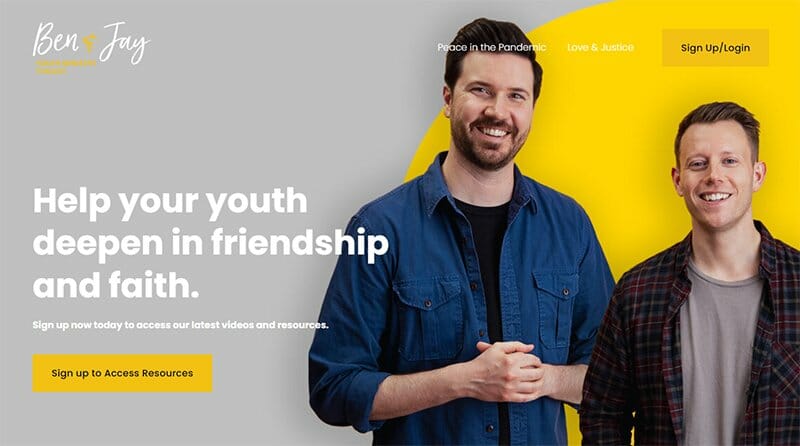
Ben & Jay’s membership website is a Christian-based initiative that focuses on helping youth deepen in friendship and faith.
I like how this membership website has a minimalist yet colorful outlook with colors like white, yellow, gray, and black at most angles of the page.
Interested visitors can click the golden brown colored “Sign up/Login” CTA button to enjoy the benefits of being a member of the community.
Below the hero section is a well-labeled and detailed biography section with comments about Ben & Jay. Pictures of Ben & Jay are the icing on the cake of this amazing membership site design.

Amanda Rose is a successful artist, dancer, coach, and dance movement therapist based in Barcelona, Spain. Interested visitors can use the drop-down menu at the right side of the page to explore the site content easily.
I love how visitors can view various stunning background images due to the parallax scrolling effect which gives the webpage an elegant and sophisticated outlook.
Each membership option on the page features a thumbnail effect and a magazine cover design to reel in visitors.
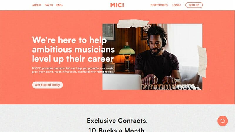
MICCO is a music-based membership platform that helps gather, organize, and make accessible the world's music industry information.
What's handy about this membership website is its flashy and visually appealing color scheme which includes basketball orange, black, soft peach, and white.
I like how the “Our Directorates” section uses a slideshow and illustrations to display its contents in a fun and engaging fashion.
The basketball orange-colored live chat widget gives visitors access to the customer services official to make inquiries about the membership business, career, and education paths.

Women in Film & TV (WFTV) website’s hero section features a colorful camera lens that serves as a proper representation of what the membership site stands for.
I like how the website uses a seven-column layout to display Women in Film & TV’s upcoming events which members have open and exclusive access to.
The white background and parallax scrolling effect make all the vital elements on the page pop and visually appealing to potential members. Interested visitors can click the gray-colored “Join Us” CTA button to taste the benefits premium members enjoy.

Ladies of Real Estate is a community of women in the real estate business that offers support and relevant tools to their members. This website design has a soft and calm design layout with soft amber, white, and black as its dominant colors.
The first catchy element of this membership website is high-quality pictures of three top-ranking members of the community. I love the strategic placement of a soft amber-colored “ CTA” button at the center of the page.
Interested visitors can visit the video template section to access multiple insightful and educational videos on how the real estate business works.

Seriously Fun Fitness has a fun and colorful outlook with various colors like blue, yellow, and orange which gives the page a welcoming vibe. The sticky navigation bar is your bridge to exploring various aspects of the page and making relevant decisions.
This online membership community offers fitness and yoga classes plus guided meditations and other virtual events to willing members. Clicking the image description on the service section gives members access to these benefits.
I love how the parallax scrolling effect and colorful fonts make the page contents visually appealing to site visitors.

Herbal Wisdom is the brainchild of Caledonia Forest, a Forest and Wildlife conservation center. Above the site’s footer is the registration section where interested visitors can click the soft amber-colored “Become An Herbal Expert” CTA button to get started.
The site footer doubles as the testimonial section where potential members can check out heartwarming reviews to convince them to join the community.
I like how the mega menu bar houses the site’s social media icons which visitors can use to access Herbal Wisdom’s social media platforms.

Erica Webb is a registered counselor and mindful movement coach who takes a mind-body approach to navigating persistent aches and pains.
I like how the webpage features a transparent drop-down menu and a bullet point navigation bar to smoothen visitors' exploration process and activities.
The blue and green sticky widget at the base of the page gives existing members and visitors access to the membership page or to make inquiries.
I love how the white-colored site footer features a contact form that visitors can use to get quick access and updates about Erica’s community.

Masters Meridian Yoga is a yoga-based membership program that offers comprehensive and technical yoga-based courses to prospective professionals.
The hero section features a stylish yoga studio that features flowers, pillows, yoga mats, and a long CTA button for visitors interested in yoga. I love how the sticky navigation bar features vital content like an “Apply Now” CTA button and links to other pages.
Masters Meridian Yoga features multiple logos of health and yoga-related certifications as a source of social proof to attract new members.

Ceramicon website features a transparent navigation bar which is your one-stop shop for exploring every aspect of the page without breaking a sweat.
I like how exciting the thriller video is, featuring a sneak peek into what interested members should look forward to. This element helps stir up their interest and compel them to click the gray-colored “Waitlist” CTA button to get on the train.
My favorite aspect is the smooth integration of text with high-quality full images to make the pages visually appealing and engaging.

Scott’s Bass Lessons is a successful membership website example that offers free and paid memberships to interested visitors.
This successful membership site welcomes visitors and potential members of their online community with an attention-grabbing background video in the hero section.
Visitors can explore some of their basic free content by clicking the gradient colored “Start Free Trial” CTA button. The sticky navigation bar houses vital links to pages like the community’s online courses which helps to promote professional development.

Scott’s Cheap Flights is a unique online membership site where members get access to curated low-cost airfare deals.
Similar to other successful membership site examples, Scott’s Cheap Flights has a free and paid membership program that interested visitors can join.
I like how the webpage uses both slideshows and multiple grid-column layouts to display vital site consent in a visually appealing manner.
This paid membership site has a soft color scheme with different shades of green as its dominant colors. I like how the site uses engaging texts and illustrations to make its design fun and lively.

The Female Entrepreneur Association membership platform has a feminine theme with soft colors like peach, pink, and white as its dominant colors.
Interested visitors can click the peach-colored “Become A Member” CTA button to have access to the members-only area and enjoy energy premium content.
I like how the testimonial section features heartwarming content in a slider format to get visitors to opt for the premium membership program.
What's handy about this membership community website is the use of high-quality images and illustrations from different angles of the page.

30 Day List Building Challenge is a unique email marketing membership website with a colorful outlook. The first thing that got my attention on this dedicated membership website is the minimalist and concise nature of the page featuring few but straightforward content.
This membership site has a colorful design layout which is sure to get visitors glued to the page and find their way to becoming new members. You can’t miss out on the attractive purple-colored “Take The Challenge” CTA button at the center of the page.

Copyhackers is a copywriting-based platform that offers valuable tools and resources to its members to help them get better.
I like how this membership site uses two colorful banners and CTA buttons with a hover effect to grant interested visitors access to their educational resources.
New members can use the search function at the top of the page to find any online course and content in the resource library. Potential paying members will jump on the offer to join the community after seeing the catalog of logos representing top clients.

DMC Coalition website stands out from other membership site platforms because of its unique design layout. You can’t miss out on the embedded looping video and the location icon.
I love the moving image effect present in the pictures and the stylized embedded videos from various angles of the site. The blue-colored site footer contains testimonials of members who are making progress because of their association with DMC Coalition.
Visitors can use the sticky navigation bar with the hamburger effect to explore various aspects of the page easily.

Peak Freelance is a freelance membership community founded in 2020 to help freelancers achieve their “peak” careers.
I like how the home page uses a two-column layout to display the content in the help section. This section features an all-members access link to resources and online courses.
There is an “Explore the community” call-to-action button where visitors can tour the site and see opportunities to grow their online business. The drop-down menu features an all-access successful membership link and other relevant elements for seamless exploration.

Arlan Hamilton is the brain behind the success of Arlan’s Academy. As a capitalist, he constructed the expert developmental course library.
What's handy about this membership site is the use of multiple-column layouts to display the community’s resources and online courses.
Each column features exclusive content that visitors can access by clicking on the blue colored “Start The Course” CTA button for quick and seamless access.
My favorite aspect of the site that makes it stand out from other successful membership sites is the sea of high-quality images from top to bottom.

Raw Spirituality is a membership-based platform that offers guidance and support for people who want to learn more about the concepts of spirituality.
This one-page membership site combines engaging texts, high-quality images, and CTA buttons to convince visitors to choose Raw Spirituality over other membership communities.
The site footer features a QR code and two CTA buttons that visitors can click to get early access to the live-streaming group sessions. I like how the white background makes all the relevant elements on the page and subscription site visible and appealing to visitors.

Find What Feels Good (FWFG) is a fitness and wellness-based membership platform. The hero section of this membership site has an embedded video that gives visitors information, a full-width image, and a black-colored “Join Today” CTA button.
As you explore the site’s content, you will see the online payment processor with content about the payment plans and membership model.
The site’s footer houses social media icons that link to the Find What Feels Good (FWFG) online profile for further exploration of general and members-only content.

Go Go Nihon is a member's platform that offers language-based training to members interested in learning Japanese.
The website's homepage uses a seven-column grid design layout to display its course contents in a visually appealing and attractive fashion.
Clicking the transparent “View More Courses” CTA button will transport interested visitors to a new page displaying its available courses with their price tags. You can get constant updates about Go Go Nihon by submitting your details in the newsletter column.

Sophie Robinson is the brain behind a successful design school that offers master classes to members of her community.
I like how this membership website uses a stunning image of Sophie Robinson having a great time teaching her students in a fun and engaging fashion.
Below the hero section are logos of top publication brands that feature Sophie Robinson’s content and news about her school.
The testimonial section features heartwarming comments from members of this community and their positive opinions and reviews to attract new and prospective members.

Foundation for Economic Education membership website pages have a minimalist and concise design layout featuring multiple eye-catching and appealing content.
I like how the course section uses a two-grid column design layout to structure its content. You can’t help but admire the attractive orange-colored “View More Courses” at the base of the page for further exploration.
The strategic use of white spaces on this membership website helps to give life to all the relevant elements on the page. What's handy about this webpage is the application of illustrations and engaging texts which gives the website a fun and warm outlook.

Brian Dixon membership website’s hero section features a stunning image of Brian Dixon and a catchy caption to get visitors clicking the CTA buttons to get started.
Beneath the hero section are engaging and interactive elements like a bio section with stunning pictures and a personal message from Brian Dixon to visitors. I love the video testimonials at the base of the page which interested visitors can watch to get inspired.

The Empowered Entrepreneur is a business-based membership platform that focuses on helping entrepreneurs use their brain power better.
You can click the red-colored CTA button on the stunning image in the hero section to get more information about the membership’s site exclusive offers.
The white-colored site footer features links to different pages and multiple social icons that link to The Empowered Entrepreneur’s online profile. Interested visitors can use the contact form at the base of the page to get in touch with the organization’s officials.

Kelly Canull is a skilled transformational soul life coach who has a knack for helping people shift their personal attention away from all outward responsibilities.
The first catchy element is an embedded YouTube video in the hero section which features a brief introduction about the platform to boost membership functionality.
Online visitors can use the sticky navigation bar with a dropdown effect to access various aspects of the website with ease. I like how the web page’s homepage displays vital information about the paid membership program with the various available options.

The Bay Area Cognitive Behavioral Therapy Center website welcomes visitors with a catchy image of stones on a water body as its hero image.
I like how the section of the page comes with a CTA button for interested visitors to take immediate action. The back-to-the-top button with a hover effect at the base of the page makes the navigation process of the membership site seamless.
Below the hero section is a catalog of logos of top publication brands that feature content on The Bay Area Cognitive Behavioral Therapy Center.

Build in Public Mastery stands out from other successful membership sites because of the sticky video at the right corner of the homepage.
As you explore the site's content, you will see a green CTA button with a hover effect for visitors interested in joining the October waitlist. If you scroll down, you see YouTube videos that feature insightful information about the community and free resources.
I love the testimonial section that contains outstanding reviews and success stories of previous users which helps to encourage visitors to join the community.

Let’s Make Picture Books is an art-based membership site that offers aspiring children’s book illustrators the tools to build strong portfolios.
Just like other successful membership websites, Let’s Make Picture Books has a visually appealing design outline with flashy designs and colorful illustrations.
Each section has a golden brown colored “Enroll Now” CTA button to encourage visitors to get lifetime access to the members-only pages.
The testimonial section gets the attention of potential members by displaying images and heartwarming reviews about the paid and free membership.
Best Membership Website Examples FAQs
A membership website is an exclusive webpage that gives members access to a set of exclusive resources or opportunities, typically in exchange for a monthly or. annual subscription fee. Interested visitors can subscribe to membership tiers that provide access to different levels of premium content.
The best membership websites have in common components like high-quality content and programming that support the membership's purpose. In addition, you will find online courses, webinars, individual or group coaching, gated blog posts, downloads, and podcasts as resources.
The Script Lab is one of the most successful subscription sites that offers valuable blog posts, free screenplay contests, screenwriting competitions, and a huge library of scripts. To join the platform visitors have to adhere to the paid membership rules which gives them access to the script library.
Creating a membership site is one of the easiest ways to increase user engagement and boost recurring revenue. Membership websites help to convert visitors or potential customers into full-time members who are loyal. These individuals can access multiple membership levels to get access to different features which helps to boost loyalty and commitment.
Creating a membership website is easy if you follow these steps. Identify your audience, pick a membership model, choose your membership software, reuse content, create new premium content, build the website and your brand, create a member onboarding strategy, and decide on a pricing model.


