Podcast Websites: 21 Best Examples and Ideas in 2025
Do you need a dedicated website to host your podcast episodes when the bulk of your streams come from podcast-hosting platforms like Spotify and Apple Music? You are asking the wrong question.
Here’s the right question. Do you want to build a brand around your podcast and attract new listeners outside the popular podcast platforms? A podcast website is the perfect marketing tool for building an attractive podcast brand.
The best podcast brands like Joe Rogan and Call Your Girlfriend have beautiful podcast websites. Why shouldn’t you have one?
This article covers my 21 favorite podcast website examples you can learn from especially their designs and structures.
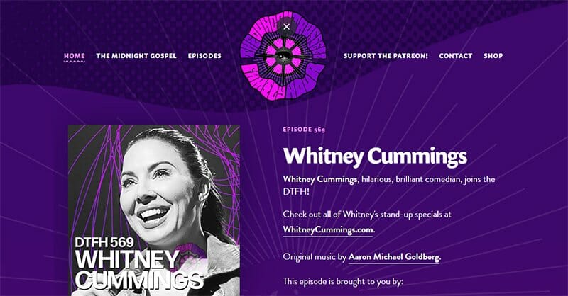
Duncan Russell’s podcast website displays the two colors (Royal Purple and Lavender Rose) on its logo throughout the site’s homepage. The Royal Purple color in different blends makes this website pop in the eye of visitors.
You can’t help but notice how the simple header used blends well with the Royal Purple color, attesting to the brilliance of this podcast website design. Including a search function in the footer section is a nice addition, allowing visitors to search multiple content offerings.
I love how the dark CTA buttons pinned to the homepage provide direct access to Patreon, Itunes, podcast RSS feed, and Duncan Russell’s socials.
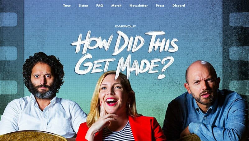
How Did This Get Made is a perfect podcast website example with an eye for aesthetics and comedy. Looks of surprise are the facial expressions from the three people serving as the hero image on this podcast website.
Not focusing only on the buzz, this podcast website displays plenty of information about new episode updates and contact information. The best part is the FAQs section with ready answers to the audience's possible questions.
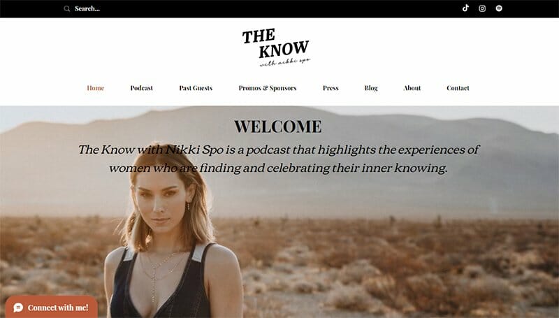
Nikki Spo’s The Know is a classical podcast highlighting the daily experiences of women in discovering their inner selves. Her podcast website offers a top bar where a search bar and her social icons take center stage.
I love how Nikki Spo displays an image of herself with brief podcast information in black font about The Know. This podcast website's best features are its chat box and popup newsletter subscription. These features ensure old and new listeners stay in the know.
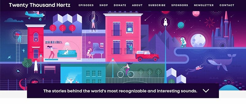
Dallas Taylor’s Twenty Thousand Hertz podcast website has an aesthetically-pleasing web design with an attention-grabbing animated image displayed on the site’s homepage.
The Twenty Thousand Hertz podcast website has a down-pointing arrow feature for navigation that allows users to scroll through the site. There are episode thumbnails that give this podcast website a full flair.
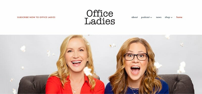
Office Ladies displays a bubbly hero image of two smiling ladies that makes its podcast website appealing to its audience. The web design is simple, with a clean header and footer built on the same white background.
You can’t help but love its CTA buttons in Thunderbird color that make this website design one of the great podcast website examples.
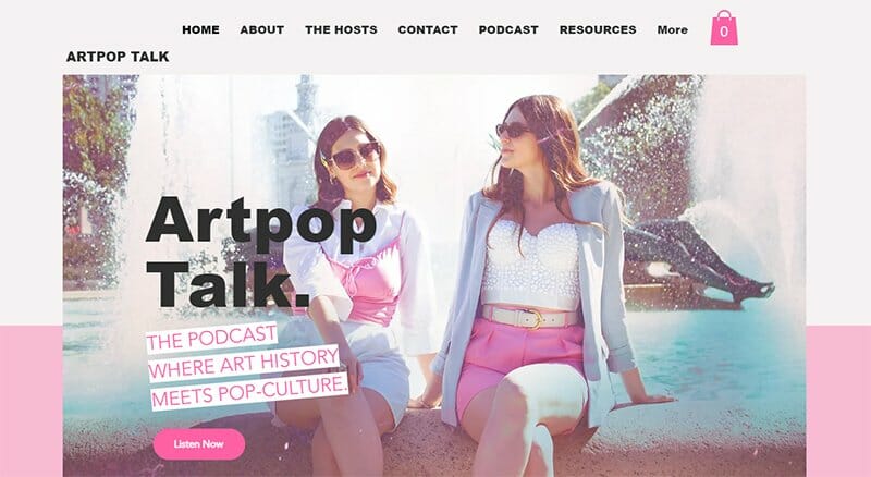
Artpop Talk is one of the beautiful podcast website examples, popular for its beauty and aesthetics. As a podcast website that serves as the bridge where art history meets pop culture, this podcast website pops.
Fonts and imagery are this podcast website's strongest suit. They complement each other to give it its unique outlook. I love how Artpop Talk cleverly integrates a YouTube video that talks more about what the brand is about.
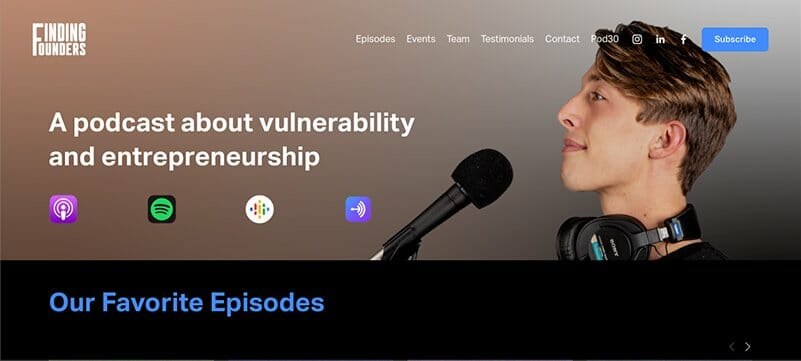
The Finding Founders podcast website focuses on vulnerability and entrepreneurship. You can’t help but love how this podcast website uses large fonts to pass its message.
I love the inspiring testimonial section of the Finding Founders website that serves as social proof. You will find testimonials from top brands about the show.
The homepage of this podcast website is its best attribute, with social links to its various social media pages and streaming platforms on display.
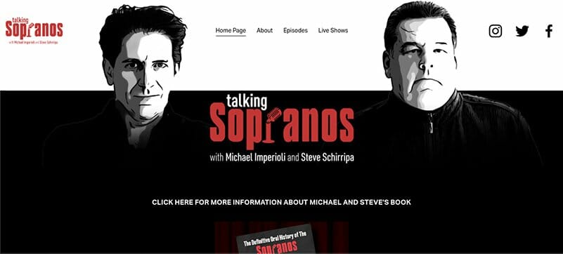
Animated images of the two hosts of Talking Sopranos, Michael Imperioli and Steve Schirripa are what new listeners first notice about this podcast website. The color scheme of red, black, and white matching the podcast artwork makes this website’s design stand out.
I love how visitors can listen to episodes directly from the homepage without needing to open another page. There are also multiple CTA buttons with direct links to contact details and streaming platforms of the podcast’s hosts.

Design Matters by podcast host Debbie Millman is one of my favorite podcast website examples. You can’t help but love how the color gradient in the background video slowly changes with time.
The site’s header menu is this podcast website’s best feature. I love how it is well-arranged with the cool fonts and spacing alongside a search function. All the text displayed in this section serve as CTAs and redirect to other pages on the website.
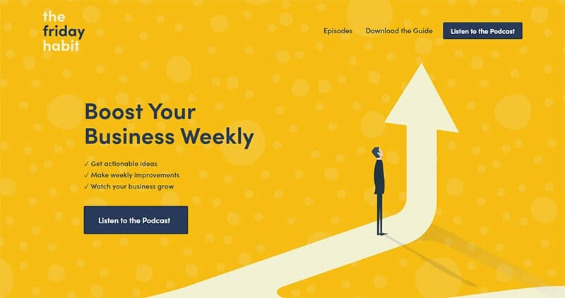
The Friday Habit is one of the best podcasts is a business-oriented podcast offering actionable ideas aimed at helping people grow their businesses weekly. The full-width image on the website with an upward-growing arrow all but symbolizes its desire for growth.
Orangey Yellow, Dark Blue Grey, Chrome White, and Pure White are the colors on display that make this podcast website stand out.
The standout feature is its CTA button displayed on the homepage labeled “Listen to the Podcast” which directs visitors straight to its podcast content. Talk about not wasting any time.
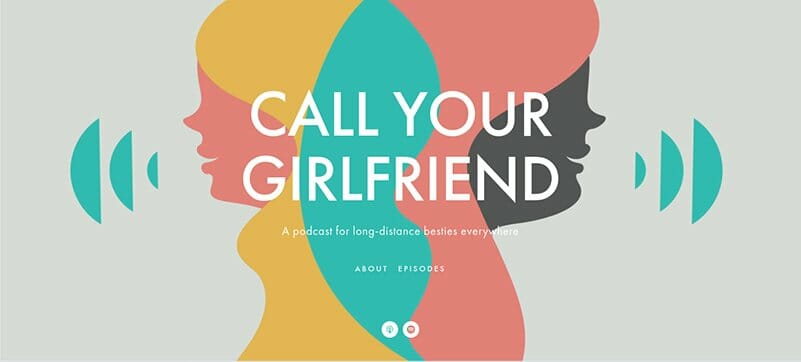
Call Your Girlfriend is a one-page website that uses a minimalist design and bright colors to attract visitors’ attention. You can’t help but notice the splash of Light Grey, Tulip Tree, Verdigris, and Light Coral colors on the page.
The only imagery on the homepage is the beautifully designed image of two women with colorful echos. Apart from the About and Episodes CTAs, the only other icons are the Spotify and iTunes logos leading to the podcast Spotify and iTunes accounts.
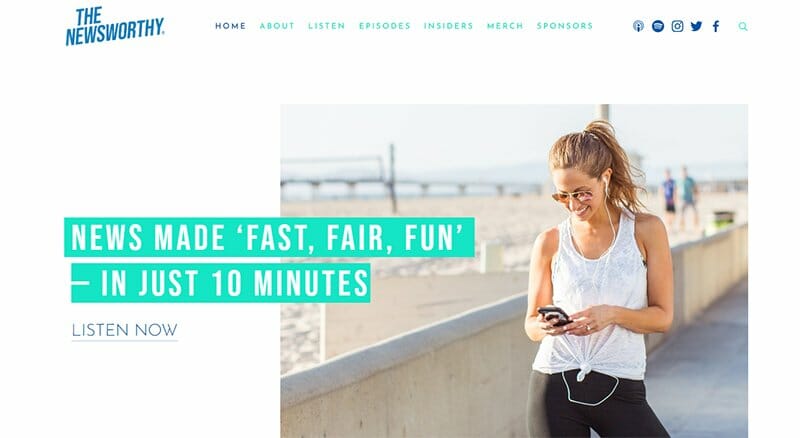
The Newsworthy uses consistent design for its podcast website, with a direct link to its recent episode in the site’s hero section. This podcast website offers users a worthwhile listening experience via its simple website layout built for both desktop and mobile.
I love the listener reviews section that displays reviews about the podcast, serving as social proof for new listeners.
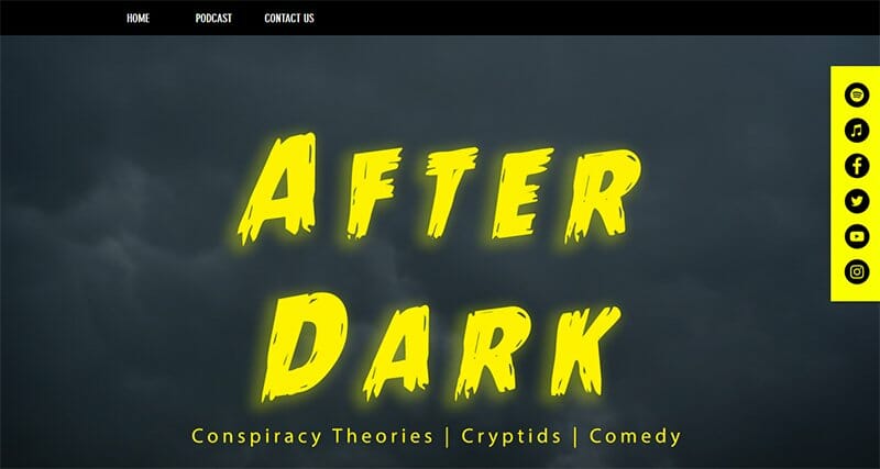
After Dark is a true crime and comedy podcast with a website design that takes you on an after-dark experience with its cloudy background effects. This podcast website uses effects that add doom and gloom that make it more intriguing than other podcast websites.
The Articlick Yellow, Outerspace, and Gun Metal color scheme displayed makes this podcast website design unique. I love how the social media and streaming platform icons pinned to the right side of the homepage on a colorful Articlick Yellow background stand out.
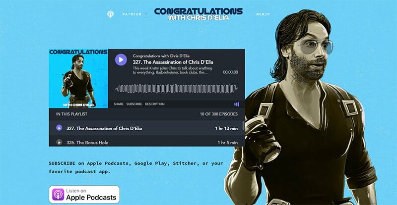
The best features of this podcast website are what first greets you when you access the webpage. The sticky audio embedded on the home page is the first standout feature. You can listen to podcasts directly from the website with this feature.
The large CTA button invite just below the fold is another feature, so bold you can't miss it. I love that there is a separate Apple Podcasts CTA button with a direct link to Apple Podcast for Apple users.
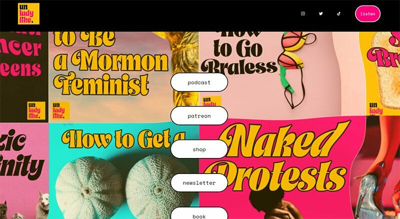
Unladylike uses an attention-grabbing background that immediately steals the attention of any visitor. Legible fonts and wavering colorful images give this website a beautiful outlook.
Unlike other podcast websites, the menu links are at the center of the homepage in white backgrounds distinguishing them from the artistic flow.
You can also listen to episodes directly from the homepage. The Unladylike website’s homepage displays a playlist of its recent podcast episode.
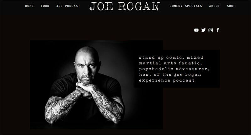
Joe Rogan is one of the best podcast website examples you can learn from to design your own website. You can’t help but notice how the website uses a dark theme background to make its white text legible and easy to read.
I love how the website links to The Joe Rogan Experience podcast hosted on the podcast hosting site Spotify.
Joe Rogan’s site offers more than just podcasting, with biographical statements, social media integrations, and contact details. Talk about a carefree mix of a podcast network with the real world.
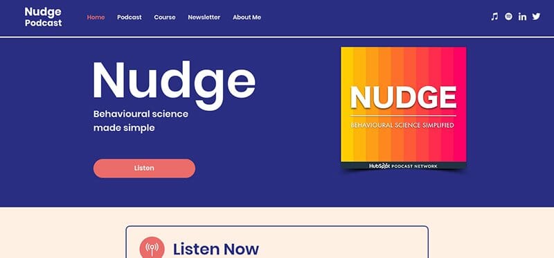
Nudge is a podcast that applies behavioral science concepts to its business acumen. This podcast website layout is clean, simple, and user-friendly, displaying colorful images and backgrounds.
I love the use of smart colors that make the website attractive and how it offers the best listening experience via its audio player. Nudge’s CTA buttons are well spelled out with smart colors differentiating them from ordinary texts.
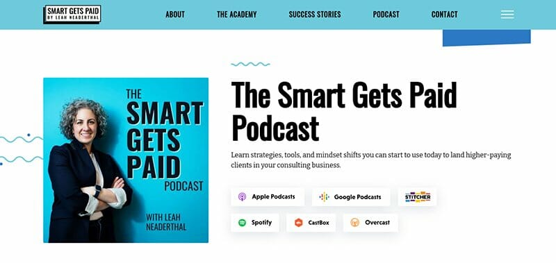
The Smart Gets Paid podcast with Leah Neaderthal website is visually-appealing due to its astonishing color blend complimenting its grid layout.
The hamburger menu at the top-right corner, accompanied by the sticky menu at the header section both serve as a handy navigation feature for visitors.
Including multiple subscribe buttons with links attached ensures visitors can choose their preferred podcast episodes easily from the episode pages.
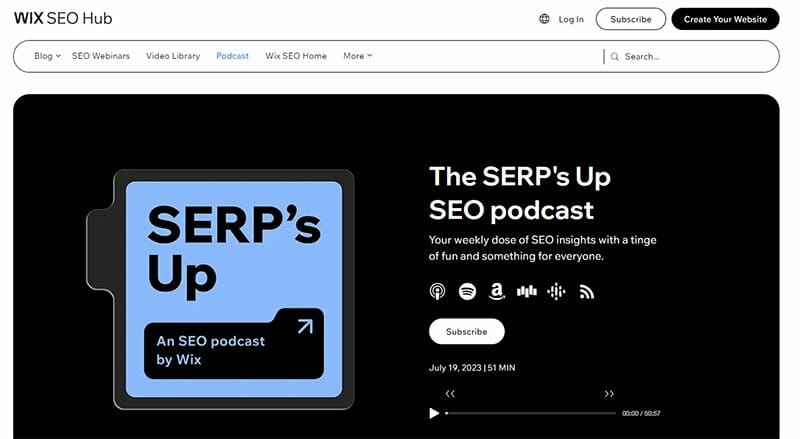
SERP’s Up is a podcast hosted on the Wix website that uses a minimalistic design with bold text. I love how this podcast website uses black and white as its dominant colors and promotes its latest episode on its homepage.
The standout feature is the two-column grid-layout blog offering access to other podcasts alongside a well-crafted “Load More” CTA button.
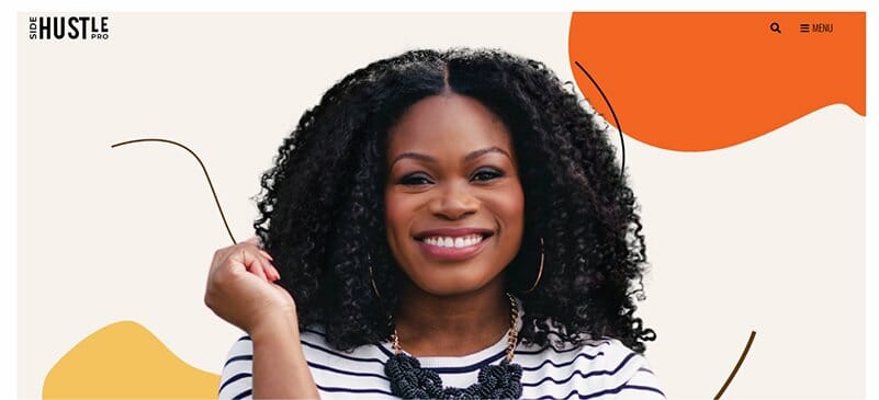
Side Hustle Pro highlights the triumphs of black female entrepreneurs who turned their small side businesses into big ventures. This modern podcast website design uses Halloween Orange, Fantasy, and Saffron Mango colors that are pleasing to the eye.
The sliders and spacious layout used by the Side Hustle Pro podcast website make it one of the most beautiful podcast website examples.
I love the “Featured in Podcast” segment that displays a slideshow of images of past guests with direct links to see previous episodes.
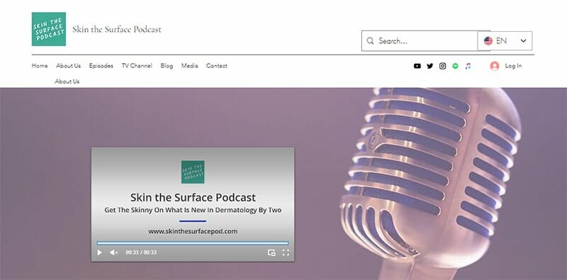
Skin the Surface is a dermatology podcast with the voices of Dr. Mary and Dr. Rina in the background offering skin advice. I love the Podcast Calendar section that gives a bird eye view of upcoming events to help subscribers keep track.
The best feature is its website translation feature beside the search feature, allowing translation across 13 languages.
Best Podcast Websites FAQs
A podcast website is a landing page for podcasts where people get valuable information about a podcast from the site. Podcast websites put creators in control of their podcast releases and the ability to grow their audience base for more listeners.
There is a long list of website builders for you to consider in building your podcast website, each with unique features and qualities. Wix and Squarespace are the best website builders in terms of eye-catching templates and relevant features.
There are many free podcast hosting sites and streaming platforms where you can host your podcast episodes. The most popular podcast hosting platform is Spotify. Other free site examples include Buzzsprout, Acast, Pinecast, and Podbean.
The required steps to create your own podcast website varies depending on the platform you intend to use. But generally, to make your podcast website, you need to choose a web host, then design a website, and you can start uploading content of your choice.
