25 Best School Websites Designs For Inspiration 2025
Every school needs to have a professional website that provides vital information about its day-to-day and extracurricular activities to prospective parents and students.
Creating a visually-appealing and professional school website doesn’t have to cost a fortune. You can hire school website design services to design your site.
But if you are looking for an affordable alternative, use website builders like Squarespace and Wix that provide you with a drag-and-drop interface and customizable templates.
This article covers the 25 best school websites that you can use as inspiration to create your own unique and personalized design.
Let’s get started.

The Seascape Private School website’s header menu displays menu links in black font over an extensive white background. As users scroll, the header menu gives way, revealing the site’s hero video amidst a welcome text displayed over it in white font.
A Let’s Chat feature pinned to the right-hand corner provides visitors with a means to communicate with the school. A huge body of text takes up significant space on the homepage, providing all there is to know about the school’s brand and its home-schooling stance.
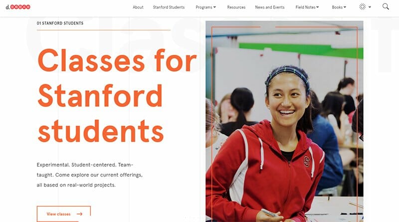
Stanford is a prestigious and respected educational institution with the stern belief that everyone can be creative. The homepage features lines of different shades of Red-Orange color, with the most prominent one serving as its hero image, adding an effect to the welcome text displayed.
At the center is an arrow navigation feature in Stanford’s Red-Orange logo color, encouraging visitors to explore Stanford. The Red Orange color is visible as ordinary text and border lines on the homepage, along with Blue, Orange, and Green.
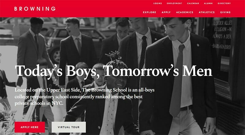
Browning is an all-boys college preparatory school leading the ranks of the best private schools in New York. I love how Browning uses a Cadmium Red color background to draw attention to the black-and-white image of high school students used as the site’s hero image.
Among the excellent school website designs, icons linked to Browning Schools’ social media pages are in-between its slideshow testimonials and an image gallery. Close to the footer section is an upcoming events section, preparing students ahead.
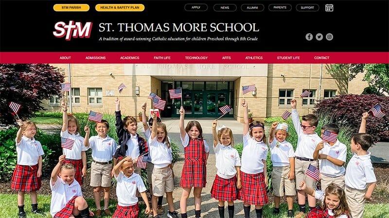
St. Thomas More School is a catholic Christian-centered community integrating spiritual and intellectual growth by nurturing faith, encouraging academic achievement, and inspiring responsible action.
One of the best school websites, the STM website uses Wix as its content management system, providing visitors with an engaging experience. I love how the website is full of high-quality images in a slideshow format. You will find more images as you explore this school website.
Social proof is one standout feature of the STM school website content, displaying parents’ and alumni testimonials in a slideshow format.
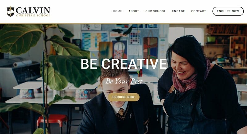
Calvin Christian School partners with parents to equip and engage students for life beyond school. Like its mission, the Calvin Christian School website engages visitors with two action words over slideshow images of students and teachers alike.
The Enquire Now CTA button placed alongside the action words in a Bullet Shell background is uniquely positioned to arrest the attention of potential students.
Calvin Christian School’s website has a newsletter section on a Bullet Shell background, prompting users to sign up for the school’s newsletter. There are centralized social media icons displayed in this section of the homepage.
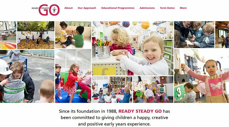
Ready Steady Go aims to give children a happy, creative, and positive early years experience. This educational website uses a minimalistic layout to pass its message.
The first thing visitors notice on the Ready Steady Go website is the varying length and width framed images taking center stage on the website. You can’t help but love the high-quality photos that show what Ready Steady Go offers current students.
I love the search feature included in the footer section of the homepage, one of its many helpful features.
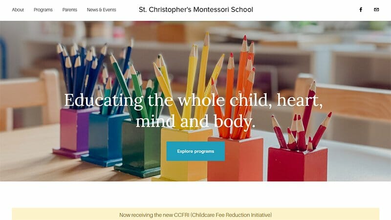
St. Christopher’s Montessori School is one of the best school website designs that display visually stunning images of stacked pencil crayons as its hero image.
Consistency is the recurring theme in the St. Christopher’s Montessori School website, sticking to the Eastern Blue color as the background color of its CTA buttons.
I love how the St. Christopher’s Montessori School website displays quality content on its homepage with neat typography, making every read worthwhile.
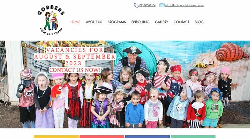
Cobbers Child Care Centre is a family-owned local business that provides a warm and caring environment to nurture and educate children. A smiling and colorful hero image of children and an instructor takes center stage, welcoming visitors to the website.
Bold colors and playful images are the visual elements Cobbers Child Care Centre uses to capture visitors’ attention. Visitors enjoy a great layout, with its content centralized, leaving visible white spaces on the homepage.
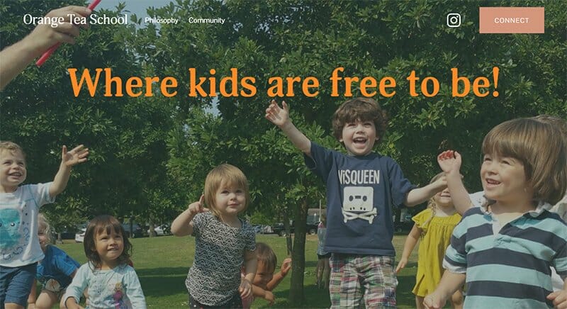
Orange Tea School is a full-day pre-kindergarten and kindergarten program with a fully integrated play-based child-led curriculum that provides a rich and dynamic learning experience.
I love how the free-spirit image of kids gives an idea of the kind of learning environment the Orange Tea School provides.
Orange Tea School website homepage has three main sections, each separated by full-screen background images. An Instagram icon and a Connect CTA button serve as this school website’s contact feature.
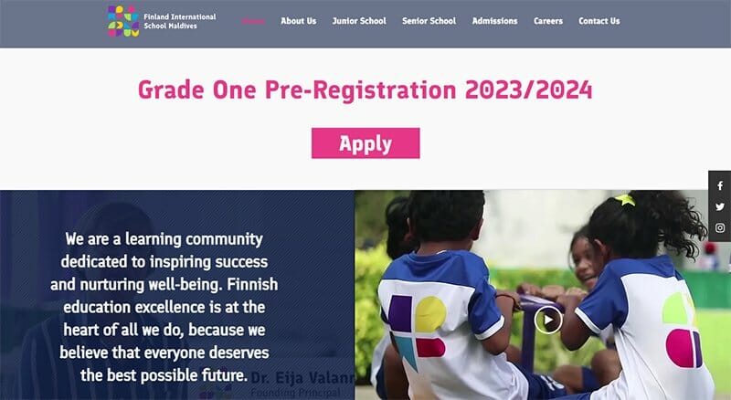
Finland International School Maldives is a learning community dedicated to inspiring success and nurturing well–being. I love the large announcement text in Cerise Pink it displays at the top of its homepage.
This school website offers outstanding features, with two-column videos serving as the site’s hero section. The video on the left has the school’s curriculum displayed over it, overshadowing the video in the background.
You will find icons on the right-hand side of the homepage that leads to Finland International School’s social media platforms.
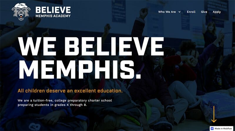
Believe Memphis Academy is a great school with the belief that all children deserve an excellent education. One of the tuition-free educational institutions, the Believe Memphis Academy uses a user-friendly web design for its school website.
The color Orange Peel is prominent throughout the Believe Memphis Academy website, most notable as border lines for the site’s CTA buttons. I love how the orange peel is the color of the underline text headers and the arrow navigation feature on the homepage.
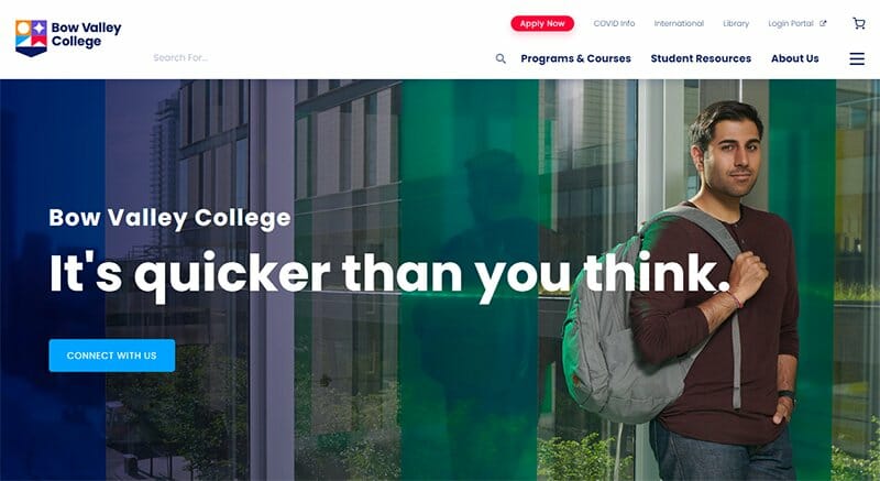
Bow Valley College through its student-centered services provides a valuable resource that enhances the student environment and supports academic success.
A step at making its school website easily navigable, Bow Valley College's website includes a search feature in its header menu beneath its colorful logo. Another search feature becomes visible via the hamburger menu alongside a list of other navigation features.
The footer section on an extensive Gulf Blue background is home to everything that concerns Bow Valley College, including linked icons to their socials.
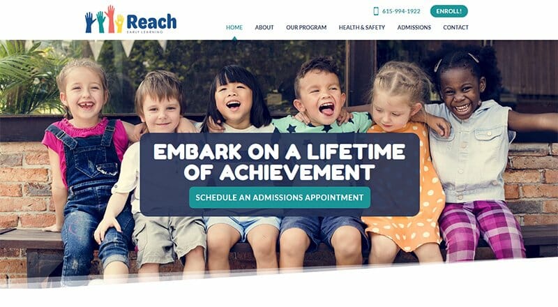
Reach Early Learning Center is an early education program serving children ages 3-5, following their unique learning through developmentally appropriate practices. This school website centers on a smiling image of six children drawing new students from its happy hero image.
I love how the website displays the color Eastern Blue as the site’s predominant color. The Reach Early Learning Center website is full of in-depth information about its services, ensuring visitors are thoroughly informed.
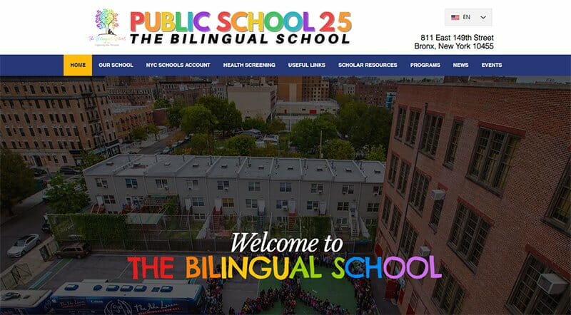
The Bilingual School is a learning community that caters to multi-language learners and students with special needs. This website design is visually appealing, displaying bold colors as text and backgrounds for its homepage section.
The school’s mission is displayed in bold black font underneath an aerial view image of the school that serves as the site’s hero image.
I love the use of the White and Purple Haze color scheme. Colorful icons linked to The Bilingual School's social media pages are boldly displayed on the homepage.
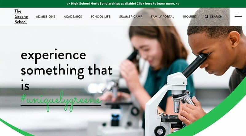
The Greene School, through its nurturing and caring environment, prepares and engages students to analyze situations, make decisions, solve problems, and communicate effectively.
Sticking to the color Dartmouth Green for its web design, The Greene’s School website is user-friendly, providing a seamless user experience. This visually stunning website design uses quality images, shapes, bold colors, and typography to attract website visitors.
The homepage features a quick links section on Dartmouth Green and Dark Mint Green background, serving as one of its user-friendly navigation features.
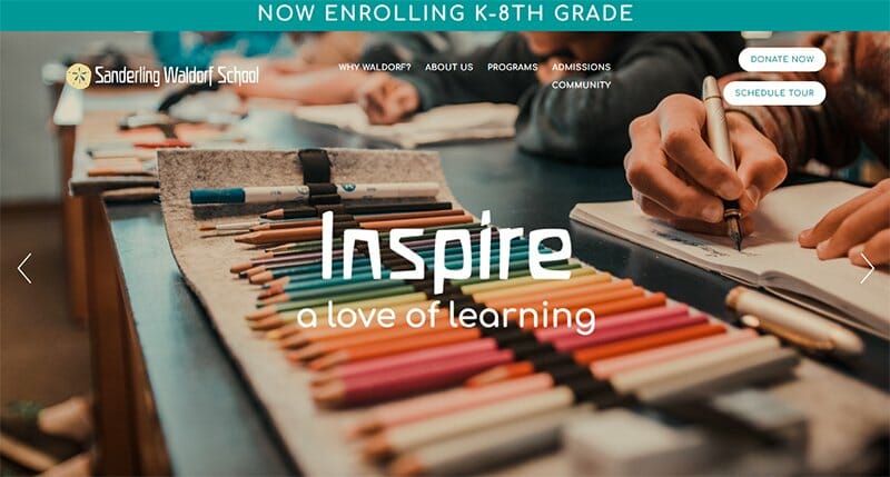
Sanderling Waldorf School believes in fostering a lifelong love of learning in every child through its developmental-appropriate curriculum that addresses all aspects of a child.
This good school website design ensures the focus is on the child by displaying slideshow images of children as its hero section. There is a Vimeo-powered video describing why Sanderling Waldorf School is a good choice further down the homepage.
Prospective students learn about the services offered and achievements recorded by this educational institution. I love how Sanderling Waldorf School displays key figures in bold white font.

Little Building Blocks is a family-owned and operated early childhood center that focuses on providing a safe, fun, and nurturing space for all children.
The first slide of images from the slideshow features a personalized welcome note, with a CTA button prompting visitors to learn more. One of the most responsive school website designs, the Little Building Blocks website blends images and text perfectly to convey its message.
I love how it alternates between images and texts in listing out its program offering, a great feature for any good website.

Heather Field School is passionate about providing the best education for pupils with additional needs through a therapeutic approach centered around individual needs.
“Together, we belong” is the text in bold complimenting an image of hands mounted together, an excellent choice of hero image.
This school website design is simple yet well-organized, displaying its website content in a centralized layout. The content arrangement makes it easy for prospective parents to find the information they need from the homepage.

St. Louis Academy is a K-5 public charter school on a mission to leverage media arts and storytelling to equip students to contribute to their communities.
Built to attract new students, the St. Louis Voices Academy makes its web design loud and clear, displaying animated images amidst bold colors.
A quoted text from Dr. Hollie Russell-West serves as the Academy’s social proof, visible on a Fun Blue background beneath the Academy’s mission statement.
There is a slideshow of upcoming events taking center stage that allows visitors to keep track of the Academy’s activities.
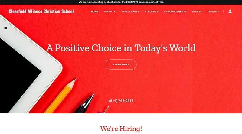
Clearfield Alliance Christian School trains future leaders through rigorous academic, athletic, and artistic pursuits with an emphasis on integrity and influence for Christ.
The Artyclick Red bold color is the Clearfield Alliance Christian School website's dominant color, visible throughout the homepage.
Quality school-related images in a centralized three-column layout serve as background images for the website’s navigation feature, complimenting the header menu.
There is a Quick Links section beautifully adorned in Artyclick Red and White, linked to other dedicated pages.
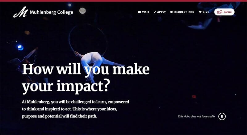
Muhlenberg College challenges its students to learn, think and act, creating a safe space where their ideas, purpose, and potentials align.
This school website design uses a video background with a pause feature as its hero image, treating site visitors to the thrilling world of Muhlenberg College.
I love how Muhlenberg College's website uses white and vivid burgundy colors from its logo. Vivid Burgundy is the background color for its CTA buttons and header texts.
Social proof is one feature this school website has in excess, displaying testimonials in video and text in two separate sections on the homepage.
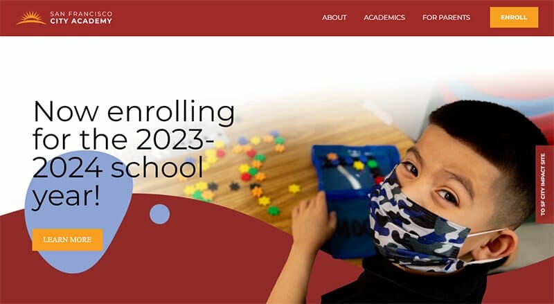
San Francisco City Academy offers faith-based education for students to develop a strong Biblical and Christ-centered foundation. This school website uses a color scheme of Vivid Auburn and Carrot Orange for its web design and displays high-quality images and shapes.
I love how the San Francisco City Academy website sticks to the Carrot Orange color as the background color for its CTA buttons.
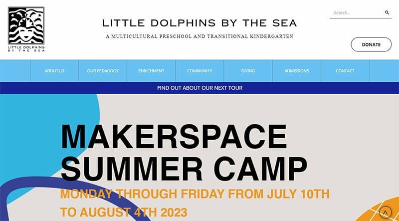
Little Dolphins is a multicultural preschool and transitional kindergarten fostering community, curiosity, and creativity. Navigation links in the Denim Blue background take center stage below the header menu using drop-down menus to reveal hidden content.
Colorful slideshow images are visible throughout the site as background and gallery images for its About section. The What People Are Saying section displays reviews from parents in a centralized layout with quoted text in Denim Blue font colors.
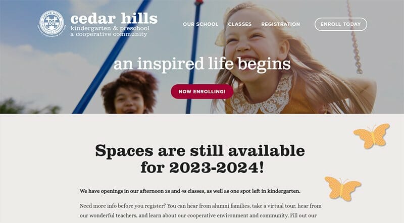
Cedar Hills offers a kindergarten, preschool, and a cooperative community, integrating students and members as community members.
Immediately catching visitors' attention on the Cedar Hills School website is the background image displayed beneath the header menu. The image of two kids having fun helps paint a positive picture in the minds of visitors.
Full of animated images and illustrations, Cedar Hills makes its school website fun and entertaining for students and visitors.
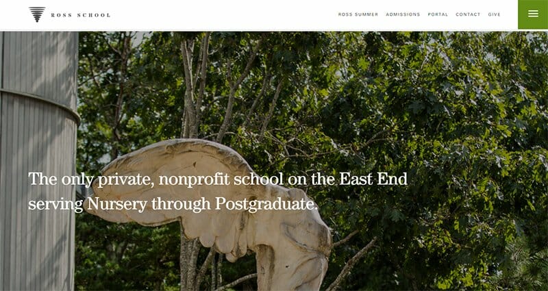
Ross School prides itself as the only private, nonprofit school on the East End serving Nursery through Postgraduate, written boldly over its site’s hero image.
The video powered by Vimeo is one of the top features of this school’s website design, taking site visitors on an online tour of Ross School.
I love how the hamburger menu in the header section serves as its navigation feature, displaying a list of navigation features on the homepage.
This school website also includes logos of top scholars and experts it collaborates with, serving as social proof to potential students.
School Website Examples FAQs
The school district is one of the biggest factors determining whether a school website will pull in visitors or not. A more populated school district will have more visitors than a densely populated one. Harvard, Yale, and Stanford have some of the highest visitations thanks to their high ranking in the list of top schools in the world. A notable mention is the Porto Business School.
Every good website depends on written and visual content to drive its message. Your website's ability to deliver on both makes it a good school website. Delivering on these two key elements helps your school website design stand out. Appearance, ease of use, inclusion of videos and images, links, and contact info are some features that make a good school website design.
Attracting prospective students depends on how attractive your school website is. A user-friendly and feature-rich website is essential. Attracting new students requires you to invest in good web designers and site builders like Squarespace and Wix.


