20 Best About Me Page Examples in 2025
Before designing your “About” page, it’s good to get some inspiration from the best “About Me” pages online.
In this article, we share with you twenty “About Me” page examples to show you how to connect with prospects and build your personal brand.
We also indicate which of the best website builders were used to create these pages. This will help you quickly design yours using the page templates provided by the same website builders.
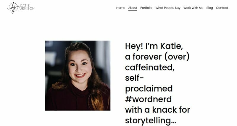
Katie is a freelance copywriter and content marketing strategist. Her “About Me” page starts with her picture and a short description of herself. Notice how she keeps it informal and mentions a fun fact—she loves coffee.
She follows that with two paragraphs about her educational background, her decision to become a freelancer and a pitch. Then comes a screen-wide banner with names of publications she’s been featured on.
The next section is a mix of pictures and text describing different aspects of her life.
The section is split into four parts and uses a color scheme of white and light purple. There is a lot of visual content here and a considerable amount of white space.
After this, you get a testimonial section with a “Read More” button leading to the testimonials page.
The page ends with a quote by Seth Godin and a call to action. Katie's page provides lots of design and copy inspiration, especially in how she designed the section about what makes her tick.
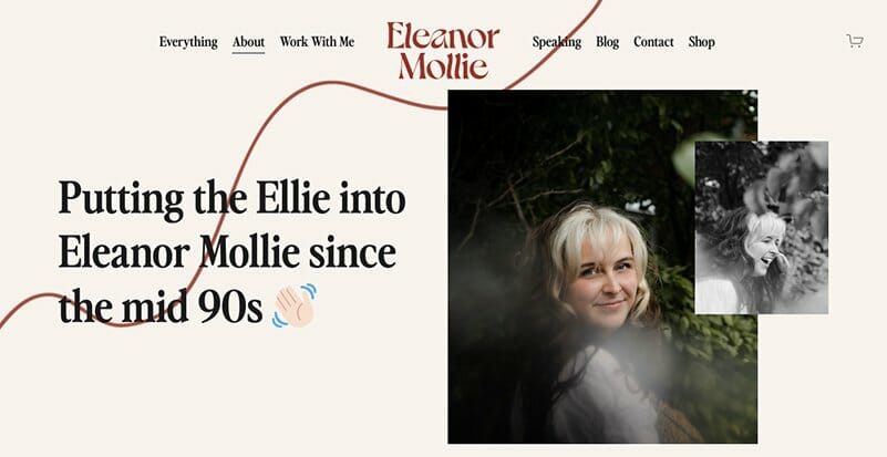
Eleanor is a copywriter, consultant, podcaster, and founder. Since managing all these creative projects may make her seem too serious, she decided to be casual and playful. You can see this from her choice of fonts, pictures, and words.
Below the hero section, she describes herself and her target audience as well as her services. She then provides a short pitch and a CTA button.
In the next section, Eleanor talks about having thousands of sunset photos, a degree she hates, duck popcorn makers, and a love for tiramisu. She does this using a casual tone, emojis, and some pictures.
She follows this with names of brands she has worked with, a CTA button, and finally a sign-up form.
What stands out from this page is the casual copy and images. Although Eleanor has worked with big brands, she shows that she’s not all work with no play.
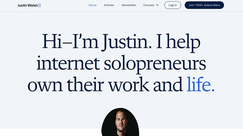
Justin Welsh is a solopreneur best known for the business advice he shares on LinkedIn and X. The hero section of his “About Me” page prioritizes copy over his picture.
This is followed by a section about his journey from a full-time job to entrepreneurship and the life decisions he made along the way. Next, Justin talks about the six topics he writes about. The topic names are links to specific pages while the descriptions are pitches showing his expertise.
In the following section, he continues his pitch touting what you’ll gain by taking his course or consulting him. The page ends with a sign-up form and some social proof—170k+ newsletter subscribers.
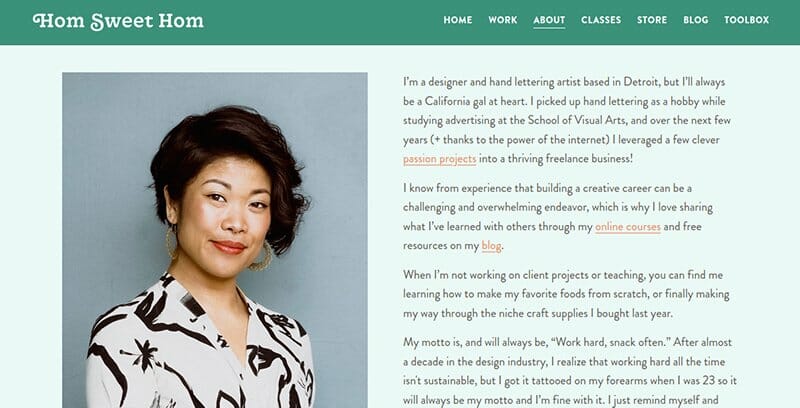
Lauren is a designer & lettering artist from Detroit who has used her skills to help market many big brands. On her entire page, she uses a color scheme that includes jungle green, turquoise, orange, and white to create contrast between text, images, and backgrounds.
In her hero section, Lauren adds links to her online courses within her story to maximize sales opportunities. She then promotes an upcoming event, lists previous clients, talks about her public speaking engagements, and adds a video of a past event.
Lastly, she lists her online courses and shows her other passions through a highlight of her Instagram posts.
Although Lauren uses a lot of text in her hero section, there’s a smooth transition into sections with lots of images and large margins. Of all the “About” page examples, this one does a good job of showing you how to use multiple colors to create contrast.
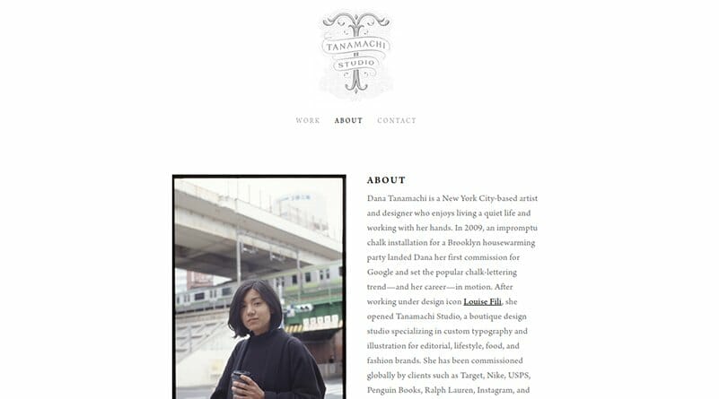
Tanamachi Studio is owned by Dana Tanamachi from New York City. She specializes in creating custom typography and illustrations.
Her “About” page is simple. It focuses on text and uses black and white only throughout the page. Next to her picture is a summary of how she started her journey and ended up working with big brands.
Below this, Dana lists 60+ clients she has worked with. Using a horizontal line to separate sections, she proceeds to list brands she has collaborated with on speaking engagements.
After this comes another section listing her awards and recognition as well as judging opportunities in different shows. This is followed by links to media interviews she has had and the names of agencies representing her.
The highlight of this page is its minimalist design. This shows that even creatives can communicate their expertise without a lot of words and images.
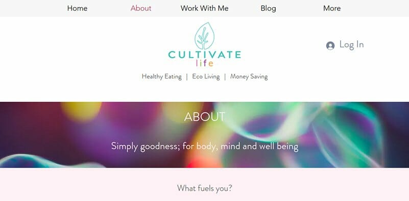
Cultivate Life is run by Yuki Solle as a passion project though she’s also certified in nutrition and weight management. Although her “About” page is quite simple, it contains unique web design elements that make it attractive and inspiring.
For her hero section, Yuki opted for a banner image with her tagline. She followed this with a section that captures website visitors’ attention with a question. For an answer, she describes herself, what she loves doing, and mentions what her audience will get from her.
After this is a testimonials section followed by a sign-up form.
One of the things that stands out about this “About” page is its interesting color scheme. From the background to the images used, Yuki combines white, black, and different shades of gray, green, purple, and pink to communicate her message.
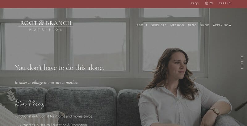
Root & Branch Nutrition is run by Kim Perez, a functional nutritionist whose target audience is moms and moms-to-be.
Her hero image features her picture, some copy, and a parallax scrolling effect. Below this is a section that introduces the rest of the page, stating that she’s a recovering perfectionist.
Next is a section split into two to show scrolling pictures on one side and several paragraphs on the other side describing her pregnancy journey. This is followed by a list of challenges perfectionist moms face and how Kim can help them.
After this you get more copy encouraging expectant women to pursue a balanced life. She then adds two CTA buttons and concludes with some Instagram posts.
What stands out is Kim’s story about her journey to overcome perfectionism. Her page is also inspiring due to her ability to include her choice of colors in her pictures.
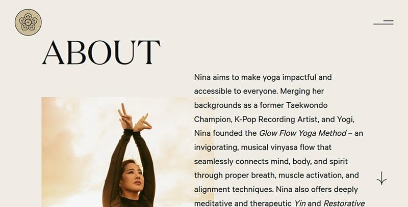
There’s a lot to love about Nina’s “About” page. You’ll notice that her color scheme matches with the pictures of herself exercising outdoors. Her hero image and the picture at the bottom of the page employ a parallax scrolling effect to increase engagement.
Below the hero section, you find scrolling paragraphs of text on a black background, followed by a lengthy testimonial from a client.
Below this testimonial, Nina urges visitors to take action, adds a booking button, and finishes with a picture of herself.
This page stands out among other “About” page examples for its color scheme and scrolling effects that create a delightful user experience. And with large fonts, reading through the text is also easy, helping visitors see the benefits of working with Nina.
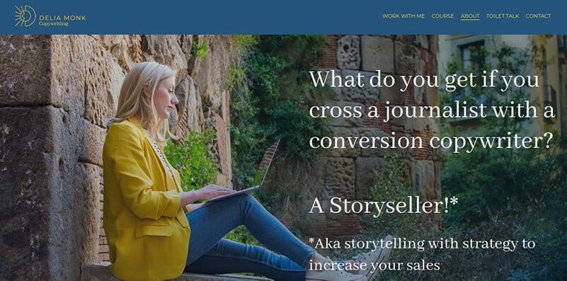
Delia is a certified copywriter who uses her “About” page to show her personality.
Below her hero image, you will find a section that reveals Delia’s way of thinking. Here you get Delia’s picture and text that uses a dating scenario to show you how to communicate your message effectively.
Next is a testimonial from a client who was happy enough to let Delia include her full name and photo. And just when you thought Delia was done with the humor, you get a set of funny stories about her past.
After this, Delia showcases her certifications, talks about her love for the sun, and adds a picture of her family. She then adds some copy, a call to action, and finally a sign-up form.
One thing that’s clear from Delia’s “About” page is her personality. She shows this using lots of yellow colors and funny yet effective copy.
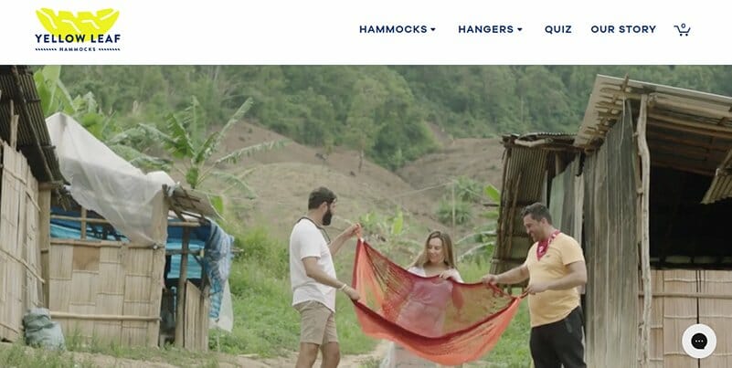
The Yellow Leaf Hammocks’ “About” page starts with a video that tells the brand story of this social enterprise.
Below the hero video is a brief “Our Story” section that summarizes the video's content. This is followed by text about how Joe—one of the co-founders—discovered Hammocks while on vacation and how they’re creating jobs for the weavers.
Further down you get a CTA button leading to the online store, a highlight of the hammock weavers, and a sign-up form in the footer.
Yellow Leaf Hammocks has one of the best “About” page examples for showing how you can communicate your company values.
The biggest inspiration however is the show of social responsibility. This page puts a lot of focus on the community that weaves the hammocks and shows how the business is transforming lives.
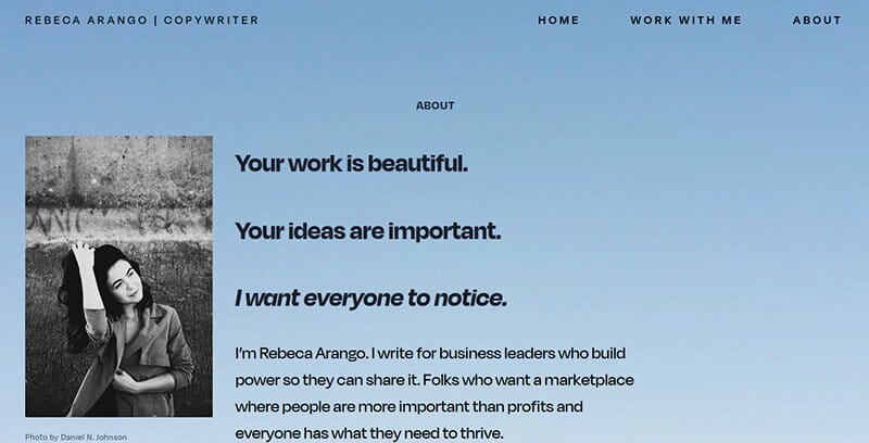
Rebeca Arango is a copywriter who is very specific about the clients she works with. She also discusses what she hopes to achieve through her work. Her page is quite long and has a lot more detail about her core values and methodology.
After the hero section, Rebeca shares her background to show her experience as a copywriter. She mentions some personal accomplishments, introduces her values, lets you know who she has been learning from, and adds a “Work With Me” button.
Next is a sign-up form, a quote on communication, and a section about how she empowers marginalized communities.
What stands out most about Rebeca is how specific she is about her choice of clients. She speaks at length about her values and why she believes in them. From this, anyone who shares the same values will quickly relate with her and choose to work with her.
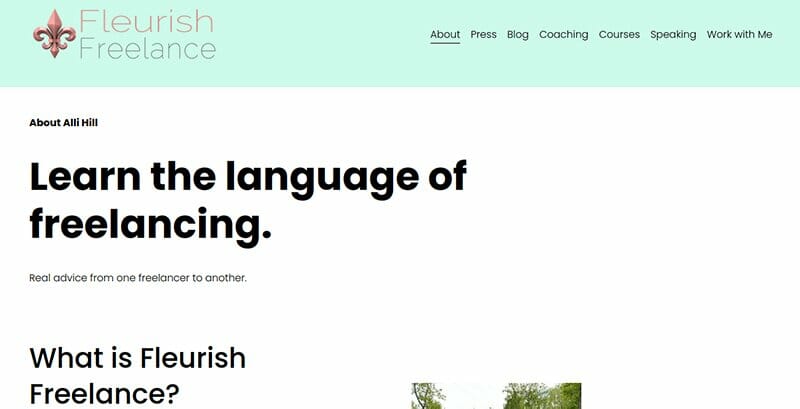
Fleurish Freelance is a freelance coaching website owned by Alli Hill. On her “About” page, Alli shares a lot about her journey from an eight-hour day job to successful freelancing.
Alli dedicates the top of her page to copy that helps her connect with freelancers looking for advice on how to grow their businesses. It’s only after scrolling that you get her picture, a short introduction, and some motivation for growth as a freelancer.
Next is a “My Story” section featuring several pictures and text explaining how she ventured into freelance writing. After this, you get a quote about freelancing, followed by links to her courses and blog. There is also an opportunity to book her for speaking engagements.
From Alli’s page, you can easily tell that she understands the challenges of building a freelancing business. This makes it easy for her to relate with those starting as freelancers.
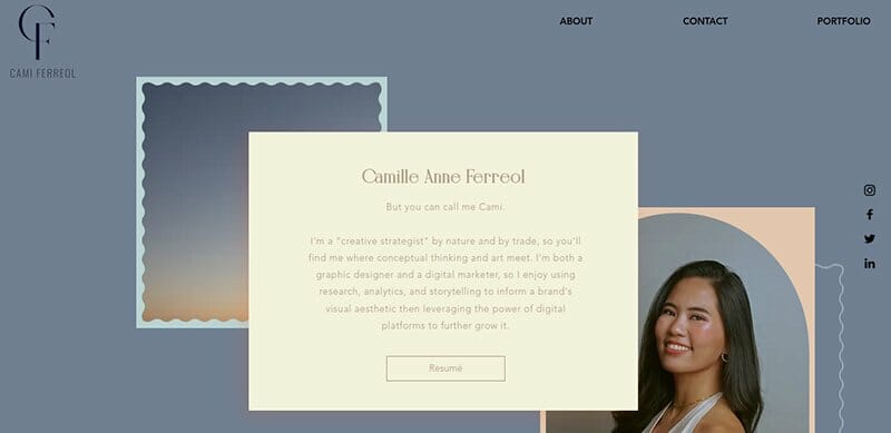
Cami describes herself as a creative strategist and her “About” page shows some of that creativity.
First, the top navigation menu is minimalist in design and features a transparent background and social media links beside her picture. Secondly, instead of focusing on her picture, Cami focuses on the text describing her by placing it center stage.
She then carves out sections of the page with postage stamp-like borders. This comes out beautifully in the FAQ section which uses a slider to answer various questions.
For some fun engagement, the letters “FAQ” are written inside a star shape that features a hover effect. The page ends with a banner that includes a link to a Spotify track that she’s listening to.
Cami’s page design shows that you don’t have to be modern to have a great site. Even with something as old-school as postage stamps, you can still end up with a beautiful page.
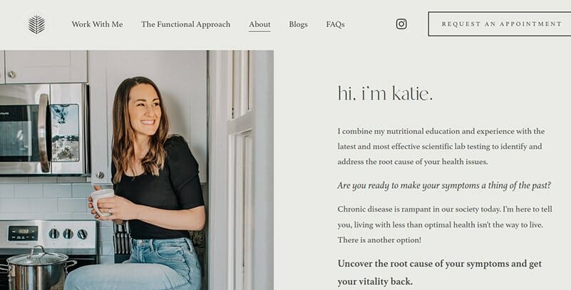
Katie is passionate about functional nutrition and its health benefits. She splits her hero section into two with her picture on one side and some text beside it pitching her solution.
At the end of that pitch is a “Work With Me” button. This is followed by a full-width banner with a quote meant to show how functional nutrition can change your life.
With another picture and more text, Katie talks about her past health challenges and how she found the solution in nutrition-rich foods. After this, you get some pictures of herself and her family, some qualifications, and finally, another pitch and CTA button.
Katie has one of the best “About” page examples that shows a color scheme that matches both the page's background and pictures.
This shows that a careful selection of pictures to match your site's color scheme can enhance the look and feel of your website.

Belinda is a freelance fashion designer focused on sustainability. Her “About” page starts with pitching her experience working with big brands. Below this, you get her picture and achievements.
With a section titled “Source Base Experience”, Belinda uses a world map to show locations from where she has had work-related experience. This map is a welcome alternative to using text to show a list of countries. She follows this with another visual display of her brand values.
After this, the page shows visual and text explanations of what a circular fashion business looks like. Finally, you get a “Work With Me” section featuring a CTA button.
Apart from the sustainability that Belinda pitches, she tells a story that emphasizes her achievements and experience working with big brands.
Belinda’s page is a great example of using creative visuals to increase engagement and guide site visitors to your online store.
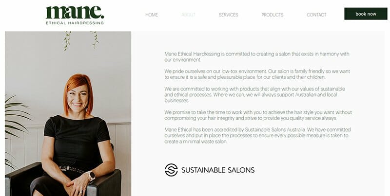
Mane Ethical Hairdressing’s “About” page is all about communicating the brand values of this sustainable salon.
Starting with a picture of the founder and text describing the salon’s values, Mane also shows that they have been accredited by Sustainable Salons Australia. This adds weight to their claims and helps in building trust with website visitors.
Below the hero section, you get two images showing hairdressing operations, followed by profiles of the founder and her colleagues.
The founder—Bronwyn Cassells—has a profile that describes her experience and journey to founding the salon. Below her profile are those of two stylists working with her.
This page focuses on what sets the salon apart—sustainability. The salon intends to market itself based on how its family-friendly environment minimizes waste while working with suppliers who share its values.

Anna Greenan, the nutritionist behind Dietitian At Your Table has seen enough people frustrated trying to live within a strict diet. Promising freedom and good health, her “About” page assures potential customers that she has the solution.
The page starts with her picture and description of herself as a non-diet nutrition counselor. She promotes intuitive eating principles and finishes this section with a button for contacting her.
Anna follows this with another short pitch and a button leading to an inquiry form. After this, she lists her qualifications, the additional training she has received, more CTA buttons, and finally, the professional bodies she is a member of.
This “About” page can help you design personal websites that focus on the pain points of your potential customers. Notice how Anna shows that she understands her prospects’ challenges and communicates that she’s qualified to help them live a more fulfilling life.
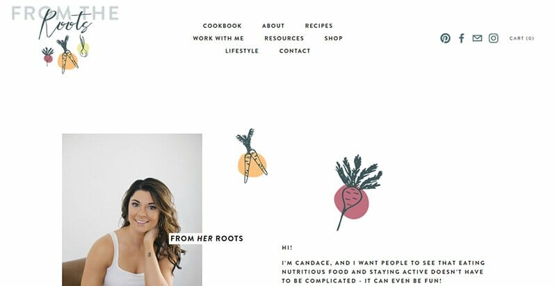
“From The Roots” has a page design that uses creative illustrations to show the foods you’ll be encouraged to take. The “About” page starts with a picture of Candace—the nutritionist behind the blog—and some text introducing her and her blog.
Next is a section in which she mentions a degree she has and her healthy and family-friendly recipes. After this is her picture and text about the publications that have featured her recipes. She also lists some of the brands she has partnered with on her blog.
Candace follows this with additional pitching, lists her certification, and a testimonial from a client. After this is a disclaimer, some Instagram posts, a highlight of blog articles, and a sign-up form.
The way Candace uses graphic illustrations to add fun makes this one of the best “About” page examples. Also, her emphasis on the benefits of functional nutrition helps her connect with any potential client.

Emily Kund is a data analyst with experience in working with and training on how to use data to make the right business decisions. Her “About” page design includes a top menu bar that scrolls briefly before sticking to the top of the page.
Emily starts with a picture of herself and a description of her core values. Next, she lists her services and shows potential customers what they will achieve by working with her.
The page concludes with a booking form where potential clients can have a 30-minute discovery call with her.
On her entire website, Emily shows that she’s someone who goes straight into the business. If you’re all about the business and not your personal story, this page can encourage you to be confident in who you are.

Mikaela Reuben believes that food and nutrition are key to a healthy and fulfilling life.
Using a color scheme of light pink and white, Mikaela's page starts with a menu design that features a partially transparent background. The hero section has her picture and introduction followed by a section that tells the story of her passion for nutrition.
After that, under the heading “Hire Mikaela”, she lists the services she offers followed by her credentials. Next is an image of a dinner table with different kinds of foods followed by a highlight of her press appearances.
Lastly, you get an image banner that includes links to her social media accounts. This is followed by a sign-up form.
About Me Page Examples FAQs
Whether it’s a personal or business website, you need an “About” page because it tells website visitors who you are. This is important for building trust and establishing your personal brand.
The only time you may not need a dedicated “About” page is when you’re using a one-page website.
The length of your “About Me” page will depend on what you want to communicate. However, since the page will include images to help communicate your message, it’s best to limit your text to a maximum of 400 words.
Your “About” page should include information such as your prospects' challenges, the solution you offer, your qualifications, past achievements, and testimonials.
You should also briefly describe your experiences and personal values, highlight a blog post or two, and add relevant CTAs. If it’s a company, remember to talk about your company culture
For a personal website or blog, your “About Me” page should be in the first person because it’s about you. But for a business website, its formal nature makes it more appropriate to use the third person.
Creating an “About” page is easy when using a website builder like Squarespace or Wix. Since they provide you with professionally designed page templates, all you need to do is customize the pages to fit your needs.
If you want a specific design, you have the option of adding your code to further customize the page and get a unique design.


