36 Awesome Websites Designs for Inspiration 2025
Have you visited a website that’s so awesome you can’t help but spend time exploring its web pages and coming back for more? If you want to design a breathtaking site with the same effect on visitors, you are at the right place.
Building an awe-inspiring site with intuitive, modern, and visually appealing features that leave a long impression on your target audience is no easy task.
Many people overload their sites with so many intuitive features and designs that it becomes an ugly web development job that repels visitors. You have to strike a balance between stunning design features and logical functionality to achieve the desired visual and user experience.
This article explores the 36 awesome website designs you can use as a reference to design your own beauty.
Let’s get started.
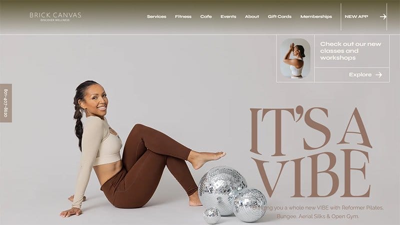
Brick Canvas is committed to bringing balance and joy to its clients' lives, offering a broad range of classes that invite more meaning and calm.
One of the cool websites, the Brick Canvas website is aesthetically pleasing, treating visitors to a soft color scheme consistent throughout the site.
Lines are one of the recurring design elements on the Brick Canvas website, marking out different sections and aiding navigation on the site.
A chat feature is visible and pinned to the bottom right-hand corner of the homepage, serving as the site’s online communication channel.
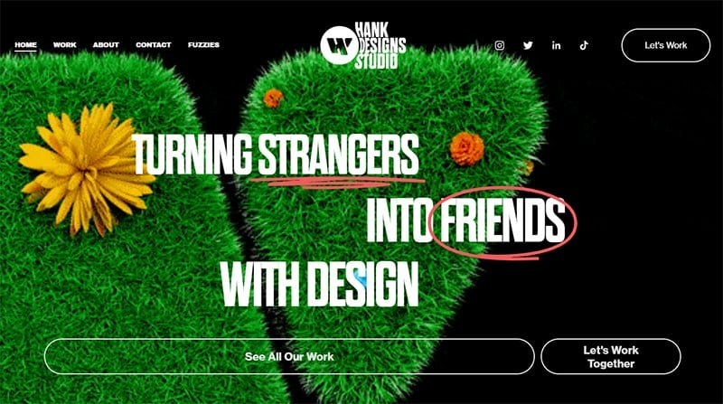
Hank Design Studios is a friendly, neighborhood creative studio that changes strangers into friends through art direction, illustration, and identity design.
One of the awesome website design examples, the Hank Design Studios’ site is unique with the hero section displaying several animations in a video format.
The consistent black background adds to the visual appeal of the Hank Design Studios website. I love how the homepage features bold typography alongside animated images.
Visible are bold logos of top brands doing business with Hank Design Studios on an extensive Green White background in a centralized layout.
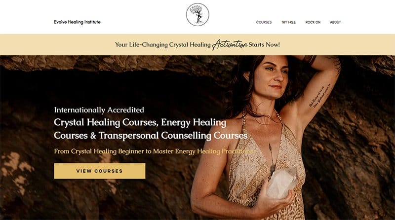
Evolve Healing Institute is an elite online academy specializing in training world-class crystal healing practitioners and master energy healing practitioners around the world.
One of the amazing websites, the Evolve Healing Institute website is modern with a clean display visible throughout the site.
A soft color scheme is visible on the site’s home page, creating a calming and soothing experience for its site visitors.
You will find logos of top brands endorsing Evolve Healing Institute displayed in black beneath the hero section on an extensive Apache background.
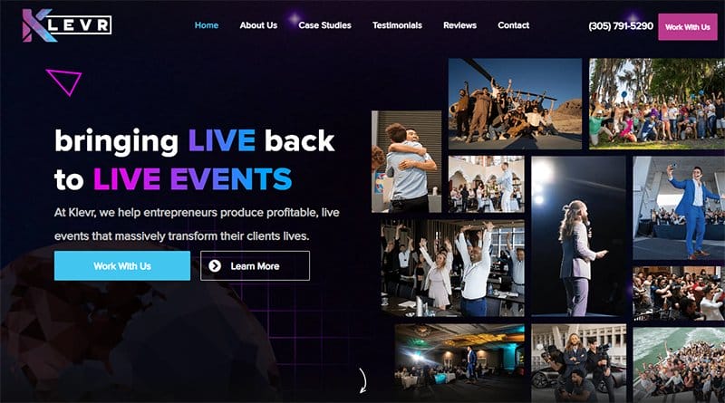
KLEVR is dedicated to planning events, headed by its team of event planners with specialized training in making dream events come true. One of the interesting websites, the KLEVR website displays a cohesion of several design elements, sticking to the brand’s identity of teamwork.
Boldly displayed on the site’s homepage are logos of top companies KLEVR has partnered with, serving as social proof to new clients.
Vibrant colors displayed throughout the site’s homepage in straight and gradient styles captivate users with its stunning design scheme.
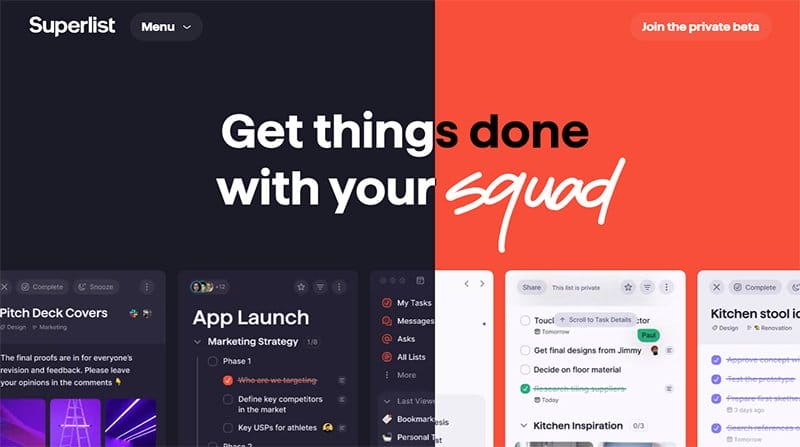
Superlist is a task management program enabling users to create, arrange, and rank their assignments all through a single platform. This beautiful website example displays cool stuff like changing colors and treats visitors to an astonishing web design.
Welcoming visitors is a bold display of Mirage and Coral Red colors, each alternating in the site’s hero section linked to the mouse cursor.
I love how the screenshot images from the platform provide visitors a visual perspective of what Superlist is about.
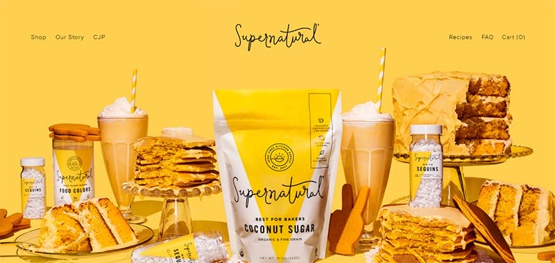
Supernatural is a brand offering natural-based products like food supplements and organic baking products. This eye-catching website embraces vibrant hues, displaying Rubber Ducky Yellow, Cloudy Azure, and Bright Sun on its homepage.
The hero section is visually appealing, displaying a full-width image of the brands’ food and products on a Bright Sun background.
I love the consistent display of appetizing images that whet visitors' appetites as they scroll through the homepage.
Animal Music Studios offers an experienced crew capable of providing music, sound design, and audio posts of the highest industry standard.
One of the awe-inspiring website examples, Animal Music Studios' top modern design feature is the display of several background videos, blending artistically into two distinct frames.
I love the display of Animal Music Studios' huge collection in a uniform three-column layout on the homepage as videos, providing visitors with a unique viewing experience.
Visible and pinned to the right-hand side of the homepage are icons linked to its social media pages, standing out in bold white colors.
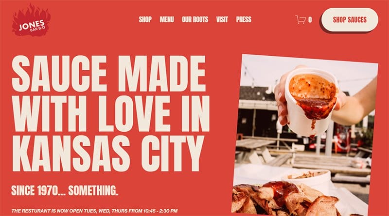
Jones Bar-B-Q displays its special and homemade sauce boldly incorporated into its web design. One of the best awesome websites, the Jones Bar-B-Q website showcases the colors Jasper and Metallic Copper from its sauce boldly on its site.
Logos of top brands featuring Jones Bar-B-Q are in a separate section on the homepage, serving as social proof. I love the bold text and the White and Jasper as its font colors.
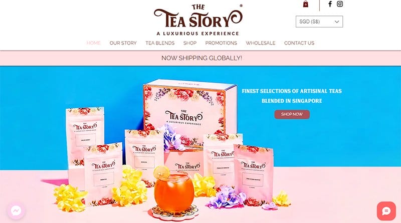
The Tea Story provides a mouth-watering taste experience to its customers through its diverse tea blend offerings. This awe-inspiring website example is modern with a contemporary web design, displaying flowers and high-quality images.
Visible and pinned to both corners of the homepage are two chat features, one powered by Messenger, both serving as the site’s online communication channels.
A client testimonial section is visible on the homepage, displaying words of affirmation on a unique flowery background.
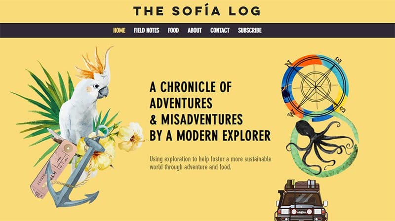
The Sofia Log company is run by Sofia Hollingsworth, a food lover and outdoor enthusiast who applies her culinary skills to the great outdoors.
One of the most breathtaking websites, Sofia’s contemporary website welcomes visitors to animated graphics and illustrations displayed over the hero section’s Jasmine-colored background.
A full-width slideshow image displays high-quality images that reflect her passion for the great outdoors and adventure beneath the hero section. Above the footer section are image excerpts from her Instagram page, visible in a four-column layout.
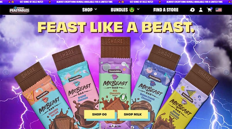
Feastables is a mission-driven snacking brand founded by YouTuber Jimmy Donaldson, rooted in gamified experiences that bring joy and fun. This stunning website example is modern and has a bold web design that takes visitors into an entirely new world of creativity.
The bold color trends are one of the stand-out design elements on the Feastables’ awe-inspiring website, one of the best web design trends. Visible is recurring strong typography, displayed as ordinary texts and texts for its multiple CTA buttons.
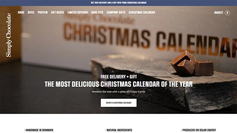
Simply Chocolate creates responsible and fair gourmet chocolate of exclusive quality with only the best natural ingredients. One of the best stunning website examples, Simply Chocolate is professional looking with a modern web design.
Consistently displayed on the Simply Chocolate site in a four-column layout are the brand’s products alongside bold texts serving as CTA buttons.
An announcement box feature announcing the brand's discount offering is visible and pinned to the bottom of the homepage on a Purple-Brown background.
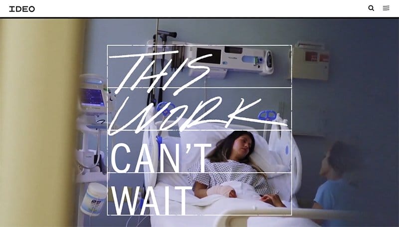
IDEO is a global design company taking a human and planet-centered approach through creative mindsets and skills for a guaranteed positive impact.
One of the stunning websites, IDEO welcomes visitors with a video of how it makes learning fun, taking center stage in its hero section.
Engaging visitors on the homepage’s plain white background is bold typography, consistently displayed in black font. Displayed in a three-column layout are some of the company’s work underlined by bold Yellow lines as the mouse cursor hovers over them.
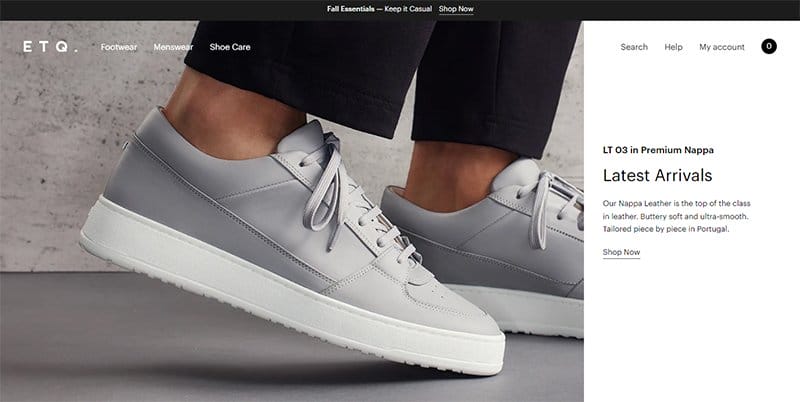
ETQ Amsterdam is an evolving clothing brand designing wardrobe essentials with strong silhouettes in tonal colorways that remain relevant in style. This breathtaking website example stands out in its soft color scheme consistent throughout the site.
High-quality images of its products take center stage on the ETQ Amsterdam website, consistent with the site’s soft color scheme.
A hover effect attached to the display of its popular products engages visitors as the mouse cursor hovers over them.
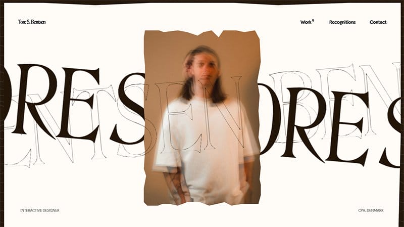
Tore S. Bentsen is the co-founder and interactive designer at Baseborn, specializing in combining Webflow and branding to create award-winning websites. This awesome-looking website has a mystical look, combining several design elements in a work of art.
A customized cursor feature is visible on the homepage as a bold circle, one of the site’s best features. I love the display of past works on the homepage’s plain white background, with a sliding image visible over bold text.
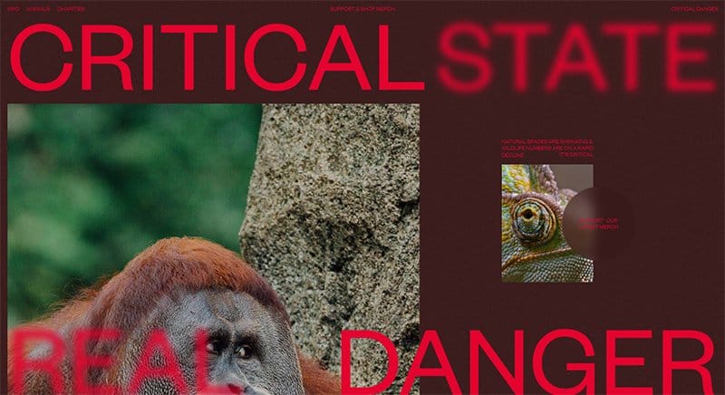
Critical Danger is a team of amazing artists, illustrators, and designers creating products to raise money to support charities protecting endangered animals. This beautiful website is visually engaging, with each homepage section linked interactively.
Bold typography stands out throughout the site’s homepage, sticking to a consistent Cadmium Red. A vertical parallax scrolling feature is visible on the homepage, engaging visitors as they scroll through the homepage.
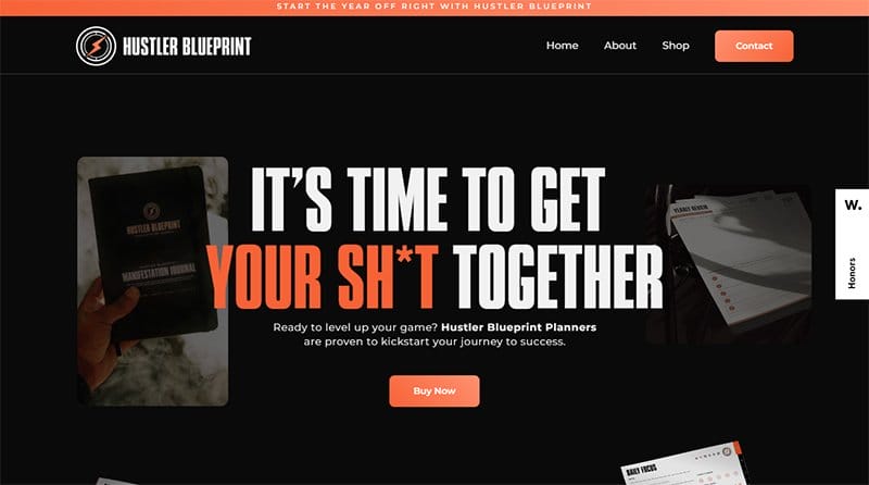
Hustler Blueprint offers high-quality and well-informed goods that support its user’s productivity and mental health. One of the awesome website examples, Hustler Blueprint is modern with a neat display of interactive elements highlighted on its website.
Boldly displayed on the Hustler Blueprint awesome website are outstanding graphics and typography used to communicate its objective to visitors.
I love how each section on the site’s home page is linked, engaging visitors visually as they scroll through the homepage.
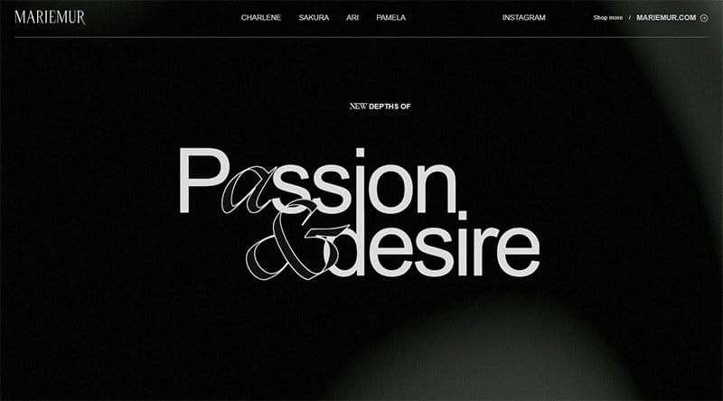
MARIEMUR makes its users' dreams come true, helping them take enticement to a new level. One of the top awe-inspiring sites, MARIEMUR is uniquely designed on a predominantly black-and-white color scheme.
The entire MARIEMUR website is visually engaging, with each section linked and accessible from the site’s sticky header menu. I love the display of exciting images of its product throughout the homepage, enticing visitors throughout the site.
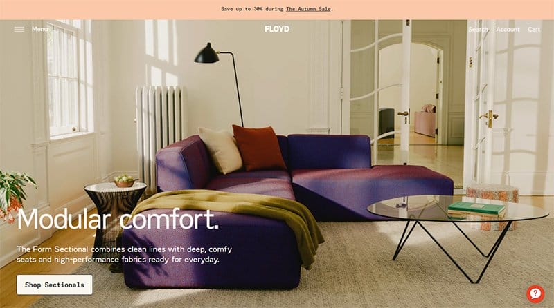
Floyd Home is committed to becoming one of the first carbon-neutral furniture brands, partnering with Climate Neutral to solve carbon emissions. This awesome website is unique with a clean layout for its site design.
The CTA buttons on the Floyd Home website stand out in their black-and-white color scheme, prompting visitors throughout the site. Visible and pinned to the bottom right-hand corner of the homepage is a help icon, providing ready assistance to visitors on accessing the site.
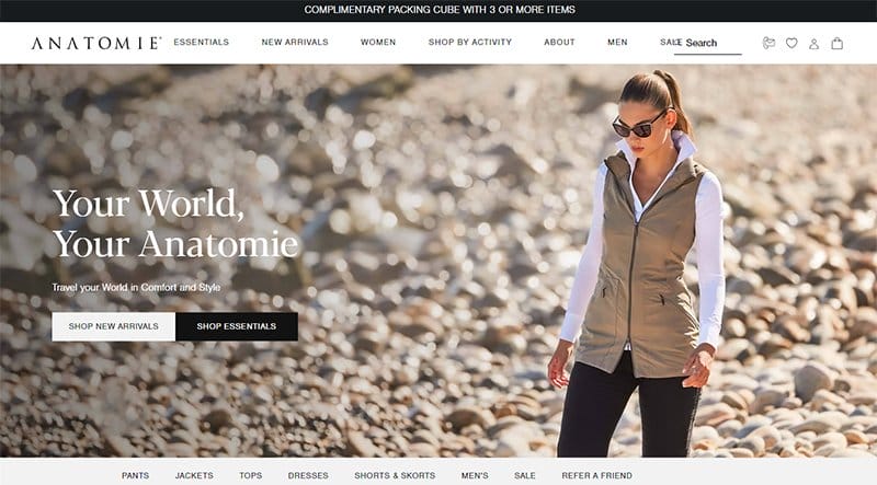
Anatomie exists to provide the most comfortable and stylish performance apparel to the global traveler and everyday adventurer. One of the top clothing brands, the Anatomie website is neat, with a well-arranged display of its products visible throughout the site.
A consistent four-column display of products is visible on the Anatomie site, displaying high-quality images that engage visitors. I love the black logos of brands endorsing Anatomie on a plain white background, serving as social proof.
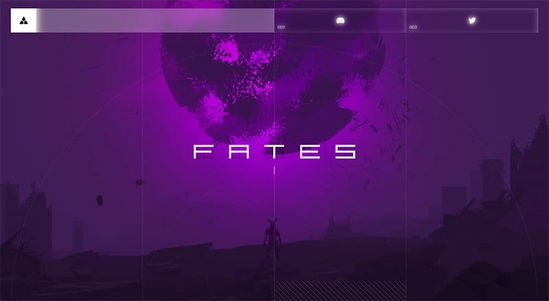
FATES offers an immersive, narrative-driven experience, tailored to provide a guide to the next step in human survival. This awesome website is aesthetically pleasing, creating a unique experience for visitors from its web design.
The bold white text stands out over the homepage’s colorful background, adding an artistic touch to its website design. Visible and pinned to the homepage are icons leading to the brands’ Discord and Twitter platforms, adding light to the dark-themed site.
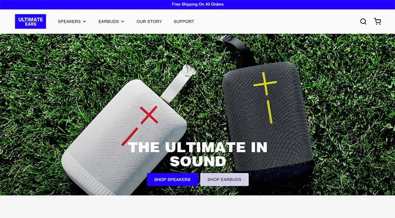
Ultimate Ears makes beautiful, premium audio gear that enables music fans and creators to listen, perform, and live to the ultimate. This awesome website is straightforward with a simple web design.
Reviews from past clients displayed in a separate section on the homepage in a three-column layout serve as social proof to potential clients. You will find blog posts displayed in a three-column layout with each post linked directly to the blog page.
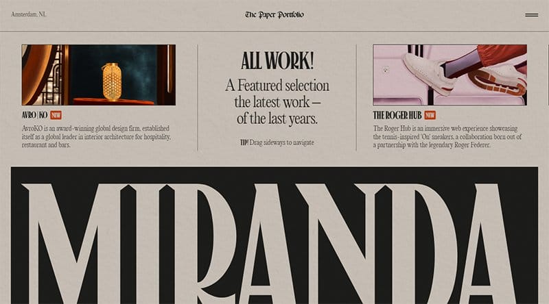
Niccolo Miranda is a multidisciplinary freelancer passionate about creating iconic digital experiences through motion, typography, and creative coding.
One of the awesome websites, Miranda’s homepage features motion, typography, and creative coding as the backbone of its web design.
Consistent throughout the site is the Cotton Seed color, boldly displayed and serving as the background color for the entire homepage. Visible on the homepage is a moving text feature and animated icons engaging visitors.
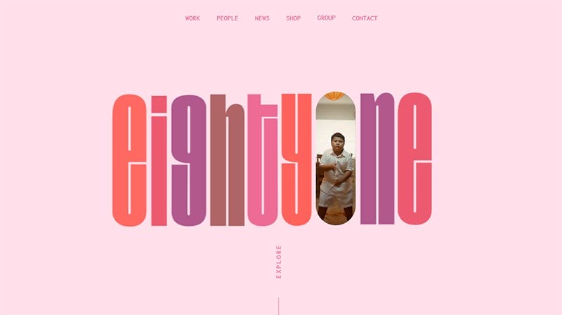
EightOne is Wellington’s largest creative agency fuelled by strategy, inspired by results, and driven by value to change the world.
This awesome website displays texts in varying colors in the hero section, opening up different sections on the homepage in an interactive manner.
High-quality images and videos are the recurring themes on the Eighty One awesome website, sticking to a consistent centralized display.
I love how the EightyOne awesome website boldly displays design elements, visually engaging visitors throughout the site.
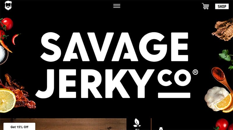
Savage Jerky offers all-natural, gluten-free, and hand-crafted ingredients that belong in a kitchen, not a lab. This cool website is visually engaging, displaying bold design elements on the homepage’s all-black background.
Image excerpts from the Savage Jerky Instagram page displayed in an irregular three-column layout on the homepage stick to a centralized layout.
I love the bold display of icons and texts on the site in clear White, one of the site’s top features engaging visitors throughout the homepage.
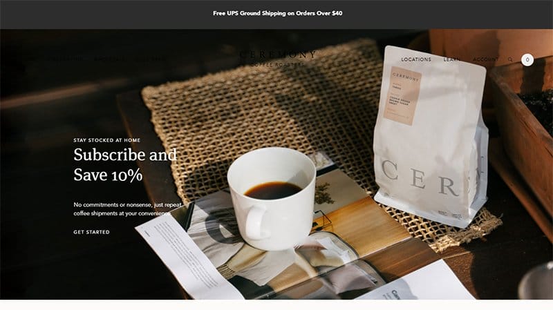
Ceremony Coffee Roasters focuses on creating beautiful coffee experiences that connect people in explicitly human ways across the world. This beautiful website welcomes visitors with a visually engaging slideshow display of its products and offerings in its hero section.
The homepage features an interactive display feature, prompting visitors to let the color guide their taste and explore its coffee spectrum.
Visible are image excerpts from its Instagram page, with each image linked directly to the Ceremony Coffee Roasters Instagram page.

Forma helps the modern workforce find harmony at work and in life, offering benefits that are delightful, distinct, and designed to support moments that matter.
One of the top cool sites, the Forma awesome website welcomes visitors in a fun way, displaying animated images in its hero section.
Logos of top companies endorsing Forma are visible in white in a moving slideshow, attached to the bottom of the hero section. Boldly displayed throughout the site is the Dark Indigo color, visible as text and background color for select sections on the home page.
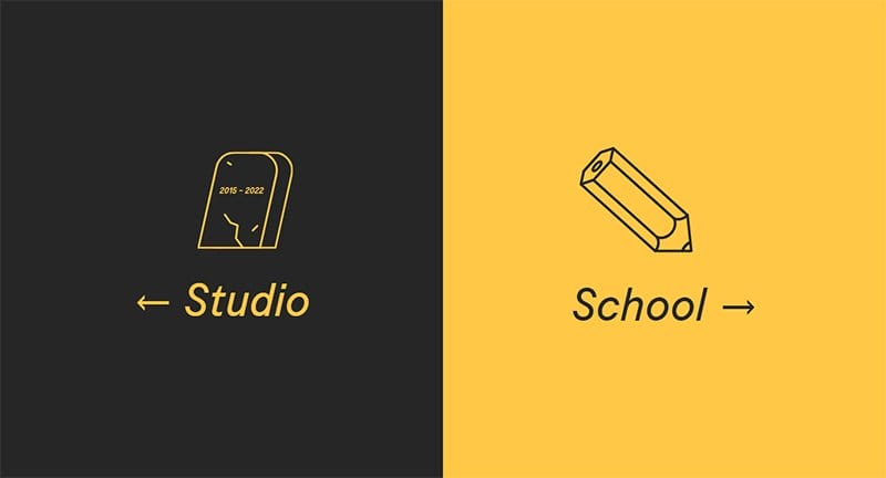
Gunner is a Detroit-based illustration and animation studio obsessing over creating imagery that hypnotizes and stirs a feeling in its viewer's guts. This great website is unique with a split page feature welcoming visitors to its web page.
The Black and Sunglow color scheme makes the site fun, displaying bold texts and icons linked to its studio and school. I love how this awesome website gives no room for scrolling on its landing page, opting for a straightforward web design.
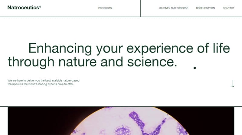
Natroceutics enhances its users’ experiences through its range of products that prioritize nature and science. One of the top awesome websites, the Natroceutics website is customized with its own cursor visible over the homepage as a bold dot.
I love the display of image excerpts from the Natroceutics Instagram page above the footer section in a four-column display.
Consistent throughout the site is the Everglade color serving as the background for multiple CTA buttons and separate sections on the homepage.
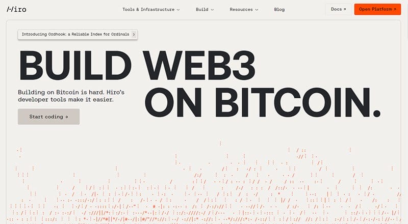
Hiro offers a complete solution to build, deploy, and scale apps with fully expressive smart contracts for Bitcoin layers. This awesome website example creates a consistent white background with white space visible throughout the site.
Articles and videos from the Hiro blog page are in a separate section on a black background and stick to a four-column layout. Adding color to the site’s plain homepage are CTA buttons, standing out in their International Orange-colored background.
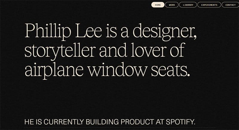
Philip Lee is a designer and storyteller currently assigned with helping to build products at Spotify, one of the top music streaming platforms. A lover of all things design, Philip has one of the top interactive website examples, with an astonishing web design.
A customized cursor feature is visible throughout the site as white dots, adding a personal touch to Philip’s awesome website.
I love how Philip combines texts, images, and videos on his website, adding interesting insights to his site’s predominant black-and-white color scheme.
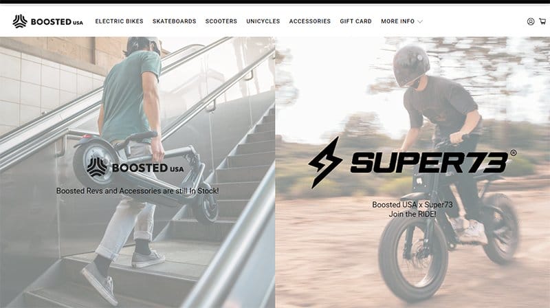
Boosted USA helps solve the transportation problem experienced across the world by empowering people with a simpler means to commute from one place to another. This awesome website is unique, displaying faded images in the split hero section.
Attached to the bottom of the two-column display are black-and-white logos of brands Boosted USA works with, serving as social proof. Adding color to the predominant black-and-white site are multiple CTA buttons, standing out in their Red Orange-colored background.
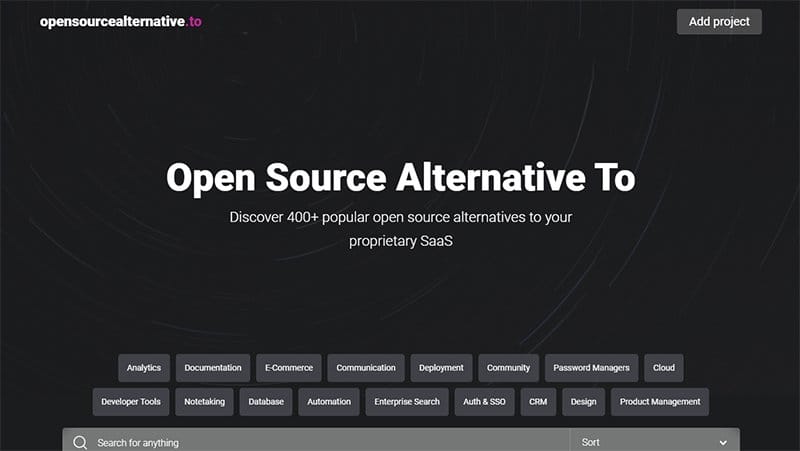
Open Source Alternative is powered by crowd.dev, offering popular open source alternatives to proprietary SaaS. This great website is unique, sticking to a dark theme for its website design.
A search bar is visible on the homepage, one of the site’s user-friendly features, allowing visitors to find a good alternative for their software.
Consistent on the site in a two-column display are proprietary SaaS alternatives that decorate the site’s all-black background with its colorful logos.
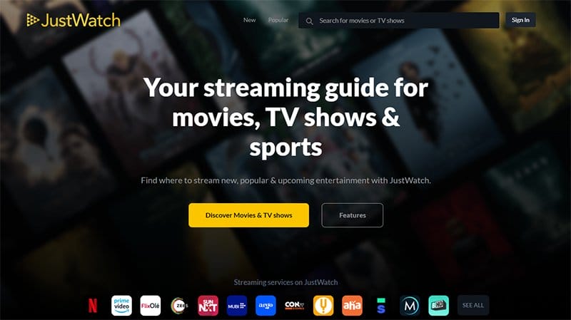
JustWatch is a streaming guide for movies, TV shows, and sports, offering new, popular, and upcoming entertainment to its audience base. This awe-inspiring website is visually appealing and designed on a consistent all-black background.
The CTA buttons on the JustWatch website are consistent with its logo’s ArtyClick Amber color, standing out as their background color.
I love how the JustWatch website arranges its content into specific categories with a search bar at the top left corner for easy access.
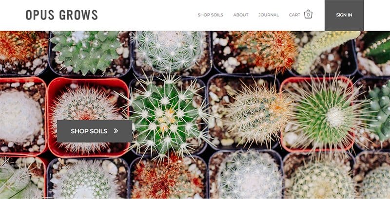
Opus Grows stands for impeccable soil quality, organic growing, and sustainably sourced ingredients, looking for ways to make potting soils better for users. One of the top eye-catching websites, Opus Grows is unique with a modern homepage design to attract visitors.
The CTA buttons on the Opus Grows awesome website are unique and easily recognizable in their Davy Grey colored background. Visible on the home page are bold colors serving as the background colors for different sections, adding color to the site.
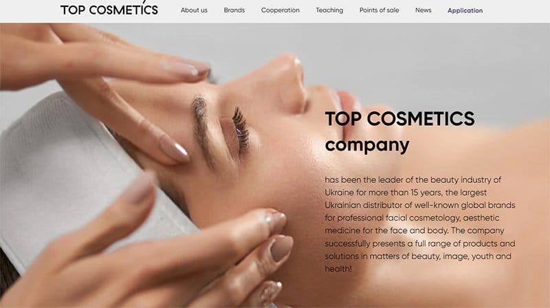
Top Cosmetics is a top beauty industry leader and one of the largest distributors of well-known global brands' products and beauty solutions in Ukraine. This awesome website is modern with a clean layout visible for its web design.
A full-width image of a lady receiving beauty treatment takes center stage on the Top Cosmetic awesome website hero section, serving as the hero image.
Attached to the bottom of the hero section are three large CTA buttons on an extensive Twilight background, each linked to different pages.
Amazing Websites FAQs
KLEVR, IDEO, Superlist, JustWatch, Supernatural, Feastables, and Animal Music Studios are among the most interesting websites to visit. Each of the websites listed above offers interesting visual content that makes them stand out as the best websites around the world.
User experience and website design are two key factors that impact the conversion rate of a website, helping build trust and credibility and boosting your search engine ranking. Customizing and personalizing your website is an effective way to increase your site’s conversion rate as they leave a lasting impression on visitors and users alike.
Websites offering interesting insights are more attractive as visitors can easily relate to their content-related display. While content is a huge part of a website design, the way and manner of presentation are important for drawing visitors in and keeping them hooked.
Website designs are now taking a more interactive look as users are more attracted to excellent websites with exciting design elements. Parallax scrolling effects, immersive 3D effects, animations, bold typography, and color gradients are among the current web app trends making headway globally.


