The 25 Best Bar Websites of 2025
Did you know that the relevance of bar websites is significantly increasing daily? Research suggests that up to 80% of bar customers prefer to order via the brand’s official website or app rather than queue at the Bar (Flipdish)
Having your own website where potential customers can check out your offerings and make purchases is essential. However, with many bar websites on the internet, you need a visually appealing website to attract your target audience and convert visitors.
You can use the best website builders, like Wix and Squarespace, to build eye-catching and functional bar websites. These website builders come with practical website-building tools and bar website templates that make the process seamless.
This article checks out the 25 best bar websites you can use as inspiration when building your web page.
Let's get started.
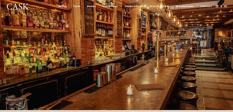
Cask Bar & Kitchen’s site welcomes visitors with a stunning image of the Bar’s space and a transparent navigation bar that encourages seamless movement.
You cannot but love how this website’s modern design stands out among other restaurant types and uses engaging content to attract more customers.
Some of the site’s engaging content includes multiple high-quality images, descriptive texts, an elegant color scheme, and a section displaying upcoming events.
I love how the parallax scrolling feature makes all the site’s content appear cozy, featuring vital content like opening hours, a blog section, and food options.
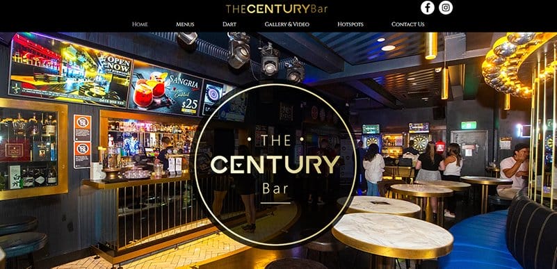
TheCenturyBar, formerly Bar Century, is popular across Sydney for extremely cheap drinks. Upon scrolling, you cannot but notice that the captivating bar images, polished design, and typography make this webpage stand out from other bars.
I love how the black background makes all the site’s content visually appealing and fun to explore.
Interested visitors can use the black-colored sticky navigation bar to visit multiple pages and get information on reservations, drinks, menu items, and the best ways to order online.
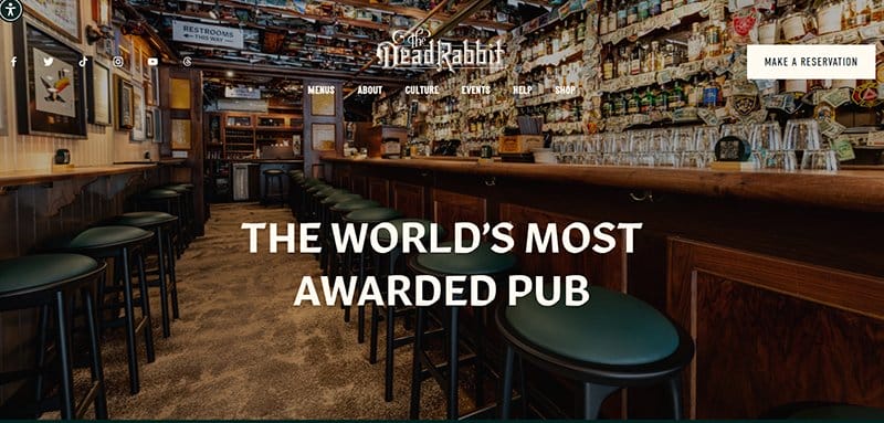
The Dead Rabbit ranks among the world’s most-awarded places due to its exceptional ability to serve classic and contemporary cocktails.
Interested visitors can use the palm green sticky navigation bar to visit multiple pages and get information on reservations, drinks, menu items, and the best ways to order online.
I like how the webpage features multiple high-quality bar-related images in a fluid grid layout with a thumbnail feature to enable further exploration.
The palm green background gives the webpage a unique perspective and makes all the available contents visually appealing.
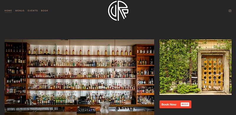
Cure, one of America's best bars, is a restaurant that offers customers a delicious meal, an excellent cocktail variety, and a wonderful atmosphere to relax.
Exploring this Bar's elegant design, you can’t help but love the colorful, clean, and eye-catching layout in the hero section, attracting more customers to their homepage.
I like how the web page features a cream-colored navigation bar on the right side, allowing visitors to explore various aspects of the page.
Potential clients can use the “Book Now” CTA button to make bookings and reservations for upcoming events.

Anvil Bar Houston is a cocktail bar with a reputation for serving unique and well-crafted drinks, leaving their customers refreshed.
Welcoming visitors to this website is the modern design of the building, giving it a cozy setting that is inviting and friendly.
I love how this site uses a three-column grid layout to organize the gallery section, encourage exploration, and make purchasing more accessible for visitors.
The social media icons are strategically positioned at the bottom of the site’s footer, making it easy for visitors to access their page.
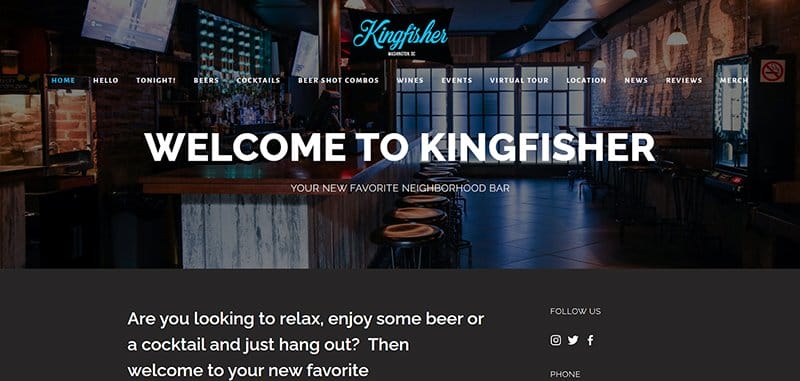
KingFisher DC is a neighborhood bar that makes you feel like you've found a place you can call home by offering fantastic cocktails to customers.
I love how this website template uses a colorful layout that welcomes visitors, with its dominant colors being black, white, and gold.
As you scroll further, the website has an informative video giving a tour of the Bar, which helps leave a lasting impression on visitors.
The sticky white navigation bar features the entire site content, making it easy for visitors to explore content and schedule services.

Library Bar is a website about excellent times with a perfect blend of classic and exotic cocktails with friends.
The first catchy element of the website design is a shelf displaying multiple books across various genres to pique visitors' interest on arrival.
An extensive FAQ section on the navigation bar provides ready answers to customers' likely questions about their services and reservations.
As you scroll further, the Bar's location is in the descriptive text so interested clients can purchase there.

Good Bar Seattle is a restaurant website offering customers classic cocktails, food, and happy hour drinks. One of the best bar websites, Good Bar Seattle, displays appetizing images on the site’s background that are visually appealing to visitors.
I love how the testimonial section displays heartwarming content from satisfied and happy customers at Good Bar Seattle.
Potential customers can contact them via their business code for more inquiries on their online ordering system.

The Berkshire Room is a professional website that offers visitors cocktails in refined surroundings and warm spaces.
Welcoming visitors to this bar website design is an eye-catching image of a building that gives prospective clients a sneak peek into its expertise.
I love how the parallax scrolling effect on the testimonial section features heartwarming content from happy and satisfied customers.
The mega navigation bar ensures easy access to different sections, enhancing user experience and keeping visitors engaged.

The Violet Hour website serves customers various food and cocktail lists in a stylish bar. The first thing that draws your attention is the use of simple designs to create a unique and sophisticated outlook with a blue-and-white color scheme.
Visitors can use the CTA button captioned “Reservations” to make inquiries and bookings for upcoming events. Potential clients can subscribe to the newsletter to get the latest updates on the Bar's website.

Rare Bird Rooftop Bar has a colorful, straightforward design layout featuring a few content pieces promoting the brand’s originality.
This bar website has a minimalistic yet elegant design layout that helps create a fun and seamless user experience.
The first catchy thing you will see on arrival is a split-page layout featuring two unique images, each displaying a link to a location-based restaurant website.
The reddish-orange site footer features vital content that helps to create a positive first impression, like the brand’s logo and two social media links to encourage further exploration.
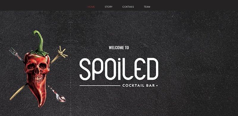
Spoiled Bar offers a fusion of consistency, simplicity, and a touch of contemporary local vibes.
This unique one-page bar website welcomes visitors with a 3D image of a bell pepper with cutleries hanging on its sides and banners welcoming them to the page.
I like how the webpage features vertical and horizontal scrolling, giving the website a unique and sophisticated outlook.
The white-colored site footer features vital content that helps to create a positive first impression, like the brand’s logo, location address, and two social media links.

Bandits doubles as a restaurant and Bar in New York, offering cold beer and cocktails with traditional bar food. This food site design has a horizontal slideshow with its location carefully crafted into the text on display.
What is most appealing about the site is the slideshow of fresh meals on display to give it a personalized look.
I like how the web page features high-quality images, which gives website visitors a sneak peek into what the brand offers.
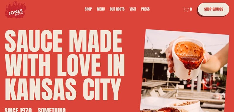
Besides its creatively crafted name, Jones Bar-B-Q took creativity to a new level when designing its food website. This site is just as chilly as its products, with an all–red background and fine white prints.
The logo embodied with a burning fire at the top left corner of the homepage is eye-catching and suitable for a food sauce brand.
My favorite aspect of this food-based website is using high-quality images at strategic sections of the page to entice potential customers.

Native Bar was born to look at the heart of our region: from the artisans to the produce, from the familiar to the novel.
The first catchy element on arrival is a sleek and blurry background video that changes its structure and composition as you explore the site contents.
You will love how the page uses high-quality image sliders to display engaging pictorial content about the Bar and give visitors a positive perspective about the business.
Interested visitors can click the dark blue “Book Your Experience” CTA button to order delivery or make reservations at the site's base.

Bar Albert Auckland offers customers a modern yet vintage parlor featuring plush sunken leather lounges, an extensive selection of single-batch spirits, and uninterrupted city skyline views.
This unique bar website features two unique images that give online visitors a taste of what to expect.
Upon scrolling, you will see a short bio section in the middle of the page featuring vital information about the Bar on a white background.
The white-colored site footer features vital content that helps to create a positive first impression, such as the brand’s logo, location address, and two social media links.

Paradiso is a Barcelona-based bar that boasts an imaginative cocktail program and art-inspired decor.
I like how this cocktail bar features multiple eye-catching design elements with responsive features that give the page a fun and sophisticated feel.
Online visitors can check out the menu section, which showcases the brand’s various cocktails and spirits, prices, and reservation options.
What's handy about this webpage is the shop section, where customers can purchase branded items and a cocktail-making kit.

Limantour is already a destination if we talk about cocktails in Mexico City, but it is an open house for the neighborhood, welcoming exploring and restless minds and classic palates.
I love how this bar website’s white color scheme gives it a unique and professional outlook, which helps attract more customers and encourages exploration.
You cannot but love the smooth arrangement of its various contents, ranging from vibrant images to engaging texts and other flashy content, which helps to drive traffic.
The site’s mega navigation bar is your one-stop shop for exploring various aspects of the page without any restrictions.

Attaboy’s website has a minimalist design featuring few texts and multiple high-catching elements to get visitors and potential customers to make necessary moves.
I love how this bar web page features a minimalist design layout with few contents, making it easy for visitors.
The first catchy thing you will see is a retro picture of an individual holding a drink with a “Just Knock” caption at the center of the page.
I like how stylish text gives the page a professional outlook and is attractive enough to encourage seamless exploration from potential customers.

Maybe Sammy is a bar brand that centers its concept and inspiration around The Rat Pack and when Hollywood glamor was revered and admired.
I love how this bar website uses multiple retros-style images on different page sections to give visitors a nostalgic vibe before purchasing.
The webpage features ample use of its white spaces, complemented by high-quality and striking images and engaging text to give visitors a memorable user experience.
The site’s online menu is visually appealing, with clickable sections presented attractively to encourage visitors to take appropriate action.

Corduroy is a rock and roll bar that serves its customers great cocktails, keeping them chilled during their visit.
My favorite aspect of this bar website is the motion graphic feature of the brand's name that rotates the page, giving it a sophisticated and stunning outlook.
The parallax scrolling effect and stylish fonts give the webpage an engaging look to excite potential customers about the site’s content.
As you scroll further in the gallery, each section features a CTA button for visitors to explore.

Bar Swift offers customers the best cocktails in Borough, London Bridge, Shoreditch, and Soho. Welcoming visitors to this fantastic bar website is a slider feature that displays multiple high-quality bar-related images to give potential customers a taste of what the brand offers.
Upon scrolling, you cannot resist the tempting and attention-grabbing moving text feature displaying engaging content about the brand.
Interested visitors can use the sidebar at the left side of the page to explore various aspects of the webpage.

Artesian Bar’s website has a fun and engaging outlook featuring multiple high-quality images by clicking the black-colored “Reservation” CTA button.
I love how the first thing you will see when you visit Artesian Bar’s website is an automated slider feature displaying some precious moments on the webpage.
The white-colored sticky navigation bar makes it easy for visitors to move across this bar website without restrictions.
My favorite element among the multiple customization options on this webpage is the Spotify playlist section, which features various retro songs visitors can enjoy while exploring the page.

Death & Co was opened on New Year's Eve 2006/07 in Manhattan's East Village. The hamburger navigation bar ranks among the most useful tools for navigating the web page's content.
Below the hero section are high-quality bar-related images in a card design layout with titles of the brand’s restaurants. Clicking on any of the images is one way to get more information about the brand’s activities and mode of operations.

Dirty Laundry Denver is a bar website that offers a selection of great cocktails with professional bartenders who are helpful and pleasant.
My favorite aspect of this webpage is the combination and mixture of flashy and colorful elements, which give the page a fun and lively outlook.
Potential customers can begin by clicking the sticky hamburger navigation bar at the top right of the page to check out various content.
The CTA button with the caption “Menu” features different food options, cocktails, and drinks available for customers.
Bar Website Examples FAQ
When creating a visually appealing bar website design, use appropriate font sizes for different sections of your website, use high-resolution images to enhance visual appeal, optimize images for the web to maintain a balance between quality and loading speed, and maintain a consistent brand identity across your website.
Yes, your bar site needs an effective ordering system because it helps increase sales without physically hosting customers in your Bar. Most bar/restaurant websites use this ordering system, which means you have a high level of competition online and need to get on board to remain competitive.
The best bar websites that rank high in the search engines include Urbanbelly, Pujol, Punkt, Bon Bouquet Café, Barra, Canlis, Lucky Folks, Flaner, Back Door Donuts, Disco, Cheetah, Septime, Abnormal Co, The Clove Club, Pizzeria Vetri, Sweetgreen, Hisa Franko, Frantzén, Laurie Raphaël, Sublime Doughnuts, Adachi, Rosebud, and Pastaria.