26 Brochure Website Examples to Inspire You in 2025
If you want to have a constant inflow of loyal customers, design a visually appealing brochure website that offers quality information about your company’s activities.
For the record, an online brochure website contains only a few pages and the main information people need to know about your business.
Designing a brochure website doesn’t have to be a difficult task. You don’t have to spend a fortune hiring a web development agency or worry about your shortage of coding and web design skills.
The best website builders like WIx and Squarespace offer relevant brochure website templates you can use to create the ideal webpage that meets your needs.
This article explores the 28 best brochure website examples you can use as inspiration when creating yours.
Let’s get started.
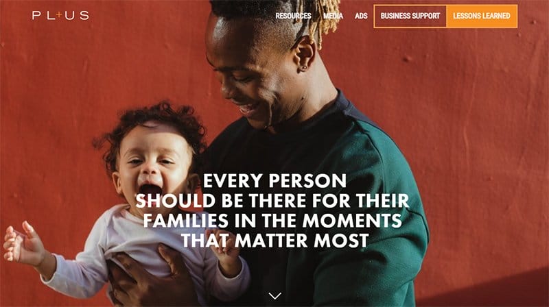
PL+US is the former campaign to win paid family and medical leave for every working person in the US.
The first eye-catching element on this site is an image of a happy Dad holding his child. I love how visitors can view various stunning background images due to the parallax scrolling effect that gives the website an elegant outlook.
This brochure website is informational and helpful to individuals across the US. Interested visitors can scroll to the “Want to Learn More” section and download the full copy of the report.

Sparks Precision Dental is committed to helping people achieve a lifetime of excellent oral health in Kansas City.
I love how Sparks Precision Dental welcomes visitors with credible content about the brand with illustrations to convince visitors about its reliable and high-quality services.
The display of high-quality images of happy and smiling faces is attractive to visitors. I love the display of customer testimonials in a slider format to inspire new customers.

Pack Up + Go is a surprise travel brand that specializes in planning surprise travel getaways. This brochure website design has a soft and calm design layout with dark jungle green, white, and ice cold as its dominant color.
Interested visitors can click the ice-cold call-to-action button on the hero section to explore trip types. I love how this travel brand uses motion effects to add beauty to the site.
Visitors interested in gateway travel with family and friends can book a vacation trip by clicking on the green button placed on the navigation bar.

Bring On Monday Is an NZ-based accounting firm offering innovative solutions and services for clients. The hero section is visually attractive with a colorful background, rich content, and a stunning image of a woman.
My favorite part is the “The Academy” section which showcases highly engaging content in a multi-column and slide format.
Visitors can watch Bring on Monday videos and read testimonials of clients. Potential customers can book a call through the red CTA button on the homepage.
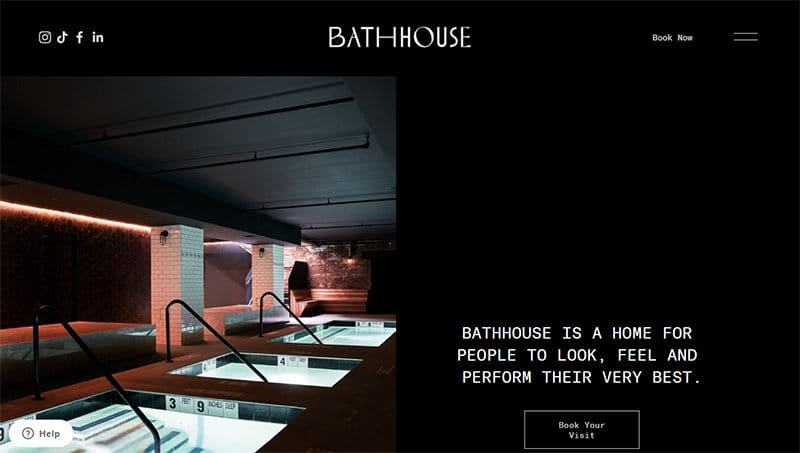
The Bath House is home for people to look, feel, and perform their very best. The first eye-catching element on this brochure site is the image of a night view three-section pool.
Interested visitors can click the black call-to-action button on the hero section to make a reservation. I like how the site features a minimalist design layout with catchy, interactive, and straightforward content.
The display of high-quality images of the food and bathtub gives the site a sweet and relaxed vibe. Visitors can click the white sticky button on the left side of the page to ask any questions.
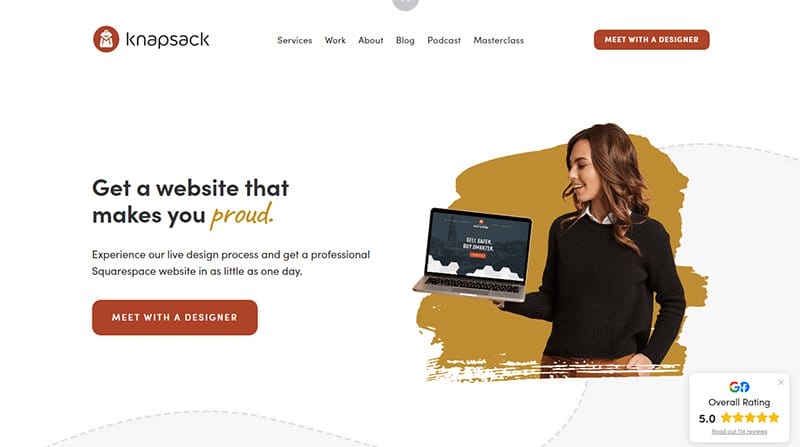
Knapsack Creative's mission is to create the world's best web design experience. This brochure site uses simple site elements yet attractive content to keep visitors glued to their screen and makes necessary decisions.
Scrolling down is the display of customers’ testimonials with images and inspiring reviews that promote the brand's image.
Interested customers can meet with the company designer to get work done with just a click on the red CTA button. I like how the center of the page features vital content about the brand's team including their bio and images.
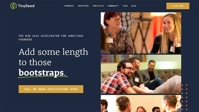
Tinyseed is the first B2B SaaS accelerator designed to help scale software businesses. This stunning website offers highly profitable information to founders looking to grow their small businesses.
The first element is the use of three-column images and videos in the hero section. Visitors and explorers can use the navigation menu bar with a drop-down feature to access the entire page content without any hassle.
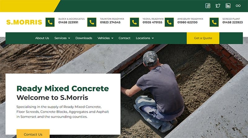
- Morris is the leading supplier of ready-mixed concrete, floor screeds, concrete blocks, and aggregates in Somerset.
The first amazing element you will see on this unique brochure website design is a catchy automated slider displaying multiple construction-based images.
This contractor's website features its multiple services in a two-column layout with a thumbnail effect and offers brand details to potential clients and target audiences.
Clicking the yellow colored “Get Quote ” CTA button on the sticky navigation bar transports visitors to a new page to get quotations for various services.
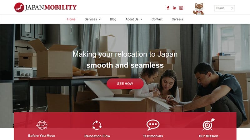
Japan Mobility simplifies the relocation process and gives people the care and support they need to start a new life in Japan. This brochure website has attractive and eye-catching elements like the brand logo and the multi-slider images.
What's handy about this brochure website is the use of high-quality images, video, and illustrations from different angles of the page.
This brochure site uses a unique marketing strategy to draw new customer’s attention by showcasing heartwarming client testimonials in a slider format.
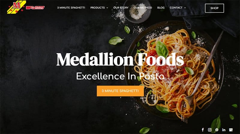
Medallion Foods creates high-quality pasta. Welcoming visitors to the page is a full-width image of delicious pasta on a dark background and the site's social media links.
This brochure site features multiple captivating contents like delicious food images, high-quality motion graphics, descriptive icons, and CTA buttons. I love how the yellow and orange color combination gives the site a lively outlook.
The site’s testimonial section contains heartwarming customer reviews. Visitors can use the transparent back-to-top feature pinned on the right side of the page.

Evolved Habitat specializes in Smart Home installations, automation systems, security solutions, smart shades, and smart lighting.
The two compelling CTA buttons on the homepage give visitors access to quotes and a free download of the smart home buyers guide. Visitors can use the black-colored sticky navigation bar to explore various aspects of the page and make relevant decisions.
Across the pages is a strategic display of high-quality images, dealer brand logos, and engaging content used to promote this business activity.

Kozyra Construction is a family-owned and operated construction company that offers turn-key custom modular home building services. This beautiful brochure website has a simple and elegant outlook with a color scheme of sky blue and white.
Visitors can use the sticky navigation bar to explore various aspects of the page quickly. You can click the phone icon on the menu bar to contact Kozyra Construction.
Interested visitors can click the white button on the services section to check out detailed information about the company's products.
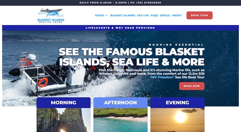
Basket Sea Life Tours offers unforgettable journeys and reveals the beauty and diversity of Ireland's marine life.
I like how the first thing every potential customer will see on this beautiful brochure website is a high-quality image of sailors. Visitors can click the red “Book Now” call-to-action button to discover the beauty of Ireland's life.
Visitors can use the sticky navigation bar with a drop-down feature to access the entire site content for further exploration. New customers can use the embedded Google map on the page to find the company's location.
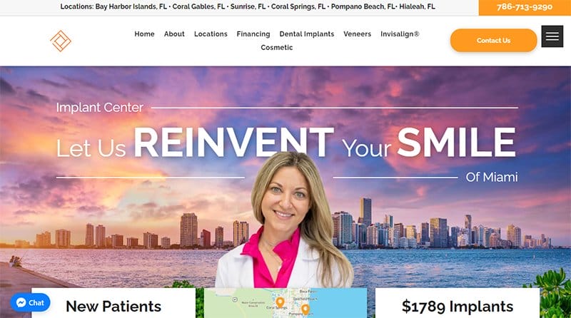
Implant Center of Miami offers superior dental implants at affordable prices. Welcoming visitors to the brochure website is a stunning image of Dr. Tatiana in a beautiful background image of Miami City.
Beneath the hero section is an embedded map that visitors can use to locate the company's various offices that are across the state of Florida. Visitors can explore the video that briefly introduces the brand.
Scrolling across the pages are stock photos of doctors displayed in a column layout with a blue “Learn More” button to have detailed information about them. This brochure site offers a financing option for existing customers.
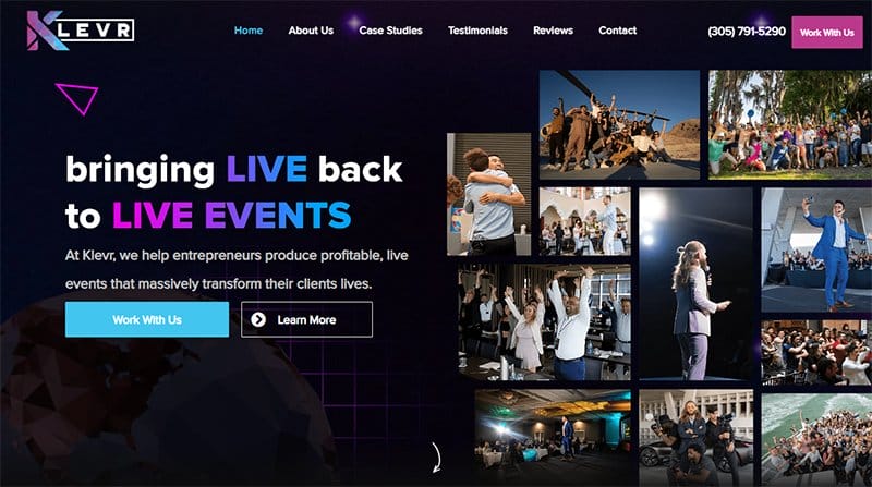
Klevr is an event planning production company that specializes in helping entrepreneurs produce profitable live events that impact their client's lives. This visually appealing website draws visitors' attention with a multi-column image of live events and a hovering play button.
As you explore the site’s contents further, you will see a catalog of logos that represents various organizations that are in partnership with the brand.
The black-colored footer features social media icons and contact information that visitors can use to reach the company.
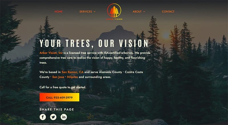
Arbor Vision is a licensed tree service that provides comprehensive tree care to realize the vision of happy, healthy, and flourishing trees.
The first eye-catching element on this brochure website is the colorful logo showcased on the navigation bar. On the homepage is a colorful CTA button that compels customers to get a free quote.
Every section on this site is full of helpful content that enables customers to understand the brand's services in a more precise fashion. These contents include engaging texts, high-quality images, and multiple logos.

Armor Shield Exteriors offers professional residential and commercial roofing solutions across the state of Connecticut. Welcome visitors to the site is an image of a rainfall background with a motion effect and a red CTA to get a free inspection.
I love how this brochure website design uses a blue, red, and white color scheme that makes elements attractive and visually appealing.
Scrolling further is the heartwarming review from a client to inspire new customers. Visitors can explore more site content through the navigation menu bar.

Umi Care offers postpartum support for the encouragement, comfort, and emotional reassurance of new mothers.
This brochure website’s homepage page gives a detailed explanation of its primary purpose in the hero section with interactive text and a purple-colored CTA button. The site’s feminine colors give it a sweet and warm outlook.
I love the constant use of multiple-column layouts to display content and illustrations to brighten the site. Visitors can learn about the benefits of doula support through this site.

Regeneration welcomes site visitors with a background image of the mountain. You can click the red colored “Latest News” CTA button for constant updates on events happening in Registration.
This stunning website is straightforward and delivers content in columns with striking points. The use of white, black, and red colors makes the site elements pop out beautifully.
I love how the “Partner With Us” section uses a drop-down effect to share information about the benefits of an interested partner.
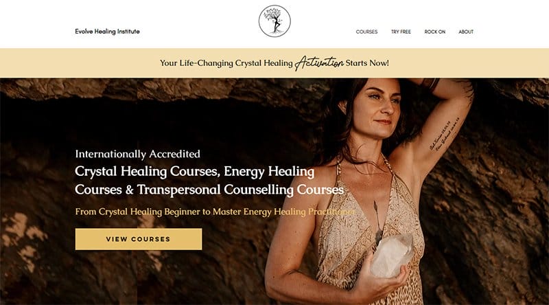
Evolve Healing Institute’s website uses a parallax scrolling effect on the hero section that gives the page a smooth feel.
Scrolling across pages are students’ testimonials from Evolve's social media platforms. You can’t help but love the heartwarming reviews from selected customers.
Visitors can spot the sticky menu button at the bottom of the page. Another beautiful element is the back-to-top feature for easy access to the homepage.
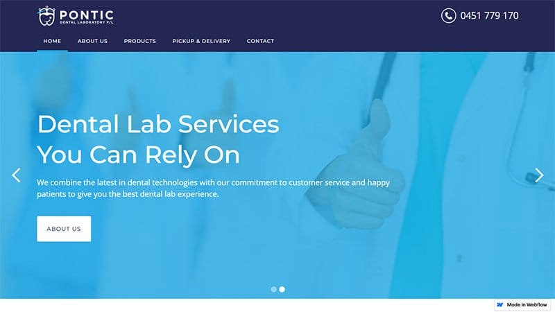
Pontic Dental is a full-service cosmetic dental laboratory committed to providing high-quality restorations for patients. This brochure-style website advertises its brand services with descriptive icons and engaging text.
Welcoming visitors to this homepage are two slider images of doctors in a transparent sky-blue color that compels visitors to view the full product range.
This brochure design has unique features that make it stand out from other brochure examples. There is a contact form that allows visitors to provide detailed information relevant to the brand.
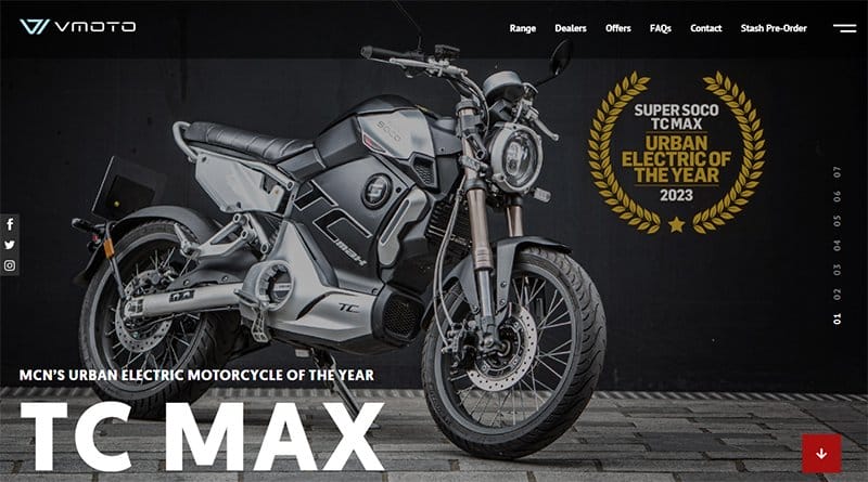
Super Soco website features a modern design layout featuring elements such as motion graphics, a sticky navigation bar, and high quality images.
Welcoming visitors to this perfect brochure is a slide show of product-related images such as high-quality powerbikes to seamlessly draw attention.
The red-colored back-to-the-top sticky widget encourages seamless exploration and swift movement across the page before making any purchase decision.
I like how the sales section features an automated slider that displays multiple bike images with the sales details. My favorite aspect of this webpage is the parallax scrolling feature which gives this brochure site a sophisticated and elegant vibe.

Yomira offers exclusive access to incredible itineraries on superyachts across the globe and off-the-beaten-path ocean adventures, designed uniquely for you by people who genuinely care.
The first catchy element on this brochure website is a video showcase of different Yachts moving on the ocean with people having a great vacation.
Clicking the teal-colored live chat widget allows visitors to have a conversation with the brand's customer support assistant.
I like how the newsletter section features a gradient-colored design layout with short texts to encourage visitors to provide their personal information.

Moorlands School Leeds has over 125 years of experience educating youngsters and has a track record of excellence in imparting knowledge.
You cannot but love the warm and lively welcome video that displays fun and educative moments in the school which helps in boosting their credibility.
I like how the webpage features multiple high-quality images of students having a great time and learning in a fun and healthy environment. The hamburger navigation bar makes it easy for visitors to navigate the web page without breaking a sweat.

The Neat Space provides clients with organized spaces that are livable and usable. Welcoming visitors to this stunning web page is a split-page feature that displays a model apartment and a short bio section.
The customer reviews section features multiple heartwarming comments and testimonials of past clients in a slider form to encourage exploration. I like how the Instagram section uses a single-column layout to display its content appealingly for visitors to check out.

Premier Student Halls has top-notch student accommodation located around The University of Birmingham. I like how the first thing you will see on this webpage is an automated slider displaying high-resolution images of some of the hall's facilities.
As you explore further, you cannot but love the details and simplicity in the texts describing the features and benefits of the different halls.
My favorite aspect of this webpage is the embedded Google Maps that encourages the seamless location of various halls within the university.
Best Brochure Websites FAQs
A brochure website is a digital version of a printed brochure that shows the products or services your company provides in a visually appealing fashion. The brochure template is different from the eCommerce template. A brochure template focuses on providing detailed information about the organization’s activities.
Every great brochure website design includes a clear and professional design, an attention-grabbing headline, concise content, high-quality images, and a persuasive call-to-action button.
Websites are dynamic and can contain all the features of a traditional brochure. On the other hand, a brochure is limited to offering information about the organization it features.
