30 Best Cannabis Website Design Examples for 2025
The cannabis market is rapidly growing due to the legalization of cannabis consumption to some degree across many countries. However, marketing a cannabis brand can be tricky.
Many platforms and search engines like Google and Facebook place restrictions on cannabis digital marketing, promotion, and sales. How do you overcome these limitations and build a successful cannabis brand? Design a visually appealing website.
Hiring the services of a website designer or a web design agency to create a beautiful cannabis website can be costly. A better option is to use the best website builders like Squarespace and Wix to design a visually stunning and lucrative site.
This article explores the 30 best cannabis websites that provide the inspiration and creative ideas needed to build your own brand website.
Let's get started.

Willie’s Reserve is a cannabis company of Willie Nelson, a long-time supporter of Marijuana legalization. His marijuana website employs simple designs on a black and white colored background, making it easy for site users to quickly find what they want.
This marijuana webpage has no header section. Instead, it evenly distributes navigations across the top of the hero section. Visible on the plain white background is a display of marijuana-infused coffee, tropical products, and organically grown American hemp.
Interested retailers can click on the dirty-green CTAs to perform their preferred choice of action and use the footer to get the company’s contact information.

Cigalar Brand is a recreational cannabis dispensary in New York. This dark cannabis website employs product-based search engine optimization as its digital marketing strategy. As a result, their products top the list in search engines based on specific searches.
The homepage uses a monochromatic color background with varying text colors. Welcoming visitors to this cannabis website is a smoke animation moving around the product images, highlighting the intense level of THC in its cannabis-infused products.
Navigating the homepage, you will notice the visual hierarchy making a stunning display of their products and the video giving Cigalar all the credibility it deserves.

Chalice Farms is a local neighborhood cannabis market that is committed to an enjoyable farm-to-pipe cannabis experience. This awe-inspiring design uses sharp images and a black and lavender-Pinocchio color scheme.
Unlike other cannabis dispensary websites, Chalices' homepage uses a black background, sleek fonts, CTA, and a non-sticky header instead of a big hero image. This design approach adds a sense of uniqueness to the web design.
Another design worthy of stating is the uniformity of CTAs and the use of a green underline to make notice of important texts.

Manifest Wellness is a cannabis business created for men's personal development. This cannabis web design is filled with minimalist designs, using only the best visually appealing images and sleek fonts to catch attention.
Specifically, the header is a green background embodying no-frills navigations and social media icons. I love how the hero section uses a three-grid layout to showcase new products.
You can't help but fall in love with the curated product section, the blend of white and green color schemes, and the simple CTA design. These designs look superb and stand out on the entire web page.

Redbird's cannabis website uses a minimalist design, featuring slides of stunning visuals showing the beauty of the cannabis plant. Rather than using a long sequence of header menus, this website only displays the wordmark logo, About, and Instagram link.
On the homepage, you will find a video embed and grids of cannabis products giving details of the brand. What I like about this cannabis website is its use of the best visuals to convey its expertise.

D8 Austin is an attractive and resourceful eCommerce website. This cannabis website employs shades of purple colors to influence the web visuals and give a grand color outlook.
The homepage is filled with navigations, from the very beginning to the footer, ensuring that visitors are not lost while exploring the web. One creative feature I love about this website is the search bar that reveals the range of cannabis products based on SEO.
Other unique features of this web include animated images, online proofs, a shipping process, FAQs, blog posts, and an interactive map.
If you are a cannabis business owner looking for inspiration to create your dispensary website, D8 Austin is a good website to check out.

GoGreen Hemp takes pride in providing the best CBD hemp products to customers and businesses across the United States. I like that this cannabis website is delightful and navigable.
The first notable design that catches your attention on this website is several products displayed on the orange background of the hero section.
Enhancing the hero design, GoGreen Hemp employs a white color background, making the image and other web elements look attractive.
More notable features of the website include a one-stop shop, a slideshow of testimonials, blog posts thumbnails, and the whole process of its product absorption. Interested clients can check the footer section to select their preferred payment option.

Cannabis Premium Gifts opens with a mouth art image conveying its choice of premium edible cannabis.
The first stand-out feature of this cannabis website is the use of petals-shaped edible cannabis to represent the brand's logo. Another feature of this homepage is the black background displaying several blog posts, each following an underlined CTA.
I like that this cannabis website is minimal and effective. Visitors can click the outline of social media icons at the footer to connect with Cannabis Premium Gifts.

Pepper Lee CBD is a cannabis-inclined cosmetics and wellness store owned by Allyson Sprinkel. She uses her cannabis website to display expertise while promoting her handmade cannabidiol products.
On the homepage of her cannabis website are clean and simple designs, appealing to the sight. I love how Pepper Lee CBD employs clutter-free navigations that align with essential web content, creating a sophisticated outlook.
What I like about this cannabis website design is the right-aligned horizontal header and the blend of white, cream, and black color schemes.
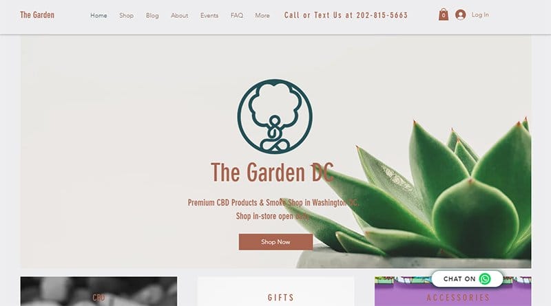
The Garden DC is a CBD oil and smoke business in Washington DC. Unlike other cannabis websites, this website opens to a Rock-white background, featuring a green logo, Clam-shell colored texts, and a complementary Shop Now CTA.
Beneath the hero page is a colorful introductory section and highlights of their services hinged to a cartoon-like image. This cannabis web design features thumbnails that lead to bulks of blog articles and a map of their office location.
I love how this cannabis website implements white space and sleek fonts to enhance the appearance of visuals.

Budho is a set of blockchain-powered solutions that keeps track of the cannabis supply chain. This beautiful cannabis website provides a fixed portal login that helps site users explore the site.
One of its unique designs is the fixed header menu that features the brand mark logo, a cart, and a search bar. The search bar makes it easy for customers to discover new services and purchase locally available cannabis products.

Cann opens with an advert for its cannabis-infused energy drinks, accompanied by a Rose-Red CTA sitting on the Sea Mist background of the hero section.
Catching your attention are color schemes that give an impressive outlook and enhance the sensational vibe of the site.
The logos of recognizable brands are on the homepage with client testimonials in animated texts, providing their target audience with social proof. I like how this cannabis website uses age verification to ensure site users are above parental guidance.

Mowellens is a phytomedicine-based brand that aims to offer the highest quality of cannabinoid drugs and skincare products. Instead of employing a wordy and boring web copy, this cannabis website uses only the best visuals to narrate the brand's expertise.
Each product in the shop section sits on the site's plain white background, each featuring a responsive design, visible with a hover effect. You can't help but notice the parallax scrolling and text animation, revealing its brand development and commitment to customer satisfaction.
Interested visitors and customers can use the footer section to view payment options, subscribe to newsletters, and connect on socials.

Humboldt Sun Grower’s Guild is a growing network of Humboldt County farmers in California. This cannabis website treats visitors to a cloudy plantation image featuring a centralized brand logo, a short mission statement, and a descriptive call-to-action button.
Taking a vertical layout of the homepage are Orange buttons that enable users to switch between sections in one click. This action gives the webpage an illusion of a standard one-page website.
As you navigate the website, you will find their best value-added services serving cannabis businesses with branded products and lab-tested flowers. Potential clients can use the non-sticky header and footer navigations to explore every aspect of the brand.

The Duber is a high-end cannabis and medical marijuana service provider with a simple yet professional website design. One of the best dispensary websites, Duber welcomes you with the hero image of weeds and bold fonts, drawing in its ideal customers.
On the extensive dawn-pink background is a user-friendly layout featuring grids of its most popular items, Caribbean Green CTAs, product thumbnails, and consultation services.
Site users can schedule a consultation to harness the medical effects of recreational cannabis without having to smoke or get high.

Ontario Cannabis Store is a legal cannabis dispensary agency owned by the province of Ontario. This recreational cannabis agency uses its web presence to enforce cannabis purchase laws that allow users to get only thirty grams per transaction.
What’s handy about this webpage is its simplicity and effectiveness of web content, giving the website a useful narrative. The fixed header of the homepage is a handful of navigations with drop-down menus that showcase the ample services of OCS.
As you explore, you will notice several Cannabinoid-infused products, a brief introductory section, a grid of searchable tropical brands, and visible payment options. These sections enhance the user-friendly layout of the cannabis website.

Breeze Botanicals prides itself as the first OLCC-licensed cannabis dispensary in Oregon. This cannabis web design embraces a unique and fun shopping experience while blending a full service of cannabis dispensary & herbal apothecary.
I like how this cannabis business website uses a white color scheme featuring shades of blue and green, background images, and interactive texts to engage customers.
The drop-down navigation bar allows visitors to read about them, check out their store locations, and purchase various products without stress. My favorite aspect of this cannabis site is the section that features color-coded products that create an appealing visual view.

Marley Naturals doubles as a brand website and a one-stop shop for all smoking accessories. Welcoming visitors to its website is a full-width image of several accessories that promote its authenticity and sustainability.
Beneath the image is a short text advert that compels you to explore every ounce of the webpage. Further exploring the webpage are squares of smoking accessories featuring white spaces and Orange Gold colored CTAs.
Visitors can easily spot the hamburger menu at the left sticky header and a search icon that allows for easy navigation. The footer on a Dawn-pink background features quick links, shipping and return policy, terms of use, FAQs, and contact information.

Lightshade serves as Colorado’s premier cannabis dispensary. I like how its cannabis website uses multiple images and Purple-haze colors to reveal the brand’s vast collections.
Featured on Lightshade’s homepage are responsive thumbnails showcasing its divisional dispensary locations. These dispensaries create a good geographical segmentation, making it easy for customers to get close access to their products.
The black-colored site’s footer embodies a structured layout of navigations like social media icons, blog posts, and cannabis consumption guidelines. Visitors can use this section to find any information relating to their needs.

Nordics Oil is a European-based cannabis company that supplies the highest quality products made with organically sourced premium hemp. This cannabis company takes to its website a simple and elegant design that perfectly blends with the CBD products on display.
Visible on the homepage are logos of reputable organizations like Forbes, certifying the legitimacy and success of its cannabis company amongst other cannabis companies. You will find customers’ reviews, serving as online proofs for potential clients.
The five-star rated products and Instagram posts feature a drag-and-drop effect that allows users to drag images and drop them externally. I like that visitors can explore the non-sticky header and footer navigations to find their area of interest.

Superette is a Canada-based cannabis store that aims to offer the best variety of cannabis-infused edibles. Welcoming site visitors is a full image of the store, showcasing its collection of highest quality products with bold fonts and a Shop Now CTA.
What I find amazing about Supperete’s website is the colorful header that gives a fun and playful vibe.
Some creative design of this minimalist website is the interactive elements that change the style of a product with a hover effect. While the search icon displays a list of outsourcing brands, the cart reveals pending orders.

Mango Cannabis is a cannabis creative agency proudly serving Oklahomans with the best cannabis experience. The homepage of this cannabis website opens to slides of motion graphics showcasing Mango Cannabis’ brand development and latest projects.
At the top left of the header is the hamburger menu that houses a vertical sequence of navigations while the top right features responsive image loops. These image loops capture the users' attention to its new and stress-free purchase development.
Scrolling down the homepage, you will notice the parallax effect, revealing the social proofs and best deals of its brand. Visitors and potential clients can use the slick sliders to navigate the testimonial section.

Verilife is a U.S.-based medical marijuana dispensary with several operating dispensaries across the country. Unlike other dispensary websites, Verlife sticks to a responsive minimalist design and sleek eligible fonts.
The homepage of this website is an Evergreen background featuring their regional dispensary locations and CTAs connected to their online shops. Above the footer are the FAQs serving as additional resources that provide the audience with valuable information.

BC Cannabis Stores is a recreational cannabis dispensary in Canada. This cannabis brand differentiates from others in the industry with its most sought-after cannabis buds, high in THC contents.
This colorful cannabis website takes advantage of product-based SEO. As a result, search engines showcase their brand products when customers search for specific CBD products.
I love how it takes the positioning to its website, integrating every one of its web content to showcase its expertise and highest quality products.
BC Cannabis Stores’ site uses green colors and smooth sliders to add a modern look and responsive thumbnails that lead to their sales page.

NeuroSolution CBD prides itself as an experienced plant-based health service provider in the United States. This cannabis brand uses a website tailored to showcase its expertise and advertise its products.
The hero section displays its broad spectrum of CBD oils and the homepage embodies every detail of the products.
You can not help but like how this cannabis website design appears exceptional. The smooth typography, homepage FAQs, online reviews, social media icons, and contact details contribute to the user-friendly experience.

Preston Hemp Co serves global cannabis companies with the best quality and consistency of dried flower products with precise humidity control. The first notable feature of their web design is the balance between images and fonts.
Apart from the hero section, this stunning web page uses a parallax scrolling effect to reveal thousands of product reviews. The ratings boost the reputation and credibility of the brand. I like how this website embraces primary colors for its color schemes.

The Herb Collective is a cannabis dispensary located in Orange County. Their website design integrates animation and sleek fonts to create a stunning focal point.
Rather than embracing the common header sequence, The Herb Collective uses a hero header to reinforce the quality of the web design.
At the end of the page, you will find several brand products ranging from the blue dream to pre-rolls, down to the cannabis fruit chews. Interested customers can use the centered hexagonal design and the top page to get more ordering details.

Charmed Hemp is a U.S.-based hemp dispensary. This dark-themed cannabis website opens to a black background with a centralized wordmark logo and a horizontal outline of navigations.
At the top right of the page is a login icon that allows clients with a personalized shopping experience. There is a handy cart icon that allows you to save items for future purchases.
Exploring the site, you will notice the Pale-gry space showcasing hot-selling products, accessible with cool sliders and the customers' reviews of their five-star products. I like how this website design uses a scrolling effect to reveal the brand's terms of use.

One of Colorado's biggest dispensaries, The Republic cannabis website welcomes you with a visual tour of its Cannabis farm featuring segments of fresh green plants.
Specifically, this site features attractive large images, legible fonts, unique CTAs, and visible white spaces as its design elements, enhancing its modern cannabis shopping experience.
The Republic cannabis website employs a one-page design yet prioritizes its value propositions, easily navigable by uniquely structured CTAs.

Physicians Preferred aims to offer the purest CBD oils of its organically grown hemp. One of the best cannabis web designs, Physicians Preferred uses creative designs from the very beginning of the webpage and maintains top-notch elegance throughout the homepage.
The hero section is an awe-inspiring layout of products combined with an animated shadow of cannabis plants on a gray-white background.
Beneath the hero section is the white space that harmonizes the sleek typography and product images. With this visual coordination, the sequence of the web elements is visible and more appealing.
FAQs
The cannabis industry is a multi-billion dollar market. World statistics reveal that the cannabis market is projected to reach $51.27 billion in 2023 and a market value of $102.90 billion by 2028. These numbers highlight the vast growth and lucrativeness of the Cannabis market.
Every niche in the cannabis market has a place when it comes to profits. From farming to the dispensary to the marketing of finished products, down to the retailers, there are no profit limitations. Nevertheless, one niche that flourishes better than others is the cannabis retail store.
Website development doesn’t have to be difficult or require a web designer. There are many cannabis website builders on the internet. However, the best website builders that can help you achieve the best web presence with highly converting website traffic are Squarespace and Wix.
Creating a beautiful cannabis web design is quite simple. All you need is to get design inspiration from cannabis websites like Marijuana SEO and Curio Wellness. Use recommended website builders like Squarespace and Wix to build and select or customize your template.
Cannabis is legal in about 20 countries. Canada, Argentina, Portugal, Spain, Thailand, Mexico, Costa Rica, and Jamaica, to mention a few, while it is illegal in other countries of the world. However, creating a cannabis business is dependent on your country of residence.