20 Best Carrd Examples And Ideas You’ll Love
As attention spans shrink and users increasingly seek instant engagement, one-page websites are becoming increasingly popular. You can use one-page websites to build an online portfolio, resume website, or landing page.
Carrd is one of the best website builders for building beautiful one-page websites that attract visitors and leave a long-lasting impression.
This article provides you with the 20 best Carrd examples that will ignite your imagination and help you create your own perfect site.
Let’s get started!

Desiree Ruiz is a holistic mentor for parents and entrepreneurs. Her website showcases ample text and video testimonials to provide social proof.
The bright hero image is a sharp contrast to the other sections of the website. Ruiz uses many captivating images and restricts the textual content to the page center to ensure that visitors are focused and engaged while navigating.
I like how she uses pure black CTA buttons on every background. The black color differentiates itself from all other web elements and stands out to the visitor.
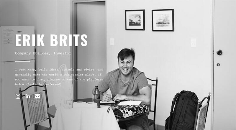
Erik Brits is a company builder and investor. Despite its simple design, his small site leaves a lasting impression on potential clients. He operates a one-page site with a full-width background image in a black-and-white color scheme.
I love how Erik presents the text on his website boldly in white-colored fonts, making it visually appealing against the monochromatic backdrop. All the additional features of this Carrd website are intentionally positioned on the left side to enhance the visual impact on viewers.
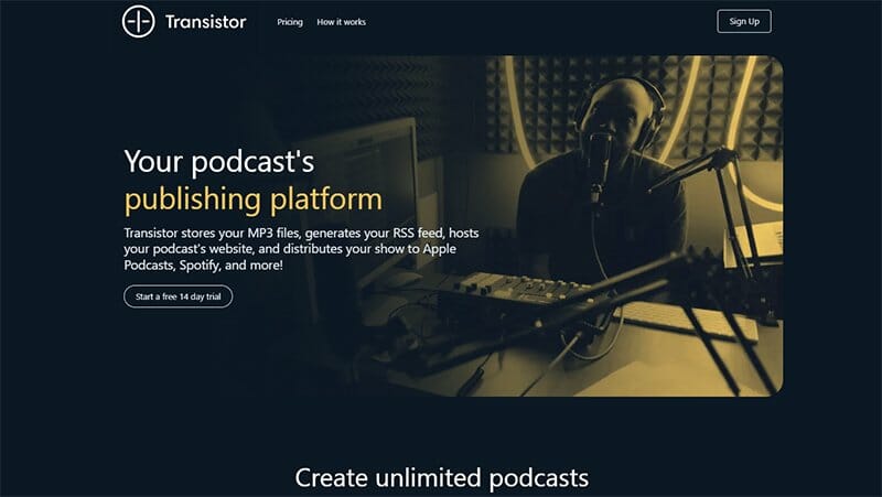
Transistor FM is a podcast website. This Carrd website excels with its structured, layer-by-layer approach to images.
The hero image seamlessly integrates with the site's black pearl background. A concise video on the web page effectively explains why Transistor is the top choice for podcast hosting.
I like this site's capsule-shaped CTA buttons that can attract visitors and encourage them to sign up for Transistor's free trial offer.
Transistor FM compensates for its barely visible header by featuring an enlarged footer in a vibrant saffron mango color. This footer prominently displays links to various sections of the website.

Newsletter OS is the home of expertly curated newsletters creatives can use to grow their clientele. The single-page website uses several traditional Carrd ideas. It presents itself as a one-page site with multiple sections, elegantly revealed on a white and lilac background.
I love how the onyx and blue colors warmly combine to give this web page a professional appearance.
The chat feature in the bottom-right corner provides quick answers to inquiries that enhance the user experience. I like how Newsletter OS employs engaging and interactive widgets to promote its products.
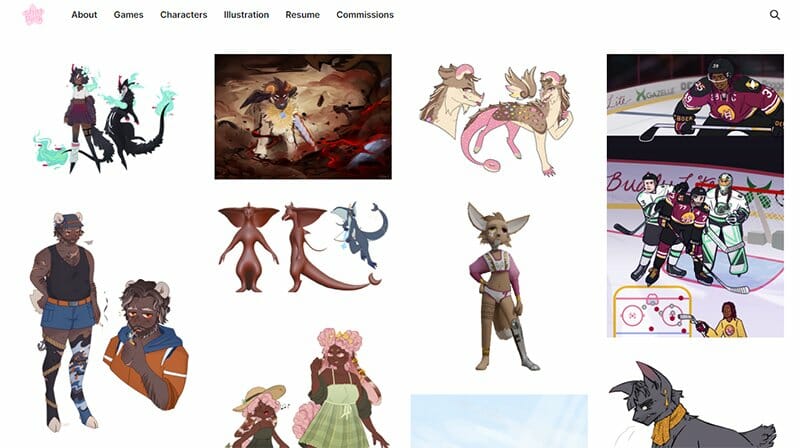
Shai Pink is a character designer, illustrator, and digital artist. Her site’s plain white background helps to highlight her colorful portfolio and other web elements.
Users can quickly locate the search icon at the far right of the header, which is isolated from other header elements and surrounded by white space. The still and moving images are a brilliant way to draw visitors' attention.
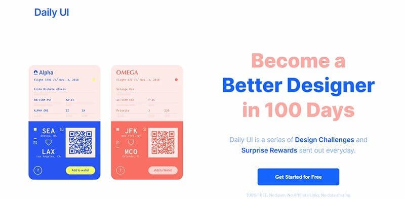
Daily UI is a design community that seeks to inspire and improve other designers with daily design challenges and surprise rewards.
This Carrd website uses soft color themes like white, pink, and blue to compensate for the extra large fonts it chooses for its texts. These components combine excellently to leave a memorable experience.
On the hero section, you will see an image set that tilts to the left once the cursor touches it. This element is sure to intrigue site visitors.

Impact Origins is an LA-based marketing agency. This Carrd website is only one page long, with background and foreground images.
The foreground elements are fast-scrolling, while the background image stays still. This effect creates a visual contrast between the stationary background and the moving foreground.
I love how the hinged background features a peachy pink color scheme, which grabs visitor's attention. This feature prevents them from merely scrolling past and missing the essential information on this page.
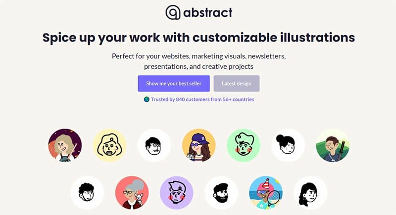
Abstract is an illustration-based site that helps create personalized characters that can meet the design and marketing needs of any entrepreneur or visual artist. I love how Abstract uses a continuous single-page website design to display its content.
The presentation kits in their design portfolio integrate images with a hover effect, causing them to pop out when they come into contact with the cursor. I like how the CTA buttons are an elongated rectangle that is light-slate blue.
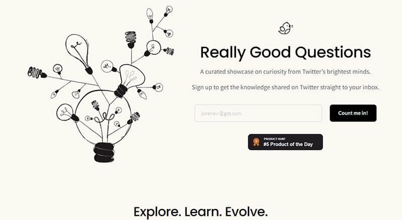
Really Good Questions is a website that highlights the questions people ask on Twitter and the answers from different tribes and communities.
The first thing that draws your attention to the website is the tree of light bulbs. In addition, the black rectangular CTA buttons are a good fit for the Vista white-colored website background.
I like how the website displays the Twitter questions in an uneven three-column layout. At the end of the display, there is an arrow icon that takes you back to the top of this one-page website.

SaaSHook is a community that helps SaaS makers and marketers convert visitors into paying customers by selling ideas to revamp their websites.
The website background color is ghost-white, mixed with cobalt blue and purple patches. I love how SaaSHook integrates the hover effect on its warm blue CTA buttons such that they pop out as the cursor comes in contact with them.
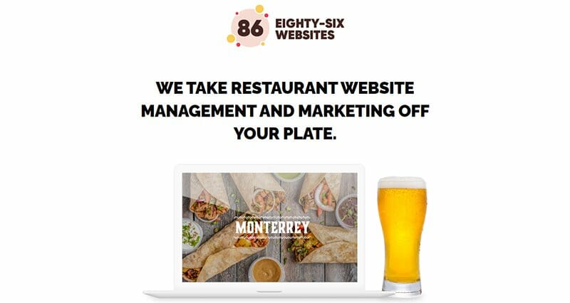
Eighty-six Websites is a platform dedicated to building and managing simple websites for bars and restaurants while being a simple website itself.
I like how you can enlarge the online form at the bottom of the page with your mouse cursor. This feature allows those who require Eighty-Six services to provide sufficient information on what they would like their website to look like.
Interested visitors can fill out the contact form at the base of the webpage and click the reddish-orange-colored CTA to get started.
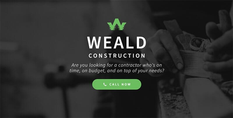
Weald Construction is a website owned by Kevin, a professional contractor. Kevin has a stylish and unique logo stationed at the top and center of his homepage. The turtle green CTA button is very bold and attractive.
I like how the elements on the homepage are well-synced with the full-width monochrome image in the background.
This one-page website arranges its sections over each other, creating a layer-by-layer effect. Like other Carrd website examples, Weald Construction adds to its aesthetic by being header-free.
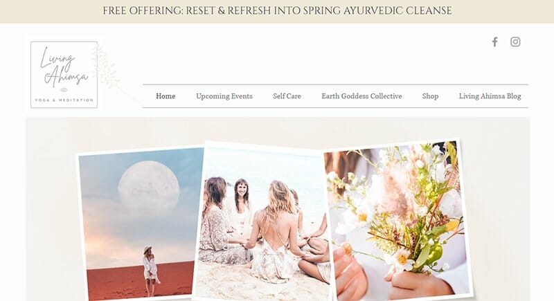
Living Ahimsa is a yoga website Lia uses to display her Ayurvedic practices. This website is a perfect example of how Carrd is the go-to if you want to build simple websites.
You will find recent updates pinned to the top of the webpage. Lia’s website features a shop section where visitors can shop for yoga props they may need.
The navigation arrows on either side of this section will allow users to stay on the homepage as they scroll through the items on sale.
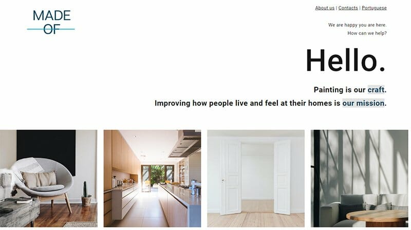
Made of Portugal is a brilliantly crafted painting website. This Carrd website takes the liberty to include Portugal/English on the site’s header so visitors can quickly switch languages with very little loading time.
The swift loading time is a general feature of this website. After the first click, navigating through the different web pages is seamless.
Made of Portugal displays the painting portfolio on the simple landing page in a four-column layout with white spaces visible between the images.
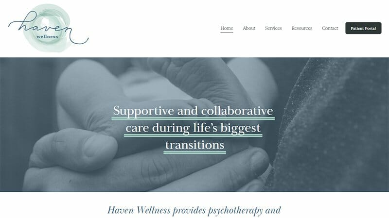
Haven Wellness offers therapy, doula, and postpartum services for families or as an individual counseling session. This Carrd website uses a sticky header, big CTA buttons, and long tabular testimonials.
I like how the “Start Here” page shows four components in rows bound by lines above and below them.
In front of each site component, you will find a plus sign that drops down the entire information when clicked and changes to a minus sign. The minus sign collapses the site components back to their rows.
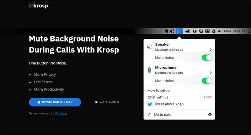
Krosp is an AI-powered noise cancellation product that works well on mobile or PC for noise and mentions free calls, conference meetings, and recordings.
The website’s background is a night black color, used so that other colors and elements on the web page shine out to the viewer. I love how the CTA button is a royal blue capsule that appears frequently on the single-page website.
Krosp imports videos, audio, jpegs, and GIFs. Mobile and PC users have easy access to these elements.
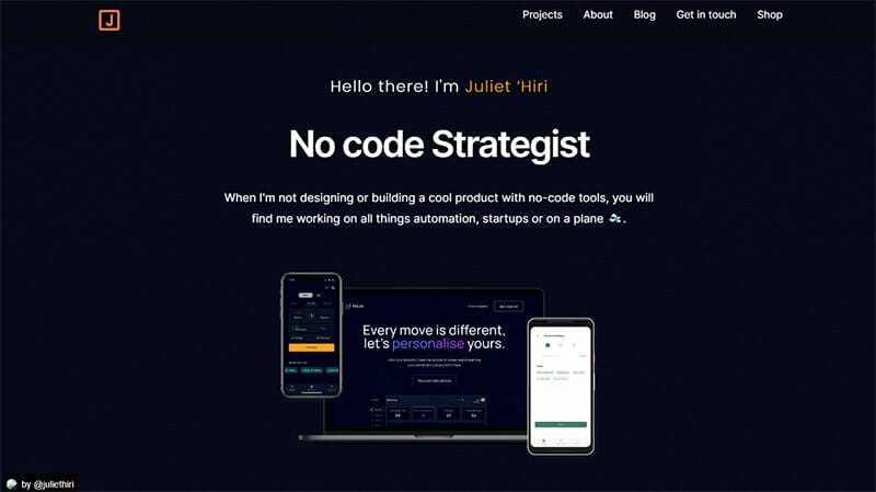
Juliet Hiri is a no-code strategist. She built this website on Carrd, which she states is one of the tools she has used in achieving pro version status.
I love how Juliet alternates between black and ebony colors in her different sections. The CTA buttons and check marks are an orange peel color. These cool colors give her website an aesthetically pleasing outlook.
You will find an excellent example of a simple contact form and a check box, allowing Juliet to gather contact information from potential clients.
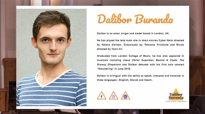
Dalibor Buranda is an actor, singer, and model based in London, UK. He trusts Carrd to build him a good personal site. On this one-page site, you will see picture frames, some showing Dalibor's facial features and others of him singing or acting.
In the background, you'll notice that music videos from his online portfolio are playing in a silent loop. There is an online form at the end of his webpage that is transparent to prevent obstructing the background video.

Fab Ninjas, a software development company, offers innovative corporate branding services tailored to meet the needs of any small business.
This branded portfolio website employs professional web design elements to establish a cohesive online presence that leaves a lasting, positive impression on visitors.
The website's color palette features formal shades of purple throughout its one-page layout, making it ideal for commercial purposes.
As you scroll between sections, the transparent header remains fixed at the page top, seamlessly adapting its color to match the current one it overlays.
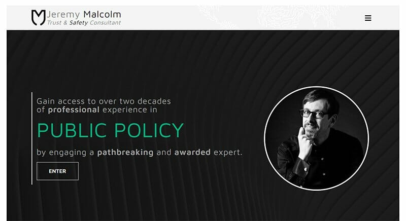
Jeremy Malcolm runs an internet security company with experience in trust and safety, internet law, and public policy. He does not spare his website on interactivity and employs many modern web design initiatives.
The hamburger icon on his header turns mint green and spins on itself as the cursor touches it. He employs a unique scrolling effect in that the different sections scroll over each other like the pages of a book.
Best Carrd Website Examples FAQs
Yes, Carrd is an excellent platform for creating one-page websites. It specializes in helping you build one-page sites with ease, making it a great choice for projects where simplicity and conciseness are key.
Carrd is perfect for crafting personal websites including elegant personal profile pages. Its user-friendly interface and customizable templates make it a fantastic option to showcase your individuality and accomplishments.
Yes, Carrd empowers you to design impactful landing pages. Whether you're promoting a product, service, or event, Carrd offers the tools to create a well-designed landing page that captivates your audience and drives engagement.
People use Carrd for a wide range of purposes, from crafting personal portfolios to showcasing business offerings. Carrd's flexibility allows users to create websites for freelancing, blogging, and event promotion to mention a few. Plus, with the option to connect a custom domain, your Carrd site can have a professional and unique web address.
Some of the best Carrd websites cater to specific fan communities. For instance, you'll find the Cute Fan site, Kee Ho fan site, and other fan pages dedicated to popular interests like the Marvel Cinematic Universe, K-pop fans, and enthusiasts of the Wild Horizon. Carrd can offer a versatile platform for creating these unique and engaging fan-focused websites.


