Consulting Websites: 32 Inspiring Examples (2025)
Building a website for your consulting business is one of the best marketing strategies for attracting new clients and business growth. Successful consultants create well-designed websites that show their skills, expertise, and services to prospective clients.
The best consulting websites include your specific consulting services, client testimonials, contact details, and work portfolio. You can design your own site with a website builder for consulting businesses like Squarespace or Wix or hire a web designer.
This article shows you the best consulting website examples you can use as inspiration to create your own site.
Let’s get started.
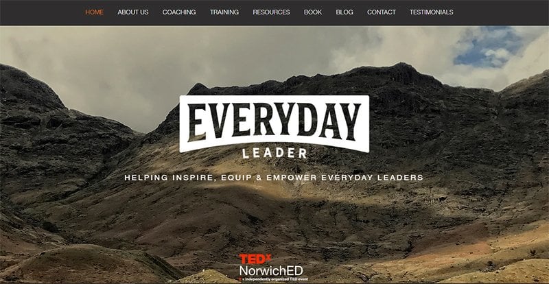
Everyday Leader is a consulting company run by Colin Tapscott that helps everyday people unlock their leadership potential. The website uses a drop-down menu that helps visitors navigate easily through its sections.
You can’t miss its attractive logo design and inspiring value proposition at the center of your screen. I love the rustic mountain landscape photos that dominate the website.
Everyday Leader adds video content to give their website a professional and engaging look. The consulting firm smartly places the TEDx logo to build social proof and credibility in the eyes of potential clients.
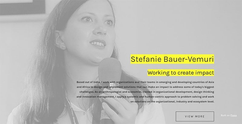
Stefanie Bauer-Vemuri has one of the best consultant websites you can use for inspiration to create yours. The consulting website design is simple and information-loaded which gives it a professional and formal look.
There are white spaces and gray colors that make the website pleasant to navigate. I love how she uses yellow highlights to draw attention to her brand name and tagline. She adds her contact details to make it easy for current and prospective clients to reach her directly.
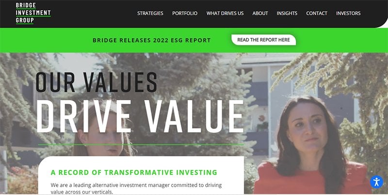
Bridge Investment Group is a consulting agency that provides investment solutions for investors. The web design is sleek and modern. You can’t miss the rotating backdrop image that gives you a glimpse of the company’s primary services.
This consulting site uses a standard white background with black sections to draw emphasis to its rich graphics, images, and text. I love how it uses lime green and turquoise accents to grab visitors’ attention to the website’s CTA buttons and relevant content.
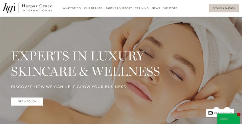
Harpar Grace International has one of the best consulting website designs. The website has a user-friendly interface that is easy to navigate thanks to its drop-down menus and well-designed sections.
I love how the consulting group uses large and bold white fonts to show the consultancy services it offers. The use of sharp and colorful photos with lots of white spaces attracts potential clients and suggests a high level of professionalism.
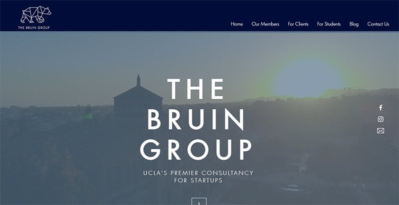
The Bruin Group is a consulting business website that offers pro-bono advisory services for startups and growing companies. There’s a background video and centered bold white fonts that capture your attention from the start.
I like how The Bruin Group uses high-quality images to show its student employees on the homepage’s diversity section. This consulting website example uses menus to help tech and non-tech-savvy visitors navigate easily through its service offerings.
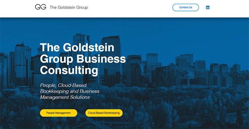
The Goldstein Group is a business consulting group with a simple and minimalist website design. You can’t miss the colorful dark blue background picture, white space, and yellow CTA buttons.
I love how you can quickly read the website's content within seconds. The professional website uses friendly pictures of its management team and brief biographies to establish credibility and attract potential customers.

Younglanes Appeal Services is a top consulting firm that offers Amazon, eBay, and Walmart reinstatement services. The site’s background design is full of high-quality professional images.
There’s a video background on the contact section that current and potential clients use to contact the company. I love how it pops up a notification each time a person submits a contact form in real time.
Younglanes Appeal Services use client testimonials from TrustPilot from previous clients to establish credibility and expertise.
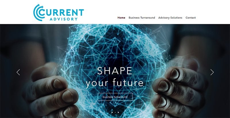
Current Advisory is one of the top consultant websites where you can draw inspiration to design your own website. What catches the attention of a potential client is the firm’s logo and the slideshow banner that displays three realistic images.
I love how it uses a simple design dominated by white space. The user-friendly website’s mobile view and experience are just as good as its desktop option.
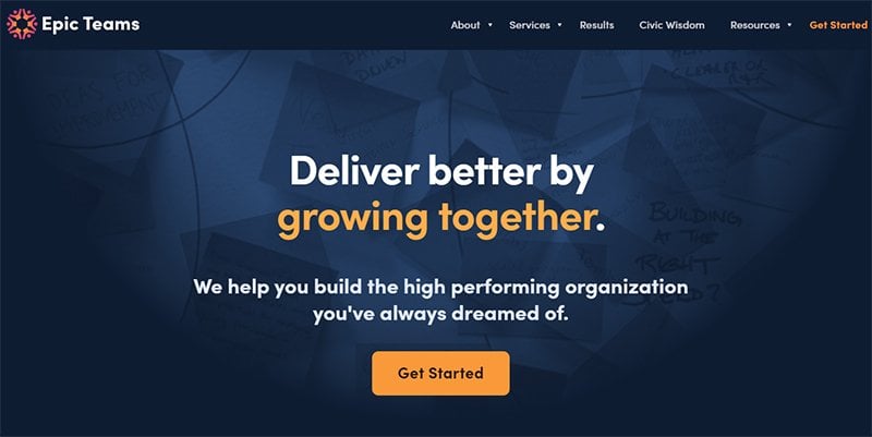
Epic Teams’ has a good consulting website design that is pleasing to the eyes. There’s a brief description of what the consulting business offers. The user-friendly website uses blue-toned, green, and orange colors and lucid writing to attract clients.
I love how the website designers behind Epic Teams use colorful vector avatars and high-quality human pictures to give the website a pleasant look.
This consulting firm smartly mentions top organizations they have worked with and features case studies from previous clients.
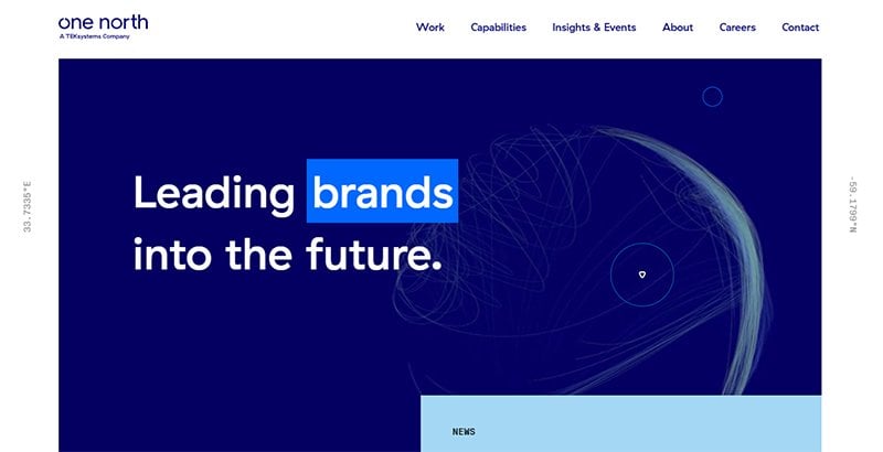
One North is a great example of a consultant website with an inspiring design. I love how the website uses cool animations and effects for a pleasant experience for visitors. You can’t miss the blue-dominated video loop when you visit the website.
This consulting website uses lots of white space. Notice how the colors change from blue to light gray and back to blue as you scroll down to check the site’s content.
The website's blog section provides you with relevant articles that match its service offerings and appeal to its target customers
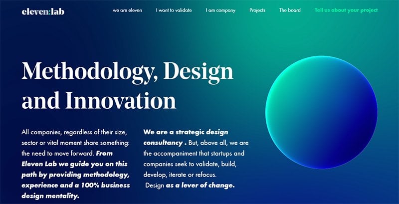
Eleven Lab is a great consulting website example consultants can draw inspiration from to design their unique websites. I love its simple website design with an informative and educational tone.
You can't help but love the visually-appealing background design that blends blue and teal. This website uses eye-catching 3D graphics and high-quality images.
The choice of large white fonts and the use of bold emphasis in the text section is brilliant and perfectly compliments the background colors.

Bows & Arrows Consulting uses a clear and visually-appealing picture of an ox in a forest setting. On its own, this picture doesn’t tell you about the consulting services the firm offers. Thanks to its value proposition at the center of the picture, the choice is perfect.
Pay attention to the website’s clean, simple, and straight-to-the-point layout. There is only two-column worth of content on the website. I like how the site’s footer contains the firm’s contact details and social media icons.

Safran Wealth Advisors is a wealth management firm that uses delicate and soothing images that bring an atmosphere of safety and professionalism. The white-dominated background helps make the website copy easy to read and scroll through.
I like how the wealth management firm uses clear menus and headers for easy navigation to other pages with rich information. As you scroll down, the website’s organized layouts will leave a memorable impression.
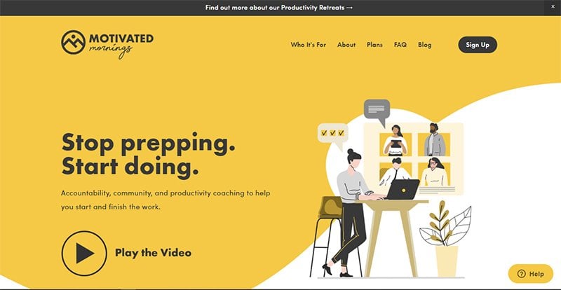
Motivated Mornings is a consultant website that helps entrepreneurs, small business owners, students, writers, and professionals start and finish work on schedule.
The bright sunshine, white, and black color scheme with its cool and work-driven animations gets you excited about your mornings. There are clickable video options that make the website more engaging.
I love how it mixes bright yellow and black call-to-action buttons that blend with the website’s primary colors. Motivated Mornings offer a free guide to generate leads for its paid plans.

TinySeed is one of the best consulting websites for SaaS founders and market leaders. The dark blue and white themed website is pleasing to the eyes. You can tell from TinySeed’s amazing copy how much professionalism is put into its mentorship program.
I love the genius idea to add video content for users that prefer an audio-visual experience. There’s an inspiring client testimonial section featuring positive and glowing feedback from three SaaS founders that is great for establishing credibility and trust.
Fresh Consulting is a great example of a trendy, youthful, and modern consulting website design. You can’t help but love the subtle yet entertaining animation videos that dominate the website. Visitors almost feel like they are watching a movie on Fresh Consulting.
Black and white are the dominant colors that give the website a professional and clean look.
I am a big admirer of how Fresh Consulting designed its Featured Work section to show it specializes in creating and marketing innovative industrial products. The use of rich pictures and relevant text gives visitors a glimpse of its expertise.
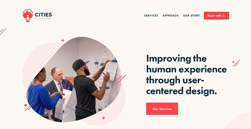
Cities Reimagined website’s use of small and high-quality pictures in the form of blobs is great for branding. The way the consulting business blends colors on a white-space-dominated background catches the eye.
As you navigate from top to bottom, you encounter the dominant white background and the teal and red colors. I love how Cities Reimagined uses its red logo color for its CTA button.
The consulting business adds social proof to the website by adding logo images of the Fortune 500 companies and other organizations it worked for. Add the client testimonials it leaves below the logos and you have established credibility.
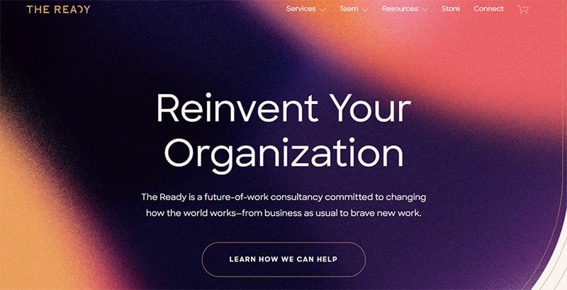
The Ready is one of the best management consulting websites designed to help ideal clients scale their online businesses. This consulting company uses bright color tones that are in line with its innovative and transformative approach to work.
I admire how The Ready uses high-quality retro images and a conversational writing style for its homepage sections. Social proof and client testimonials are important for any website. The Ready dedicates a section to showing their best clients.
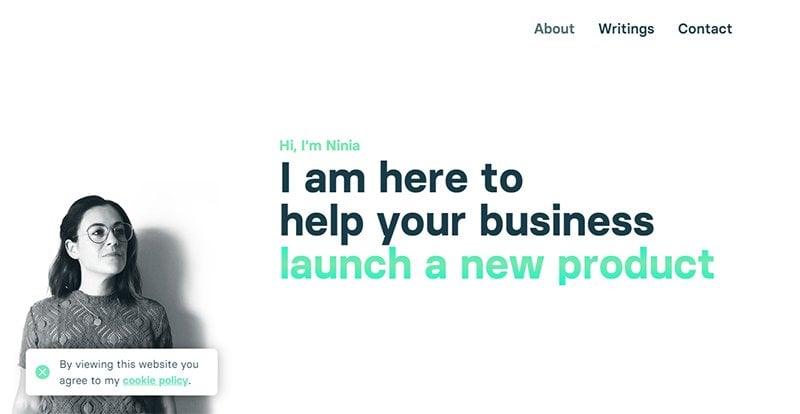
Ninia Azzopardi has a top consultation website she uses to showcase her rich and relevant industry experience as a digital strategy marketer and consultant. I love the minimalist and simple website design that uses black and green colors with plenty of white space.
Visitors can easily scroll to the sections they require information from with its neatly categorized web page sections. She uses an interactive picture of herself that moves and then disappears as you scroll down to other sections.
Ninia does a great job showing popular brands has worked with on her website. I like how she shows the total number of campaigns she has managed to establish her credibility.
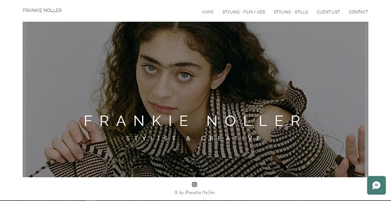
Frankie Noller is a fashion consultant with a straightforward website design. The first thing you see on her website is a high-quality picture of Frankie Noller in a stylish pose.
She barely uses any text, unlike other websites on this list. Her large work portfolio does the talking for her. When you click on any of her works, it pops up in a larger format instead of taking you to another website.
The website uses menus that help users navigate through different relevant pictures like client lists, settling films/ads, and contact information.
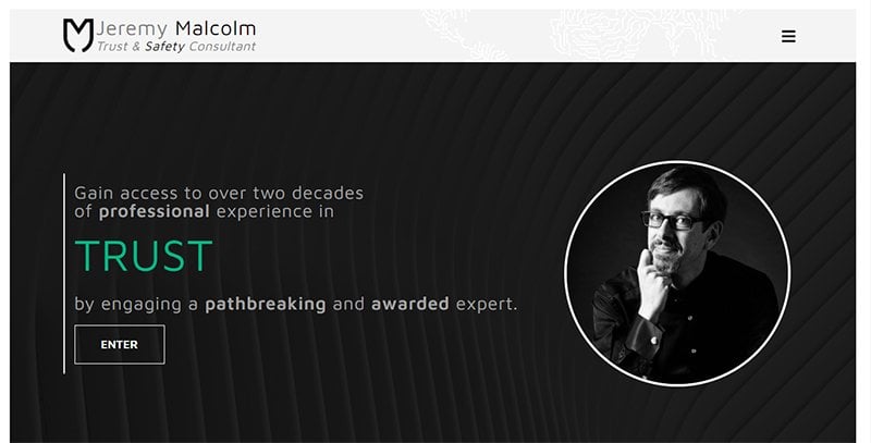
Jeremy Malcolm’s website is a great example of a simple but effective one-page website design. The smart loading design elements and animations when you visit the website are impressive and worth emulating.
I like how the big green text changes after a few seconds. You can’t miss the black-and-white professional picture of Jeremy Malcolm in a circular frame. The picture blends well with the website’s black, gray, white, and green colors.
Jeremy links to his social media accounts, resume, contact, and articles. Many interactive elements on the website make it pleasing to the eyes.
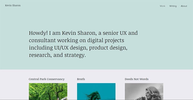
Kevin Sharon is a UX consultant that uses her website to promote her personal brand and consultation services. I love how she uses a simple and basic design, picking warm milky gray and ice crystal blue colors for the website’s background.
Sharon uses case studies to show her expertise. She arranges each case study with a title, picture, and “View Case Study” link for easy viewing.
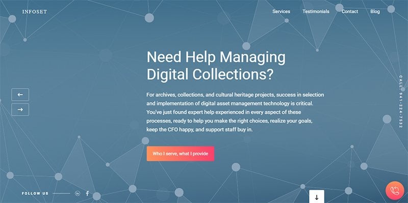
Infoset has one of the most interactive consulting websites where you can gain inspiration to design a modern and sleek website. The first thing that catches your attention is the scrolling slider that switches between different slides automatically.
There are many interactive elements on Infoset’s site. You can’t miss the call button and the CTA buttons in glowing maroon red. Infoset uses a scrolling slider with clickable back and forward arrow buttons for the clients’ testimonial section.
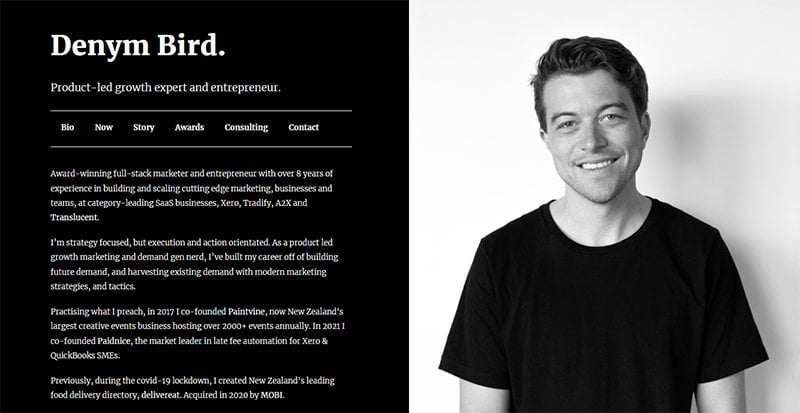
Denym Bird uses a simple design, paying no attention to the flashy elements and features that characterize many websites on this list. The one-page website wears a minimalist look and uses black and white colors even for Denym’s picture.
I love how the website performs an interesting tweak on the traditional menu position and function. Instead of using menus at the top of his website, he uses them inside the main text.
You can click on any of the six headers and have the text content change instantly instead of directing you to another page.
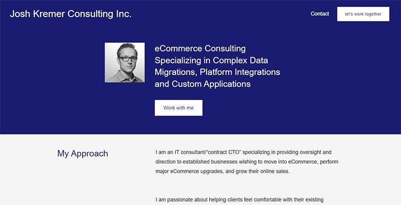
Josh Kremer Consulting is one of the best eCommerce consultant websites with a simple and minimalist web design. The website uses blue, gray, and white colors that make it feel professional.
I love how it uses visible font sizes with the right line spacing that encourages visitors to read through its heavy copywriting. There’s a search function you can use to find any information you want and a section where he lists his top clients.
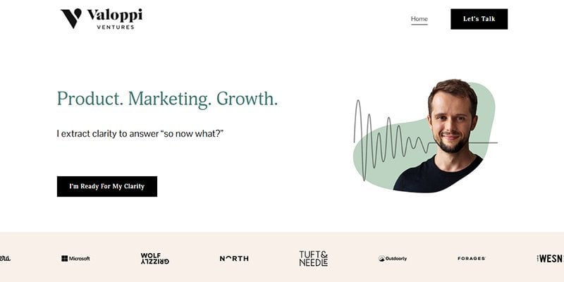
Patrick Valoppi owns Valoppi Ventures, a marketing consulting firm targeted at startups. I like how Valoppi puts his face at the center of his website to jointly grow his personal and company brand.
There’s a long buildup of popular brands he has worked with that he displays on his website to build trust and credibility in his services. I like how the website uses black CTA buttons to contrast the light and warm background colors.
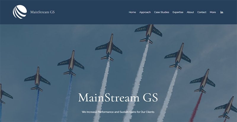
Mainstream GS is one of those consulting firm websites you see and you have no problem guessing it uses a corporate website design. The first thing you see is the cool cartoonish image of airplanes flying in the sky.
I love how the website is picture heavy and uses few words. Visitors that want to find out more information about its services can easily use the headers to navigate to more detailed pages.
Natural Interaction has a simple web design that uses high-contrast text to get visitors to have a pleasurable reading experience. I love how it uses good copywriting text to make its CTA buttons more appealing to visitors.
The website uses cartoon images to add colors and flavor to the scrolling experience. There is a client review section with interactive arrows that let you easily flip through different reviews.
Natural Interaction has a contact section visitors can get in touch with the brand. I like how there are links to the brand’s Medium and LinkedIn pages at the top of the website.
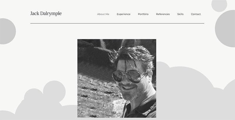
Jack Dalrymple’s website reads like a resume. The consulting website has a plain background color that changes shape as you scroll through the website. You can’t miss the high-quality black-and-white picture of Jack Dalrymple that oozes confidence and professionalism.
I like how Jack displays his accomplishments and years of experience on the website to establish trust and credibility in the eyes of potential clients. He shows his best work and adds references from previous big-name employees.
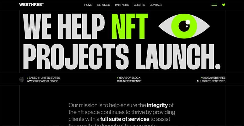
WebThree Consulting’s website design makes for a stunning spectacle. Visitors enjoy an impressive show in the few seconds it takes the design-heavy website to load.
You can’t help but notice the many interactive elements on the website. Every section you navigate to seems to come to life with the different animations and pictures performing some level of movement.
I love the choice of a black background that contrasts perfectly with the white and lemon colors used to write text and create graphics.
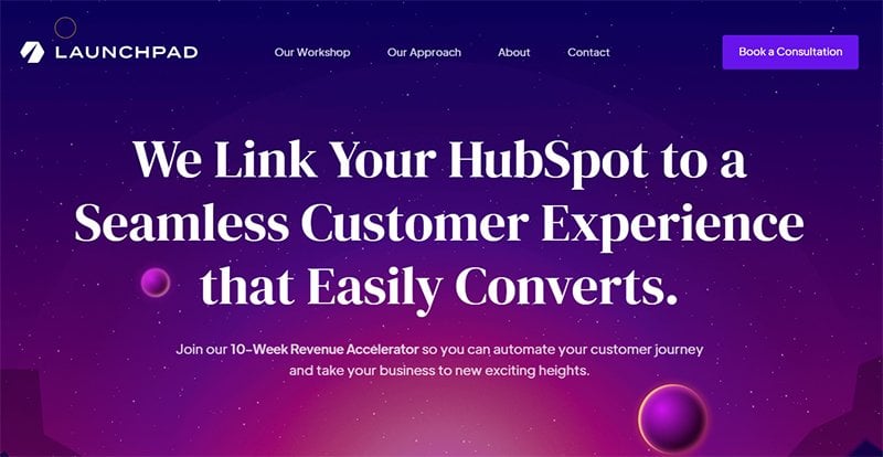
Launchpad Consulting has a beautiful website that is pleasing to the eyes. The website uses purple, pink, and blue starry night colors, interactive elements, and eye-catching animations that encourage users to explore its different sections.
You can’t miss the bold white headlines, stylish fonts, and pretty blue CTA buttons that are everywhere on its homepage. Launchpad Consulting has a testimonial and partner section that serves as good social proof of its expertise and trustworthiness.
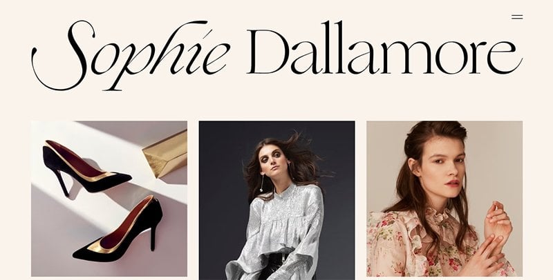
Sophie Dallamore offers fashion consultancy services to interested clients. I love how the website transitions from a countdown animation to a fashion gallery before getting to its stable state each time you load the page.
This fashion consulting website uses high-quality images and short but powerful copy to attract potential clients. There is a menu button at the top right side of the site that contains more sections for visitors to explore.
Consulting Websites FAQs
The best website builders for consultants are Squarespace and Wix. Squarespace is an excellent website builder with many easy-to-use features and consultant website templates you can choose from. Wix offers a wide variety of customizable website templates for consultants.
The cost of building a consulting website depends on if you are hiring someone to do it, using a website builder, or doing it yourself. Hiring a web developer and designer can cost you a high fee compared to when you use a website builder or do it yourself. On average, the cost of building a consulting website ranges from under $100 to up to $10,000.
Every consultant needs to have a website if they want to stay competitive. A consulting website helps you build your brand’s recognition, helps potential clients discover you, and market your skills and expertise.


