34 Beautiful Dark Websites for Inspiration
Do you want to create a website design that offers visitors a memorable user experience and helps you rank high on search engines’ results? Try using the classy dark theme to design your website’s outlook.
Hiring a web design agency or web designer can be expensive and time-consuming. A better alternative is to use the best website builders to create beautiful dark websites that suit your preferences.
The best website builders like Wix and Squarespace come with customer-dark-themed website templates you can use to create your own site.
This article checks out 34 amazing examples of dark websites you can use for inspiration when creating your own website.
Let's get started.
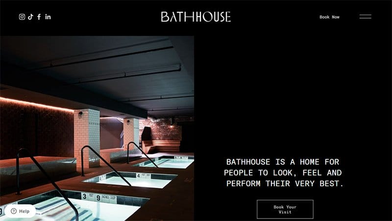
Bath House offers state-of-the-art bath-related treatments and restaurant services for people who desire to look and feel great.
I like how this great website features multiple mind-blowing design elements featuring pure dark colors and white text which gives the homepage an elegant vibe.
Potential customers and visitors can use the hamburger navigation menu on the pure black sticky header to explore various aspects of the page.
My favorite aspect of this page is the zig-zag design layout featuring high-quality images, bold white text, and CTA buttons to encourage user engagement.
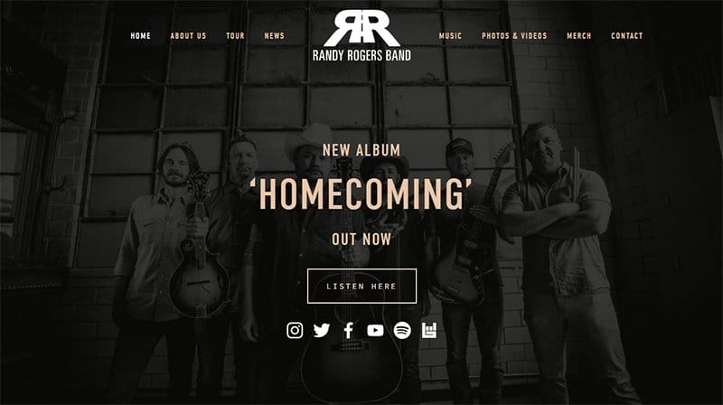
Randy Rogers Band have been together for over seventeen years and are still as thick as thieves.
The first catchy element is an eye-catching background picture of the Randy Rogers Band with a description of their latest album and a transparent CTA button.
I love how the black background makes all other design elements visible and visually appealing while giving the page a stunning and sophisticated outlook.
The site’s footer features vital details such as email addresses, social media icons, and a pure white newsletter form.
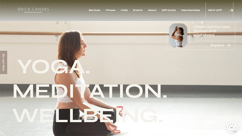
Brick Canvas is a wellness website that offers a broad range of classes for every level. The first catchy element on this dark website is an image of a woman practicing yoga with three main captions “Yoga, Meditation, and Well-being”
This wellness website uses a dark and clear color scheme and features in every section a cool fitness and spa image. There is an attractive payment plan for the benefit of new visitors. I love the display of client testimonials to get visitors to use its services.
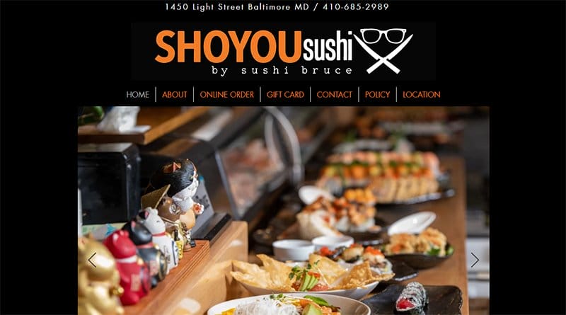
Shoyou Sushi is one of the most coveted and best sushi restaurants in Baltimore. Welcoming visitors to the website is a slide display of mouth-watering sushi and other delicious dishes.
The large dark ash menu features the site logo and a white three-line button on the right side for visitors to explore content.
I love the simplicity of the website, elements are visible on the black background. Below the hero section is the restaurant location for visitors to visit and check the brand out on social media through the icons.
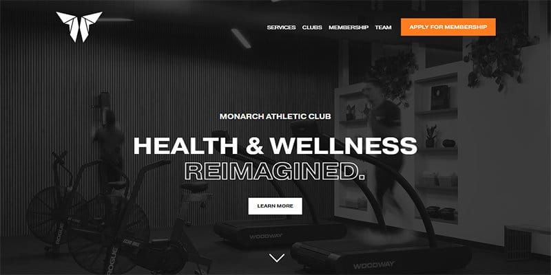
Monarch Athletic Club is a health and wellness institution that operates a members system to help its members achieve fitness goals.
Welcoming visitors to the Monarch Athletic Club website is a full-width image of a well-equipped guy with the caption “Health and Wellness Reimagined.”
I love how this fitness website switches between gray, white, and black color schemes which gives the website a colorful and lively vibe.
As you explore its content further, you will see multiple high-quality images and engaging texts, brighter colors, and top brand logos for credibility and social proof.
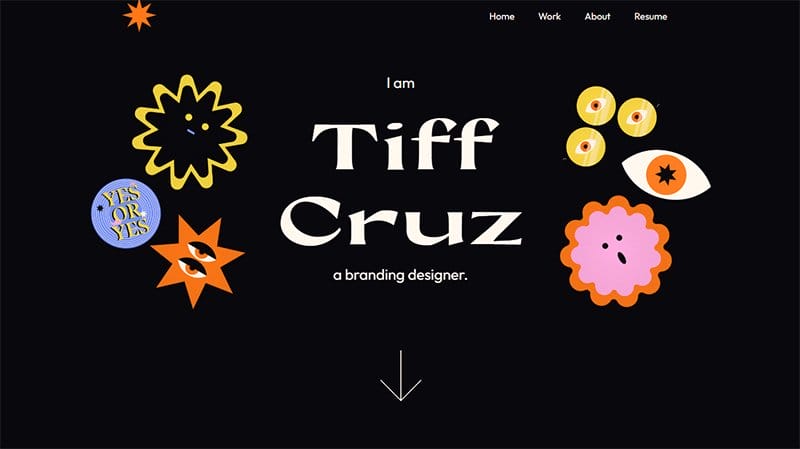
Tiff Cruz is a multidisciplinary designer and paranormal enthusiast based in New York. Welcoming visitors to the webpage is the caption “I Am Tiff Cruz ” and colorful illustrations that have a motion effect upon scrolling.
I like how the black background makes all the flashy design elements on the web page visually appealing to visitors. You can use the drop-down button to navigate the website easily.
The work section features six colorful cards that link to different pages of the site and encourage visitors' decisions.
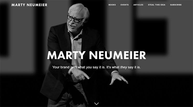
Marty Neumeier is the founder of Liquid Agency, a design firm that focuses on helping our clients launch new brands and reinvigorate existing ones.
The parallax scrolling effect is the icing on the cake because it makes the design elements on the site sync to create a pleasant user experience. Online visitors can browse and explore various aspects of the website’s pages via the drop-down navigation bar.
I love how the bio section uses dark text on a light background to display vital information about Marty Neumeier and Liquid Agency to boost credibility.
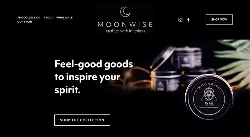
MoonWise is a scented candle brand that uses vegan-friendly 100% natural, domestically grown soy to create the ideal candle.
The first catchy element on this online store web page features an image with a dark theme and transparent CTA buttons to access the shopping page.
I love how the “Featured Items” section uses a zig-zag design layout featuring high-quality images, bold white texts, and CTA buttons to encourage user engagement.
Clicking on any of these images is a one-way ticket to access the shop page for a full view of the brand’s products and accessories.
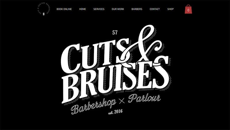
Cuts and Bruises is a unique traditional barbershop in London. The first element on the site is a full-width dark background with a bold white text logo.
On the homepage are two white CTA buttons “Shop and Book” compelling visitors to either walk in or book for a section through the online platform.
Visitors can click on the links below a YouTube video to watch daily uploaded videos and stay updated with cuts and Bruises.
Potential customers can navigate their way to the barbershop through the Google Map feature on the last section of the page.

Adrienne Raquel is a professional photographer and creative director who has worked with top clients like YSL Beaute, GQ, Apple, Savage Fenty, and Rolling Stone.
What’s handy about this dark-themed portfolio website is the vast number of high-quality images from top to bottom featuring celebrities from different spheres of life.
Interested visitors can click any of these images to have a full view of the portfolio page and access vital information.
The purple-colored mega navigation bar serves as a doorway to exploring various aspects of the webpage without stress such as the online store section.
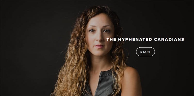
The Hyphenated Canadians is a portfolio website that is based on the story and uniqueness of immigrants in Canada. The first catchy element on this modern portfolio site is a stunning automated slider of high-quality images that covers the entire screen.
Interested visitors can click the transparent “Start” CTA button with a hover effect to access the site homepage and explore other design elements.
I love how the homepage uses a seven-column grid layout featuring high-quality images with a thumbnail effect as the portfolio’s structure.
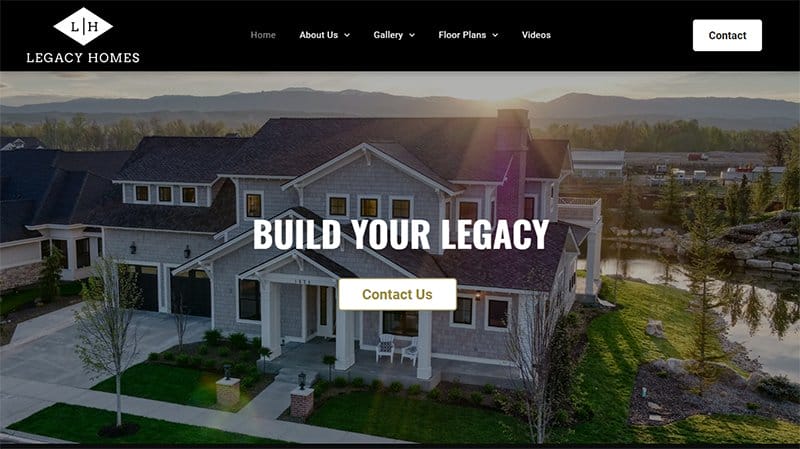
Legacy Homes of Idaho is a design and construction-based company that helps their clients design and build their dream homes in serene locations.
I like how the first thing every visitor will see on arrival is an interesting video displaying vital details about Legacy Homes of Idaho.
Online visitors can click the white and yellow colored “Contact Us” CTA button to have a quick and productive chat with the company’s customer service representatives.
As you explore the site’s content further, you will see multiple logos of top communities that are partners with Legacy Homes of Idaho.
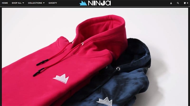
Ninja is a streetwear brand that sells high-quality products such as hoodies, shorts, sweatshirts, t-shirts, and jeans. The first catchy element on this streetwear website is an engaging video featuring various clothing items in bright primary colors.
Potential customers can use the search engine function on the sticky navigation bar to seamlessly locate specific items before making any purchase-based decisions.
I love how the product display section uses multiple grid design layouts to display its products in a visually appealing fashion.
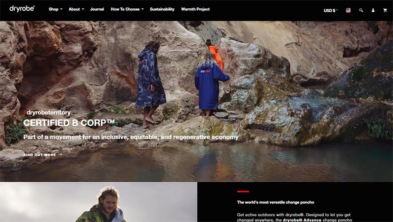
Dryrobe is the brainchild of Gideon Bright, a UK-based surfer with over 30 years of experience in the water. This good dark website features multiple engaging content like high-quality images. engaging texts and multiple CTA buttons.
I like how the webpage features logos of top organizations that supply their sportswear in a slider format to make it engaging.
The black-colored site footer features vital information about the brand like a certification logo, payment options, social media icons, and a newsletter column.
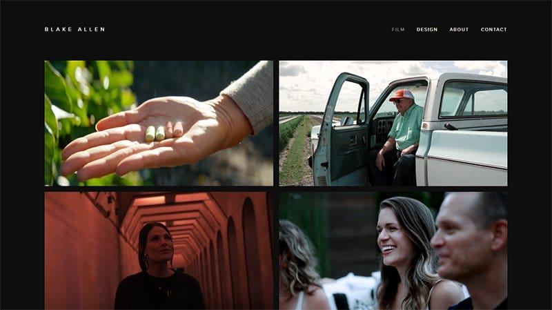
Blake Allen is a professional creative director and filmmaker passionate about the art of storytelling and has been in this business for more than a decade.
This portfolio page welcomes visitors with multiple high-resolution images in a grid column layout which makes the site exploration process like child's play. Clicking on any of the images will transport you to a separate page where you can explore vital details about each project.
Interested visitors can access Blake Allen’s social media profile by clicking any of the social media icons at the base of the site.
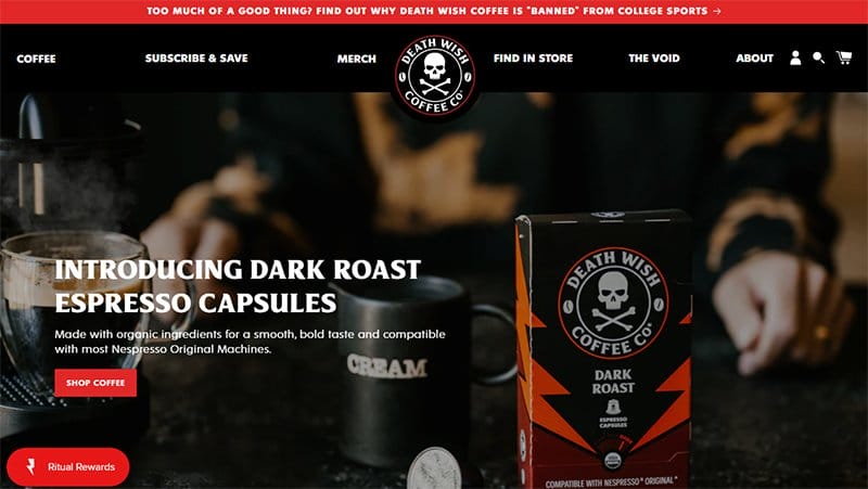
Death Wish Coffee is a unique coffee brand that follows a rigorous brewing process to get an outstanding taste and textures that are satisfactory to users.
I like how the first catchy element on this webpage is an automated slideshow of multiple high-quality images and engaging text.
Potential customers can use the sticky navigation bar with a drop-down effect to explore various aspects of the page. Click the larva orange “Shop Coffee” CTA button to access the page’s shop section for a pleasant shopping experience.
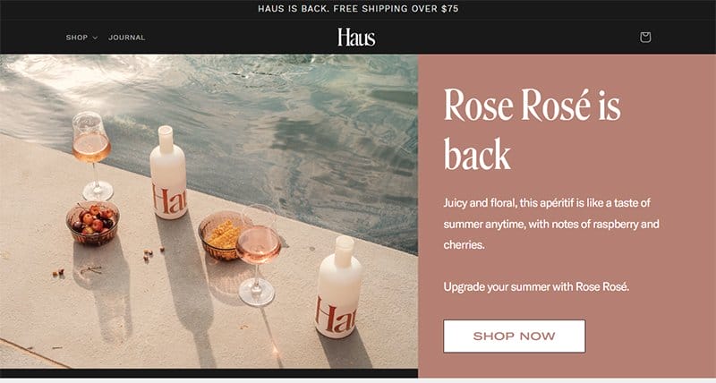
Haus is an alcoholic drink that comes in pleasant flavors like Rose Rosé, Citrus Flower, and Grapefruit Jalapeño.
I like the split page design feature displaying a high-resolution photo of the Haus brinks and fruits at the poolside and a short bio section. Clicking the white-colored “Shop Now” CTA button is your one-stop shop to explore the store page for intentional purchases.
The black-colored site footer features vital information about the brand like a horizontal navigation bar, social media icons, and a newsletter column.
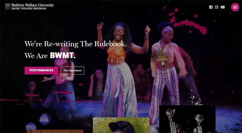
Baldwin Wallace University offers education programs like eight semesters of music theater workshops and advanced acting classes taught by our world-class BFA Acting faculty.
Online visitors can explore the site content via the purple-colored hamburger navigation bar on the sticky menu bar.
What’s handy about this university webpage is the full-width background videos that span across every aspect of the page. I like how the other page elements like high-quality images and engaging texts pop up as you scroll access which gives the page an animated vibe.
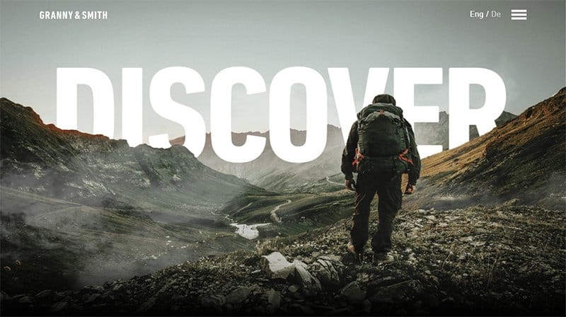
Granny & Smith's website allows visitors and potential clients to switch between languages English and German for understanding and readability.
The first catchy element on this webpage that will get users' attention is a stunning image of a hiker at the top of a mountain.
Interested visitors can navigate this website via the hamburger menu and take various actions like registering for a business course. As you scroll further, you will see a catalog of top brand logos that are customers of Granny and Smith's innovative company.
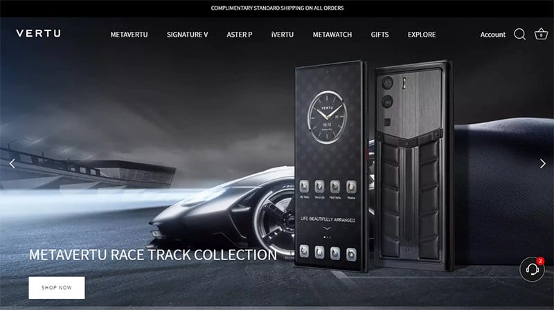
VERTU is a luxury cell phone and wristwatch brand that offers its product uniquely and stylishly to compelling visitors to purchase. I like how the first thing a visitor sees is an automated slide show of 3D images and a white-colored “Shop Now” CTA button.
Potential customers can click the black-colored chat widget to reach the company's customer service representatives for inquiries.
I love how the light and dark side of this online store features mind-blowing design elements which makes visitors' exploration process engaging and worthwhile.
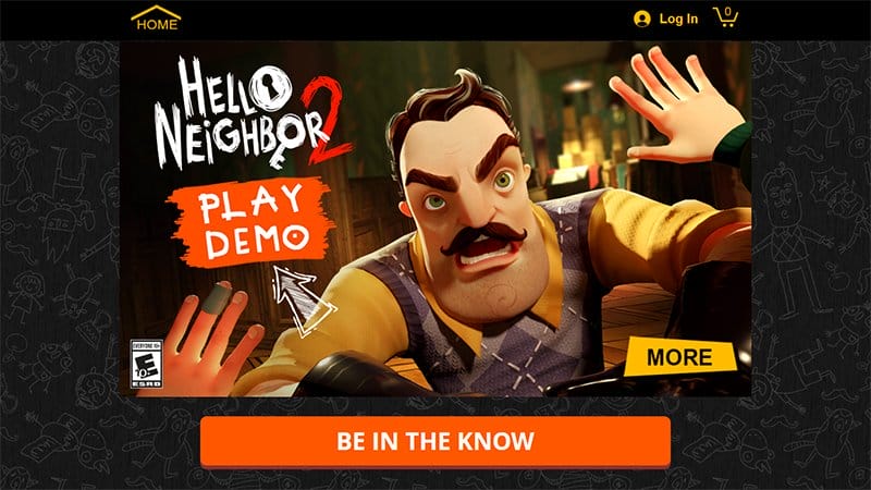
Hello Neighbor is an animated horror video game and the website doubles as an online store where interested visitors can buy the brand’s merchandise.
This dark website example has a minimalist design layout with multiple colorful and animated elements which gives it a fun and lively feel.
Online visitors can click the laver orange colored “Be In The Know” CTA button to access the newsletter pages for constant updates and engagements.
At the center of the page, you will see different versions of the game displayed in a two-column grid layout for potential customers to explore.

Memo is a mobile app that offers a unique and exciting way to learn languages with memes and videos. The first catchy element on this dark website design is bold text describing the functionality of the app on different operating systems.
Interested visitors can click the transparent “Get The App” CTA button in the hero section or scan the sticky barcode to download the mobile app.
Upon scrolling you will discover multiple engaging contents like motion graphics, moving texts, embedded videos, and colorful CTA buttons.
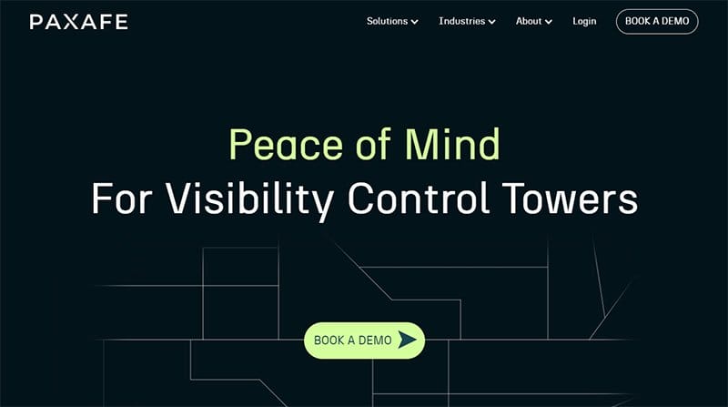
PAXAFE is an AI-enabled, device-agnostic risk-management platform that reduces product loss, and improves operational efficiency.
This website’s homepage kicks off with a dark green animated blueprint featuring a moving “Book A Demo” CTA button with a hover effect at its center.
Potential customers can click this CTA button to enjoy the benefit of the platform via the demo option before making any lasting decisions.
My favorite aspect is the split page feature that displays different content simultaneously and vital information that focuses on the platform.
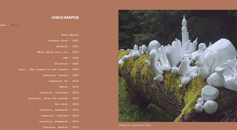
Chico Santos's research in contemporary art on urban growth in environmental areas. I like the split-page design layout that welcomes visitors to the website by displaying an image of ceramic objects on a tree in the forest.
Visitors can click on the three key buttons at the top right side of the menu to explore Chico projects. The brown color footer has two social media Icons on it, interested visitors can follow for more insight.
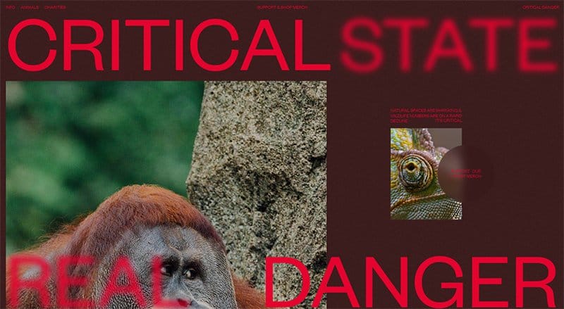
Critical Danger's website doubles as an endangered animals awareness platform and an online store that offers merchandise at affordable prices.
This dark-themed web page welcomes visitors with a picture of an orangutan and a motion graphic of a chameleon with its eyes moving in different directions.
I like how this website’s visual hierarchy switches from vertical to horizontal scrolling as you proceed toward the end of the page. The Critical Danger’s site displays multiple high resolutions of endangered animals which helps to give life to the platform’s initiative.
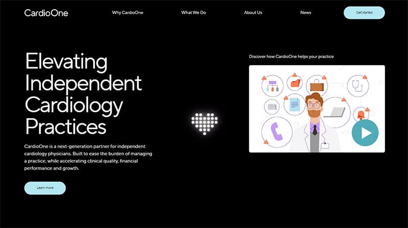
CardioOne believes in the importance of local cardiologists and sees it as their mission to ensure they maintain their independence.
Interested visitors can click the light blue colored “Get Started” CTA button on the black-colored drop-down navigation bar to enjoy the benefits of CardioOne.
What’s handy for me is how the colors of the switches as you scroll across the page give the site a fun and lively feel. The black-colored site footer houses vital information like contact links, email addresses, and two unique social media icons.

Daniel Aristizábal Is an art director and digital 3D artist working in various fields of art, including fashion and entertainment.
This dark website features a blue background and short text to help visitors identify images and navigate the site contents with ease. As you explore further, you will observe that below every image is an arrow pointing right you can click to view the Daniels project.
Interested visitors can use the sticky hamburger navigation bar to move across pages. At the down-right side of the page is a transparent sticky back-to-top feature to help visitors navigate easily to the homepage.
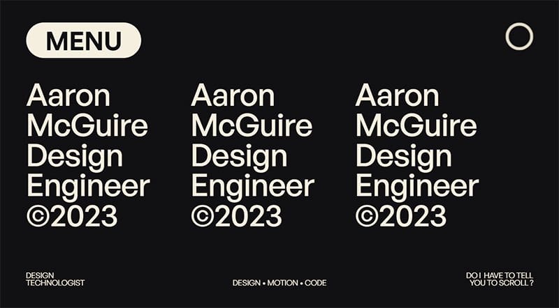
Aaron McGuire is a Los Angeles-based expert in high-tech archaeology, group dynamics, UI/UX, coding, animation, 3D design, and inventive problem-solving.
Welcoming visitors to this stunning web page is a text-based slider that features appealing content about the owner of the webpage in a positive light.
Interested visitors and potential customers can check out the bio section for a full run-down of Aaron McGuire's credentials before deciding to hire him. The sticky menu CTA button with a hover effect is your one-stop shop to access every aspect of the page.
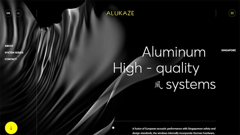
Alukaze is a unique architectural company that deals with designing aluminum with high-quality systems. The first catchy element that welcomes visitors to the website is a dark background displaying a flipping aluminum curtain design.
On the homepage are multiple attention-grabbing and engaging content written in different font sizes. The transparent pinned menu bar features an email icon on the right side for visitors to mail Alukaze directly for further information or inquiries
Beneath the hero section is informative content about the site and the two sections have a slide display of beautiful apartments and well-structured building images.

Conqr is a digital and creative agency based in Mexico, that helps brands connect, engage, and create meaningful experiences. The first catchy element on this webpage is a donut-shaped 3D design that changes its structure in a loping fashion.
Interested visitors can click the white-colored “Explore” drop-down button at the base of the hero section to have a head start in the exploration process.
The sticky hamburger navigation bar is your one-way ticket to visit multiple pages on this stunning dark website easily.

3AI has extensive experience across machine learning, quantitative investments, and genuine Alpha discovery. Welcoming visitors to the site is a moving text featuring content about the organization and an animated background element that makes the page visually appealing.
Beneath the hero section is a horizontal scrolling display center that features engaging texts and diagrams to display 3AI activities. Interested visitors can click the ash color “Discover Insight” CTA button for further details.
My favorite section of the site is the partnership section which displays brand logos to get visitor attention and boost credibility.
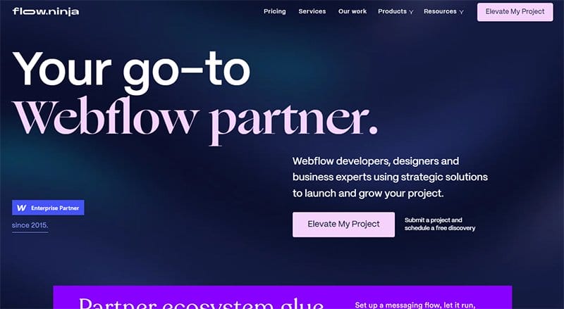
Flow Ninja is a web flow developer, designer, and business expert using strategic solutions to launch and grow projects. This beautiful dark website homepage has a blue background with a pink “Elevate My Project” CTA button.
I like how the website features multiple graphic designs and high-quality images in a slide display to grab visitors’ attention. I love the calm deep blue color scheme which gives the webpage a homely feel.
This dark website showcases client testimonials in a slide form with heartwarming comments to inspire visitors.
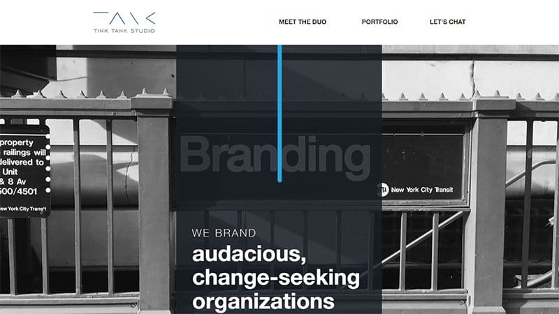
Tink Tank Studio creates brand voice and tone and develops strategic storytelling for brands. Welcoming visitors to the site are multi-column layout images in a parallax scrolling effect which makes the webpage a sight to behold.
A pinned white-colored menu bar features a site logo and a chat link for the interested visitor to drop a message. Visitors can explore the brand’s work projects by clicking on the blue-colored “View Portfolio” CTA button.
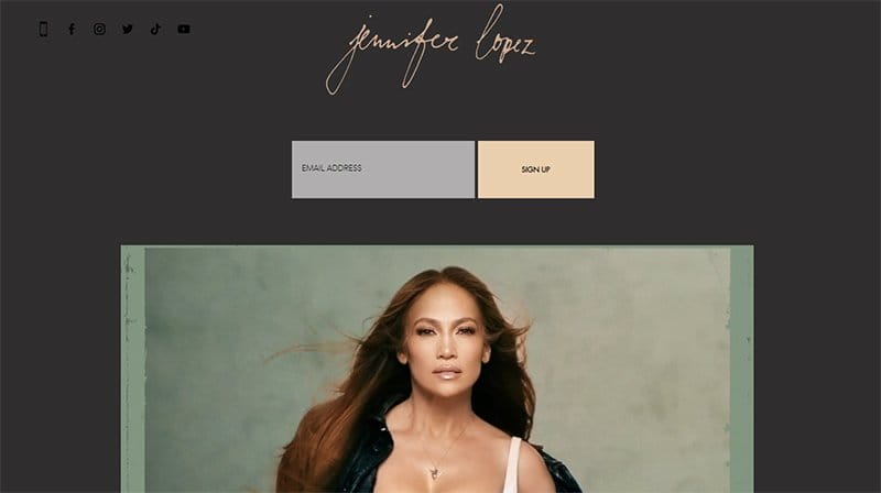
Jennifer Lopez’s website has an online store function that deals with female clothing, accessories, and music. Welcoming visitors to the site is a stunning image of Jennifer's front cover latest video album for her fans to check out.
At the top center of the homepage is the green color CTA button “Shop” which will direct visitors to shop for apparel, journals, and music.
The “Sign Up” button allows visitors to create an account that gives them easy access to the online platform. I love how the musician’s website features a dark ash background.
Best Dark Website Examples FAQs
Some vital tips when creating an outstanding dark website design include avoiding pure white fonts, being careful with saturated colors on dark themes, using brand colors wisely, avoiding shadows, communicating depth, meeting accessibility color contrast standards, reviewing your imagery database, and allowing users to switch from regular to the dark mode.
Using a dark background for your site design has various benefits that make it stand out from a light-mode design. Dark-themed websites help alleviate eye symptoms like eye strain, dry eyes, and fatigue. This design element makes it easy for users and visitors to read the website content under low light intensity, an excellent choice for mobile devices.
Yes, dark-themed websites are good because they offer certain advantages like an excellent contrast projection which makes it easy for visitors to focus on content on their computer or mobile devices. There are more dark websites in use today than ever before, although dark-themed websites are not as common as their light-mode counterparts.
As a professional designer or if you are using a website builder to create your custom website, the best color for a dark theme surface color is Dark Grey — #121212. With this color shade, you are sure to experience constant returns from your visitors and increase the likelihood of a pleasant user experience.


