Fitness Websites: 28 Inspiring Examples (2025)
The fitness industry is one of the most lucrative niches to start a business but it is highly competitive. Whether you want to set up a fitness club, a yoga studio, a CrossFit gym, or a digital fitness business, you need a well-designed fitness website.
Photography is the most important element of any great fitness website. Visitors will better connect with pictures and videos of bodies in motion than with any text description. However, there is more to creating a winning fitness website than splashing pictures on the homepage.
This article explores 28 outstanding fitness websites that you can use for design inspiration to create yours.
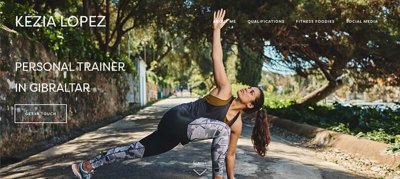
Kezia Lopez offers her clients a personalized diet plan alongside fitness plans. Her online fitness website displays a high-quality hero image of Kezia undergoing a routine in an outdoor setting.
The scroll feature, which serves as a navigation feature, makes navigating through the site easier. I love this website design and how the texts are displayed on a white background and between images, making it look professional.
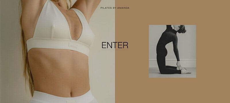
Pilates by Amanda is built as a two-page website, with the first page displaying an image slideshow of the personal trainer. In between on this first page is a CTA button which leads directly to the site’s main home page.
The main home page still maintains the same visual identity as the first page, with the slight tweak being the use of a black-and-white video slideshow.
Amanda’s fitness website, adorned with background colors, including heathered gray, platinum, and mushroom is aesthetically pleasing. I love how the fonts are clear and easy to read.
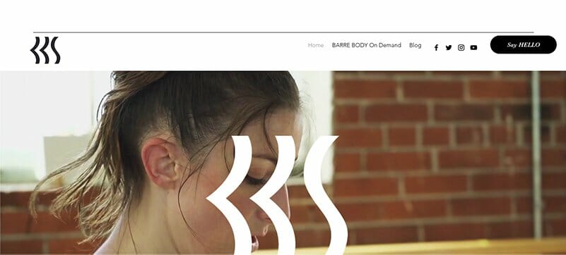
Barre Body Studio is a professional using both imagery and short videos to pass its message across to fitness enthusiasts. This Barre-inspired brand promises “sweat on demand” which is visible in clear black text in between two circular frames of videos.
Built on an all-white background, this fitness brand’s website uses the best images and videos with little text to deliver its message.
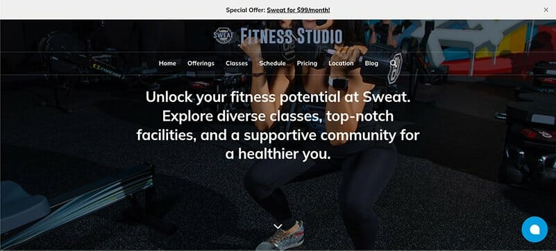
Sweat FXBG's main aim is to create a cohesive brand experience via HIIT (high-intensity interval training), yoga, rowing, barre, and indoor cycling.
I love how Sweat FXBG's overall brand message is clear and displayed in bold on the website. The chat feature is thoughtful and allows site visitors to inquire about the fitness center.
You will love the mobile-friendly app that aligns with Sweat FXBG’s brand identity of offering the best-branded bookings experience.

Jessica Manning’s certified fitness website is simple and minimalistic with plenty of free physical space unused. I love how this great fitness website is mostly adorned in black and white except for the pictures and some background.
The get on the list segment that attends to new member sign-ups is well designed and spelled out, prospective clients cannot miss it.
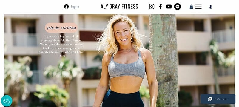
Aly Gray is a fitness professional that designed for herself a fitness website with the best selection of digital offerings. A smiling hero image of Aly Gray in her workout outfit instantly greets site visitors.
On both sides of the home page are two icons, one of a coin where lifelong customers earn rewards and the other a chat feature. In her Get Fit With Me section, users can access one on one training, custom or live workout plans, or join fitness challenges.

The Limit is a hybrid fitness website offering both in-person and online workouts. It is full of high-quality images and elegant text.
What is particularly striking about this fitness website is the listing of their in-demand, Zoom, and on-demand workouts prominently on the site. There are even live Saturday dance parties.
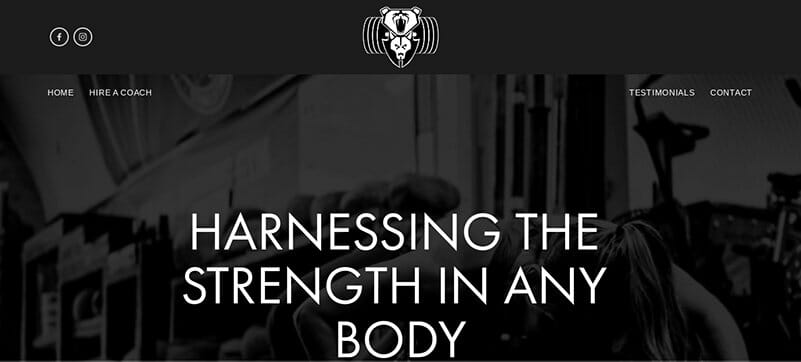
What first greets visitors of the BearWolf fitness website is the white legible font displayed on an all-black background. You can’t help but notice the image of a lady working out behind a large body of text with the message “harnessing the strength in any body”.
The strength of the BearWolf fitness website lies in its gallery of pictures that displays strength. I love how the website uses a predominantly black-and-white color scheme with the only bright color on display an image of people working out.
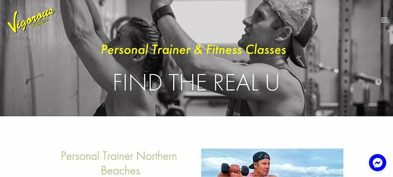
Vigorous Fitness is all about helping people find their way in their fitness journey through personal training and fitness classes. The chat feature powered by Messenger is the site’s best feature because it provides a direct link for you to chat with Vigorous Fitness.
I love the “what our customer says” section that displays reviews posted on Google alongside a perfect 5-star Google rating.

Berlin Athletic has the best one-page website design in the fitness industry. I love how it spells out all its business offerings on one page. Unlike other fitness websites, Berlin Athletic welcomes visitors with a free participation offer for its outdoor fitness training sessions.
What is most striking about this website design is the different black-and-white images of the workout session used as the background. You feel like you are on a fitness journey yourself just by scrolling through the page.

Heat Bootcamp is one of the best fitness websites you can draw design inspiration from. The color scheme on the Heat Bootcamp’s fitness website is astonishing. I love how there is no shortage of exciting colors as every image on display is colorful.
You will love Heat Bootcamp’s CTA buttons and its logo. These two features light up when hovered or clicked upon, giving visitors a pleasant experience.

Paddle Upright is one of the best outdoor fitness websites. This paddleboard instruction website offers several features that provide visitors with the best user experience.
Transitioning through the Paddle Upright website is smooth. This fitness website employs parallax scrolling effects to give users the most elegant experience.
Navigation is Paddle Upright’s best feature, with a menu option at the top alongside a floating anchor menu at the right. These two navigation options assist visitors to book classes online with ease.
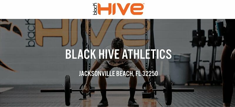
Black Hive Athletics doubles as a small business website, offering CrossFit classes, personal trainers, and fun kids' fitness courses. I love the high-quality image of a man attempting to lift a weight,
You can’t help but admire the orange CTA button on display. There is a map image that provides clear directions on how to access the Black Hive Athletics gym.

Stacy Lel Fitness is the best Barre-inspired business with a robust video library of over 200 workout videos only available to premium subscribers.
The arrangement of the images on the site alternating from left to right alongside the names of the routine is delightful. I love the soft color scheme Stacy Lel chooses for her barre-inspired brand website with shades of Edgewater and bluish gray.

Minnesota Climbing Co-Op displayed on a French blue background, the same as for its logo, is fondly called the most colorful of websites.
The first thing to catch anyone's attention is the full-width slideshow of pictures of its indoor facility taken from different camera angles. This fitness website is a world of French blue with bold white fonts that gives the most aesthetically pleasing look.
You can’t miss out on the helpful page dedicated to hours and facilities. This page displays in bold fonts all the information you need for easy accessibility.

My Fitness Suites owned by Tyler and Michelle runs a good fitness website that helps people achieve their fitness goals. This Cincinnati-based gym offers the best pricing plans through its well-structured and clear pricing plan page.
Adorning this fitness website are bright colors, including blue zodiac, pearl aqua, corn yellow, and white, all serving as background colors.
The contact section is the best aspect of this website. It uses clear fonts and a map feature with a zoom-in option.

CrossFit Gahanna, made up of community-building instructors, offers wellness-focused fitness for the whole family. Its fitness website is designed with a black and white full-screen photograph of its indoor gym.
An informative chat pop-up in blue is the first thing that greets visitors on this webpage and is the best of gestures from this fitness brand.
I love how this website mixes up both white, black, and red colors for fonts, with red distinguishing its well-placed CTA buttons.

Hot Yoga Auburn’s fitness website uses the colors of its logo, white and brandy punch, as its color scheme throughout the site. As expected of a yoga website, this fitness website displays a fullscreen picture of people in the art of yoga as its background.
The stand-out feature is the “What People are Saying” section where this fitness website displays its clients’ testimonials in a video format.
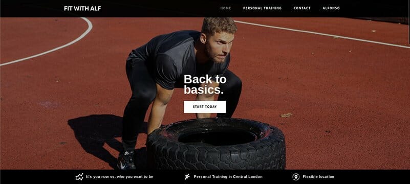
As a personal trainer with over ten years of experience, Alfonso Lovine prides himself on helping people transform their bodies and lifestyle.
His personal trainer website, built on a white background displays a hero image of Alfonso working out with a stern look of dedication. If you are having doubts, a look at previous customer testimonials will surely restore your confidence, as they are brief but detailed.
I love how this great fitness website is designed smoothly and elegantly with multiple CTA buttons to assist site visitors.
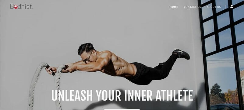
Bodhist aims to simultaneously work on both the physical and mental health of their clients, led by their sports conditioning specialist Nuo.
A full-screen image of Nuo working with ropes and suspended in air is the kind of image a website needs to keep people intrigued. I love the customer testimonials section that touches on a wide variety of sports for inclusiveness.

You need a trainer, LJ fitness training has one just for you, which is the message displayed behind a full-width video on the webpage. LJ Performance Training Center is not just a gym. It caters to both the needs of individuals and personal trainers alike.
One good thing about the site is its CTA buttons, distinguished in red, make it very hard to be missed. I love the brand bio section because of its brevity and effectiveness in passing the intended message with a scheduled consultation option.

The Body by Emily fitness brand started from Instagram, with brand owner Emily Samuel leading the charge as the best fitness workout influencer. You will love the slideshow video of Emily behind the very words the website displays, Strong, Sexy, and Confident.
Emily uses her website to sell merchandise to interested visitors. There is a Shop CTA button that connects you to her online store where she sells her fitness products.

Body Design by Brit offers fitness for motherhood. Coach Brit’s fitness website makes use of parallax scrolling to pass its message across to a wide range of audiences.
The use of a floating anchor menu at the right side of the screen ensures visitors can easily navigate the website. There is a back-to-the-top feature at the end of the page, that takes you to the top without needing to scroll.
I love this site’s About section which displays a picture of a pregnant lady alongside a body of text to pass across its message.

Gramz Fitness website allows users to make a comprehensive fitness assessment through its full-width background video. You can’t but help admire how the choice of a white background makes the other design elements pop beautifully.
The mixture of light mustard and black colors for its CTA buttons is brilliant. I love how testimonials are displayed in a slideshow format and change at the user's pace.
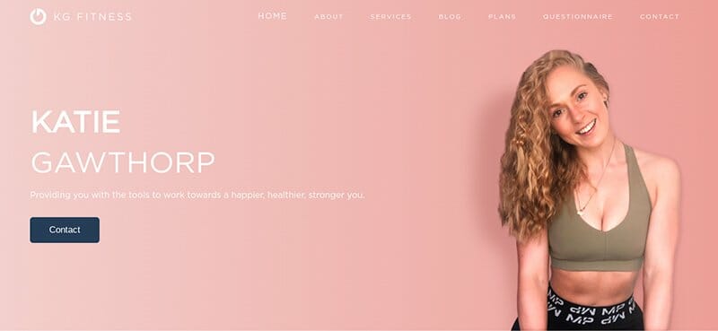
Katie Gawthorp interchanges between white and rose fog to design her website. It is a beautiful sight to behold.
The inclusion of clear numbers helps put a little more perspective into what the About section is about. I love how she includes her pricing plans on the home page so visitors can know how much this fitness center charges.

Stax Cycle Club is an indoor cycle club in the habit of creating fitness challenges while live-streaming free classes to its online community. Its website displays a full-width slideshow video of various workout routines.
The long list of testimonials on display on the home page helps instill confidence in the brand and is well spelled out in clear font.

Asta Blazeviciute is the face behind the Ballet Body Sculpture brand. Her picture is the hero image stretching out on the homepage.
Using a parallax scrolling effect, this fitness website predominantly uses black and white images with very few colorful images towards the end to mix it up. The inclusion of a FAQ section is helpful and provides answers to routine visitors’ queries.

Koreball user experience is unrivaled in the world of online fitness websites. Its homepage, built on a shiny black background, displays two icons, Koreball, and Workouts. You can’t help but love the animated images just below the CTA buttons.
I love how the Koreball section doesn’t provide you with only boring details but uses pictures and text to show you how to use the product. The workouts and custom workouts sections provide you with free exercise routines you can use to achieve your fitness goal.
Fitness Websites FAQs
CrossFit, Planet Fitness, Livestrong, and LA Fitness are among the best website options for your gym workouts. The design of the website and testimonials goes a long way in instilling confidence in a gym workout website. Ultimately, the choice of the best website for gym workouts boils down to each person's individual preference.
A fitness website is a place that introduces people to a fitness or gym center. Displaying pictures of your own fitness business is key to helping people put a face to your brand. Different fitness websites serve multiple business functions. Some fitness websites double as online shops.
Any fitness website builder can help you build your site. But in terms of quality and features, Squarespace and Wix are the best out of the bunch. They offer a rich library of relevant fitness website templates, powerful eCommerce functionality, and easy-to-use website designing tools.


