Best Franchise Website Designs of 2025 | 25 Great Examples
Did you know that the franchise business model accounts for 10.5% of businesses with paid employees in the United States? (Franchise Times) The strong competition for market share and revenue can be daunting whether you are a franchisee or franchisor.
An eye-catching and user-friendly website design helps attract new customers and partners to your franchise business. However, creating conversion-optimized franchise websites that meet all the relevant design principles can be overwhelming.
Choosing the appropriate page layout, visually appealing color scheme, and engaging content are vital to designing a successful franchise site.
The best website builders, like Squarespace and Wix, offer you custom franchise website templates to use as a guide when building your website.
This article explores the 25 best franchise websites you can use as inspiration when building your webpage.
Let's dive right in.

Burny Wild’s franchise website has a simple and consistent graphic design, which makes it user-friendly. The website's header section has a side navigation bar in the top left corner, which users can click to access links to multiple pages.
This beautiful website promotes small businesses by leveraging platforms like Facebook and Instagram. Burny Wild’s positions its logo in the web footer area, unlike other design examples, that place their logo on the website's header section.
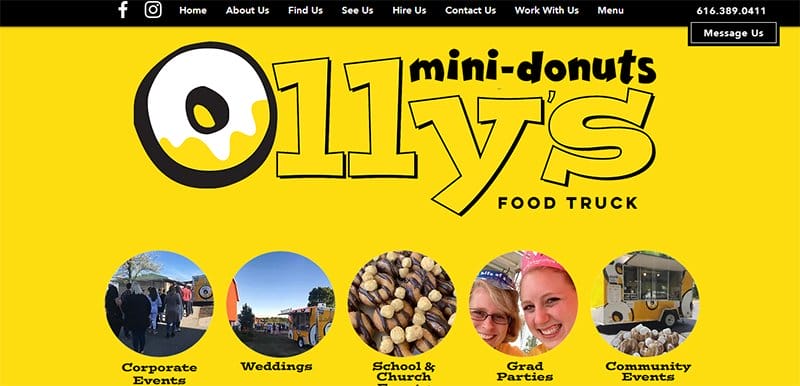
Olly's Donut specializes in making doughnuts for customers at their events. This franchise website design implores an attractive color palette of bright yellow, black, and white.
I love how the Hire Us section features a short, entertaining, and enlightening video on the different flavors of yummy doughnuts available for users.
The keyword research feature enables the web designer to identify and incorporate relevant keywords throughout its content, improving search engine ranking.
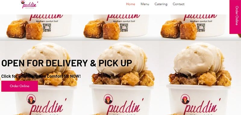
The puddin' franchise website uses a colorful and elegant design that is beautiful and captivating to target the local market.
Displaying high-quality images of its product image on the website conveys the product's benefit and generates prospective customers' interest.
I love the use of multiple colorful pink CTA buttons on the web page with words like “Order Now” and “Full Menu,” prompting users to take action.
This website’s mobile app is a critical element of its strategy, giving customers a convenient way to engage with the brand.
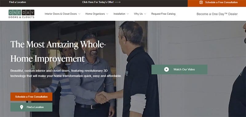
One Day Doors & Closet franchise website greets visitors with a captivating video showcasing visually appealing designs.
The hero section grabs the attention of website visitors with a high-quality video that entices them to stay engaged. This effective marketing strategy helps to draw in potential franchises.
I love the testimonials section, where satisfied customers share their experiences, which is one of the marketing efforts that helps attract more franchisees to the business.
The overall page layout is impressive, with a minimalist design, great typography, a beautiful color scheme, and high-quality imagery that enhances brand recognition.
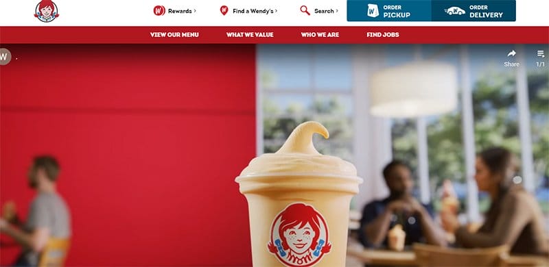
Wendy's franchise website design greets its users with an interactive video encouraging customer engagement. This beautiful website features a sticky navigation bar, enabling customers to navigate the site easily.
I love the display of product images, offering prospective customers a visual representation of the products and assisting them in making informed purchasing decisions.
With the availability of an order pickup and delivery icon, the website design makes it convenient to order delicious food from the comfort of your home.
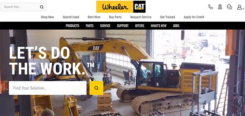
The Wheeler Machinery franchise website has a simple, unique design that is easy to navigate and user-friendly.
Prominently placing the bright yellow CTA buttons on the first page with explicit texts like “Learn More” and “View Our Blog” enhances online visibility.
Placing the white-colored side menu on the welcome page makes it convenient for web visitors to access diverse sections of the page without scrolling.
One of the black-colored web footer elements is the display of social media icons, which provide social proof and credibility.
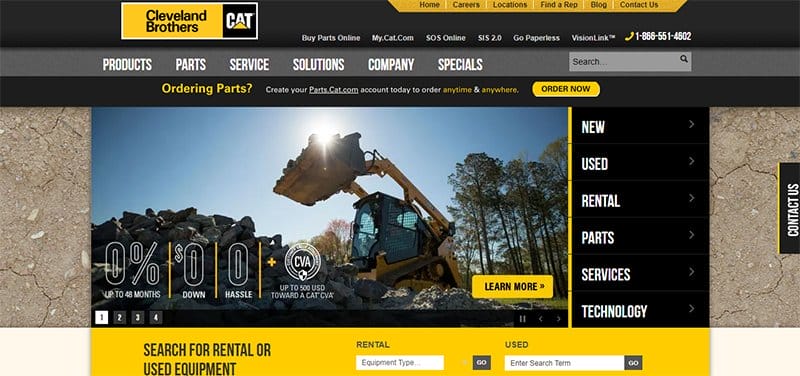
The Cleveland Brothers franchise website maximizes its header by placing its logo on the left side of the homepage, creating a recognizable brand identity.
One of the critical elements of this website design is a search bar at the right corner of the header and in other parts of the webpage. This function allows potential users to enter keywords to find content that matches their query through search engine optimization.
The Cleveland Brothers franchise website uses high-quality images that are visually appealing and effectively communicate what the webpage offers to its users.
I love how this company showcases featured brands as a marketing strategy for attracting franchisees into the franchise network.
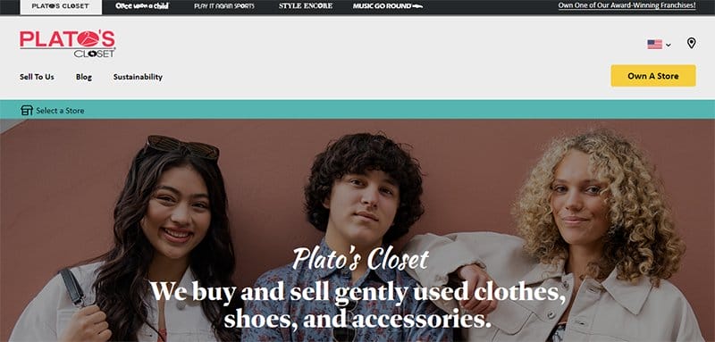
Plato's Closet has an impressive hero section with high-quality images that enhance its visual appeal. Interestingly, a rewards section offers users incentives subject to specific terms and conditions mentioned on the webpage.
This eye-catching website has an attractive color scheme that imparts a professional and polished look. With social media icons present, it is evident that the franchise has an online presence that helps to promote online visibility.
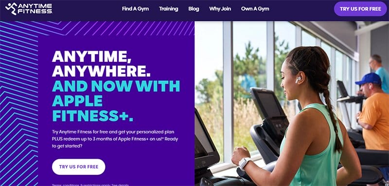
Anytime Fitness’s website focuses on creating a visually appealing experience for its visitors through a simple, clean, and uncluttered design.
The consistent use of a purple and white color scheme in the webpage design makes the site visually appealing and reinforces the brand's identity. One of the website's key features is its mobile responsiveness, allowing for seamless browsing on mobile devices.
This franchise website aims to connect with local markets by customizing its content to suit the area's culture, resulting in an engaging experience for franchisees.
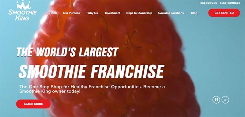
Smoothie King uses a vibrant color scheme of bright red and white, which makes the webpage attractive and attention-grabbing.
The hero section of this web page features an engaging carousel that displays a video, providing potential users with an idea of what the site is about.
Clicking on the bright “Learn More” CTA button guides users to key points about the product using precise language.
Tapping on the red-colored menu bar leads to a drop-down menu containing navigation links that promote seamless integration.
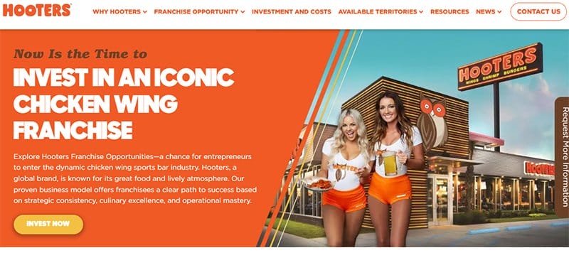
Hooters has a visually stunning and simple graphic design with a vibrant color palette. I like how the header area has a catchy tagline in white text on a bright orange background to attract prospective customers.
The Call to Action (CTA) buttons are colorful and eye-catching, with short texts placed in specific locations to encourage customers to take action.
With the use of a variety of web design resources, Hooters creates a visually appealing and user-friendly website.
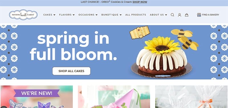
Nothing Bundt Cakes' website design is colorful and rich. The header section displays a picture of a cake, which conveys what the site is about. I love the use of a sticky navigation bar that encourages users to explore the webpage's content.
This beautiful website includes a section for specific locations, which provides information about franchise locations, making it easier for users to find and contact them.
Nothing Bundt Cakes’ website offers ongoing support to their franchisees on technical aspects to help with their web growth and development.
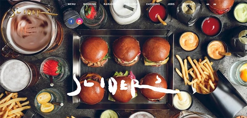
SLIDERS Copenhagen’s website design effectively drives business growth by engaging users with compelling website content.
The site's header features a transparent navigation bar that blends seamlessly with the black background, ensuring optimal online visibility.
As you explore the site, you'll undoubtedly notice the hero section, which showcases an image of various cooking ingredients.
As you scroll down the webpage, you will love the use of high-quality images to communicate the brand's essence.
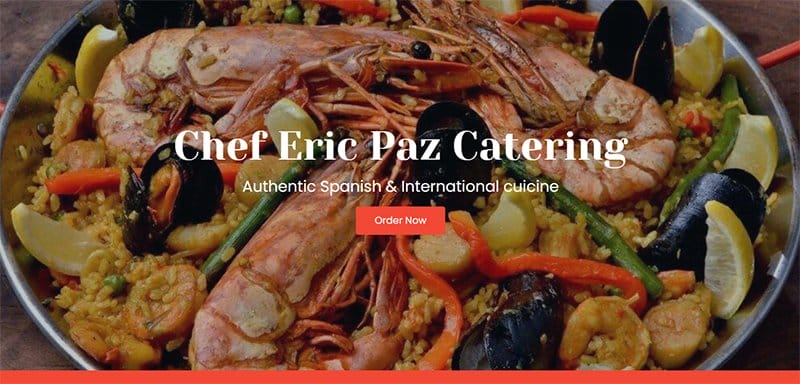
Chef Eric Paz Catering specializes in Spanish and international cuisine. This franchise website welcomes its users with a high-quality image of delicious-looking food.
I love how a section of the web page is about Chef Eric Paz with a brief biography about him, his delicacies, and awards.
The black and bright orange call to Action (CTA) buttons on the page are eye-catching with inscriptions like “Order Now” and “Book Now,” which encourages customer engagement.
To place orders, there is a phone icon to make a call and an email icon to send mail, depending on which one suits customers.
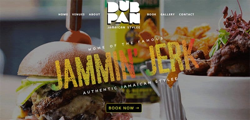
Dub Pan Jamaican Stylee welcomes its users with a classy and elegant design featuring high-quality imagery of its product image. This website's hamburger navigation bar lies in the middle of the hero section.
Clicking the hamburger icon displays a drop-down menu, providing links for easy navigation without the need to scroll.
There is a section on the site where users can sign up for special offers and newsletters to receive recent information regarding the page.
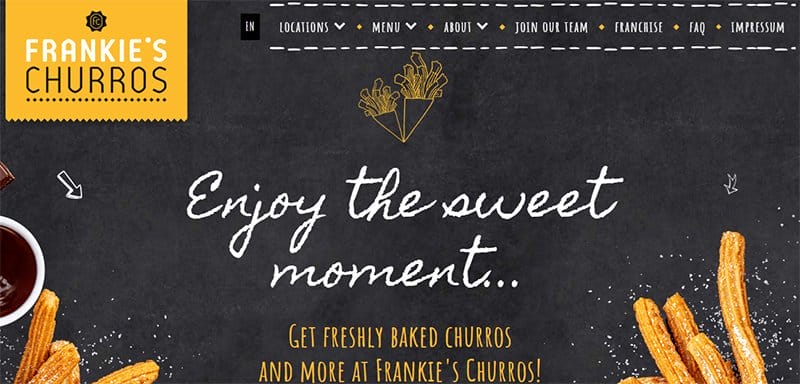
Frankie's Churros franchise website design uses bright and vibrant colors to make the site attractive and attention-grabbing.
This eye-catching site supplies information about its location, contact details, and address, encouraging local businesses.
Clicking on the side menu icons appears a list of links for seamless navigation. Users can easily switch between English and German using the language selector in the header section next to the navigation button.
I love the display of an eye-catching video that contains essential elements regarding this franchise's website design to help drive business growth.
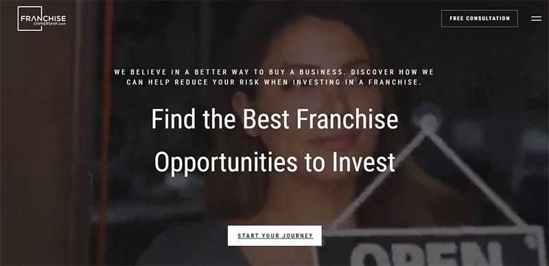
Franchise Ownership uses a simple and minimalist design. The hero section displays an engaging video conveying the site's essence.
While exploring the page, you notice an area that features brand icons of franchise companies that have successfully worked with this website design.
At the headers section is a clear CTA button with the text “Free Consultation,” which, when users click on, they get to chat with experts.
The “About” section gives a brief biography of the founder of Franchise Ownership, Michael Blair. One fantastic element of this franchise website design is leveraging social media, which helps with its increase in search engine ranking.
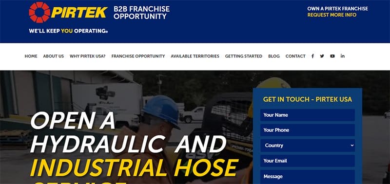
PIRTEK uses a bright yellow, blue, and white color scheme to make its site welcoming and inviting. The hero section features a background video with white text that guides users in understanding the concept of the video.
I love how this franchise website example showcases positive review videos from franchisees who have experienced business growth with the brand.
The footer section of the page includes a black “back to top” arrow that takes users back to the header without having to scroll up manually.
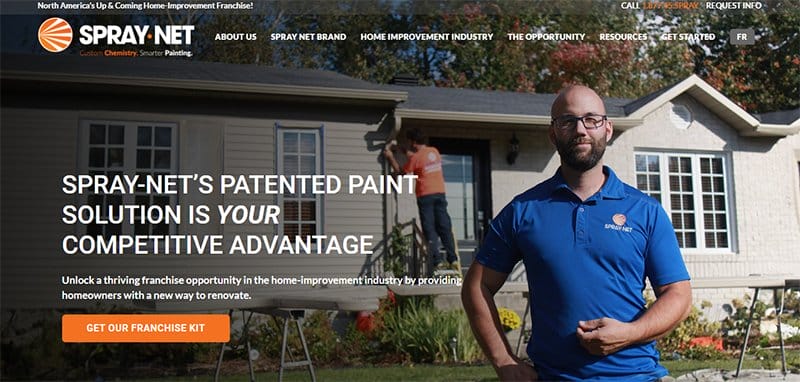
The Spray-Net franchise website design features a vibrant and flashy color scheme of bright orange, blue, and white that makes the site memorable.
Incorporating other visual elements in the web page, like images and videos, captures visitors' attention and increases customer engagement.
The hero section showcases a high-quality image that represents the brand and a catchy tagline that reinforces brand recognition.
I love the use of a consistent color scheme throughout the webpage, creating a perfect balance.
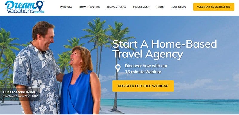
Dream Vacations houses the hamburger navigation icon at the top left corner of the webpage, which helps users effortlessly navigate the site.
Projecting a high-quality image at the hero's section is attractive and visually appealing, with a yellow CTA button housing the text “Register for Free Webinar.”
You cannot but notice the client seals that neatly occupies a section of the first page, instilling confidence in franchisees and prospective customers.
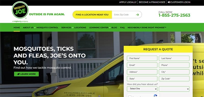
Mosquito Joe contributes to business growth by generating leads through search engine optimization and visibility. I love how the website's side menu provides seamless navigation for customers to find essential information, making it user-friendly.
The use of attractive Call to Action (CTA) buttons, such as “Get Started Today” and “Request A Quote,” offers users the opportunity to take the desired action.
While browsing this colorful website, customers can find a green-colored section for testimonials containing customer reviews, an effective form of social proof.
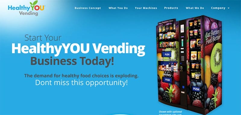
HealthyYOU Vending is a nutritional distribution platform dedicated to making healthy snacks, drinks and food products available to people across North America.
I love how this franchise website has a simple and uncluttered design. The hero section features content that helps prospective customers understand what the webpage is all about.
This webpage has a transparent navigation bar that blends with the site's background, providing seamless integration.
The welcome page displays the product image, giving users a visual presentation of what the product looks like and making informed purchases.
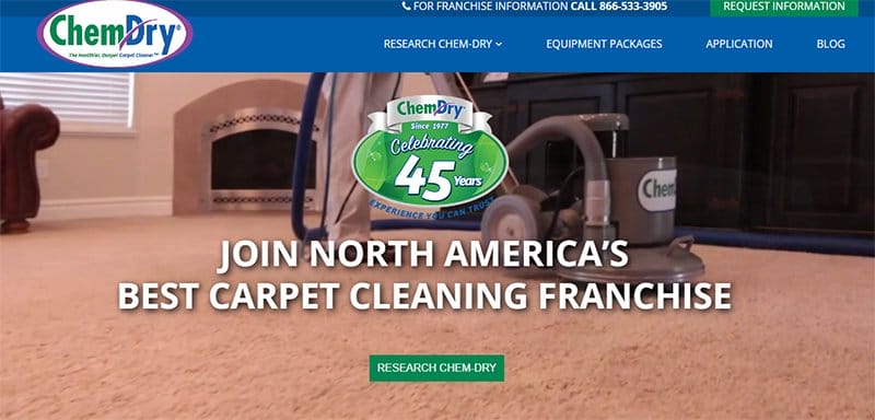
ChemDry’s website design stands out due to its simple and unique pattern, which captures users' attention.
The hero section features a high-quality video that runs for two minutes and gives an insight into the franchise website's services.
I appreciate the web designer's use of multiple green CTA buttons that create visually appealing designs while maintaining consistency.
Unlike other website designs, the ChemDry website footer takes up more space, containing essential content like FAQs and popular links that provide users with crucial information.

Restoration1’s website design is simple and uses a catchy color scheme of bright orange, blue, and white. Each section of the page has a bright orange CTA button with texts like “Contact Us” and “Learn More,” encouraging customer engagement.
Tapping the location icon on the web footer helps interested franchisees get the nearest franchise location to them.
This franchise website offers potential customers an avenue to explore different business opportunities and learn more about the services they offer.

SiteSwan offers development and web design services to small businesses who want to create a new website that meets the web content accessibility guidelines. This franchise website features a visually appealing color scheme of bright orange, blue, and white.
I love the optimization of the header section by placing the logo in the top left corner of the homepage, promoting brand recognition.
The web footer of the site contains a map with information on the brand's location and social icons to enhance online visibility.
Visitors interested in the brand’s web development services can use the contact form to reach out and book an appointment.
Franchise Web Design FAQ
To create a franchise website, you need to choose a suitable website builder that suits your needs and decide on the content and structure of your site.
There are several elements that a great franchise website design should have: a clean design that reflects the franchise brand, clear and straightforward navigation, and responsive design.
Before you turn your brand into a franchise, you need to consider your brand's strength; then, you can develop a franchise system and promote your franchise through marketing.
A franchise website can contribute to search engine optimization by including relevant keywords and generating backlinks to the franchise website, which improves your SEO.