40 of the Best Website Homepage Design Examples
Your homepage acts as your website’s virtual door that grants visitors and potential customers access to other page areas. The outlook of your homepage determines if visitors will be willing to explore other aspects of the page or jump to another website.
Designing an eye-catching and memorable homepage is the foundation of any successful website. However, many don’t know the ins and outs of designing a stunning home page design.
You don’t have to be an expert in web design to create a brilliant homepage. Simply learn great design lessons from the top website homepage design examples and use a website builder to make the design process.
The best website builders like Wix and Squarespace have state-of-the-art templates with stunning designs and other relevant accessories that will make it stand out.
This article explores the 40 best website homepage design examples you can use as inspiration when creating your own website.
Let’s get started.
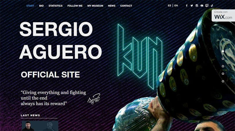
Sergio Agüero's webpage is where you find everything you are looking for about this outstanding soccer player. I like how the homepage welcomes visitors with multiple full-width images of Sergio Agüero playing football and lifting a trophy.
Interested visitors can use the bullet point navigation bar to explore various aspects of the page without sweat. You can click on each section for full content information about Sergio and his achievements. The page footer features social media icons and sponsors’ logos.
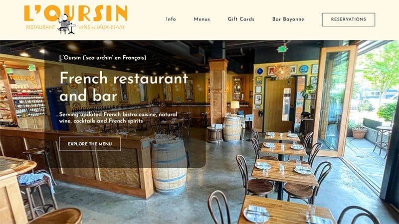
L’Oursin is a French restaurant, bar, and wine shop in Seattle’s Capitol Hill/Central District that offers French bistro cuisine, natural wine, cocktails, and spirits.
This stunning website’s hero section features a stunning slideshow of multiple high-quality images displaying mouth-watering cuisines. Below the hero section is a single-column grid layout featuring vital information about the restaurant to direct visitors to the next logical step.
Interested visitors can click the “Reservation” CTA button with a hover effect on the drop-down navigation bar to book a special seat.
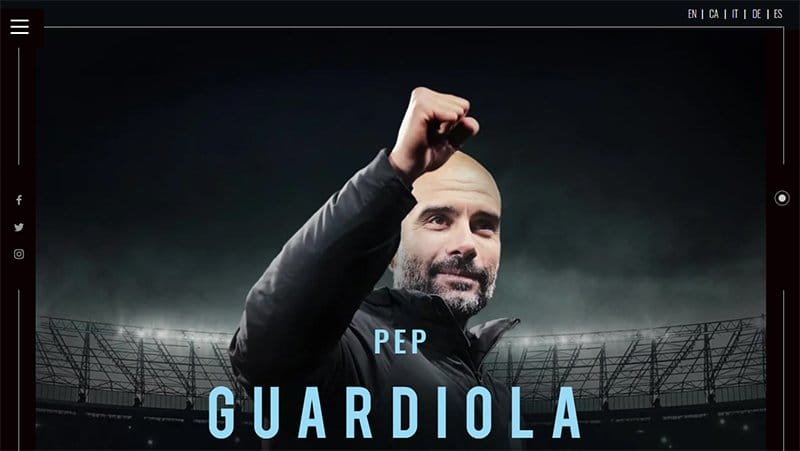
Pep Guardiola’s website uses a single-page site approach featuring a bullet point navigation bar for seamless movements. The first catchy element on this webpage is a stunning image of Pep Guardiola in a stadium with his name written in bold text.
Interested visitors and fans can use the hamburger menu bar on the left top corner of the page to move across pages and make relevant decisions.
This personal website features three sticky social media icons that serve as direct links to Pep Guardiola's online profiles.
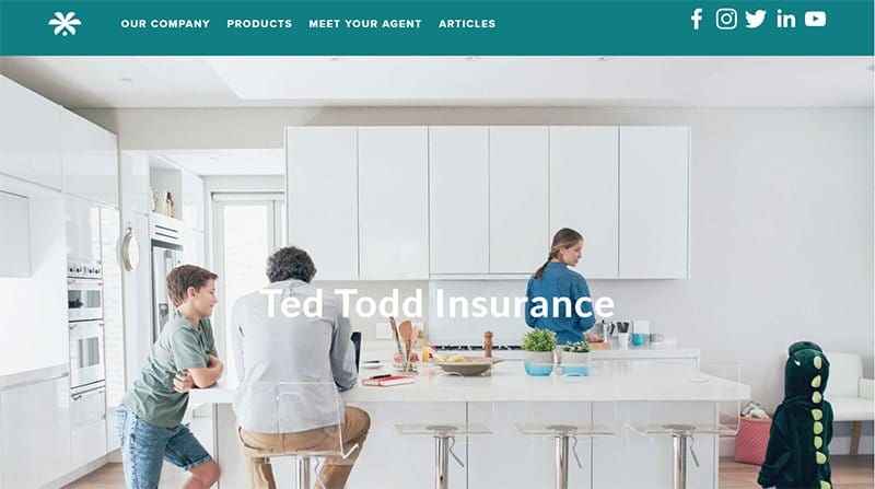
Ted Todd Insurance proudly serves Florida as an exclusive Allstate agency and ensures its customers have the best deals.
Welcoming visitors to this homepage is a full-width image of a family having a great time in the kitchen. There is a caption “Ted Todd Insurance” that signifies that you are in the right place.
Below the hero section is a black-colored “ Request A Quote” CTA button to encourage visitors to get the prices of different insurance packages.
I like how the product section uses a four-column fluid grid layout with descriptive icons and engaging texts to educate visitors.
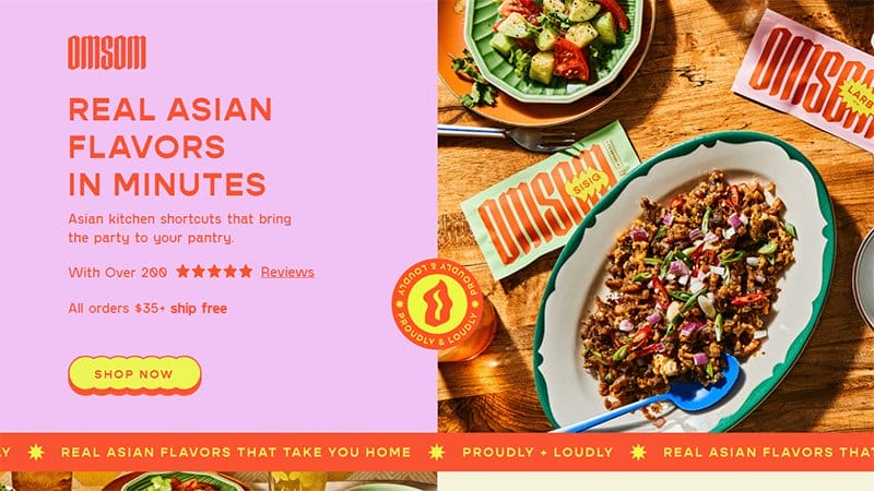
Omsom has one of the best homepage design examples with attention-grabbing design elements to create a pleasant user experience for website visitors.
The first notable element on this website's homepage is a split-page design featuring a stunning picture of mouth-watering cuisines and engaging texts.
I love how the right side of the hero section introduces visitors to the restaurant with a headline that reads “Real Asian Flavors In Minutes.” As you scroll further, you will observe how effective this homepage features a customer-centric design to grab visitor’s attention.
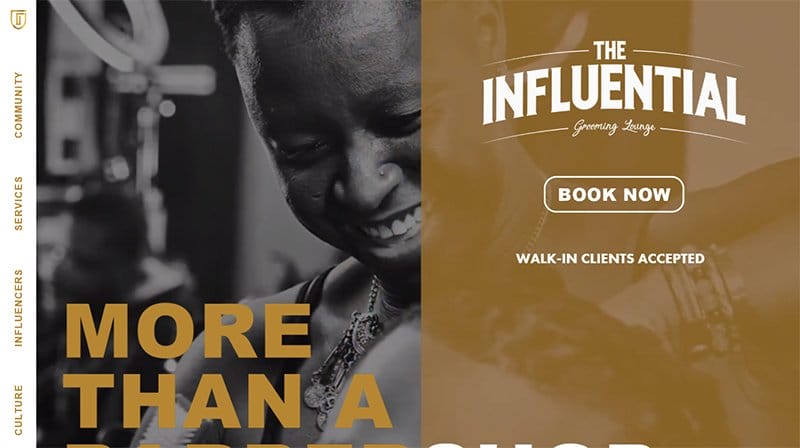
The Influential Grooming Lounge is a Portland-based barbershop that offers top-notch services to its customers at affordable prices.
I like how this uses a black and white themed slideshow to welcome visitors and introduce them to the lounge's activities in an engaging fashion. Clicking the transparent “Book Now” CTA button with a hover effect enables you to secure a seat for a grooming section.
Unlike most homepages, the Influential Grooming Lounge chose to use a vertical sidebar on the left side of the page as the primary means of navigation.
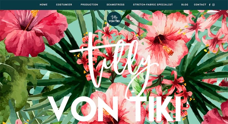
Tilly Von Tiki’s website welcomes visitors with an eye-catching illustration of flowers and two blue whale-colored CTA buttons in the hero section.
This unique homepage has a stunning and colorful design layout featuring colors like red, white, black, yellow, misty rose, Persian pink, and sunset orange.
I love how the bio section features engaging texts and a motion graphic effect on the team members' images to make it engaging to potential customers. Interested visitors can click the social media icons on the mega navigation bar to access the brand's online profile.
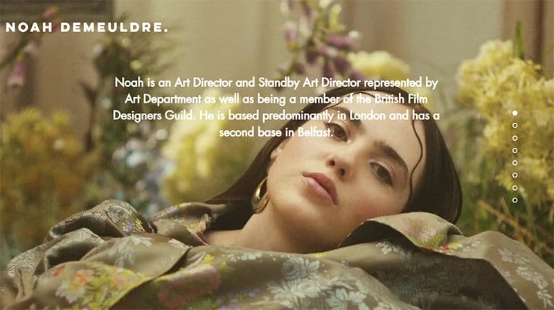
Noah is a London-based art Director, who's a member and a representative of the British Film Designers Guild.
Welcoming visitors to the website is a five-column layout with transparent buttons that compel visitors to view the project design.
I like how the personal website displays videos in a slideshow format for visitors to watch a short video of Noah's set and production design projects. At the end right side of the page is a back-to-top feature that can easily transport you back to the top on navigation.
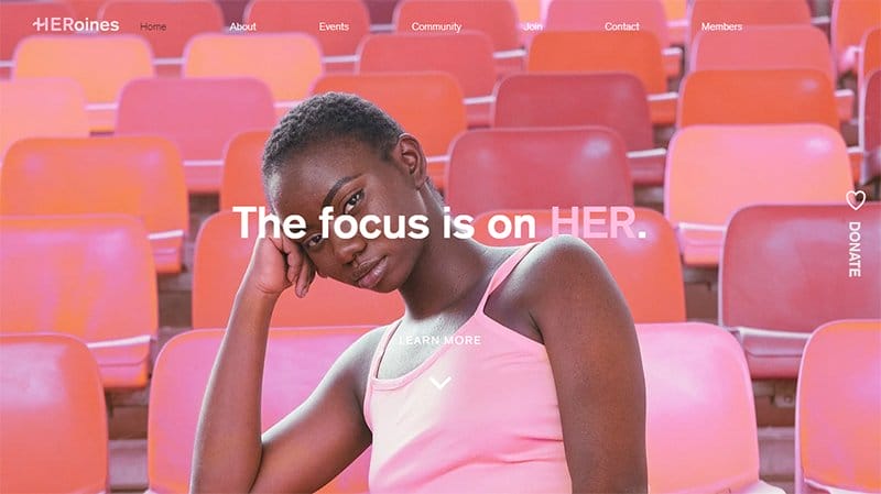
Heroines is a nonprofit organization that provides seminars and workshops for women 18+ in the New York area. This platform shows the idea behind it with feminine features.
On the homepage is a full-width image of a young girl sitting in a pinkish color background. Beneath the hero section are black and white CTA buttons that encourage visitors to make donations and join the community.
The testimonials section features content in a flashy and visually appealing color scheme and heartwarming customer reviews that help to boost social proof.
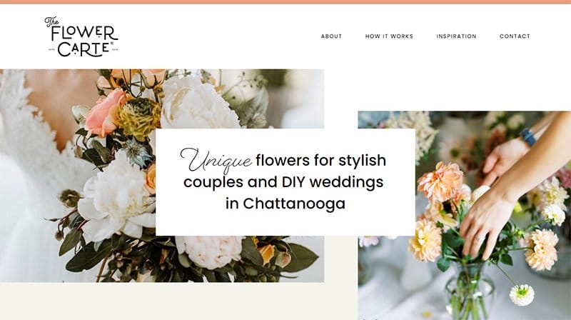
The Flower Carte offers beautiful flowers for decorating wedding ceremonies and making them memorable.
I love how this custom wedding website uses multiple grid-column layouts in various sections to display its products and other content attractively. What’s handy for me about the webpage is the use of an automated slider in the customer testimonials section.
Interested visitors can submit their email addresses in the subscription column on the white-colored site footer for constant product-related updates.
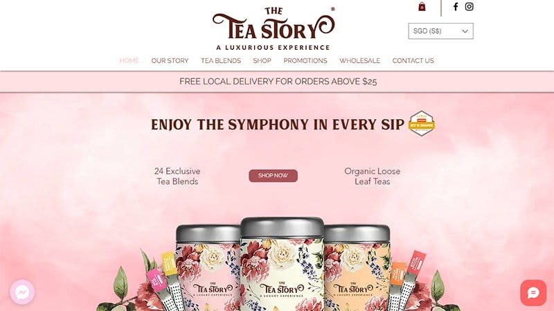
The Tea Story Is a luxury brand that provides an extensive collection of the highest quality premium organic loose-leaf teas. Welcoming visitors to the site is a large pinned menu bar with the page logo on it.
Displayed intensively on the homepage is a motion graphic of the product images with a brown color CTA button “Shop Now” that invites visitors to buy.
The revolutionary tea website showcases client testimonials in a slide form with heartwarming comments to inspire visitors. I love how the sticky page footer has social media icons on display for visitors to stay in touch for an extraordinary tea experience.
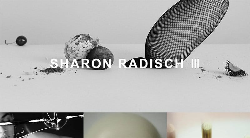
Sharon Radisch is a fashion, still life, and interior photographer, based in NYC and Paris working worldwide with baritone clients. The first eye-catching element on the site is a three-column layout of images of fashion, jewelry, and cosmetics.
Visible throughout the site is a column with images that visitors can click to explore content. This beautiful website is simple and artistic which makes it easy for visitors to view.
The yellow-colored background footer features a short biography of Sharon and social media icons linked to the platform profile for visitors to explore.
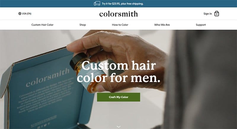
Colorsmith’s awesome homepage features a sticky navigation bar with a drop-down effect that makes the exploration process seamless.
This good website homepage design welcomes site visitors with a full-screen video and a “Craft My Color” CTA button with a hover effect. Clicking its signature bright green CTA button is your one-way ticket to accessing the site's online store without stress.
I like how the “About” section uses a simple homepage design featuring a zig-zag design layout to display high-quality photos and engaging texts.
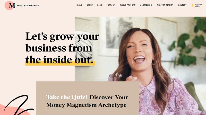
Melyssa Griffin's website’s homepage communicates a compelling value proposition from top to bottom. I like how this blog-like homepage design welcomes visitors with a looping video of Melyssa Griffin with supporting copy to help her target audience get familiar.
This interactive web design features engaging elements like a featured image in the About section, primary call-to-action buttons, and logos of top brands for social proof.
The icing on the cake for me is the parallax scrolling effect that makes every relevant image, embedded video, and primary and secondary call-to-action buttons sync.
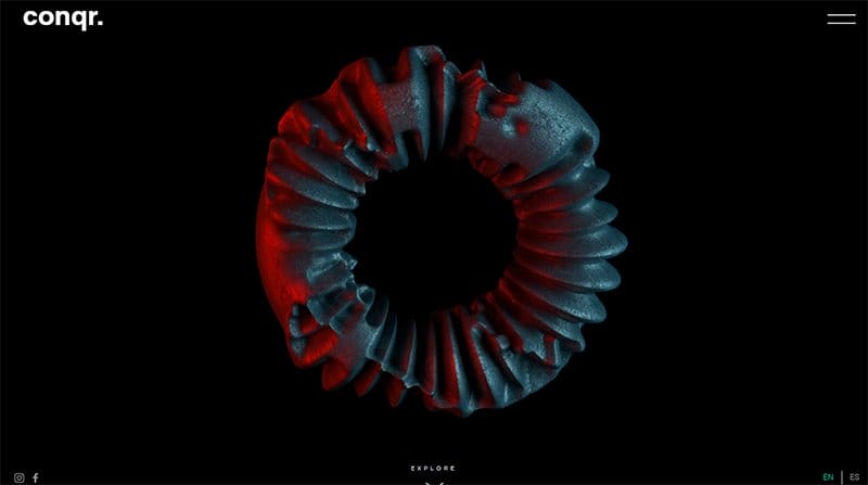
Conqr Is a digital and creative agency based in Mexico, that helps brands connect, engage, and create meaningful experiences. The first eye-catching element on the site is a round digitized metal transforming into a different shape.
Interested visitors can click the “Explore” CTA button embedded at the low center of the homepage for easy access to other parts of the page. I like how the site’s black background makes all the other elements on the web page visually appealing.
Exploring further into the digital website are high-quality images and content that are engaging and attention-grabbing.
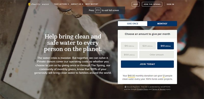
Charity: Water was founded by Scott Harrison who partners with experienced local organizations that build sustainable and community-owned water projects around the world.
This charity-based homepage follows modern web design trends which encourages visitors to take action at different angles of the landing page. When a visitor arrives on this homepage, they first encounter a catchy background video, power words, and a payment gateway.
You will love the unique combination of engaging texts featuring that brand's unique selling proposition, illustrations, and payment platform to encourage visitors to take action.
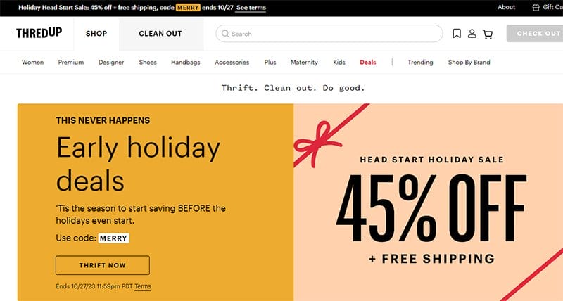
thredUP is a great example of a website design that uses stunning elements to achieve shopping-based goals while building trust and communicating value.
The search bar at the top of the page is your one-way ticket to exploring and locating various items easily. This eCommerce site features multiple high-quality images with a thumbnail effect that serves as links to the product page.
My favorite aspect of this site’s design is the use of multiple sliders featuring each brand image and compelling text to encourage purchase behavior.
Animal Music Studio offers original music compositions crafted by an extensive team of artists, songwriters, composers, and producers.
The first attention-grabbing element on the site is a black background with appealing white color content. At the top left side of the homepage is a sticky transparent logo which gives the page a fun vibe.
You cannot miss the transparent “Join Our Network” CTA button calling interested visitors to connect with Animal Music Studio. The footer features social media links for visitors to explore further.
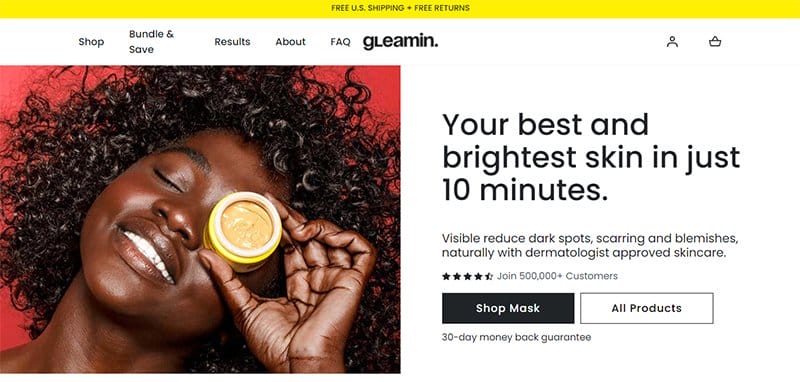
Gleamin is a beauty brand that offers potent superfoods that help to enhance natural beauty and give costumes the perfect glow.
The first notable element is a split-page design featuring a hero image of a young lady and engaging text displaying vital information about the brand.
I like how the white background makes all the texts and relevant images stand out and visually appealing to influence user behavior towards purchase. Below the hero section are logos of top publication brands that have featured content about Gleamin products.
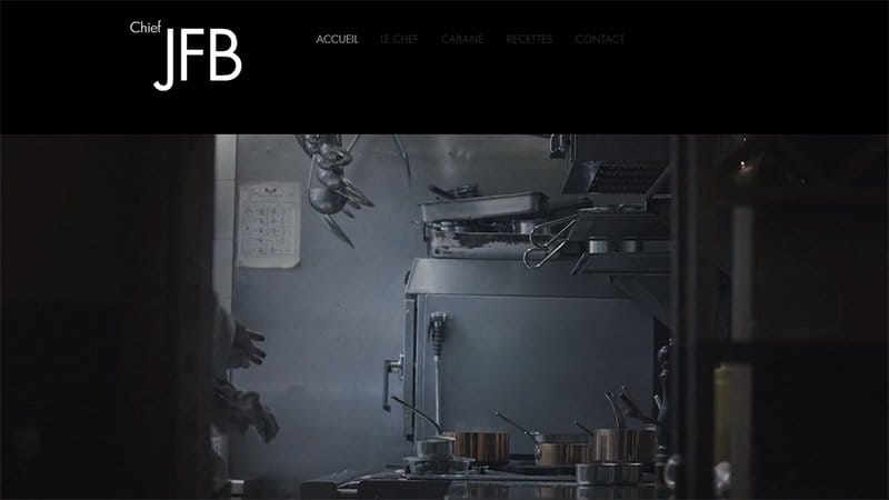
Jean-François Bury is a certified chef with a knack for preparing mouth-watering and memorable dishes. This dark homepage works great on desktop and mobile devices.
A jaw-dropping background video in the hero section featuring an excellent example of a documentary of Jean-François Bury at work welcomes visitors.
The dark background makes all the elements of the page appealing and sophisticated. Interested visitors can use the transparent sticky navigation bar with a drop effect to explore various aspects of the page.
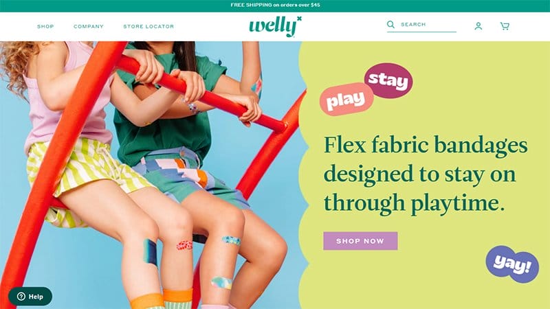
Welly is a kids-based clothing online store that sells quality clothes ideal for different kinds of functions.
This online store website's homepage uses modern design conventions to compel visitors to make purchase-based decisions. The search bar on the drop-down navigation menu makes the process of locating various items seamless and effective.
Interested visitors can submit their email addresses in the subscription column on the green-colored site footer to get constant product-related updates.
Jonathan Mori is the brain behind the success of Jomor Design, an independent design practice that focuses on fashioned branding and websites.
I love how effectively Jomor Design implements multiple mind-blowing homepage design ideas resulting in significant website optimization.
The parallax scrolling effect makes all the unique elements like high-quality photos, looping videos, and stylish font texts appear elegant and visually appealing.
Online visitors can switch from day to night mode and vice versa by clicking the sticky switch widget at the left side of the page.
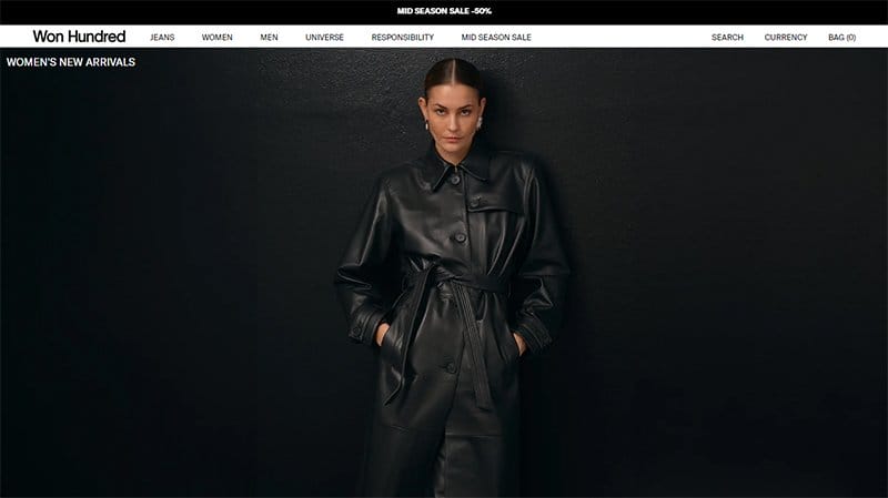
Won Hundred is a Copenhagen-based fashion brand founded in 2004 by Nikolaj Nielsen. Potential customers can explore every inch of the page via the white-colored sticky navigation bar without any restrictions.
I like how the eCommerce site uses full-width images with a thumbnail effect unlike most website homepages to attract visitor's attention.
The white-colored site footer houses vital information that offers key benefits to visitors and potential customers like contact details, payment options, and a newsletter column.
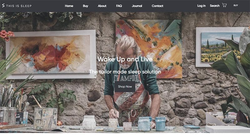
This Is Sleep website doubles as an online store that offers state-of-the-art and tailor-made sleep solutions at affordable prices.
The first catchy element is a jaw-dropping slideshow of high-quality images with an ash-colored” Shop Now” CTA button to access the online store page.
Below the hero section is a slideshow of the brand’s top products with price tags for prospective buyers to take action.
I like how the white background displays only what potential customers want to see in a visually appealing fashion.
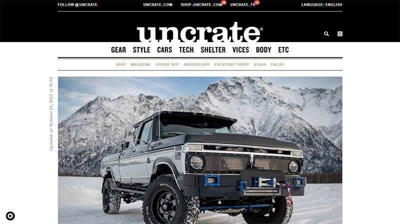
Uncrate is the leading buyer's guide for men that offers detailed information about various products that make purchase decisions seamless.
Potential customers can use the search function on the black-colored sticky navigation bar to locate items on the page.
This eCommerce website has a unique magazine-like homepage design layout featuring high-quality images, image sliders, and transparent CTA buttons at various angles of the page.
Clicking on any of the images is a one-way ticket to access the online store page to purchase your desired products.
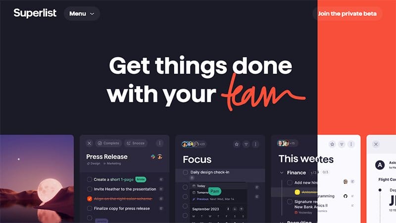
Superlist has worked with top organizations and its website features these brands' logos at the center of the page.
This stunning website’s homepage welcomes visitors with a horizontal slider displaying attention-grabbing content on multiple devices. Interested visitors can click the menu button on the drop-down navigation bar to access various pages of the site.
My favorite aspect of this website’s homepage is the strategic application of stylish fonts and engaging texts to influence visitors' behavior.
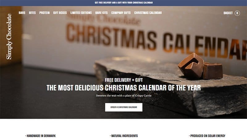
Simply Chocolate is a major producer of handmade chocolate bars that give consumers a memorable experience.
I like how the page features multiple high-quality images displaying chocolate bars that give visitors and potential customers a sneak peek into the product.
As you scroll across, you will see multiple single-column design layouts of products with thumbnail effects that link to the shopping page.
The black-colored site footer houses vital information that makes every visitor's adventure on the page products worthwhile.
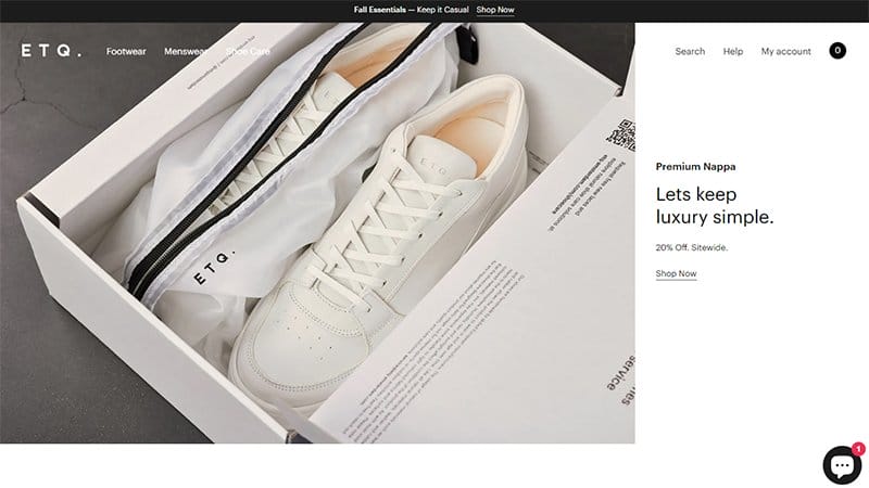
ETQ Amsterdam was founded in 2010 out of the need to solve the problem of the luxury trend of over-abundant branding and excessive pricing.
This online footwear eCommerce store welcomes visitors with a stunning image of boxed shoes, engaging texts, and a “Shop Now” CTA button.
Online visitors can use the transparent sticky navigation bar with a drop-down feature to explore various angles of the page without stress.
The black and white colored live chat widget on the right corner of the page is your one-stop shop to seamlessly reach ETQ Amsterdam customer services.
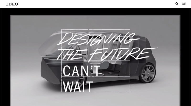
IDEO has a colorful theme featuring colors like white, black sunny yellow, and medium jungle green as its dominant colors.
The first catchy element on this webpage is an interesting background video in the hero section that features children having fun in the playground. Interested visitors can use the hamburger navigation bar to explore various aspects of the page and make vital decisions.
What's handy to me about this webpage that makes conversion paths stand out is the moving text feature in the newsletter section to encourage engagement.
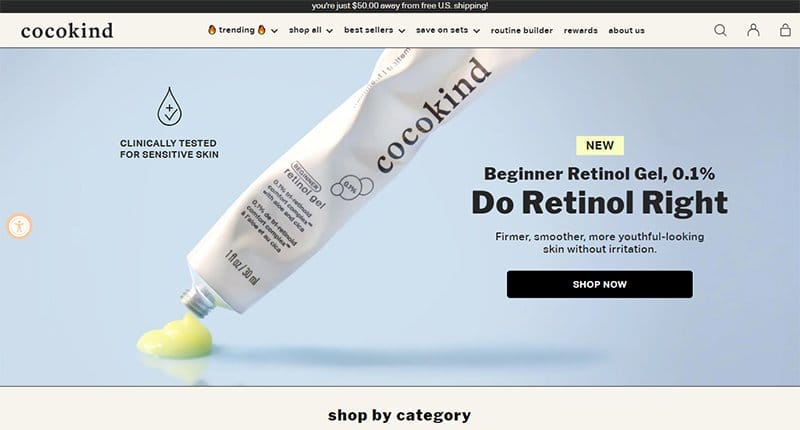
Priscilla Tsai, founder and CEO of Cocokind, a skincare brand that’s founded on the need to change the status quo of the beauty industry.
I like how this online store homepage features multiple attractive elements to get visitors and prospective customers glued to their screens and buy products on display.
The site's visual hierarchy follows an aesthetic approach and leverages stylish fonts to communicate each message, and high-quality images for a better view of each product.
Interested visitors can click any of the social media icons on the site footer to get more information about the brand via its online profile.
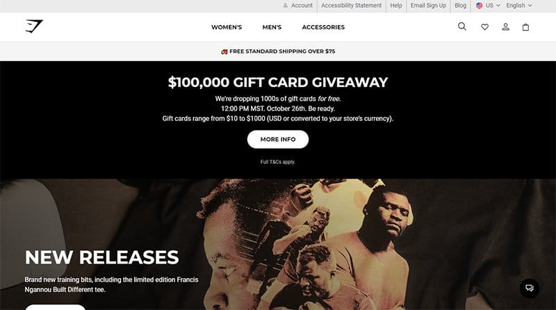
Gymshark began in 2012, from a garage in Birmingham, UK. The brand creates fashionable gym wear.
The first catchy element on this webpage is a vertical split page design feature displaying an ad for a $100,000 gift card giveaway and a vintage picture of boxers.
Potential customers can use the search function on the white-colored sticky navigation bar to locate items on the page without stress.
As you explore the site content further you will see multiple single-column grid-column layouts to give potential customers a sneak peek of the products.
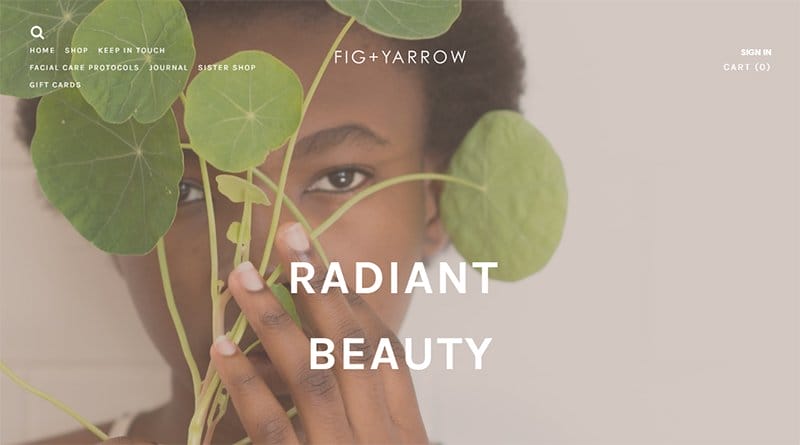
Fig + Yarrow is the brainchild of Brandy Monique who creates pure, potent, and effective personal care products to inspire nourishing and uplifting daily rituals.
The first catchy element on this eCommerce web page is a stunning image of a beautiful lady holding a fig plant. Clicking the transparent “Shop Clean Beauty” CTA button with a hover effect transports you to the site shop page.
I like how the parallax scrolling effect makes all the elements of the page come together smoothly and gives the page an elegant outlook.
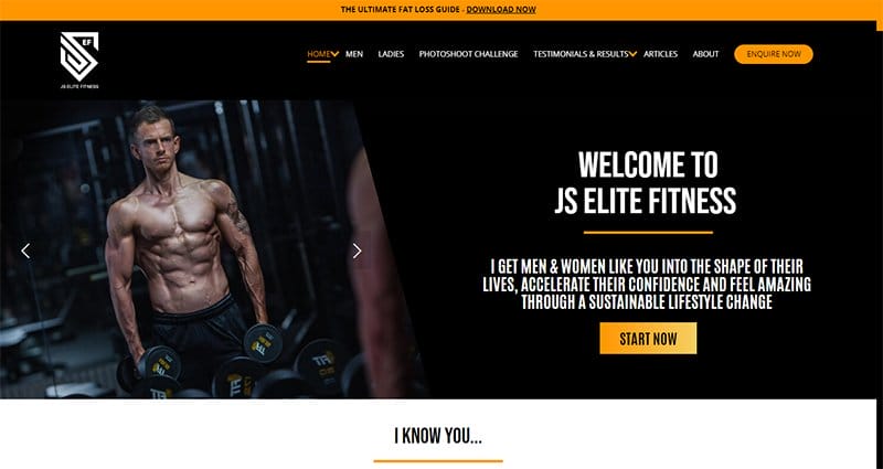
JS Elite Fitness is a premium online coaching service that specializes in helping men & women achieve their fitness-based goals.
I like the split page design layout in the hero section featuring a slideshow of men working out at the gym, engaging texts, and a golden brown colored “Start Now” CTA button.
As you scroll further, you will see an attention-grabbing before-and-after section that displays people's transformations with high-quality images.
This brilliant homepage design features a black-colored sticky navigation bar with a drop-down effect that makes the exploration process seamless.
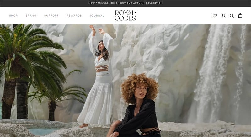
Royal Codes is a fashion bar that creates timeless designs using the softest and most comfortable fabrics. The final arrival section uses a slideshow effect to display its content and a multi-color feature that helps potential customers see the product in different colors.
I love how the customer testimonial section features heartwarming customer reviews from satisfied clients which serves as a source of social proof and helps to boost credibility.
My favorite aspect of this webpage is the use of a double-column grid layout to display the content in the Instagram reels section.
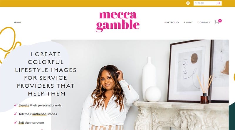
Mecca Gamble is a personal brand designer that shows off their client's style and establishes trust with their audience.
Welcoming visitors to this stunning website homepage is a slider of jaw-dropping content featuring beautiful images, stylish font texts, and a pink-colored CTA button.
As you explore the site contents further, you will discover various high-quality images from top to bottom. The Instagram reel section uses stunning images with bright colors and a thumbnail effect linking to the brand’s Instagram page.

Benjamin Manley and Mark Labriola II are the founders of The Friday Habit Podcast which focuses on helping entrepreneurs navigate seamlessly.
I like how the hero section features two dark blue colored “ Listen To The Podcast ” CTA buttons to encourage immediate participation from visitors.
As you scroll further, you will discover multiple top streaming platform logos where you access the uploaded podcast and listen easily.
I like how the homepage features an embedded background video of an ongoing podcast section to give interested visitors a sneak peek.
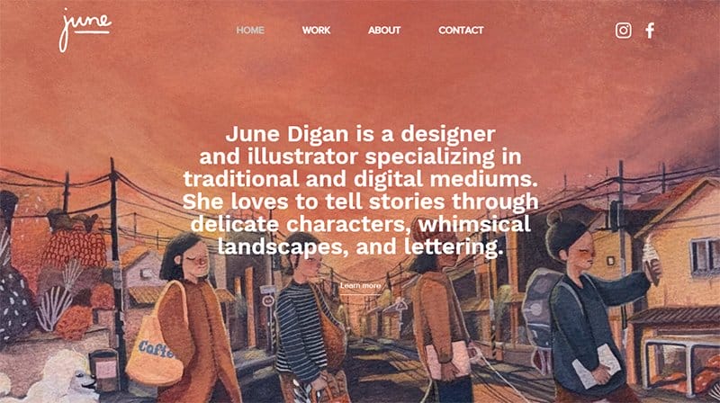
June Digan is a designer and illustrator specializing in traditional and medium, focusing on emotions and storytelling using delicate characters. A full-length illustration image featuring children going to school and engaging text in the hero section welcomes visitors.
I love the homepage features multiple high-quality illustrations, free-hand drawings, and paintings which makes the website engaging for visitors.
A noticeable white button back-to-top feature pinned at the right center of the page helps visitors navigate back to the homepage.
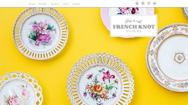
French Knot Studio is a wedding planner and event designer based in Savannah, Georgia, and travels worldwide.
Welcoming visitors to the site is a half-width motion display of a wedding event in a looping format to grab visitors' attention.
I love the arrangement of the large menu bar featuring the site logo and social icons on the left side. Interested visitors can click on the icons to explore more content.
The white-colored mega menu is your one-stop shop for exploring various aspects of the webpage.
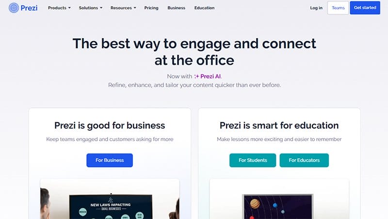
Prezi’s website has a clean design layout with catchy elements like engaging texts, primary and secondary call-to-action buttons, and multiple high-quality images.
I like how the homepage features logos of top brands that are in business with or partners of Prezi to boost social proof and increase credibility. Interested visitors can click the blue-colored “Get Started” CTA button on the mega menu bar to jump on this great opportunity.
The site footer houses multiple vertically shaped menu bars and social media icons that link directly to Prezi’s online profile.
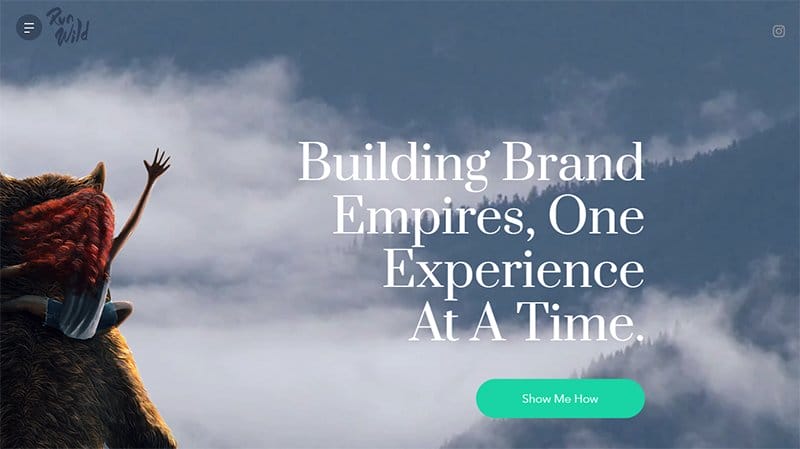
RunWild Design is a visual design studio based in San Diego. Welcoming visitors to the site is a full-width illustration image of a standing beer looking at the sky. I love how RunWildDesign does a great job of displaying a few key benefits in its bold and large tagline.
Interested visitors can click on the green CTA button “Show Me How” at the center of the homepage to explore the site’s content. This design studio site uses a calm color scheme background which makes content visuals appealing.
My favorite section of the site is the “Latest Illustrations” which displays slideshow images of new illustrations with a shop button for visitors to purchase.
Best Homepage Examples FAQs
Some of the best homepage designs include FreshBooks, A24 Films, Omsom, HubSpot, Pixelgrade, Mint, Dropbox, Chipotle, 4 Rivers Smokehouse, eWedding, Spotify, Colorsmith, Melyssa Griffin, Nine Lives Foundation, Digiday, Jill Konrath, Evernote, Telerik by Progress, Basecamp, TechValidate, Medium, Kind Snacks, Ahrefs, and Not Just Brochure Wear.
Yes, call-to-action buttons are necessary for every engaging and interactive website. Your homepage design is not complete without a call-to-action button that compels visitors to make vital decisions and take action. You must have multiple CTA buttons at strategic points of the page to ensure every visitor does not leave without taking action.
Some top benefits of a well-designed homepage include providing a better first impression, helping keep up with competitors, boosting revenue, improving your search engine optimization (SEO) strategy, building trust with your audience, helping keep up with competitors, and creating consistency.
If you want to build a great homepage design, here are some factors you must consider. Clearly answer “Who I am,” “What I do,” and, or “What can you (the visitor) do here,” resonate with the target audience, communicate a compelling value proposition, optimize for multi-device usability, include calls-to-action (CTAs), and employ great overall design.


