20 Best Japanese Website Design Examples of 2025
Do you want to create a one-of-a-kind Japanese webpage that will stand out among other modern websites? Certain technicalities make a Japanese website different from others. Without careful consideration, you can create a webpage that will appear offensive.
If you want to avoid this problem, use state-of-the-art website builders like Wix and Squarespace to help you get the job done. These website builders have a top-notch Japanese website template that you can use as a guide when creating your one custom site.
This article covers the 20 most eye-catching Japanese website designs that will get the attention of visitors and make your page stand out.
Let’s dive in.
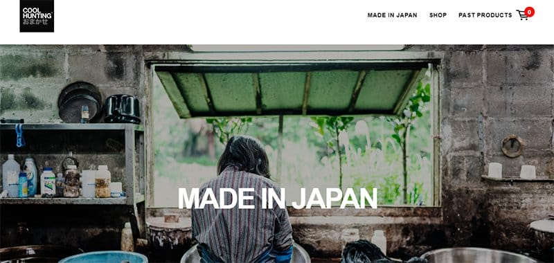
Cool Hunting Omakase is a Japanese online shopping platform that provides limited-edition gift items to customers. I like how this Japanese eCommerce website uses a white background with black plain text to create a simple and decent web design.
This Japanese website uses a slideshow to display high-resolution images of some artisans in a partner program with the brand crafting some of the products.
Interested visitors in Western countries can click the ‘Shipping Information' link in the white-colored footer to see their shipping options.
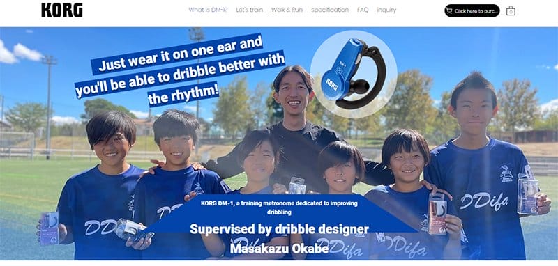
Korg is a Japanese company that develops electronic musical instruments. Unlike Western websites, this Japanese website gives a lengthy description of the significant products it displays.
One exciting thing about this website is the use of a lengthy video to give a detailed breakdown of how to use the product. This fine website might be tedious to explore due to information overload, making it hard to find what you need.
Interested visitors can click the cart icon in the white-colored horizontal sticky header to buy Korg's products.

Sabukaru Online is a magazine that provides the online world with a view of Japanese culture, products with context, and human stories.
I like how this Japanese website uses a unique grid layout in the web design to display several articles with titles in capital letters. I love the use of small space for a large amount of content.
Visitors will see the brand logo, which is the brand name in white-colored, non-standard typefaces in the transparent header.
Sabukaru Online’s site uses a blend of images with a soft color palette alongside a black background to create an aesthetic web design.
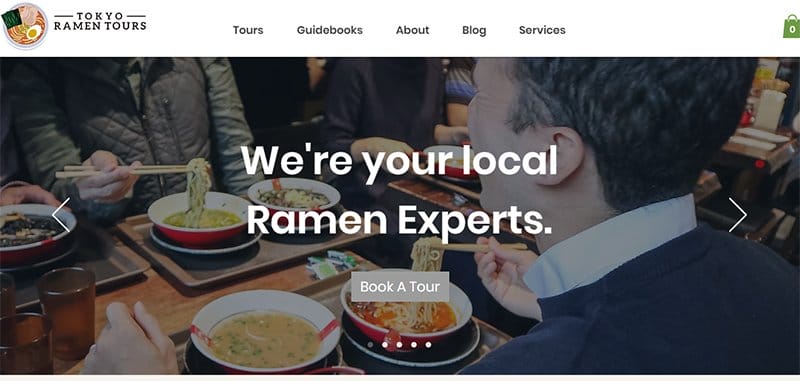
Tokyo Ramen Tours is a brand that guides people to the best ramen shops in Tokyo and other regions across Japan. I like how this food website uses a slideshow in the testimonial section to make exploration fun.
One striking thing about this Japanese website is the brand logo, which illustrates a bowl of ramen. Potential clients can go through the Instagram reels above the bright-gray-colored footer to see the service quality of the brand.
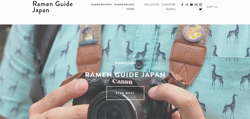
Ramen Guide Japan is a brand that provides users with high-quality ramen content in the English language. One exciting thing about this website is that it doubles as a blog and eCommerce website.
This beautiful website incorporates Japanese and Chinese fonts in describing some ramen dishes in the ‘Ramen Review Section.' Interested visitors can contact Ramen Guide Japan using the social media links in the white-colored footer.
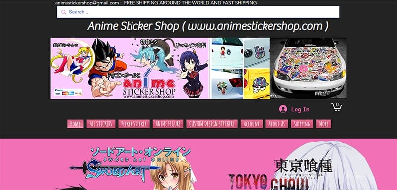
Anime Sticker Shop is an online shop that provides customers with high-quality vinyl anime stickers and decals. I love the use of a fuchsia-pink color in certain areas to paint this as an anime-related brand for end users.
This anime website encourages new users to continue exploring with stickers of popular anime characters and graphic texts of the anime title in the hero section.
Users can use the fuschia-pink-colored link tags on the left-hand side to select sticker items from specific anime.
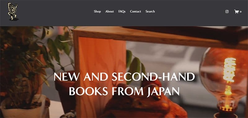
Bakezori Books is a Japanese bookstore that provides customers with assorted books in different categories.
One thing I like about this website is the use of a soft color palette, which is familiar with Japanese web designs. The minimalist nature of this website helps users have a distraction-free reading experience.
You can follow Bakezori Books on Instagram for updates using the Instagram link in the footer of this website. If you need inspiration for your own website, which will cater to the Japanese market, use this website as an example.
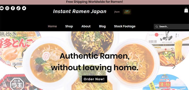
Premium Japan Instant Ramen is an online platform that provides customers with the best ramen from Japan. Japanese designers tend to use illustrations native to Japanese culture, which shows cultural differences in modern website design, as seen in this website.
Customers can use the rectangular search option in the black-colored horizontal header to search for specific products. You can contact Premium Japan Instant Ramen using the sticky white-colored ‘Let's Chat' widget on the bottom right of your screen.
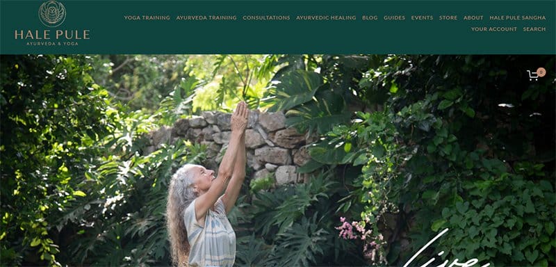
Hale Pule is a center for healing using yoga and ayurvedic medicines. I like how this site uses clear images and quality content to draw attention to Hale Pule's services.
This Japanese website incorporates parallax scrolling effects alongside extensive use of brownish-pink color in the color scheme to create an elegant web design. Interested visitors can use the cart icon on the green-colored horizontal footer to shop on Hale Pule.
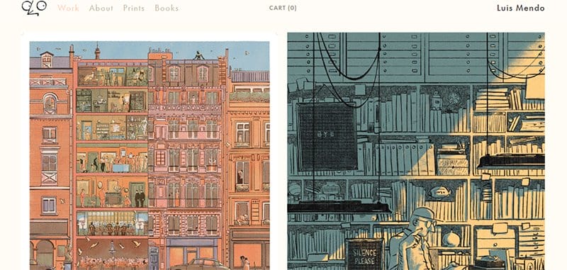
Luis Mendo is a Japan-based Spanish artist with a history as an editorial designer and creative director. I like how this art website welcomes visitors with lifestyle and urban landscape artworks.
This Japanese web design uses less font while abundantly displaying Luis Mendo's works on this website's landing page. Interested users can buy Luis Mendo's latest projects using the cart option on the white-colored horizontal sticky header.
I love how this Japanese website incorporates the colors in the illustration works of Luis Mendo against a floral-white background.
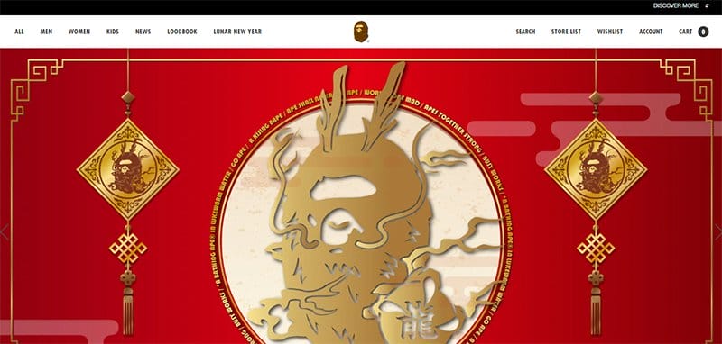
A Bathing Ape is a Japanese fashion brand that deals in all types of clothing for all genders. I like that this site uses interactive tools like slideshows to display products.
This Japanese website does not display non-standard typefaces. Instead, A Bathing Ape’s site uses a design similar to Western web design as it caters to customers globally.
A Bathing Ape doubles as an advertising platform like most eCommerce websites displaying designer brands above the white-colored footer.
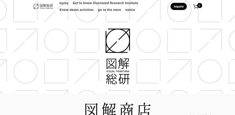
Zukai is a Japanese eCommerce store that sells illustrations made by the Illustrated Research Institute. Popular Japanese websites use the Japanese writing system in website design, as they tend to be for Japanese consumers.
Potential customers can use the black-colored, rounded-rectangular ‘Go To Store' CTA button to shop for preferred products on this website.
Visitors who want to participate in developing a social language can click on the ‘Research and Development' link in the black-colored footer.

Fashionsnap is a brand that gathers and disseminates information on fashion. When you open this web page on a mobile web, the typography will be in Japanese web fonts, which is ideal for Japanese customers.
The images of items and the black typography make up for the little graphic design on this website. Visitors can use the hamburger menu icon on the right-hand side of the white-colored horizontal header to navigate this website easily.
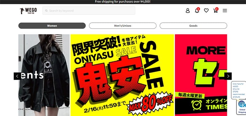
Wego is an eCommerce store that deals in different brands of unisex clothing. First-time users can navigate this website easily using the white-colored horizontal sticky header.
This web design uses the hierarchical contrast required for eCommerce stores by using a plain-colored background.
One noticeable feature is the website end, ‘jp,' which is unique to several websites of Japanese origin. Visitors can contact Wego using the social media links in the gray-colored footer for more information.
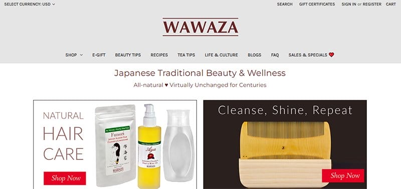
Wawaza is a Japanese company that provides customers with quality health and skincare products. Customers can change to a preferred currency using the ‘Select Currency' option in the gray-colored horizontal header.
You can use the red-colored rectangular ‘Details' CTA button to see information about interested products. One exciting feature of this website is using image links to a blog and YouTube videos to make interaction fun and interactive.
While some Japanese websites use typographies of non-Latin languages, others, like this one, use a typography with Latin alphabets.
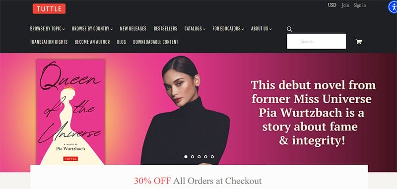
Tuttle Publishing is one of the top publishing companies in Asia. This publishing house provides educational resources to the younger generations and older people.
Visitors with dyslexia or visual impairments can use the blue-colored circular accessibility menu at the top right of the screen to enable audio narration.
Interested visitors can click the ‘Become an Author' option on the black-colored horizontal header for information on how this brand supports independent authors.
Customers can download supplementary eBooks to read offline using the ‘Downloadable Content' option in the black horizontal header.
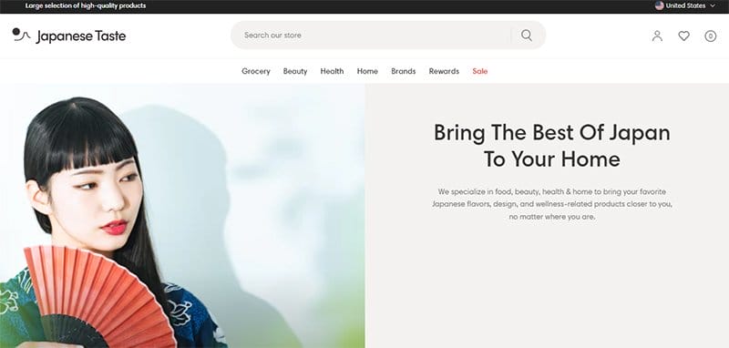
Japanese Taste is an online store that provides customers with high-quality Japanese-made products. I like how this eCommerce website uses hover effects on the displayed product items.
This eCommerce site uses the ash color to create a soft palette, making this website visually appealing. Users can stay up to date with information on the latest products by subscribing to newsletters from Japanese Taste using the white-colored, rounded-rectangular form.
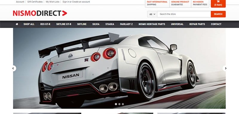
NismoDirect.com is an online store that provides Nismo motor parts to customers in many countries worldwide. Customers can use the black-colored horizontal sticky header to navigate this website smoothly.
Customers can get a preview of products by clicking the black-colored rectangular ‘Quick View' CTA buttons that pop up with hover effects.
I like how this website uses a carousel in the testimonial section with graphic text, creating an interactive visitor experience.
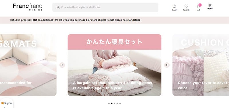
Francfranc is a Japanese eCommerce store that provides customers with a wide range of products. Like many Japanese designs for eCommerce websites, this site displays its array of products on a white background.
I like how this website features a gray-colored search option that customers can use to narrow down their preferred products. Interested customers can look through the slideshow of Instagram reels for products featured on the brand's Instagram page.
One of the unique characteristics of this website is the guide on shopping using the cart icon at the bottom left of your screen.
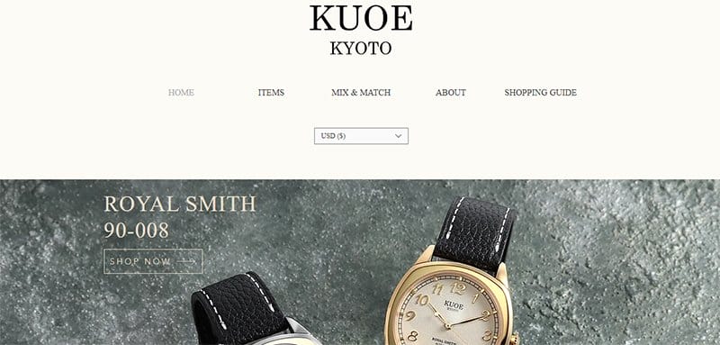
Kuoe Kyoto is a Japanese watch brand established in 2020. This eCommerce website features an option to change the displayed currency to a preferred one in the white-colored header.
Customers can get more details about their choice of products by watching the YouTube videos in the ‘Promotional Video' section. Interested visitors can subscribe to newsletters from Kuoe Kyoto using the form in the gray-colored footer.
Japanese Website Examples FAQ
Various factors call for the unique characteristics of a Japanese website. The lengthy descriptions on the page require unique writing systems to ensure visitors can seamlessly explore its contents. Due to these factors, web designers tend to use graphics rather than plain text to display content.
Western web design features fewer fonts to communicate to their target audience. On the other hand, Japanese web design features a significant number of loud banners, multiple columns, dense text, various tiny images, and an overall cluttered, crowded look. Exploring a Western web page is not as complex as its Japanese counterparts.
The Japanese website design has a unique structure that makes it stand out among other designs. You cannot but notice that the Information on the webpage is very condensed on Japanese websites and leaves few spaces.
Japanese websites tend to represent nature-based content which is a factor that is widely acceptable in various parts of the world. In addition, Japanese design is known for minimalism, organic forms, geometric shapes, symbolism, and custom typography.
Some of the characteristics of a Japanese website that make each of its pages a memorable experience include clean lines, natural materials, a subdued color palette, densely packed text, a busy layout, tiny low-resolution images, cute and bright characters, and the use of flash and eye-catching animations.