63 Best Examples of Lead Generation Website Designs
Are you tired of running unsuccessful lead-generation campaigns? Does your website or landing page struggle to attract qualified leads for your sales team?
Designing an attractive website is crucial to the success of any lead generation strategy. Unfortunately, many websites aren’t optimized for lead generation.
Does your site have a slow loading speed, sparse content, an unfriendly mobile design, and an unattractive lead magnet, or none at all? The combination of one or more of these undesirable elements is the reason why you are struggling to attract qualified leads.
This article covers the 65 best lead-generating website examples you can use as a guide to design a site that generates leads on autopilot.
Let’s get started.

Mingua Beef Jerky is a Kentucky family-owned company that uses old-fashioned and all-natural recipes to offer outstanding products to its customers. One of the best lead gen websites, the Mingua Beef Jerky website is unique, boldly displaying catchy design elements.
The site’s chosen typography is catchy in its bold font type, engaging screen readers and visitors as they scroll through the site. I love how the CTA buttons stand out in the logo’s Grapefruit color, prompting visitors to shop for specific products.

Fresh Prints is an online community of student entrepreneurs who run their businesses successfully from the comfort of their school environment.
One of the top lead-generating website examples, the Fresh Prints website is artistic, displaying several colors and high-quality images on the homepage’s plain white background.
Social proof is top of the site’s lead generation strategy, displaying images taken from different social media platforms to build trust in the brand.
A chat feature is visible and pinned to the right-hand corner of the homepage, serving as the site’s online communication channel.

The Financial Knot is home to Stephanie Vokral, a certified divorce financial analyst offering a wide range of divorce financial planning services to women specifically. This top lead generation website is unique, displaying bold typography as its top design element.
Bold logos are visible on the homepage, complementing the typography, featuring top brands The Financial Knot has been featured in. I love the display of testimonials in a centralized slideshow on a Quicksand background, serving as social proof.

Campbell Consulting helps organizations teams and individuals to thrive by applying evidence-based organizational psychology. One of the best lead generation websites, the Campbell Consulting website is minimalistic with a straightforward web design.
The logo’s Silver Tree color stands out on the site as the background color for multiple CTA buttons, prompting site visitors throughout the site.
An anchor menu feature is visible and pinned to the right-hand corner of the homepage, serving as the site’s top navigation feature.

Lynne Saunders is a well-being specialist, transformational coach, and founder of Wisdom Well, where she combines energy medicine and energy psychology. This stunning lead-generating website example is aesthetically pleasing, sticking to a soft color scheme for its web design.
The header menu is packed, displaying a logo and several header texts on an all-black background pinned to the top of the homepage. I love the various tactics employed to generate leads on the site, notably the stylish fonts that engage screen readers.

Gordon’s Downsizing & Estate Services are experts in senior real estate, downsizing, move management, and the sales of goods. This beautiful lead generation website stands out, displaying bold design elements consistently throughout the site.
The logo’s Carrot-Orange color serves as the background color for the site’s multiple CTA buttons. An announcement box is visible over the homepage’s catchy full-width hero image with a CTA button visible alongside, prompting visitors to get in touch.

Andrea Rodman Interiors is an award-winning and internationally published interior design firm shaping how we live and enjoy our surroundings.
One of the best lead generation websites, the Andrea Rodman Interiors website is aesthetically pleasing, sticking to a clean and modern layout for its web design.
Welcoming visitors to the site are several high-quality images displaying some of the brands’ work in an interactive slideshow. I love how the site alternates between texts and images throughout the homepage, engaging visitors and screen readers alike.

The Gutsy Mama Project offers Squarespace design membership specifically for moms looking to build their own money-making design business.
One of the top lead generation website examples, the Gutsy Mama Project website is unique, sticking to a centralized layout for its web design.
I love the use of the underline feature to display important texts on the site’s homepage, engaging visitors and adding a personal touch to the website design. Screenshot images vouching for the brand are visible on the site and serve as social proof to potential customers.

OGI Eyewear is committed to independent optical professionals, happily supporting their customers in every step of their optical journey. This colorful lead generation website example is aesthetically pleasing, displaying several eye-catching design elements.
Bold colors and animated images are the stand-out design elements on the site, combining to improve the site’s overall visual appeal.
Visible on an extensive Barberry background are image and video excerpts from the business Instagram page, displayed in a centralized three-column layout.

The Buffalo Ambition Beauty Academy was created for individuals who identify as being more than their titles, but artists. This awesome lead generation website example is unique, sticking to a clean layout to display its content.
Welcoming site visitors is a half-width video with a CTA button displayed, prompting visitors to secure a seat in its barbering intensive training. Other CTA buttons are prominent on the site’s homepage, prompting visitors to join and secure a seat in its beauty academy.

Caroline Linz is a website designer helping her clients build top-class Squarespace and Shopify eCommerce online stores. One of the best lead generation websites, Caroline’s website is modern, sticking to a soft color scheme for her website design.
The site’s CTA buttons stand out over a Light Salmon background, prompting visitors to check her extensive design portfolio. Logos of top brands Caroline is certified by are visible on her homepage, adorning the plain white background.

Taekwon Kids is a family-oriented martial arts school that teaches authentic Taekwondo, Judo, and self-defense.
One of the best lead generation website examples, the Taekwon Kids website displays the Artyclick Deep Sky Blue color predominantly over the homepage’s plain white background.
An extensive map feature is visible above the footer section, providing visitors with directions to its physical studio. I love the display of testimonials from past clients in a constantly changing slideshow, visible on an extensive Artyclick Deep Sky Blue background.

Brew Tea Co. is an online retailer that offers all the essentials for making the ideal cup of tea for any occasion. One of the top lead generation websites, the Brew Tea Co. leverages the Old Gold color to draw customers to its website.
I love the display of the CTA buttons on the Brew Tea Co. website over colorful backgrounds, with black color acting as the backdrop color. There are slideshow pictures of the company's top-selling products in a gentle color palette set against a bright yellow background.

Staay offers supplements consisting of a handful of active ingredients each carefully selected to optimize your pet’s overall health and wellness. This beautiful top lead gen website example is modern, sticking to a clean layout for its web design.
Each homepage section is visually appealing, displaying images and animated icons that help generate leads. The CTA buttons are prominent in their unique font and varying colored backgrounds, prompting visitors to shop from the online store.

Coal and Canary are in the business of fun and making delicious scented candles that bring joy and happiness into people’s lives. This great lead gen website example is visually stunning, sticking to a consistent display of the Raspberry Pink color.
A search bar is visible in the site’s extensive header menu, helping visitors find and locate specific items on the site. Bold CTA texts appear prominently on the site in their Raspberry Pink font color, prompting visitors to perform specific tasks.

Lucky’s Market is a store dedicated to good food with the firm belief that good food should not be a luxury but a necessity. This great lead gen website example is aesthetically pleasing, welcoming visitors to a slideshow display of mouth-watering images.
The Satin Sheen Gold color adds a unique touch to the website design, visible as the background color for different sections and select CTA buttons. I love the display of several of its stores along with locations and contact info in an interactive four-column carousel display.

Gemma is the founder of Hush Little Darling, a fully certified sleep coach with a passion for helping families get the restful night's sleep they deserve. This top lead-generating website example is visually appealing, sticking to a soft color scheme for its web design.
Bold CTA buttons are prominent on the site’s homepage, easily catching visitors' attention with their Rose Gold and Bluish color scheme. Consistent is the centralized layout, engaging screen readers and centering visitors’ attention on the site’s content.
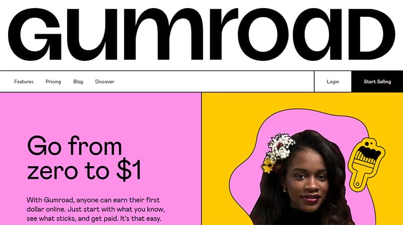
Gumroad helps its target audience make their way, offering more balance, flexibility, or a different gig, making it easier to chart a new path. One of the best lead generation websites, the Gumroad website is visually appealing with an eye-catching website design.
Bold colors and animated icons appear throughout the homepage as part of its lead-generation efforts to attract potential customers.
Visible in a consistent three-column layout are the best-selling products and creators Gumroad offers which serve as inspiration to potential customers.

Growth Rock is an eCommerce conversion rate optimization (CRO) agency based in the San Francisco Bay Area, running AB tests on SaaS, eCommerce, and media sites.
This beautiful lead generation website is modern, sticking to a centralized layout for its entire website content.
The hero section is appealing, sticking to a Cerulean Blue and White color scheme to attract leads to the site. Boldly visible and displayed over the hero section is a call-to-action button on a Greenish-Teal background, prompting visitors to learn more about the CRO framework.

Surge Labs develops WordPress websites that are fast, professional, modern, and uniquely built to help clients communicate their messages to their target audience. This top lead generation website example is modern, professional, and uniquely built to generate leads.
I love the display of past websites Surge Labs has developed for clients in a three-column layout, helping the company build its lead generation campaign.
There are multiple calls-to-action buttons on the site, prompting visitors in its Thunderbird-colored background and generating leads.

Shopify is an all-in-one commerce platform to start, run, and grow a business, helping its clients achieve independence.
One of the best lead generation websites, the Shopify website is professionally looking, welcoming visitors to a full-width video playing in the hero section background.
Multiple CTA buttons stand out on the site in a black-and-white color scheme, prompting visitors to start and enjoy a free trial. I love the display of the list of the platform features alongside images and videos that help with a visual perspective.

Zillow is reimagining real estate to make unlocking life’s next chapter easier, offering an on-demand experience for selling, buying, renting, and financing. This great lead generation website example is minimalistic with a straightforward web design.
A bold search bar is visible over the site’s half-width hero image, helping visitors locate a particular location directly from the homepage.
The search bar sticks to the top of the page as visitors scroll, a major part of the site’s lead generation efforts.
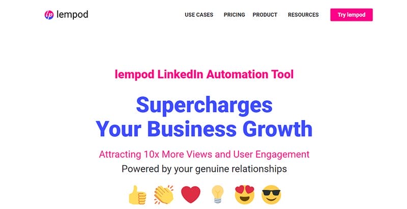
Lempod is a LinkedIn automation tool designed to supercharge business growth, powered by genuine relationships, focusing on user engagement. This awesome lead generation website example is simple with a clean layout for its web design.
I love the display of customer stories on the homepage, serving as social proof to potential customers. The CTA buttons are consistent in their ArtyClick Crimson background, prompting visitors to try Lempod.

The Charity: Water helps bring clean and safe water to every person on the planet, helping solve the massive water crisis.
One of the top lead generation websites, the Charity: Water website maintains a centralized structure for all materials, maintaining consistency in its web design.
There is a donation form placed over the hero video in a White and Dark Midnight Blue color scheme, encouraging visitors to donate.
You will find a three-column arrangement featuring team stories on the homepage, with each story connected to the company's blog page.

Hootsuite is a top social media management platform building a diverse, inclusive, results-oriented culture that encourages people to excel. This awesome lead generation website is built as a sales funnel, designed to boost user engagement.
Colorful animated icons are visible throughout the homepage, beautifying the homepage’s plain white background. Several CTA buttons are standing out in their Firefly background, prompting visitors to start a free trial.
The website's bold and fashionable font choices draw screen readers in as they browse the homepage's information. I love the display of user reviews in a centralized, three-column slideshow, serving as social proof to potential customers.

Discord is a voice, video, and text communication service that creates a space for everyone to find belonging and hang out more often. This great lead generation website example is unique, sticking to a centralized layout to keep visitors engaged and boost conversion rates.
I love how this user-friendly website accommodates mobile users, prompting visitors to download the app available on Windows. The use of animated icons adds to the site’s visual appeal, helping drive traffic.

NerdWallet is more than a typical financial company; its team of nerds empowers people to make confident financial decisions. One of the top lead-generation website examples, the NerdWallet website is aesthetically pleasing with a straightforward web design.
You will find the logo’s Green Haze, Atlantis, and Dartmouth Green colors on the site’s homepage, prompting visitors as CTA buttons. Large icons are visible above the hero section, one of the site’s powerful lead-generation tools, helping to attract potential leads.

OptinMonster started with a simple goal, to build a powerful enterprise-level technology to help businesses grow their customer base and revenue. This top lead generation website example stands out in its bold display of design elements, visible as texts and icons.
Visible and pinned to the homepage are pop-ups of new customers who have purchased OptinMonster, a top digital marketing strategy. There is an extensive FAQ and resource section, providing website visitors with access to ready answers and helpful resources.

Landbot is an AI chatbot generator that helps marketing, sales, and customer service teams turn conversational experiences into revenue-driving outcomes. This stunning lead generation website is straightforward, maintaining a consistent centralized layout for its web design.
I love the display of testimonials from past clients in two separate sections on the homepage, serving as social proof to potential customers. Standing out are the CTA buttons in their French Rose background, prompting visitors to try Landbot for free.

Exicom Tele Systems develops industry-leading EV charging solutions for homes, workplaces, and public spaces, to integrate them into modern daily life. This cool lead generation website example is unique and built on a predominantly black-and-white color scheme.
Top of the site’s lead generation strategy is its talk to an expert feature linked to a CTA button, helping generate new leads. Standing out are logos of industry leaders who trust Exicom displayed in fading black over a plain white background.

Userpilot helps SaaS companies unlock product growth, activate more users, increase feature adoption, and drive expansion revenue. One of the best lead generation websites, the Userpilot website is unique and built on a consistent centralized layout.
This top user-friendly lead-generating website is designed interactively to boost conversions and is accessible on mobile devices. The all-black background adds to the site’s design aesthetics, making the texts and images more engaging for visitors.

Document360 is an AI-powered self-service platform to build, share, and manage knowledge base, product documentation, manuals, SOPs, and Wikis. This top lead-generating website is visually appealing, with different colors adorning the site’s plain white background.
There are links to try the platform for free on the homepage, embedded in CTA buttons, poised to attract a potential customer. I love the display of testimonials in a separate section on the homepage, serving as social proof to potential customers.

Leadsify spends hundreds of hours per month searching the web for the best design leads to help businesses grow exponentially.
One of the best lead generation websites, the Leadsify website leads new and existing customers with its unique content displayed in a predominantly black-and-white color scheme.
A pop-up announcing a new lead capture is visible and pinned to the left-hand corner of the homepage. Visible on the homepage is an extensive FAQ section in a two-column layout, providing ready answers to potential questions.

Passion, quality, and teamwork are at the heart of everything Avaropoint does, providing on-site IT-managed services and cloud solutions for businesses. This great lead generation website is unique, sticking to a single page for its entire web design.
Focused on improving a business conversion rate, the Avaropoint website sticks to a centralized layout, making each scroll engaging.
The Iris color serves as the background color for its CTA buttons, prompting visitors to learn more and try it for free.

Quilter helps hardware teams innovate faster, empowering them to dedicate their entire focus to exploration, innovation, and creation. This great lead-generating website is aesthetically pleasing and built on a predominant Black and Aqua Green color scheme.
The Aqua Green colored CTA buttons decorate the homepage’s all-black background, prompting visitors to reach out and join the waitlist. Easily recognizable is the site’s typography, standing out in its bold and unique font types.

Osimis is reinventing the radiologist’s workplace with the power of AI, taking an integrated, ROI-driven approach to vendor-agnostic medical imaging. This unique lead generation website has a dark-themed web design focused on lead capture.
I love the display of featured blog posts on the homepage in a two-column layout, informing visitors of the latest trends and featuring educational content.
Testimonials from top industry leaders displayed in an inconsistent three-column layout serve as social proof to potential customers.

Reunion is the leading marketplace for clean energy tax credits, with an experienced team that helps minimize risk at each step of the transaction process. This beautiful lead generation website is unique, displaying the logo’s Dark Blue Green color predominantly on the site.
Multiple Get Started CTA buttons are visible at unique locations on the homepage with an arrow icon that draws visitors' attention.
I love how the entire website is built on a consistent centralized layout, engaging visitors and adding a personal touch to the website design.

Databox’s mission is to make it easier for everyone in a company to discover actionable insights and leverage data to drive faster and goal-directed decision-making.
One of the best lead-generation website examples, the Databox website is eye-catching, displaying several animated icons and screenshot images of the platform.
The Dark Seafoam color stands out on the site as the background color for CTA buttons, prompting visitors to access the site’s free tool. Colorful logos of brands Databox integrates with are visible in a separate section, helping the brand generate high-quality leads.

Flywheel is a new breed of technology company at the intersection of software innovation and service, offering the best-managed WordPress hosting for busy creatives.
This top lead generation website example is modern with plenty of white spaces visible throughout the homepage.
Several pop-up boxes are visible on the homepage, announcing the brand’s mouthwatering deals, designed to generate leads. Standing out is an extensive FAQ section, providing answers to potential questions visitors might have about Flywheel and its services.

Best Choice Products develops the world’s best-selling products inspired by real people, helping its customers maximize their savings while offering the optimal standard.
One of the best lead generation website examples, the Best Choice Products website is stunning, displaying several colorful sections to attract visitors' attention.
A live chat button pinned to the homepage in the logo’s blood-red color serves as the site’s online communication feature. There are multiple CTA buttons in varying colored backgrounds, prompting visitors to shop for items based on unique categories.

Viral Loops helps users create their dream referral program through its referral program templates inspired by billion-dollar brands. This top lead-generating website example is professionally looking with huge white spaces visible between homepage sections.
Logos of top brands that trust Viral Loops are visible on the homepage in a black-and-white color scheme, serving as social proof. Top of its lead generation strategy is its CTA buttons, prompting visitors to try for free, boldly displayed on the homepage.

Weblify's journey started five years ago, running a startup that was dependent on getting business from its website. This modern lead-generating website example sticks to a clean layout for its web design.
The entire website creates content of a particular type to generate leads, displaying eye-catching animations alongside. Prominent on the site are form submissions, prompting visitors to input their contact details and see new design offerings.

Durdental offers a dental practice you can trust, created to make its clients laugh at all times. One of the best lead-generating website examples, the Durdental website is unique, incorporating its logo’s Bondi Blue color predominantly into its web design.
The entire site’s homepage is visually appealing, with plenty of white space and animated icons to keep visitors engaged as they scroll. I love how the site’s CTA buttons use a White and Bondi Blue color scheme, a key part of the site’s lead generation strategy.

Vinewood Construction is a California-licensed general contractor providing solutions for all tenant improvement and general contracting needs.
One of the top generating website examples, the Vinewood Construction website is unique, sticking to a centralized layout for its web design.
The CTA buttons on the site stand out in a black-and-white color scheme, prompting visitors throughout the site. An accessibility icon is visible and pinned to the right-hand corner of the homepage, giving visitors control of the site’s layout.

Jennifer Ferland is a top-performing Bay Area realtor showing her commitment to her clients’ experience by applying the concept of wellness. This beautiful lead generation website is visually appealing, sticking to a soft color scheme for her web design.
The CTA buttons on the site stand out in their black-and-white color scheme, top of the site’s lead generation strategy. I love the display of image excerpts from her Instagram page in a five-column layout, each linked directly to the page.

Nua Construction is home to Jake, a Levin-based local contractor covering the needs for digger excavation and small construction in the local Horowhenua area. This awesome lead generation website is aesthetically pleasing, displaying the Earth Blue color extensively on the site.
I love the display of images from its recent projects in a two-column layout on the homepage, serving as a persuasive copy to visitors. Testimonials from happy clients serve as social proof to potential customers.

Exponent Investment Management helps you achieve peace of mind by giving you the confidence to know that your goals are within reach.
This great lead generation website is visually stunning, built on a predominantly Blue and White color scheme. There are two prominent CTA buttons displayed over the hero image.
I love the display of recent articles on a separate homepage section, sticking to a centralized three-column layout linked to other pages.

Tatum Hamernik is a Connecticut-based author and illustrator with Ocean Breath, her breakthrough poetry book. This stunning top lead generation website example sticks to the Aqua Haze color as the site’s consistent homepage background color.
Welcoming visitors is a front cover image of the headline book surrounded by several reviews from notable industry personalities. The consistent centralized layout adds a unique touch to the website design, focusing visitors attention on key elements.

Redeemer Central is a church community in Belfast practicing the way of Jesus and working for the peace and good of our city. This visually appealing lead-generating website example is unique, welcoming visitors to its single-page landing page.
Two CTA buttons are prominent over the full-width captivating image, prompting visitors to access the main site. The other CTA button directs visitors to the Advent and Christmas page, boldly displayed in clear White font.

Monday.com is a project management platform that provides teams with end-to-end workflow options. This SaaS website is an excellent example of an interactive lead-generating site with prominent elements representing the site's primary functions.
As users navigate across the website, screen readers and visitors are drawn in by the bold text sticking out on the plain white background. The website's CTA buttons stand out in their Blue Lotus background.

Jasper is an effective AI copilot for enterprise marketing teams seeking better results rather than just faster outputs regularly. An excellent example of a lead generation website, the Japer website is visually appealing with dynamic links connecting each homepage section.
Superior hero video material welcomes site visitors, drawing their focus away from the primary hero text that is superimposed over it. The homepage's vibrant colors and interactive typography greet users as they browse over it, enhancing the site's visual appeal.

Soundboy Pro is a course teaching all the techniques and requirements for the effective use of gears and software in the creative process.
One of the top lead generation website examples, the Soundboy Pro website is unique, standing out in its predominantly black-and-white color scheme.
The logo’s Chilli Pepper color stands out over the site, easily recognizable as the background color for the site’s multiple CTA buttons. Top of the site’s lead generation strategy is the site’s CTA buttons, prompting visitors to Join free classes and access a free guide.

Reaching Out is the biggest and best-known organization focused on supporting the LGBTQ+ and MBA community.
An organization focused on educating, inspiring, and connecting members, the Reaching Out website is visually stunning in its consistent display of bold colors.
The logo’s colors give the entire homepage a colorful and visually stunning look. Visible in a black-and-white color scheme are logos of Reaching Out partners, alongside a CTA button prompting visitors to become partners.

Teachable helps creators engage their online audiences and get paid on their own terms with courses, coaching, and downloadable content. One of the best lead-generating websites, the Teachable lead gen website is professionally looking and packed with informative content.
Multiple CTA buttons stand out on the homepage in varying colored backgrounds, prompting visitors to join and try Teachable for free.
The entire site’s homepage is well-arranged, with each section detailing features and steps to make the most of the Teachable platform.

With the help of Proof's customer-focused marketing, companies can easily increase website conversion rates and client engagement. This great lead gen website example stands out because it uses a single, concentrated layout to show all of its content.
The Blue Orchid and White color scheme makes the CTA buttons stand out and encourages users to explore the entire website. I love how the site's hero section has an information bar with a call-to-action button, encouraging users to try Proof for free.

Be My Dream Books inspires children to dream big and embrace their differences through diverse and inclusive characters. A great example of an outstanding lead-generating website, the Be My Dream Books site is unique, sticking to a soft color scheme to display its content.
Consistent with the brand’s identity, the site’s homepage displays animated images and icons, drawing the attention of its target audience. The entire homepage aids the buying process with white CTA texts, prompting visitors to purchase a book directly from the site.

The Everyday Athlete is a coaching program that trains people directly to improve their performance, and physique, through optimizing their nutrition, strength, psychology, and conditioning.
This top lead-generating website example is minimalistic with a straightforward web design. I love how the entire website design sticks to a consistent centralized layout, engaging visitors and screen readers in their bold display.
The CTA buttons stand out in their Black Pearl and White color scheme, easily recognizable over the homepage’s plain white background.

With the SEO methodology that SurferSEO offers, customers may boost their organic traffic exponentially while also improving their ranking.
The main navigation menu of the website is the header menu which uses a drop-down menu function to display animated icons and concealed content.
I love how the website's numerous CTA buttons stand out against the bright color palette of the logo, prompting visitors and generating leads.

Tinyseed is the B2B SaaS Accelerator for ambitious founders to increase the number of autonomous, self-sustaining companies around the globe.
This beautiful lead generation website catches visitors' attention from the hero section, displaying images and dots over an Ebony Clay background.
I love the display of content about what makes Tinyseed different with a large Vimeo-powered video visible beneath the hero section. Tinyseed’s CTA buttons are catchy in their Satin Sheen Gold background, with perfectly designed white texts.

Vinebox offers a lovely tasting experience, offering some Sommelier-curated wines from the world’s premier regions, including Italy, France, Spain, and California.
One of the best lead generation website examples, the Vinebox website is modern, sticking to a clean layout for its web design.
The CTA buttons on the site serve as one of its top lead-generation tools, prompting visitors to purchase specific products. You can’t miss out on the email subscription section that encourages visitors to join the brand’s mailing list.

Bite Toothpaste Bits was founded with the belief that a brighter smile does not have to come at the expense of our bodies or the environment. This fine lead generation website example is unique, emphasizing its product and features in its web design.
The CTA buttons are unique and easily recognizable on the site, standing out in their black-and-white color scheme. Boosting the site’s lead capture are reviews from past clients displayed in an interactive two-column slideshow, serving as social proof.

Skullcandy is on a mission to help others who love music heal and make the outdoors a better place. One of the best lead-generating websites, the Skullcandy website is visually appealing with a beautiful color scheme that attracts visitors’ attention.
The typography is one of the site’s standout design elements, increasing the conversion rate in its eye-catching display. I love how the website arranges its content to help generate leads and convert visitors to paying customers easily.

Nixon is the premium lifestyle accessories brand of choice for independents, creatives, and free-thinkers, offering a full range of watches, bags, leather goods, and accessories.
This stunning lead generation website example is unique, standing out in a predominantly black-and-white color scheme.
I love the display of high-quality images of Nixon’s products on the site’s homepage in an interactive product carousel feature. A search bar is visible on the site’s header menu, helping visitors easily find specific products.
Lead Generation Website Examples FAQs
A lead generation website is designed to convert visitors to customers by effectively nurturing their interests. A key area of the inbound marketing methodology, lead generation is a crucial aspect of every website, empowering the site to attract and nurture potential prospects into paying customers.
Thorough research and analysis and in-depth content planning are what make a good lead-generating website stand out. A good lead-generating website is designed to turn visitors into potential customers, enlightening them about the brand and what they stand to gain.
Consistent messaging, presenting a clear message to a target audience, unique value proposition, compelling headline, engaging copy, social proof, and calls-to-action buttons are the key elements that identify with every high-converting landing page.
