16 Best Linear Website Examples For Design Inspiration
Are you interested in creating an outstanding website design with vital elements and seamless navigation across multiple pages? Your best option is to use a linear web design layout.
With this element, you can easily arrange and simplify your site's contents while displaying every relevant information you are willing to put out there and encourage exploration.
Use the best website builders like Wix and Squarespace to design state-of-the-art linear websites that keep visitors entertained and willing to explore. These website builders offer custom linear website design templates to use when creating your webpage.
This article covers the 16 best linear website examples you can use as a source of design inspiration when creating your site.
Let's get started.
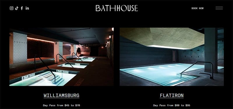
Bath House offers state-of-the-art bath-related treatments and restaurant services for people who desire to look and feel great.
I like how this great website features multiple mind-blowing design elements, including pure dark colors and white text, which gives the homepage an elegant vibe.
My favorite aspect of this page is the zig-zag design layout featuring high-quality images, bold white text, and CTA buttons to encourage user engagement.
Visitors and potential clients can use the hamburger navigation bar to access various aspects of the page without any restrictions.
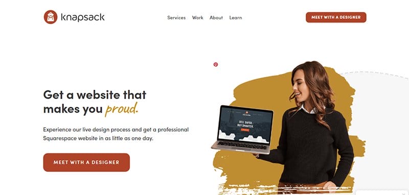
Knapsack Creative Co is a web design company that offers top-notch services to its clients with the singular goal of creating the world's best web design experience.
I love how this linear webpage has a good website structure, making it easy for site visitors to explore its content and product pages.
The main page features user-friendly tools and interactive content, which is designed to get users engaged and willing to collaborate with the brand.
With just a few clicks on the pale carmine colored “Meet With A Designer” CTA button on the home page, interested visitors can access important information about collaborating.
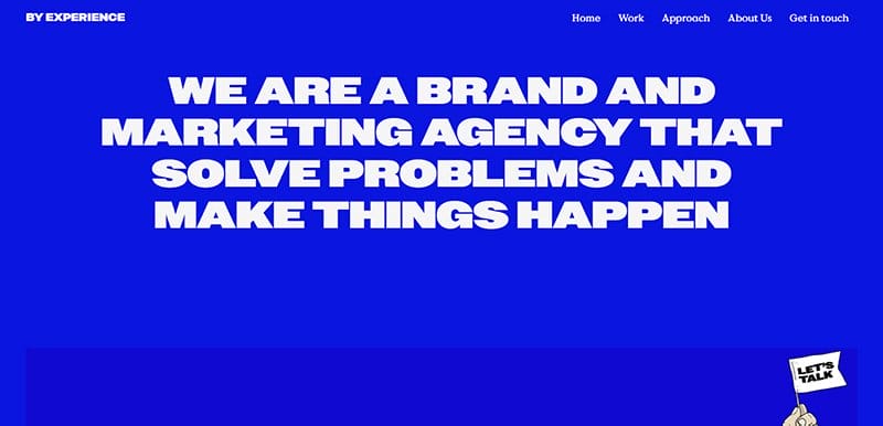
By Experience is a brand and marketing agency that aims to solve marketing-based problems and make relevant changes to help boost engagement and drive traffic.
I love how the cobalt blue background makes all the site's contents visually appealing and engaging, making the page stand out from other websites.
Interested visitors and search engine crawlers can use the transparent sticky navigation brat with a drop-down feature to travel across various pages on the website.
Below the hero section is a unique grid design layout that features the brand's services and past projects to get potential clients to click the contact link for collaboration.
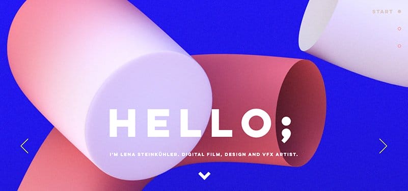
Lena Steinkuhler is a freelance multidisciplinary designer based in Hamburg, Germany. She is a pro at designing projects through animation, VFX, and live-action.
I love how they use a button navigation bar, which makes it fun and engaging for visitors to move across pages and make necessary decisions.
The hero section features a slider page featuring high-quality, colorful images, which is a taste of what the brand offers its clients. Upon scrolling, you will see multiple high-resolution images of past projects and a contact form at the base of the page for interested visitors.
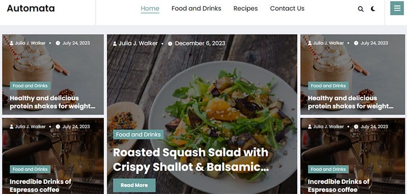
The Automata website's structure has a unique line that exposes explorers to its central comets with just a few clicks on its internal links.
Welcoming visitors and potential customers to this unique food-based linear website is a combination of high-quality images in a fluid and sequential structure.
The hero section features a slider page with clickable links that transport visitors to unique web pages for further exploration. Interested visitors can use the teal-colored back button to travel across the sites without manual scrolling.
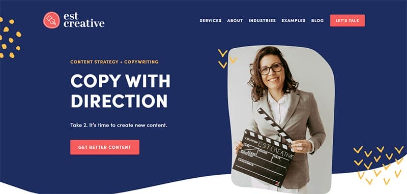
EST Creative is the brainchild of Emily, a creative copywriter with an eye for design, a knack for brands, a digital mindset, and a passion for influencing people. I love how you will first see a stunning picture of Emily with relevant content about the brand.
The underlying color palette on the site is visible on an extensive Cloud Burst background and consists of the logo colors Saffron Mango and Bean Red.
Playful hand-drawn arrow icons and dots are present, enhancing Emily's portfolio page's visual appeal.
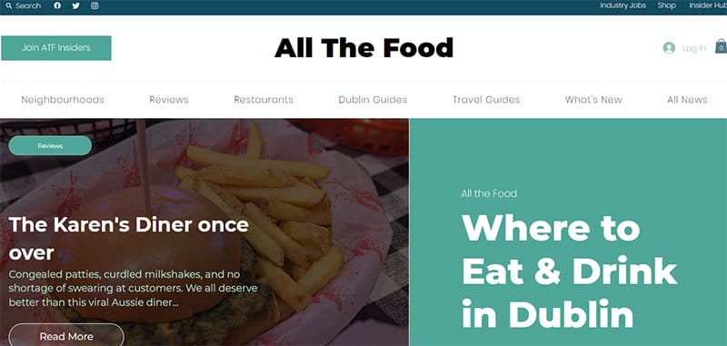
All The Food is a food-based news website that offers content to help readers experience Dublin's best food and not waste time or money on mediocre meals.
This one-page website features multiple colorful contents, which make it appear unique from other news websites.
What's handy for me about this unique linear website example is the lavish display of high-quality images with thumbnail features and CTA buttons that link to other pages.
I love how the white background makes all the site's contents visually appealing and engaging, making the page stand out from other websites.
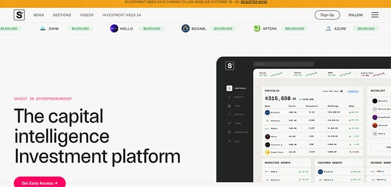
StartupStarter provides access to key company data of companies by sector, stage, and type, providing a path for investors to underwrite investments in a more organized, data-driven manner.
Welcoming visitors and potential clients to this unique web page is a caption “Capital intelligence for startups & investors” and a folly-colored “Get Early Access” CTA button.
Visitors and potential clients can use the hamburger navigation bar to access various aspects of the page without any restrictions.
I like how this investment website features multiple motion elements displaying vital content like the brand's services, partners' logos, and stock market updates.
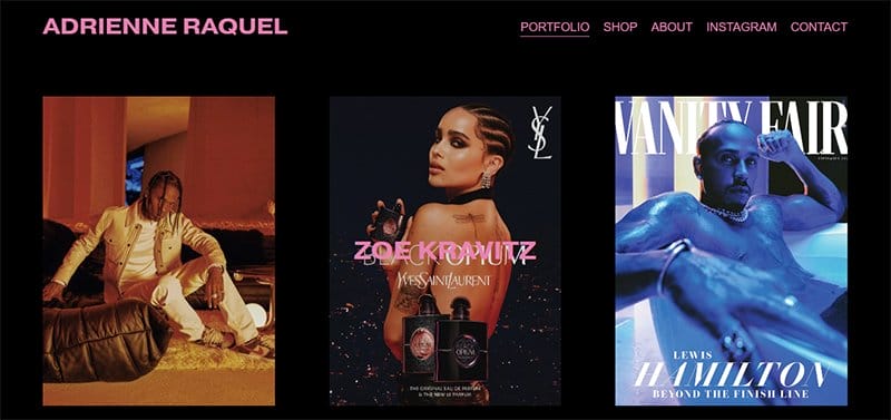
Adrienne Raquel is a professional photographer and creative director who has worked with clients like YSL Beaute, GQ, Apple, Savage Fenty, and Rolling Stone.
I like how this portfolio website features eye-catching content that spans across the page for seamless exploration. Interested visitors can click any of these images to view the portfolio page and access vital information fully.
The purple-colored mega navigation bar is a doorway to exploring various aspects of the webpage without stress, such as the online store section.
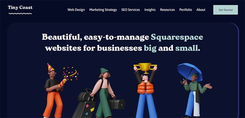
Tiny Coast Digital was founded by Brittany Taylor, a digital marketer and web designer based in Vancouver, BC.
I love how this unique linear website has a good structure and features every relevant content with an illustration, encouraging seamless navigation.
Upon scrolling, you will love using a long rectangular structured layout to display the brand pages, and with just a click, you can visit its pages.
Clicking the teal-colored “Get Started” CTA button on the mega navigation bar with a drop-down feature grants visitors access to the About page.
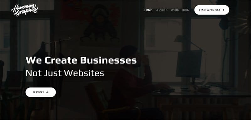
Hausman Graphics is a creative company that offers various services, from web design to content writing and search engine optimization (SEO).
Visitors are welcomed to this unique web page by video background content, which helps guide users on the best ways to take advantage of the brand and its activities.
Below the hero section are four unique links that offer visitors and potential customers a guided tour of the brand's services.
I love how the “Featured Project” section uses a grid design layout to display some of the brand's top projects with a thumbnail feature, encouraging further exploration.
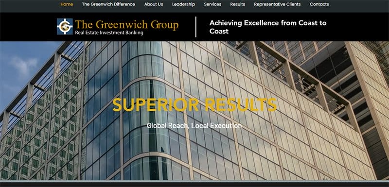
Greenwich Group International was formed in 1995 by the original managing partners of Jones Land Wooten (JLW) USA after JLW merged to become Jones Lang Lasalle (JLL).
The first thing you will see is a looping video displaying the company's best structure with a responsive design.
Below the hero section is a unique grid design layout featuring the brand's services with a teal-colored “Read More” CTA that helps users navigate this page section.
I love how each page section features a link that grants access to the ‘child' pages (such as main category pages) for more exploration.
The teal-colored site's footer features vital content like four social media icons that link to the brand's online profile.
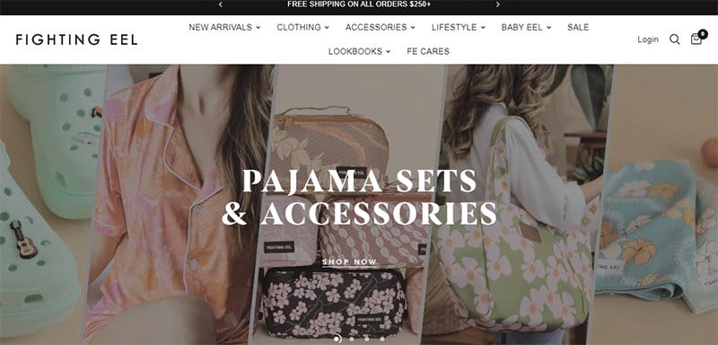
Fighting Eel's website welcomes visitors to this linear web page with a slider feature displaying some of the brand's products with high-quality images. I love contextual links embedded in the “Shop Now” CTAs, which allow potential customers to explore the shop page.
You can use the search function on the white-colored navigation bar to locate items seamlessly before purchase.
Upon scrolling, you will see multiple highs of the brand's products in the display with a thumbnail feature that links to the product page.
I love how the site's structure encourages multiple internal links, allowing visitors and potential customers to move easily across the site's pages.
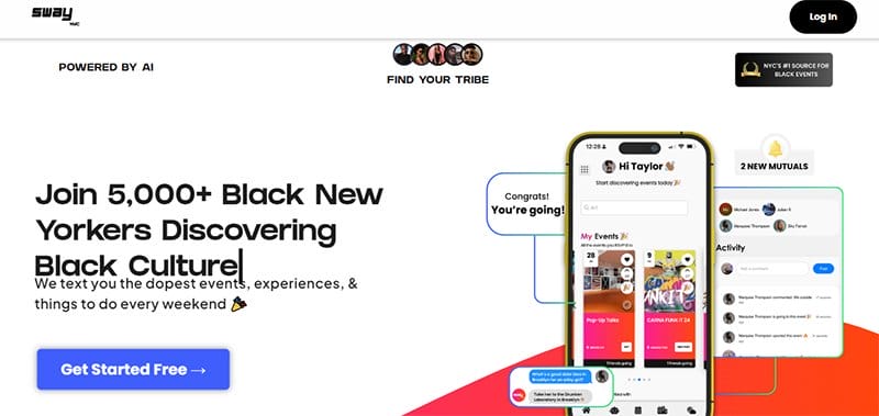
The SwayNYC website features multiple engaging and colorful elements, which help to create a pleasant and memorable experience for visitors.
The first catchy element of this stunning web page is a motion text feature that displays content about the brand's activities with a phone-based mockup.
Upon scrolling, you will love the heartwarming content in the testimonial section with a slider feature and a “Read More” link that encourages further exploration.
The black-colored site's footer features a “Get Started” link displayed on the right side, which guides users' access to the contact page.
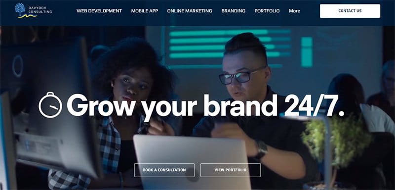
Davydov Consulting is one of the fastest-growing and efficient web design and consultancy agencies in Shoreditch in London, UK.
I love how this linear website features engaging content like high-quality images, embedded videos, engaging text, and links that encourage exploration.
Clicking the green-colored Whatsapp sticky widget grants visitors access to the brand's social media page for seamless collaboration with the brand's officials.
The navy blue colored sticky navigation bar with a drop-down feature serves as a portal that features different categories of links that lead to other site pages.
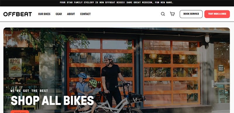
Offbeat Bikes was founded in 2017 as Chicago's first bike shop specializing in e-cargo bikes for family transport.
I like how the hero section features a slider page with clickable links that transport visitors to unique web pages for further exploration. You can use the search function on the white-colored navigation bar to locate items seamlessly before purchase.
My favorite aspect of the page is the proper arrangement of all its contents, which is a single file with relevant links ending in high-quality images and CTAs.
Linear Website Examples FAQ
Describing a linear website has a lot to do with the site's arrangement and structure of the contents. This unique website structure features multiple pages and links them in an orderly fashion to teach a subject or ensure the viewer sees everything in a prescribed order.
The significant types of website structures available in website design include hierarchical, sequential, matrix, and database structures. These structures have unique features that make them stand out and help give web pages a unique and elemental outlook.
A hierarchical website structure has multiple benefits, such as guiding visitors and search engine crawlers from a general page, like a homepage, to more content via a CTA button, clickable links, images with a thumbnail feature, and a site footer.
A deep site structure and a hierarchical structure have few features in common, but they differ based on their outlook. Both site structures have the same information organized into more sublevels, but the information they possess at the base of their pages differs.
The best website structure is none other than the hierarchical website structure. This good site structure is called the tree model because of its tree-like shape, resulting in the proper arrangement of its content, which encourages seamless exploration. The general pages are called top pages, and pages with specific content are subpages or child pages.
Explore Further
- Types of Growth
- Gray Websites
- Best Red Website Design Examples
- Innovative Web Design Examples
- Examples of Bad Website Design
- Real Multilingual Website Examples
- Best Luxury Websites
- Best Dynamic Website Examples
- Best Colorful Website Design Examples
- Best Sleek Website Design Examples
- Best Clean Website Design Examples