24 Best Dynamic Website Examples of 2025
Do you want to build a perfect website that attracts your target audience but don’t know whether to create a dynamic or static site?
Static websites tend to have a simple and minimalistic web design while dynamic websites display content based on different audience’s needs.
Creating dynamic websites doesn’t have to be a difficult task. Hire a professional web designer with top-notch skills to create content or use a no-code website builder like Squarespace and Wix to create one.
This article checks the 24 best dynamic websites you can use as inspiration when creating your own website.
Let's begin.
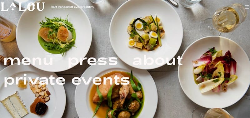
Lalau Restaurant and Bar’s website uses a mouth-watering image of rich cuisine on the homepage to captivate viewers and stir their appetite.
You can use the bold white-colored text navigation menus on the homepage that display a stunning hover effect when you move the cursor.
I love how the hamburger Icon on the top right eases navigation for the target audience. Walk-in customers can find the address on the top left of this website for accessible locations.

Exclusive PR Solutions is a reputable full-service firm specializing in public relations and digital marketing. This excellent example of a dynamic site adopts a dark and white-themed aesthetic, creating a conducive atmosphere for visitors.
I admire how the blue-colored animated homepage greets visitors with attention-grabbing white-colored text. The “Contact Us” CTA button on the bottom-left of the homepage attracts visitors with a thrilling hover effect.
Every aspect of this web design displays a top-notch web design, enhancing user interaction. You will find the navigation menu on the top right for seamless exploration.
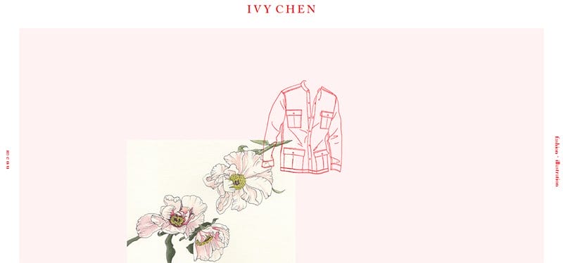
Ivy Chen is a Canadian-based fashion designer and creative illustrator. The hero section of Ivy's website displays an impressive picture of petals and a jacket to welcome visitors, reassuring their creativity.
I love its white-and-peach color scheme with red-colored typography that gives this modern static website a trendy look. You can access the vertically-displayed menu button on the left of the homepage.
Ivy Chen's website features a stunning parallax scrolling effect that offers unusual aesthetics. The underlined “Let's Connect” CTA button in the peach-colored footer enhances visitors' engagement.

Travel Taale is a South African-focused safari travel blog founded by Sam and Stephanie Taale. The fullscreen vibrant picture of a dry mountainous desert with the text “Ready for your first or next self-drive safari?” on the homepage is captivating.
I like how Travel Taale's HTML code functions as a read-only site that allows users to access and view information without making changes.
The white-colored header holds a few drop-down menus while the gray-colored footer contains contact information and links to informative articles for intending safari park explorers.

Blue Dog Cookhouse & Bar offers genuine, delightful, eclectic gourmet cuisine made from organic ingredients.
The homepage of this elegant cookhouse welcomes visitors with fullscreen grandiose imagery of dishes and rich interiors, bringing the exotic dining experience to reality.
Blue Dog's website conveys its offerings on the homepage, featuring a simple “Eat, Drink, Visit” message with an engaging hover effect. Visitors can click on the links to seamlessly complete orders.
The transparent header displays navigation menus and social media icons on the right for its target audience to subscribe.

Animal Music is a Miami-based music house offering music for advertising, sound design, and audio posts. The homepage features a modern design by merging two frames with videos, presenting an innovative visual concept.
I love its seamless blend of modern static and dynamic website elements, including a parallax scrolling effect that enhances depth and user interactions.
The social media icons of this website are vertically pinned on the right side of the homepage for easy accessibility. You will like the expansive grid layout gallery that showcases stunning videos to enhance the viewing experience.

Noah Demeuldre, a UK-based freelance production designer and art director, showcases astonishing projects on her own website. The visually appealing HD video of a lady on Noah's homepage offers visitors a positive impression.
A concealed CTA button and text elements in the middle of the homepage appear when the cursor moves around the hero video. This powerful tool makes the website attractive to visitors.
You will like how the anchor menu on the right side of the homepage allows for seamless navigation. Noah's website features a parallax scrolling effect that gives viewers a premium feel.

Recap After Use is a UX web designer specializing in developing interactive website designs and other web applications that have a responsive design.
Adorning an all-black color scheme, the landing page of this portfolio website greets visitors with a boldly written brand name.
An animated image of a ballpen with “Recap After Use” written on the cover opens as you scroll through the website.
This brochure site displays impressive website portfolios with visually appealing hover effects and a “Launch Site” CTA button for user engagement.

Dockyard Social offers street food and a variety of event spaces ranging from weddings to conferences. The use of a black-and-yellow contemporary color scheme on this website is admirable.
You can’t help but notice the fullscreen picture of a beautifully decorated event hall that opens the homepage. Exploring this website's content feels like floating in zero gravity, thanks to its smooth and seamless navigation.
I love how Dockyard features the names of its reputable partners on its website on a yellow-colored background above the footer to boost credibility.
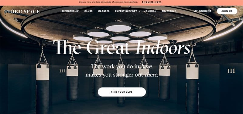
Third Space is a London-based luxury health club boasting the best fitness equipment and training experts. This fitness brand's website features immersive images and videos with little text to communicate its message.
The homepage's full-width video of luxury fitness facilities reaffirms their commitment to offering unrivaled fitness experiences.
I love the spaces between navigation menus on the transparent sticky header, which allows easy identification. There is a white-colored rectangular “Join Us” CTA button on the top right for interested subscribers.

Apollo is a leading technology firm empowering industries through digital transformation. One striking feature of this website is the use of aesthetically blue-and-white color schemes that give the site an impressive look.
The captivating animation display in the blue-colored hero section and other web pages makes it attractive and engaging. A hidden hamburger icon on the top right showcases as you scroll down.
I love how the white typography brand name is boldly written in both English and Chinese on the top left to emphasize brand identity.

Dogstudio is a creative studio that combines arts, design, and technological innovations to deliver unique and impactful solutions to its customers. What first stands out on this modern website is the immersive video background.
This clean website features a hamburger icon on the right of the transparent header, which makes the homepage sleek and clean. “Our Showreel” menu on the top displays a captivating video that stuns viewers.
You can't help but admire the parallax scrolling feature that makes navigating this website fun and engaging.

Glass-house Studio produces exceptional handcrafted glass art for homes and gardens. The vibrant image of glass suncatchers beside the bold green-colored typography on the white background homepage creates a feeling of substance.
I love how the green-colored rectangular “Show Homeware” button takes visitors to their captivating gallery of engaging content.
You will admire how the white-colored sticky header of this art website displays navigation for a seamless user experience. Visitors can sign up for their newsletter in the white-colored footer.

Propel partners with dynamic tech communities to jointly develop solutions, share expertise, and drive innovation for company growth. The brilliant white-colored theme blends well with the blue animations on the homepage.
I love how this site features two compelling CTAs to attract users. There is a blue-colored rectangular “Get Started” button on the top right and another black-colored “Get Started” button in the middle of the homepage.
Interested visitors can “Subscribe to the Monthly Newsletter” and access other essential contact information in the black-colored footer.

Fuelflip Energy is a technology company providing dual fueling solutions to reduce carbon emissions from diesel generators. This company's website features a consistent turquoise-blue color scheme with a parallax scrolling effect to create a visually immersive experience.
You can't miss out on the beautiful logo on the top left, creating a positive first impression. The top displays uniquely positioned menus for improved navigation, while the footer shares essential contact information.
Clients can find the company's social media handles at the bottom-right of the homepage to follow the brand.

Earcouture is an online store offering brands that rekindle your music experience and redefine your perception of sound quality. The homepage welcomes visitors with fullscreen, brilliantly gradient-infused slides showcasing its astonishing dynamic contents.
This portable e-commerce business website features a harmonious white color scheme with abstract elements, swirls, light fractions, and several other factors that make the site appealing.
I love how the product listing pictures have a hover effect that complements the featured product. The hamburger menu on the top right makes exploring Earcouture's website easy and fun.

Quant Block is a global consultancy firm reshaping DeFi with customized solutions. The first thing you will notice on this modern website is the navy-blue color scheme that makes it attractive and engaging.
This modern website uses white-colored typography and a gradient “Contact Us” CTA button at the bottom left of the homepage to attract user engagement.
I love how this blockchain consultancy website features testimonials in the “Our Clients and Trusted Partners” section to achieve social proof. The interesting navigational links in the navy-blue-colored footer aid in the seamless exploration of this website.

Zwift provides the best example of a virtual cycling platform for runners to train, race, and connect globally. The homepage shares an immersive fullscreen video of indoor cyclists with the bold white-colored text “Indoor Cycling made fun” to welcome viewers.
You can't help but admire the orange-colored “Get Started” CTA button on the right of the white-colored sticky header. I love how Zwift features testimonials on its website to build trust.
Interested visitors can locate other navigation links and social media handles in the black-colored footer to follow the brand.

Pilgrim and Pup is an adventure travel blog that offers helpful tips for pilgrims and adventure travelers. I love how this web page opens with top-notch four-grid images of wild locations on the turquoise green-colored theme, bringing the desert experience to life.
The Instagram links at the top right and in the green-colored footer take users to its pool of engaging content.
Pilgrim and Pup's Dynamic website design combines eye-catching pictures and text to communicate to its users. The black-edged “Say Hello” CTA button at the top right helps visitors connect with the brand seamlessly.

Authority Hacker specializes in developing static and dynamic websites whilst offering premium digital marketing training.
I admire how the blue-themed picture of its founders beside the white-colored text “Learn How to Create a Profitable Website” smiles at visitors on the homepage.
This beautiful website features two red-colored rectangular CTA buttons on the homepage to catch visitors' attention.
As you scroll towards the “About Us” section, Authority Hacker displays slides of its team, which make the site of this web design agency engaging. The navigation menus at the top make the exploration process seamless and less time-consuming.
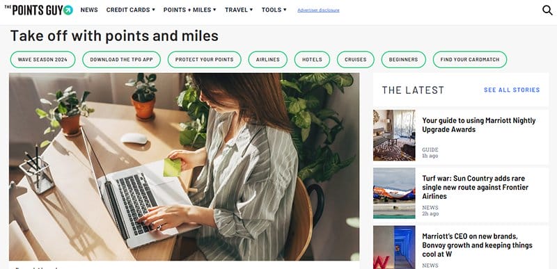
The Point Guy is a great example of websites that provide reliable information on travel and credit cards. This news website uses an advanced programming language to display high-quality images and bolded texts, making it visually attractive.
I love how this site features an expansive double-layer menu on the white header with the blue-colored rectangular “Subscribe” CTA button on the right. Interested visitors can sign up for their daily newsletters in the black-colored footer.
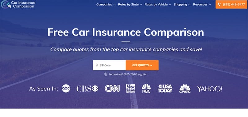
Car Insurance Comparison offers the best dynamic website example for evaluating auto insurance policies. This website features a white color scheme using vibrant photographs and texts to share its dynamic content.
I admire how the homepage greets visitors with a navy-blue tinted road image and a white-and-orange-colored rectangular “Zip Code” insertion link for user authentication.
I love how this great dynamic website uses mega menus that enhance effective content management systems and functionality.
This website's server-side scripting dynamically generates personalized content, enhancing efficient data processing and user experience.

Gadget Flow is an example of an e-commerce site that specializes in tech products and accessories. The hero section of this dynamic website opens with a breathtaking video of gadgets that create a positive impression.
I love the astonishing white color scheme that makes this dynamic website soothing. Gadget Flow's website skillfully implements client-side scripting, ensuring a dynamic interface and user experience.
This e-commerce site uses high-resolution pictures to display its product listings, which makes the site engaging.

Everyday Leader, founded by Colin Tapscott, provides top-notch leadership development training for individuals and organizations. You will admire its multiple color schemes and impressive load time, ensuring a swift and seamless user experience.
The homepage displays a fullscreen picture of Colin Tapscott training four women on a round table.
I like how its black-colored sticky header displays well-placed navigation menus. One striking thing you will notice is testimonials from reputable clients to strengthen credibility. Interested users can contact them using the white-colored “Get In Touch” form in the footer.
Dynamic Websites FAQ
The main difference between a dynamic and static website is that static websites have the ability to appear in a particular format for every user that accesses them. This type of website can only change when a developer modifies the source files. On the other hand, a dynamic site can present different information to different visitors.
YouTube is a dynamic website because it presents tailor-made information that matches the diverse needs of individual users. The homepage and site content of every user are unique and cannot be the same due to their unique interest and algorithm configuration.
A dynamic website provides more website functionality and enables user interaction. This site displays content based on the user’s needs and enables additional website flexibility by allowing connection to a CMS. A dynamic website allows multiple users to adjust the content, and It is less costly to make adjustments and changes versus a static website.