13 Best Liquor Website Design Examples in 2025
Do you own a liquor store and are searching for effective ways to increase conversions for your business? Creating a beautiful website presents your brand in a positive light and helps you attract a specific audience that fits your ideal customer profile (ICP).
The process of creating or launching a liquor website can be challenging. You may need to hire a web designer with an excellent track record of designing liquor websites.
A cost-effective option involves using a website builder to get the job done. The best website builders, like Wix and Squarespace, offer beautiful templates that inspire users to create their dream sites on desktop or mobile devices.
This article explores the 13 best liquor website design examples you can use as inspiration when creating a website of your dreams.
Let's get started.

CASK is a liquor store that offers its customers a range of spirits, locally crafted beers, and expertly mixed cocktails.
This excellent website stands out with a stunning homepage design of its liquor store featuring high-quality images of various alcohols that will keep visitors placing orders.
You can't help but admire the cream-colored “Learn More” CTA button for visitors seeking information on the bar's services. I love how attractive and visually appealing the private dining option with natural light for special events is.
The white-colored navigation bar with different menu options helps visitors seamlessly explore other pages on the site.

Maybe Sammy is an international cocktail bar in Sydney whose passion is to serve customers with delicious drinks and live music from time to time.
The first catchy element of this alcohol website is high-quality videos that showcase the bar’s mode of operation and provide an engaging user experience.
I love how this site uses a two-column grid layout to organize the gallery section, encourage exploration, and make purchasing easier for potential customers.
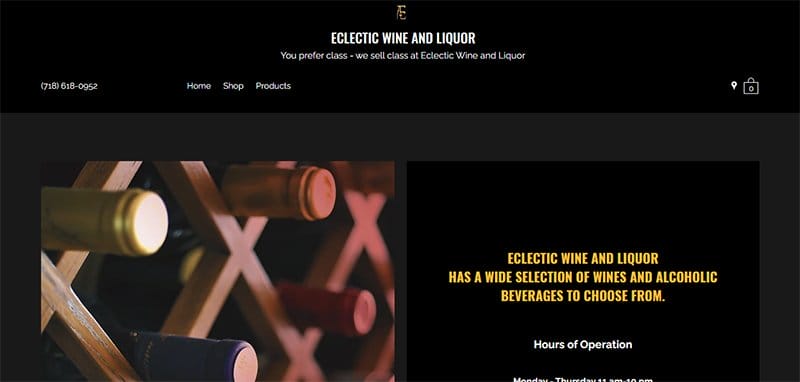
Eclectic Wine and Liquor is a popular store in Brooklyn that sells a great selection of wine to its customers.
This liquor website has a minimalist yet informative layout with a unique display of high-quality pictures, engaging texts, and an eye-catching color scheme.
Below the hero section is a yellow colored *Get In Touch” CTA button that potential customers can use to get more updates on its services.
I like how the wine store features a full-width Google Maps feature on the site's footer to assist visitors in locating the nearest physical location.

Maru Karaoke Lounge is a classy, modern bi-level lounge that offers a great collection of cocktails and karaoke rooms for clients to enjoy music.
I love how this bar website features a parallax scrolling effect, giving the page a unique and sophisticated outlook.
The page features multiple high-quality images and video content that give prospective clients a sneak peek into its expertise.
As you scroll further, the social media icons are strategically positioned at the bottom of the site's footer, making it easy for visitors to access their page.

Beat Box is a bar that offers its clients alcoholic beverages made with a potent blend of fruit wine, giving a refreshing sensation. Justin Fenchel, founder of Beat Box, has contributed to prioritizing the satisfaction of their customers.
My favorite aspect of this web page is the strategic use of high-quality images, a splash of bright colors, and stylish texts in various page aspects.
The sticky navigation bar features vital content that visitors require to make necessary decisions and explore its content.
I love how the testimonial section features a blog of heartwarming reviews from satisfied customers, developing and establishing the brand’s credibility.
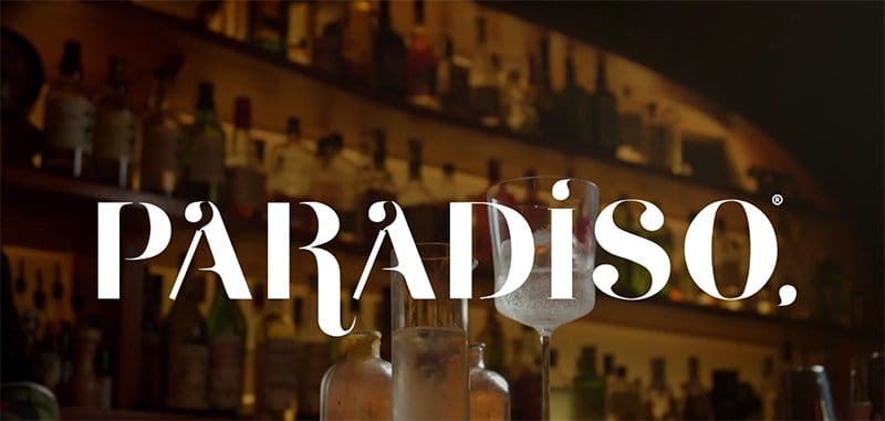
Paradiso is one of the world's best cocktail bars with a perfect Italian-Spanish dish that serves quality cocktails, and provides elegant services and a caring staff.
Welcoming visitors to this page is an image of the clouds and planets that is visually appealing, making visitors anticipate more.
Below the hero section are high-quality images showing some of the amazing cocktails served to customers. The white-colored navigation bar helps potential customers to discover more updates on its services.
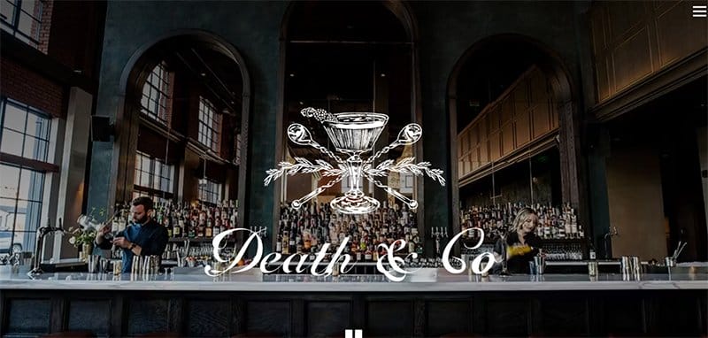
Death and Co bar is a cocktail lounge and a restaurant that serves excellent wine and crafted cocktails and delivers beautifully prepared foods.
The hero section of this visually appealing website displays high-quality images showcasing different sections of the bar and a collection of alcoholic beverages.
I love the multiple CTA buttons that are unique and easily recognizable in their black-and-white color scheme, prompting visitors to click.
The white-colored navigation bar contains a bio section that conveys the brand's identity, effectively serving as social proof to potential customers.

Limantour is one of the top bars in the world and the right place to go for a portion of great food and tasty cocktails like black tea, oregano, and pineapple juice.
The first thing that draws your attention to this site is the striking image of the Limantour liquor store and the chilled glass of wine.
Interested visitors can start by clicking the red colored CTA button to book reservations. The social media links are your one-way ticket to exploring the company's online profile. Customers can use the hamburger navigation bar to explore most of the site content.

Spoiledbar offers drinks designed with quality ingredients that are manufactured locally, giving each sip a taste of freshness to customers.
Welcoming visitors to this page is the image of a skull in red color. Everything about the design screams unique and stylish.
As you scroll further, the cocktail menu makes potential customers select from a variety of options available for purchase.
I like how this wine website displays ample use of its white space to make its contents visually appealing to visitors.

Bar Swift is a multi-award-winning bar that allows friends to connect for conversations while enjoying their favorite beverage.
Welcoming visitors to this website design is a slideshow displaying the full-width image of the bar premises, providing visitors with a picture of what to expect.
Beneath the hero section is a blue-colored CTA button designed to simplify the booking process, prompting visitors to make direct bookings via the site.
The mega navigation bar ensures easy access to different sections, keeping visitors engaged. I like how the site displays ample use of every negative space, making the site appear visually appealing.

Attaboy is a bar that serves creative cocktails in a classic vineyard and space for its customers. My major highlight on the site is the image of a glass of tequila held in the hands of a man.
The black-colored navigation bar helps visitors explore various aspects of the website without any hassle on their devices.
As you scroll further, you can’t miss out on the display of a social media icon for potential customers to browse through their page for more options.
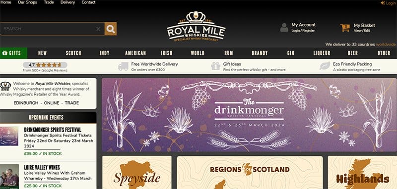
Royal Mile Whiskies is one of the most respected whiskey merchants in the world, and it specializes in the manufacture of beverages like single malt or Irish whiskey.
This wine shop has a minimalist design that has a stunning outlook and makes it easy for visitors to enjoy its content. The dominant colors include brown, purple, and ash.
I love how potential customers can make use of the cart to make online purchases. The mega navigation bar is your stop shop for exploring various aspects of the website with ease.
I love how the FAQ section under the customer service options helps interested customers get answers to their questions and creates a room to ask more questions.

The Booze Shop is a brewery with a reputation for delivering high-quality and reasonably-priced liquor. Welcoming visitors to this site are high-quality images showcasing a variety of liquor like vodka, rum, spirits, beer, and whisky for interested customers to shop.
The white-colored navigation bar features vital information that visitors can use to explore more content and the search button to select specific items.
I love how this liquor website design uses a slideshow effect to make the product display more appealing and intriguing to potential customers.
Liquor Website Design FAQ
Creating a site that will stand out among other wine store websites involves clarifying your website goals, choosing your site platform, selecting your website template with attractive color schemes, purchasing your domain name, establishing your basic branding guidelines, outlining your web page structure, easy navigations, attention-grabbing CTAs, and contact forms.
Some essential elements that you must include in your wine store website are a strong brand identity like logos and company names, an about us section, a service menu, a price list, your past works, your store, a booking link, and contact details, cancellation policy, and opening hours.
There are many website builders online, but the best and most reliable website builders for your wine shop are Squarespace and Wix. These state-of-the-art website builders offer classically designed templates and no-code options that make your building process seamless.
The top liquor website examples you can use as inspiration when building your own website include Brown Forman, Wolf Spirit Distillery, BeatBox Beverages, Pennsylvania Liquor Control Board, Liquor Authority, Beam Suntory, Saucey, Mission Wine & Spirits, Brown-Forman, Remedy Liquor, The Party Source, Breakthru Beverage Group, and Uptown Spirits.
Explore Further
- Liquor Store Business Name Ideas Generator
- Bar Business Name Ideas Generator
- Bar & Club Website Templates
- Great Club Website Examples
- Food Business Name Ideas Generator
- Food Blog Name Ideas Generator
- Best Restaurant Website Builders
- Drink Brand Name Ideas Generator
- Energy Drink Business Name Ideas Generator