35 Best Portfolio Websites to See Before Creating Your Own
Creating a portfolio website can be challenging and rewarding. The elements of design, coding, and content creation required to create one can be overwhelming, deterring many from building their own portfolio sites.
You don’t have to hire a web designer or learn coding to build an online portfolio website. Many website builders like Squarespace and Wix help you build the best portfolio sites at an affordable price without any need for coding or design experience.
This article explores the 35 best portfolio websites that spark your creativity and provide you with inspiration to create your website.
Let’s get started.
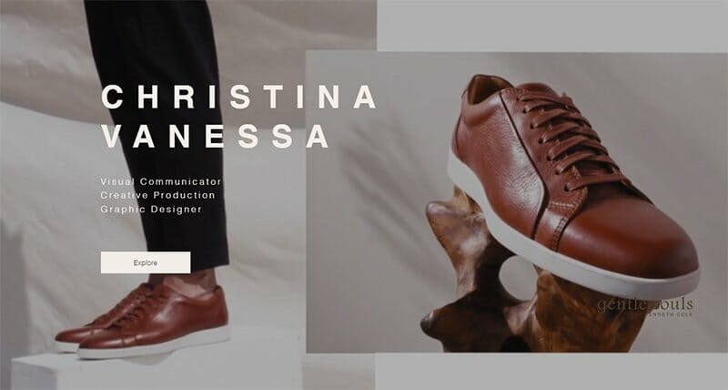
Christina’s portfolio website employs a minimalist web design with neutral colors dominating the website. The center stage of this great portfolio website is a captivating video that communicates the essential elements of her overall portfolio.
I love how the CTA button on the homepage is a soft-peach color with a hover effect. On the other pages, it's carbon gray.
A header is absent from the homepage because the hero video is full-width. However, it's present on the other web pages and displays only two elements. The Explore page features multiple gallery options for all her products and services.
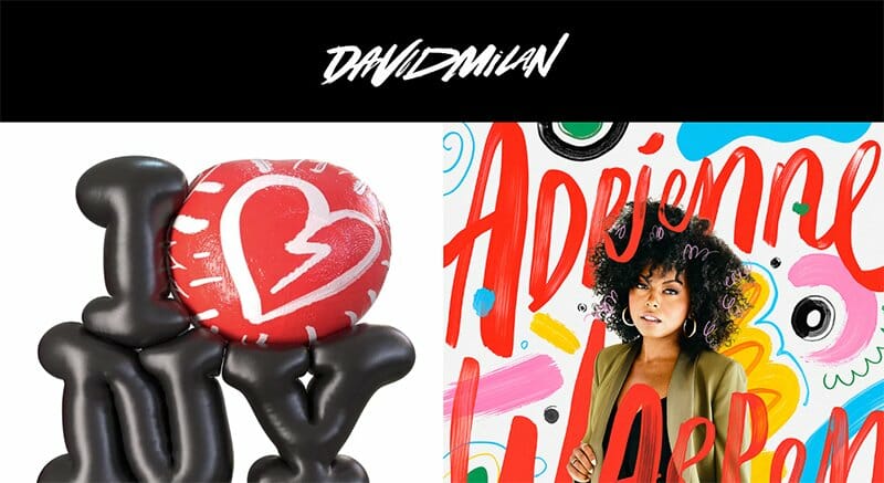
David Milan is a skilled illustrator, animator, graphic designer, and all-around visual entertainer. This webpage features organizations of great repute such as Entertainment Weekly and The Washington Post.
The journey down his one-page portfolio website is memorable. I love how the first attention grabber on his website is the black header that loops his name, written (on its own) with thick white ink.
David Milan’s website footer is a distinct ripe-lemon color that displays his contact details in black fonts.
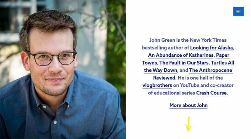
John Green is a New York Times best-selling author. I love how he only displays textual content on the right side of the page. The left side of the page is hinged with a curious blue background, and the web section is written in yellow-green letters.
On his homepage and bio, you'll find a very confident photo of John hinged to the left side. It gives his site viewers and potential customers a calm and domestic feeling as they navigate the site. His webpage also has an FAQ section.
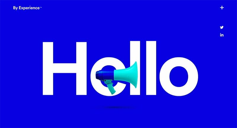
By Experience is a serious contender for the most professional website on this list. The cobalt-blue background gives potential clients a sense of safety.
This portfolio site opens with a looping presentation of who they are, what they do, and what to do with the information.
To replace the navigation bar, By Experience uses icons that stick to the right side of the homepage. By Experience use social media icons that link to its LinkedIn and Twitter accounts.
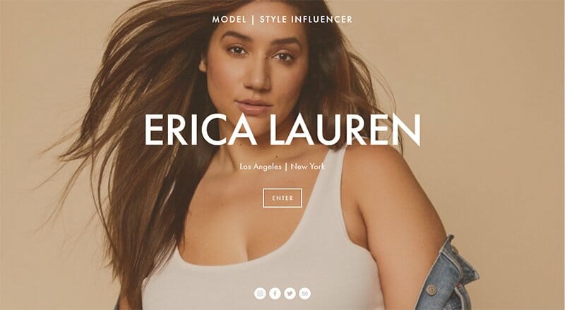
Eric Lauren is a plus-size model with a background in business and music. The first thing viewers see is a slideshow of her modeling pictures and an interstitial gate that says “enter.” This element is relevant in capturing the viewer's attention and encouraging user engagement.
Her website background is white, but when the user clicks a CTA button, the color turns black. The contrast in the background and the click feedback colors shows an artistic view.
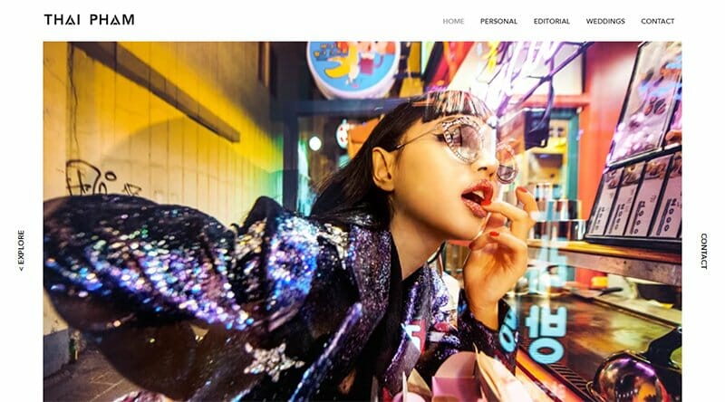
Thai Pham is a photographer and a visual artist. Her website uses a general black-on-white theme.
You will see a visually appealing photo on her landing page, compelling you to scroll down for more. I love her clever use of the parallax scrolling effect to reveal her other captivating photography projects.
She uses a sticky navigation bar featuring five elements, one of which is an editorial showcasing all the reputable magazines that featured her work.
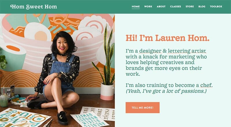
Lauren Hom’s website has an exciting web design pattern, similar to a children’s book. The dark peach CTA buttons sit comfortably on the lily-white background and confirm the homely narrative of the website.
You will quickly see how she underlines texts that she intends for users to remember with an orange-colored pen. Some of them are links to other pages of the website or other websites entirely.
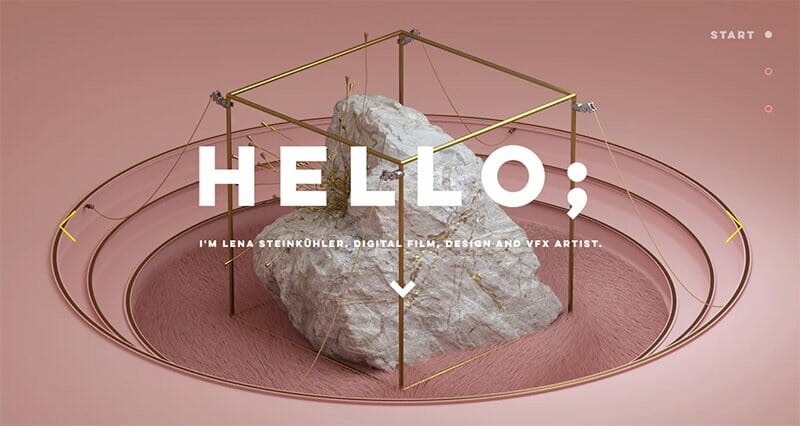
Lena’s website opens her portfolio webpage with the word “HELLO” in big and bold fonts. She employs a slow slideshow on the landing page to showcase her best and most colorful design works.
If you’d like to navigate the designs quicker, Lena conveniently places sunny-yellow arrows to the left and right to make the navigation process interactive.
Lena uses a single-page design layout with three sections, ‘start, work, and about'. The brevity of the entire website is what sells Lena’s effectiveness and professionalism.
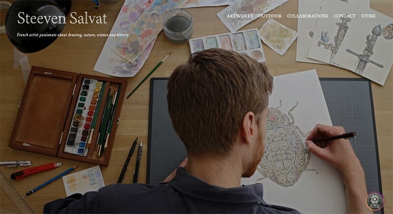
On Steeven Salvat’s landing page, there are no elements beyond this screenshot that you see. However, the auto-scrolling slideshow on the static landing page does a great deal to describe most of what Steeven’s art is about.
You can immediately tell Steeven’s love for animals and ancient mechanics from his drawing choices.
The image of the sculpted lion head at the bottom right is a link to his Instagram page where you’ll find unlimited projects of art. Wherever you go on the website, the image sticks to that point.
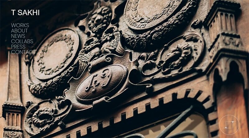
T Sakhi opens with a slideshow of high-quality images. As you scroll down the portfolio page, the contrast of the colorful and vibrant images with the website's black background gives site visitors an artistic experience.
Are you searching for design inspiration? This portfolio website is a good place to start. T Sakhi displays modern design ideas and video elements on every webpage to communicate the ephemeral emotions the Sakhi sisters evoke with their art.
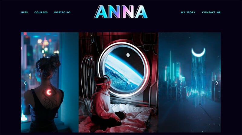
Anna McNaught is a Photoshop artist, photographer, and designer. You will notice that the neon effect that she uses on her website name is one of the features that give the page its futuristic aura.
I like how she is quick to show the logos of the companies that have used her images in the past for social proof. Anna allows you to save all the dreamy and imaginative images on her website with a simple drag-and-drop feature.
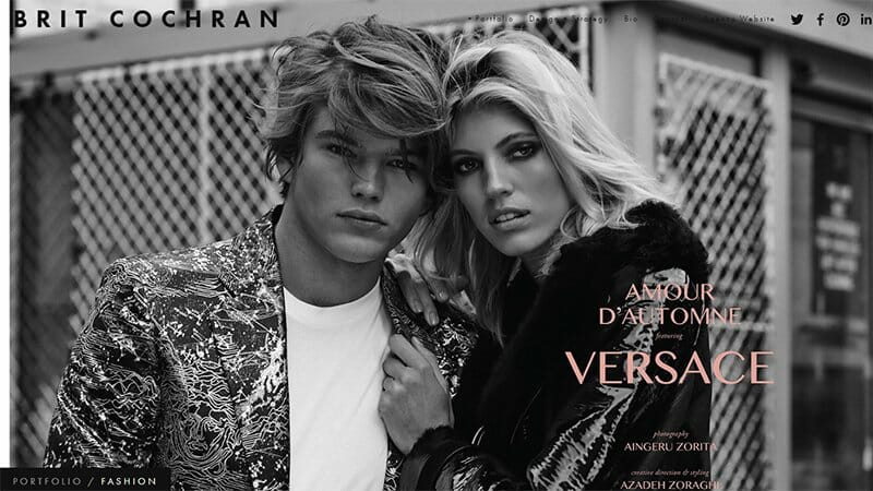
Brit Cochran, who owns a makeup and design studio operates a static landing page that displays high-quality images from certain sections of her portfolio.
She has a five-section portfolio. The images on her homepage are a continuous slideshow of five images. You can see the section that each image belongs to at the bottom left of the page.
This portfolio website has superior micro-interactive elements that allow for nearly mindless user navigation. The command to change through slideshow images almost follows the cursor around.
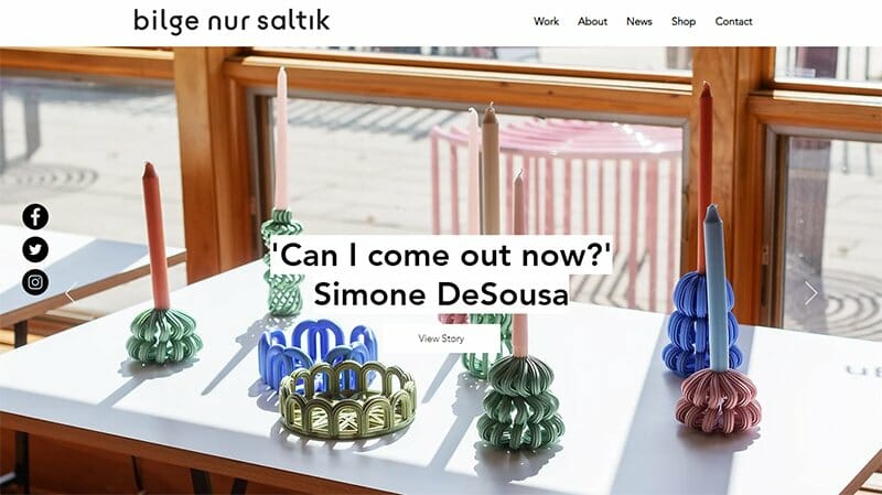
Studio Bilge Nur Saltik’s web design portfolio employs customizable layouts you can easily create on your website.
This portfolio site welcomes you with a white-smokey-coloured pop-up that invites prospective clients to subscribe to the mailing list. Bilge kindly presents her art designs on the website using customizable themes.
While the widgets of her socials stick to the right side of the landing page, the header does not. This design style is understandable because there are limited features on the page and the exploration only begins as you click through links.
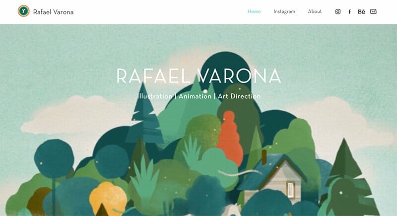
Rafael Varona uses his website as a channel for his social media accounts. On his sticky header, what you’ll mostly see are links to his socials (Instagram, Facebook, and Behance, which) showcase a bulk of his online portfolio.
In his hero section, you'll see that he syncs a number of his creative jobs into one interesting looping illustration.
This exciting web design allows for responsive templates on mobile phones. With mobile, you’ll only see a fraction of the illustration, while a hamburger icon replaces the components of the header.
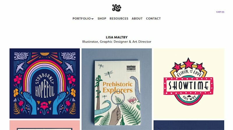
Lisa Maltby is an illustrator, graphic designer, and art director who loves nature. She uses a white background for her website so that all the colors of her portfolio examples pop.
I like how Lisa's portfolio displays the logos of companies she has worked for in carousel form and handcrafted prints for sale on the Shop page.
Interested visitors can purchase by adding items to the cart whose icon is away from the other header components at the top right.
Alex McDaris is a designer and art director who owns a design studio. Any time the cursor comes in contact with the GIF images, it shows a header that illustrates the purpose of the title.
You can't help but notice the background colors, high-quality images, and the way she uses color text to create a visually striking and colorful effect.
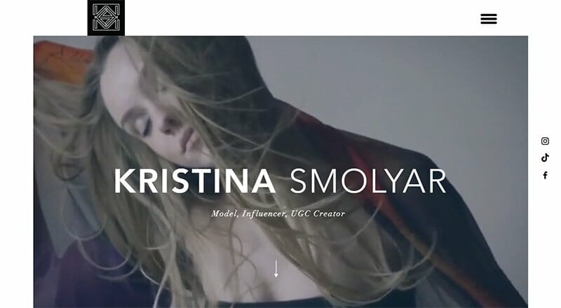
Kristina Smolyar is a model, influencer, and UGC creator, she tells this with white-colored fonts superimposed on her hero video. Her attractive logo stands out from the frame of this video at the top left of the portfolio website. Also worthy of note is that her website has no header.
Her one-page portfolio website employs modern techniques like parallax scrolling and displays her photos such that you can drag and drop them externally. She features logos of reputable clients as social proof for other prospective clients.

Janet Echelman is a sculptor, popularly known for her use of unlikely materials and computational software.
Her website background is a pale shade of gray. She intentionally displays her artwork and other visual elements in a fanciful card-like fashion.
Janet has a lot of press and her web page allows her to display all the newspaper pages and magazine covers she appears on.
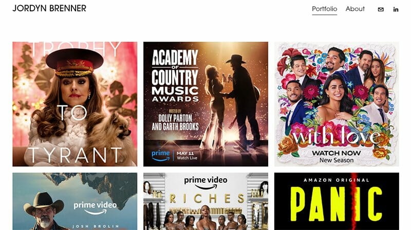
Jordyn is a creative director at Amazon Studios. On her portfolio page, the cover prints you see, whiten up and reveal the movie or TV show title as you place your cursor over them. You can also drag and drop the cover prints, but they will copy as a link, not an image.
She places her Contact CTA centrally at the footer, with the same black and thin fonts of the header components, clearly visible on the white background.
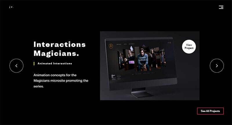
Joao Verissimo is a motion and interaction designer. On Joao’s webpage, some components animate when the cursor hovers over them to give it a trendy outlook.
The primary colors of his portfolio website are black, turmeric, and white. You can’t miss out on the hamburger icon on the top right and his compact logo on the top left that sticks to the screen. Joao expertly uses GIF promotional videos of his best works on his portfolio site.
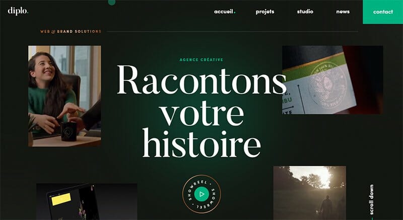
Diplo is a French-based branding and product designer. His website uses the hover effect in such a way that clickable elements light up with everglade rays when they come in contact with the cursor.
With Diplo’s website, you see that you can have more than one frame on your hero page. Diplo has four short videos playing simultaneously on the four frames of his landing page.
Most of the CTA’s on the website are not the conventional brick buttons, they are usually plainly exposed.
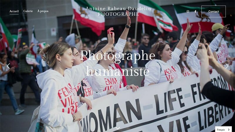
Antoine Rabeau Daudelin is a humanist photographer who is very passionate about his work. His homepage is a full-frame slideshow of his most intriguing photos.
The arrows on the bottom and to the side of the images are elements of a micro-interactive webpage.
Antoine opts for a plain white background to display his portfolio online. His website is simple with a modern intricate approach. I like how you can click any portfolio image and view it in full screen.
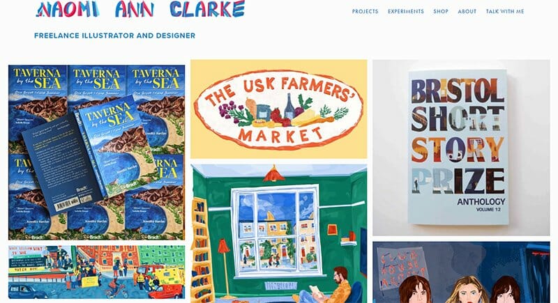
Naomi Ann Clarke is a freelance illustrator and designer focused on creating bright and bold illustrations. She makes her website name stand out with the color blending of dark pink and dark sky blue.
Dark sky blue is the default color of the CTA buttons and header components. They turn dark pink as they come in contact with the cursor. The colors are good choices as they sit nicely on the pale gray background of the website.
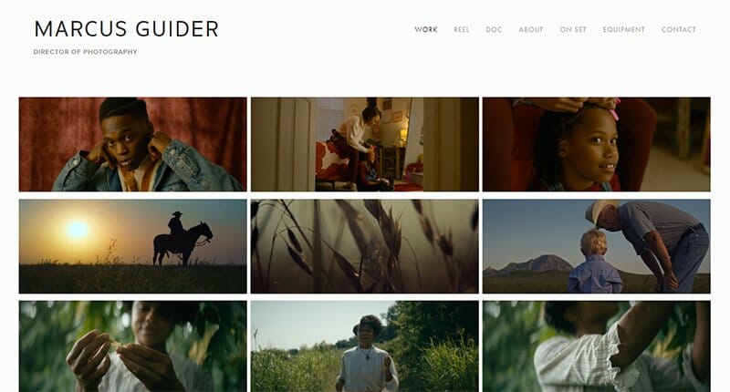
Marcus is a film and media photographer. He characterizes his website with minimal fonts, small-sized picture frames, and lots of white spaces. You can tell that this is one of the portfolio website examples with a minimalist design.
I particularly like how he arranges his portfolio in groups of three. Every three pictures represent a project (movie or commercial) that he has shot.
When you click over any of the three frames in a group, you're taken to a different page where you’ll see other pictures for that project.
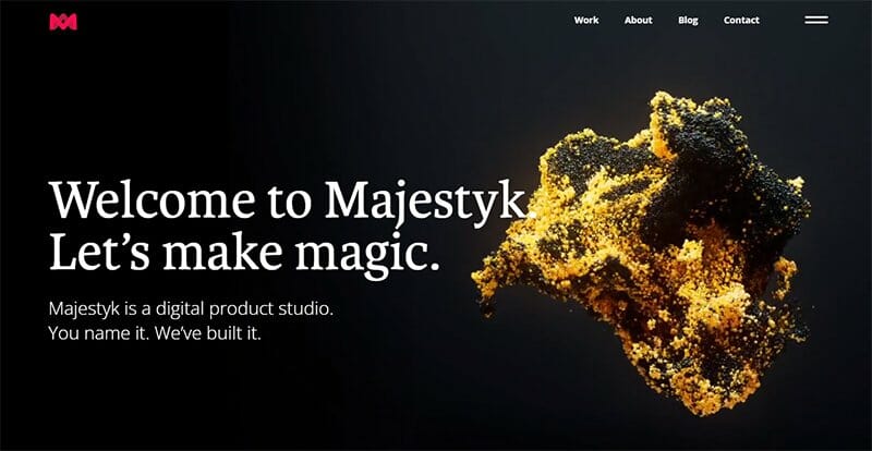
Majestyk Apps helps create exciting digital experiences for brand users, thus their website cannot be any less so.
The double strokes on the top right beside the conventional header components reveal elements of both the header and the footer against a white backdrop. I love how this portfolio site features brick-red CTA buttons that toggle as you hover the cursor over them.
Majestyk’s website shows the logos of big brands that they've worked with along with the creative work process involved with some brands' design portfolios. Free portfolio resources are available.

Nicole is an illustrator from Shanghai, now based in Portland, Oregon. You will observe that the header elements are on the left side of the webpage while the website owner's name and contact are on the right. On most free portfolio websites, it is usually the other way around.
Also worth mentioning is that when you scroll down to the end of the homepage, you will not see a footer. Nicole ensures that she exhausts the page with her unique and vibrant paintings.

Rou Marcellus is a pro in the photography business with a BFA in commercial photography from Savannah College of Art and Design.
Her images have a minimalist aesthetic as does the web design of her portfolio website. She centralizes her website name and header and all her web colors are neutral and albescent, while the CTA buttons are black.
Rou dedicates her homepage to frames of her high-pixel images and uses another page to classify them according to the emotions they evoke.
Emma Da Silva is a young and talented photojournalist. On her website, what will pop first is the cursive style with which the website name is written. You can’t help but notice how the brand name and other features of the header are at the top center.
Her excellent portfolio website proves that you don't need multiple pages to showcase your talent and expertise regarding your work and impress potential clients.
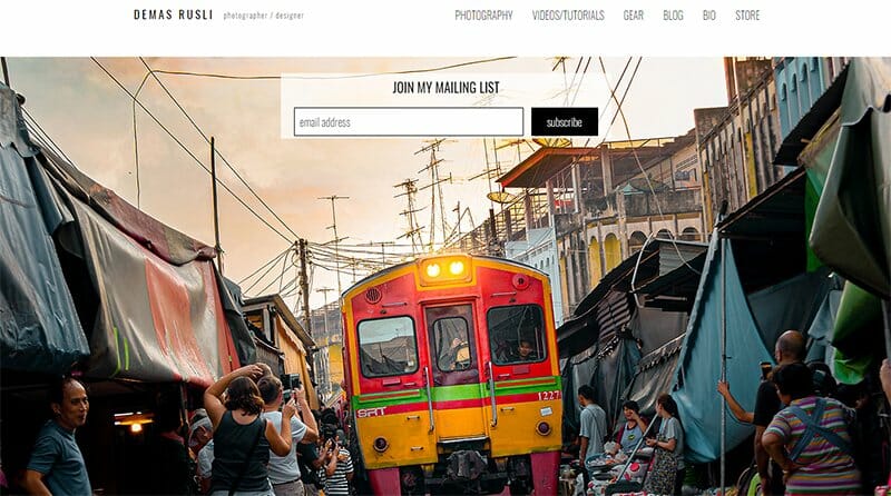
On Demas Rusli's portfolio website, the box to subscribe to his mailing list is not a pop-up, nor is it found at the foot of the page, as it appears on other portfolio websites. Here, it takes center stage superimposed on the beautiful hero images set in an auto-scrolling slideshow.
One of his header components is a link to video tutorials where he teaches the skills required to achieve elite photography and editing.
Myghail is the portfolio website of Mihailo Vucenic who has comfortably settled with graphic design as a lifetime career path. His hero image is a multi-colored silhouette that contrasts well with the black background of the website.
You can see Myghail’s header at the center of the page displaying three menu buttons. One leads to three frankly unique online stores that use attractive marketing tools to enhance customer experience.
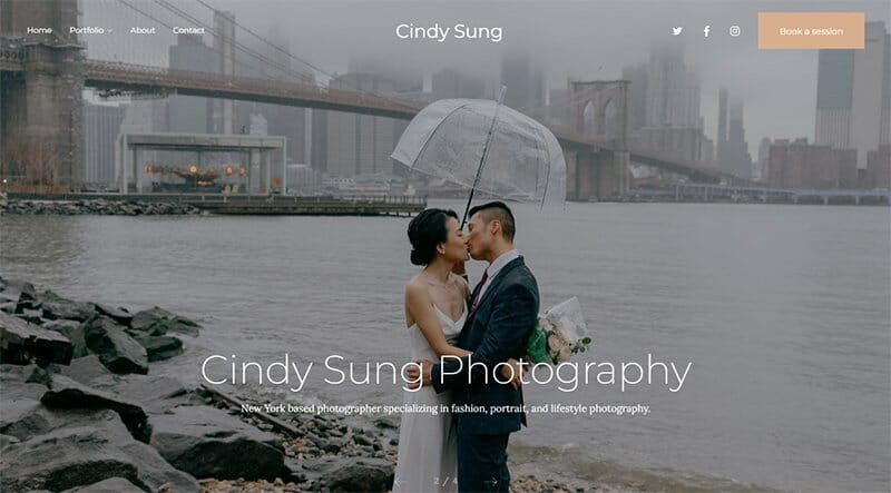
Cindy Sung is a talented New York-based photographer. On her landing page, there is a wholesome outdoor image of Cindy in greyscale. The CTA buttons that she uses very frequently are a very light shade of brown.
She makes sure to use beautiful images for the cover photos of the different portfolio sections labeled on the homepage. Her testimonials show the pictures of the clients besides their reviews.
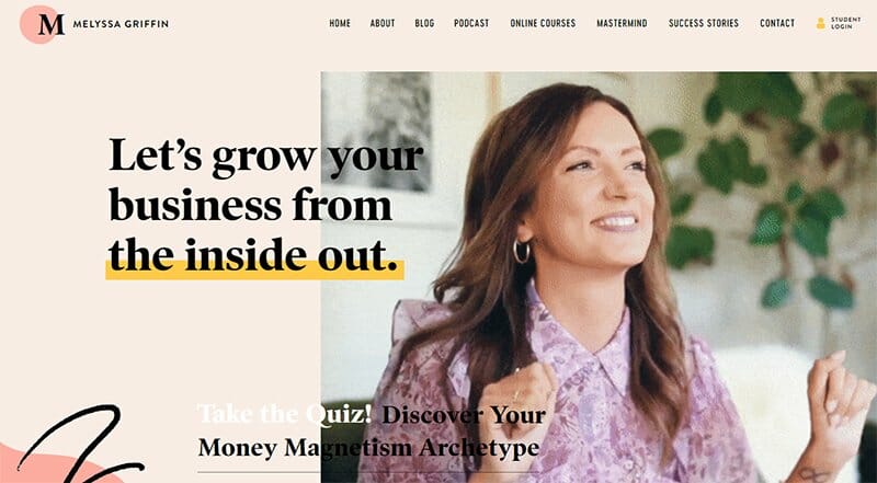
Melyssa Griffin teaches entrepreneurs how to navigate the daunting world of creative marketing. She uses a long and continuous homepage for unlimited storage of her rich portfolio.
I love how Melyssa invites users who are yet to create a free account for her courses, on a free trial period with her quiz pop-up. She uses CTA buttons with varying colors to make the web page more on edge.
Her website has a personal touch that accommodates enough pictures and videos of smiling and dancing to make visitors comfortable.
Chris Collado is a seasoned photographer, graphic designer, and filmmaker. He is good with his craft and the portrait of the blue-eyed lady on his homepage does well to exemplify that.
The other images on the homepage are tightly knit together, leaving no white background space in view.
Chris opts for a non-sticky header so as not to obstruct any details of the full-frame images on his homepage. Along with his fancy logo, the header contains several components, one of which he uses to sell prints.

Ling K is a group of creative professionals and graphic designers. This website's color theme is brown, white, and mustard yellow. I love the choice of colors that produce a beautiful and stylish appearance.
You will find a search function on Ling K’s website that helps visitors easily find the information they need quickly.
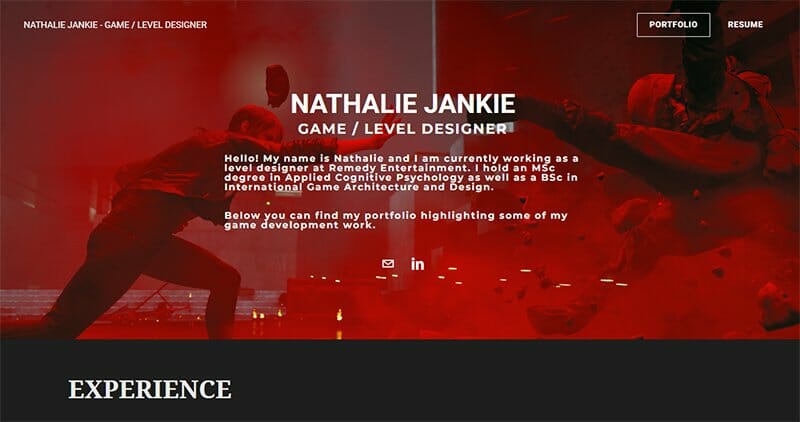
Nathalie Jankie is a game/level designer at Remedy Entertainment. While Nathalie’s sticky header has only two components, her homepage is loaded with her bio and experienced portfolio.
Given Nathalie’s coding knowledge, she integrates tracking codes on her website to measure the user's bounce rate. This insight into user behavior will help her improve website performance. You will find Nathalie’s downloadable resume on the website.
Best Online Portfolio Website Examples FAQs
An online portfolio is a digital showcase of your work, skills, and achievements displayed on a website to exhibit your expertise and attract potential clients or employers.
The best portfolio website builders are Squarespace and Wix. These website builders come with attractive templates that are a vital aid to help you create your one-of-a-kind portfolio website.
A portfolio site is worth it because it enhances your professional image, boosts visibility, establishes credibility, and opens doors for networking. When your potential clients want to check your credibility, the internet is the first place they’ll go, and you have to be there waiting for them with a worthy portfolio site.
A great portfolio website has an appealing design, clear navigation, high-quality content, consistency, responsive layout, engaging user experience, a compelling ‘About Me' page, easy contact access, fast loading times, interactive elements, testimonials, and regular updates to showcase growth.
Explore Further
- Art Portfolios
- Marketing Portfolios
- Examples of Web Developer Portfolios
- Best Portfolio Website Builders for Designers
- Personal Websites
- Portfolio Website Templates
- Developer Portfolio Website Templates
- Portfolio & CV Website Templates
- Web Designer Portfolio Website Templates
- Personal Website Templates


