22 Recruitment Website Design Examples We Love
A well-crafted recruitment website is essential for showcasing your agency's expertise and bringing the best candidates your way.
Whether you are building a new website or redesigning an existing one, you don’t have to spend a fortune on hiring a website developer.
Staffing agencies and recruiting firms can use the best website builders like Squarespace, Wix, and Webflow to create the best recruitment websites. These tools help you to achieve excellence in web design and user experience.
This article covers the 22 amazing recruitment websites examples that you can gain inspiration from to design your own site.
Let's get started.
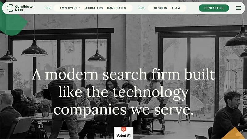
Candidates Labs is a search firm that offers recruitment services across tech hubs in the US and is remotely accessible to any job seeker nationwide.
Monochrome images and sea green call-to-action buttons are typical on this recruitment website. The header combines a floating menu bar that sticks to the top of the screen with a hamburger icon at its end, revealing supplementary information.
I like the subtle curvature applied to the edges of tiles and frames, enhancing the overall aesthetic appeal of the site.
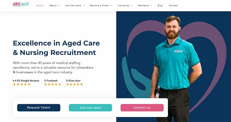
Aktrapid, a specialized healthcare sector recruitment agency based in Victoria, embraces a clean and minimalistic design approach.
This staffing website showcases its services with small icon illustrations and limited fonts. The consistent use of the blue and dark pink color scheme, extending even to product images, provides a cohesive visual experience.
I love how the hinged header, featuring minimal text fonts, maintains a spacious layout, accommodating up to seven components without appearing cluttered. The blog section enhances visitor engagement, prolonging their time on the site and encouraging interactivity.

OnHires has earned immense popularity in the global tech sector, aiding businesses in assembling a recruitment crowd from the ground up. This recruitment website employs a layered format, featuring crisp images of real people in nearly every section.
The call-to-action buttons, initially green, seamlessly transition to blue upon cursor interaction. I love how the combination of green and blue hues across each layer gives the website a vibrant and imaginative design.
A straightforward contact form close to the footer offers the flexibility to expand should potential clients wish to provide more detailed information.

Rocket takes pride in its AI-driven recruitment workflow, delivering superhuman efficiency. The website's clean and simple design ensures easy reading of the web copy.
The homepage of this great recruitment website features three strategically placed call-to-action buttons. You can find one on the white header, another in the navigation zone, and the third near the footer. All three buttons share the same compelling prompt: ‘Book a Call'.
Rocket includes a blog and a chat feature which enhance user interaction and provide valuable resources.

Prometeo Talent is one of the best recruiting agencies specializing in hiring tech and engineering talents in Latin America. One of the first elements that will capture your attention is the animated flowchart.
The header is a plain white bar carrying three components, plus the company logo and hinged to the top of the screen. The call-to-action buttons exhibit a 3D-like effect, seemingly popping out from the screen.
When the cursor hovers over the CTA buttons, they recede into place. This striking 3D effect captivates the visitor's attention.
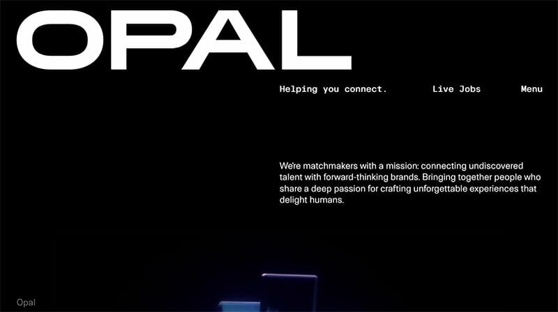
Opal is a recruiting agency specializing in the UX, creative, and tech industries. What stands out is the interactive feature on the landing page. By scrolling upward, visitors can dynamically enlarge the fonts of the company logo.
For job seekers, the homepage provides information on how many jobs are available and guidance on the application process.
Hiring companies are not left without a helpful feature. There is an expandable online form close to the footer where they can extensively describe what role they are looking to fill.
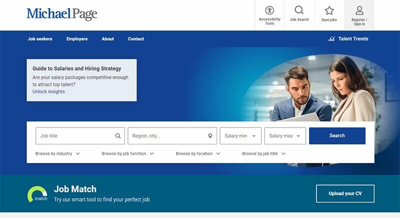
The Michael Page Group boasts a proven track record in successful job search and recruitment within the UK. This recruitment website embraces a formal and professional aesthetic with a predominantly blue and white color scheme.
You can find a special two-layer navigation header on Michael Page’s website. At the top layer, visitors will find a link to accessibility tools catering to those with disabilities or limited sensory abilities.
The components on the bottom layer open up an extensive preview when the cursor hovers over them. This preview reveals images, sub-menus, and respective CTA buttons.
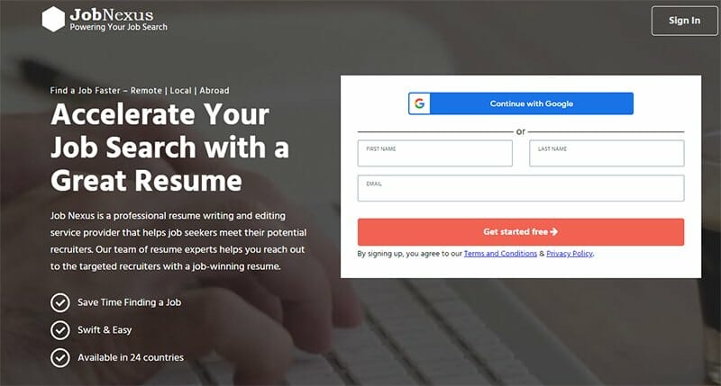
Job Nexus connects job seekers with their potential recruiters by providing them with valuable resume writing and editing services.
This headerless website has a clean design with a layer-by-layer arrangement of its pages. The footer page is where you will find all the relevant links to other portions of the website.
I like the signup form on the landing page with an auto-fill feature using your Google details. The bold call-to-action buttons have an attractive bean-red color that is difficult for visitors to miss.
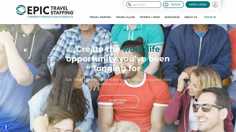
Epic Travel Staffing is a recruitment agency that helps traveling resident nurses and allied health technicians find their ideal travel nurse recruiter. This recruitment website employs a subtle parallax scrolling effect for the landing page and the early parts of the navigation zone.
I like the colorful photo embeds of travel nurses engaging in recreational activities. These images are dreamy enough to make other travel nurses desirous of the Epic Travel Staffing experience.
As testimonials are essential for a recruitment business, Epic presents its social proof with a carousel of five frames showing satisfactory reviews.
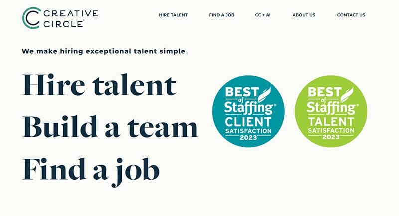
Creative Circle specializes in creative staffing and recruitment within the digital marketing field. The landing page features stylish fonts for text which are clickable.
When the cursor hovers over the text, a coral blue paint stroke appears to indicate that these are clickable links. Creative Circle integrates an online chatbot on the web page to enhance the user experience.
In the footer section, the web page provides additional menu options such as Blog, Privacy, and Accessibility Settings. This approach prevents the page header from becoming too overwhelming.
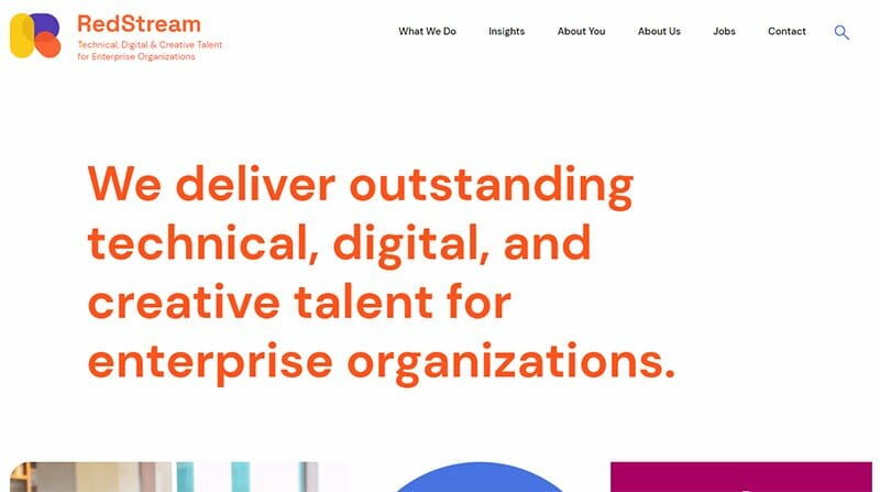
RedStream is a recruitment firm for technical, digital, and creative talent. I love the use of a white background, any other color would conflict with the colorful tiles used in displaying site components.
This recruiting site uses bright colors like yellow, purple, and orange, mirroring the colors from the company's logo. I love how the staff bio page showcases high-resolution imagery.
What sets this site apart is its distinctive call-to-action buttons. Each resembles a box with an eye at its center. When interacted with, the cursor triggers an expansion, revealing the enclosed text inscription.
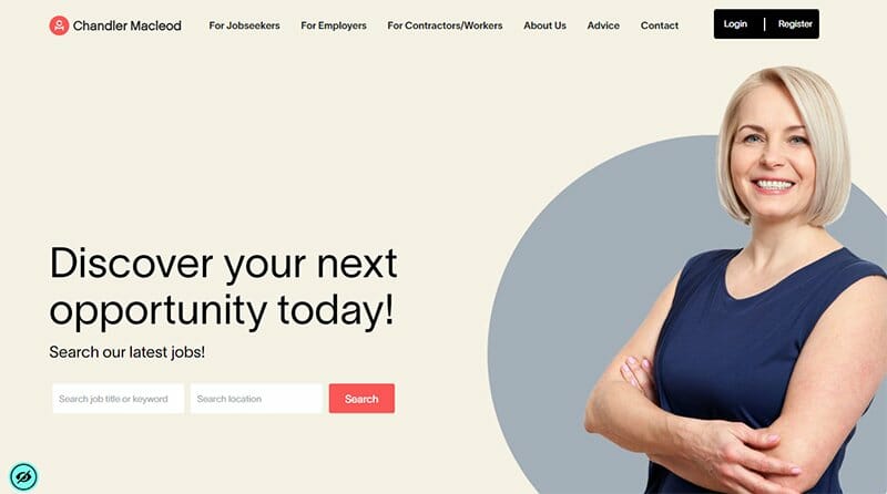
Chandler Macleod is a seasoned venture staffing agency boasting a long-standing presence in the industry. The website's homepage stands out with its meticulously layered presentation exuding professionalism.
The dynamic hero image is a notable feature. You'll be greeted by a fresh, high-quality image of a field professional, distinct from your initial encounter. You can find a link to a sitemap at the tail end of the web page showing a brief overview of all website elements.
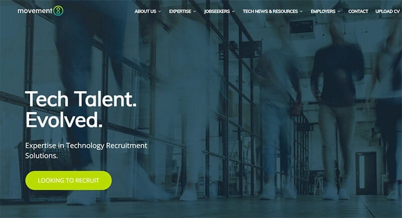
Movement8's specialty is providing Tech & IT recruitment and executive search services across the UK and Europe.
If you're seeking inspiration to create a much-needed recruitment website for your company, this site is a must-visit. Movement8 offers several admirable features that you can add to your own website.
One standout aspect is the dropdown menus in the header bar. The navigation zone features a section displaying the latest jobs, with their salary range and application instructions.
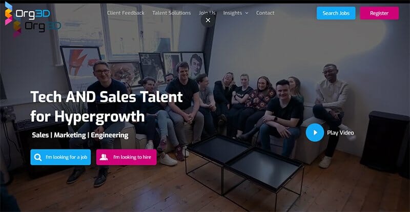
Org3d is a company known to build trust with fast-growth tech businesses US-wide, to become their exclusive talent partners, and assist in scaling up sales.
This great recruiting website stands out for its contemporary web design and cutting-edge user interface. The landing page seamlessly integrates a looping background video that spans over a minute without causing delays or disruptions to other site features.
On the client feedback page, there are more than enough video testimonials to convince potential clients to make Org3d an extension of their company.
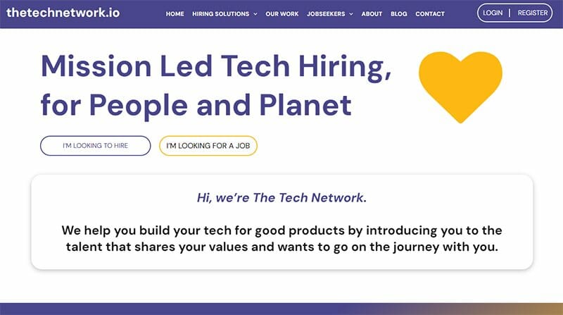
The Tech Network offers straightforward and efficient recruitment solutions for companies dedicated to creating technology that benefits people and the planet.
Employing ample white space on the landing page is a thoughtful touch, giving visitors a soothing experience upon entering the site. This open space serves as an excellent backdrop for the predominantly blue and yellow color scheme.
I like how this website displays companies it has worked with in larger fonts than the other texts on the website.
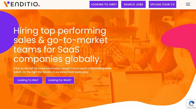
Venditio excels in recruiting high-caliber talent for global SaaS companies. This recruitment website showcases a vibrant visual: splashes of yellow, orange, and blue paint against a dynamic video backdrop.
In the navigation zone, scrolling animations smoothly reveal the SaaS opportunities available, the companies Venditio has worked for, and the client testimonials.
The space management of these scrolling animations allows the homepage to come to a quick and easy close with its gray-colored half-page footer.
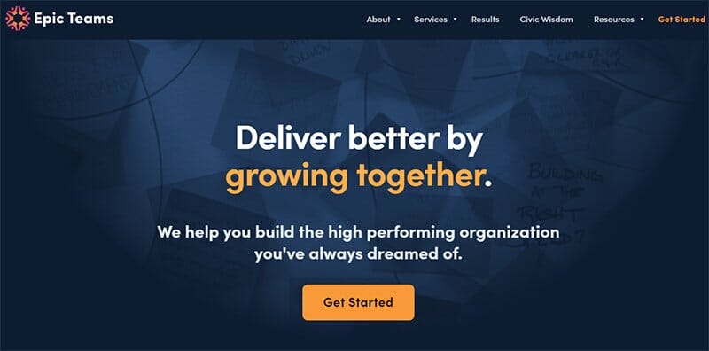
Epic Teams empowers the next generation of leaders in rapidly growing startups. What sets this website apart is its sleek and refined layout.
The large and small icon illustrations make the website beautiful to behold. Pictures of happy-looking individuals displayed on this recruitment site draw visitors' attention.
Epic Teams employs a dynamic color scheme, alternating between black and elf-green backgrounds. On both background types, the subdued-orange call-to-action buttons blend seamlessly.

Handshake, a recruiting platform, facilitates early connections between employers and Gen Z talent by linking them with leading educational institutions across the US.
This recruiting website offers a user-friendly experience, making it accessible to fresh graduates and discerning employers.
Handshake features a two-layer navigation bar. The lower bar remains anchored to the page as you scroll while the upper bar discreetly tucks away. Additionally, the vibrant lime-green hue of the call-to-action buttons enhances the website's trendy overall web design.
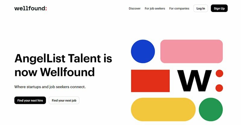
Wellfound, previously known as AngelList Talent, stands out for its ability to connect job seekers with the most promising startups in their area.
This recruiting website introduces lively icons at the beginning of each page, infusing energy into the initial black-and-white scheme. I like this website's seamless integration with Google. Users can easily create a Wellfound profile using their existing Google credentials.
Navigating the job search page is a delight for seekers, thanks to its meticulous categorization of job roles, clearly indicating location and salary ranges.
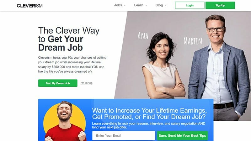
Cleverism empowers career enthusiasts to land their dream jobs and offers valuable advice to help new employees negotiate higher salaries.
The website's header features a sleek white bar with CTAs in a vibrant medium green color. One standout feature is the hero image showcasing the site's owners, Ana and Martin, reinforcing their credibility and personal touch.
Cleverism strategically incorporates SEO-friendly wording in its call-to-action buttons. So, if anyone asks Google, “How can I rock at my job interview?” they find their way to this exceptional website.
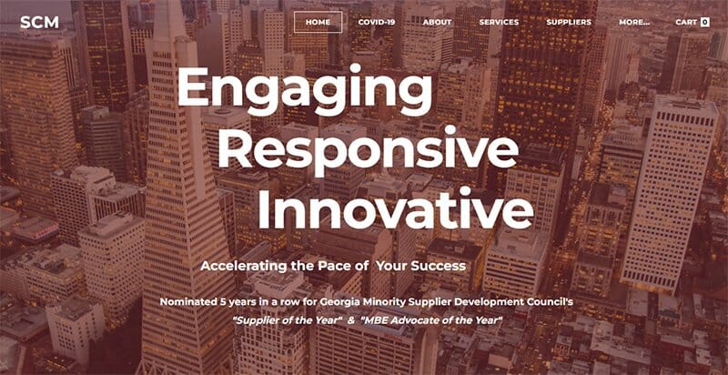
Signature Contingent Management is a Managed Service Provider (MSP) and a Talent Solutions industry. The hero page features a full-width background image consistent across all other pages.
Initially, the header appears transparent when the page is static. However, as you scroll down, it transforms into a white bar affixed to the top of the screen. SCM provides a downloadable video in the navigation area that explains their services.
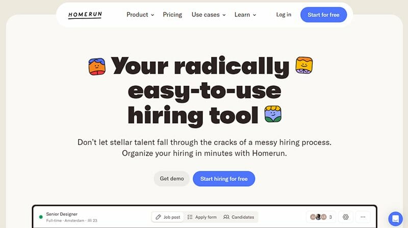
Homerun helps small businesses create a one-stop hiring platform with the most modern features for easy recruitment. This great website features a floating capsule-shaped header bar that sets the pace for seamless navigation.
Cards or tiles are the main layout elements on this website. These cards make for a responsive design and are ideal for mobile devices.
In displaying client reviews, Homerun uses a self-scrolling carousel, a unique feature on recruiting websites. The chat box on this website is like a condensed web page with a home, message, and help section.
Best Recruitment Website Examples FAQs
Setting up a recruitment website is straightforward with the help of various website builders. Squarespace and Wix are among the top options that offer excellent features and quality output. All you need to do is choose a suitable recruitment website template, and customize it to your preferences, after which you can publish it on the web.
Recruitment or staffing websites typically expect job seekers to create a comprehensive profile using their resume, relevant skills, work experience, and contact information. Additionally, they may encourage candidates to set up job alerts, apply directly to job listings, and engage with employer content to demonstrate interest and proactiveness in the job search process.
Your recruitment agency website should feature a clear description of your services, a user-friendly job search function, an easy-to-use contact form, and a compelling ‘About Us' section highlighting your expertise and team. Consider including client testimonials, blog content on industry insights, and a strong call-to-action for job seekers and employers.
Explore Further
- Recruitment Website Templates
- Recruiting Statistics for Recruiters and Job Seekers
- Recruitment Agency Business Name Ideas Generator
- Staffing Agency Name Ideas Generator
- Best Applicant Tracking Systems and Software Tools
- Employability Skills
- Self-Employment Guide
- Best HR Software Solutions
- The Ultimate List of Employee Productivity Statistics
- Best Employee Monitoring Software


