25 Best Red Website Design Examples In 2025
Are you interested in creating an outstanding website design with vital elements that will seamlessly grab visitors' attention? Use vibrant colors like red in your web design layout.
With this element, you can easily control the perception of visitors and encourage them to make necessary purchase-based designs.
Use the best website builders like Squarespace and Wix to design state-of-the-art red-coated websites that keep visitors entertained and willing to explore. These website builders offer custom red website design templates that you can use when creating your own webpage.
This article covers the 25 best red website examples you can use as a source of design inspiration when creating your site.
Let’s get started.
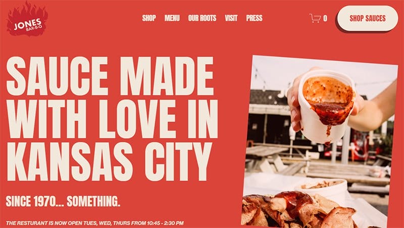
Jones Bar-B-Q, other than its creatively crafted name, took creativity to a whole new level when designing its food website.
This site is just as chilly as the products they offer with a dark coral–red background with fine white prints which helps this section stand out.
The brand’s memorable logo embodied with a burning fire at the top left corner of the homepage is eye-catching and suitable for a food sauce brand.
My favorite aspect of this food-based website is the motion graphic feature that rotates the page with great intensity.
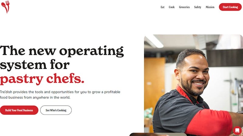
Tre’dish provides the tools and opportunities for you to grow a profitable food business from anywhere in the world. I like how the first thing you notice is a stunning high-quality image of a professional chef with a motion text feature at the left side of the page.
Interested visitors can click the fire engine red-colored call-to-action button to enjoy some of the benefits of Tre’dish.
As you scroll across the page, you will see various eye-catching elements like an automated slider of high-quality images, and vector designs.
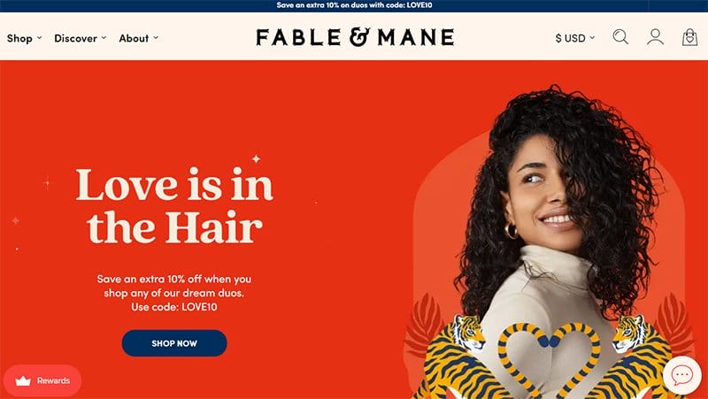
Fable & Mane is the brainchild of Akash Mehta and Nikita Mehta, who came together to create an outstanding hair product to help people keep their hair lush and beautiful.
Welcoming visitors to this good red website is a video background content featuring details about the company which helps leave a lasting impression on visitors.
I like how the looping video features a clever use of the color red in most aspects of the page which helps to stir up strong emotions from visitors.
As you explore the page further, you will see other stunning colors like bright orange, gray, rubber ducky yellow, marine, green, light eggplant, and shades of rich black.
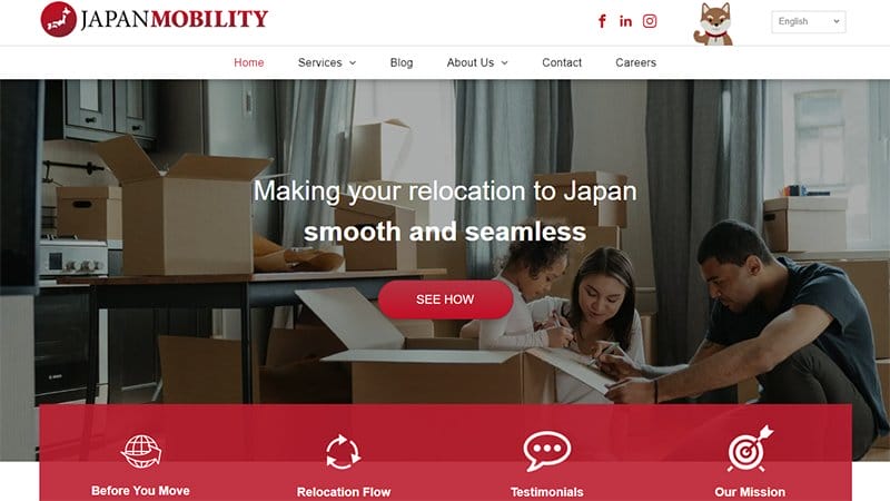
Japan Mobility specializes in providing cost-effective relocation services throughout Japan to various clients across different parts of the world.
Welcoming visitors to this stunning web page is a slider feature displaying multiple eye-catching Japan-based images in the hero section. Visitors can proceed to click the Cornell red-colored CTA button at the center of the page.
I love how the testimonial section uses a slide show feature to display heartwarming content about Japan Mobility’s satisfied customers and previous clients.
The white-colored sticky navigation bar with a drop-down feature makes it easy for visitors to explore various aspects of the page and make necessary decisions.
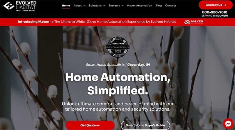
Evolved Habitat has a well-trained team that specializes in simplifying complex technologies and seamlessly integrating them into your interior design for an aesthetically pleasing result.
Welcoming visitors to this outstanding red website design example is video content that explains the brand's activities in the hero section.
Visitors can choose between clicking the Ferrari red-cored “Get Quoted” CTA button or the transparent buyer guide to get on board with the company operations.
As you explore further, you will love the use of a zig-zag layout to display various page contents like the company services with high-quality images and engaging texts.
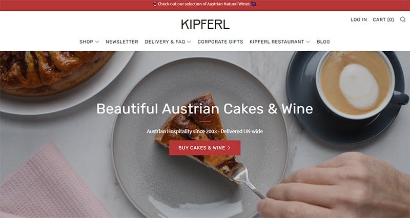
Kipferl is a cake and wine-making brand that offers its product in an engaging and visually appealing manner on its webpage.
The first catchy thing you will see on arrival is a looping video content featuring people eating the brand's cakes and elegantly drinking wine. Interested visitors can click the faded red colored “Buy Cakes And Wine” CTA button.
The search function on the white-colored sticky navigation bar helps visitors and potential customers have a focus search and identification of desired items on the page.
You can click on any of the social media icons strategically positioned on the white-colored site’s footer which links to the brand’s online profile.
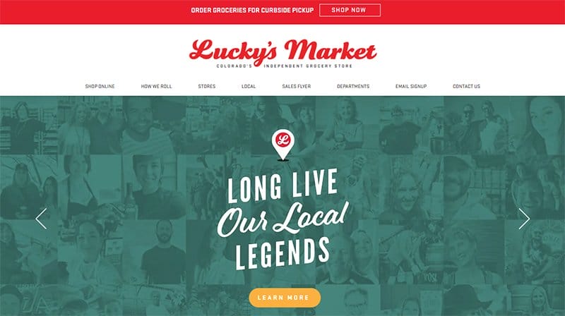
Lucky’s Market offers delicious organic and natural food items at affordable prices to its customers across different locations.
Welcoming visitors to this amazing red website example is a catalog of graphic design featuring eye-catching content about the brand in a slider format.
The center of the page uses a powerful hue in the form of a red background to get the attention of visitors to the location section.
Potential customers can check out various Lucky’s Market locations by clicking any of the high-quality images displaying different locations.
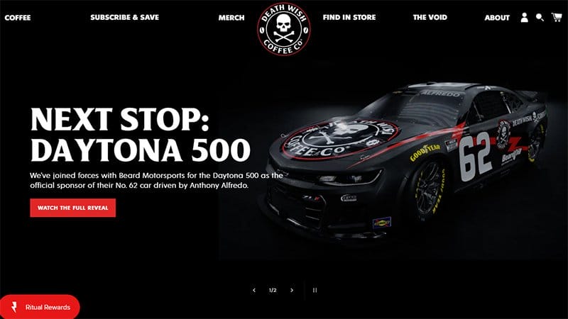
Death Wish Coffee follows strict grading requirements to ensure quality and consistency from cup to cup. I love how the black background makes all the site’s content pop and visually appealing which is designed to compel visitors to make a purchase.
The black-colored sticky navigation bar with a drop feature makes it easy for visitors to explore the site content.
My favorite aspect of this stunning webpage is the lava-red coated CTA buttons that help to get visitors' attention on the most vital parts of the page.

Alleyoop is a fashion and cosmetic-based brand that offers state-of-the-art products designed to make their look and feel beautiful.
The first catchy element visitors will observe is an automated slider in gradient collated graphic design displaying the brand's products and activities.
Each of the design elements features a bright red colored “Shop All” CTA button that encourages visitors to explore the shop page.
The lovely arrangement of the brand’s products in multiple card design layouts with high-quality images gives visitors a peek into what they offer.
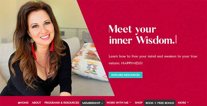
Maria Felipe is an international speaker, healer, and the author of the best-selling book Live Your Happy.
Welcoming visitors to this stunning red-coated homepage is an image of Maria Felipe, a motion text that displays “Meet Your Inner Truth, Happiness, and Wisdom”. All these contents are on a lipstick-red background in the hero section.
I love the motion graphic element the site uses to display logos of top publication brands that have featured Maria Felipe's content in their articles. The bio section features a stunning image of Maria Felipe with engaging content about her brand.
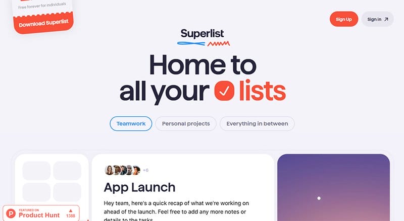
Superlist is a design company that applies its team skills and expertise to make their client's dreams come true. You will love how the webpage uses a console layout to arrange its contents in an engaging fashion and grab visitors' attention.
Each image has its unique signature colors with bold text that features a thumbnail function that leads to a different page for more content.
The most dominant color on this design company's website is coral red. As you explore the content further, you will see other eye-catching colors like dodger blue, black lavender, and rum.
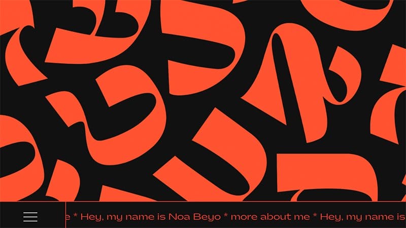
Noa Beyo is a fourth-year undergraduate student in visual communication based in Holon, Israel. Attracting visitors to this unique page that ranks among the best red websites is motion text features displaying red-orange colored letters on a dark shaded background.
The site’s dark background makes all the ideas and content on the page visually appealing and compelling for visitors to explore.
You can begin by clicking the sticky hamburger navigation bar at the base of the page to check out various content on the site without any restrictions.

Margot Priolet is a Paris-based freelance make-up artist who works for various fashion and beauty brands.
This unique webpage has a minimalist layout featuring few texts and no images. The first catchy thing you will see on the webpage is “Margot Priolet” written in bold text at the center of the page.
You can use the image navigation bar on the web page to check out some of the brand’s past projects and make necessary decisions easily.
I like the use of a Ferrari red color shade to coat all the site’s text with a buttery white background to make all the content visually appealing.
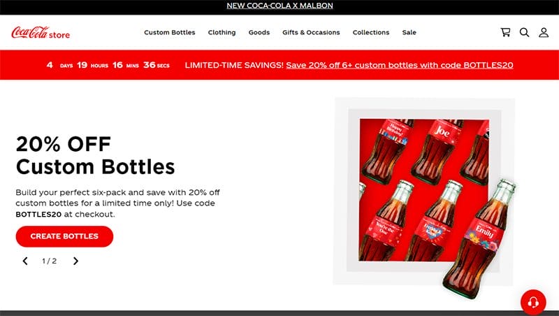
Coca-Cola is one of the most popular soft drinks in the world. The webpage features multiple high-catching elements that give that page an element and sophisticated outlook.
Interested visitors can use the search feature on the mega navigation bar to explore content across the web pages. I love how the display section uses slideshow features to display some of the brand's top products with price tags for interested visitors to purchase at will.
What's handy about this webpage is the switch between a white and Ferrari red background which gives the page a fun design layout.
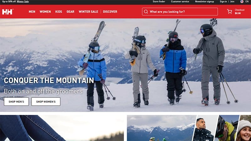
Helly Hansen sells top-notch protective gear which is built for protection on every great outdoor adventure like skiing slopes, sailing, and hiking.
You cannot but love the combination of white and black text to describe the entire design concept and the brand's mode of operation. The use of high-quality model images serves as a powerful tool to create an exciting experience for visitors and potential customers.
Online customers can use the fire engine red-colored sticky navigation bar with a drop-down feature to explore various aspects of this webpage.

Spline is a leading mechanical, electrical, and plumbing engineering firm that offers existing and potential customers top-notch services. You cannot but love the use of bold colors to showcase every important information on the page and other engaging website content.
I love how the webpage features its subscription plans with a bright red color scheme to seamlessly draw attention to vital details and encourage visitors to get on board.
As you explore the web page further, you will love how the site features other colors apart from its signature color like banana yellow, asphalt, and white.

Fire Wings offers delicious food items at affordable prices to their customers. The restaurant offers customers the option to purchase their products through online orders.
I like how the menu section features a slideshow with engaging text displaying content about the brand’s bio with fine white text to get visitors’ attention.
You can click the fire engine red colored “Order Online” sticky widget with a hover effect to get a taste of the company’s delicacies.
Downloading the company’s app is the surest way to get food without breaking a sweat. You can use the Google Play and Apple Store CTA buttons to access the brand’s app.

Armor Shield Exteriors was founded in 2001 by Scott Tearman, who has over 20 years of experience in the roofing business.
I like how the webpage features multiple high-quality images, engaging texts, and video content, on a visually appealing and colorful layout.
Interested visitors can click the Ferrari red colored “Contact’ CTA button to reach this roofing business’s customer services officials.
The terminal section features high-quality images and heartwarming reviews from satisfied customers about Armor Shield Exteriors' exceptionalism in delivery.

Leica Camera is a photography-based brand that offers high-quality products at affordable rates to interested customers. The brand helps educate aspiring photographers who are willing to learn the basis of the art.
I like the page that features multiple high-quality images which is a testament to the brand's design expertise to encourage visitors to visit the contact page for a collaboration.
The use of an accent color as the website’s significant color scheme with a hint of Rosso Corsa makes the page stand out. Interested visitors can drop their details in the subscription for constant updates on the brand's activities and latest releases.

Bon Bon Bon founder and head chocolatier, Alexandra Clark, was born into a chocolate-loving family who are in support of her dream to create a chocolate factory.
I like how this food-based website combines different shades of pink, black, and cadmium red in various parts of the page to give it a visually appealing layout.
As you explore the page further, you will appreciate various eye-catching elements like funny animated concepts, motion graphics, and high-quality images. You can use the hamburger navigation bar on the top right side of the page to explore the page’s content.

Hiut Denim Co is a fashion-based brand that specializes in making high-quality jeans. The company took a break for about forty years but is now back in business.
Welcoming visitors to the outstanding clothing website examples is a split page that displays a model wearing the brand items and a picture of the company’s warehouse.
You can click the lava red colored sticky chat widget on the extreme right side of the page to get in touch with Hiut Denim Co’s customer services representatives. I like the use of multiple grid column layouts to display the company product in the shopping section.

Custom Truck One Source aspires to be a leading supplier of trucks and custom equipment to utility, rail, telecom, infrastructure, forestry services, and other specialty equipment operators.
I like how the display section uses a three-column layout to display the brand's services with engaging text written on high-quality images.
These images have a thumbnail feature that serves as a portal to the service section where visitors can get more relevant information.
The bold red brownish-colored “Get Quote” CTA button with a sticky feature grants visitors access to the contact page and audience with the brand’s officials.

Jonathan Alpeyrie has worked as a freelancer for various publications like The Sunday Times, Vanity Fair, Le Figaro Magazine, ELLE, American Photo, and Glamour.
The first eye-catching element that stays with you all through the exploration process is the brownish-red colored “Cart” sticky call to action button. With this button, you can access the brand's online stores without restriction and make purchases according to your desire.
You can use the hamburger navigation bar on the top right side of the page to explore the page’s content.
The horizontal and vertical design layout gives this webpage a unique outlook which makes it a reliable design inspiration to people interested in creating a red website design.
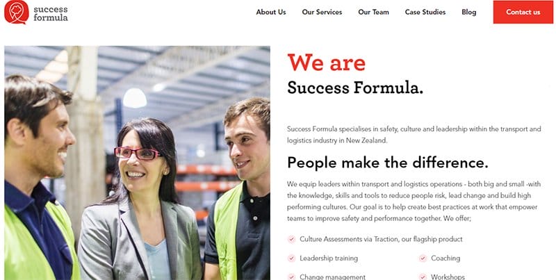
Success Formula is a unique organization that specializes in culture and leadership and transport and logistics.
Welcoming visitors to this outstanding clothing website is a split page that displays images of the company employers and some engaging texts about the success formula
I love the webpage displaying logos of top publication brands and partners that are in business with the company. This vital piece of content serves as a source of social proof and helps increase brand credibility.
Interested visitors can click the ruby red colored “Contact US” CTA button on the sticky navigation bar to gain unlimited access to Success Formula’s ongoing support officials.

Lior Flower Design is a flower-based brand that custom-made flower arrangements and a curated collection of contemporary plants to fit modern interiors.
The first catchy element you will see on this webpage is an image of flowers on a Cornell red-colored background in the hero section.
I like how the webpage uses multiple fluid grid design layouts to display its contents in a visually appealing fashion for visitors to explore.
The page features colorful flower-based content using multiple high-quality images and embedded video content in various aspects of the page.
Red Websites FAQ
When creating your own website using the color red is a design strategy to get visitors' attention and give them a sense of urgency and importance. This eye-catching color is relevant when trying to focus users' attention on important elements or the site’s components and compel them to take action.
Some certain elements and factors cross your mind when you see the color red in design. The most popular is danger which is a sure means to grab visitor attention and get them curious about the site’s content. In addition, you can consider other meanings like passion, power, love, and excitement.
When using red in web design, web designers must keep in mind that the use of the color must be minimal to avoid distracting visitors and potential customers. You must make sure that it complements the overall theme of the site and encourages further exploration.
Explore Further
- Best Black and White Website Design
- Beautiful Examples of Gradient Websites
- Best Green Website Design
- Best Neon Website Design Examples
- Best Colorful Website Design Examples
- Best Sleek Website Design Examples
- Best Dynamic Website Examples
- Best Black and Gold Website Designs
- Best Blue Websites
- Stunning Yellow Websites