24 Retro Website Design Examples We Love
If you have been around long enough, you will observe that some vintage styles never go away. They only add a touch of modern design to reinvent themselves every season. Inspired by these vintage elements, the best retro website designs are enduring in beauty and value.
Whether you're an artist, business brand, or service provider, you dream of creating something that will last forever.
Investing in a retro website design that leaves a memorable and enjoyable effect on visitors is a huge plus. There are not many online business tools that will generate a better return on investment (ROI) than your website.
Luckily, the best website builders like Squarespace and Wix provide retro-looking templates and tools that you can use to build a retro website.
This article explores 24 handpicked examples of retro website designs to fuel your creativity and nostalgia.
Let’s get started.
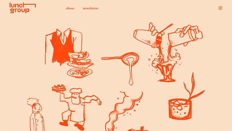
Lunch Group, a hospitality consultancy, relies on freehand sketching to attain its vintage feel. The homepage displays its web elements on an attractive almond-colored background. Texts and icons have red-orange paint, and the page closes with a bluish-green footer.
I like the text of the company logo and header menu in lowercase letters. The elongated ‘h' in the company logo gracefully swings in a pendulum-like motion, extending from the back to the front. This effect keeps the web page alive and visitors intrigued.
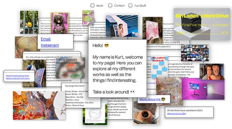
Kurt Champion's page is unlike any I have ever seen. The design choice properly integrates vintage elements with its elaborate picture mix.
I love how the checkboxes for “Work, Contact, and Fun Stuff” are the menu options of this retro website. Clicking any checkbox retracts the images on the web page, leaving only images related to the checkbox you clicked.
Kurt could only trust a plain white website background to pull off the creative design, and I dare say it is a clever choice.
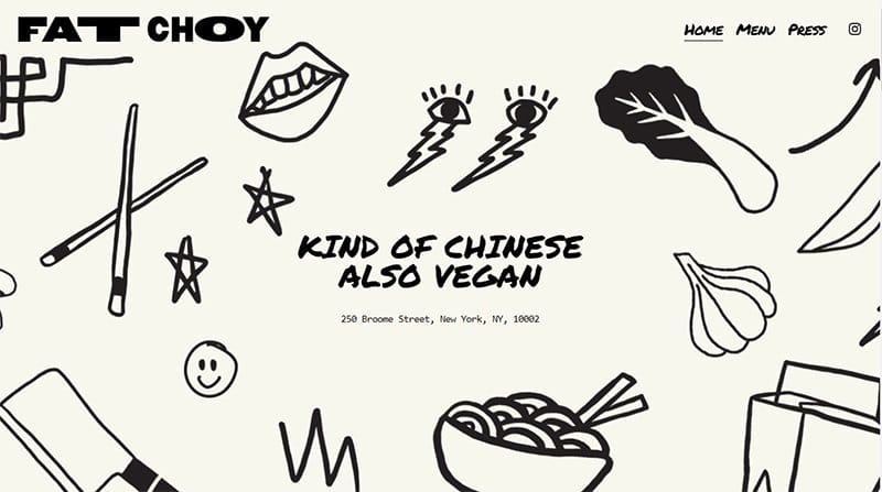
Fat Choy, a restaurant at 250 Broome Street, New York, gets its retro vibes from what looks like hand-drawn icons across its landing page. The icons blend well with the typography of the web page. Fat Choy uses handwritten fonts for most of its text display.
The navigation zone displays frames of mouth-watery dishes in a mango-orange background. I love how the frames adhere to the website’s white background with paper tapes. Such freedom of creativity is why retro themes are so beloved among website designers.
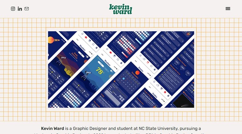
Kevin Ward is a Graphic Designer and student at NC State University, pursuing a Master's in Graphic Design. He uses a porcelain color for the background of his web page, reinforcing his vintage design with orange gridlines in the navigation zone.
I love how Kevin adopts a classic header with a centralized company logo and social media details to the left.
The right part of the header bar carries a subtle hamburger icon that drops down to reveal Kevin’s works. He displays his creations in a carousel so visitors can have a full view within seconds.
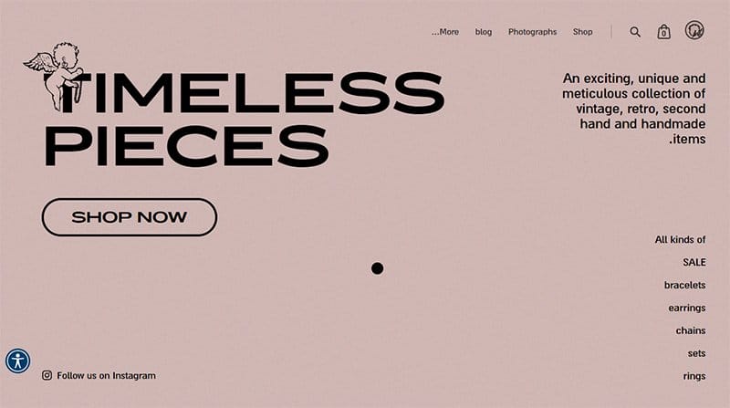
Timeless Pieces’ website displays a serene clam shell background. I love the use of black fonts to convey a sense of sophistication, contributing to a website design that effortlessly fuses classic elements.
Navigating this digital space is intuitive with clear cart and search icons, providing seamless access to essential elements. These design elements are reminiscent of a bygone era, evoking a retro style with a vintage feel.
The capsule-shaped “Shop Now” call-to-action button stands out, inviting users to explore a curated selection.
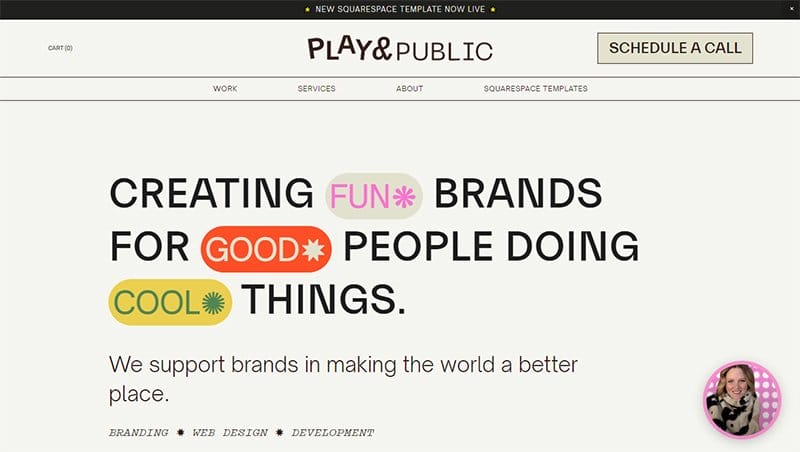
Play and Public is a branding and web design studio dedicated to supporting brands on a mission to make the world a better place. I like the hybrid fonts used for the company name on the header section.
There is a mix of geometric patterns and shapes in the navigation zone. You can’t miss the fancy web cursor that describes the company’s services in a way that picks the visual interest of modern consumers.
The circular frame at the bottom right opens a fun video where the founder urges users to interact with the webpage.
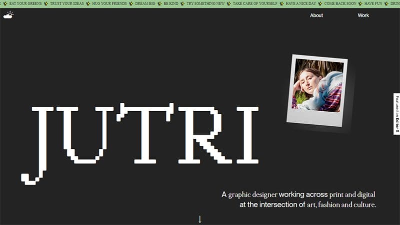
Julia Trindade's website is a testament to a thoughtful website design that seamlessly blends simplicity with artistic flair. As a good website admirer navigating the intersection of art, fashion, and culture, Julia's digital space is a visual feast.
The pixelated font and white-colored text create a unique and playful typography, adding a touch of fun to the browsing experience against a timeless black-and-white background.
This retro website shows how simple typography and a nod to retro aesthetics can transport users to an era where creativity and style intertwine seamlessly.
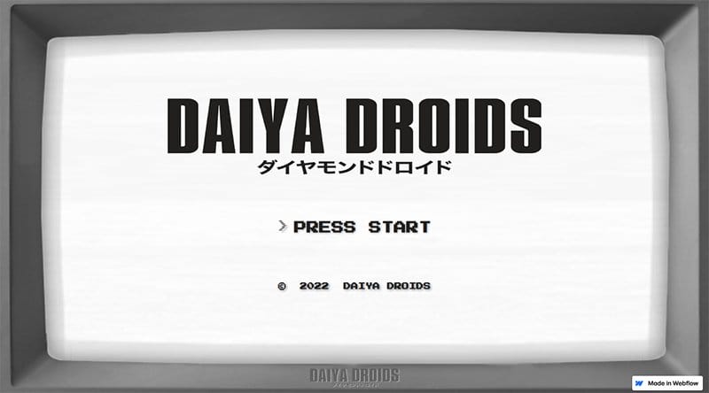
Daiya Industries hopes to be the leading Asian company in Droid development. This retro website boasts a unique and vintage style using the design of the unicolor TV popular in the early days.
The URL first opens to an interstitial gate showing pixelated typography against a white background. As you click on “Press Start,” the site takes you to its main page that shows links to its About and social media pages.
This site will tickle your childhood memories, making you recall how you used to play Minecraft on the home monitor.
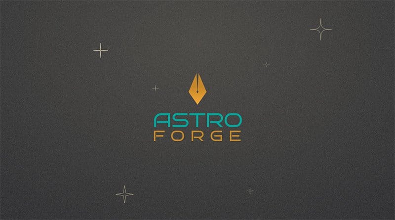
AstroForge is a space-related agency whose main objective is to make space materials available on Earth and reduce carbon footprint. This one-page retro website adopts simple color schemes like blue and orange-brown for texts and a grainy dune color for its background.
Geometric shapes are constantly moving in the background of this web page to depict the stars and asteroids in space. Images of team workers appear as pixelated icons close to the bottom of the page.
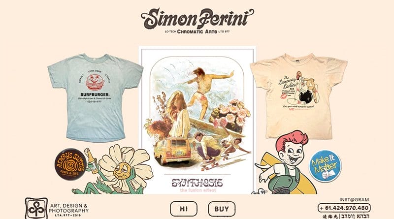
Simon Perini displays his chromatic art with a retro web design. I like how he restricts his site images to the center of the page, leaving visitors allured by the merino-colored background seen clearly from the edges.
This retro website has no header bar but a fixed company logo that harmlessly overlays the site images as you scroll. You will notice a fixed footer displaying “HI” and “BUY” buttons to add a modern flair to the design.
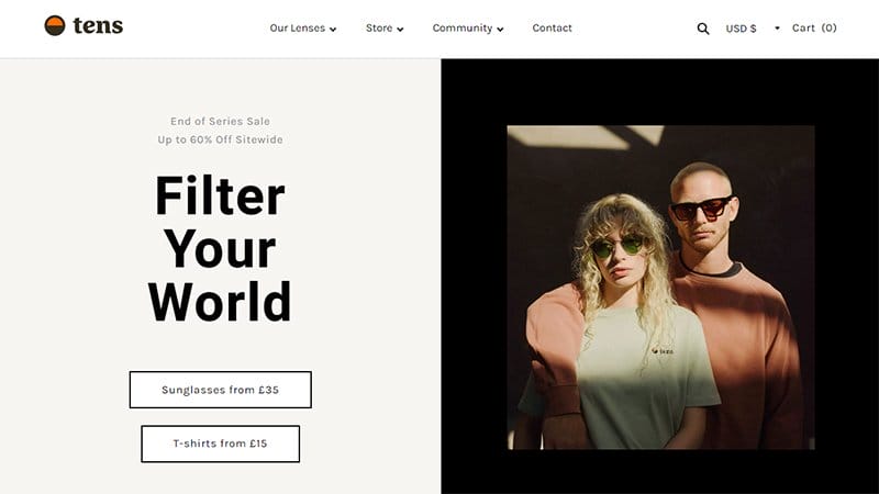
Tens is a fashion company that sells sunglasses in retro style. As a visitor, there is a lot to experience on this website. The fixed header is a straightforward navigation menu, featuring a search icon, currency options, and a cart.
Scrolling down this website is like spinning a color wheel. The layers in the navigation zone each have a peculiar background color that rhymes with the glasses being advertised. On each layer, there is a video frame of lavish models wearing the Tens glasses.

- Peterman Company is an American retail company that sells clothing, fashion accessories, and furniture founded in 1987. This community website keeps in touch with its long-standing customers by using retro designs on its products and its web display.
I like the choice of a fixed header on this webpage. The header is a convenient two-layer bar, sometimes three when there are hot Black Friday deals to display. I love how the site’s header features contact info and a capsule-shaped search bar.
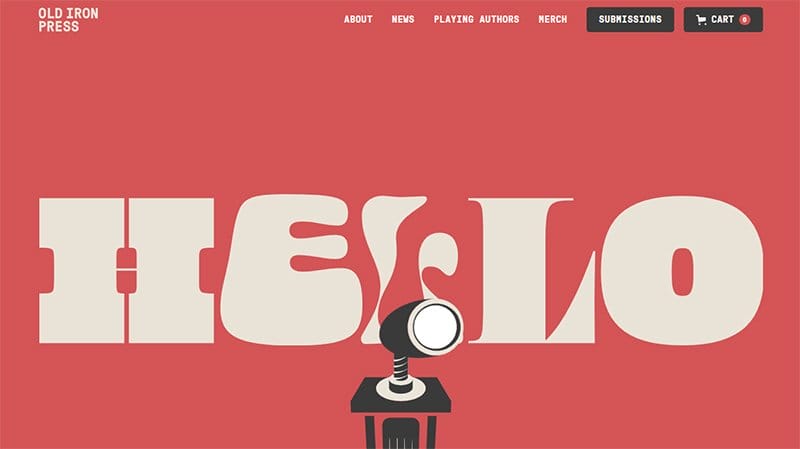
Old Iron Press is a publishing house based in Indianapolis. What gives this website its unique retro feel is the bold “Hello” on the landing page, written in captivating yet simple typography.
An attractive pastel-red color is what you see as the background, and the text uses a white rock color.
The icon at the bottom of the landing page is a lamp on a wheel, an image uncommon to this era yet a good fit for the page and its customers. Interestingly, the lamp head swings with the cursor as you move it from side to side.
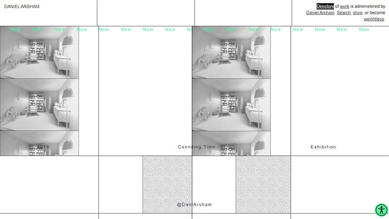
Daniel Arsham is a contemporary artist based in New York City. He employs a vintage website design to display his unique art. Like many personal sites, Daniel designs his website to his taste, using grid lines and a black-and-white color scheme.
He tries to catch the attention of his site visitors in the navigation zone by stretching the cursor into a long arrow. If you navigate close to the center of the page, you will observe the page split to reveal one of Daniel’s works.
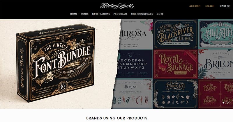
Heritage Type Co. is an independent brand that provides designers with the right graphic supplies to revive their love for artistic design amidst today’s technology-laden world. This retro website opens to a black two-layer header bar featuring a cart and search icon.
A carousel of two full-page product frames illuminates the hero section. I like the video tutorials in the navigation zone on how to use their products or create your handwritten fonts.
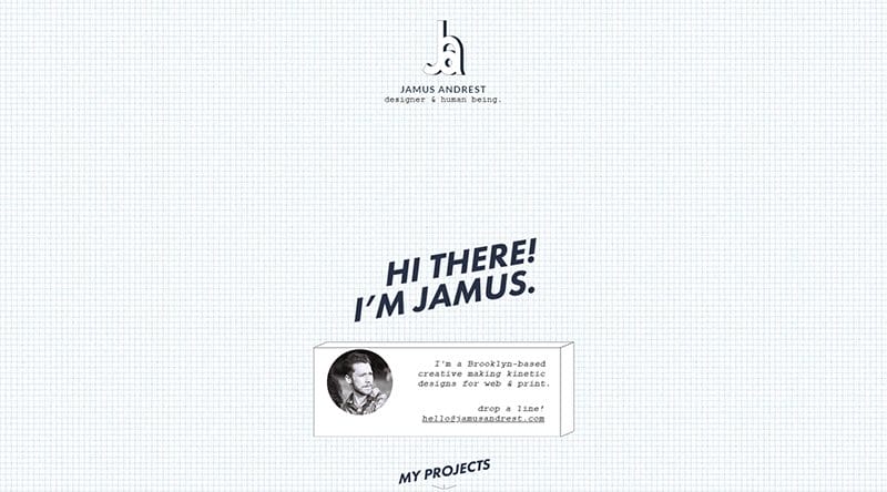
Jamus Andrest is a Brooklyn-based creative that makes kinetic designs for web & print. Gridlines are a big part of vintage designs, which is why Jamus goes for a white background web page with a condensed grid.
This retro website features a captivating logo positioned at the center, exuding a dynamic three-dimensional appearance. Like a vinyl record, the logo creates a mesmerizing effect as it rotates endlessly.
Jamus is consistent with the 3D display. You will find that his portfolio images and CTA buttons seemingly defy the constraints of the screen.
Marina Movellan's website is a vibrant example of expertly crafted website design. Against a clean white background, Marina's website employs bright colors that enhance visual appeal and reflect her dynamic personality.
The animations on this webpage are subtle yet effective, adding a touch of modernity to the overall retro design. This retro website boasts a sticky header, ensuring easy access to essential navigation options as visitors explore the content.
These elements synergize seamlessly, creating a visually engaging platform that exemplifies the power of combining bright colors, static headers, and simple typography in modern website design.
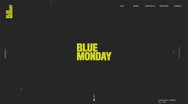
Blue Monday is a dynamic digital film and video production hub born in 2014 in the heart of Birmingham.
The use of high-quality videos is a compelling example of how the site displays its cinematic prowess, transporting users into the world of professional storytelling.
Navigating the website reveals an engaging blend of elements, with the Nimbus font ensuring a modern and legible presentation. Subtle animations and multiple colors on text add interest to the website design.
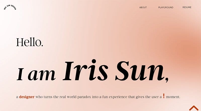
Iris Sun is an interdisciplinary designer with a multifaceted background in UX UI, Product, and Industrial Design. The website design features a sunlike animation against a pale copper background that adds a touch of brightness to the digital space.
Black-colored fonts with animated elements contribute to a fun and engaging website design, bringing a contemporary twist to an otherwise simple typography.
Animated pictures enhance the interactive experience further, creating a seamless blend of modern and vintage elements.
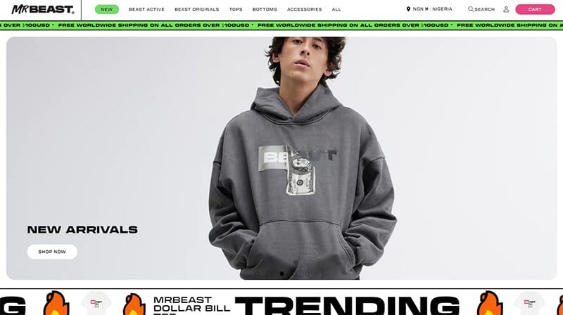
MrBeast Store is an eCommerce website that effortlessly blends sleek website design with user-friendly elements.
The high-quality pictures of the available wear take center stage, providing users with a clear and enticing view of the products. Animations on texts add a touch of modernity, enhancing the overall user engagement.
Bright colors infuse a sense of energy into the interface, creating a fun and dynamic atmosphere. A convenient search icon and capsule-shaped cart button are on the header, aiding easy navigation on the web page.
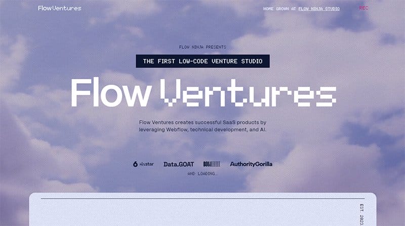
Flow Ventures' website is a digital haven where successful SaaS products come to life. The top of the site greets you with an animated sky video background, setting the stage for a dynamic and immersive experience.
This one-page wonder takes you on a scrolling adventure, revealing multiple backgrounds, each a canvas showcasing the diverse services that Flow Ventures offers.
Pixelated fonts add a unique touch to this web page, blending modernity with a hint of retro style. The bright colors punctuate the scrolling landscape and add a sense of fun to navigation.
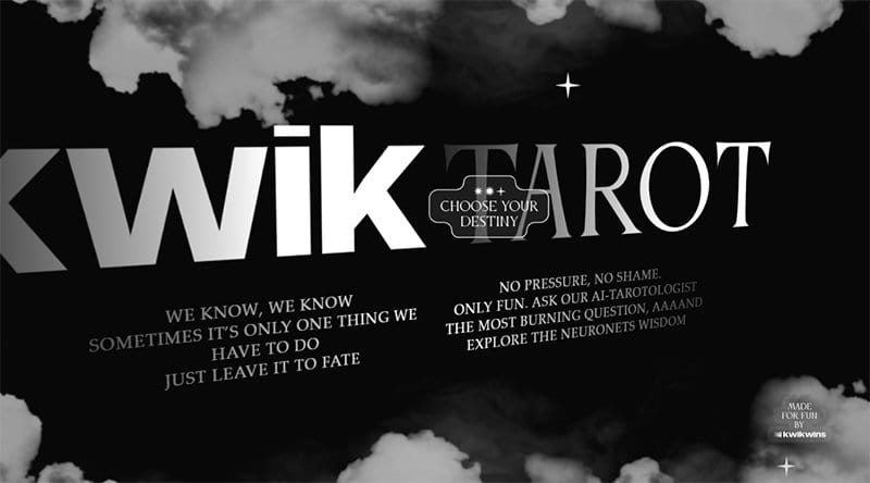
Kwik Tarot is an AI tarotologist who reveals wisdom from tarot cards on visitors’ issues. The user-interactive elements on this web page are impressive.
I love how the landing page features a black background with floating natural gas resembling the clouds in the night sky.
As you move the cursor around the landing page, you will notice that the texts spin around an axis in the direction that the cursor moves. The CTA “CHOOSE YOUR DESTINY” integrates a hover effect with purple beams shooting from it upon cursor interaction.

Studio Yee Foo Lai’s graphics mix the modern and retro aesthetic, presenting a sense of familiarity for wide-ranging individuals. The web page looks comfortable with its plain white background and achromatic images.
In the navigation zone, the website design takes a lazy loading approach to load an uneven three-column layout of Yee’s portfolio. The texts written are in clear, bold fonts with linkified texts underlined to avoid complexities.

Ayelet is the personal site of Israeli artist and graphic designer Ayelet Raziel. Her retro-looking website is so commensurate with her art. I like that only the parts of the header bar that carry menu options hinge to the screen’s top.
She carefully selects a vibrant color palette for her website, incorporating soothing blues and purples in the hero section for a calming effect. I love the transitions to bright colors like pink and yellow for attention-grabbing buttons and accents on subsequent pages.
Best Retro Websites FAQs
Retro sites are websites whose typography, colors, or images have a vintage look. These websites draw inspiration from retro themes in fashion, art, and technology. The modern flair of these retro website designs makes it possible for any business or service provider to use nostalgia as a marketing technique.
Creating a vintage or retro-style website is easy with user-friendly platforms like Squarespace or Wix. Choose vintage fonts and experiment with design elements. The fusion of vintage themes and modern simplicity allows for the effortless creation of a captivating website that blends the best of the past and present.
Retro design is trending due to its nostalgic appeal. Inspired by sources like the Harvard Film Archive, modern designs often draw inspiration from the past, Retro elements add a unique touch to web projects. Additionally, retro design evokes a sense of authenticity and timelessness, making it a popular choice for those seeking a unique and enduring visual style.
Retro website designs use bold color schemes, pixel art, vintage typography, and nostalgic graphics. Elements like analog-style textures, old-school patterns, and retro-inspired illustrations contribute to the overall aesthetic. Retro designs often feature elements reminiscent of past decades, such as neon lights, cassette tapes, and vintage technology.

