25 Best Review Website Design Examples for 2025
Are you searching for the best review website designs for inspiration to create or redesign your site? Whether you are a web developer or a business owner, building an amazing review website doesn’t have to cost a fortune.
You can use the best website builders like Squarespace and Wix that offer user-friendly solutions to design visually stunning and accessible review sites.
This blog post covers the 25 best review website design examples that use sleek layouts, seamless navigation, and eye-catching visuals.
Let’s get started.
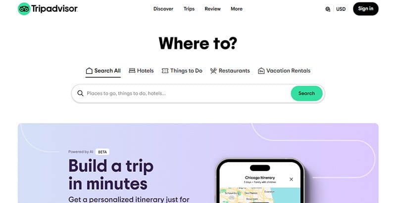
Tripadvisor is a leading travel guidance platform with a sleek review website design. The interface boasts a visually pleasing card layout, providing an organized display of reviews and recommendations.
A user-friendly search bar and icon help with easy navigation, enabling users to discover exciting places and activities effortlessly. With a clean white background, the design ensures a pleasant and distraction-free browsing experience.
The cherry on top is the enticing call-to-action button inviting users to ‘Start a Trip With AI,' seamlessly integrating innovative technology into the user journey.
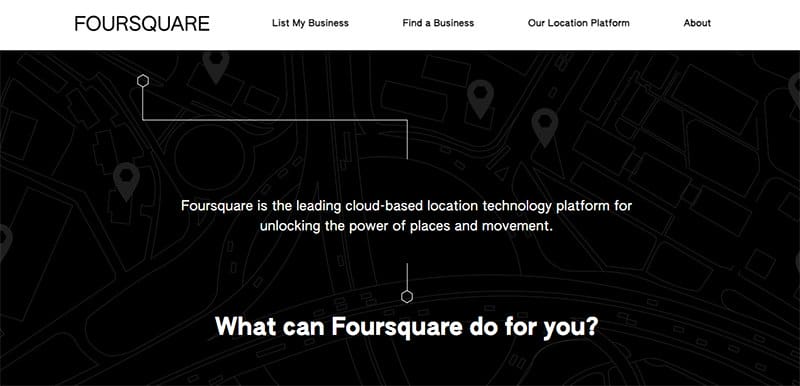
Foursquare's innovative review website uses bold aesthetics featuring a captivating black background with delicate white lines, creating an artistic map-like ambiance.
Navigating the site is easy with the sticky menu bar that ensures easy access to essential functions. The strategically placed call-to-action button that says ‘Take Me There' enhances user engagement.
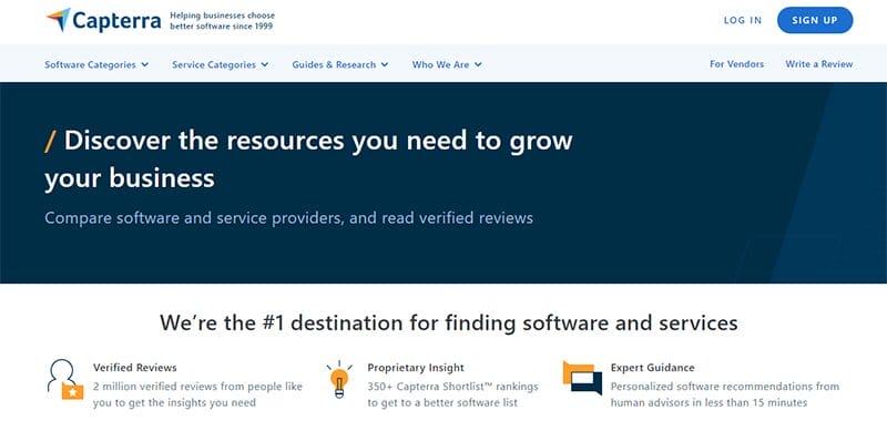
Capterra is a review website for discovering software and services. This review site embraces simplicity with a clean white background, creating a user-friendly environment for its diverse audience.
A strategically placed call-to-action button tells users to ‘sign up,' seamlessly guiding them toward an enriching exploration of software options.
The user testimonials create contextual feedback, providing valuable insights for its diverse target audience.
Capterra's website design meets the standards of a decent website and stands as a reliable compass for those navigating the complex landscape of software and service.
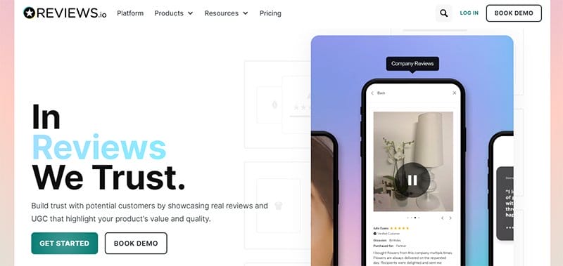
REVIEWS.io design employs engaging visual elements, including a captivating video slide animation that makes the user experience more fun.
A sleek menu elegantly sits on the bar, seamlessly guiding visitors to explore different pages for a comprehensive journey. I love the display of icons of companies collaborating with REVIEWS.io to offer users a sense of trust and reliability.
This review website's thoughtful design is visually appealing and strategically incorporates user testing and design feedback elements to enhance the overall user experience.
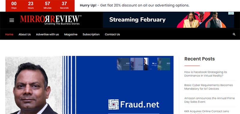
Mirror Review offers an engaging platform with a sleek and user-friendly interface that showcases the achievements of companies and entrepreneurs.
Commenting on their groundbreaking innovations that are reshaping the market, Mirror Review provides insightful writing that captures the essence of success stories.
This review website features a convenient popup box that invites users to subscribe to Mirror Review's newsletter by providing their name and email.
I love the use of the sticky menu bar for easy navigation, a hamburger menu for comprehensive options, and a search icon for quick access.

Dogfood Advisor is your go-to guide that simplifies how you choose the best food for your furry friend. I love how the hero section welcomes you with an endearing dog picture and clear words describing the site's purpose.
This review website employs a user-friendly card layout against a white background, ensuring easy navigation and a visually pleasing experience.
Whether you're on a desktop or a mobile device, Dog Food Advisor's thoughtful design caters to all users, making the content creation a delightful and informative experience.

HeadphoneAddict offers free and unbiased opinions on contemporary consumer headphones. This great website design features a clean white background adorned with variations of blue and black text colors, creating a visually appealing and readable interface.
User interaction is prioritized with a search icon, ensuring easy access to specific information. Visitors are encouraged to explore and leave reviews.

GearHungry has a calming white background that harnesses the power of white space, creating a clean canvas that leaves the right impression.
Black text exudes clarity, making navigation incredibly easy. The touch of Eastern Blue on CTA buttons and menu bar links adds a subtle vibrancy, ensuring a visually engaging experience.
GearHungry website's functionality includes a user-friendly search bar, allowing visitors to find information effortlessly.
Clear pictures and attractive icons enrich the visual appeal, turning the website into a captivating space for exploration.

Trusted Reviews is a UK-based technology haven that provides a global audience with comprehensive insights on various consumer tech products.
This website design ensures a pleasant experience, featuring a fast-loading and user-friendly interface. A sticky menu bar grants easy navigation, while a prominent search icon makes it easier and faster to find specific reviews.
Social media icons seamlessly connect users to their online community, enhancing engagement. Bold texts give information, making Trusted Reviews informative and a delightfully efficient platform for tech enthusiasts worldwide.

Consumer Search, a comprehensive review website, diligently covers categories from Home & Garden to Health & Beauty. This website design excels with high-quality pictures, enhancing the user's experience.
In the site’s footer, users find essential links to the privacy policy, terms of service, help, and copyright date, underscoring the website's commitment to transparency.

SmartFinder is a dynamic review site that helps guide users to the best products for their needs.
This review website design is visually striking and user-friendly, featuring a card layout against a clean white background. SmartFinder has numbered links that help users progress to the next page, enhancing the user journey.
I love how SmartFinder stands out among websites with a thoughtful design, creating an engaging platform for users seeking valuable feedback on technology products.

Lipscore's review website is a powerhouse for businesses aiming to boost revenue and foster genuine customer relationships.
This unique web design embraces an elegant dark gray-blue and white color scheme, creating a sophisticated backdrop. Users see a compelling “Get started” call-to-action button that entices them to explore the platform's offerings.
I love the display of logos of clients they have collaborated with, instilling trust in potential users. Lipscore's website design prioritizes user experience and is a tool for businesses researching enhanced customer relations.
The thoughtful color scheme, engaging animation, and user-centric approach make Lipscore's platform an inviting space.
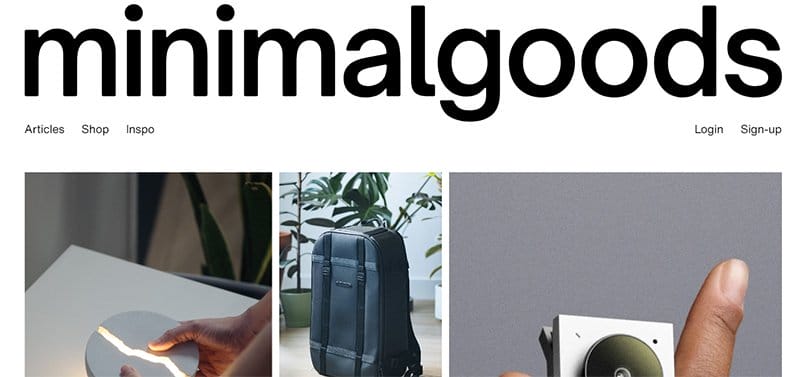
Minimalgoods is a review website with a mission to spotlight impeccably designed objects. The design speaks volumes, featuring crisp, clear pictures against a clean white background.
Navigating the site is simple, with a strategically placed and enlarged Minimalgoods logo that functions as the refresh and homepage buttons.
Minimalgoods is not just a website; it's a curated space where thoughtful design meets honest product reviews.

All Movie Things uses a simple and efficient website design. The moody blue menu bar sets the tone, creating a visually pleasing backdrop for movie enthusiasts.
In a helpful card layout, movie review links are side by side, allowing users to explore content easily. The simplicity of the design is intentional, making it a straightforward and user-friendly platform.
All Movie Things has thoughtfully arranged its content, making it a point of reference for reviews that guide you through the cinematic landscape.

Sound Advice creates the best magazine experience for visitors. This website design boasts black text in capital letters against a crisp white background, delivering a clear and bold visual impact.
Inspiration flows through every aspect, from the interesting articles to the first-class design and high production values.
Sound Advice's website ensures that visitors are informed and inspired, offering a place to rest and enjoy top-notch content.

A&Z KITCHENS specializes in custom kitchen designs, makeovers, and more. This dark website unfolds against a sleek black and light lime green background, creating a vibrant visual experience.
The menu bar features a strategic call-to-action button, inviting visitors to “Get the Price.” This website design elegantly combines simple texts with clear pictures, guiding users through their process and offering valuable tips.
A&Z KITCHENS' design is not just informative; it's a visual journey, providing insights and inspiration for those exploring kitchen and home improvement companies.

The Head West Guide is a review website where real people with genuine experience in the direct-to-consumer (DTC) arena share insights.
This website design focuses on a clean white, black, and bright blue palette against a crisp white background.
A standout feature is the curved-edge CTA button enticing users to “View Guides,” creating a visually appealing call to action.
This unique site design highlights the platform's dedication to fostering a community where designers and developers can focus on creating and developing with real-world insights.

Soncina Travel offers a gateway to extraordinary Winnipeg experiences. The site’s backdrop features a striking picture of a suited man, setting an inviting tone.
Five-star client testimonials grace the site, providing genuine comments that pique the interest of potential travelers.
This website's thoughtful design incorporates an email address form and a subscribe button, making it easy for interested individuals to sign up for updates.
Soncina Travel's redesign doesn't just showcase tours; it creates an immersive online experience, blending functionality with the allure of exceptional travel adventures.
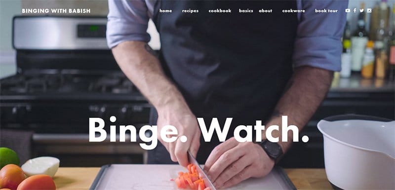
Binging With Babish is a review website owned by Andrew Rea, where he seamlessly blends the roles of chef, filmmaker, and irreverent YouTube personality.
This beautiful website design is a visual feast, featuring a high-quality picture capturing him in action, creating a delectable atmosphere.
Social media icons direct visitors to Andrew Rea's vibrant online presence, connecting the website and his social media pages.

All The Food, your guide to Dublin's culinary delights, ensures readers savor the best without wasting time or money on subpar meals. This food website is elegant, with a black, white, and light sea green color scheme.
Navigating the site is easy with the presence of a search icon. Social media icons connect readers in several ways to the All The Food brand.
All The Food's review website guides readers through Dublin's culinary scene and community, making it a business with a brand that thrives on interaction in several ways.

Destructoid is a Webby Award-winning video game blog crafted by Yanier Gonzales in March 2006. This gaming website design is an immersive experience, instantly enveloping visitors in a video game ambiance.
Stylishly displaying available video games with pictures sparks interesting ideas and engagement. I love how this review website features a toggle button for a dark mode, transforming the white background into a captivating dark canvas.
WordPress powers its dynamic pages, enhancing user-friendly navigation. With a sleek search bar, Destructoid isn't just a blog; it's a portal for gamers, offering an interactive and visually engaging exploration of the gaming universe.

The Action Elite welcomes users with a dynamic banner featuring action movie stars as you enter the website.
This user-friendly design offers a fixed social media icon on the right side that stays put as you scroll down. Tools like a drop-down menu and a search icon empower consumers to browse the site easily.
With an engaging layout and thoughtful design tools, The Action Elite provides a seamless and enjoyable page-browsing experience for action movie enthusiasts.

Penn Moviegoer is the website of the University of Pennsylvania's exclusive film and media criticism publication.
The black and white background provides a classic backdrop when scrolling, triggering a delightful animation with background pictures at the top.
This website design emphasizes easy navigation, featuring a search bar and social media icons at the bottom, creating a seamless link to broader discussions.
With thoughtful elements and a focus on user-friendly advice, The Penn Moviegoer offers a visually engaging platform for film enthusiasts and easy access to insightful content.

KillerStartups.com is your go-to platform that offers real-time reviews of budding internet startups, catering to entrepreneurs and investors.
The website design combines a crisp white background with a soothing dark sky blue and black text, creating a visually appealing interface.
A curved-edge call-to-action button beckons entrepreneurs, while another strategically placed on the menu bar invites startups to submit their ventures.
The site's functionality is enhanced with a search bar, facilitating easy navigation. Catchy artistic pictures and social media icons at the bottom round out this engaging site, providing valuable insights and free exposure for emerging startups.

TheWebAppMarket boasts an intuitive design, featuring a clean white background that ensures a sleek and modern look.
This site’s homepage offers an engaging multimedia experience, with a dedicated section to watch YouTube videos. The videos keep you informed about the latest app trends and developments.
I love how the animated icons seamlessly guide users to new, trending apps, reputable development agencies, and insightful blogs.
A user-friendly form awaits at the bottom of the page, inviting visitors to stay updated on the latest courses, developments, and trends by subscribing to the newsletter.
Review Web Design FAQ
Review a website design by assessing the web designer's expertise, evaluating the use of the best software, and ensuring fast loading for optimal user experience.
Popular review sites include Yelp for businesses, TripAdvisor for travel and dining, and Trustpilot for various services. Choose platforms relevant to your industry to gather and showcase customer feedback.
Include portfolio assessment, client testimonials, expertise verification, clear communication, adherence to timelines, transparent pricing, post-launch support, and thorough contract review in your web design agency checklist.
Creating a review website helps to establish a one-stop local platform, enhancing visibility on search engines for businesses and providing users with insights they can understand.