20 Best Static Websites of 2025 | Inspiring Examples
Static websites, known for their simplicity and efficiency, continue to leave an indelible mark on the digital landscape. They rely on fixed content, meticulously crafted to engage visitors.
Creating an exceptional static website demands attention to several factors. Regardless of your field, you can manually create captivating static websites without the need for complex coding, thanks to website builders like Wix and Squarespace.
This article covers the 20 best static website examples that will give you the creative boost you need to build your own static website.
Let's get started.

Arm Creative is a lean team of creatives who love telling stories, designing cool stuff, strategizing for the future, and dreaming big. If you seek inspiration for creating static websites, you have found a good website to visit in Arm Creative.
The static site generators present this static web page in a peculiar layer-by-layer format, each with engaging elements more interesting than the last.
I like the vibrant blue and gold colors that define the homepage and how the images seem to be moving upward as you scroll.
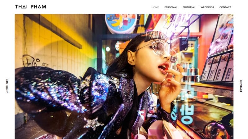
Thai Pham is a talented photographer. Her sleek and static website showcases her artistry. The site's design is elegant and functional, featuring strategically placed “Explore” and “Contact” buttons.
I love the captivating grid of pictures that awaits visitors and how each picture reveals details on cursor hover. This seamless interaction offers a glimpse into the content, encouraging exploration.
Thai Pham's website is an excellent example of well-crafted static web pages, demonstrating the perfect blend of style and usability.
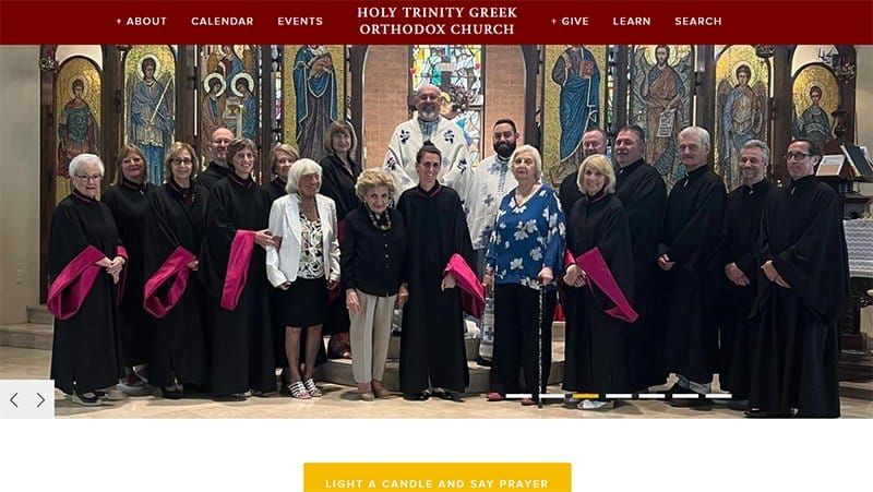
Holy Trinity Greek Orthodox Church uses a static approach to presenting current information and historical events online.
This church website welcomes visitors with three peculiar things. The first is a dark-red header that centrally displays the church's name and links to other static pages on either side.
Attractive hero images are the second appeal of this static webpage. The images are in a carousel, but two arrows at the bottom left of the pictures allow users to control the slider.
The third peculiar thing on this website is the bright corn yellow CTA button that turns gray upon cursor interaction.
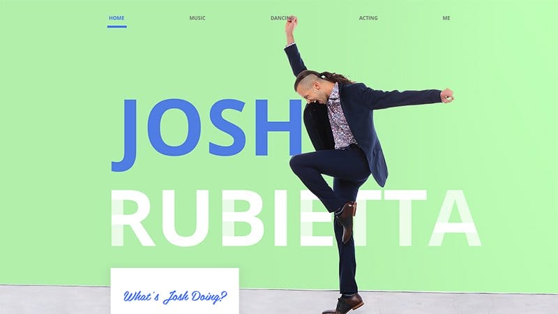
Joshua Rubietta is a talented musician, dancer, and actor. His website has a seamless lazy loading feature, ensuring swift and engaging navigation.
This creative genius welcomes visitors to his website with a dynamic visual: a captivating image of him dancing. He positions it elegantly above his name in a bold font.
I love the parallax scrolling effect on his website. Joshua Rubietta sectioned layers of the homepage into different career paths. Each layer maintains a blue and white theme, confidently inspiring artists to create a static website that displays all their artistic talents

Kwanton is a computer science PhD student. He has a captivating static website that mirrors his expertise. This static site welcome display exudes creativity and artistry, setting an engaging tone.
The site owner intertwines words seamlessly on his static website and displays a fine blend of golden bell, burnt pink, and dusty teal colors.
Engaging pictures vividly convey his works and projects, enhancing visitor interaction. I see Kwanton's website as a prime example of creating static web pages, showcasing his talent among notable static website examples.

Shane Kinkennon is a certified executive coach and certified master facilitator. On his website, he places the rectangular Call-to-action buttons strategically per section. I love how he maintained the consistency of his font all through the static pages.
The satin sheet color appears in every section of the website, either as the background, the color of the CTA button, or the highlighted text.
This static website closes with a linear online form in the footer section, making it easy for visitors to sign up for Shane’s monthly newsletter.

Peter McKinnon is an internationally acclaimed photographer, filmmaker, YouTube creator, and entrepreneur in Toronto, Canada.
The header section on this static website features menu options floating on a captivating hero image. Instead of using many words, Peter uses moving images as backgrounds, giving visitors a smooth scrolling experience.
I love the full-screen display of images he uses to attract visitors to his creative world. Every layer has an interactive image, more attractive than the last. The parallax scrolling effect further enhances the overall user interaction on this static website.
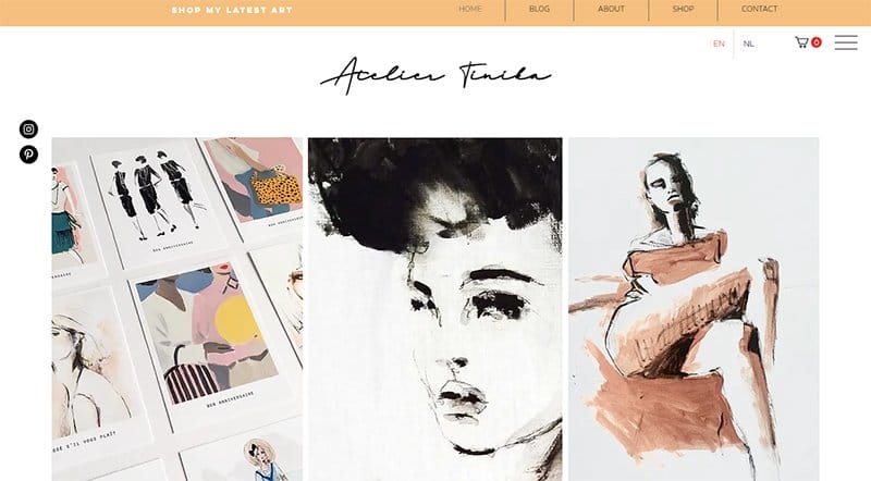
Atelier Tinika's website showcases a collection of feminine and opulent paintings tailored for interiors and businesses.
She uses a double navigation system on her static website, a non-sticky header, and a hamburger icon that sticks to the screen and reveals other options.
This static site exudes a timeless charm, mirroring her artistic style. Her name graces the page in an elegant signature-like font against a pristine white backdrop, ensuring a prominent presence.
Atelier Tinika’s static web page aligns seamlessly with her artistic career, making it a standout example of static websites.

Daniel Grindord is a skilled UK-based cinematographer and video maker, presenting his craft through a website that speaks volumes in simplicity.
A captivating video compilation showcasing Daniel's versatile career welcomes visitors to this static website.
Unlike many sites, his site stands out for elegance and simplicity, steering clear of overwhelming links and call-to-action buttons. I love how Daniel Grindord clearly defines his expertise without unnecessary clutter.
This static web page displays his work, emphasizing the power of straightforward design on static and dynamic websites.
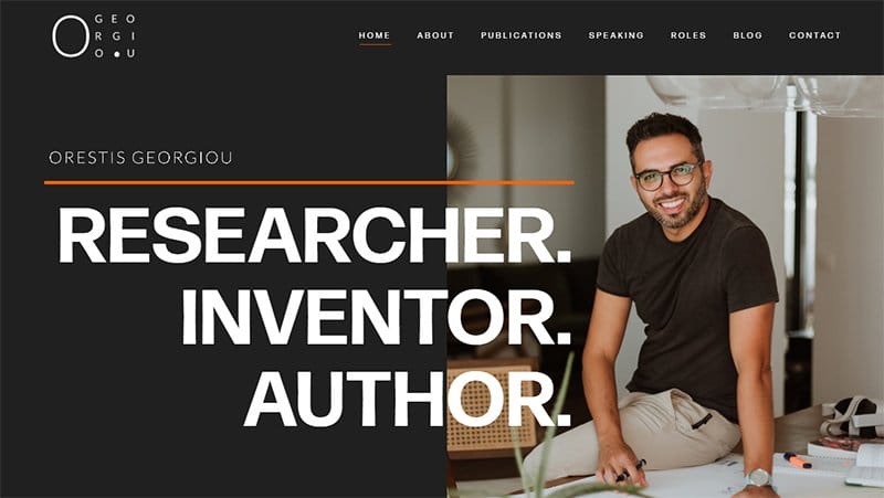
Orestis Georgiou, a distinguished researcher, inventor, and author, showcases his multifaceted talents through a static website. The use of orange on the website adds a touch of vibrancy, emphasizing shapes and underlines throughout his site.
I love how the content is readable and engaging, complemented by high-quality images. Orestis’ website highlights the essence of static HTML and the importance of well-crafted HTML files in web design.
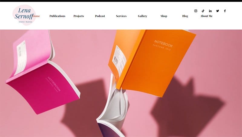
Lena Smirnoff is a talented writer, journalist, and podcaster. She uses a bold white bar that sticks to the top of the screen to display her menu options and fancy logo.
The use of a GIF on the landing page adds a dynamic touch, enriching the user experience. After seconds of being on her website, a grayish-colored pop-up appears, encouraging visitors to subscribe to her newsletter.
Lena's website uses elements like her ruddy brown CTA form and blog tiles to create a visually appealing and interactive platform.
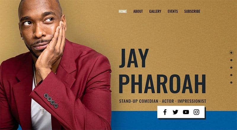
Jay Pharoah is an actor and stand-up comedian. His website provides a delightful platform for fans to connect and explore his creative endeavors.
This comedian’s website features a vibrant color palette. The combination of white, Medium Electric Blue, Vivid Burgundy, and Driftwood creates an engaging atmosphere. High-quality images capture his profession while the layout allows easy navigation.
I love how Jay placed links to social media at the base of the hero page, so visitors can quickly connect with him.
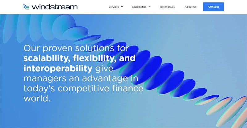
Windstream is a leading provider of advanced network communications and technology solutions for businesses and organizations.
This static website delivers personalized content excellently through its intuitive design, and the server-side optimizations guarantee swift loading times.
I love how the website stands out for its clear and readable content with the main sentences emphasized in bold and enhancing user experience. The blend of various blue shades and high-quality images creates a visually appealing static website.
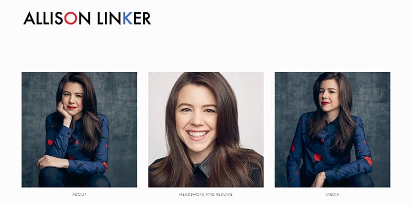
Allison Linker is a versatile actress and singer known for her creative and sincere portrayal of original characters in new musicals and plays.
She showcases her talent through this website with a simple homepage design. The liberty for visitors to explore her work is evident in the six clickable grids.
Her brand colors, red and blue, create a cohesive visual experience. This beautiful website’s visual editor allows for creative freedom, ensuring a personalized journey for every visitor, with a focus on personalized content.

Phylum is a team of career security researchers and developers that enables the best defensive products for their customers. The welcoming blue theme on this static website preaches a message of professionalism and authority.
This unique site effectively leverages its header section to display eight links to the other static pages, two bold CTA buttons, and a clickable logo.
Phylum displays seemingly dynamic content to the client side. I like the cards of condensed web pages that are interactable to visitors. One even has a chat feature and a share button.
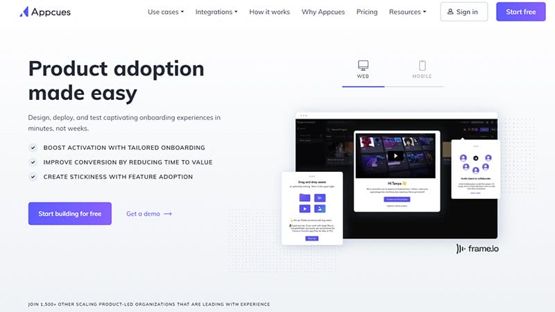
Appcues is online software for creating in-product experiences like user onboarding and feature announcements without writing codes.
This static website has a sticky header with its logo fixed. I love how the blue lotus color from the logo is the predominant color. The unique color adds a touch of elegance to the static assets on the page.
I love the cheerful display of written content complemented by insightful infographics on the webpage. The lazy loading effect enhances performance, ensuring optimal loading times for users.

By Experience, a boutique brand and marketing agency exudes simplicity and elegance through its website design. I love the serene backdrop and straightforward fonts create a calming ambiance.
The consistent use of royal blue adds a touch of sophistication, lending uniformity to the site. Engaging user interaction is evident as the cursor transforms into a circle, enhancing the browsing experience.
By Experience cleverly uses short videos and overlays to convey services, ensuring a dynamic presentation. A must-visit for creating static web pages, By Experience uses captivating user engagement techniques to attract and keep visitors.

Workiz is one of the leading platforms for field service teams, trusted by over 120,000 pros. This static site schedules jobs, dispatch invoices, and tracks performance. I love the use of an intuitive design and a vibrant yellow color scheme.
Users can access specific content effortlessly with the straightforward navigation menu on this static website. Workiz presents testimonials on its website through a dynamic slideshow, showing the platform's popularity and reliability.
I love the clarity of content on the website, employing data and facts to showcase its prowess in field service solutions.
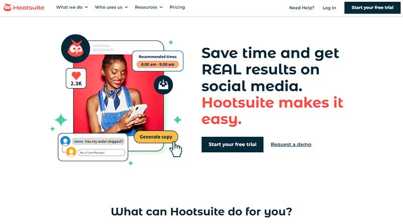
Hootsuite is a social media management platform that handles everything a social media manager does. This static website is consistent with its web design, sticking to a centralized layout for its website’s content.
I love the use of high-quality images and a fancy fixed header. The prompt to book a demo appears prominently in the hero section. One feature I find interesting is how the bird on the logo tilts and winks intermittently whenever the cursor touches it.
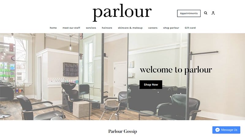
Parlour is a premier destination for hair services, waxing, tinting, and makeup. The bold header of their website guides users effortlessly to explore other aspects of the site.
You will find the brand name in bold font on the non-sticky header. There is a prompt to click on the appointment section toward the end.
I love the hero section which features a high-quality image of a reception scene and a warm welcome message that sets a delightful tone. The placement of social media links conveniently in the footer section helps users connect with them easily.
Best Static Website Examples FAQs
A static website is a type of website that displays fixed content, typically on a single web server. This efficiency, combined with optimal search engine optimization, propels them into the spotlight. Examples of static websites include front pages, read-only sites, and those where the content remains consistent over time.
A static website, like popular examples found on GitHub Pages, presents fixed content stored in a single HTML file. It's like reading a book where the content doesn't change. A dynamic site uses server-side scripting languages like Python or Javascript files to fetch information from databases and generate pages in real time like social media feeds that update dynamically.
Yes, dynamic websites are more complex to build than static websites. Dynamic website examples use server-side scripting languages to generate dynamic pages and a complex database to manage content. This complexity contrasts with the ease experienced when you create static websites using website builders like Wix or Squarespace.
When it comes to building static websites, several popular platforms come to mind. Wix and Squarespace are excellent examples. They allow web developers to efficiently manage content by processing pre-built files and turning them into a complete website. These generators flexibly create read-only sites with a fixed number of content samples for every user.