24 Beautiful Teacher Website Examples [2025 Inspiration]
Are you looking for the best online platform to communicate with your students and attract new ones? Do you want to redesign your existing educational website but need inspiration and guidance to create an effective one?
Having a professionally-designed teacher website is a brilliant strategy for getting a fair share of the booming eLearning industry.
Whether you are a full-time teacher or a part-time one looking to deliver knowledge and build a passive income stream, creating or redesigning your website is easy. Website builders like Squarespace and Wix help you create the best websites that excel in design and user experience.
There are many teacher websites on the internet with eye-catching web designs and attention-grabbing content styles you can draw inspiration from.
This article covers the 24 best teacher website examples that provide you with amazing design ideas you can use to build or redesign your own site.
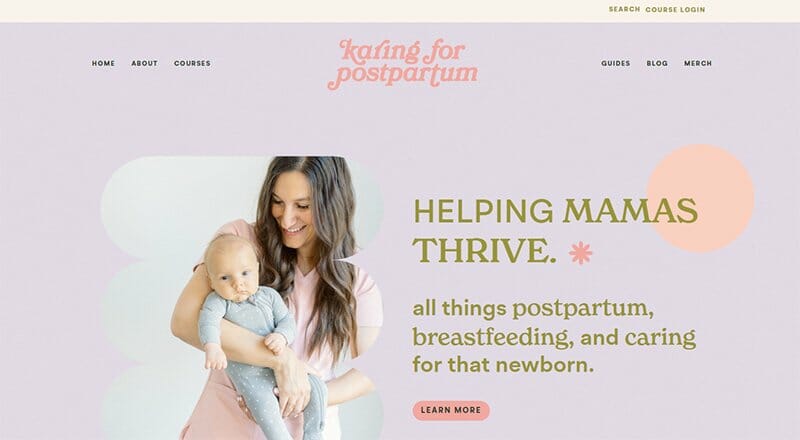
Karrie is a mom of four, a postpartum and neonatal nurse, a certified location counselor, and the brain behind Karing for Postpartum, coined from her name.
Karing for Postpartum is a teacher website designed to help mothers thrive in all things postpartum, providing them with valuable teacher resources. Soft colors are the recurring color theme on Karrie’s website, displaying Light Apricot and Gainsboro as predominant colors.
Her website displays several aesthetic design elements, with the animated shapes and slanting moving text being the most prominent on its site.
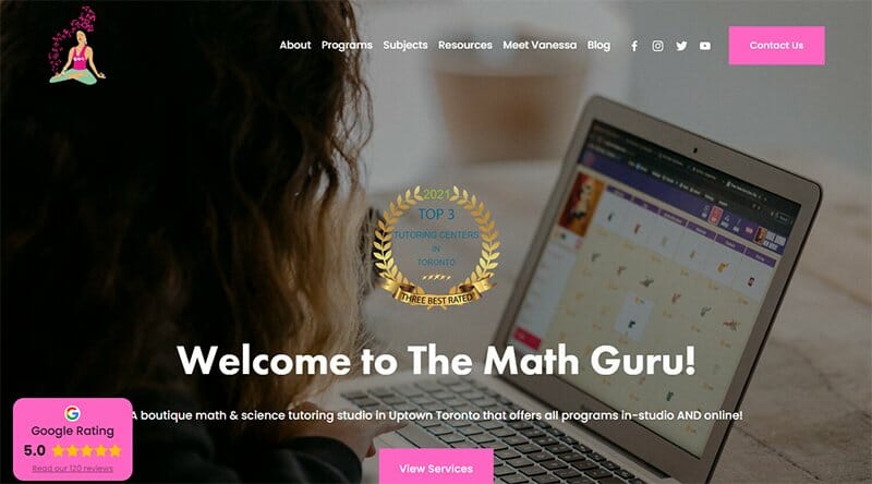
Vanessa Vakharia is the founder and director of Math Guru, a super cool math and science tutoring studio in Toronto. Math Guru uses a super cool color scheme of Denim Dark Blue and Neon Fuchsia for its site design.
Testimonials are visible in two separate sections on the Math Guru website, with one section displaying all Google-based reviews. There are logos of top news brands and outlets, displayed in two separate sections that prove the high standard of this online school.

Full Lotus Yoga is a community that believes a yoga studio is more than a place to practice postures. Slideshow images of Full Lotus Yoga sessions take center stage on its website, with centralized text and CTA buttons to go with each image.
Two colors stand out on the Full Lotus Yoga website, Cactus and Flame, with the Flame color coined from its logo. Navigation texts are visible in various segments on the website, backed by quality images and a Cactus-colored background.

Kristy Tutors believes learning should be enjoyable with a teaching approach adapted to suit the age, ability, aims, and interests of individual students. A Warm Purple on a White Smoke background is the color scheme for Kristy Tutor’s website design.
The CTA buttons and header texts stand out in their Warm Purple color. There is a chat feature pinned on the homepage, providing visitors with a means of communicating with the tutor.
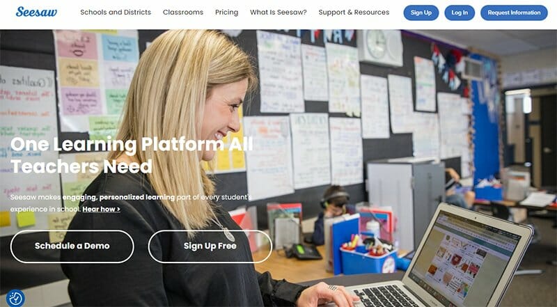
Seesaw announces itself as a learning platform all teachers need, with extensive teaching resources to help teachers in their professional development.
Two CTA buttons welcome visitors to the seesaw teacher website visible over its hero image. One allows for free sign-ups, while the other prompts users to schedule a demo.
The rotating video feature in the What Seesaw Can Do section is one of this teacher website's standout features that engage visitors.

Creative Connections Tutoring offers personalized learning for individual success, led by tutor Erin Sumner. This teacher website recognizes the importance of building professional connections. It is specifically designed to connect with visitors.
The first thing visitors notice on accessing the site’s landing page is an image of a typical classroom taking center stage as the site’s hero image. A clear CTA button urging visitors to contact her now is visible over the captivating hero image.

K & K Swim School is Western Canada’s largest private swim school with a unique philosophy that focuses on each individual’s abilities and needs. Displayed as its site’s hero image is an image of a child taken underwater, with the words challenge, grow, and inspire.
Consistency is the recurring theme on the K & K Swim School website. This teaching website uses a centralized layout to display all of its homepage content.
The client testimonials slideshow and logos of proud membership this school belongs to point out this site as one of the best teacher websites.

Learn To Be is a teacher website that helps kids from underserved communities unlock their potential by connecting them with exceptional tutors for free.
This teacher website displays two CTA buttons prompting visitors to become a tutor or enroll a student. Each of the two CTA buttons though placed side by side is easily distinguishable by their background and font colors.
Learn To Be displays screenshot images from its online platform, giving visitors an idea of what to expect.

Daily Burn is a fitness teaching website offering users access to thousands of workout routines for their fitness journey. This teaching website uses straightforward navigation, making arrow points visible throughout the homepage.
A picture of people streaming fitness and doing the poses takes center stage on the Daily Burn website. There is a bold play button that when clicked displays a rich video that shows what the fitness website is all about.
You can’t miss out on the CTA button that prompts visitors to activate a free 30-day trial and start their streaming fitness journey. Daily Burn displays testimonials from past clients in an extensive three-column slideshow to show its credibility.

Steezy helps people reach their dance goals with over 1,500+ online dance classes and programs available to prospective students.
One of the best teacher website examples, Steezy’s website displays a slideshow of its dance videos in two of the three columns serving as its hero image. The third column combines an announcement and information section, displaying the logos of top brands to draw visitors in.
Bold typography and well-positioned CTA buttons are the main talking points in Steezy’s teacher website design.

Angela Valencia is a Spanish teacher and a Colombian native with a teacher website befitting one of the best language teachers.
The first thing that catches visitors' attention aside from the video content is the CTA button prompting visitors to take a free lesson. This free lesson feature comes with a free video of Angela teaching Spanish, giving visitors a preamble of what to expect.
Angela displays reviews from her students in a slideshow format, highlighting key points in bold yellow backgrounds.

Victoria’s Kitchen was founded out of Victoria’s passion to share her love for her beautifully crafted cupcakes with the world. Doubling as Victoria’s personal website, the website layout is simple, using a minimalist design to serve its audience base.
Welcoming visitors are soft-colored slideshow images of Victoria, other instructors, and dedicated students learning the art of baking delicious cupcakes.
Victoria Kitchen’s website displays the natural color of her cupcakes, with colors Pale Mauve, Classic Rose, and White visible extensively as her site’s background colors.
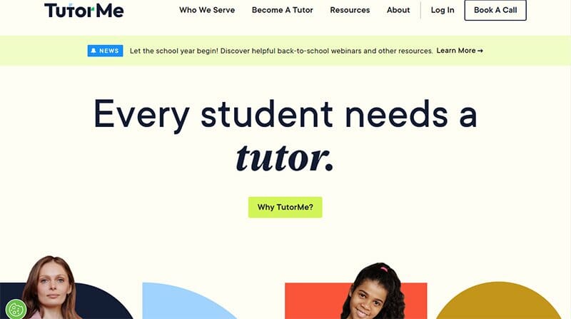
Tutor Me takes pride in its stats, displaying numbers in bold white font beneath two high-quality images on its website homepage. As a top teacher website, Tutor Me connects students with highly qualified tutors, guaranteeing the best personal experience for students.
Shapes, animated images, and colors make Tutor Me stand out among other teacher website examples, giving it an aesthetically pleasing look.

Weronika Zubek is a personal website and art studio where visitors can find fine art, prints, online classes, and teacher resources.
Home to all aspects of her work, Weronika places a header text link to her class sessions in her site’s header menu. There is a cart feature at the top right corner of the homepage that helps users keep track of their orders.
I love how Weronika Zubek displays excerpts from her Instagram page centrally in the footer section alongside links to her socials and a search feature.

Kitchenclassroom aims to help expand people’s understanding and appreciation of food and cooking with simple and relaxed cooking lessons. A smiling hero image of a chef and two other students takes center stage on the Kitchenclassroom website.
The CTA buttons on a black background stand out, revealing further information when clicked on. There are delicious images of some of the chef’s sample menu items displayed in a three-column layout.

Christian Dorn is a studio musician, mixing engineer, educator, and the name behind the Christian Dorn Music empire. As an educator, Christian Dorn is among the top music teachers, with teaching experience in drum lessons.
This teacher website example is consistent with its CTA buttons, displaying them in a Dartmouth Green background.
Christian provides visitors with a free preview, granting them access to free classroom resources, guides, and Drum PDF accessible from his site’s homepage.

Rehearsal Room Music School offers music lessons for different ages and skill levels, focusing on Guitar, Piano, Drums, Bass, Songwriting, Bands, and Voice lessons.
Beneath a half-screen full-width hero image of a drummer in the background is the Rehearsal Room Music School’s trial lesson information questionnaire. Built in black-and-white and complemented with a black-and-white image, the setup is easy for visitors to fill.
Colorful images and videos from the Rehearsal Room Music School’s Instagram page add color to this predominantly black-and-white built website displayed in a five-column layout.

Erika Gonzalez is a certified professional dog trainer, behavioral consultant, and dog lifestyle expert, providing online content and valuable resources via her website. A simple design, Erica’s From Dusk Till Dog teacher website uses a centralized layout for her website content.
Underneath a top bar notification before the header menu are black-and-white icons leading to the From Dusk Till Dog socials and streaming platforms. A three-column layout for images and texts is consistent on Erica’s website.

Smart Passive Income teaches proven methods that build an audience and help users monetize their work. Visitors first notice the circular changing images as the hero image, displaying testimonials from previous clients.
Dots and lines are visible throughout the site, adding extra aesthetics to the already visually-appealing website design. The pinned header navigation menu displays content with a drop-down menu feature visible alongside a search bar for a more refined search.
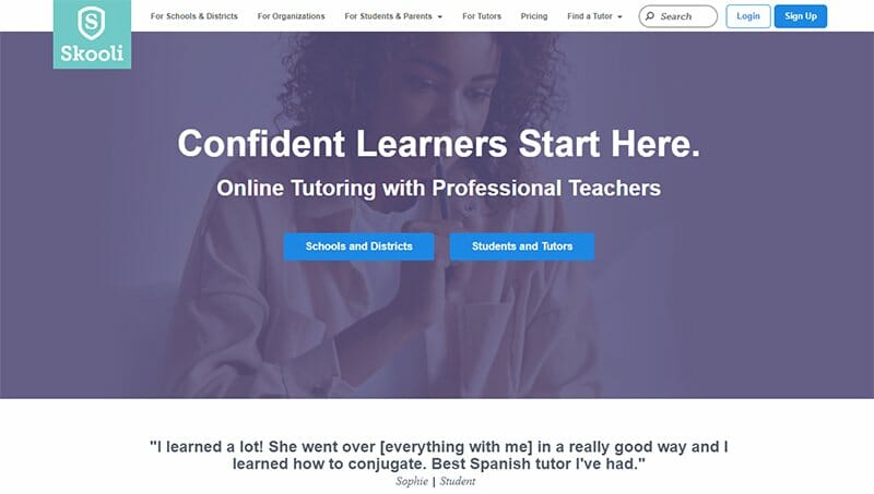
Skooli offers schools, districts, and organizations an equitable and affordable online tutoring platform to provide academic support across all subjects.
An educational support platform, the Skooli teacher website displays a hero image of a girl thinking in the background, blending with a Dolphin colored background.
Beneath the site’s hero image is a slideshow of testimonials from students across different grades attesting to the Skooli brand. I love how Skooli displays logos from top brands in its As Seen Section, including Forbes, helping instill confidence in the brand.

MasterPasha Photography is home to the mobile photography course, an independent lifestyle photography online course with a cinematic style and some backstage magic.
This photography website is visually appealing, displaying bold and stylish typography to complement its high-quality images. There are YouTube videos visible on the homepage, providing visitors with an unusual viewing experience.
Another top feature of MasterPasha Photography is the use of still and moving sections, making scrolling through the website entertaining.

The Simply Organized Teacher website design displays its content over an extensive white background. A brand that prides itself on helping with organizing the classroom for middle-aged teachers, proper organization is at the heart of its website design.
You can’t help but admire the Lightning Yellow CTA buttons on The Simply Organized Teacher, easily distinguishable from the ordinary body of texts.

Learning in Hand is a good teacher website that started as part of a classroom website, spearheaded by Tony Vicent to help teachers. This website’s home page uses a minimalist design, displaying a White and Cerulean color scheme throughout.
I love how Learning in Hand uses a centralized layout for its content. A three-column mixture of a video and animated images grabs visitors’ attention and gets them to explore the other sections and pages.

Laurent Bouty is the brain behind the marketing canvas method, a tool designed to help smart marketers become even smarter. His site, a personal website for himself and a teaching website for his brand, looks like a blog post, with a surplus of innovative teaching strategies.
The position of CTA buttons on Laurent Bouty's website is strategic, standing out in their clear white fonts. This teacher website displays its content in a centralized format, leaving plenty of visible white spaces on each side.
Best Teacher Website Examples FAQs
Squarespace and Wix are among the best website builders building teacher websites, thanks to their extensive features and pricing. These website builders guarantee the best user experience for their users.
Every teacher's website needs to have a welcoming homepage that spells out its classroom ideas and list of activities. There should be images and video content of class or group sessions on display. A list of educational events, contact details, and a personal experience section are all important features that should be on a teacher's website.
Creating your own website to take your teaching services online is a big step and requires professional assistance for the best result. Website builders like Squarespace and Wix have ready templates to use in creating your own teaching website. For the best outcome, using the services of a web designer is the best choice.
Creating a teacher's website is a major step in securing student engagement, as the bulk of the learning community is now moving online. Class sessions are now done from the comfort of the home to allow students to learn from any location.
A good teacher website is an excellent tool to sell online courses depending on how easy and accessible visitors can access the feature. Creating catchy navigation links and CTA buttons is one of the easiest ways to sell online courses on your teacher's website.


