Best Training Websites of 2025 | 33 Examples For Design Inspiration
Professional development training is one of the fastest-growing niches in the e-learning industry. Individuals and organizations are spending more on this e-learning sector.
If you own a training company, you will know that the competition for customers is at an all-time high. However, creating a kick-ass and user-friendly training website will give you an advantage over your competitors without one or a poor web design.
You can hire the services of a website development agency to help you create the perfect training website, but that can be time-consuming and expensive.
A better alternative is to use the best website builders, like Squarespace and Wix, that offer state-of-the-art educational templates and tools to design an eye-catching training site.
This article explores the 33 best training websites that provide you with rich inspiration and web design tips you can use to create yours.
Let’s get started.
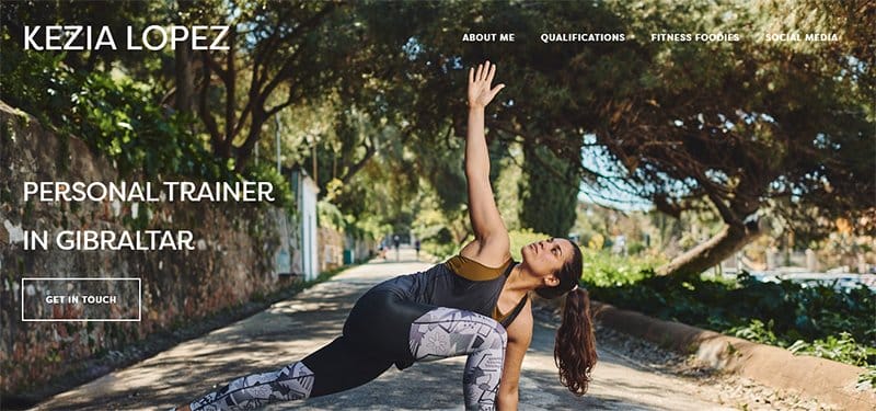
Kezia Lopez is a Gibraltar-based personal trainer and Nike brand ambassador who provides her clients with customized diet and exercise regimens. A heroic photo of Kezia performing a routine outside serves as the site’s hero image.
I love the website's layout and how the expert placement of text between the photographs on a white background. Kezia Lopez uses her site to display several images of her working out.
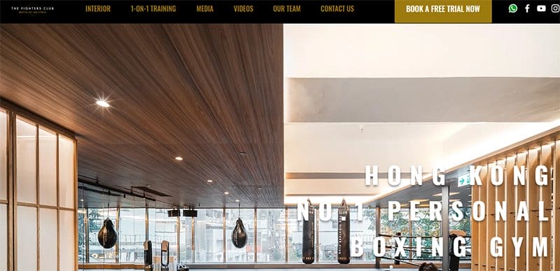
The Fighters Club prides itself on being the best boxing and Muay Thai private training studio in Hong Kong, providing one-on-one training based on its clients' goals.
A great website with a professional web design, the Fighters Club training website is aesthetically pleasing, paying keen attention to details.
The logo's Buttered Rum color is a key part of the site's web design, standing out as font and background colors over the all-black homepage background.
A compilation of training videos is accessible above the footer section in a five-column layout, helping users practice independently.
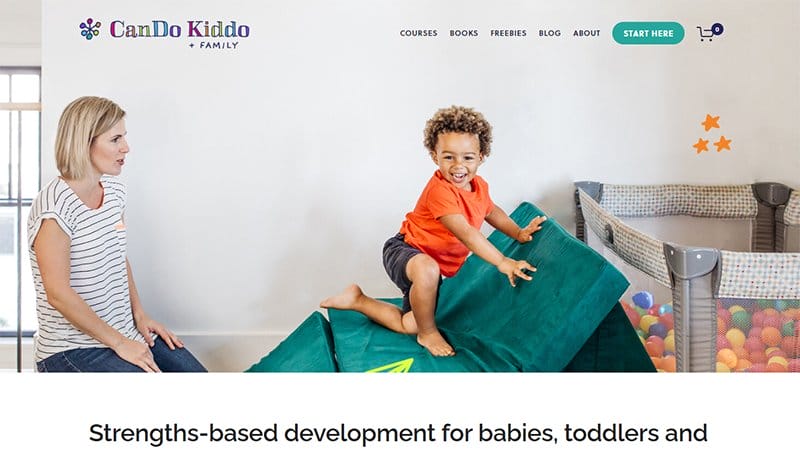
CanDo Kiddo designs its website with the Squarespace website builder, emphasizing diversity, growth, intuition, and intensity. The owner, Rachel Coley, is shown supervising a toddler in a full-width hero photograph on the CanDo Kiddo website.
This training website features a straightforward design with a white backdrop, alternating text and image placements, and CTA buttons that take users to different pages. Links to its Instagram page and pictures are visible on a cloud burst background in the footer section.
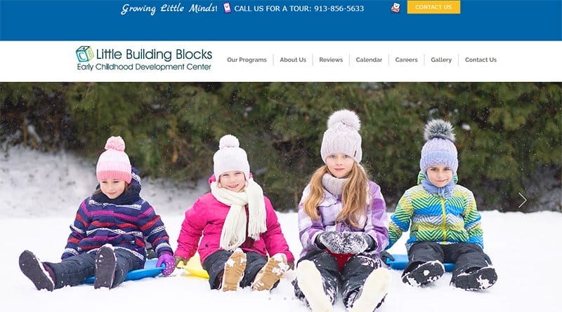
Little Building Blocks is a family-owned and operated early childhood center that provides a safe, fun, and nurturing space for all children. This good training website example is professionally-looking and displays well-arranged sections.
Welcoming visitors to the site is a full-width slideshow of the training center activities, captivating visitors with their high-quality display.
I love how the site alternates between images and texts in listing its programs, using bold colors to distinguish between individual CTA buttons.
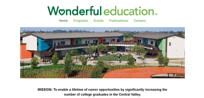
Wonderful Education's mission is to enable a lifetime of career opportunities by significantly increasing the number of college graduates in the Central Valley.
One of the best higher education websites, the Wonderful Education website is minimalistic, sticking to a centralized layout for its training website design.
Listed in a centralized two-column layout are the organization's courses, alongside images that help visitors with a visual perspective. CTA buttons are visible and attached to each course in Clover Green backgrounds, prompting visitors to Learn More about each course.
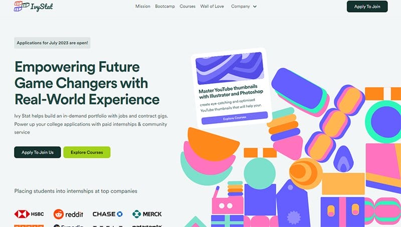
Ivy Stat empowers a generation of learners with hands-on experience and actionable resources to pursue passion-fueled careers and start profitable businesses.
This top training website design example is aesthetically pleasing, treating visitors to a display of eye-catching design elements.
Bold colors and shapes are easily visible on the site, catching users' attention and improving the site's visual appeal. Testimonials from past clients are available on the homepage in an inconsistent three-column layout, serving as social proof to potential customers.

Global Swiss Learning is an international team with diverse backgrounds, transforming premier vocational education into lifelong changes. This beautiful training website is modern, sticking to a clean layout for its training website design.
I love the display of logos of Global Swiss Learning partners and clients on separate homepage sections in a black-and-white color scheme, serving as social proof.
Visible on the homepage is a list of the company's courses in a three-column layout, headlined by high-quality images.
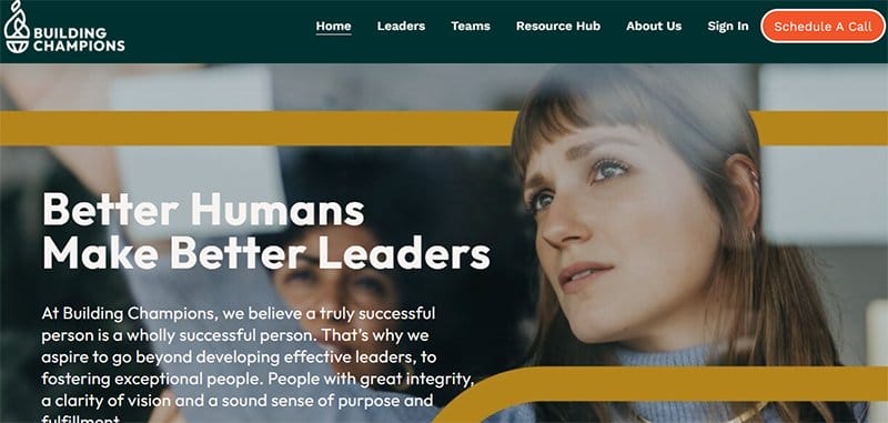
Building Champions aspires to go beyond developing influential leaders and fostering exceptional people with great integrity, clarity of vision, and a sound sense of purpose and fulfillment.
One of the top training website design examples, the Building Champions training website, is visually appealing, displaying bold design elements visible as shapes and colors.
The site's multiple CTA buttons are unique and easily recognizable in their Flame and White color scheme, prompting visitors. There are logos of its featured clients on an extensive Squash background, alternating between black and blue as font colors.
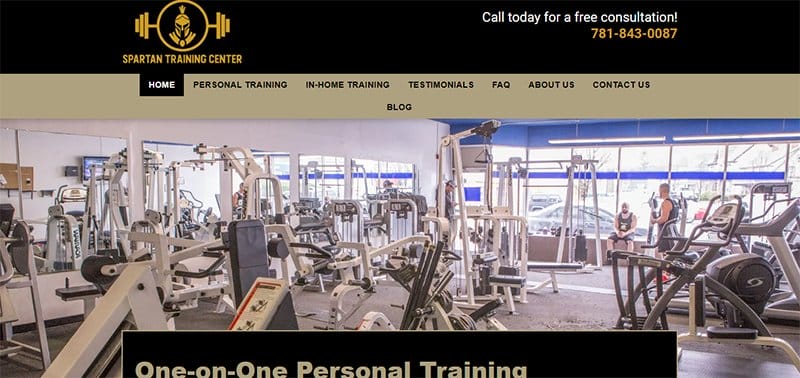
Spartan Training Center offers one-on-one personal training to its clients in the South Shore, as it has been its custom for over 20 years. One of the top training websites, the Spartan Training Center website is minimalistic, sticking to a straightforward training website design.
The logo's Satin Sheen Gold color is a vital part of the site's web design, visible as background and font colors for different sections. A parallax scrolling feature is visible as users scroll the homepage, keeping their focus on the site's main content.

Codewars is the world's most advanced coding assessment platform for organizations looking to scale their hiring, upskilling, and certification programs.
One of the best training website examples, the Codewars training website is unique, sticking to a modern and intuitive layout to display its content.
The homepage uses a dark-themed background, making the site's images and animated icons more appealing to users. I love the use of the logo's Carmine Pink color to highlight header texts and multiple CTA buttons.
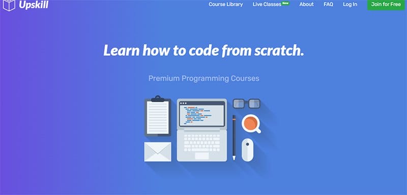
Upskill is a high-quality tech training platform helping users learn fundamental and state-of-the-art programming skills using modern technologies. This fantastic training website is visually appealing, displaying eye-catching design elements.
Everything about the site's web design is bold, with the texts and animated icons engaging users as they scroll. I love the display of reviews from students across 150 countries on the homepage in a two-column layout, serving as social proof.
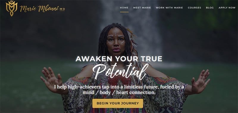
Marie Mbouni offers transformational experiences for change makers, leaders, and achievers who want to step into their wholeness, power, and purpose. This eye-catching training website is aesthetically pleasing, with color gradients that add a mystical touch to the web design.
Links to her online courses are accessible from her site's sticky header menu and header texts linked to other pages. The logo's Desert color is the background color for multiple CTA buttons and unique homepage sections.
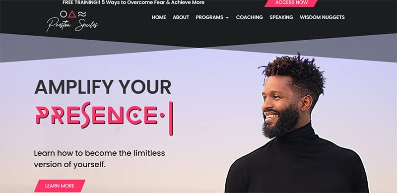
Preston Smiles empowers, inspires, and amplifies a multi-generational movement of radical love through creative, conscious content and intentional acts of love.
One of the top training website design examples, the Preston Smiles training website, is unique, emphasizing the artistic side of its web design.
The Radical Red color is one of the site's primary colors, serving as the background color for its CTA buttons. An accessibility icon that gives users control of the site's layout is pinned to the left-hand side of the homepage, one of the site's user-friendly features.
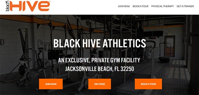
Black Hive Athletics is a private gym that provides clients with the best equipment, cleanliness, and access options anywhere on the beaches.
Besides providing CrossFit classes, personal trainers, and entertaining kids' fitness courses, the Black Hive Fitness website is a small business website.
Three CTA buttons stand out over the site's hero section in its Blaze Orange color logo, prompting visitors to Join Now, Get a Day Pass, or Book a Tour.
Images of its gym facilities are visible on the site's homepage, sticking to a consistent two-column layout.

Mari Suzuki's vision is to create a world where everyone achieves and stays at their ideal weight, health, and happiness through whole and home-cooked meals. This minimalistic training website design is designed to inform visitors of the benefits of cooking.
Free resources that help users take simple steps in their cooking journey are available in a separate section amidst a captivating background image.
Animated images, a video of herself, and an image of her cookbook beautify the site's homepage, adding to its design aesthetics.
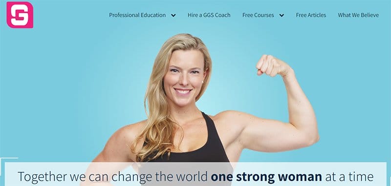
Girls Gone Strong is a movement dedicated to women's health, strength, and empowerment, providing industry-leading educational materials to help women reach their goals. This stunning training website design example is professionally-looking and has well-arranged content.
You will find logos of top brands the movement has consulted and collaborated with in a centralized layout beneath the hero section. Consistent on the site is its multiple CTA buttons in their Fountain Blue background color, prompting visitors to check out more details.
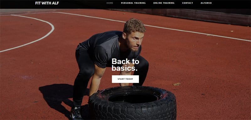
With more than a decade of expertise as a personal trainer, Alfonso Lovine loves assisting clients in changing their bodies and lifestyles.
One of the top training websites, the Fit with Alf training website, features an image of Alfonso doing a challenge as its hero image.
The training website design is clean and classy, displaying several call-to-action buttons to help users navigate.
An extensive gallery displaying before and after images of former clients serves as social proof to potential customers, helping with a visual perspective of what to expect.
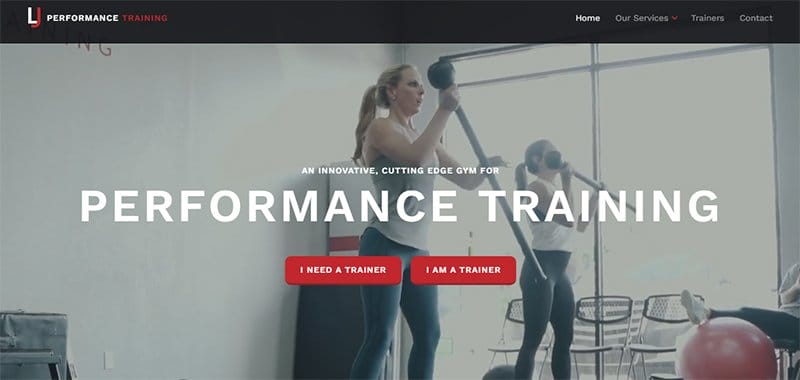
LJ Fitness Training is a semi-private personal training gym catering to those searching for a comfortable yet equipped space for their training. This excellent website example is visually appealing and displays high-quality images and videos as the site's core content.
The site's CTA buttons are easily noticeable due to their red distinction, one of its many standout design qualities.
I love how the brand bio section conveys the intended message effectively and offers the opportunity for a booked consultation.

Fitwell offers a team of the best sports chiropractors in San Francisco, offering a specialized treatment that gets you out of pain and moving at full potential. This top training website is modern, sticking to a clean layout for its web design.
I love the display of testimonials from past patients on the homepage's plain white background, visible in an interactive three-column slideshow. The center's services are listed in a three-column layout, with a map feature that helps users access the center.
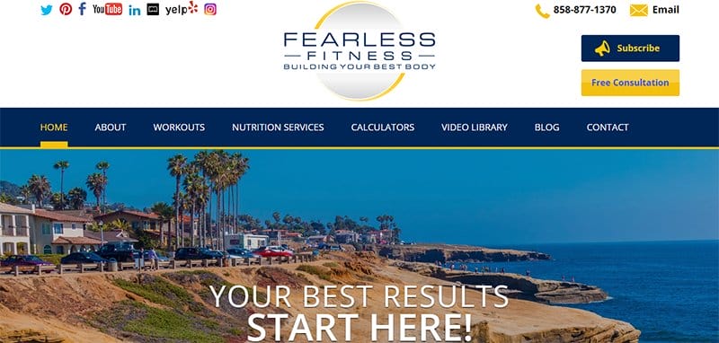
Fearless Fitness specializes in all health and fitness levels, prioritizing its clients' overall health and wellness. This training website example is unique, displaying bold design elements consistently on the site's home page.
The site uses a doubleheader menu, with the top header menu displaying colorful social media icons over a plain white background.
A Buy Workout CTA button takes a fixed centralized position at the bottom of the homepage, standing out in its ArtyClick Orange-colored background.
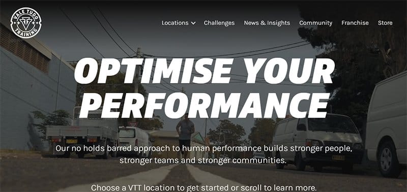
Vale Tudo Training builds stronger people, teams, and communities through its no-holds-barred approach to human performance.
One of the best training websites, the Vale Tudo Training website is aesthetically pleasing in its high-quality display of content on its home page.
A chat feature is visible and pinned to the homepage's right-hand corner, serving as the site's online communication channel. Users enjoy a parallax scrolling effect as they scroll up or down the homepage, displaying full-width images of its team and facilities.
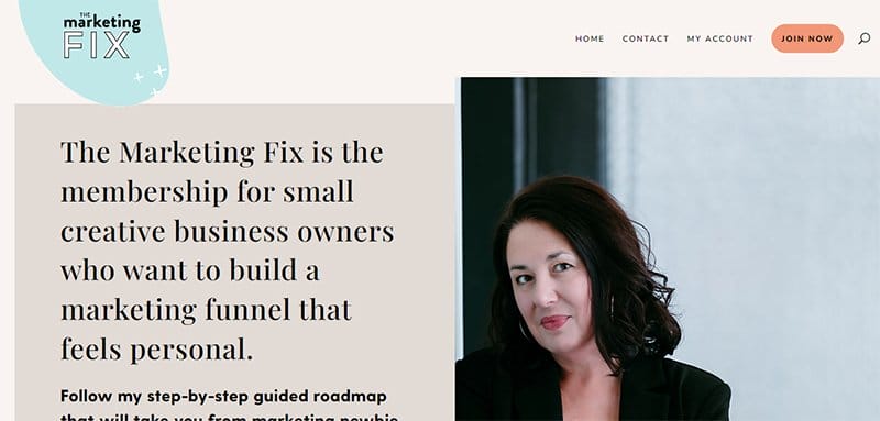
The Marketing Fix is a monthly membership and resource library for creative business owners who want to build a marketing funnel that feels personal. One of the top training websites, the Marketing Fix training website design is unique and uses multiple eye-catching elements.
Full of resources and tools to help users build a marketing funnel, the homepage uses old but classy fonts to engage users. A soft color scheme is visible as visitors scroll the homepage, combining several shapes and interactive icons to improve the site's visual appeal.
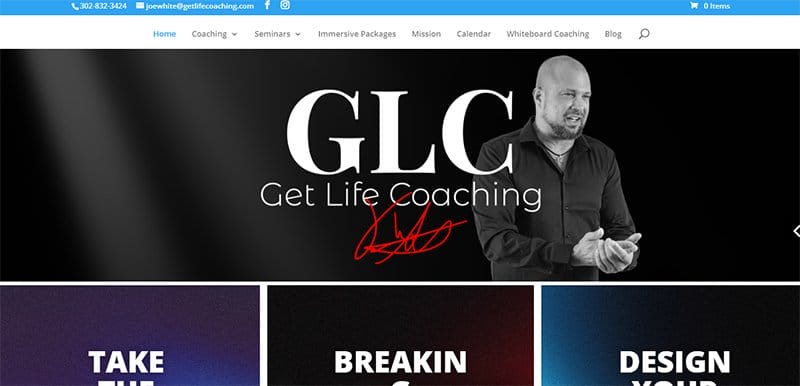
Get Life Coaching helps people break free from feeling dependent, weak, and unfulfilled and shift into dependent, fulfilled, and powerful beings.
One of the top training website examples, the Get Life Coaching website, is aesthetically pleasing, displaying several color gradients as background for its homepage sections.
I love the display of testimonials from past clients in white on a purple-colored background, serving as social proof to potential customers. An extensive FAQ section is visible beneath the free tool section, providing ready answers to possible questions.
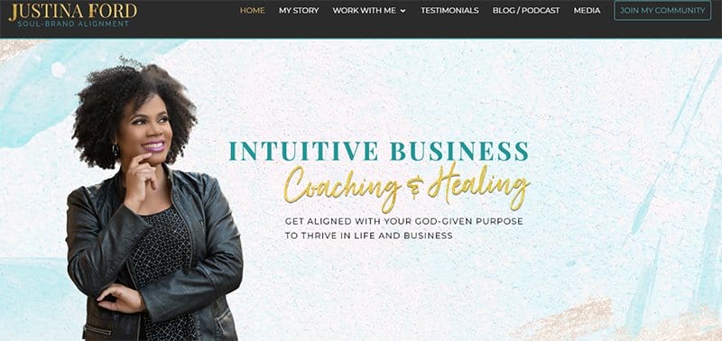
Justina Ford is a business mindset coach and beauty agency owner teaching heart-centered creatives how to get out of their heads and use their God-given talents. This top training website is aesthetically pleasing, displaying a playful mix of bold colors.
Logos of top brands Justina has been featured in are visible on the homepage in gold, an essential part of her online branding strategy. I love how the site alternates between different font types and colors for its typography, one of its top interactive elements.
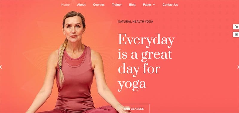
Yogger Studio is all about yoga for life for self-control, inspiring people to be healthier and happier in their daily lives. This fantastic training website example is professionally-looking, with unique sections that engage users.
The hero section is visually appealing, displaying centralized images in a captivating slideshow on an extensive sunset-orange color gradient.
Attached to the bottom of the hero section is a CTA button prompting visitors to join any classes offered and gain value.
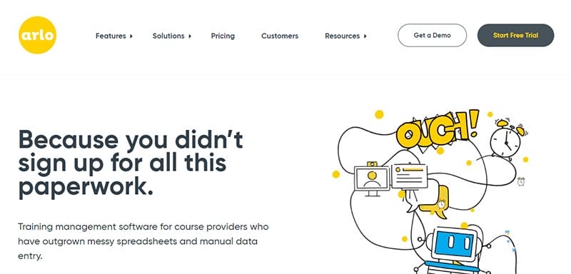
Arlo is training management for course providers who have outgrown messy spreadsheets and manual data entry. One of the best training websites, the Arlo training website is unique, with plenty of white space that allows users to focus on its essential and relevant information.
An extensive FAQ section on the homepage provides ready answers to users' likely questions about the software and the online courses.
You can’t miss out on the robot icon at the bottom right-hand corner of the homepage, serving as the site's online communication channel.

Quickchannel is a video platform designed with simplicity, ensuring users effortlessly create, manage, and share videos in one platform. This professionally-looking training website displays screenshot images of its platform on its homepage.
The logos of its trusted partners are beneath the hero section in an interactive slideshow, serving as social proof. An extensive FAQ section is visible on the homepage, helping users answer potential questions about the company and its platform.
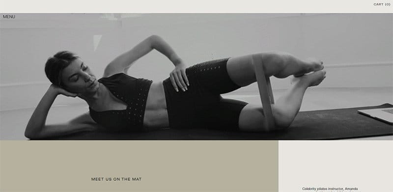
Pilates by Amanda Fitness site is two pages long, including a photo slideshow of the personal trainer on the first page. An Enter CTA button in the middle of this initial page takes users straight to the website's home page.
The use of a black-and-white video slideshow is the only minor change made to the main home page's visual identity from the first page. I love the use of heated gray, platinum, and mushroom as the backdrop colors on this fitness website.
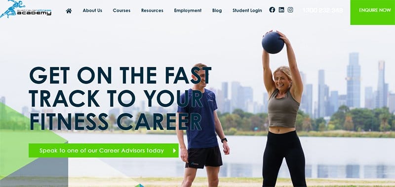
The Australian Fitness Academy is a leading online fitness education provider that delivers nationally accredited fitness and personal training qualifications in Australia. This top fitness website example is aesthetically pleasing, displaying several eye-catching design elements.
Google-based reviews are also visible on the homepage on an extensive Rich Electric Blue background, sticking to a centralized four-column slideshow.
I love the display of several lines, shapes, and colors on the site's homepage, adding to the site's design aesthetics.
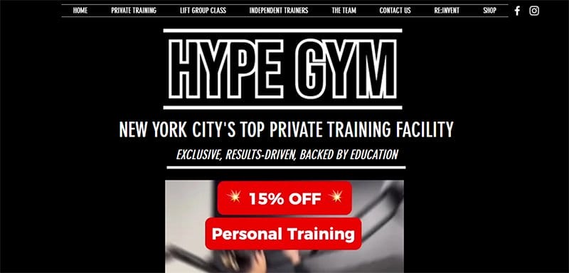
Hype Gym is New York City's top private training facility offering personal and semi-private training and group classes. One of the best training websites, the Hype Gym training website is unique and built on a predominantly black-and-white color scheme.
The site's multiple CTA buttons are boxed in a black-and-white color scheme inspired by the company's logo design.
I love how the header menu sticks to the site's black-and-white color scheme, displaying header texts and social media icons linked to the company's social media platforms.
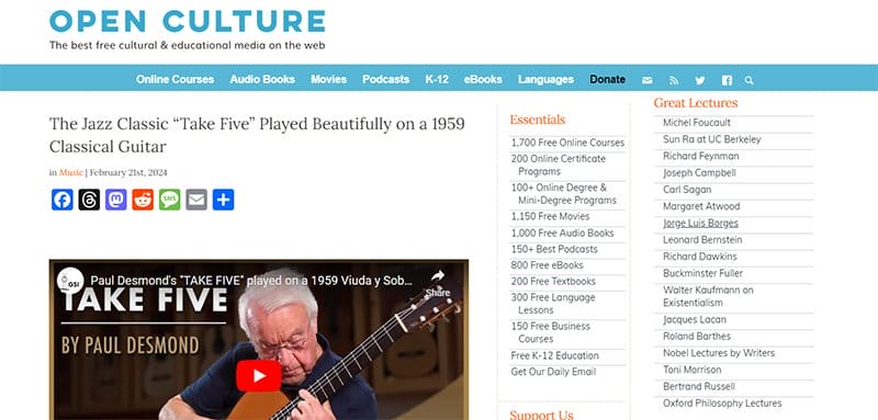
Open Culture is a higher education training website that sources the web for the best educational media for its users. This training website example is minimalistic, sticking to a plain web design.
The Fountain Blue color is prominent on the site's homepage, distinguishing CTA texts and buttons from regular texts and the site's content.
I love the arrangement of content on the site's homepage, with a search icon in the header menu that grants users easy access to resources.
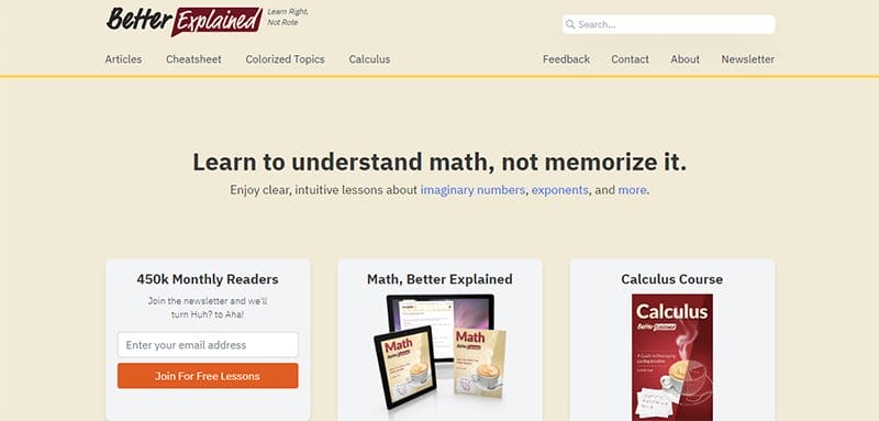
Better Explained mission is to help people understand new concepts while sharing moments that make learning fun and memorable. This top training website example is unique, sticking to a centralized layout for its web design.
Links to its articles are embedded in different blog excerpts on the homepage, each headlined by colorful, animated images and bold titles.
I love how the site lists different topics on the homepage, categorizing them into different categories and making them easily accessible.

Workplace Safety Solutions is a dynamic safety management and health consultancy assisting businesses and organizations in managing their health and safety requirements. This top training website design example is minimalistic, sticking to a straightforward website design.
Welcoming visitors to the site is an all-text hero section, providing a brief company bio alongside CTA buttons leading to its About and Services page. Beneath the hero section is a list of the company services, sticking to an inconsistent four-column layout.
Training Website Examples FAQ
Choosing an amazing training website design is easy, with numerous website builders offering templates and inspiration to adapt to your own website. To create an amazing training website design, choose a domain name and hosting plan, pick a website builder and a learning management system, and set up a theme.
Udemy, edX, Skillshare, Udacity, FutureLearn, Codecademy, Khan Academy, LinkedIn Learning, Google Skillshop, OpenLearn from Open University, Harvard Extension, Academic Earth, and MasterClass are among the best websites that offer professional online courses.
A corporate online training program is a schedule of educational activities at little or no cost, designed to educate employees about their work environment. Beneficial to both employers and employees, this online training program helps employees progress professionally and personally by honing their knowledge and skills.
Explore Further
- How to Create and Sell A Successful Online Course
- Training Course Business Name Ideas Generator
- Best Online Course Platforms
- Best Performance Management Systems
- Dog Training Business Name Ideas Generator
- Best Learning Management Systems
- Ultimate List of eLearning Statistics
- Education Website Templates
- Online Education Website Templates
- E-learning Website Templates