36 Above-the-Fold Content Examples to Inspire Your Own
Every section of your webpage plays a vital role in boosting user engagement and increasing the chances of a high conversion rate.
The above-the-fold section is one of the most essential parts of a put-together webpage. This section refers to the part of the web page that first greets users when they land on a page. The content in the above-the-fold section includes header, text, imagery, or visible video.
Creating an attractive and attention-grabbing above-the-fold profile on your webpage increases your chance of encouraging visitors to spend more time on your page.
You can use the best website builders, like Squarespace and Wix, to design awe-inspiring, above-the-fold content for your website.
This article explores the 36 best above-the-fold content examples you can use as inspiration to design your own site.
Let's get started.
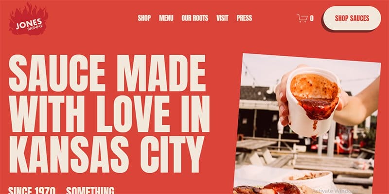
Deborah and Mary Jones took over the Jones Bar-B-Q restaurant from the original business owner, Leavy B. Jones Sr.
This eCommerce website layout displays attention-grabbing graphics, and mouth-watering product description features that will convince visitors to place an order.
I like how the website features an attention-grabbing sliding text element displaying engaging text and captions.
Clicking the white-colored “Shop Sauces” CTA button with a hover feature encourages visitors to check out the page's eCommerce section for a seamless purchase experience.
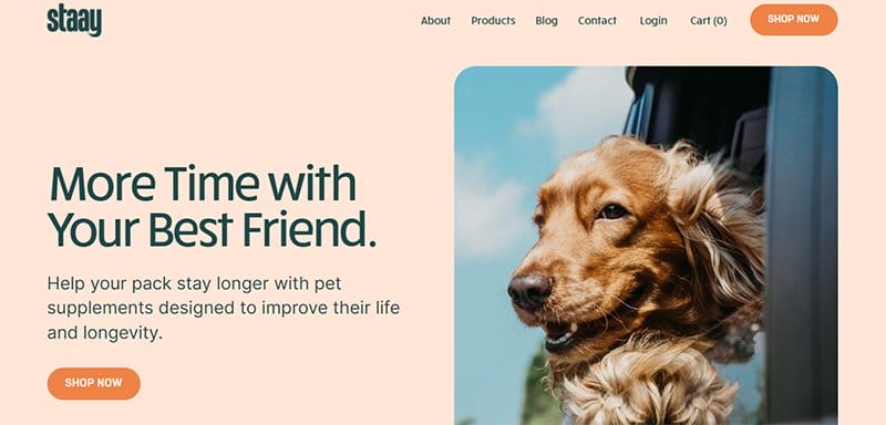
Staay is a company concerned about ensuring a pet's overall health and wellness through the sale of supplements.
What will get your attention is the bold text “More Time With Your Best Friend” and a picture of a golden retriever. Combining these elements gives the homepage a warm, friendly, and homely vibe.
Click the bright orange colored “Shop Now” CTA button on the menu bar and hero section to explore the content the brand has for sale.

Sophie Hollingsworth is a lover of adventure, food, cooking, and the outdoors and the mastermind of the Sofia Log.
A Black and Jasmine color scheme is visible on the Sofia Log Wix blog, with a world map taking center stage and serving as the site's hero image.
The above-the-fold section features multiple colorful and animated contents, which makes the hero section fun to explore.
I like how the webpage features engaging text in black, which makes it visible and attention-grabbing.

Evolve Healing Institute was created by Kate Mantellowho, who has a passion for spiritual healing via the therapy of crystals.
The home page welcomes visitors with a hero image and a mouth-watering offer to learn the principles behind crystal healing by clicking the Apache-colored call-to-action button.
I like how the website color scheme features exotic colors like peach yellow, black, apache, and white to give the page an elegant outlook.
The white-colored sticky navigation bar encourages visitors to explore various aspects of the webpage.
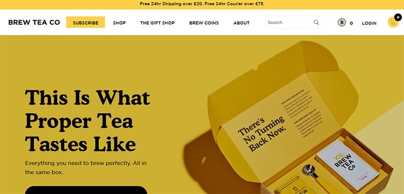
Brew Tea Co is a food-based brand that produces tea from the freshest rolled whole leaves. The hero section of this online business welcomes visitors with heartwarming content like high-quality product images in an automated slider feature.
I love how Brew Tea Co uses a bright color scheme, with its dominant colors being black, bright sun, and white.
Interested visitors can use the sticky navigation bar with a drop-down feature to explore various aspects of the page.
The search bar is a great tool that makes it easy for visitors and potential customers to locate various items on the webpage.
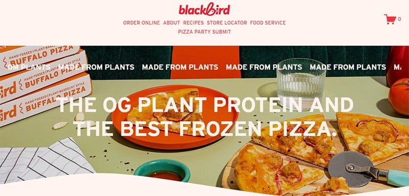
Blackbird's eCommerce page features various showstopping design elements that will get visitors wanting more.
The first catchy element is the hero image, which displays mouth-watering pizza with large static text and a moving text feature that gets customers’ attention.
Using the right color scheme can stir up a hunger. With this knowledge, Blackbird uses colors like military green, earth, deep carmine pink, and verdigris.
My favorite aspect of the page is the moving text feature with the caption “Made From Plants,” which displays the purity and excellence of the baking process.
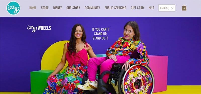
Ailbhe and Izzy Keane are the founders of Izzy Wheels, a creative wheelchair brand that centers around inclusivity and bold self-expression of people using wheelchairs.
Welcoming visitors to this stunning web page is a colorful image featuring Ailbhe and Izzy Keane with the caption, “If You Can't Stand Up, Stand Out!
Clicking the shop icon on the sticky navigation bar is your one-way ticket to explore the eCommerce section, where you can purchase different wheels.
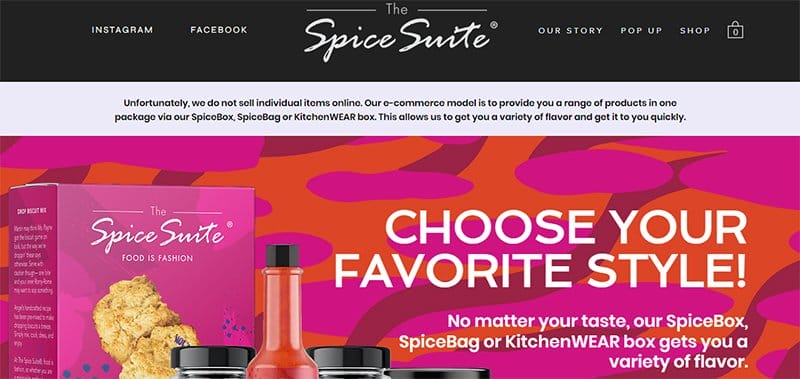
Angel Gregorio is the proud owner of Spice Suites, a fashion-inspired company that sells unique spice blends.
The first thing that got my attention on arrival was using vivid colors to make the site's content pop. In addition, the parallax scrolling effects are among the elements that spice up the store.
Angel Gregorio does not waste time before displaying a lovely, high-quality picture of herself with stunning clothes in the “Best Dressed Kitchen” section.
Visitors can explore the brand's social media account by clicking links on the site's navigation bar directly to the brand's online accounts.
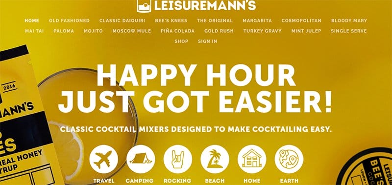
Leisuremann’s Cocktail Mixes is the brainchild of Cliff Couvillon, along with his college buddy, Matt Curtis. I like how Leisuremann's Cocktail Mixes site’s hero section features several graphic designs sliding in a looping fashion.
The header “Happy Hour Just Got Easier” displayed on only the top half of the page is punchy, sticks with visitors and compels them to make necessary decisions.
I love how the page uses multiple descriptive icons to display vital content and communicate with visitors to stir up a quick response.
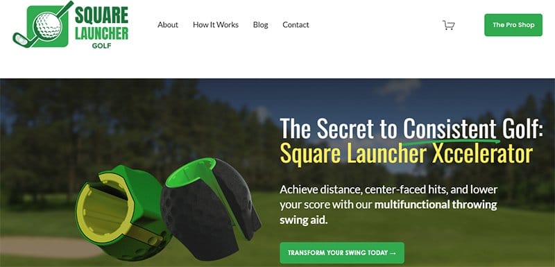
Square Launcher Golf is a sporting organization with a primary mission to simplify golf and make it enjoyable for everyone.
I like how the above-the-fold content integrates the brand’s logo in the top left corner of the page to alert visitors that they are on the right page.
My favorite aspect of this sport-based webpage is the suspended animation feature, which helps to give life to the page and make the product more attractive.
The hero section features engaging text about the brand product with the aim of compelling potential visitors to click the green-colored “Transform Your Swing Today” CTA button.
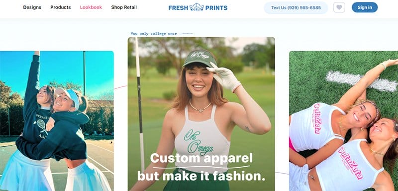
Fresh Print is a brand of student entrepreneurs offering different custom apparel products in various colors, styles, and options. One of the top eCommerce websites, the Fresh Prints website leaves its print on its site visitors with its eloquent display of shades of blue.
I love the display of image excerpts from the brand's Instagram page on the homepage in a centralized three-column display, each bordered by thick blue lines.
Clicking the sticky live chat widget allows website visitors to chat with the brand's customer service reps if they need information about the company.
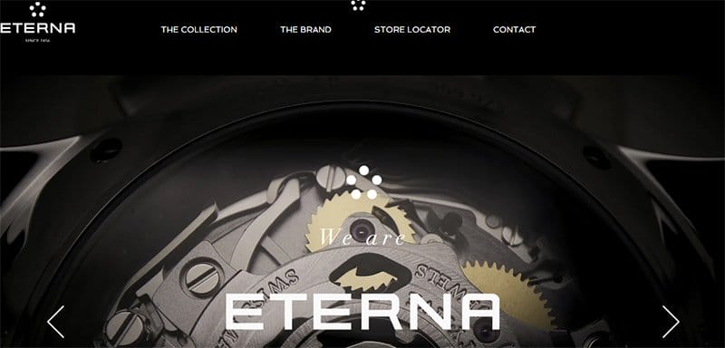
Eterna is a luxury wristwatch brand that originated in the Swiss watchmaking tradition. On arrival, the first catchy element is a slider feature displaying vital content about the brand's history and some of its activities.
You will love the arrangement of the brand's watches in different categories. These images come with a thumbnail feature, creating a fun and user-friendly experience.
Clicking the transparent “Discover” CTA button with a hover feature transports you to a new page displaying a promotional video about the brand to convert visitors.
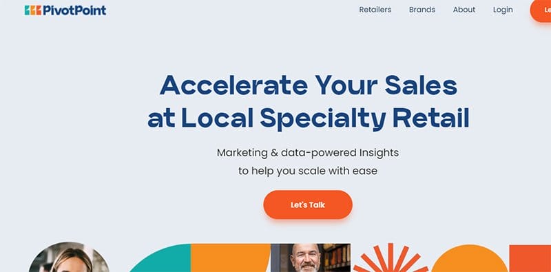
PivotPoint Retail Solutions, Inc. is a benefit corporation based in California that uses POS data integration and cooperative marketing strategies to ensure speciality retailers can thrive.
The first notable element is the arrangement of the images and shapes in the hero section of the page, which helps improve the mobile experience.
I like how the brand's customization options include a parallax scrolling feature and a responsive design element, which makes all the site content fun to explore.
Interested visitors can click the orange-colored CTA button at the center of the hero section, which grants visitors access to chat with customer service representatives.
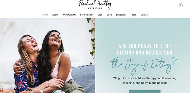
Rachael Hartley Nutrition's website has a basic style with calming colors to instill a sense of serenity in its users.
Welcoming visitors to this eCommerce web page is a split-page design layout featuring a high-resolution image of Rachael Hartley having a great time.
Hippie Blue and Green White are the leading website colors, a classic combination that matches Rachel’s brand identity. The logos of a few well-known companies are visible in the “As Seen” area as social proof.
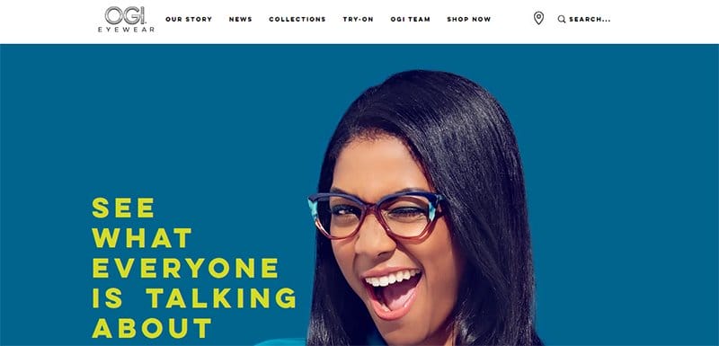
OGI Eyewear is a Minnesota-based eyewear brand that designs beautiful and trendy eyewear. I like how OGI Eyewear features a colorful design layout with its dominant colors being barberry and tory blue.
My favorite aspect is the try-on feature, which allows potential customers to glimpse what they will look like while wearing glasses.
Interested visitors can use the white-colored sticky navigation bar to access the try-on feature via different mobile devices.
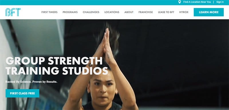
Body Fit Training provides group strength training programs built to deliver positive outcomes for all fitness levels.
One of the top fitness website examples, Body Fit Training, is unique, boldly displaying its logo's Cerulean color as the site's predominant color.
Welcoming visitors to the webpage is a popular strategy that most web designers use to make their projects stand out.
This strategy involves using a looping video element that displays a peek at the brand's activities, which is helpful for stirring up excitement from visitors.
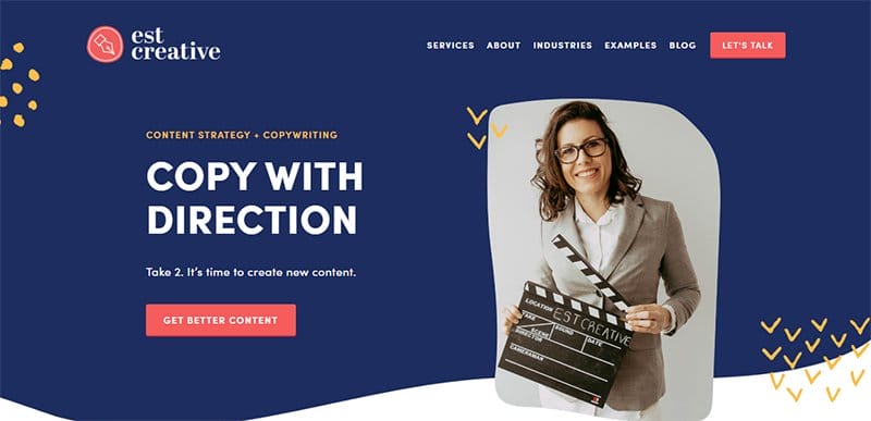
Emily is a freelance copywriter, content strategist, and the proprietor of EST Creative, a company that assists clients in producing content for their companies.
Welcoming visitors to this webpage is a stunning image of Emily, which helps to give the brand a face and keep potential customers engaged.
The underlying color palette on the site is visible on an extensive Cloud Burst background and consists of the logo colors Saffron Mango and Bean Red. Playful hand-drawn arrow icons and dots are present, enhancing Emily's portfolio page's visual appeal.
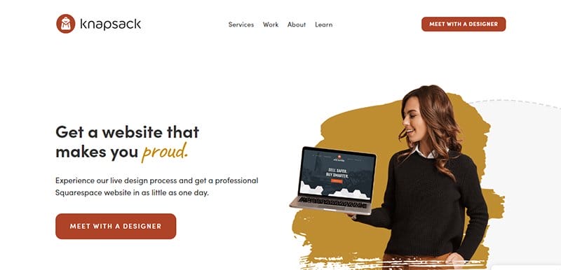
Knapsack Creative Co is a web design company that offers top-notch services to its clients with the singular goal of creating the world's best web design experience.
I love how this website designer webpage has a good website structure, making it easy for site visitors to explore its content and product pages.
With just a few clicks on the pale carmine colored “Meet With A Designer” CTA button on the home page, visitors can access important information about collaborating.
The white background gives this website a unique outlook, making it stand out from other simple web pages.
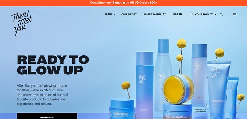
Then I Met You is a top-notch skincare brand founded by Charlotte Cho with the vision to create the perfect skincare product.
Welcoming visitors to this stunning landing page is an eye-catching graphic design that displays the brand's products and highlights its unique selling point.
Visitors interested in getting more details about the brand can use the hamburger navigation bar to explore the page and check out every content about the fold.
The search bar on the menu encourages user engagement and visitors to explore and locate items beyond the above-the-fold section of the page.
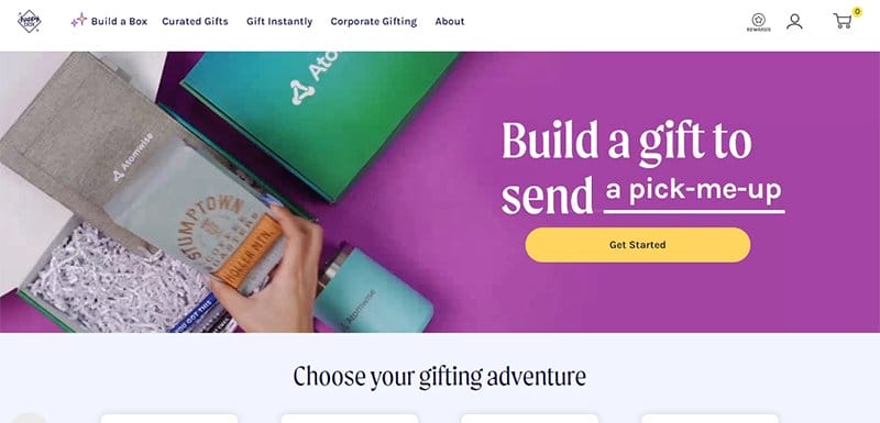
Happy Box Store is a gifting-based brand that focuses on making gifting more modern, fun, and convenient.
Immediately visible above the fold area of this minimalistic e-commerce web page is a looping video displaying some of the brand's top products.
I like how the web page uses eye-catching text about gift building with a light-mustered “Get Started” CTA button to get the visitor's attention.
Clicking the sticky live chat widget grants website visitors the opportunity to chat with the brand's customer service reps.
Animalz is a content marketing agency that offers top-notch services to its customers and web users to help them seamlessly reach their target audience.
I love how this stunning website doesn't bombard visitors with messaging about their services in the above-the-fold design but uses simple texts and emojis to convert visitors.
The responsive web design element in various aspects of the page, like the CTA buttons, texts, and navigation bar, makes it easy to get visitors' attention.
My favorite aspect of this above-the-fold website design, which makes it stand out from other responsive web pages, is the motion effect in the logo display section.
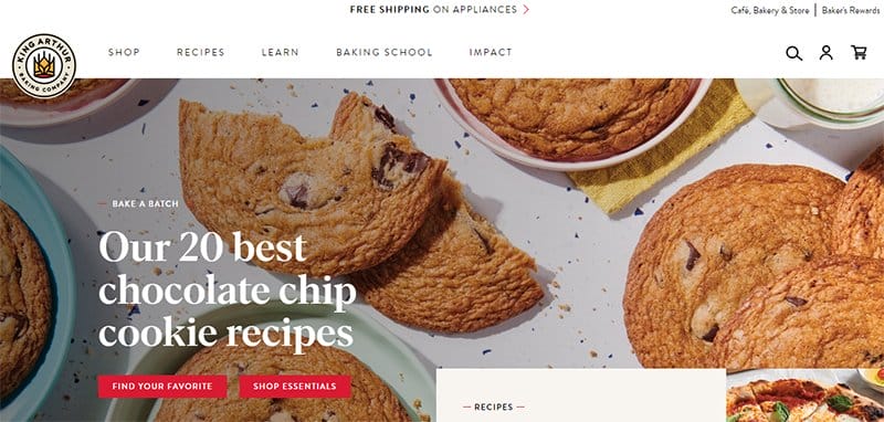
King Arthur Baking has provided bakers with superior flour since 1790, from Martha Washington's apple pie to the invention of the chocolate chip cookie.
On arrival, the first catchy element you will see is a full-width image displaying mouthing watering pastries and the caption “Our 20 Best Chocolate Chip Cookie Recipes.”
Interested visitors can use the sticky navigation bar with a drop-down feature to explore various aspects of the page.
This food-based website features engaging content in the hero section, such as a search bar allowing visitors to search for any content about the fold and beyond.
I like how the page features a live chat widget on the upper half of the fold to enhance user interaction significantly.
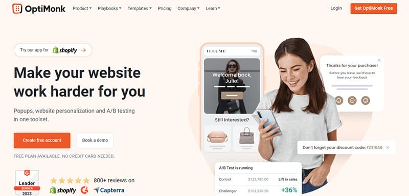
OptiMonk is a unique marketing software brand aiming to help small businesses with simple, practical tools for increasing their online revenue.
I like the informative and engaging section above the fold line, featuring images, texts, and multiple bright orange-colored CTA buttons to influence user behavior.
This unique section features three logos displaying positive reviews from brands like Shopify, leader, and Capterra, which is a source of social proof and helps boost credibility.
I love how the rose-white background makes this website stand out from other landing pages, makes all its content visually appealing, and can get visitors' attention.
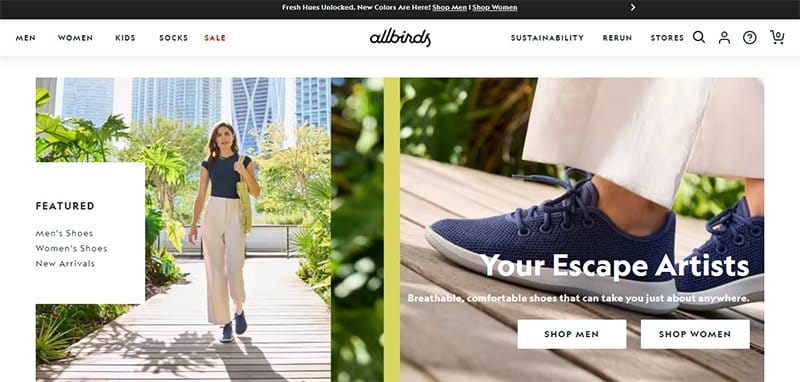
Allbirds emphasize sustainable practices in the production process of their goods. Footballer Tim Brown and engineer Zoey Zwillinger are the brains behind Allbirds, a footwear brand that uses natural and sustainable materials in making their products.
I love how the eCommerce store uses multiple slideshows to display its shoes engagingly and interactively to get customers' attention.
Interested visitors can click on any of the white-colored “Shop” CTA buttons for unlimited access to the eCommerce section of the page.
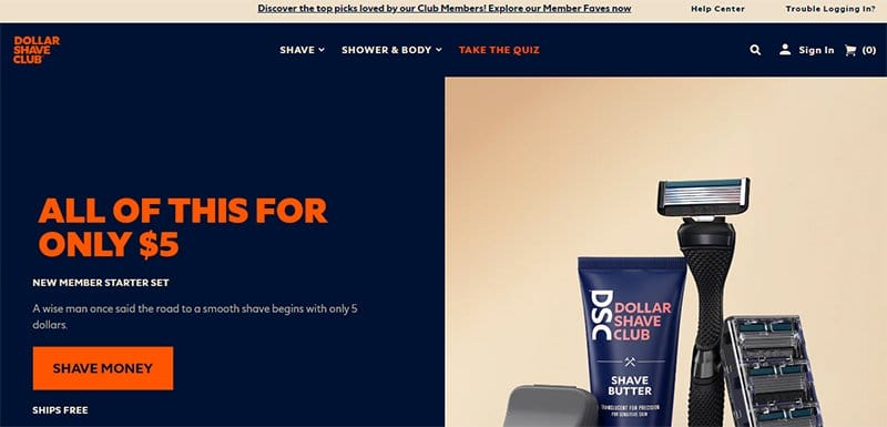
Dollar Shave Club is a male grooming and shaving brand that offers quality products at affordable prices.
Welcoming visitors to this eCommerce web page is a split page design layout featuring a high-resolution image of the brand products.
The background image comes with a thumbnail feature, which leads to a different page where visitors can get information about every product's key benefit.
I like how the above-the-fold content on this site's front page is straightforward and helps reduce the average time users spend on the website.
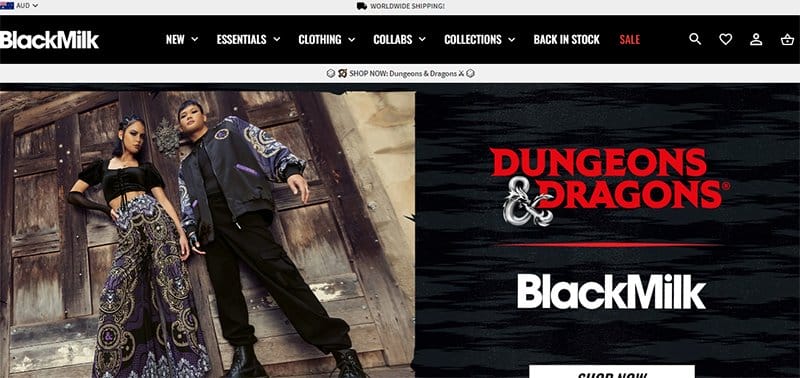
BlackMilk Clothing is a fashion brand with top-notch clothing that meets the demands of the world's diverse cultures.
I like how the page features multiple key visuals that make the site stand out and increase the brand's conversion rates. My favorite display element is the catalog of brand logos at the hero section's base, which helps boost BlackMilk Clothing's credibility.
Clicking the white-colored “Shop Now” CTA button is the fastest way to convert visitors because this transports them to the shop section where they can make purchases.
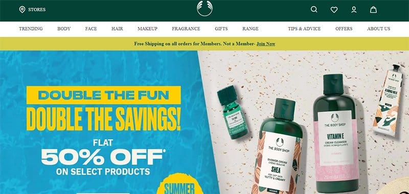
The Body Shop is a beauty-based brand that offers unique skin care products that will help users eliminate inputting and leave them glowing and stunning.
I love how the first thing visitors will see on arrival is a whopping 30% discount on each purchase visitors make on the webpage.
You will love the display picture of its product that fits the standard website resolutions for desktop and mobile screens.
Interested visitors can use the sticky navigation bar with a drop-down feature that aligns with the screen size to explore various page aspects.
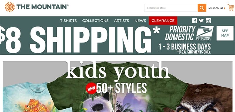
The Mountain is an eco-friendly apparel manufacturer that sells clothing items, particularly T-shirts, for different target customers.
Welcoming visitors to this colorful website is a strategy display of one of the most common screen resolutions featuring a slideshow of new releases. Combining two unique screen sizes displays the brand's products and encourages visitors to buy them.
I like how simple the site's texts are and how it features interactive messages that attract visitors' attention and inspire users to explore further.
The top half of the hero section features vital content such as links to the blog post section, a search bar, and social media icons.
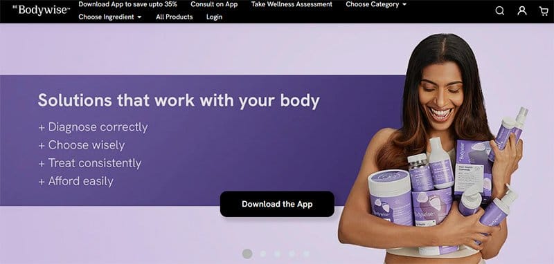
Bodywise is a wellness revolution designed to help users reclaim control over their health, drowning out the chaotic information they deal with daily.
I like how this first portion of a webpage is visible without scrolling. The high-quality graphic design features content about the brand and high-quality images to make it visually appealing.
Clicking the black-colored “Download App ” CTA button is your one-stop shop for accessing the store, where they can download the brand's custom app on different devices.
The search bar on the menu encourages visitors to explore and locate items beyond the above-the-fold section of the page.
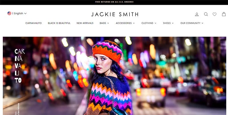
Jackie Smith is a fashion-based brand that sells high-quality clothing and accessories to interested buyers on its eCommerce page.
On arrival, the first catchy thing you will see is a high-resolution image of a model wearing the brand's product on a street.
Clicking the sticky live chat widget allows website visitors to chat with the brand's customer service reps if they need information about the company.
Interested visitors can use the sticky navigation bar with a drop-down feature to explore various aspects of the page.
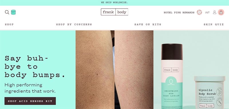
Frank Body is a beauty brand that sells various products with the potential of giving users smooth and glowing skin and outlook. This unique webpage welcomes visitors with a single-column grid layout featuring images with a thumbnail effect.
Clicking any of these images is your one-way ticket to explore content in the eCommerce section of the page, where you can buy more products.
The sticky navigation bar with a drop-down feature has a responsive element that causes it to display images upon scrolling.
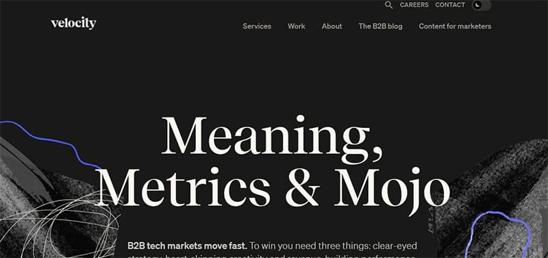
Velocity Partners is a B2B marketing agency that offers top-notch services to its clients at affordable prices.
Welcoming visitors to this webpage is a fascinating 3D animated video and a paragraph of content about the brand's offerings and activities.
The phrase “Meaning, Metrics & Mojo” describes what the business is all about and serves as a catchy phrase to excite visitors and potential customers about the brand.
My favorite aspect of this above-the-fold content is a day/night dial, which makes it easy for visitors to enjoy the page contents at different times.
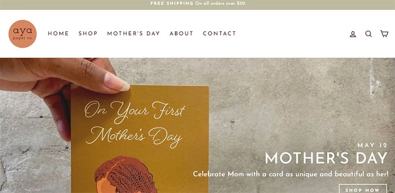
Aya Paper Co creates greeting cards and stationery that look and sound like their clients. This online store’s contents feature illustrations and messages that reflect the diversity of the Black experience.
The first catchy element is a slider feature displaying vital content about the brand's history and some of its activities.
Visitors can use the search function, a great example of a helpful tool that makes it easy for visitors to locate various items on the webpage.
Clicking the shop icon on the sticky navigation bar with a drop-down feature is your one-way ticket to explore the eCommerce section, where you can purchase different wheels.
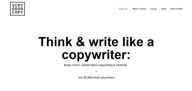
VeryGoodCopy is a creative agency that crafts articles, landing pages, web pages, and emails for brands. Welcoming visitors to this webpage is a catchy caption, “Think & write like a copywriter,” which introduces visitors to the brand's mode of operations.
The white background gives this website a unique outlook, makes every design element visually appealing, and makes it stand out from other simple web pages.
This simple and engaging above-the-fold design ensnares their visitors' attention and convinces them to check out their micro-articles.

InVision is a digital product design company that helps users quickly build sleek, impressive websites. The bright red-colored “Explore Featured” CTA entices visitors to click and explore the hidden content behind the page.
I like how the page welcomes visitors with multiple images on ongoing projects and the caption “Freehand – The All-in-one Collaborative Workspace” at the center of the hero section.
The white-colored sticky navigation bar encourages visitors to explore various aspects of the webpage without limitation.
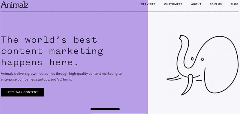
Animalz is a content marketing agency that delivers growth outcomes to enterprises, startups, and VC firms.
Welcoming visitors to this content marketing agency web page is a split page design layout featuring a text section displaying brand information and a free hand drawing.
The mega navigation bar encourages visitors to explore various aspects of the webpage without limitation.
Clicking the black-colored Let's Talk CTA button connects potential clients to a natural person who can offer them more information about the service.
Above-the-Fold Examples FAQ
‘Above the fold’ refers to the section of your site that's visible before users scroll down the page. Once you begin the scroll, all the contents you will see are considered below the fold.
Yes, online readers are scanners who may only have the time to scroll across the page if the contents above the fold are engaging. Giving adequate attention to the content above the fold is vital when it comes to SEO optimization.
The best practices you must follow when creating a tremendous above-the-fold design include keeping it simple, using engaging headlines, incorporating visuals, making navigation easy, using a strong call to action, and testing different versions.
The common mistake most web designers make is adding too much information and mixing a bunch of colors in the fold section of the page. These elements may distract visitors and potential customers from focusing on the central message, resulting in them not taking necessary actions.
You must give particular attention to every vital content that appears in the top half of the webpage, which remains visible without the need for scrolling. If these elements meet the proper communication standards and seamlessly grab visitors' attention, your webpage will become more engaging.