42 Best Award-Winning Websites For Design Inspiration In 2025
Having a visually appealing website design is essential for converting visitors into customers. The best website designs offer beautiful visual presentations and a pleasant user experience.
Finding the most impressive website designs to use as inspiration to create or redesign your own site is no easy task. There are far more bad website examples online than great ones.
Luckily, professional web design and development bodies like Webby Awards and Awwwards recognize the best website designs at intervals. You will get better inspiration and design ideas from checking through award-winning websites.
This article covers the 42 best award-winning websites to inspire you to create yours.
Let’s get started.
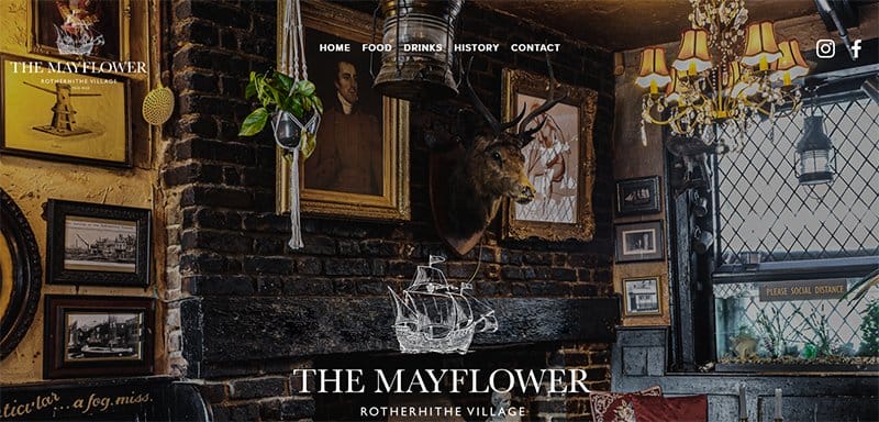
The Mayflower is part of The Black Pub Dog Company, serving fresh, seasonal foods and thoughtfully chosen wines in a friendly laid-back atmosphere.
One of the fantastic websites that keep users engaged, the Mayflower website is modern, sticking to a clean layout for its web design.
High-quality images of its menu options and locations are scattered on the homepage’s plain white background, telling a compelling story.
The chosen font type displayed stands out as one of the site’s key elements, engaging screen readers and site visitors as they scroll.

Blue Dog is a tavern and cookhouse providing its patrons with food from locally acquired ingredients. One of the best-designed websites, the Blue Dog website features an attention-grabbing image of the interior view of its cookhouse and bar.
I love the display of three distinct CTA buttons over the website's hero image, listing the business’s services in clear white fonts. The Drink, Eat, and Visit CTA buttons show changing visuals as the mouse hovers and links to its other pages.
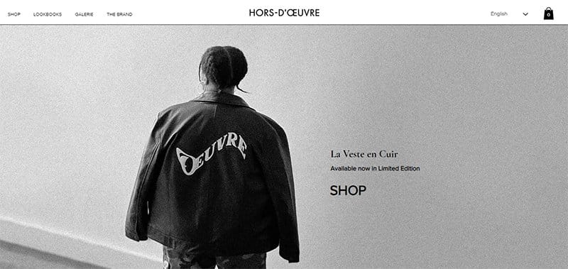
Hors D'Oeuvre is a French creative studio delivering an authentic body of work focused on effortless styles and attention to detail. One of the standout award-winning websites, the Hors D'Oeuvre website is unique, built on a predominantly black-and-white color scheme.
Images of beautiful pieces adorn the site's homepage in a colorful two-column display, adding color to the website design. A cart icon is visible and pinned to the site's sticky header menu, helping users keep track of their purchases.
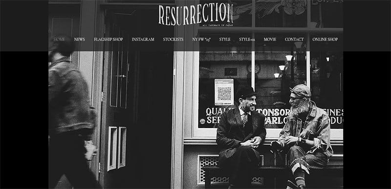
Resurrection is a fashion brand offering all hand-made clothing items made in Japan. One of the best website design examples, the Resurrection website is unique, sticking to a centralized layout to display all of its brands' products.
The entire site is built on a predominantly black-and-white color scheme, adding a mystical touch to the design. This award-winning site uses unique typography to portray an exciting concept, alternating between different font types to display essential information.
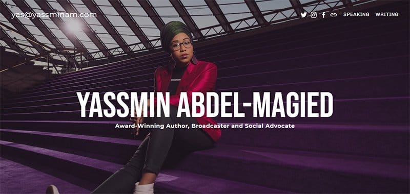
Yassmin Abdel-Magied is an award-winning author, broadcaster, and social advocate championing the case for women across the globe. One of the best website design examples, Yassmin’s website is unique, leaving no room for scrolling on her homepage.
Welcoming visitors is a slideshow display of several high-quality images of herself at different functions, overwhelming visitors.
I love the display of links to her social media pages and other pages in the site’s header menu, easily recognizable in their white colors.
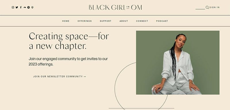
Black Girl In Om exists to hold and catalyze healing within black women everywhere on their unique journeys towards wholeness. One of the award-winning website examples, the Black Girl In Om website is unique, sticking to a soft color scheme for its web design.
The entire site is built on a consistent Albescent White background, making the text in black more appealing to screen readers and site visitors. Several lines and shapes are visible as part of the site’s design elements, adding to the site’s visual design.
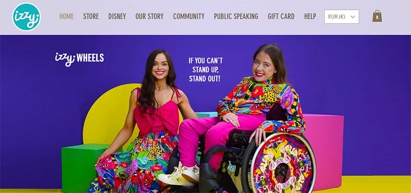
Irish sisters Ailbhe and Izzy established Izzy Wheels, and a long history preceded the establishment of this wheel-based company. Visitors find the modern website for Izzy Wheels visually appealing because of its use of vivid colors, animations, and pictures.
The Izzy Wheels website design features a plethora of original artwork and excellent wheel photos all over the place. Logos of prominent brands and kind words about the brand are visible on the site’s homepage, helping build credibility about the brand.
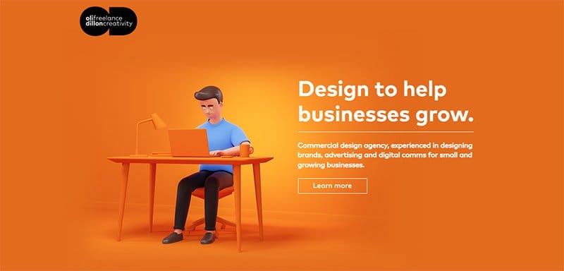
Oil Dilon is a commercial design agency experienced in designing brands, advertising, and digital comms for small and growing businesses. One of the dynamic website examples, the Oil Dilon website, is visually appealing, sticking to a centralized layout for its entire site's content.
Different bold colors serve as the background color for each homepage section, making the centralized content more appealing to visitors. I love the display of testimonials from past clients in a centralized slideshow on the homepage, serving as social proof to potential clients.
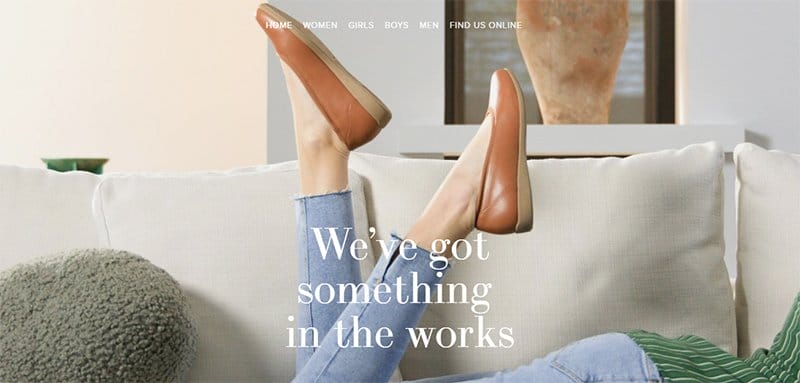
Payless ShoeSource is a shoe brand that gives people with the unique opportunity to do extraordinary things with confidence and style.
One of the award-winning website examples, the Payless ShoeSource website is unique, standing out as one of the minimalistic homepage design examples.
Welcoming visitors to the site is a full-width image of a lady wearing one of its products, displaying confidence and style. Beneath the hero section is plenty of information about the brand and the website, keeping visitors up-to-date about the latest changes.
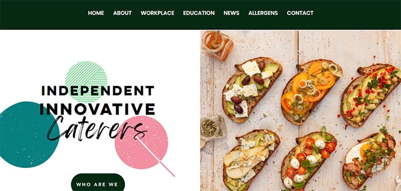
Cleverchefs is a dynamic catering business passionate about food and forming long-lasting alliances with other food enthusiasts.
The Cleverchefs website is a great example of creative web design, using a split-page layout to showcase enticing photos of its dishes.
I love the display of the company's prominent brand logos in a triangle against an all-black backdrop, signifying their accreditation and support. A central chat button pinned to the site's homepage facilitates connection between users and the brand.
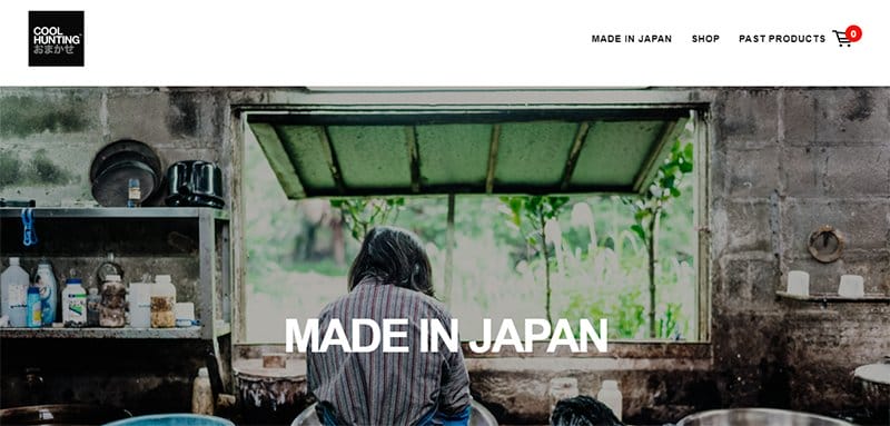
Cool Hunting Omakase presents a selection of limited-edition gifts individually chosen and commissioned by the firm for its clientele.
One of the best website design examples, the Cool Hunting Omakase website, is unique, using an intuitive layout that encourages visitors to explore the web page.
The website's header menu, which features CTA buttons for the shop and previous products and a Cart symbol, functions as the navigation menu.
Aside from the website's main image, all other material, such as the picture slideshow, is arranged centrally, leaving lots of space.
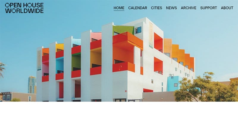
Open House Worldwide is a network of 50 organizations hosting festivals and dialogue about architecture, design, and cities across the globe.
One of the top award-winning website designs, the Open House Worldwide is aesthetically pleasing, consistently displaying bold colors and shapes on the site.
The CTA buttons on the site are unique and easily recognizable in their black-and-white color scheme, prompting visitors. I love the display of images of different cities in different shapes, one of the site’s top interactive features.
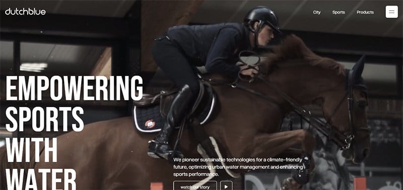
Dutchblue pioneers sustainable technologies for a climate-friendly future, optimizing urban water management and enhancing sports performance.
One of the best award-winning websites, the Dutchblue website uses an interesting concept for its web design that encourages visitors to keep scrolling.
Each homepage section is well-designed to attract attention, with an interactive background and features that keep visitors locked in.
A parallax scrolling feature is visible as part of the site's interactive elements, engaging users as they scroll.

Dolce & Gabbana Beauty Gift is a gift store that helps users discover the perfect creation for their loved ones.
One of the top award-winning website design examples, the Dolce & Gabbana Beauty Gift site is aesthetically pleasing, displaying several eye-catching and aesthetic design elements.
The entire site links together as a means of visual storytelling, taking users on a personalized journey in choosing their perfect creation. Background music attached to the site adds to the list of design aesthetics with an on-and-off switch pinned to the bottom of the homepage.
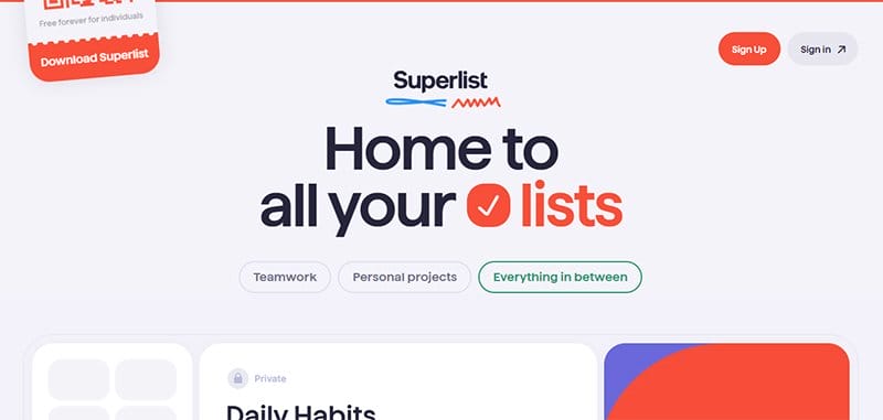
Superlist is a task management tool where users can plan, arrange, and rank their to-do list. One of the best website design examples, the Superlist website displays unique usability elements that guide users through the best ways to use its platform.
The Superlist website greets users with a color scheme of Mirage and Coral Red, one of which makes way for the other when the mouse pointer goes horizontally.
Each background offers customers a two-in-one packed hero image by uniquely displaying two different sets of information.

Torgerson Design Partners is a full-service architecture firm that helps its clients bring the most innovative ideas to life. This excellent example of a professionally-looking website is modern, sticking to a clean layout for its web design.
The grapefruit, orangey red, and black logo are the site's standout colors, adding color to the website design. I love how orangey-red stands out as part of the background color for the site's CTA buttons, distinguishing them from regular texts.
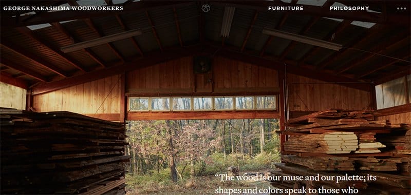
George Nakashima Woodworkers is a furniture-making brand designing pieces of furniture in compliance with the brand's mission of a classic and contemporary design approach and singular craftsmanship.
One of the best website design examples, the George Nakashima Woodworkers website, is aesthetically pleasing, displaying natural images throughout the site.
Welcoming visitors to the site is a slideshow of stunning photos that take users on the company's craftsmanship journey. I love how the site alternates between texts and images in a two-column layout, adding a twist to the plain white background.
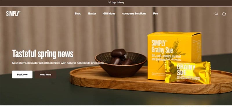
Simply Chocolate is a Danish chocolate maker that creates responsible and fair gourmet products of exclusive quality with only the best ingredients.
One of the best website designs, the Simply Chocolate website is unique, using natural chocolate colors for its website design color scheme.
Image excerpts from the company's Instagram page, each linked to the page, adorn the homepage in a centralized six-column layout. Images of the brand's products are visible in two and three-column displays, with prices and a CTA button attached.

Zillow offers products and services to provide a seamless, end-to-end transaction experience, helping renters, shoppers, buyers, and sellers with every step of their journey. This award-winning website example is minimalistic, sticking to a clean layout for its web design.
Animated images and icons are everywhere on the site's homepage, engaging users with their colorful display. An extensive search bar is visible over the site's hero section, helping users locate specific properties around specific locations.
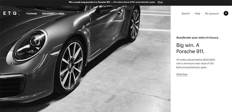
ETQ Amsterdam designs wardrobe essentials with strong silhouettes in tonal colors and ever-evolving styles. This beautiful website is modern and has a clean layout.
High-quality images of the brands' products are everywhere on the site's homepage, providing visitors with an enticing visual design. Product carousel features are visible on the homepage, combining different products into an interactive slideshow.
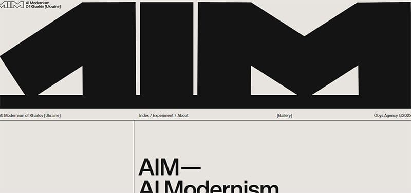
AI Modernism Of Kharkiv is an artificial intelligence experiment based on Kharkiv modernism, displaying the selection of Ukraine's top 5 influential artists. This award-winning website is minimalistic, sticking to a plain website design.
A predominantly black and gray webpage, the site's homepage displays bold and eye-catching elements visible as text. Images from the artists' works are visible on the site's website, adding color to the site's plain web design.
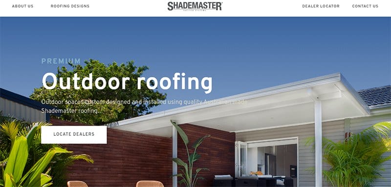
Shademaster combines exceptional designs and premium materials, providing its clients with the solutions they need to achieve a great outdoor living space.
One of the best website designs, the Shademaster website is aesthetically pleasing, sticking to an attractive color scheme for its website design.
A Chat With Us feature is visible on the site's homepage, serving as the site's online communication channel. I love how the doubleheader menu becomes visible as visitors scroll the homepage, which is designed to ease the navigation process for visitors.
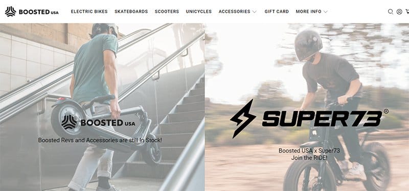
Boosted U.S.A. empowers people everywhere to commute across their cities, campuses, and communities in ways that were never possible. This fantastic award-winning website is modern, sticking to a clean layout for its website design.
I love the display of logos of top brands associated with Boosted U.S.A. in a black-and-white color scheme beneath the site's two-column hero sections. The CTA buttons and texts stand out on the site, easily recognizable in red-orange colors.
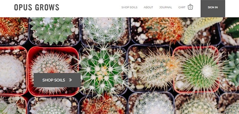
Opus Grows is the newest addition to the organic line of gardening and landscaping products, committed to the promise of good soil stewardship. This professionally-looking website example is well-arranged, with each section designed using a clean layout.
Bold colors and typography are the consistent design elements on the site's homepage, engaging users with their eye-catching display. The CTA buttons stand out in their Davy gray-colored background, prompting visitors throughout the site.
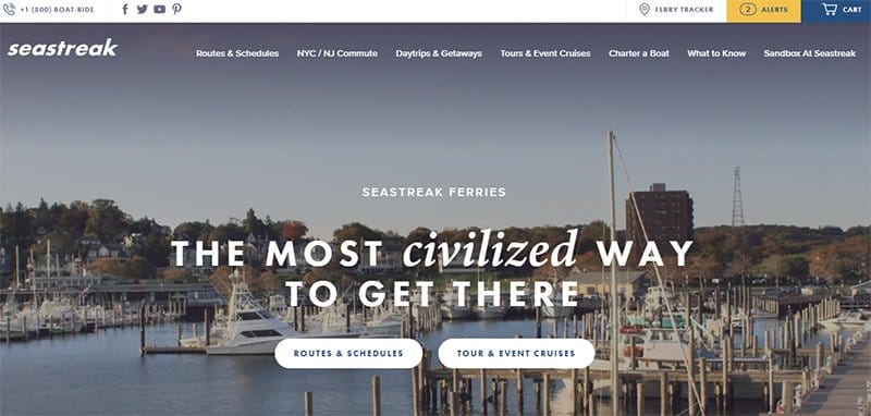
Seastreak Ferries offers its clients the most civilized way to reach their ideal destination via its state-of-the-art ferries. This outstanding website design is aesthetically pleasing in its modern and clean layout.
Welcoming visitors to the site is an aerial image of its docked ferries, helping visitors understand the business's services. Listed on the homepage are all the company’s tours and event cruises, each serving as a CTA text providing full detail when clicked on.
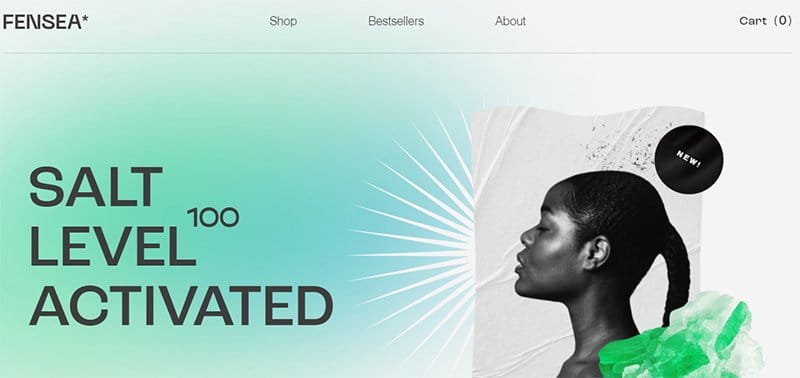
Fensea is a beauty and cosmetic company that helps its customers choose the proper body care products. This award-winning website example is aesthetically pleasing, with a color gradient that welcomes visitors.
Still and motion sections are visible on the site's homepage, on top of the site's interactive features and design aesthetics. The CTA texts are easily recognizable in green font, distinguishing themselves from regular texts.
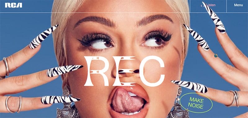
RCA Records are lovers of music, partners of creation, advocates for change and the next evolution, and fierce in its dedication to creative spirits.
One of the best website designs, the RCA Records website is aesthetically pleasing, sticking to an intuitive layout for its web design.
A customized circle mouse cursor is visible over the site's homepage in a white and blue color scheme, adding a unique touch to the web design. The entire site consistently displays bold design elements, visible as texts and colors that steal visitors' attention as they scroll.
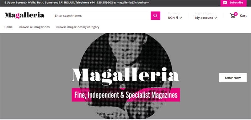
Magalleria is a stash of fine, independent, specialist magazines offering high-quality and exciting content. This professionally-looking website is well-arranged and sticks to a plain and clean web design.
I love the display of excerpts from the Magalleria blog on a separate homepage section in a three-column layout, each linked to the blog page. The logo's Hollywood Cerise color is visible on the site's homepage, adding color to its plain web design.
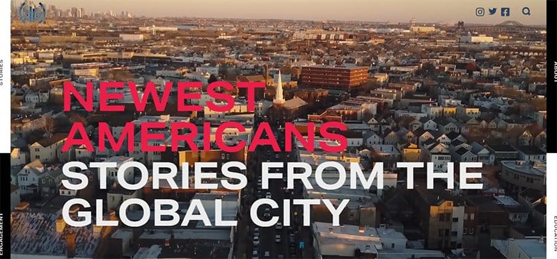
Newest Americans is a project birthed to honor the past, present, and future of migrants by telling their stories from the global city. This award-winning site uses attractive images to capture visitors’ attention.
Menu texts are visible and pinned to the sides of the hero section in a black-and-white color scheme, serving as the site's primary navigation feature.
Social media icons and a search icon are visible and pinned to the top of the homepage, serving as the site's top user-friendly feature.
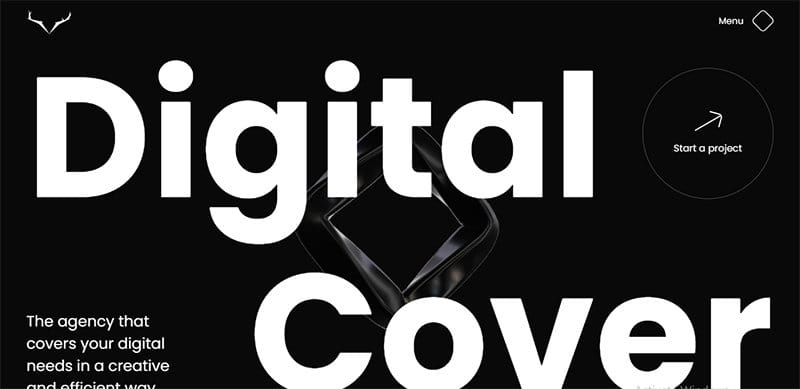
Digital Cover is a creative agency that builds and manages efficient, creative, and innovative websites optimized using SEO. One of the award-winning websites, the Digital Cover website is unique, built on a predominantly black-and-white color scheme.
The entire site is interactive, with each homepage section linked in an interactive and engaging display. I love the display of logos of top brands the Digital Cover agency trusts on the homepage with an all-black background in a centralized four-column layout.
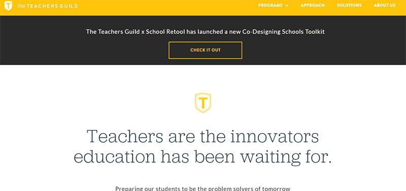
The Teachers Guild is a professional community that activates teachers' creativity to solve today's biggest educational challenges. One of the best website design examples, the Teachers Guild website, is professionally looking and displays well-arranged homepage sections.
The logo's Mikado yellow color is the background color for the header menu and unique homepage sections. Plenty of spaces are visible throughout the site's homepage, allowing visitors and screen readers to digest the site's content.
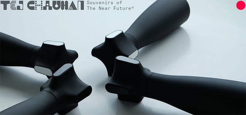
Tej Chauhan uses his emotive industrial design approach to create iconic product experiences that elicit joy and well-being. One of the award-winning website examples, the Tej Chauhan website, is visually appealing and adheres to a clean web design.
Welcoming visitors is a slideshow display of high-quality images of different products, adorning the site's homepage in their full-width display.
An ArtyClick Cool Red circle is visible, pinned to the top right-hand corner of the homepage, revealing the site's header menu.
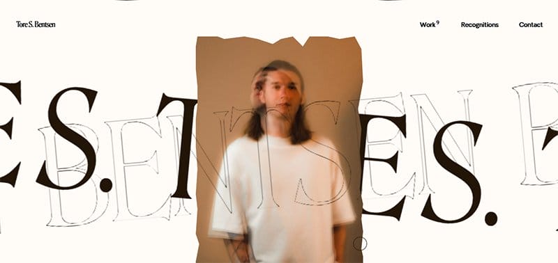
Tore S. Bentsen is the co-founder and interactive designer at Baseborn, specializing in combining Webflow and branding to create award-winning websites. This top award-winning portfolio website is a masterpiece fusing different interactive design elements.
The predominant black-and-white scheme of the website is overwhelmed by the consistent display of design elements, adding to the site's visual appeal.
Images of Tore's past work are visible on the homepage, moving from right to left and adding to the site's design aesthetics.
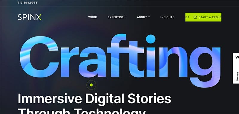
Sphinx Digital is a design and technology agency building world-class products for the digital ages. One of the best websites, the Sphinx Digital website is aesthetically pleasing in its modern and clean web design.
An Honors text box announcing the site as an award-winning website example is pinned to the right-hand side of the homepage. The logo's Bitter Lemon color is the background color for the site's CTA button and customized mouse cursor feature.
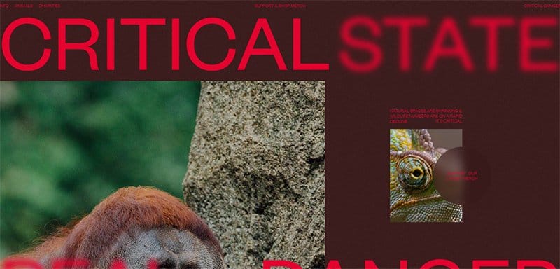
Critical Danger is a team of amazing artists, illustrators, and designers creating one-of-a-kind merchandise to raise money for charities supporting endangered species.
One of the best website designs, the Critical Danger website is interactive, with each homepage section designed to take users on an engaging journey.
Red is the primary color on the site, visible in different shades as the font and background color. Images of nature and endangered animals are scattered throughout the site's homepage, helping to put context into the team's cause.
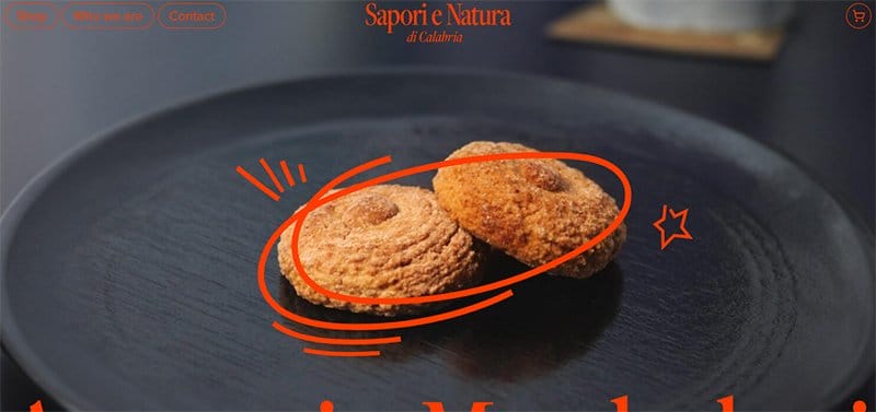
Sapori e Natura, located in Castrovillari, in the territory of the Pollino National Park, produces artisanal baked goods whose main ingredient is almonds.
One of the best websites, the Sapori e Natura website, has unique visual content displaying images of its ingredients and products.
The orange color stands out on the site as its primary color, visible as the font and background color for different homepage sections. I love how the CTA buttons in the site's header menu have orange-colored borders, distinguishing them from regular texts.
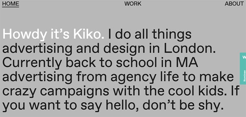
Kiko Wu is a multidisciplinary creative from London with experience in advertising, graphic design, and creative direction.
A large customized circle dot is visible over the site's homepage, aiding navigation and helping users easily navigate.
Images of the designers' work are scattered over the site's plain web design, adding color and aesthetics to the website design.
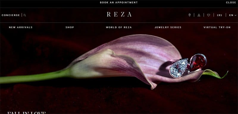
REZA is a family-owned and controlled business drawing inspiration from an extensive gallery of modern, contemporary, and primitive art.
One of the outstanding business website examples, the REZA website, which is aesthetically pleasing, with the entire site displaying eye-catching images.
At the core of the site's visual design is the display of high-quality images of its products, drawing in visitors to engage. A bell icon is visible and pinned to the site's homepage, revealing the site's online communication options when clicked.
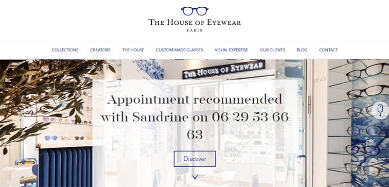
The House of Eyewear is an expert passionate about helping its clients choose and select customized glasses for every occasion.
One of the award-winning website examples with the best user interface, The House of Eyewear website is aesthetically pleasing with its subtle web design.
A mouse feature pinned to the right-hand side of the homepage helps users navigate efficiently. The Phthalo Blue color adds a unique touch to the website design, distinguishing between regular and CTA texts.
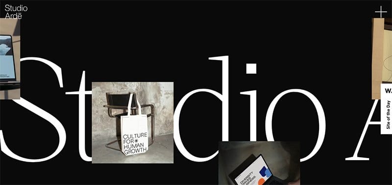
Studio Arde is an award-winning branding and design studio committed to increasing companies' visibility with women in leadership. One of the best website design examples, the Studio Arde website is unique and built on a predominantly black-and-white color scheme.
Framed images of the company's work appear everywhere throughout the homepage. I love the bold typography displayed consistently on the site's website, engaging visitors and screen readers as they scroll.
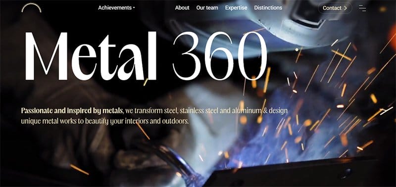
Metal 360 is a craft company specializing in metalwork, ironwork, and locksmithing, transforming steel, stainless steel, and aluminum into unique metalworks. One of the best website designs, the Metal 360 website stands out with its captivating and responsive design.
Each homepage section is linked interactively, displaying horizontal and parallax scrolling effects as visitors scroll. A customized dot icon is visible over the site's homepage, adding to the site's interactive elements.
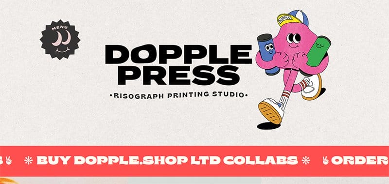
Dopple Press is the first and only dedicated Risograph and design studio headed by award-winner Liv White, showcasing meaningful and characterful design.
One of the top portfolio website designs, the Dopple Press is aesthetically pleasing in its display of eye-catching design elements.
A menu icon that helps users navigate is pinned to the site's homepage as an animated icon, adding an artistic touch to the website design.
Bold typography and colors decorate the site's homepage, adding to the list of design trends employed in the web design.
Award-Winning Website Design FAQ
There are plenty of available resources that provide design ideas and inspiration for creating your own website. SiteInspire, Awwwards, Lapa Ninja, CSS Nectar, and Best Website Gallery offer design ideas and inspiration.
The CSS Design Awards website is a platform that shines the spotlight on exceptional website designs from the best web designers. For inspiration and design ideas to create your own website, the CSS Design Awards platform serves as a website design award gallery, showcasing exceptional website designs.
Website designers battle balance, proximity, alignment, visual hierarchy, and contrast in creating a standout website. Color, line, shape, form, typography, space, and imagery are among the best digital design elements that make a website stand out among other cool website designs.