24 Best Clean Website Design Examples of 2025
Do you need help driving traffic to your website or boosting user engagement? Whether you want to create a new website or redesign an existing one, using a clean website design layout is essential for capturing your audience’s attention.
A clustered design will result in most of your audience spending less time on your website because the contents are challenging to explore.
Using the best website builders like Wix and Squarespace is the game changer your website needs to rank high and have more loyal visitors. These website-building tools come with state-of-the-art and clean website templates that will help transform your site’s outlook.
This article covers the 24 best clean website design examples you can use as a source of inspiration when rebranding your site.
Let’s get started.
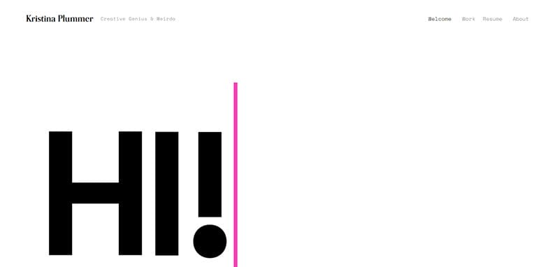
Kristina Plummer is a creative genius who has a passion for helping humans and non-humans feel seen, heard, and understood. This elegant website design makes ample use of its white space featuring visual content in the form of disappearing text.
I like how the hero section of the entire website features minimal text and other important elements like a mega navigation bar and links to other pages.
What's handy about the webpage is the simplicity in its delivery, effective communication via text animation, and an undeniable clean layout that makes every element appealing.
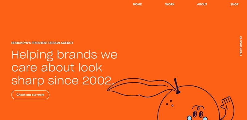
OrangeYouGlad offers top-notch visual design services for local and national small businesses, non-profits, startups, EdTech, and Fortune 500 companies.
Welcoming visitors this outstanding clean website design is a full-width banner with a pumpkin orange color scheme featuring catchy texts about the brand. You cannot but love the animated feature at the extreme right side of the banner featuring a smiling orange.
Interested visitors can click the transparent “Check Out Our Work” CTA button with a hover feature to explore the brand's multiple projects before visiting the contact page.
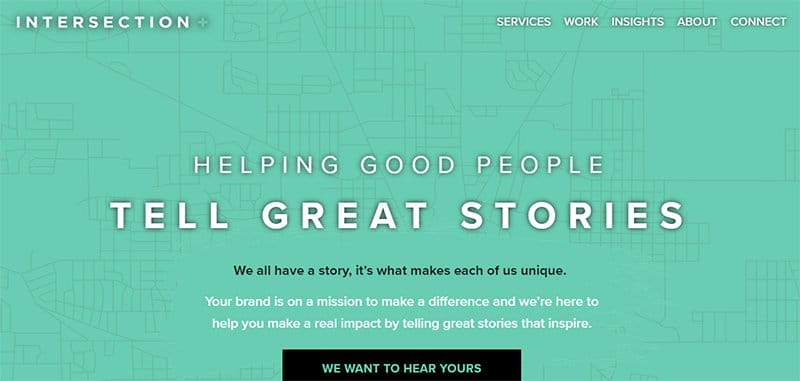
INTERSECTION is a full-service marketing agency empowering brands to share their story. Welcoming visitors to the full-width video, displaying happy moments of people which he.
I love how the hero section features a captivating black-colored CTA button, compelling visitors to click and share their brand's story for great connectivity.
This clean website uses a minimal design to create a beautiful and straightforward layout and a column layout to showcase crucial information that attracts visitors’ attention.
The dark footer features social media icons, a contact button, and a free intersection marketing section for interested visitors.
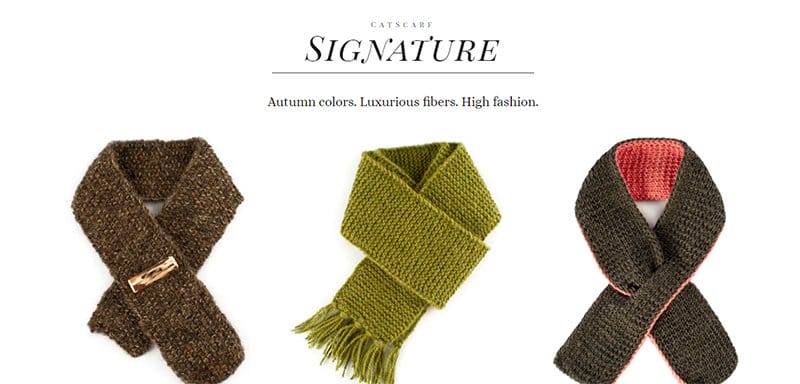
Catsarf is a hand-knit quality fashion brand that produces scarves for cats. I love the full-width image of a sleeping cat in one of CatScarf's signature scarves with a transparent CTA “Shop Now” that directs visitors to the product section.
Scroll beneath the homepage is a beautiful and high-resolution product image displayed on a white background with stylish and bold text that describes each item.
One of the design elements of this clean site I love is the thumbnail effect that allows visitors to access the shop section to purchase the brand’s product. Potential customers can follow Catscarf on social media with one click on any of the icons on the site’s footer.
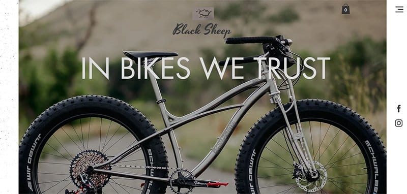
Black Sheep Bike creates the best handmade bikes perfect for its target audience. I love how this clean eCommerce store welcomes visitors with stunning images of one of their best products and the brand’s motto “In Bike We Trust.”
As you explore the content further, you will see a multi-grid column layout featuring images of products with short details. Beneath the homepage, visitors can click and watch insight videos and images of how products are arranged together.
This clean website has a single-page layout with good design inspiration that will influence purchase decisions. I love the site's idea of showcasing popular products in various categories in an appealing manner.
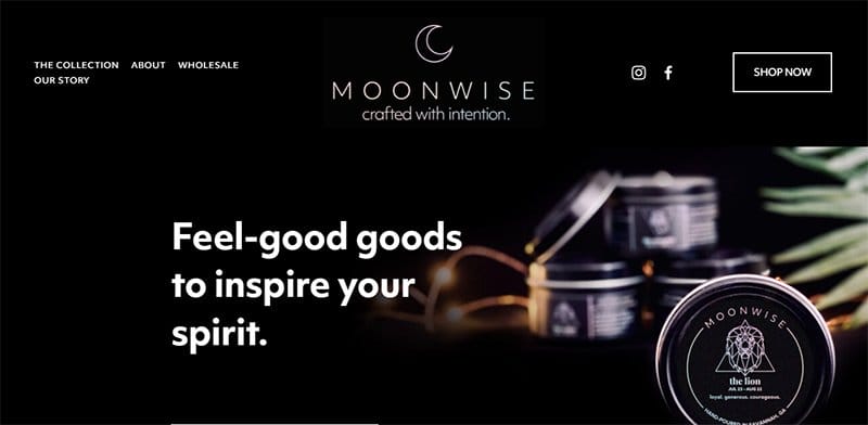
MoonWise deals in handcrafted candles made from 100% natural soy wax, premium phthalate-free fragrance oils, and a quartz crystal inside.
Moonwise's website stands out with its dark large menu bar that contains a beautiful brand logo with two styles of font text and a CTA button.
The site’s black background makes all the colorful design elements pop and visually appealing and encourages visitors to explore further content.
I love the “Feature Items” section featuring engaging captions and high-quality images with thumbnail effects that redirect visitors to view full details.
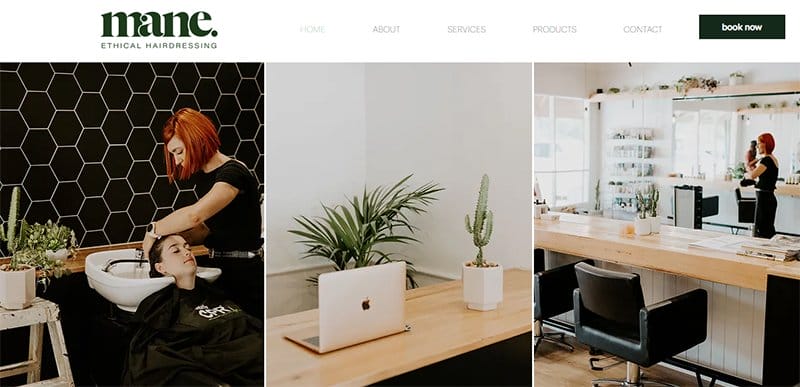
Mane Ethical Hairdressing is committed to creating a salon that exists in harmony with your environment. I love how this clean website uses Bronwyn Cassels's image as the cover photo in the hero section, showcasing the beauty of the salon.
On the navigation bar is a dark green text logo and a call to action button, compelling potential customers to book for a section.
The minimalism of this clean webpage gives the site a simple outlook and makes it easy for visitors to explore its content.
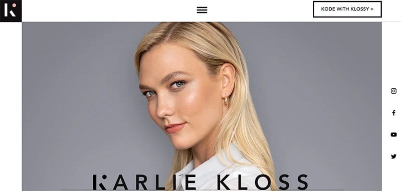
Karlie Kloss is a supermodel, entrepreneur, and philanthropist. Klossy supports the next generation of designers on Project Runway.
This elegant website has a minimalist and concise design layout featuring multiple displays of eye-catching and appealing content.
You cannot but love the multiple high-resolution images on the page on a zig-zag layout which makes the content visually appealing.
Interested visitors can subscribe to her newsletter on the black-colored footer or follow her social media links on the navigation bar.
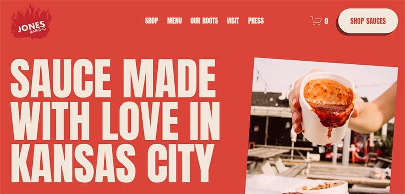
Jones Bar-B-Q’s clean website welcomes visitors with captivating content and an image of mouth-watering sauce dropping on the shredded chicken.
Beneath the hero section are a product image and a basketball orange CTA button compelling visitors to shop sauce.
The dark orange footer features the brand logo, contact information, and address. I love the simplicity of this single-page website with straightforward content.

ETQ was created as an answer to the luxury trend of over-abundant branding and excessive pricing. This landing page welcomes visitors with a nice pair of white shoes with a CTA button “Shop Now” on the right side of the homepage to make a purchase.
Interested visitors can use the drop-down menu at the right side of the page to explore the site content easily.
This clean website uses a simple design to achieve a modern site and elegant and sophisticated outlook. I love the beautiful display of products in slider format, which makes the content interactive and visually appealing.
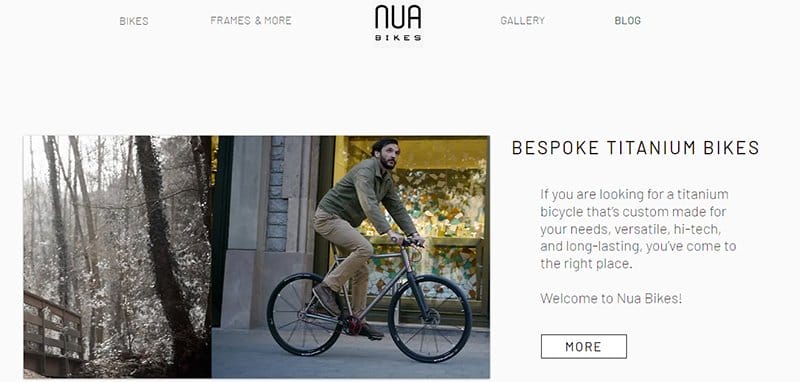
Nua Bikes deals with titanium bicycles that are custom-made for versatility, hi-tech, and long-lasting. This clean website welcomes potential customers with a multi-slide image of bikes and riders and a white button visitors can click to explore more content.
The strategic use of white spaces on this clean website helps to give life to all the relevant elements on the page. I love how the testimonial section features heartwarming comments from customers that attract new buyers.

A Fork and a Pencil is a classic restaurant known as one of the best home cooking kitchens. The first eye-catching element on this clean website is a four-column layout with images of mouthwater dishes.
This clean website design has a smooth parallax scrolling effect in between the sections, giving the site a pleasant user experience, making the contents worthwhile to explore.
The search feature on the navigation bar is your one-stop shop to locate various items and explore the site's contents seamlessly.

Baxter Of California is an award-winning men's hair care, skin care, and shaving business site. I love how this clean website uses stunning images of men with attractive looks to display products in an elegant and sophisticated fashion.
Visitors can use the white sticky menu bar to navigate the entire site and the search feature to easily single out products of interest before purchase.
This minimal design website has a soft color scheme of white and sky blue, which gives the page a cool, fun, and interactive look.
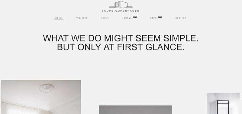
SCOPE Copenhagen’s website has a straightforward layout with a bright color scheme that makes it stand out from other clean websites. The site's transparent navigation bar and bold text give this clean webpage an elegant and professional look.
As you scroll across the page for more details, you will see various high-quality images of the brand’s product in various display formats.
I love how aesthetically pleasing, interactive, and easily accessible the page on the site is. You can click on any of the large text or use the sticky navigation bar to check out more contents.
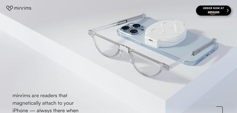
MinRims are fashionable readers that magnetically attach to your iPhone and are always there when you need them. I like how this clean website features special effects like horizontal and vertical effects making it fun, interactive, and engaging to explore.
My favorite aspect of this webpage that gives it a unique outlook from other clean website designs is the parallax scrolling feature.
You cannot but love how the website creatively displays multiple high-quality images of these special reading glasses in its various dimensions to encourage purchase.
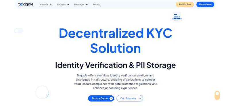
Toggle’s website makes exploration seamless via the sticky navigation bar with a drop-down feature that displays various contents upon hovering.
I love how clean and colorful this unique webpage is with a white background that makes all the simple design elements and ideas appear appealing. You cannot miss the animations in various aspects of the page which gives the page a fun and lively vibe.
This clean website features a three-column design layout at its center with vector images to describe the multiple verification processes.
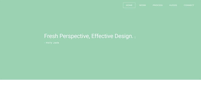
Mintboxx is Holly Jade’s brain child. She is a full-stack UX Designer with a niche in productizing designs to high-fidelity, shippable interfaces.
The first catchy element on this modern website is the tale-colored hero section featuring moving text that describes the character of the company. This cool website has a clean design with a light background that makes the design elements pop to visitors.
I love how the page features a vector image at the center of the page and multiple logos of top organizations which serves as a source of social proof.
Visitors can use the sticky navigation bar with hover effects to explore their desired section of the page where they can get crucial information about the brand.
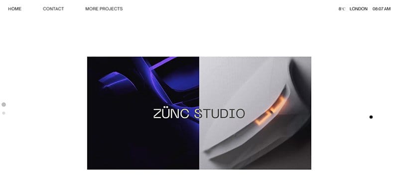
Zunc Studio’s website has a clean design layout without elements like videos, background sound, and bold and catchy texts to make visitors' experiences fun and memorable.
Welcome visitors to this unique web page is a looping video format displaying 3D contents and other mind-blowing projects and the creation of Zunc Studio.
I love how multiple images pop up on display as you hover across the text section of the page gives you a tempting view of the page content. Clicking on any of these images is your own way ticket to explore the site content further.
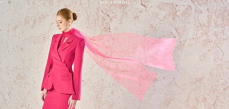
HA THONG is a clothing brand with a mission to create the image of modern and confident women and bring out the beauty and elegance within them.
Visitors and potential customers can use the search feature on the sticky navigation bar to locate items on the web page. I love how the image on the display section changes its contents when the mouse hovers over it, giving the webpage an elegant outlook.
Loyal customers can use contact and social media icons to explore other brand-related content for further purchase and exploration.

Haerfest is an NYC-based accessories brand that designs comfortable and fashionable bags for people reimagining the workplace.
This clean website used a four-column layout to display its top product and vital project with thumbnail features for seamless access and insightful exploration.
Prospective customers can use the sticky navigation bar with a drop-down feature to explore various aspects of the webpage before making any decision. Visitors can scroll to the right side of the web page and click the chat button to massage Haerfest directly.

Youssri Rahman's website has a unique concept featuring multiple high-quality images, videos, and engaging text to keep visitors entertained.
Kicking off the clean and elegant website is a black background featuring the brand name in bold white text. The next catchy element is a horizontal scrolling feature that brings you into a section displaying multiple high-quality images in an appealing fashion.
I like how the page features a vertically structured sidebar that displays links to various aspects of the website and encourages seamless exploration.
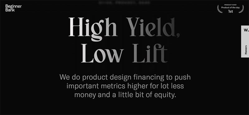
Beginner Bank’s website has minimalism as its core feature. This clean website has a single page that has a minimal design and communities without visitors in a straightforward and precise fashion.
I love how the site’s dark color scroll gives it a sophisticated and professional outlook which compels visitors to checkout the contact page.
Interested visitors can click any of the two CTA buttons at the base of the page for further exploration and to make vital business-based decisions.
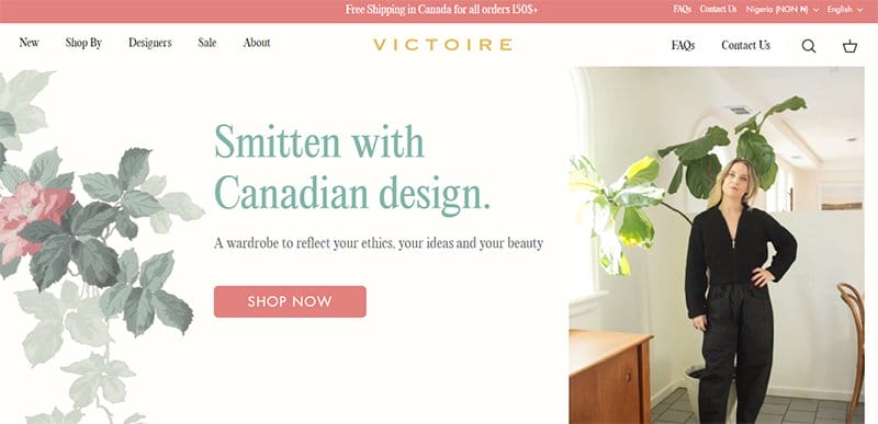
Victoire Boutique Is an independent women's boutique dedicated to ethical and sustainable clothing & jewelry made by Canadian designers.
Interested visitors can click the pitched-colored “Shop Now” CTA button on the hero section to access the online store page to check out the various product categories.
This fashion website has a modern and feminine outlook in various aspects of the page and uses high-quality images to give it a fun feel.
My favorite section is the testimonials that speak about the brand's professionalism and reliability to inspire new customers.
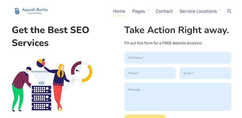
Aayush Bucha is an SEO Expert with 5 years of experience and a search engine optimization expert team. The homepage of this clean website is attractive with illustrative animations that compel visitors to take action right away.
I love that the site content is full of creative and educative items in bright and attractive colors, serving as a guide to answer customer questions.
Scrolling further, you cannot miss the client testimonials section that displays images and heartwarming reviews from customers for credibility.
Clean Web Design FAQ
With careful and precise positioning in a clean website design, you are sure to grab your audience's attention. An uncluttered homepage tends to impact views more because every vital detail is obvious, and navigation becomes seamless and inspiring. You will make a great first impression on visitors.
The key features of a clean website design include easy to use, optimized for mobile, quality content, readily accessible contact and location, clear call-to-actions, optimized for search and the social web, solid web page layout structure, good typography, limited color palette, and consistent imagery.
The benefits of having a clean landing page design include improved user experience, faster load times, increased usability, better accessibility, higher conversion rates, improved SEO (SEO), enhanced brand identity, more memorable user experiences, reduced bounce rates, easier navigation, increased mobile responsiveness, and greater visual impact.
A clean website design comes with a clear structure, easy-to-use navigation, and non-distracting design. On the other hand, a cluttered website makes you feel confused because of its arrangement, leading to users leaving the site without finding what they were looking for.