20 Best Community Websites of 2025 [Inspiring Examples]
Did you know that 27.3% of consumers visit online communities to research a product or service before deciding whether or not to make a purchase? (Incyte Group Whitepaper)
Designing a branded community website helps improve customer experience, increases retention and engagement, reduces supper costs, and provides reliable product or service feedback.
If you own an online community website but don’t enjoy these benefits, check your website design. Luckily, you don’t need to spend a fortune to hire a professional web designer to build or redesign your community website.
You can use the best website builders like Squarespace and Wix to create a good community website that attracts loyal memberships.
This article covers the 20 best community website examples you can use as a guide when designing your own site.
Let’s get started.

ArtSnacks Mix is an online community built for artists to connect. This online community website uses a minimalist design that focuses on brand content.
I like how the site’s landing page features interactive details on what the community website is about. Interested visitors can click the green-colored “Show a Plan” CTA button to explore the depth of the site and get more information about the community.
This community website is a great example for users interested in exploring their artistic experiences. The white background gives the black text a better look.

Outwild is a community and event series for people who want to create an outdoor value-driven lifestyle. Users can explore the entire site through the drop-down navigation bar and make community-based decisions without stress.
Welcoming visitors to the page is a full-width image that captures happy moments with two compelling yellow CTA buttons.
Interested visitors can watch the embedded YouTube video and be inspired. If you have any suggestions about Outwild Hub, click “here” for the answers.
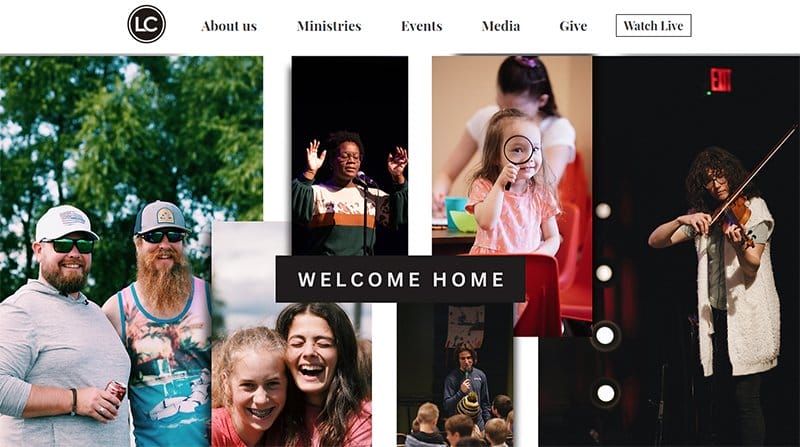
Life Church exists to help people of all ages to experience life to the fullest. The happy faces and joyful moments displayed on the homepage are visually appealing to visitors.
This amazing community website showcases high-quality images in a slider format. With the use of white space on the site, elements appear more beautiful.
Interested visitors can support the church mission by clicking the white CTA button displayed on the navigation bar. Users can access back to the homepage by clicking the white sticky back-to-top feature on the right side of the page.

Ready Steady Go encourages children to develop into independent and confident individuals for their next educational step.
The first eye-catching element is the beautiful logo on the navigation section and a multiple fluid grid layout of images displaying kids playing. These images feature a stunning blend of primary colors which gives the page a playful feel.
The footer features a parent portal link and a search button which makes it easy for members to find specific items.

Stanford is a hub for innovation, collaboration, and creativity with the mission to help people become innovators.
One of the best community website designs, Stanford makes it easy for visitors to access the website content. There is a sticky navigation bar containing vital information about the website.
Scrolling down, users discover more about the school service. You can use the “Learn More” button below the section to explore further.
The designers of this great website made an excellent choice of color, making the site element stand out beautifully.
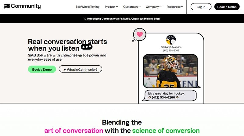
Community is a text messaging service that connects individuals and organizations directly to audiences through text messaging at scale.
I love how the website design of this online community platform has modern features with cool and attractive elements that are visually appealing to users.
The homepage features a lemon green CTA button that compels visitors to click to view the brand services and schedule a demo.
This community website displays intensive brand logos of partners to help boost credibility and increase social proof. The use of bright colors as touch-ups made the site elements shine.

Bujo U is a paid membership site that brings together passionate bullet journalers to share their knowledge and networking.
This online community website welcomes visitors to the hero section with a Georgia Peach CTA button to have exclusive access to bullet journals.
Beneath the homepage is a short video about Bujo U that gives a brief description of what the community is built for. The site uses a simple website design element to create an excellent user-friendly online community platform that supports members.

The Indiegogo community website is where early adopters and innovation seekers find lively and imaginative tech before it hits the mainstream.
I like how this community website features outstanding elements from various angles of the page to make prospective members feel homely. Indiegogo uses a column layout to display content and icons to demonstrate better understanding.
This community website proudly displays popular projects in a slide format to gain visitors’ attention. I love the display of vital info and social media links on the ash-white colored footer.

Snowday photos capture high-quality lifelong memories with friends and family. The first catchy element on this community webpage is an image of a train featuring attention-grabbing motion design falling snow.
I love how this community website features multiple engaging design elements such as a sticky navigation bar, Christmas-themed high-quality images, and motion graphics.
Visitors can discover more exciting content through their social media platforms displayed on a green color footer.
The bright colors give the site a fun and Christmas vibe. Visitors can use the red CTA “Get ticket” button to make a reservation to the North Pole to meet Santa.
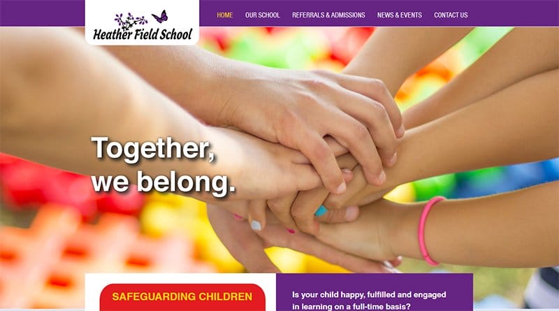
Heather Field School is a nurturing and therapeutic special school for children with complex social, emotional, and mental health needs. I like how the brand’s logo sticks out of the mega navigation bar with a drop-down feature which makes it visually attractive.
The landing page strongly emphasizes the importance of the brand's objectives and aims via attention-grabbing elements like engaging text and high-quality images.
Interested visitors can use the navigation menu bar to explore content. The purple footer contains vital details like the school location and contact info for further inquiries.
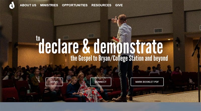
Declaration Church develops disciples who will declare and demonstrate the Gospel to Bryan/College Station and beyond.
I like how this community website's front page image features details about the community activities and gives visitors a sneak peek into the church’s activities. You can click any of the three transparent CTA buttons on the homepage.
Interested members can click the “Listen Now” CTA button to stay updated with preaching and teaching on podcasts. The black-colored footer features the church address, contact information, and social media links for interested users to follow for more insight.
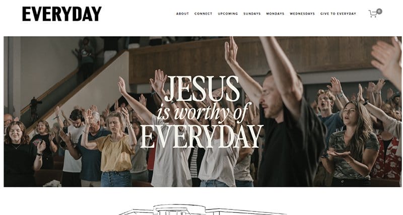
EVERYDAY has a vision of building a home base for everyday believers to be catalyzed into their spheres of influence.
I love how this community website design is simple and has engaging content which gives the site a unique and smooth user experience. This community website example helps to create opportunities for members and other communities to fellowship and function in unity.
There are high-quality photos on site showing the Everyday community. Visitors can explore exciting content through the white sticky navigation menu bar.
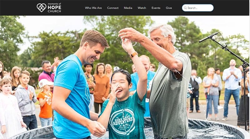
Moments of Hope Church believes that the Gospel of Jesus is the world's hope and is willing to share this good news with everyone.
Welcoming visitors to the stunning image of a teen girl participating in a baptism ceremony. Beneath the hero section is a sky-blue CTA button compelling visitors to view its services.
This community website has a bright color scheme featuring colors like sky blue and white. These elements give the page a heavenly outlook.
Visitors can use the search features on the navigation bar to find items and the back-to-top button to move back to the zenith of the homepage.
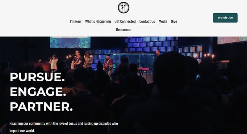
Centralia Community Church focuses on reaching its community with the love of Jesus and raising disciples who impact our world.
This outstanding community website is well-designed with stylish and multiple modern elements in various angles of the page to give it an elegant outlook. I like how the webpage constantly uses multiple-column layouts to display its content attractively.
As the user scrolls seamlessly beneath the homepage, there is an embedded video that welcomes visitors to the Centralia Community Church.
On the upcoming events section are lineup activities for Christmas inviting members to come and socialize with one another.

Bettermode focuses on driving customer engagement and retaining more customers with a unified customer community platform. This online community website welcomes visitors with a captivating lemon green CTA button to book a demo.
I love how the Better Community Templates section introduces the site with a well-organized YouTube video to educate users about the platform.
Bettermode’s website is rich with engaging content. Visitors can discover how bettermode supports businesses to streamline their customers' experience.

Discord is the easiest way to talk over voice, video, and text, hang out, and stay close to your friends and communities. I love the constant use of animation to decorate this online community webpage, giving the site a fun and colorful outlook.
This community site creates avenues for networking from the comfort of your home, letting you interact with family, friends, or clients.
Interested visitors can click the White or black CTA button on the homepage to download from the app store. Users can follow Discord’s social media platforms for more insight.
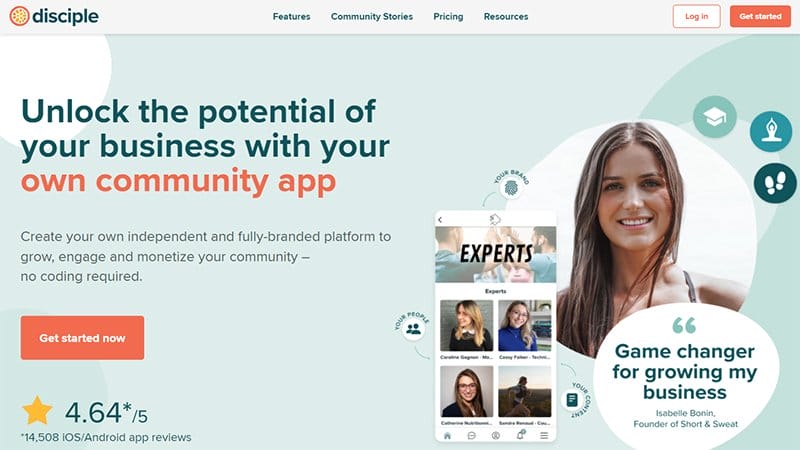
Disciple helps you create your own independent and fully branded platform to grow, engage, and monetize your community
The attention-grabbing elements on this community website are the colorful display of the brands’ logos Disciple worked with for credibility.
This platform allows interested visitors to book a free consultant with the team before proceeding to pay for the branded app.
I love how this site uses clickable icons and bright colors that beautify the entire website and make its content visually appealing to explorers.

Supperlist Is a great app to help manage teamwork, personal projects, and everything. This community website design is seamless and beautiful. The major color scheme is orange black, and white.
I like the stylish use of a column layout to display the page’s vital content with a touch of motion element that makes the site stand out.
Supperlist is one of the best examples of a community site with outstanding design elements from top to bottom. Visitors can click the orange-colored “Join Our Beta” CTA button on the homepage to download the app.
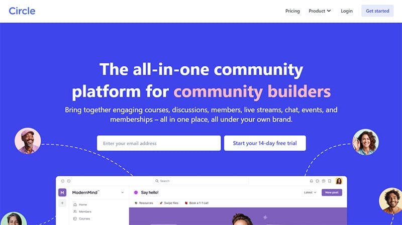
Circle brings together engaging discussions, members, live streams, chat, and events in one place and brand. This webpage is one of the most outstanding community websites for individuals and businesses to share ideas.
The platform focuses on creating a thriving community for users and displays a live simulation of how the community operates in the hero section.
Every section on this site has helpful content that can successfully aid users in creating their accounts. Circle uses stylish font size text on the white background which gives it an excellent outlook.
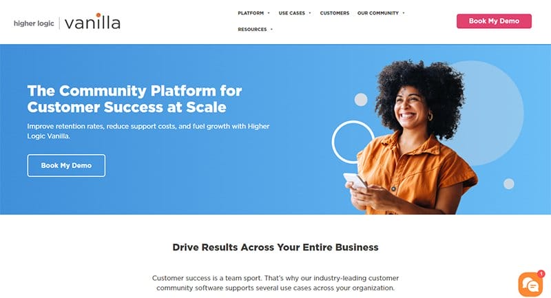
Higher Logic Vanilla is the online community platform for improving retention, reducing support costs, and fueling customer growth. This community website landing page is interactive and engaging and allows visitors to click the sky blue CTA button to book a demo.
I love how this community website uses icons to demonstrate points on the four-column layout across the page. This site proudly showcases other band logos that they have worked with on various projects.
Interested visitors can use the chat feature pinned on the right side of the page to reach Higher Logic Vanilla.
Best Community Website Examples FAQs
An online community website is a melting point or platform that brings people together to share information, resources, ideas, and project collaboration. Such communities help people form strong bonds and build lasting relationships that will be beneficial to them and the community at large.
Your community website must include the following to rank high in the search engine: community info, an email list, user profile rules, a domain name and a web hosting plan, an ideal community-based theme, the right plugins, and an avenue for discussions, messaging, and member profiles that enable the group to share stories, experiences, ideas, and opinions.
Here is how to create a successful community website design that will appeal to prospective members; Define your community purpose and goals, create community guidelines and rules, select a community hosting platform, identify community stakeholders, set up your community, build your community with engagement, and grow your online community.


