15 Best Elegant Website Examples For 2025
The evolution of web development has come a long way, from the text interface to the blocky web interface, down to modern web designs.
Web statistics show there are over 200 million active websites with 252,000 new websites created daily. This means there is a probability that competitors already exist in your web niche.
How can you beat this competition? Successful brands position their brands to attract dream clients and potential customers with the use of an organized and elegant website.
To get this same result, you need the expertise of web designers, likely to be quite pricey. Alternatively, use the best website builders like Squarespace to build classy and elegant websites and show your expertise to the world.
This article covers the best 15 elegant websites that will inspire you with design ideas to build and redesign your existing web.
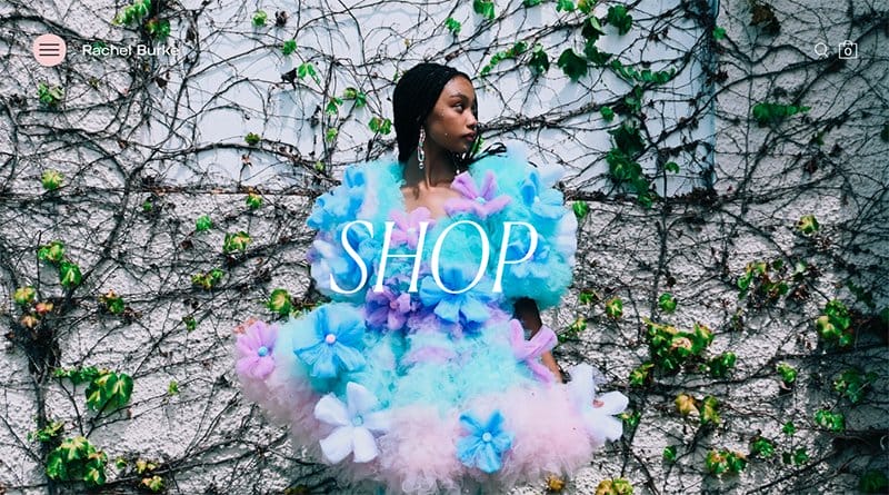
Rachel Burke is a multidisciplinary artist and top designer whose work is inspired by naive craft material, transforming the mundane into magical. On her landing page, visitors are greeted with a hero image of her classy and elegant modeled design, accompanied by a Shop CTA.
Just after the hero section are vogue designs from her company that will get visitors focused on her site. Visitors can control the view of images with the customized image slider at the top of the image in her Latest Work section.
Another stand-out design you will discover as you scroll down the page is story headlines written in stylish font on a plain white background. By clicking on the story headline, you will be redirected to a site, gaining access to articles about her success as a designer.
I like how this website hides a list of categorized elements in a three-line menu at the top-left side of the page. It adds a touch of simplicity and uniqueness to the overall web design.
Animal Music is a music-oriented brand with a vision of developing award-winning music and creative sound designs.
The first thing that gets your attention on this landing page is work examples represented in an auto-play video format. This design leaves an impression of simplicity, trust, and professionalism in the minds of visitors.
I love the display of highlights of its advert creation in boxes of a vertical and horizontal layout. You can’t help but see how this elegant website employs special designs, parallax scrolling, and unique CTAs for its video creation.
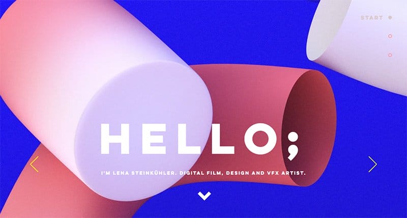
Lena Steinkuehler is a digital film designer and creator who uses visual effects to create look development and design projects. You can’t miss out on the welcome message HELLO that beautifies the hero section.
Visitors can explore a range of designs with a click-to-slide image slider and a point-down arrow leading to a section of curated designs. Visible white spaces separate images on this elegant website, helping viewers organize the best visual experience.
The footer section of this site holds the attention of its visitors with a feminine background image made with special effects, showcasing important contact means.
Another amazing feature Lena uses to glue visitors to her site is the visual effects employed in creating her CTA, giving a touch of elegance.
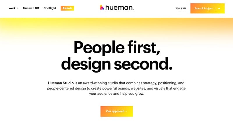
Hueman Studio is an award-winning studio with excellent track records in crafting visuals and people-centered designs for brands. This elegant website greets you with a two-font design of its success as a brand, customized with a sophisticated gradient background.
I like how the non-sticky header of the site displays the company's brand name in a centered position leaving other elements in a left-right position.
You can't help but notice the full-width animated visuals on display. Explore this elegant website to discover more classy design ideas showcased on the web.
Provider is a Japanese-inspired homeware store dedicated to creating and acquiring artful and functional homewares. Visiting this elegant website is a full-width display of several artful homewares in the hero section.
Beneath the hero section is a horizontal four-column image display of its new arrivals with corresponding prices, each separated by visible white spaces.
I like how the dark grey footer background differentiates from the fixed header, blending with the overall dawn-pink color background of the site.

Calicanto Luxury Bags is an Italian-based brand, undoubtedly dedicated to producing elegant and classy bags using original leather with the advantage of durability.
The first thing that grabs your attention on this website is the display of a high-quality bag reflecting the primary objectives of the brand.
Complementing the website design is a stand-out feature at the non-sticky header that allows visitors to make a language choice with just one click.
I love how the dark jungle green background of the footer showcases links and the mailing section that allows visitors to make subscriptions to Calicanto’s newsletters.
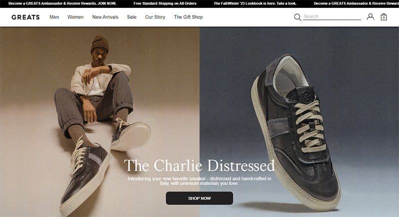
GREATS is the first sneakers brand born in Brooklyn. This elegant website design treats visitors to an unusual collection of its brand, displayed on a two-colored background following a transitioning CTA.
Featured on the floating header section are gender-categorized brand collections and a unique search icon present for a seamless user experience.
Taking a deeper dive on the website, you will notice the New Arrivals, each having a display of origin, color shades, and a quick cart.
Unlike other websites, I like how this classy website differentiates its footer section with a whitish-lilac background while employing modern UI/UX for its overall designs.
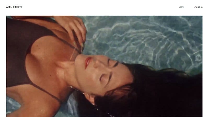
Abel is a brand that designs handcrafted, classy, elegant, and non-tarnishing jewelry capable of withstanding vogue trends and suitable for everyday use.
Welcoming visitors to its website is a full autoplay video of models proudly flaunting its timeless jewelry designs.
Right under the autoplay are several images in boxes demonstrating the unique craft of the brand, each with its respective price. Plenty of white spaces are present to ensure visitors' attention does not deviate from the colorful images on display.
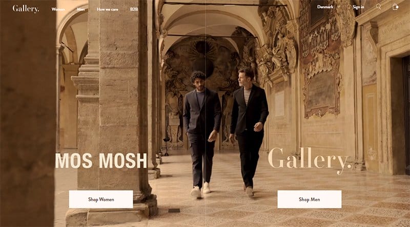
Mos Mosh has one of the best elegant websites you can ever find online. You will surely get glued to the highlight of its brand in an entertaining yet professional full-width video made with special effects.
The vista-white colored background of the web coordinates impressive 3D visuals with unique CTAs leading to a bulk of its products and services.
Another outstanding attribute of this website is the explicit use of navigation that lets users stick to a choice amidst its diverse features.
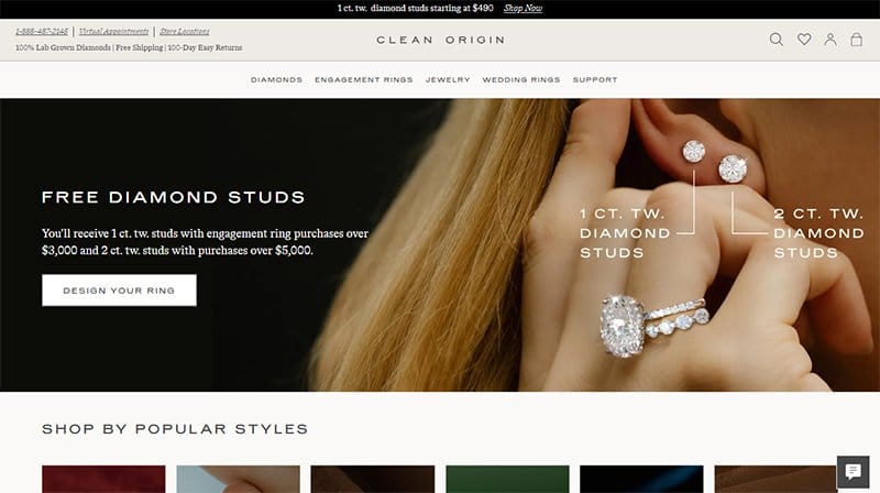
Clean Origin’s elegant website aims to offer its customers the best online experience. The sticky header shows a drop-down menu feature that displays a range of products, services, and terms of sale.
This elegant website displays its custom designs in six boxes with a horizontal layout, each following stylish texts, perfectly fitting on the vista-white background.
If you scroll down the page, you will discover several freebies the company offers that leave visitors with an impression of trust.
Further complimenting the outstanding elegance of this landing page are sections for scheduling virtual appointments, shopping sections, FAQs, and a mailing section for newsletter subscriptions.
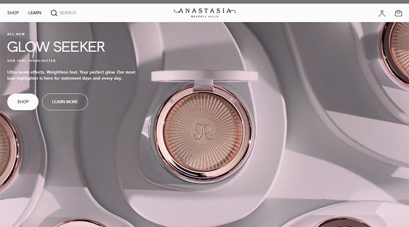
Anastasia Beverly Hills is a glow-seeking make-up brand with one of the best elegant websites. This stunning website greets you with an impressive animated motion display of its product with an amazing touch of clearly designed CTAs.
The fixed header of the page is characterized by a floating menu, a centered position of its brand name, and partnership loyalty.
Just after the hero section are images of products her company offers, a professional shopping section, exclusive offers, footer elements, and social media links. Explore this elegant website for classy design ideas and inspiration for creating your elegant web.
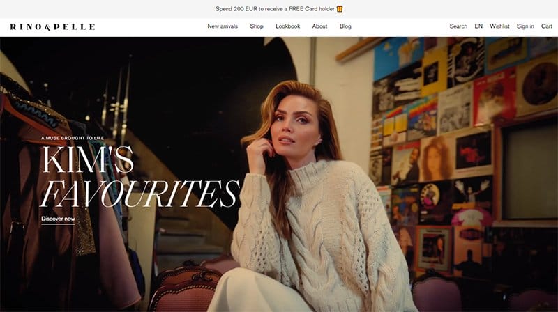
Rino & Pelle is a design-driven fashion brand that constantly incorporates the most relevant fashion trends into its signature mix of classic designs.
The elegant site opens with a full-width auto-play video of modeled elegant collections with a classy touch of stylish letterings and a unique CTA.
Aside from the centered position of navigations at the fixed header, the right-positioned elements are visible for a user-friendly experience. Beneath the hero section is a four-column image with white spaces, each popping up a unique style when the cursor hovers around it.
Another outstanding feature you will find on this elegant website is the parallax scrolling effect that embodies classy and elegant trends of web designs. I like how the web page pops up a mailing form as a soft reminder for its subscriptions.
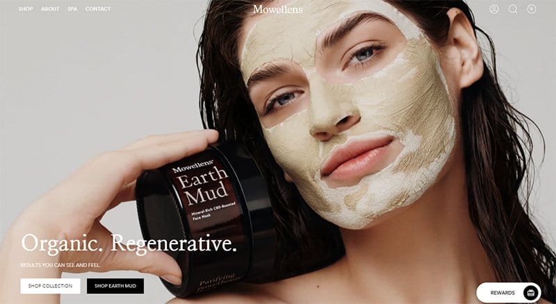
Mowellens' elegant website treats visitors to a classy and professional website design. The hero image, bold texts, navigations, vibrant CTAs, and shopping section occupy the foreground of this website.
Scrolling down the page, you will notice the parallax scrolling employed in the image display accompanied by a special design idea.
Another stand-out design on this site is a two-layered moving text that announces its commitment to customer service. I love how Mowellens uses modern web design to keep visitors focused on the page.
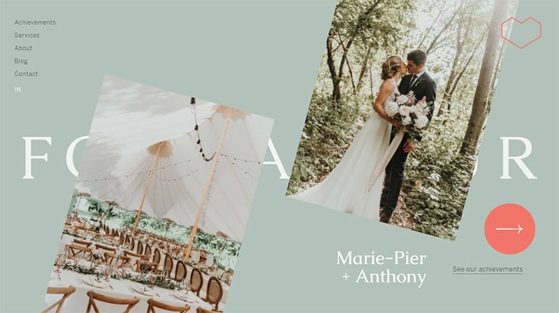
Foundamour is a high-end wedding planning agency in Montreal-Canada, one of the closest allies to France. The company’s vision is to create beautiful and lasting memories with dynamism and an innate sense of style.
This elegant website uses clean visuals and modern web design to convey its best services. Navigating the page are four background colors that display colorful 3D-like images representing the confidence and success of Foundamour as a brand.
Beneath the publication section is an impressive click-to-watch video, excerpts from its Instagram page, a bold CTA, and a footer section containing just its social media links.
I like how Foundamour uses a unique cursor and language choice to leave a colorful touch on the user navigation.
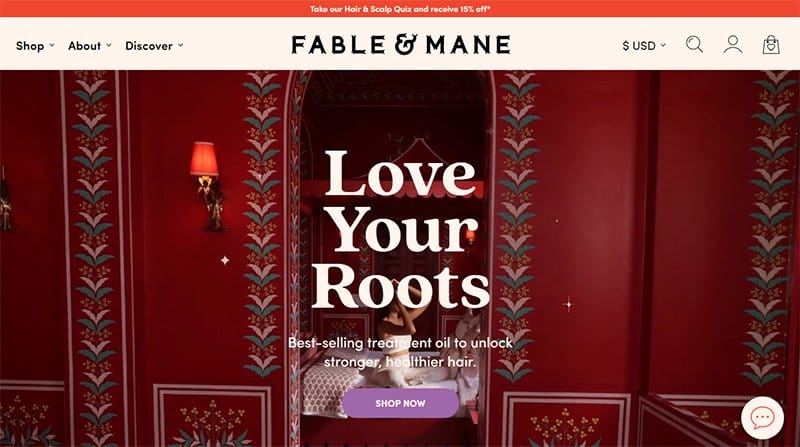
Fable & Mane is a family business co-founded by Akash Mehta and Niki Mehta. This business page treats visitors to bold lettering that rests on the lava-red background extending to the light pink header of the web.
This elegant website stands out with a drop-down menu, a luxurious display of its five-star products, unique logo designs, and a click-to-watch product video.
You can't miss the popups, attention-grabbing slogan, and CTA represented in moving texts on a dark lilac background. I love how the fierce tiger head logo featured on both the header and footer section symbolizes the strength and power of the company.
Best Elegant Websites FAQs
Creating an elegant website is advantageous. An elegant website will give you an edge over competitors and help you stand out in your niche. Choose any recommended website builders, select a template or customize your template, add elegant visuals, display your expertise, and client reviews, and include necessary information.
Classy website design is all about making your website more appealing with clean and technology-inspired visuals, accompanied by trends of modern designs and user-friendly navigations. Parallax scrolling, floating menus, pop-ups, and full-width clean visuals are design ideas for an elegant website.
Elegant websites differentiate from other websites with sophisticated color palettes, easy-to-read fonts, and a richness of classy designs that reflect the vision of a brand.


