25 Gray Websites with Neutral Color Schemes
Website design statistics show that 40% of value appreciates the colors on your website over any other web design component. If you are searching for a neutral color scheme that is minimalistic and does not evoke negative emotions, consider using a gray color scheme.
Gray-colored websites get visitors glued to the screen and encourage seamless exploration, helping you draw and retain traffic on your webpage.
You can use the best website builders like Wix and Squarespace to design state-of-the-art gray websites. These website builders offer custom gray website design templates to use when creating your webpage.
This article explores the 25 best gray website examples with neutral color schemes you can use as a source of design inspiration when creating your site.
Let's get started.
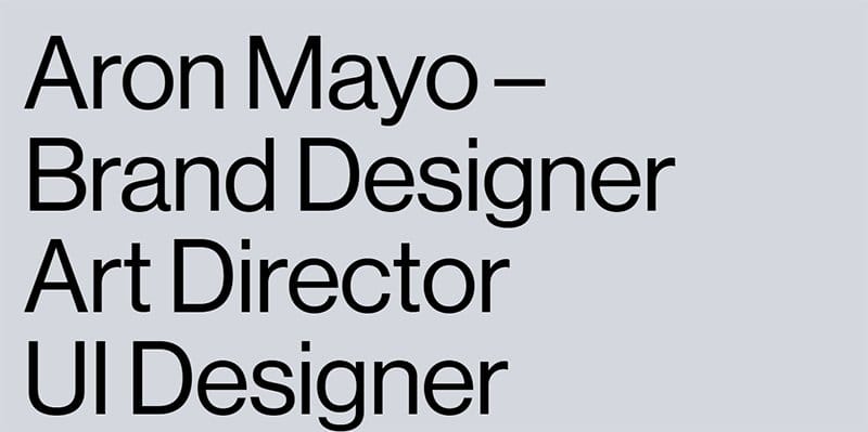
Aron Mayo is a professional brand designer, art director, and UI designer with over 14 years of experience working with brands like Nintendo, Toyota, Arnsdorf, and Myer.
Welcoming visitors to this stunning blue chalk background-coated web page is an intro about Aron Mayo’s skill sets and experience. Below the bold text is a lovely image of Aron Mayo, which helps to get visitors acquainted with him before any form of collaboration occurs.
As you explore the page further, you will love the zig-zag design layout the brand uses to arrange its content and display high-quality images and engaging texts.
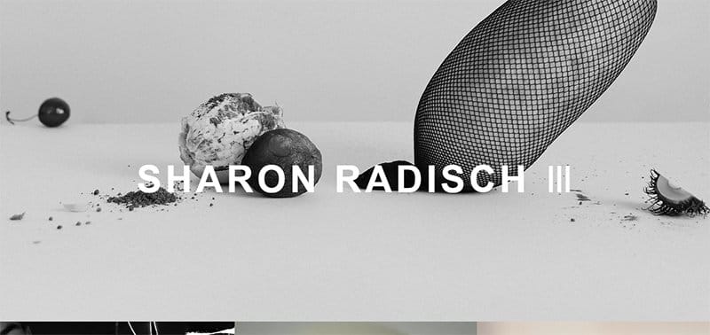
Sharon Radisch is a photographer, creative director, and artist based in NYC and Paris. Welcoming visitors to this stunning webpage is an aqua haze-coated theme image in the hero section. You can click the brand’s name to get access to the About page.
I like how the webpage features multiple high-quality images in a fluid grid layout displaying Sharon Radisch’s top projects. Each image has a thumbnail feature, which grants visitors access to some of her top projects.
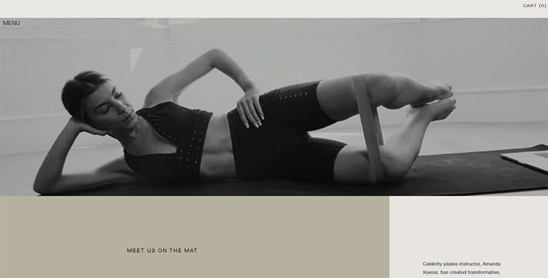
Pilates By Amanda focuses on creating transformative, low-impact exercise classes that sculpt the body and renew the mind. Welcoming visitors to this amazing web page is a looping video content that features some of the Pilates activities engagingly and interactively.
I like how the page combines shades of gray, like white rock and pinkish-gray, to give the site an elegant and sophisticated outlook.
As you explore the site further, you will see various high-quality images with a thumbnail feature that grants visitors access to more information about the brand's activities.
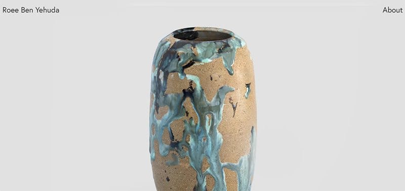
Roee Ben Yehuda is a 29-year-old designer from planet Earth and a former student at Design Academy Eindhoven and Shenkar College.
I like how the web page features a parallax scrolling element, which gives the page a fun and sleek look. As you scroll across the page, you will see multiple high-quality images with a thumbnail feature, which grants access to the portfolio page for further exploration.
Interested visitors can check the black sticky Instagram icon on the left side of the page to explore more content about the brand online.
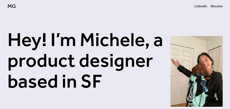
Michele Gee is a professional product designer based in SF with a knack for creating top-notch design projects that will wow her clients.
The lavender mist background gives this unique web page an outstanding outlook and engages visitors with eye-catching images and texts. I love how the transparent navigation menu allows visitors to explore the page’s contents without restrictions.
I like how Michele Gee includes a stunning image of herself with her dog in the hero section and a short bio about what she does.
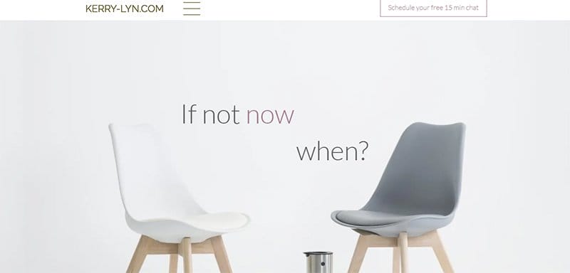
Kerry Lyn is a life coach who offers a top-notch counseling section for relationships, careers, and family. I like how the first catchy element on this stunning web page is a stunning image of furniture in the hero section.
The parallax scrolling feature makes all the catchy site content appear sleek and engaging, compelling visitors to take appropriate action. Interested visitors can click any video content in a slider format to get more information about the brand's activities.
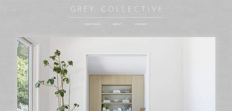
Natalie Mason, a Los Angeles native who loves and appreciates thoughtful and refined yet livable spaces, established Grey Collective.
This minimalist web page features few contents but starts with a full-width image of a living space displaying household items, like furniture and a large flower pot. Visitors can use the mega navigation bar to explore this gray-colored portfolio page.
I like how the site’s color scheme centers around the brand’s name, featuring French gray and white as its dominant colors.
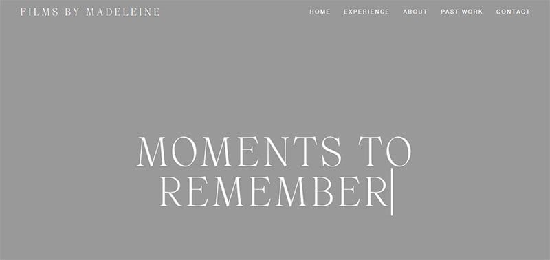
Films by Madeleine is a brand that focuses on nostalgia and the honest journey of life, featuring its ups and downs, grand gestures, and the tiny moments in between,
The Roman coffee-colored background gives the webpage a unique and visually appealing outlook and makes all the site’s contents engaging to visitors.
I like how the hero selection features engaging text about Madeleine and a looping video featuring some of her past projects. The parallax scrolling feature makes all the catchy site content appear sleek and engaging, compelling visitors to take appropriate action.
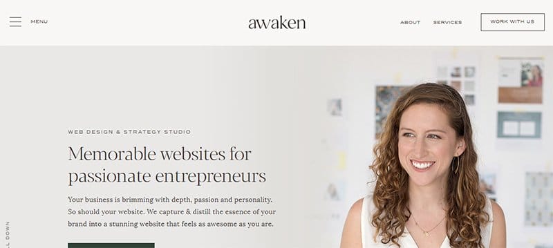
Awaken Studio comprises a team of experts relentlessly focused on elevating its client's brand with a personalized website.
Interested visitors can click the transparent “Work With Us” CTA button with a hover feature on the negation navigation bar to collaborate with Awaken Studio.
The hamburger navigation bar is your one-stop shop to explore every inch of this stunning pale gray-colored web page.
I love how the site features a motion graphic feature and a looping video at the center of the page to expose visitors to vital information.
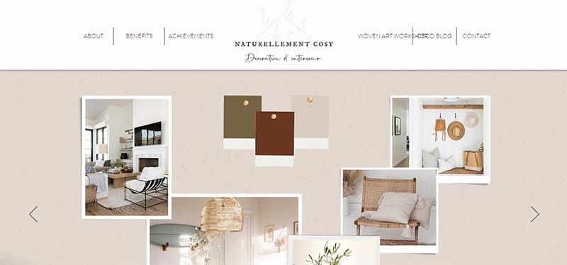
Naturellement Cozy was born from the desire to offer interior design and decoration services that adapt to your projects.
I love the use of stylish text to display heartwarming content in the text like testimonial sections about the brand from various satisfied customers.
The rodeo dust-colored site footer contains various information like the brand’s toll-free number, contact information, social media icons, and newsletter column.
I like how the Instagram section features high-quality images with a thumbnail feature, which grants access to the brand's Instagram page.
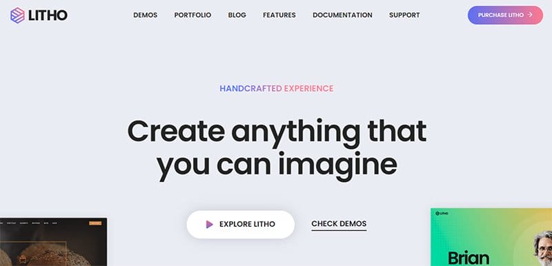
Litho is a creative agency that offers top-notch services to its clients, helping them make their business ideas come to life.
I love how the web page combines blue chalk, black, and gradient colors to give the site an elegant vibe. This beautiful site uses a card design layout to display every course with a catchy image featuring a thumbnail feature for further exploration.
The sticky back-to-the-top button makes it easy for visitors to explore the page's content without sweat. I like how the testimonial section features multiple engaging and heartwarming content, which is a source of social proof and helps boost credibility.
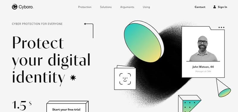
Cyboro is a platform that helps to integrate secure, seamless, and trusted identity and access management into customer and workforce applications.
This stunning gray website example features attractive colors and design elements you will notice once you arrive on the page. The first catchy thing is a gradient-coated responsive element that appears in floating shapes with a black-and-white image of John Watson.
I love how the dominant colors on the page are white, smoke, and black, which makes other design elements attractive and visually appealing.
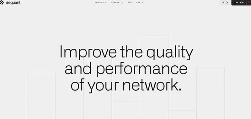
Bequant is a leading network optimization software company from Madrid, Spain. The brand's vision focuses on developing technology that adds intelligence to networks to extract maximum performance from available infrastructure.
Welcoming visitors to this stunning gray-coated web page is a motion graphic element with an engaging caption in the hero section.
I love how the webpage features animated elements that give the site a fun and engaging outlook, compelling visitors to explore its contents further.
As you explore the page further, you will love the spring wood-colored sticky navigation bar with features that lead to other website sections.
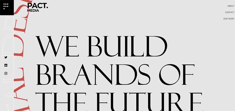
Pact Media is a professional brand creation company that helps non-profits, governmental agencies, ethical businesses, and research institutes speak directly to their audience with carefully crafted communication.
I like how this stunning gray (Mercury) website features multiple eye-catching design elements, such as motion graphics, bold texts, and various photos featuring different shades of gray.
The vertical and horizontal scrolling feature gives the webpage an elegant and modern outlook, which makes it fun for visitors and potential clients to explore.
Interested visitors can check out the portfolio section by clicking any images to get more information about the brand's projects.
My favorite aspect of this page is the display section, which features icons of brands that endorse Pact Media and are in partnership with them.
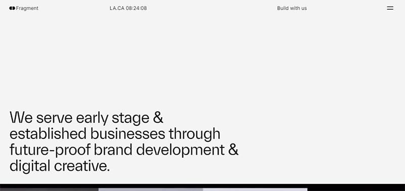
Fragment serves early-stage & established businesses through future-proof brand development and digital creativity. Welcoming visitors to this fantastic web page is a looping video featuring some of the brand projects engagingly and interactively.
As you explore the page further, you will love using multiple high-quality images of different sizes to help visitors and potential clients view their past works.
The site's dark color scheme features black and pale gray as its dominant colors. You can use the sticky navigation bar with a drop-down feature to explore various areas of the page.
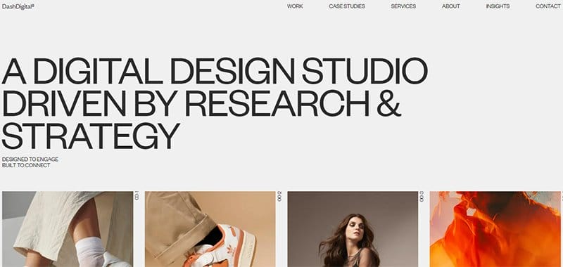
Dash Digital Studio's website has a minimalist layout with a soft peach background, blog texts, and images coated without bright colors.
The mega navigation bar is your one-stop shop for exploring various aspects of this webpage. I like how the site welcomes visitors with a short bio text revealing the brand's mode of operation and primary vision.
You cannot but love the catalog of high-quality images featured at the base of the hero section that displays some of Dash Digital Studio's best projects. Clicking any of these images is your one-way ticket to explore the page content further.
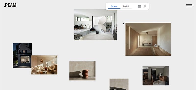
PEAM is the brainchild of Andra Harbeck, who is a professional designer with a knack for transforming a living space into a masterpiece.
I love the responsive feature that characterizes this gray website example, making exploring it fun and engaging. This minimalist webpage has an amour-colored background, which makes it visually appealing.
Clicking the hamburger navigation bar on the right side of the page transports you to a unique page where you can check out some of the brand's projects.
The base of the page features three unique links that lead to other pages on the site where visitors can get vital information.
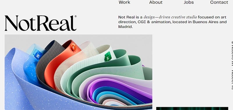
Not Real is an award-winning studio with professional designers that creates impactful high-end visual content. This brand focuses on art direction, CGI & animation in Buenos Aires and Madrid.
The first catchy element you will see on arrival is a colorful looping video that features some of the brand's projects in a visually appealing fashion.
As you explore the page further, you will love the zig-zag design layout the brand uses to arrange its content and display high-quality images and engaging texts.
What's handy for me about this webpage is how using harp shades as the background color allows the brighter colors on the page to pop.
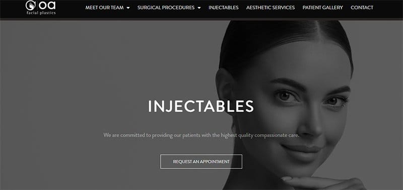
OA Facial Plastics is a collection of passionate physicians and professionals dedicated to providing an individual-based approach to reaching your personal aesthetic goals.
Welcoming visitors to the fantastic web page is a stunning image with a slider feature displaying engaging texts, which helps boost the brand’s marketing strategy.
Interested visitors can click the transparent “Request An Appointment” CTA button with a hover effect to contact the brand’s officials. Visitors can use the Google Maps feature at the center of the page to locate the OA Facial Plastics office seamlessly.
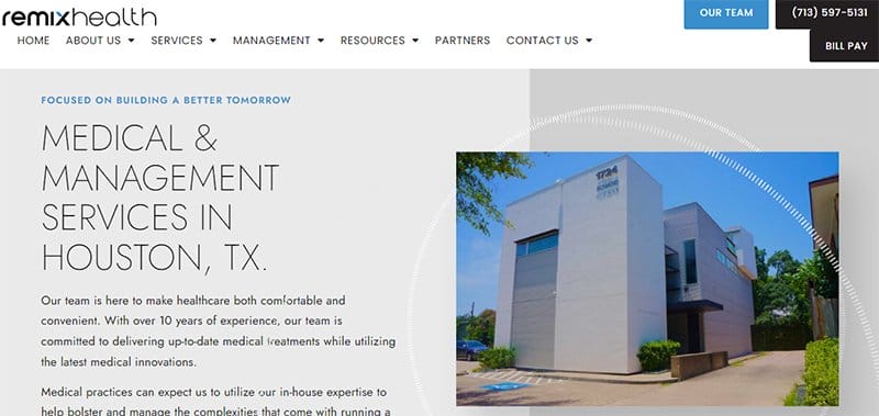
Remix Health offers top-notch health-related services like trident revenue cycle services, remote monitoring, alternative pain management, and home care services.
Welcoming visitors to this amazing gray webpage is an image of the hospital’s building and a short bio that helps visitors get acquainted with its origin and activities.
As you explore the page further, you will love the spring wood-colored sticky navigation bar with features and links leading to other website sections
Interested visitors and potential clients can click the blue “Our Team” CTA button on the sticky navigation bar to contact the brand’s officials.
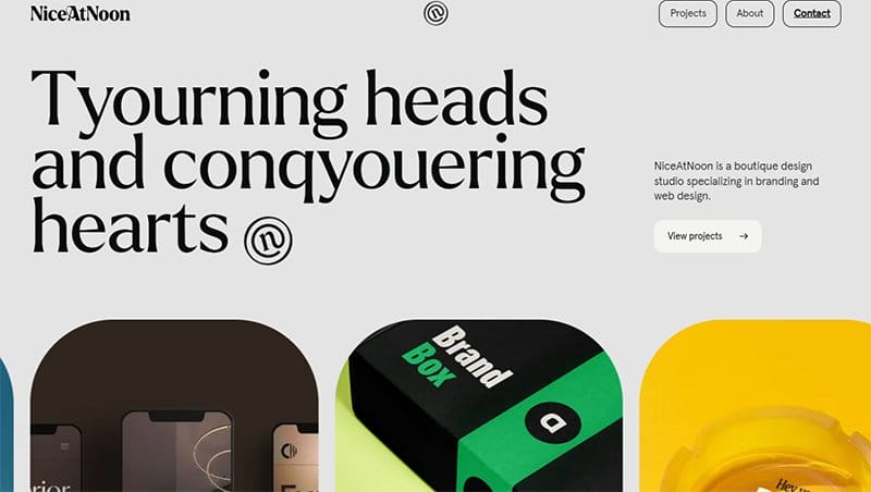
NiceAtNoon is a design-based brand that focuses on helping its clients create a story-based brand image that will help them increase their customer base.
I love how the dawn pink background makes all the eye-catching design elements pop and appeal to visitors upon arrival. The use of stylish text plays a vital role in stirring visitors' interest and making the page more engaging to explore.
What's handy about NiceAtNoon’s webpage is multiple card design layouts with a slider feature displaying the brand’s top projects.
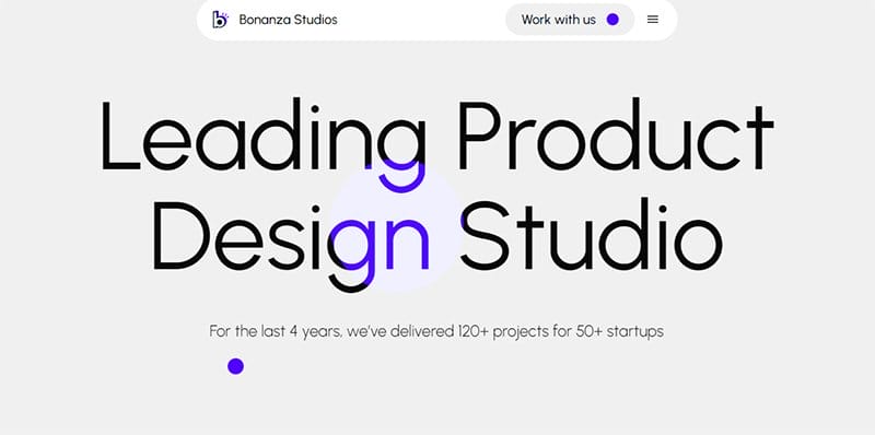
Bonanza Studios features multiple stunning design elements that display the brand’s relevance to the design and creative world.
I like how the first thing you see upon arrival is a caption written in bold text that displays “Leading Product Design Studio” as its message to visitors.
The site's peach-colored footer houses vital content like links to other pages and four social media icons that act as a portal to the brand’s social icons.
I love how the page features multiple responsive design elements that change its structure and content upon contact.
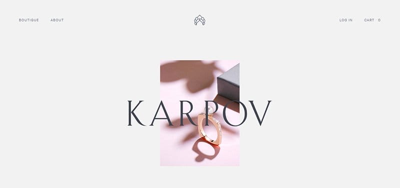
Karpov is a creative brand created by sisters Hélène and Jeanne Karpov of Russian origin. The first thing that will excite visitors upon arrival is the inverted scrolling features that make the hero action image larger as you scroll.
This stunning gray-coated webpage has a unique design layout featuring minimalist content with professional photos and scrolling animation effects.
You can use the mega navigation bar to explore this soft peach-coated webpage seamlessly and have vital discussions.
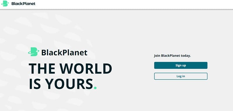
BlackPlanet is here to create a shift in the multiverse, where black lives matter. This brand is black-owned and operated by a diverse group from many intersections of the black experience.
The first catchy element on this webpage is the brand’s logo and a newsletter column in the site’s hero section. I like how the web page features high-quality images with bright colors centered around the black community.
Interested visitors can click any online store CTA buttons on the site's base to download Black Planet’s mobile app.
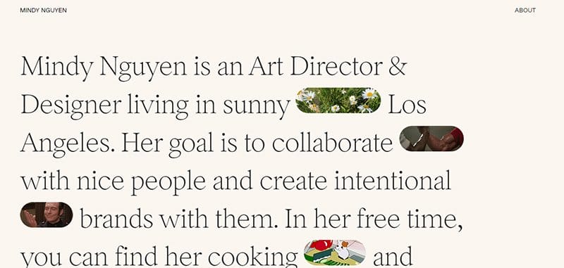
Mindy Nguyen is an Art Director & Designer living in Sunny Flowers, Los Angeles. She aims to collaborate handshakes with friendly people and create intentional chef-kiss brands with them.
The first catchy element you will observe on arrival is a bio section that displays content about Mindy Nguyen with tiny GIFs to give it an engaging feel. I like how she includes a simple picture of her wearing an off-white T-shirt in her living room.
As you explore the site content further, you will love how she uses a horizontal design layout to arrange some of her past projects in an orderly fashion. Each project has a high-quality image, short texts, and a custom CTA button for further exploration.
Gray Website Design FAQ
Yes, gray is a good color for a website because it can make the web design look elegant, refined, and fresh and have a modern outlook. With a gray background, you can seamlessly integrate other colors to create a visually appealing and colorful page that stands out from other sites.
You can use beige as an alternative to the color gray when setting up your web page. Beige can serve as a proper background and color scheme when creating a visually appealing website that will get visitors glued to their screens.
Using a gray background for your website features various benefits like your ability to integrate additional colors that contrast with gray and display high-quality images that will serve as a guide to site information. Gray makes a modern and sleek color scheme, giving your webpage an elegant outlook.
Explore Further
- Best Black and White Website Design
- Beautiful Examples of Gradient Websites
- Best Green Website Design
- Best Neon Website Design Examples
- Best Colorful Website Design Examples
- Best Sleek Website Design Examples
- Best Dynamic Website Examples
- Best Black and Gold Website Designs
- Best Blue Websites
- Stunning Yellow Websites