29 of the Best Examples of Mobile Website Design
Internet statistics show that about 4.32 billion people use their mobile devices to surf the internet. Designing a mobile-friendly website is essential to reach a larger audience and rank high on Google’s search results.
The best mobile-friendly websites adapt to different devices and screen sizes, record fast page loading speeds, and display eye-catching visuals.
Creating a mobile-first website design doesn’t have to cost a fortune or be time-consuming. You can use the best website builders like Squarespace and Wix to design websites with an excellent mobile web experience.
This article covers the 29 best mobile website design examples providing a rich blend of inspiration to build your own mobile-friendly site.
Let’s get started.

1790 Coffee is a family-run company committed to ethical and sustainable practices in producing and sourcing its fair-trade Mexican coffee.
One of the best examples of mobile-first websites, the 1790 Coffee website is aesthetically pleasing, welcoming visitors to a centralized display of its products.
Each homepage section of the site is well-arranged, giving room for easy access across various devices, including smaller screens.
A product carousel feature is visible above the site's footer section, displaying high-quality images of its processes in a centralized four-column slideshow.

Puffin Packaging specializing in innovative, eco-friendly packaging, sourcing recyclable and biodegradable materials to manufacture versatile temperature-insulated packaging.
This brilliant mobile-friendly website example is aesthetically pleasing in its prominent display of gentle colors.
The Pale Cerulean color stands out on the site's homepage as the background color for different sections, engaging users with its consistent display. This color stands out as a tool to divide different homepage sections, adding a unique touch to the site's mobile-first design.

Staay offers pet supplements consisting of just a handful of active ingredients carefully selected to optimize a pet's overall health and wellness.
One of the standout mobile-first website examples, the Staay website is unique with a responsive design that favors mobile device usage.
The site is well-arranged, displaying bold fonts as crucial elements, allowing users to focus on critical information. The CTA buttons lead users in their uniform Dusty Orange-colored background, easily recognizable alongside several complex design components.

Sharon Radisch is a photographer, creative director, and artist in New York and Paris, exploring various fine art and design mediums. One of the best mobile-friendly sites, Sharon's website guarantees a seamless user experience via its user-friendly mobile design.
Welcoming visitors is a black-and-white image serving as the site's hero image, with the artist's name displayed centrally in bold alongside a hamburger menu.
Beneath the hero section is a three-column display of the artist's work, blended as colored and black-and-white images to catch users' attention.

The Jones sisters' barbecue and sauce center is named the Jones Bar-B-Q with love in Kansas. This beautiful website has an intuitive layout filled with pictures of fire and the natural sauce hue of jasper.
High-quality font and images of the restaurant's food options, sauce, and the Jones sisters are visible throughout the website to give it a polished appearance.
Quickly adapting to multiple versions and smaller screens, the mobile-friendly website stands out in its consistent display of interactive elements.

Yang's Place is a vibrant new restaurant in Ringwood East that aims to deliver delicious traditional Chinese cuisine using recipes from various regions.
This excellent mobile-first website design example is aesthetically pleasing, with a colorful blend of unique design elements.
Beneath the hero section are several sections displaying header texts and appetizing images straight out of the restaurant menus. The site's mobile-friendly navigation stands out among all the features, improving the website's performance.
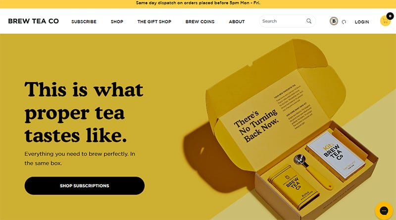
Brew Tea Co. is an online retailer that offers all the essentials for making the ideal cup of tea for any occasion. This top mobile-friendly website example illustrates a successful dropshipping business leveraging Old Gold's color for its responsive web design.
The CTA buttons on the Brew Tea Co website are heavily spaced over colorful backgrounds, with the color black acting as the backdrop color.
I love the display of slideshow pictures of the company's top-selling products in a gentle color palette set against a background of bright yellow.

BALLOON is an emotionally vivid and delicately rendered short film offering an alternative world that prizes softness and sensitivity over brute strength.
One of the top mobile-friendly website examples with a mobile-first approach, the BALLOON website stands out in its mobile responsive design.
Welcoming visitors to the site is a centralized display of a boy surrounded by several awards the movie has grossed since its premiere.
Several bold colors are visible as visitors scroll through the site's centralized content, stealing attention and offering a unique mobile experience.
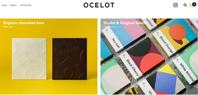
Ocelot Chocolate is a company that uses an environmentally and socially responsible manufacturing approach to create premium chocolate products.
One of the top mobile websites, the Ocelot Chocolate mobile site prioritizes mobile responsiveness in its central, two-column layout.
Bright and warm hues are visible on the homepage, with the color corn yellow striking out against a plain white background. I love how the site incorporates a variety of color schemes, which enhances the visual appeal for mobile users.

Sophie Brittain is a New York-based product designer passionate about creating seamless and delightful user experiences.
This simple website prioritizes mobile responsiveness, replicating her passion in her mobile-friendly website design and minimizing the display of unnecessary elements.
Bold-colored shapes and icons stand out as the site's main design element on its homepage, captivating users with their sparse display. The centralized layout encourages users to focus on the minimal content displayed on the homepage.

8 and 9 is an independent Miami-based premium streetwear brand rooted in the symbolism of each digit, with 8 representing infinity and 9 symbolizing perfection. This top mobile-first website is modern and sticks to a clean layout for its mobile website design.
Welcoming visitors to the site is a full-width slideshow of different images of its latest wears, flashing across mobile screens. The homepage displays consistent, high-quality photos of its products, providing visitors with many options.

Hollie Fuller is a freelance illustrator and maker with a playful approach to image-making inspired by people and things.
This stunning mobile-friendly website uses a mobile-first design strategy to accommodate mobile visitors across different devices, guaranteeing an outstanding mobile experience.
High-quality images of the illustrator's work are visible on the homepage's plain white background in an inconsistent three-column display. Each image on display uses bold colors and sizes, quickly stealing the site visitors' attention.

Chubbies was founded in 2011 by friends who found the traditional world of men's capital fashion completely unrelatable. One of the best mobile websites, the Chubbies mobile website prioritizes mobile responsiveness, making every scroll worthwhile for mobile users.
CTA buttons stand out centrally over several high-quality background images, stealing the attention of the photos displayed.
An extensive search bar is visible in the site's header menu alongside icons and CTA texts, helping users locate specific items.

Michelle Carlos is an artist, writer, and illustrator who translates his travel experiences, childhood memories, and culture into children's books.
One of the best mobile-friendly websites, Michelle's portfolio website is artistic, capturing visitors' attention through its consistent display of illustrated images.
Visitors will love the site's illustrations, with the centralized layout ensuring the focus remains on them. The stylish font displayed on the site in their bold displays captures attention, engaging screen readers and visitors as they scroll.

Crane Capital helps build and grow real estate businesses across Asia's leading cities by investing in necessary real estate for people and communities to thrive. This top mobile-friendly website displays minimal text and essential design elements.
A leading mobile-first design example, the Crane Capital mobile site prioritizes mobile responsiveness with a responsive design that accommodates desktop devices and mobile screens.
Users enjoy the parallax scrolling feature as they scroll through the site's homepage, engaging visitors with a high-quality display of images.

Brown Owl Creative is a well-established WIX partner company that creates custom-designed WIX sites for its clients. One of the top mobile-first website examples, the Brown Owl Creative website is unique, sticking to a centralized layout for its web design.
The plain white background displays large images of the company's past work, adorning the homepage in their colors. Plenty of white spaces are visible on the site's home page, allowing users to focus on their mobile screen as they scroll on their mobile devices.

Soli is the investor behind Lattes & Leases, a company that helps its clients make real estate investing fun, accessible, and straightforward.
One of the top mobile-friendly website examples, the Lattes & Leases website is aesthetically pleasing, sticking to a gentle color scheme for its web design.
Sliding texts, animated icons, and catchy CTA buttons stand out on the site's homepage, engaging visitors with their quality and colorful display.
I love the display of testimonials from past clients on a bright background in a slideshow, with CTA texts helping users navigate through several testimonials.

Prostudio is a full-service digital agency helping to create compelling digital products for progressive companies. This beautiful mobile-friendly website example is unique, with an interactive, responsive design that engages users.
An anchor scrolling menu is visible and pinned to the left-hand side of the homepage as dots, serving as the site's mobile-friendly navigation feature.
Listed at the footer of the site's homepage are texts linked to the agency's social media pages alongside a language-switching feature.

iDIG Marketing is a Canadian company with a sweet spot for digital marketing and tailored technology solutions. One of the best mobile-friendly websites, the iDIG Marketing website is unique, displaying bold design elements in a centralized layout.
Several product carousel features are prominent on the site, displaying the company's partners, success, and services. The logo's Orange Peel adds a personal touch to the website design, serving as the background color for the site's multiple CTA buttons.

Pipcorn is a minority-owned, family-run, and women-owned company that sells snacks made from heritage corn.
One of the top mobile-first websites, the lovely Pipcorn online store is a top-ranked product Shopify site, featuring bold design elements as its primary digital advertising technique.
Bold writing against an expansive Ecru White background makes the sticky header menu on the Pipcorn website stand out.
Pinned to both corners of the home page are a chat feature and an accessibility icon with a Macaw Blue Green backdrop that guarantees an optimal user experience.

Gearlaunch aims to be the one-stop shop for premium goods by giving buyers and sellers quick and easy access to the supply chain.
This eye-catching online store, one of the best mobile design examples, greets visitors with a vibrant presentation that explains the company's mission.
A comprehensive rundown of the brand's operations is visible beneath the hero section, with a concentrated two-column layout against a plain white backdrop.
Slideshow-formatted excerpts from the GearLaunch blog page are accessible in mobile and desktop versions.

Pieces by Rust & May are effortlessly stylish and timeless enough to be worn for many years, making it one of the successful dropshipping store examples.
One of the best mobile websites, the Rust & May website design is simple, with a large display of its product categories on the homepage's stark white background.
The site's navigation comprises two sets of three-column product categories separated by an introductory section with bold white letters. I love how the Rust & May website uses a responsive design that guarantees optimal user satisfaction.

Blink helps bring peace of mind to its clients and loved ones through affordable, innovative, and easy-to-use smart home devices. One of the standout responsive websites, the Blink mobile site is professionally looking and sticks to a clean layout for its mobile website design.
The mobile version of the link desktop site is unique, with an intuitive layout that makes it easy for mobile users to digest the site's content. I love how the CTA buttons stand out in the logo's Celestial Blue color, prompting visitors to Shop Now from any location.

Allbirds offers premium shoes with more traction and lower carbon emissions. This fabulous mobile-friendly website example uses stunning images of shoes and feet to communicate its message.
The site's responsive design heavily emphasizes CTA buttons and content, which stand out because of their striking black-and-white color scheme.
I love how the stories area gives the Allbirds brand a personal touch and helps tell an exciting story about the company's goals and offerings.

Taylor Stitch is committed to building the best possible clothing through years of user feedback and doubling its commitment. One of the best mobile-first website examples, the Taylor Stitch mobile site is user-friendly, featuring striking design elements.
Testimonials from previous customers are in a centered three-column format, with the woodland backdrop giving the section a distinctive feel.
I love how the CTA buttons display white font against gorgeous picture and video backgrounds, easily readable on any mobile screen.

Hiut Denim Co. is the reinvention story of a town breaking from making jeans for over 40 years and finding its feet again. One of the top mobile websites, the Hiut Denim Co. mobile website is unique, with a responsive design that accommodates different mobile screens.
The Lava color stands out on the site as the primary color, boldly displayed as the background color for different homepage sections and CTA buttons.
A prominent chat feature is visible and pinned to the left-hand side of the homepage, serving as the site's online communication channel.

In Print Art Book Fair is an annual Jerusalem event featuring works from over two hundred international exhibitors. This fantastic mobile-first website example is mobile-friendly and specifically designed to accommodate mobile users on different mobile devices.
The entire site's layout sticks to a centralized display, making it easy to view on any mobile device and effortlessly fitting into any mobile screen. Plain white as the background color leaves plenty of white spaces that allow users to focus on the site's centralized content.

Mailchimp is a leading email marketing and automation brand that recommends ways to get more opens, clicks, and sales to its clients. One of the best mobile-friendly websites, the Mailchimp site is built to accommodate different categories of users on their mobile devices.
Fully packed into unique interactive sections, visitors get a first-hand view of the brand's strategies from the homepage. I love the display of logos of top brands Mailchimp integrates with the footer section in a three-column layout, serving as social proof.

Kissmetrics helps users unlock unlimited revenue potential through simple analytics that track human behavior. One of the best mobile-first website examples, the Kissmetrics mobile website is informative, taking users on a visual journey of what they stand to gain from the platform.
Animated icons stand out at unique locations on the homepage, capturing visitors' attention and adding an artistic touch to the website design.
Several screenshot images of the platform add to the site's interactive elements, giving users a customized viewing experience.
Mobile First Website Examples FAQ
A mobile-first design is a website design approach to designing UIs that prioritizes small screen experience across multiple devices. Unlike other website design approaches, mobile-first designs start from smaller screens and gradually work to accommodate larger screens.
Besides loading the site on mobile devices, the fastest and easiest way to know if a website is mobile-first is to use professional inspection tools. Google's page speed insight tool and its mobile-friendly test allow users to check whether a website is mobile-friendly from a simple search.
The best way to design a website for mobile users is to choose a mobile-friendly design that prioritizes loading speed. Selecting a mobile responsive theme or template, optimizing loading speed, compressing images, and using HTML are some steps to take in designing your website specific for mobile users.
A mobile-first design is an intentional design choice that focuses on mobile devices instead of desktop versions, improving mobile UX and prioritizing mobile experience. On the other hand, a responsive design is a reactive design that helps shift a site's content to accommodate different screen sizes.